How to use Pivot Tables – Excel’s most powerful feature and also least known
This article explains the basics of Excel's pivot table, I have included VBA code for the most common actions.
What's on this page
- What is an Excel Pivot Table?
- Prepare source data
- Rearrange values
- Use an Excel defined Table as a Pivot Table data source
- How to build a pivot table
- How to configure a Pivot Table
- How to move a column header to the Filters area programmatically - Pivot Table
- How to move a column header to the Columns area programmatically - Pivot Table
- How to move a column header to the Rows area programmatically - Pivot Table
- How to move a column header to the Values area programmatically - Pivot Table
- How to use Pivot Table Report Filters
- How to manipulate the Report Filter programmatically
- How to add fields to Pivot Table Column Labels
- How to add fields to Pivot Table Row Labels
- How to add fields to Values area
- Pivot table features
- How to insert a pivot chart
- How to insert Slicers
- How to refresh a Pivot Table
- Copy a Pivot Table without source data
- Customize the layout
- Consolidate data from multiple cell ranges
- Get the Excel File here
- Create monthly time sheet using a Pivot Table
- Change PivotTable data source using a drop-down list
- Use hyperlinks in a pivot table
- Normalize data - VBA
- Disable autofit column widths for Pivot table
- Analyze trends using pivot tables
- Prepare data for Pivot Table - How to split concatenated values?
- Auto populate a worksheet
- How to create a dynamic pivot table and refresh automatically
- Auto refresh a pivot table
1. What is a Pivot Table?
A pivot table allows you to summarize huge amounts of values amazingly fast in groups and sub-groups you specify. You can then analyze the data with ease, compare values by date or by group and see important trends. It is one of the best and most powerful Excel features and also one of the least known.
Pivot table charts is a great tool for visualizing your data.
Slicers allow you to quickly filter data, however, the report filter has the same functionality but perhaps not as elegant.
The following article shows you how to analyze pivot table data:
Recommended articles
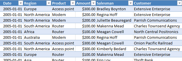
Table of Contents Introduction to pivot tables Create pivot table Group data Analyze data (pivot table) Compare performance, year to […]
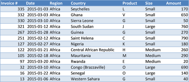
2. Prepare source data
Before you build your first pivot table make sure your data source table follows some simple rules.
- Use unique header names for all your columns.
- Make sure you have no blank cells.
- Check your spelling. If you have one cell "West" and another "Westt" they will both show up in the pivot table. You can correct this later.
- Convert your data source to an excel defined table (optional).
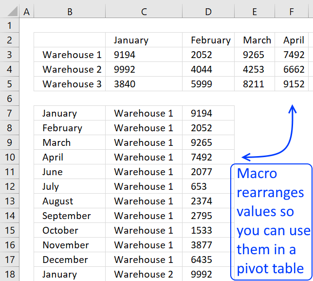
3. Rearrange values
This picture below shows you a table with bad data structure, you can't use it in a pivot table.
The table below is much better, all values in this table are not shown for obvious reasons. A couple of things are missing though, can you see it? Unique table header names and the data table is not an excel defined table.
You don't have to use an excel defined table but it will make it a lot easier if you add more values later on to your table. An excel defined table is dynamic and it will save you time not needing to adjust the pivot table source range.
I have made a macro/udf that can help you rearrange your data, see these posts:
Recommended articles
To be able to use a Pivot Table the source data you have must be arranged in way that a […]
Recommended articles
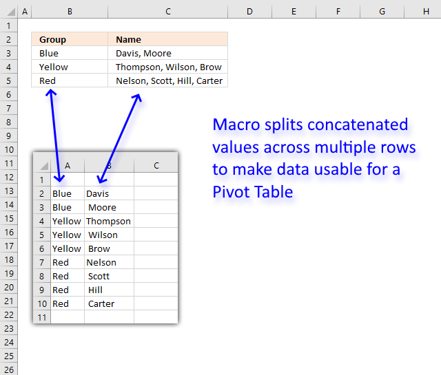
This article demonstrates a macro that allows you to rearrange and distribute concatenated values across multiple rows in order to […]
4. Use an Excel Table as a data source
Why do you want to use an Excel Table as a data source to your pivot table? You don't have to but it will make your life easier whenever you want to add or delete records to your data set.
The Excel table adjusts automatically to new data and this saves you time since you don't need to update the data source cell reference each time.
Here is how you convert a generic data set to an excel defined table:
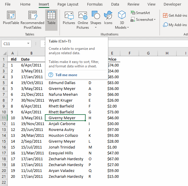
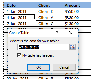
- Select a cell in your data table.
- Go to tab "Insert" on the ribbon.
- Press with left mouse button on "Table" button.
You can also use these shortcut keys: CTRL + T
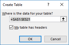
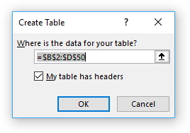
This dialog box shows up.
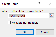
Excel finds the entire data table automatically =$A$1:$C$48, do make sure this is correct.
My table does not have table headers so I don't select the "My table has headers" check box.
Press with left mouse button on the OK button.
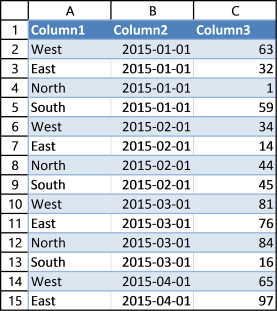
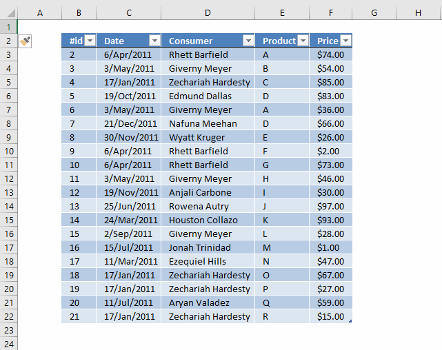
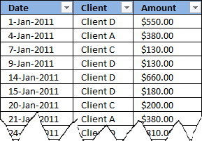
Excel has now converted your data table to an excel defined table. It has also inserted new column headers, see picture above. I don't want to use these table header names as they are not descriptive of each column.
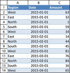
This table is much better, later on these table header names will make it much easier for us when working with the pivot table.
Learn how to change data source with a drop-down list:
Recommended articles
In this article, I am going to show you how to quickly change Pivot Table data source using a drop-down […]
Learn more about excel tables:
Recommended articles
An Excel table allows you to easily sort, filter and sum values in a data set where values are related.
5. How to build a pivot table
- Select a cell in your data table.
- Go to tab "Insert" on the ribbon.
- Press with left mouse button on the "Pivot table" button.
This dialog box appears.
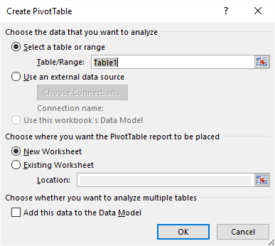
It uses the excel defined table name in the first field, very good. It also allows you to choose where you want your new pivot table. I am going to place the pivot table on a new sheet. Press with left mouse button on the OK button.
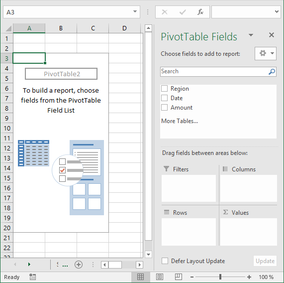
Excel creates a blank pivot table for us on a new worksheet, see picture above.
5.1 How to insert a Pivot Table programmatically
This is what the macro recorder returns while inserting a pivot table.
Sheets.Add
ActiveWorkbook.PivotCaches.Create(SourceType:=xlDatabase, SourceData:= _
"Source data!R1C1:R365C7", Version:=6).CreatePivotTable TableDestination:= _
"Sheet17!R3C1", TableName:="PivotTable7", DefaultVersion:=6
Sheets("Sheet17").Select
Cells(3, 1).Select
The following article shows you how to refresh a pivot table automatically:
Recommended articles
In a previous post: How to create a dynamic pivot table and refresh automatically I demonstrated how to refresh a pivot […]
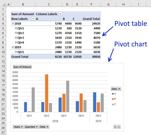
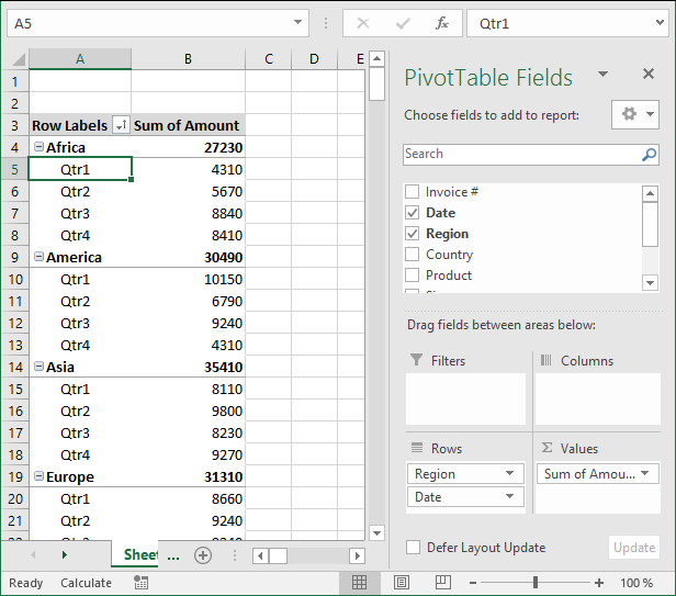
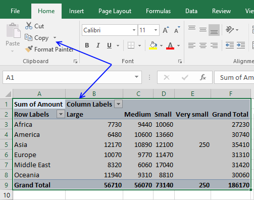
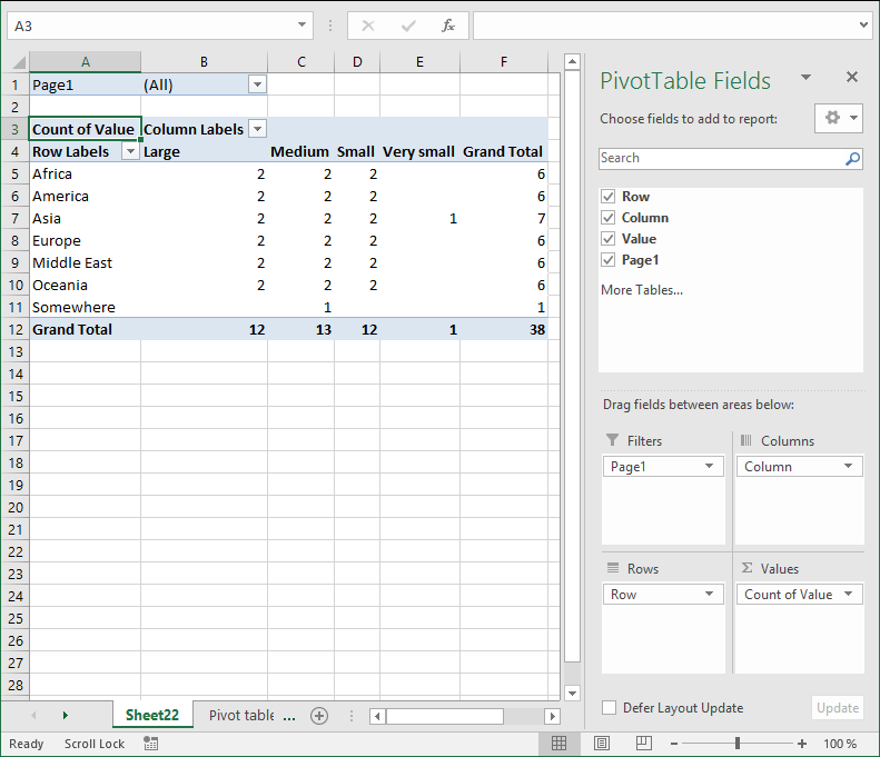
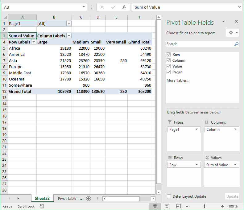
6. How to configure a Pivot table
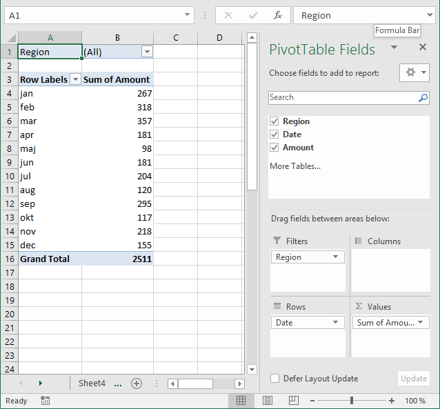
The pivot table on the worksheet is blank and it tells us "To build a report, choose fields from the PivotTable Field List".
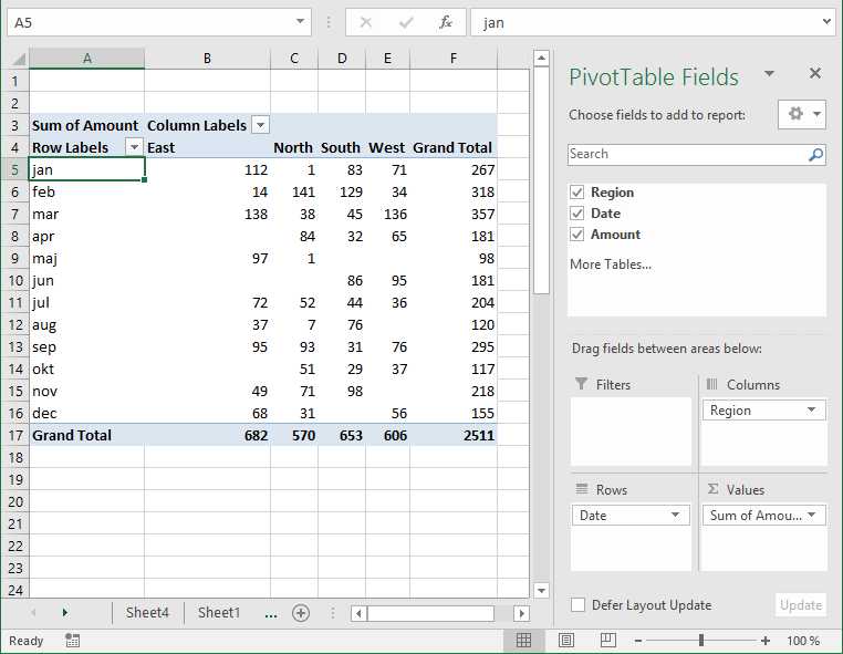
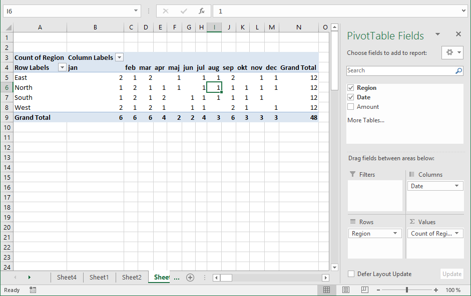
You can find our fields in the blue box named 1, see picture below. The fields are Region, Date and Amount the same as your header names in your data source table, now you understand why it is important to name your data source headers.
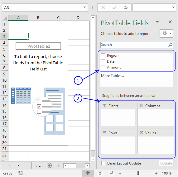
The way this works is that you can press and hold with left mouse button on one of the fields and then drag it to an area. The areas are Filters, Columns, Rows and Values and I have drawn a blue box around them with the name 2, see above picture.
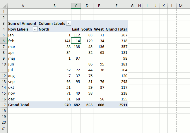
Drag Region to Filters, Date to Rows and Amount to Values, see picture below. Excel is trying to help me out here, it automatically grouped my dates into months se column "Row Labels". Don't worry, I will show you later on how to group and ungroup dates.
6.1 How to move a column header to the Filters area programmatically - Pivot Table
This is what the macro recorder returns when I drag Region to Filters area.
With ActiveSheet.PivotTables("PivotTable3").PivotFields("Region")
.Orientation = xlPageField
.Position = 1
End With
6.2 How to move a column header to the Columns area programmatically - Pivot Table
Here is the output when I drag Region to Columns area.
With ActiveSheet.PivotTables("PivotTable3").PivotFields("Region")
.Orientation = xlColumnField
.Position = 1
End With
6.3 How to move a column header to the Rows area programmatically - Pivot Table
This happens while recording Date to Rows area.
With ActiveSheet.PivotTables("PivotTable3").PivotFields("Date")
.Orientation = xlRowField
.Position = 1
End With
ActiveSheet.PivotTables("PivotTable3").PivotFields("Date").AutoGroup
6.4 How to move a column header to the Values area programmatically - Pivot Table
Finally Amount to Values area.
ActiveSheet.PivotTables("PivotTable3").AddDataField ActiveSheet.PivotTables( _
"PivotTable3").PivotFields("Amount"), "Sum of Amount", xlSum
Learn how to use hyperlinks in a pivot table:
Recommended articles
Sean asks: Basically, when I do a refresh of the data in the "pivotdata" worksheet, I need it to recognise […]
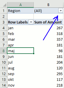
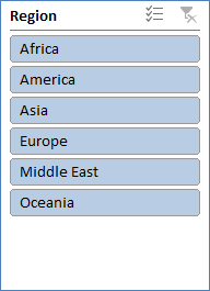
6.5 Report Filters
The report filter allows you to select a subset of your data. In this case I want to work with values in region "West". Simply press with left mouse button on the arrow and select a Region. Press with left mouse button on OK. See animated picture below.
If you are interested in the vba code for this action here it is.
ActiveSheet.PivotTables("PivotTable3").PivotFields("Region").ClearAllFilters
ActiveSheet.PivotTables("PivotTable3").PivotFields("Region").CurrentPage = _
"West"
6.6 Column Labels
Press with left mouse button on and drag Region to Columns area.
Unique values from column Region in your source data table shows up horizontally on the pivot table (cell range C4:E4, pic above).
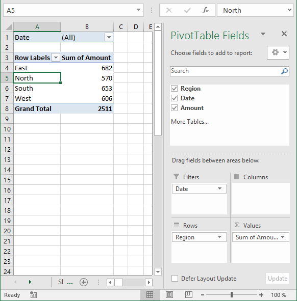
6.7 Row Labels
The following picture shows Region in Rows area and Date in Filters area.
6.8 Values
The last area is Values. You are not limited to numbers (Amount) here, you can drag Dates or Region here also. Notice that you can't sum text values but you can count them.
Learn how to link a combo box with a pivot table:
Recommended articles
In this post I am going to demonstrate two things: How to populate a combobox based on column headers from […]
7. Pivot table features
Here is a list of the most used functionalities.
7.1 Summarize and analyze
The pivot table is phenomenal at processing huge amounts of data very quickly. Since calculations are done in almost no time you can easily drill down in every detail very quickly.
I have shown you earlier in this article that if you drag a field to Values area, the pivot table sums your values into groups depending on what specific fields you have in the Columns and Rows area.
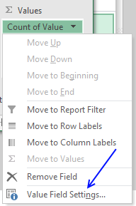
It also allows you to see trends in your numbers, follow this example. Drag "Amount" once again to Values area, you should now have two "Amount" there.
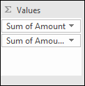
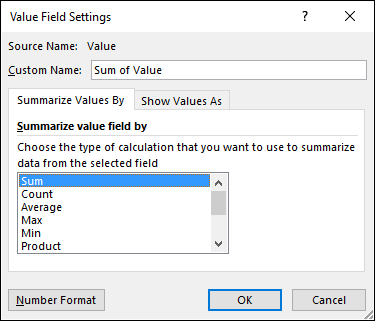
Left press with left mouse button on the down pointing arrow next to the second "Amount" and then press with left mouse button on "Value Field Settings...". Press with mouse on tab "Show Values As"
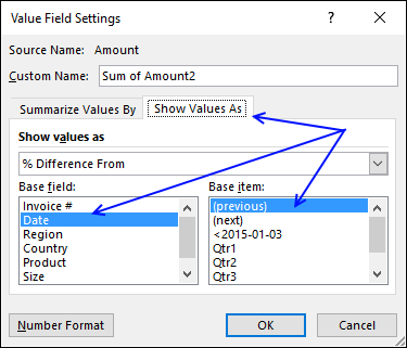
Select Date in Base field: and (previous) in Base item:, see picture above. Press with left mouse button on OK
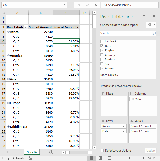
There is now a new column next to the sums. It shows the % difference compared to the previous values. The number in cell B8 compared to the number in cell B7 is -4.86% less. (8410/8840) -1 = -4.86%
Learn to build a pivot table calendar:
Recommended articles
This article demonstrates how to build a calendar in Excel. The calendar is created as a Pivot Table which makes […]
7.2 Count
The following picture shows Region in both Values area and Rows area. Date in Columns area grouped by month.
7.3 Unique distinct list
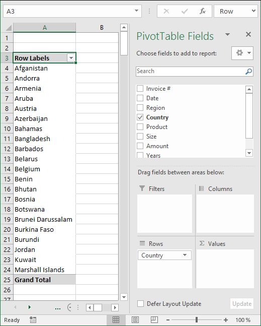
You can use the a pivot table to extract a unique distinct list from a column in a large list. The picture shows countries, simply drag Country to Rows area.
7.4 Extract unique distinct records
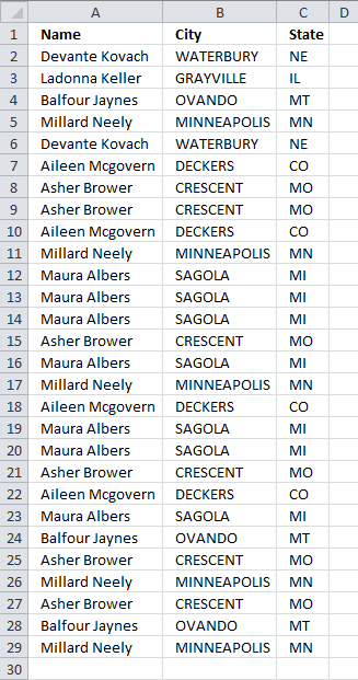
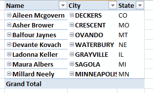
Here is a table with many duplicate records.
- Select a cell in the table above.
- Go to tab "Insert" and press with left mouse button on "Pivot table" button
- Place the pivot table somewhere on your worksheet/workbook.
- Drag "Name", "City" and "State" to "Row Labels" field
- Also drag "Name" to "Values" field
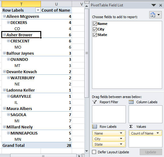
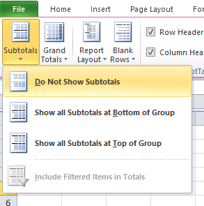
- Values are not on the same row which is confusing. Go to tab "Design" on the ribbon, press with left mouse button on "Report Layout" button and then "Show in tabular form"
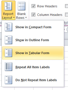
- To show all values, go to tab "Design" and press with left mouse button on "Report Layout". Then press with left mouse button on "Repeat All Item Labels"
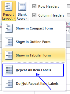
- The last thing to do is to hide "Subtotals", press with left mouse button on "Do Not Show Subtotals" button.
Here is a picture of the final table, it shows you unique distinct records. In other words, duplicate records are removed from the source data table.
It is possible to extract unique distinct records using a formula, read this post:
Recommended articles
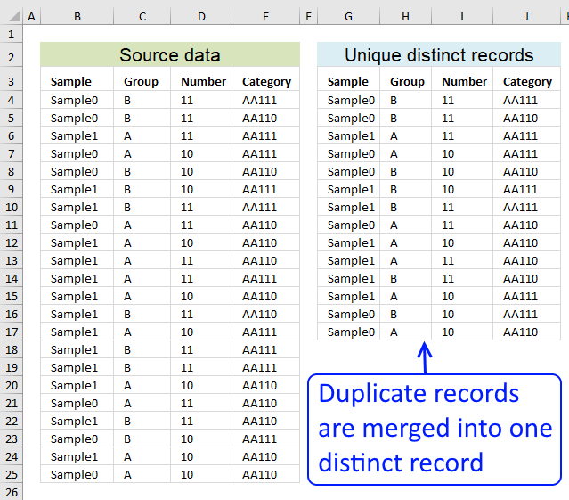
Table of contents Filter unique distinct row records Filter unique distinct row records but not blanks Filter unique distinct row […]
7.5 Count unique distinct values
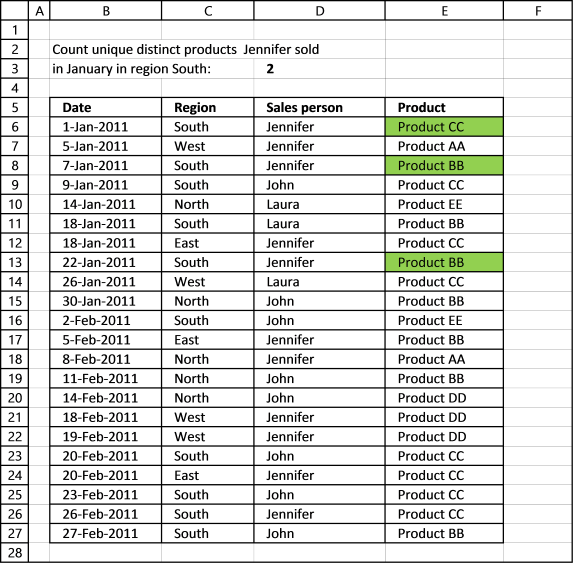
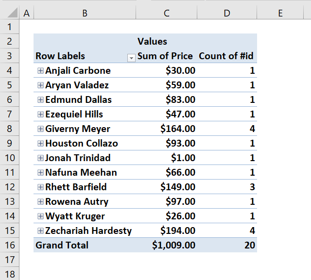
Excel 2013 and later versions allows you to count unique distinct values. The following picture shows you data table, the scenario is this:
How many unique distinct products did Jennifer sell in region "South" and in January 2011?
I have highlighted the values below that match above criteria.
For this to work you need to enable a check box before creating a new pivot table.
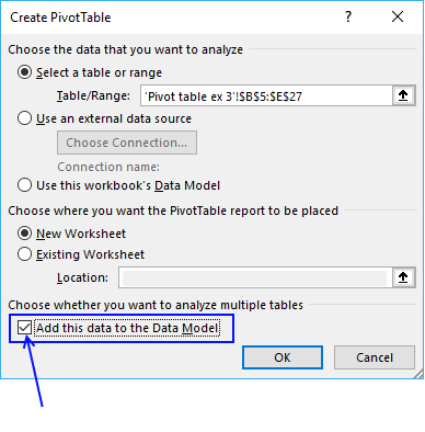
Press with left mouse button on OK button. To be able to filter month January and not individual dates only, drag "Date" to Rows area.
There are now two "Date" fields in Rows area, the other is "Date (Month)". Drag "Date (Month)" from Rows area to Filters area and drag "Date" back to top area. It now looks like this:
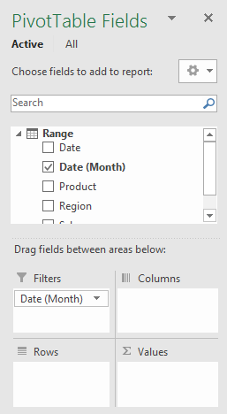
Drag "Region" and "Sales person" to Filters area. Drag "Product" to Rows and Values area.
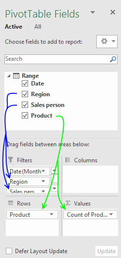
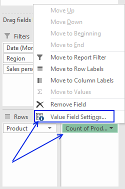
Press with mouse on "Count of Products" then press with left mouse button on "Value Field Settings..."
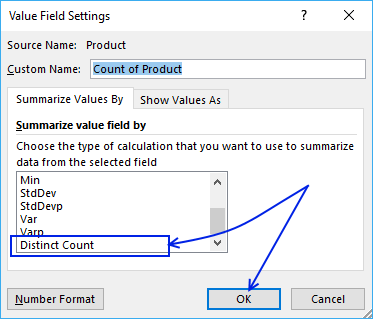
Select "Distinct Count" and press with left mouse button on "OK" button
Now let's filter the pivot table, press with left mouse button on filter "arrow" next to All and select "January", "South" and "Jennifer". Press with left mouse button on OK button.
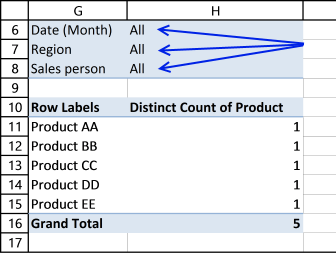
Here is the final pivot table:
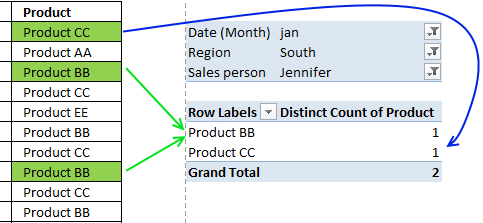
There are two unique distinct products shown next to "Grand Total".
7.5.1 Count unique distinct records (rows) in a Pivot Table

Excel versions earlier than 2013 need a different approach, the method demonstrated here uses formulas to count unique distinct records.
The table I am working with is in cell range B2:D7. I have then added another column (E) to count unique distinct rows.
Formula in cell E3:
Copy cell E3 and paste it down to cells below as far as needed.

7.5.2 Create pivot table
- Select cell range B2:D7
- Press with left mouse button on "Insert" tab on the ribbon
- Press with left mouse button on "Pivot table" button
- Choose where you want the pivot table to be placed.
- Press with left mouse button on OK.
7.5.3 Setup pivot table
- Press with left mouse button on and drag Name, Address and City to row labels.
- Press with left mouse button on and drag Count to values.

There are three unique distinct rows (Grand Total)
7.5.4 Count duplicate records (rows) in a Pivot Table

The table I am working with in this example is in cell range B2:D12. I have then added another column (E) to count duplicate rows.
Formula in cell E3:
Copy cell E3 and paste down to E12.
7.5.5 Create pivot table
- Select cell range B2:D12
- Press with left mouse button on "Insert" tab on the ribbon
- Press with left mouse button on "Pivot table" button
- Choose where you want the pivot table to be placed.
- Press with left mouse button on OK.
7.5.6 Setup pivot table
- Press with left mouse button on and drag Name, Address and City to row labels.
- Press with left mouse button on and drag Count to values.
There are six duplicate rows (Grand Total)

7.5.5 Count unique distinct values in an Excel Pivot Table
This section describes how to count unique distinct values in a Pivot Table using a prior to Excel version 2013.
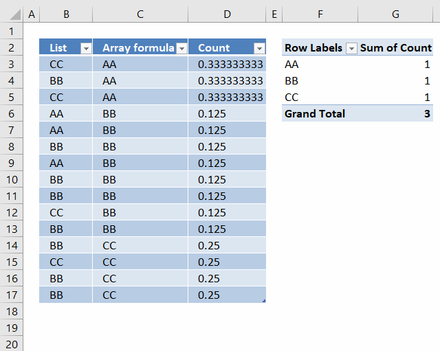
I have a small problem that I am not sure on how to solve.
I now have a list of 15 cells with 3 unique values (arr formula in all 15 cells). When I use this into a pivot table, I want to get the count as 3 since that is the unique count. But I am getting 15 as the value!
I am assuming that the pivot table is reading the formula as a value and counting it. Any way to circumvent that?
Answer:
Update: It is now possible to count unique distinct values in a Pivot Table. You need Excel 2013 or a later version.
I don´t think it is possible to count unique values in a pivot table unless you add another column to your table or use VBA: Improve your Excel Pivot Table to count unique values or items

Formula in D3:
Copy cell D3 (Ctrl + c). Paste (Ctrl+ v) on cell range D4:D17.
Setup pivot table
- Press with left mouse button on and drag Array formula to Row Labels
- Press with left mouse button on and drag Count to Values
How the formula in cell D3 works
Step 1 - Construct the COUNTIF function
COUNTIF(range,criteria) counts the number of cells within a range that meet the given condition.
Select cell D3.
Type =COUNTIF(
Select cell range C3:C17
Press F4. You have now created absolute cell references to cell range C3:C17.
=COUNTIF($C$3:$C$17
Now create a relativ cell reference to cell C3.
=COUNTIF($C$3:$C$17, C3)
=COUNTIF($C$3:$C$17, C3)
becomes
=COUNTIF({"AA"; "AA"; "AA"; "BB"; "BB"; "BB"; "BB"; "BB"; "BB"; "BB"; "BB"; "CC"; "CC"; "CC"; "CC"}, "AA")
and returns 3. There are three AA in the array.
Step 2 - Divide 1 with the number of counted values
=1/COUNTIF($C$3:$C$17, C3)
becomes
=1/3
and returns
0.333333333333333 in cell D3.
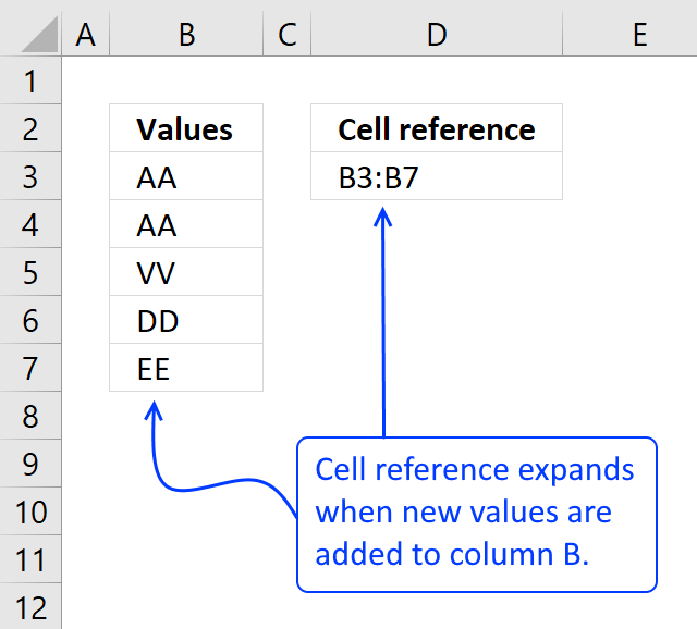
Count values in a pivot table using an Excel defined table as a data source
7.6 Sort data
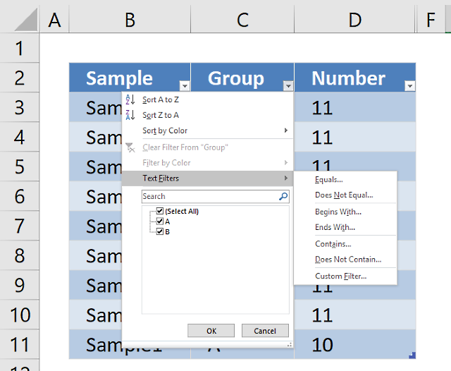
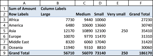
It is possible to sort almost anything with data in a pivot table. This picture shows a pivot table and I want to sort column East from smallest to largest. Press with right mouse button on on a cell in a column you want to sort. Press with mouse on "Sort" and then sort Smallest to Largest.
Recommended articles
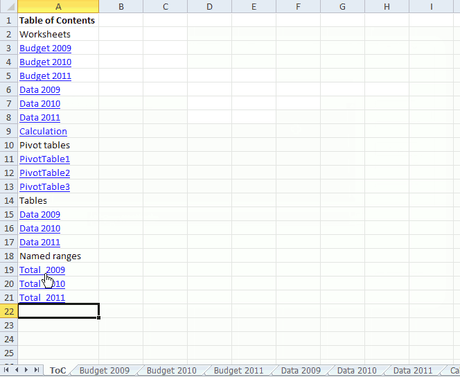
This article demonstrates a macro that automatically populates a worksheet with a Table of Contents, it contains hyperlinks to worksheets, […]
7.7 Group data
A pivot table allows you to group dates. You can group dates (and time) by seconds, minutes, hours, days, months, quarters and years.
Press with right mouse button on on a column or row you want to group, then press with left mouse button on group and this dialog box appears.
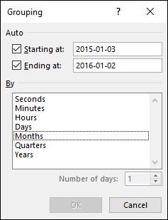
Below Group is Ungroup and I don't think I have to explain that.
Recommended articles
I read this interesting article Quick Trick: Resizing column widths in pivot tables on the Microsoft Excel blog. It is […]
7.8 Multiple levels
You can rearrange the pivot table so it has multiple levels on Rows area or Columns area or both. Drag more than one field to an area to create multiple levels.
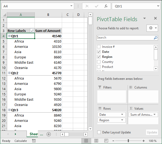
The picture shows you data grouped by quarter and then by region. You can also drag fields in an area to sort them, the order is important.
The Date and Region field switched places.
7.9 See data behind a pivot table cell
To see the data behind a pivot table cell just double press with left mouse button on a cell that interests you and excel creates a new sheet with the corresponding data shown.
7.10 Row and column grand totals
If you don't need the grand totals, turn them off by going to tab "Design", press with left mouse button on "Grand Totals" button and pick a setting you want. The choices are:
- Off for Rows and Columns
- On for Rows and Columns
- On for Rows only
- On for Columns only
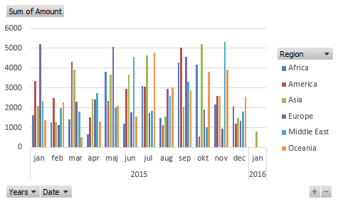
8. Insert a pivot chart
A pivot chart helps you visualize Pivot Table data.
- Make sure you have any cell selected on your Pivot Table
- Go to tab "Analyze" on the ribbon.
- Press with left mouse button on "Pivot chart" button.
From here you can pick a variety of charts, the preview helps you in your decision.
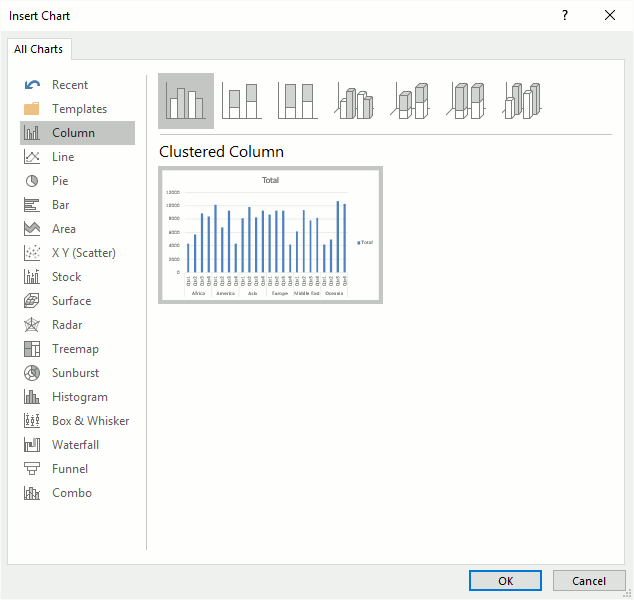
The chart will change if you apply a filter or sort pivot table.

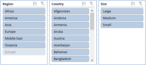
9. Slicers
Excel 2010 and later excel versions lets you insert slicers, they are no different than the Report Filter except that they look different and take up more space on your worksheet.
Go to tab "Insert" on the ribbon and press with left mouse button on the "Slicers" button.
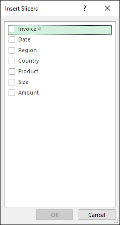
From here you can pick a field, I will select Region and then press OK button. The slicer appears on your worksheet, you may need a new location for it.
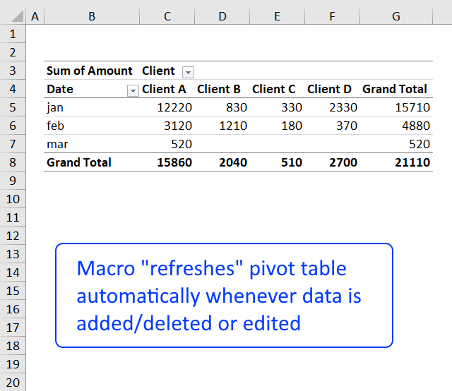
10. Refresh a pivot table
If you add, remove or edit values in your source data table you must update the pivot table to reflect the changes made, every time. This is easy to forget, here is how to do it.
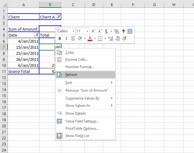
Press with right mouse button on on a pivot table cell.
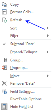
Press with left mouse button on "Refresh".
You can automate this with a macro.
Private Sub Worksheet_Activate()
Sheets("Pivot table").PivotTables("PivotTable1").RefreshTable
End Sub
Put it in your worksheet code module, see this post for more details.
11. Copy a pivot table without
If you want to share your pivot table but not the source data, follow these steps.
- Select the pivot table you want to copy
- Press Ctrl +C or press copy button on tab "Home" on the ribbon
- Press with right mouse button on on a cell where you want to paste the pivot table
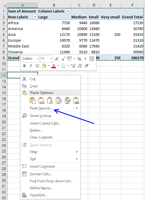
- Press with mouse on "Paste Special..."
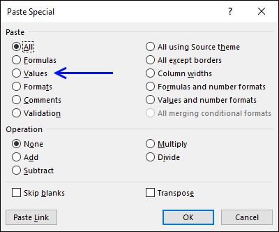
- Select "Values"
- Press with left mouse button on OK button
- Repeat step 3 and 4 and then select "Formats"
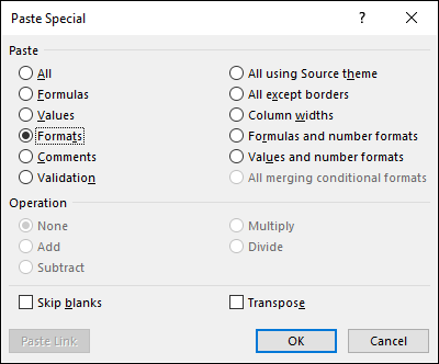
- Press with left mouse button on OK button
You can tell that the copy has no link to source data by first selecting a single cell in the copied pivot table and then a single cell in the original pivot table. The are two more tabs (Analyze and Design) on the ribbon if the original pivot table is selected
12. Customize the layout
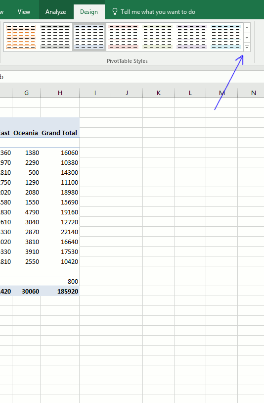
You can easily change the pivot table layout with one of the pivot table styles or create a entirely new one.
Select a cell in the pivot table. Go to tab design. Press with mouse on a style and the pivot table is instantly changed. You can hover with mouse pointer over different styles and see the changes to your pivot table change before you make up your mind.
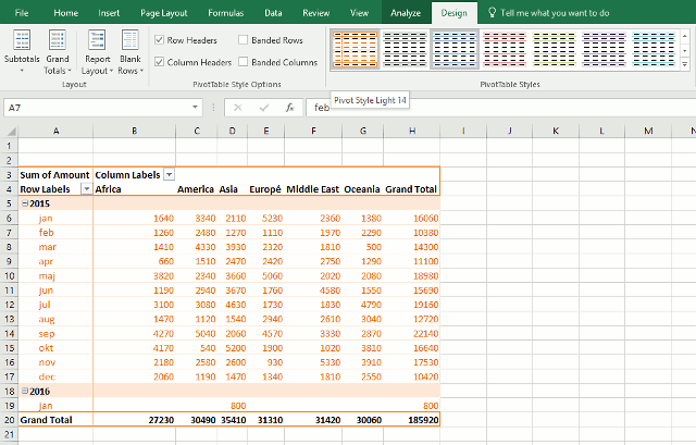
What happens if I record a macro while changing pivot table style?
Sub Macro2()
ActiveSheet.PivotTables("PivotTable1").TableStyle2 = "PivotStyleLight14"
End Sub
To create a new pivot table style, go to tab Design. Press with left mouse button on the arrow in the lower right corner of pivottable styles window, see picture below.
Select a table element and press with left mouse button on "Format" button.
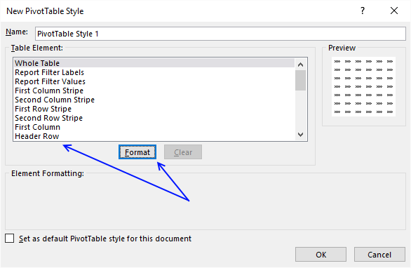
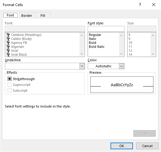
Change formatting and press with left mouse button on OK button.
Repeat with the remaining table elements you want to change.
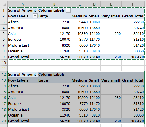
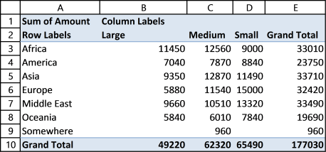
13. Consolidate data from multiple cell ranges
Excel has a feature that lets you consolidate data from multiple pivot tables or cell ranges.
Here are my two pivot tables for 2015 and 2014. I want to consolidate both pivot tables into one, notice that they share the same structure
Pivot table 1 - 2015
Pivot table 2 - 2014
Here is how to do it.
- Press Alt + D + P (This opens the pivot table and pivot chart wizard)
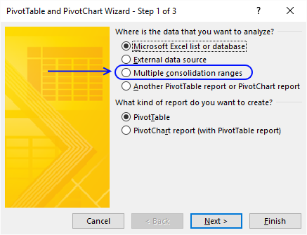
- Press with mouse on "Multiple consolidation ranges"
- Press with left mouse button on Next
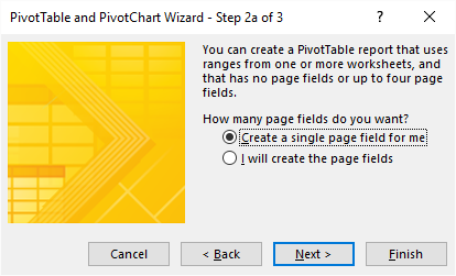
- Select "Create a single page field for me"
- Press with left mouse button on Next button
- Select the first worksheet range you want to consolidate
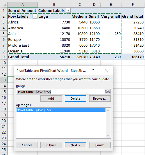
Notice that I select the row and column labels as well but not the grand totals. - Press with left mouse button on Add button
- Repeat step 6 and 7 with your remaining ranges.
- Press with left mouse button on Next button
- Select if you want to create a new pivot table on an existing sheet or a new worksheet
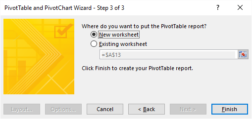
- Press with left mouse button on Finish
- Left press with left mouse button on arrow next to Count of Value
- Press with left mouse button on "Value Field Settings..."
- Press with left mouse button on "Sum"
- Press with left mouse button on OK
15. Create monthly time sheet using a Pivot Table

Today I am going to demonstrate how amazing pivot tables are! Take a look at this time sheet.
You can expand each month and see time spend on each project. The pivot table also shows a summary of both months and projects.
I made the pivot table from a simple table containing fake project time data.

This table can have duplicate dates, as you may be working on multiple projects in a single day.
How I created the Pivot Table
- Select a cell in your table.
- Go to tab "Insert".
- Press with left mouse button on "Pivot table" button.
- Press with left mouse button on OK.

Arrange data
- Press with left mouse button on and drag "Day" from "Pivot table Field List" to "Column Labels" area.
- Resize pivot table columns widths.

- Press with left mouse button on and drag "Date" to "Row Labels" area.
- Press with right mouse button on on a date and select "Group".

- Select months and press with left mouse button on OK.
- Press with left mouse button on and drag "Project" to "Row Labels" area.
- Press with left mouse button on and drag "Regular hours" to "Values" area.
- Go to tab "Design".
- Press with left mouse button on "Subtotals" button.
- Press with left mouse button on "Show all subtotals at bottom of group".

- Press with left mouse button on and drag overtime hours to "Values" area.
- Change headers "Sum of Regular hours" to R and "Sum of overtime hours" to O.
Picture of a monthly timesheet by project with overtime hours.

Recommended articles
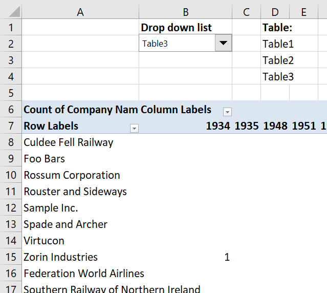
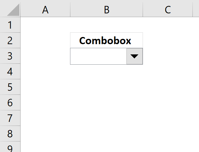
16. Change PivotTable data source using a drop-down list
In this article, I am going to show you how to quickly change Pivot Table data source using a drop-down list. The tutorial workbook contains three different tables (Table1, Table2 and Table3) with identical column headers.
In this tutorial:
- Create a combo box (form control)
- Select input range
- Add vba code to your workbook
- Assign a macro to drop down list

Create a Combo Box (Form Control)
- Go to the developer tab
- Press with left mouse button on "Insert" button
- Press with left mouse button on combo box (form control)
- Create a combo box
Want to learn more about Combo Boxes? Read this article:
Recommended articles
This blog post demonstrates how to create, populate and change comboboxes (form control) programmatically. Form controls are not as flexible […]
Select input range
- Press with right mouse button on on combo box
- Press with left mouse button on "Format control..."
- Go to "Control" tab
- Select an input range (D2:D4)
- Press with left mouse button on OK
Cell range D2:D4 contains the table names, you probably need to change these names.
Add VBA code to your workbook
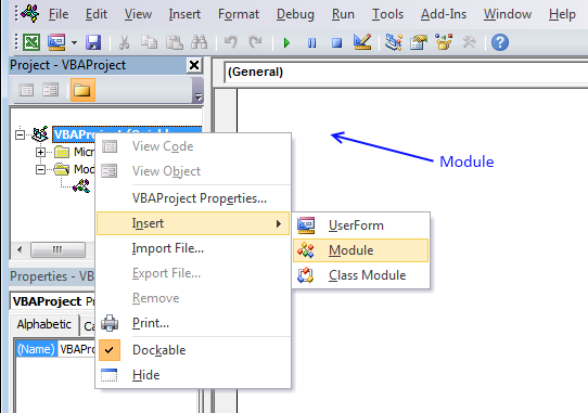
- Press Alt+F11.
- Press with right mouse button on on your workbook in the project explorer window.
- Press with left mouse button on "Insert".
- Press with left mouse button on "Module".
- Copy the code shown below and paste to code module, see image above.
- Return to Excel.
Sub ChangeDataSource()

With ActiveSheet.Shapes(Application.Caller).ControlFormat
    ActiveSheet.PivotTables("PivotTable1").PivotTableWizard SourceType:=xlDatabase, SourceData:= _
    .List(.Value)
End With

End Sub
For this code to work you need to change pivot table name (bolded) in vba code: PivotTables("PivotTable1") to the name of your specific pivot table.
Assign a macro
- Press with right mouse button on combo box
- Select "Assign macro..."
- Select ChangeDataSource macro
- Press with left mouse button on OK!
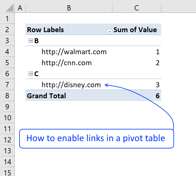
17. Use hyperlinks in a pivot table
Basically, when I do a refresh of the data in the "pivotdata" worksheet, I need it to recognise the cell is a hyperlink. In addition, when I update the indivital pivot tables, it looks at the data in the "Notes" field and recognise it as a hyperlink.
Answer:
The image below shows a very simple PivotTable containing a few hyperlinks, they look like they don't work if you press with left mouse button on them because they miss the blue underline.

Vba code
The following macro is an Event macro meaning it must be located in a sheet module. It runs when a selection changes on a worksheet. For example, every time you select a cell on sheet1 the macro is rund.
'The Event name must be Worksheet_SelectionChange(ByVal Target As Range), you can't change this.
Sub Worksheet_SelectionChange(ByVal Target As Range)

'Declare variables and data types
Dim ptc As PivotTable, Value As Variant, Rng As Range

'Check if only 1 cell is selected
If Target.Cells.Count = 1 Then

    'Iterate through each pivot table in active worksheet
    For Each ptc In ActiveSheet.PivotTables

        'If selected cell intersects with pivot table cell range
        If Not Intersect(Target, Range(ptc.TableRange1.Address)) Is Nothing Then

            'Does the cell contain a http or https link?
            If Left(Target.Value, 7) = "https://" OR Left(Target.Value, 8) = "https://" Then

                'Open hyperlink
                ActiveWorkbook.FollowHyperlink Address:=Target.Value, NewWindow:=True
            End If
        End If
    Next ptc
End If

End Sub
How to use Event code
- Copy VBA code above.
- Press Alt + F11 to open the Visual Basic Editor.
- Double press with left mouse button on the sheet in project explorer that contains the Pivot Table.

- Paste code to sheet module.
- Exit VBE and return to Microsoft Excel.
18. Normalize data - VBA
To be able to use a Pivot Table the source data you have must be arranged in way that a Pivot Table can handle. For example, the data set above in cell range B2:F5 has headers both horizontally and vertically. In other words, the data set is a two-dimensional table.
Months are arranged horizontally in row 2 and items are arranged vertically in column B, a Pivot Table can't work with data arranged in this way. The data must be arranged row by row meaning values on the same row belong together. Debra has a great post and video about normalizing data for excel pivot table.
This article describes and demonstrates a macro that normalizes data so you can use it in an Excel Pivot Table, meaning it rearranges a dataset layout from two dimensional to row by row. The following animated picture demonstrates the macro.

To view macros in your workbook simply press Alt + F8 to open the Macro dialog box, then press with left mouse button on NormalizeData macro and press with left mouse button on "OK" button to start the macro.
Now you will be prompted for a cell range that the macro can work with and rearrange the data, press with left mouse button on OK button when finished.
The macro creates a new worksheet and populates it with values from the cell range you selected.
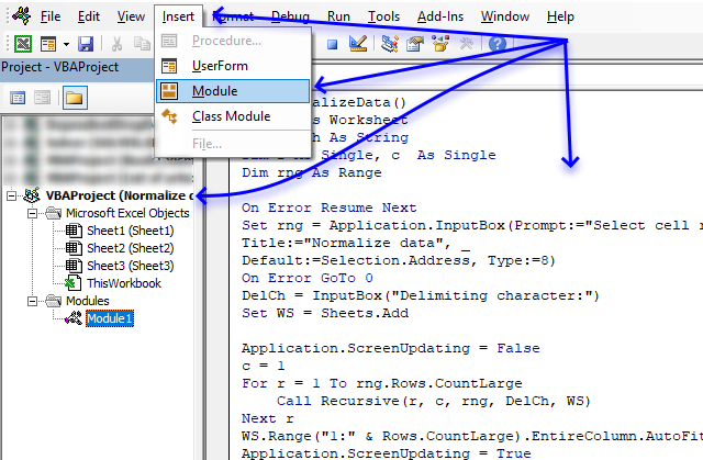
Where to put the code
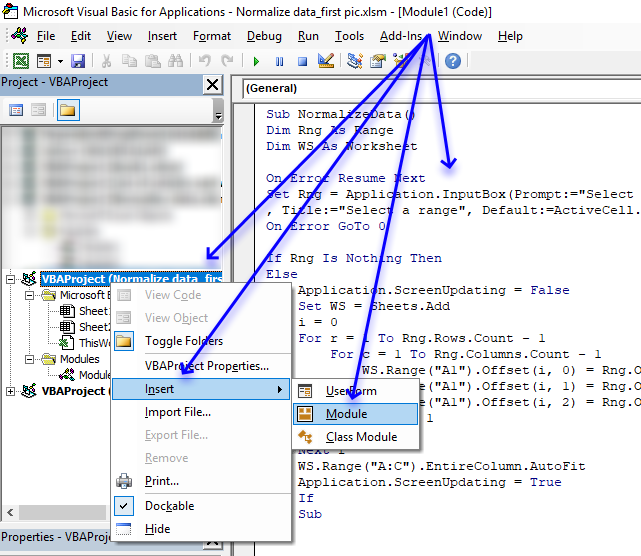
- Copy VBA code below.
- Press Alt+ F11 to open the Visual Basic Editor.
- Press with right mouse button on on your workbook in the Project Explorer.
- Press with left mouse button on Insert.
- Press with left mouse button on Module to insert a code module to your workbook.
- Paste code to module.
- Exit VB Editor and return to Excel.
VBA code
The VBA code below contains comments so you know what each line does. A comment begins with a ' which is a single quote or apostrophe, you can safely remove the comments if you don't want them in your code.
'Name macro
Sub NormalizeData()

'Dimension variables and declare data types
Dim Rng As Range
Dim WS As Worksheet

'Enable error handling
On Error Resume Next

'Show inputbox so the user can select a cell range and save result to object Rng
Set Rng = Application.InputBox(Prompt:="Select a range to normalize data" _
, Title:="Select a range", Default:=ActiveCell.Address, Type:=8)

'Disable error handling
On Error GoTo 0

'Check if object variable Rng is empty
If Rng Is Nothing Then

'If object variable Rng is not empty then continue with the following lines
Else

    'Don't show changes on screen
    Application.ScreenUpdating = False

    'Add a worksheet and save it to object variable WS
    Set WS = Sheets.Add

    'Save value 0 (zero) to variable i
    i = 0

    'Iterate through 1 to the number of rows in the cell range the user selected
    For r = 1 To Rng.Rows.Count - 1

        'Go through 1 to the number of columns in the cell range the user selected
        For c = 1 To Rng.Columns.Count - 1

            'Save values from cell range to worksheet
            WS.Range("A1").Offset(i, 0) = Rng.Offset(0, c).Value
            WS.Range("A1").Offset(i, 1) = Rng.Offset(r, 0).Value
            WS.Range("A1").Offset(i, 2) = Rng.Offset(r, c).Value

            'Add 1 to variable i
            i = i + 1

        'Continue with next column
        Next c

    'Continue with next row
    Next r

    'Adjust column widths
    WS.Range("A:C").EntireColumn.AutoFit

    'Show changes to the user
    Application.ScreenUpdating = True
End If

'Stop macro
End Sub
If your data is concatenated to a cell then this article may interest you:
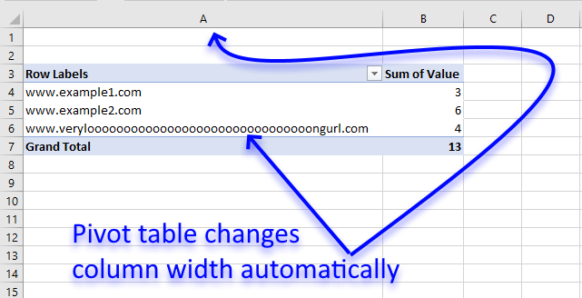
19. Disable autofit column widths for Pivot table
I read this interesting article Quick Trick: Resizing column widths in pivot tables on the Microsoft Excel blog. It is about Excel automatically making column widths too wide when using URLs in pivot tables. Stacey Armstrong demonstrates how to disable this setting.
Here are the steps to manually disable Excel resizing column widths automatically.
- Press with right mouse button on on any cell in the Pivot table.
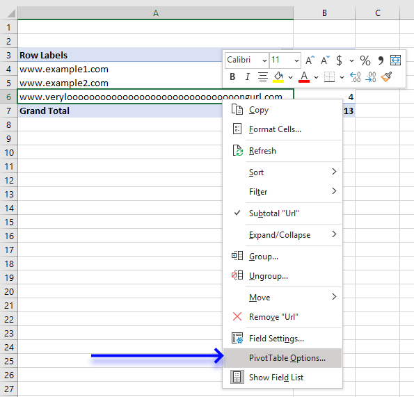
- Press with mouse on "Pivot Table Options".
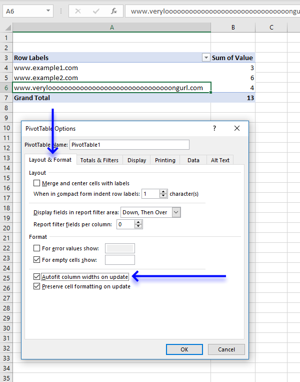
- Press with mouse on the "Layout and Format" tab, then press with left mouse button on the box next to "Autofit column widths on update" to uncheck it.
- Press with left mouse button on OK button to close the dialog box.
Lindsay Hughes commented:
I recommend that you create a personal macro workbook and save the following macros to that workbook. This will make it easier for you to change this setting automatically, simply run the macro to apply this setting to all Pivot tables in the active workbook.
If you use it really often then I recommend adding the macro to the Quick Access Toolbar located at the very top of Excel.
The following Event macro disables this setting for a Pivot Table named PivotTable1 in a worksheet named Sheet1. An event in Excel is a thing that happens that triggers something else to happen.
In this case, if any worksheet in the workbook is activated the code is rund.
'Event code is exectued when any sheet is activated
Private Sub Workbook_SheetActivate(ByVal Sh As Object)

'Save False to HasAutoFormat property for worksheet Sheet1 and PivotTable named PivotTable1
Worksheets("Sheet1").PivotTables("PivotTable1").HasAutoFormat = False
End Sub
I can't change it to the default setting but the code below automatically disables this setting for all pivot tables on the active sheet.
Private Sub Workbook_SheetActivate(ByVal Sh As Object)

'Dimension variable and declare datatype
Dim pt As PivotTable

    'Iterate through pivottables in active worksheet
    For Each pt In ActiveSheet.PivotTables

        'Change property HasAutoFormat to False
        pt.HasAutoFormat = False

    'Continue with next pivot table
    Next pt
End Sub
This macro changes the setting for all pivot tables in all worksheets in the active workbook.
Private Sub Workbook_SheetActivate(ByVal Sh As Object)

'Dimension variables and declare datatypes
Dim pt As PivotTable
Dim WS as Worksheet

'Go through each worksheet in the worksheets object collection
For Each WS In Worksheets

    'Iterate through pivottables in active worksheet
    For Each pt In WS.PivotTables

        'Change property HasAutoFormat to False
        pt.HasAutoFormat = False

    'Continue with next pivot table
    Next pt

'Continue with next worksheet
Next WS
End Sub
The following macro disables the setting for pivot tables in all open workbooks
Private Sub Workbook_SheetActivate(ByVal Sh As Object)

'Dimension variables and declare datatypes
Dim pt As PivotTable
Dim WS as Worksheet
Dim j As Single

'Go through all open workbooks
For j = 1 To Workbooks.Count
   'Go through each worksheet in the worksheets object collection
   For Each WS In Workbooks(j).Worksheets

       'Iterate through each pivot table
       For Each pt In WS.PivotTables
           'Change property HasAutoFormat to False
           pt.HasAutoFormat = False

       'Continue with next PivotTable
       Next pt

       'Continue with next WorkSheet
   Next WS

'Continue with next workbook
Next j
End Sub
19.1 Where to put the code?

- Copy above VBA code.
- Press Alt+F11 to open the Visual Basic Editor.
- Double press with left mouse button on your workbook to expand the object list.
- Double press with left mouse button on Thisworkbook in the project explorer window to show the workbook module.
- Paste VBA code to the workbook module.
- Exit VB Editor and return to Excel.
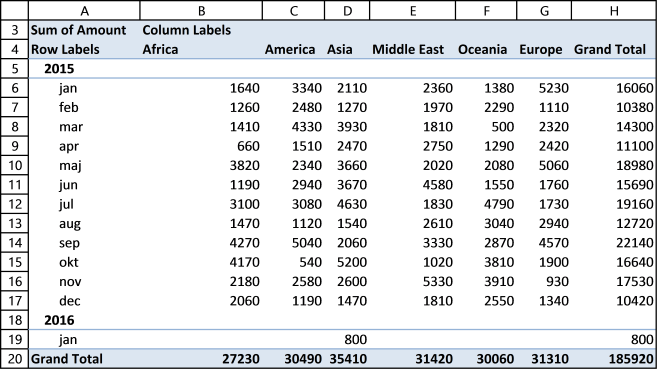
20. Analyze trends using pivot tables
A pivot table can quickly summarize and categorize many table records into a single report. Here is a picture of a table containing random fake data.
Let me show you what you can do with the data above and a pivot table.

You can group dates into months, quarters and years and sum corresponding data.

You can also categorize data into regions, products, salesperson or whatever categories you may find interesting.

It is possible to spot sales trends and quickly examine the underlying data, for instance on specific years, regions or products. Later in this post I'll show you how to compare sales from year to year or any year. The pivot table is somewhat "intelligent" and knows that you are interested in comparing selected (expanded) quarters or months.
Create a pivot table
- Press with left mouse button on any cell in your table
- Go to tab "Insert"
- Press with left mouse button on "Pivot table" button

- Press with left mouse button on OK
Group data
Now your pivot table looks like this:

- Press and hold on Date in Pivot table field list
- Drag and release over "Row labels" area
- Press with right mouse button on on any date in the pivot table

- Press with left mouse button on Group...

- Select months, quarters and Years
- Press with left mouse button on OK

Analyze data (pivot table)
Add "Amount" to the pivot table.
- Press and hold "Amount" in the pivot table field list
- Drag and release over Values area.

All sales in each year are summarized.

Press with mouse on any + to expand that specific year. Since you grouped dates into years, quarters and months, the next "level" is quarters.

Press with left mouse button on again + on a quarter and months are displayed.

You can expand or collapse all fields with one press with left mouse button on. Press with right mouse button on on any date and select "Expand Entire Field".
Compare performance, year to year, quarter to quarter (previous year), month to month (previous year)
Add pivot table field "Amount" to the Values "Area". You already did that? Do it again.
- Press with mouse on "Sum of Amount" field in "Values" area
- Press with left mouse button on "Value Field Settings..."

- Go to tab "Show Values As"
- Select Show values as "Difference From"
- Select Years in Base field
- Select (previous) in Base item.
- Press with left mouse button on OK

There is a sharp decline in sales in 2011. Expand 2011.

Notice that there are no +/- values in the quarters. That´s because only one year is expanded. Let's compare with year 2010, expand 2010.

Sales were pretty good in the three first quarters but the fourth quarter was terrible. You can quickly compare sales to year 2009. Collapse 2010 and expand 2009.

See that! Values in the +/- column changed! Quarters in 2011 are now compared to quarters in 2009.
Product trends
Which products show a decline in sales quarter 4, 2011?
- Press with left mouse button on "arrow" near "Row Labels"
- Select only year 2010 and 2011
- Remove "Sum of Amount" in Values "Field"
- Drag Products from Pivot table field list to Column area.

"Access points" and "Modems" have the largest declines in sales in quarter 4, 2011.
Region trends
Do all markets have the same decline in sales? This time calculate % difference from the same quarter last year.
- Press with mouse on "+/-" in Values area.
- Press with left mouse button on "Value Field Settings"

- Change Custom name to "%"
- Change Show values as: % Difference From
- Press with left mouse button on Ok
- Remove Products from Column Labels area
- Add Region to Column Labels area

All markets show a decline in sales.
Final thoughts
The data is random and from 2005-01-01 to 2011-11-05. That is why sales decline in quarter 4, 2011.
Recommended articles
- Showing Sales Trend In Pivot Table
- 6 Ways to Use Pivot Table to Analyze Quarterly, Monthly & Yearly Trends
- How to Use Pivot Table to Effectively Analyze Your Marketing Data
21. Prepare data for Pivot Table - How to split concatenated values?
This article demonstrates a macro that allows you to rearrange and distribute concatenated values across multiple rows in order to make it possible to use the dataset in a Pivot Table.

The animated image above shows how the macro works. Here are the steps to run and use the macro.
- Press Alt+F8 to open the Macro dialog box.
- Press with mouse on "NormalizeData" to select it.
- Press with mouse on "Run" button to run the macro.
- An input box appears asking for a cell range.
- Select the cell range you want to rearrange.
- Press with left mouse button on OK button on dialog box.
- An input box appears asking for a delimiting character, the example shown above has a comma as a delimiting character.
- Press with left mouse button on OK button on dialog box.
- A new sheet is inserted and is populated with values from the cell range you selected, however, each concatenated value has now a row or record on its own. This is necessary if you want to analyze the data in a pivot table.
VBA macros
There are two macros that make this possible, NormalizeData() and Recursive().
'Name macro
Sub NormalizeData()

'Dimension variables and declare data types
Dim WS As Worksheet
Dim DelCh As String
Dim r As Single, c  As Single
Dim rng As Range

'Enable error handling
On Error Resume Next

'Show input box and ask for a cell range
Set rng = Application.InputBox(Prompt:="Select cell range:", _
Title:="Normalize data", _
Default:=Selection.Address, Type:=8)

'Disable errror handling
On Error GoTo 0

'Ask for a delimiting character
DelCh = InputBox("Delimiting character:")

'Insert a new worksheet to your workbook
Set WS = Sheets.Add

'Don't show changes on screen
Application.ScreenUpdating = False

'Save 1 to variable c
c = 1

'Iterate from 1 to the number of rows in the selected cell range
For r = 1 To rng.Rows.CountLarge

    'Start macro Recursive with variables r, c, rng, DelCh and WS
    Call Recursive(r, c, rng, DelCh, WS)

'Continue with next row
Next r

'Change column width to fit content
WS.Range("1:" & Rows.CountLarge).EntireColumn.AutoFit

'Show changes to Excel user
Application.ScreenUpdating = True

End Sub
The second macro is displayed below.
'Name macro as dimension arguments and declare data types
Sub Recursive(r As Single, c As Single, rng As Range, DelCh As String, WS As Object)

'Dimension variables and declare data types
Dim str As Variant
Dim cc As Single, ccc As Single

'Split cell using delimiting character saved to variable DelCh
str = Split(rng.Cells(r, c).Value, DelCh)

'Iterate through values in array variable str
For i = 0 To UBound(str)

    'Check if variable c is equal to 1
    If c = 1 Then

        'Iterate from 1 to the number of columns in selected cell range
        For ccc = 1 To rng.Columns.CountLarge

            'Check if row number of first empty value in column ccc is larger than variable j
            If WS.Cells(Rows.Count, ccc).End(xlUp).Row + 1 > j Then

                'Save row number of first empty cell in column ccc to variable j
                j = WS.Cells(Rows.Count, ccc).End(xlUp).Row + 1
            End If

        'Continue with next column
        Next ccc

    'If c is not equal to 1 then do the following.
    Else

        'Save row number of first empty cell in column c to variable j
        j = WS.Cells(Rows.Count, c).End(xlUp).Row + 1
    End If

    'Save value in array variable str to worksheet based on row variable j and column variable c
    WS.Range("A1").Offset(j - 1, c - 1).Value = str(i)

    'Check if c - 1 is greater than 0 (zero)
    If c - 1 > 0 Then

        'Check if cell is empty based on variable j - 1 and c - 2
        If WS.Range("A1").Offset(j - 1, c - 2).Value = "" Then

            'Save value one row above to cell
            WS.Range("A1").Offset(j - 1, c - 2).Value = _
            WS.Range("A1").Offset(j - 2, c - 2).Value
        End If
    End If

        'Check if c is equal to the number of columns in the selected cell range
        If c = rng.Columns.CountLarge Then

            'Check if variable i is not equal to 0 (zero)
            If i <> 0 Then

                'Iterate from 1 to the number of columns in the selected cell range.
                For cc = 1 To rng.Columns.CountLarge - 1

                   'Save value in cell above to cell based on variable j - 2 and cc - 1
                   WS.Range("A1").Offset(j - 1, cc - 1).Value = _
                   WS.Range("A1").Offset(j - 2, cc - 1).Value

                'Continue with next column
                Next cc
            End If
        Else

            'Run another instance of macro Recursive this time with the next column number
            Call Recursive(r, c + 1, rng, DelCh, WS)
        End If
Next i
End Sub
Where to put the code?
- Copy both macros above.
- Press Alt+F11 to open the Visual Basic Editor.
- Select your workbook in the Project Explorer.
- Press with mouse on "Insert" on the menu.
- Press with mouse on "Module" to create a code module.
- Paste code to code module.
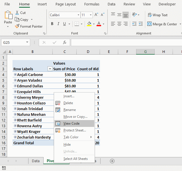
22. Auto populate a worksheet
Answer:
Your question is perfect for a Pivot Table. The problem is that you need to refresh the Pivot Table every time you change the source data, however, this can be done automatically with a few lines of event code.
I´ll show you how to set up the pivot table and how to make it auto refresh using VBA. I will also provide an answer for how to accomplish this using only array formulas.
What you will learn in this article:
- Create an Excel defined Table.
- Create a Pivot Table.
- How to set up a Pivot Table.
- Use VBA code in your workbook.
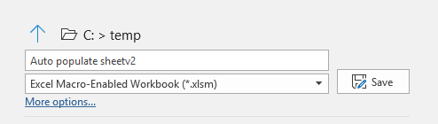
- Save your workbook as a macro-enabled workbook.
- Create array formulas and how they work.
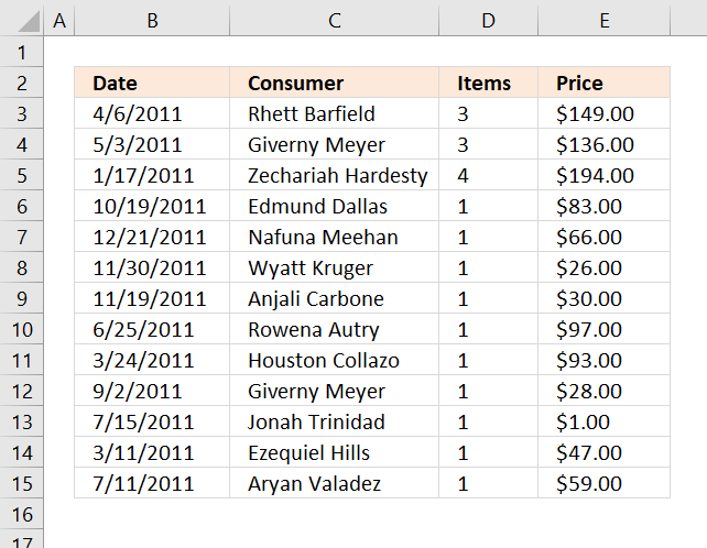
Example sheet "Data"

Create an Excel defined Table
Why convert the data set to an Excel defined Table? It expands automatically meaning you don't need to adjust cell references if you add or delete data.
- Select any cell in your data set.
- Go to tab "Insert".
- Press with left mouse button on "Table" button.
- Press with left mouse button on the checkbox "My Table has headers" if appropriate.
- Press with left mouse button on OK button.
The image below shows what the Excel defined Table probably will look like.
Create a Pivot Table
- Select all data on Sheet "Data"
- Go to tab "Insert"
- Press with left mouse button on "Pivot Table" button
- Press with left mouse button on "Pivot table" and a dialog box appears.
- I chose to put the Pivot Table on a new Worksheet.
- Press and hold with left mouse button on fields in Field List.
- Drag to different areas below, now release left mouse button.
- The dates and items go to RowLabels.
- The Price goes to Values area.
Read more about Pivot Tables for more detailed instructions.
The following animated image shows the above steps in greater detail.

Example sheet "Pivot table"
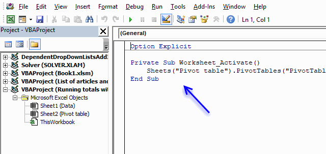
Below is VBA code to refresh Pivot Table every time the Pivot Table Sheet is activated. You put the VBA code in a worksheet module, instructions below.
Private Sub Worksheet_Activate()
    Sheets("Pivot table").PivotTables("PivotTable1").RefreshTable
End Sub
Where to put the code?
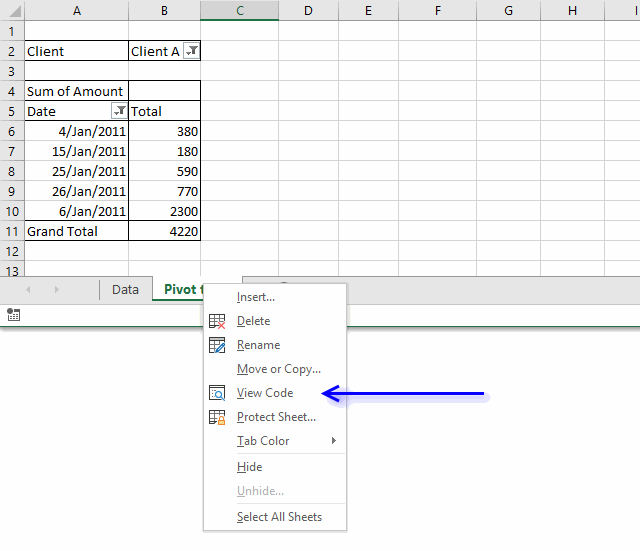
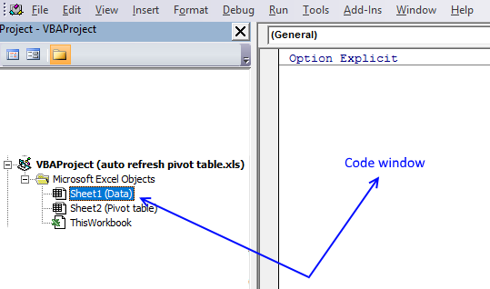
- Press with right mouse button on on sheet name "Pivot table"
- Press with left mouse button on "View Data".
- Paste code to the worksheet module.
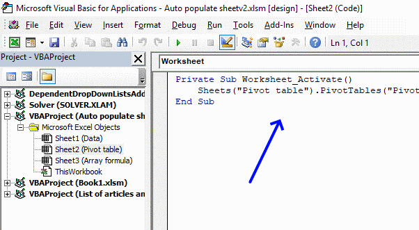
- Exit VB Editor and return to Excel.
Totals based on Name and Date
The formulas demonstrated here are not necessary if you use a Pivot Table, they simply show how to accomplish the same thing using only formulas. I highly recommend using a Pivot Table.
The image above shows three different formulas, the first formula in cell range B3:C15 extracts unique distinct records based on date and name.
The second formula counts records based on name and date, the third formula adds prices and returns a total also based on date and name.
Array formula in cell B3:
How to create an array formula
- Copy formula above.
- Select cell B3.
- Paste formula to cell.
- Press and hold Ctrl + Shift simultaneously.
- Press Enter once.
- Release all keyboard keys.
The formula bar now shows the formula with a beginning and ending curly bracket telling you that you entered the formula successfully. Don't enter the curly brackets yourself, they appear automatically if you did the above steps correctly.
How to copy array formula
- Select cell B3
- Copy cell. (Short cut keys: Ctrl + c)
- Select cell range B3:C15
- Paste to cell range (Short cut keys: Ctrl +v).
Explaining formula in cell B3
The array formula contains cell references (structured references) to the Excel defined Table, there is now no need to adjust cell references if the data source expands or shrinks.
You can find an explanation to the formula here: Filter unique distinct records
Count records based on conditions
Formula in cell D3:
Copy cell D3 and paste to cell range D3:D15.
Explaining formula in cell D3
This formula counts the number of records based on two conditions, name in the corresponding cell in column C and date in the corresponding cell in column B.
This article explains the formula in greater detail: Count unique distinct records
Sum amounts based on conditions
Formula in cell E3:
This formula is simply a SUMIFS function, read more about it here: How to use the SUMIFS function
23. How to create a dynamic pivot table and refresh automatically
This article shows you how to refresh a pivot table automatically using a small VBA macro. If you add or delete data in your data set the pivot is instantly refreshed.
There is no need to manually refresh the pivot table or changing cell references if the data source table grows or shrinks. The Excel defined table uses structured cell references that adjust automatically.
How to create an Excel defined table
- Select a cell in your data set.
- Press with left mouse button on "Insert" tab on the ribbon.
- Press with left mouse button on table button.
- Press with left mouse button on "My table has headers" if needed.
- Press with left mouse button on OK button
Adding new records to the table is easy, simply type on the row right below the last record and the table will expand automatically.
You can also press with right mouse button on on a cell in the table to open a context menu, press with left mouse button on "Insert" and then "Table Rows Above".

Recommended article:
Recommended articles
An Excel table allows you to easily sort, filter and sum values in a data set where values are related.
How to auto-refresh pivot table
VBA offers a solution how to automatically refresh pivot table every time you activate "pivot table" sheet, there are other ways to solve this as well like refreshing pivot table every time a cell in data source table is edited.
Press with right mouse button on on the sheet name where you placed the pivot table.
- Press with left mouse button on "View code".
- Paste code to module.
- Change sheet name and pivot table name in VBA code, you probably have a different sheet name and pivot table name.
VBA code
Private Sub Worksheet_Activate()
    Sheets("Pivot table").PivotTables("PivotTable1").RefreshTable
End Sub
Excel 2003 and earlier versions: Create a dynamic named range
This also works in Excel 2007/2010 but it is easier to create a table.
- Press with left mouse button on "Name Manager"
- Create a new named range, named Rng.
- Type in "Refers to:" window:

Press with left mouse button on Close button!
Recommended article:
Recommended articles
What is a named range? A named range is a feature in Excel that allows you to assign a specific […]
24. Auto refresh a pivot table
In a previous post: How to create a dynamic pivot table and refresh automatically I demonstrated how to refresh a pivot table when a sheet is activated. This post describes how to refresh a pivot table when data is edited/added or deleted on another worksheet.
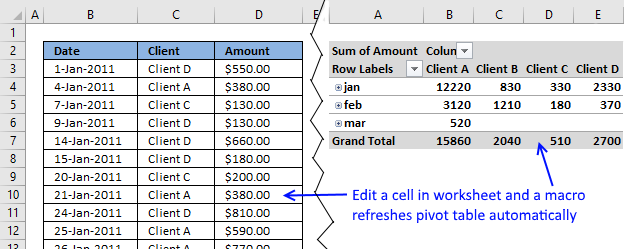
The issue here is that a pivot table doesn't know if
- source data has changed
- source cell reference has changed
That is why you have to manually change the source cell reference and refresh pivot table, this is very easy to forget. However, this article solves your problems using an excel defined table and three lines of event code.
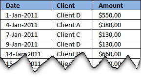
In this example there are two worksheets, "Data" and "Pivot table", to make it simple. The following image shows you some of the data on worksheet "Data"
Watch a video
Create a dynamic source range
Excel is not smart enough to know when you have added values to your data, the source cell reference won't adjust automatically. However Excel defined tables (Excel 2007 and later versions) has that feature and luckily it is easy to implement.
You will also need event code to refresh your pivot table but first let's build an Excel defined table.
Excel 2007 and later versions
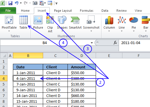
- Go to your "Data" worksheet
- Select a random cell in your data
- Go to tab "Insert" on the ribbon
- Press with left mouse button on "Table" button (Ctrl + T)
- Press with left mouse button on OK button
Here is the excel defined table:
Recommended article:
Recommended articles
An Excel table allows you to easily sort, filter and sum values in a data set where values are related.
Excel 2003 and earlier versions
The named range formula below is dynamic meaning it automatically expands both horizontally and vertically while adding new entries or columns.
- Start Name Manager.
- Press with left mouse button on "New..."
- Type in "referer to:" field.
=Data!$B$2:INDEX(Data!$2:$65536, COUNTA(Data!$B:$B), COUNTA(Data!$2:$2)+1) - Press with left mouse button on OK.
Recommended articles
Gets a value in a specific cell range based on a row and column number.
Create pivot table
If you already have a pivot table, skip these steps.
- Press with left mouse button on "Pivot table"
- Excel 2007/2010: Type table name in "Table/Range" field
Excel 2003 and earlier versions: Type Rng in "Table/Range" field - Press with left mouse button on OK
Recommended article:
Recommended articles
A pivot table allows you to examine data more efficiently, it can summarize large amounts of data very quickly and is very easy to use.
How to auto-refresh pivot table
The following event-code must be placed in the same sheet as your data is. Whenever you edit/add/delete data, event code is rund.
The downside is that it refreshes the pivot table every time you add data to a single cell, this may slow down your workbook on an older computer.
Read this post if you'd rather refresh your pivot table when you activate pivot table worksheet.
Here is instructions on how to insert the event code to your "pivot table data source" worksheet:
- Press with left mouse button on "Developer" tab on the ribbon.
- Press with left mouse button on "Visual Basic" button
- Double press with left mouse button on "Data" sheet in project explorer window.
- Insert event code into worksheet code window to the right of the project explorer window.
VBA code
Private Sub Worksheet_Change(ByVal Target As Range)
  Worksheets("Pivot table").PivotTables("PivotTable1").PivotCache.Refresh
End Sub
The code is copied into the code window for sheet "Data". The Worksheet_Change sub is rund when a cell is changed in sheet (Data).
This line of code refreshes the pivot table on sheet Pivot table whenever a cell is changed on sheet Data.

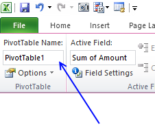
Press with mouse on any cell in your pivot table and go to tab "Options" to see the name of your pivot table. Make sure to use that name in code above.
Your pivot table is now instantly refreshed whenever a cell value on worksheet "Data" has changed, and the pivot table source data range is adjusted if values have been added/deleted to your excel defined table.

Get Excel *.xlsm file
Pivot table category
More than 1300 Excel formulasExcel categories
175 Responses to “How to use Pivot Tables – Excel’s most powerful feature and also least known”
Leave a Reply
How to comment
How to add a formula to your comment
<code>Insert your formula here.</code>
Convert less than and larger than signs
Use html character entities instead of less than and larger than signs.
< becomes < and > becomes >
How to add VBA code to your comment
[vb 1="vbnet" language=","]
Put your VBA code here.
[/vb]
How to add a picture to your comment:
Upload picture to postimage.org or imgur
Paste image link to your comment.
Moment you use tables you are restricting it to 2007/2010
Instead create a 2d dynamic name
Data
='1'!$A$1:INDEX('1'!$1:$65536,COUNTA('1'!$A:$A),COUNTA('1'!$1:$1)) and use it in the Pivot Range
Great comment, thanks!
hi oscar,
thanks for this cool tip!
btw, if i have another Pivottable (using different pivotcache), can i add an additional line?
e.g. PivotTable2 is using diffent pivotcache than PivotTable1. If you're wondering, i use different pivotcache due to date grouping (PivotTable1 = daily, PivotTable2 = 7-days grouped)
Private Sub Worksheet_Change(ByVal Target As Range)
Worksheets("Pivot table").PivotTables("PivotTable1").PivotCache.Refresh
Worksheets("Pivot table").PivotTables("PivotTable2").PivotCache.Refresh
End Sub
thanks!
davidlim,
Yes, that works. Make sure you have the correct sheet and pivot table names.
Thanks for sharing!
HI Im confused on how we do this in excel 2013
hi oscar,
i noticed there is a problem on pivottable with grouped dates.
my Data sheet is an Excel 2010 Table. Data is daily stats, therefore i add new daily data below the Table.
whenever new data is appended to the Table (new daily data), the PivotTable will automatically "ungrouped" (grouped Dates --> single Dates).
I had to manually regroup the dates again.
have you encountered this?
davidlim,
It seems that the pivot table preserves formatting if you copy and paste data to your table or dynamic range. When you move a cell range to the last row of a table or dynamic range, pivot table formatting is lost.
Try copy / paste next time you append new data to your table.
hi oscar,
thanks for the response.
fyi, i performed copy-n-paste "value only" when i append the data.
also, i've tried another macro: refresh pivottable when pivottable sheet is selected. <-- this doesnt have any issue :)
anyways, this alternate macro suits me as well.
very much appreciate your help!
Hi,
When I try this with Excel for Mac 2011, the sheet appears to get stuck in a loop where it's recalculating the sheet over and over again. The only way to get out is to force quit Excel.
Ideas?
Oscar,
That seems to work a treat. because I have 3 pivot tables on individual worksheets that are not the same worksheet as the pivot data, I have placed the code on each of the pivot table sheets. I'm assuming this is correct, as it didn't work on the other pivot table sheets where I hadn't included the code.
Any chance to could add comments to the code, so that I can work out what the subroutine is doing ?
The help is appreciated and hopefully it will help others as well.
Kind Regards
Sean
Sean,
Thanks!
I have added comments to the code.
This code works for all pivotTables in a workbook.
Copy/paste the code below to "ThisWorkbook" code module in project explorer (Alt+F11)
Private Sub Workbook_SheetSelectionChange(ByVal Sh As Object, ByVal Target As Range)

Dim ptc As PivotTable, Value As Variant, Rng As Range

For Each ptc In Worksheets(Sh.Name).PivotTables
    If Not Intersect(Target, Range(ptc.TableRange1.Address)) Is Nothing Then
        If Left(Target.Value, 7) = "https://" Then
            ActiveWorkbook.FollowHyperlink Address:=Target.Value, NewWindow:=True
        End If
    End If
Next ptc

End Sub
Get the Excel *.xlsm file
Hyperlinks-in-pivot-tables-in-a-workbook.xlsm
The follow code from above works well except that the first time I press with left mouse button on a hyperlink, I get a Run Time Error 13. When I reset and press with left mouse button again, it's fine. What could be the cause of this. Code is below:
Sub Worksheet_SelectionChange(ByVal Target As Range)
Dim ptc As PivotTable
'Find every pivotTable in ActiveSheet
For Each ptc In ActiveSheet.PivotTables
'Check if selected cell is a pivot table cell
If Not Intersect(Target, Range(ptc.TableRange1.Address)) Is Nothing Then
'Check if the cell value begins wih https://
If Left(Target.Value, 7) = "https://" Then
'Follow hyperlink using cell value as hyperlink address
ActiveWorkbook.FollowHyperlink Address:=Target.Value, NewWindow:=True
End If
End If
Next ptc
End Sub
Brian,
Run Time Error 13 - Type mismatch
Which line is the problem?
Hey Brian,
I get the same Error 13, when I select a range of cells.
Following Line is (according to Excel) the problem:
If Left(Target.Value, 7) = "https://" Then
Best,
Christian
Sorry, Oscar of course :)
Christian,
You are right. If you select more than one cell you get an error.
Try this:
Sub Worksheet_SelectionChange(ByVal Target As Range)
Dim ptc As PivotTable, Value As Variant, Rng As Range
If Target.Cells.Count = 1 Then
    For Each ptc In ActiveSheet.PivotTables
        If Not Intersect(Target, Range(ptc.TableRange1.Address)) Is Nothing Then
            If Left(Target.Value, 7) = "https://" Then
                ActiveWorkbook.FollowHyperlink Address:=Target.Value, NewWindow:=True
            End If
        End If
    Next ptc
End If

End Sub
Thanks for commenting!
Oscar,
The original code works well for me, however, I also get the mismatch error in selecting multiple cells. I tried the new code that you posted to fix this error, but when using it, the follow hyperlink no longer works. Any ideas?
Hi Oscar,
I was able to get this to work on Excel 2011 (Mac) but when I open up the same file in Excel 2010 (PC) the macros don't run. I've enabled Macros and set the security settings to run all Macros.
Essentially what I have is multiple pivot tables across 6 worksheets all using the Data worksheet as the data source.
I tried to update the Macro to use the code you mention in the post "https://www.get-digital-help.com/auto-refresh-a-pivot-table-in-excel/". Using this the macros runs but I get a run-time error '1004': Application-defined or object defined error.
Any thoughts on what I can do in Excel 2010 to get my macro to run?
Thanks - Tim
The Attachement has no Excel files :(
Code is not working with xl 2007
deepak ji paulson,
I opened both files and they work here. I am using excel 2007.
I'm not sure that I'm in the right location for this, and I'm working handicapped with v2003 and I don;t know vba.
I have an xml file thats exported from a third party tool. I import that into excel and add a column to the far left. In this column I do a match fucntion. This function matches specific data in one column of the xml data to "sheet2" which containes a list of codes that I care about. Then I create a pivot table that uses the match (1-30), ingnores blanks and NAs to filter my pivot. What gets displayed is all the information I care about. Works great. Problem is I'm doing this on a weekly basis and realize there must be a better way to link to the xml, still make my match to my codes and create a piviot table.
Question is how to acheive this. No luck treating the xml as a database. Excel is not seeing it.
Please advise and thanks for the expertise.
RE,
Is it possible in excel 2003 to import xml using Get external data, from other sources?
Import multiple XML data files as external data
If it is then you should be able to refresh external data source if the xml file name is the same.
This is a simple and beautiful solution! Thanks!
My pivot table is called "PivotTable"
I created a macro, put the code in:Sub ChangeDataSource()
With ActiveSheet.Shapes(Application.Caller).ControlFormat
ActiveSheet.PivotTables("PivotTable").PivotTableWizard SourceType:=xlDatabase, SourceData:= _
.List(.Value)
End With
End Sub
Now when I try to change the data source via drop-down i receive this error: Run-time error '1004' Reference is not valid.
...all ok with exampke untill the moment of questions: if for e.g. i have two uniques values with the same amount of records.. then dividing will be nothing worse....
..."nothing worth" i have meant (sorry :) )
Jeff,
I am guessing, the names in the combo box don´t match the table names in your workbook?
How to find the table names
1. Select a cell in a table
2. Go to tab "Design" on the ribbon
Andrius,
Yes..
I am not sure I understand.
[...] Disable autofit column widths for all Pivot Tables in a sheet (VBA) [...]
The code above did not work for me. I pasted into the suggested location and the pivot tables are still autofitting on update.
Is there something I am missing?
Thanks!
Bob,
I tried the code and it works in in excel 2007 and 2010.
Did you double press with left mouse button on Thisworkbook in the project explorer window?
Oscar, you are awesome! millions of thanks
HI,
THe link is working fine but if i need to press with left mouse button on the Text or value column and if the hyperlink has to be opened what could be the solution for that?.
Harshitha,
Sub Worksheet_SelectionChange(ByVal Target As Range)
Dim ptc As PivotTable, Value As Variant, Rng As Range

For Each ptc In ActiveSheet.PivotTables
    If Not Intersect(Target, Range(ptc.TableRange1.Address)) Is Nothing Then
        If Left(ptc.TableRange1.Cells(Target.Row - ptc.TableRange1.Row + 1, 1).Value, 7) = "https://" Then
            ActiveWorkbook.FollowHyperlink Address:=ptc.TableRange1.Cells(Target.Row - ptc.TableRange1.Row + 1, 1).Value, NewWindow:=True
        End If
    End If
Next ptc

End Sub
You probably need to change this line:
If Left(ptc.TableRange1.Cells(Target.Row - ptc.TableRange1.Row + 1, 1).Value, 7) = "https://" Then
Bolded value is the column number for the links in the Pivot table range.
There is a much much easier way to keep the pivot table dynamic guys!!
Simply reference only the top row of your data. Leave out the column references.
Example- Before: $A$1:$Z$5000
Example- After: $A:$Z
Notice we are completeley leaving the numbers out...works like magic!
JamesO,
Yes, it works but only when the data begins on row 1.
I have not tried this in excel 2003 but if it works you can skip the "named range" part.
You still have to press with right mouse button on your pivot table and select "refresh" to refresh pivot table.
Thank you for commenting!
I am also getting a run-time rror'1004: Application-defined or object-defined error on:
ActiveSheet.PivotTables("PivotTable2").PivotTableWizard SourceType:=x1Database, SourceData:= _
.List(.Value)
I changed the pivot table name as instructed above, but that has not corrected the error. Any suggestions? Thanks.
Hi oscar,
Thank you for very helpfull function. Please share how to save. Because, After create this , save and close this excel, and I open this excel file, but this VB didn't exist.
Please inform me how to save.
Thanks a lot
luluk tri,
Save as an *.xlsm file
Hi Oscar,
Thank you for your advice. Once more, please assist me.
All of macro was run smoothly. But, I found that "UNDO" was deactivated by system. How to activated "UNDO".
Thanks.
luluk_tri
luluk_tri,
Yes, the undo stack is lost.
Undoing A VBA Subroutine
Jennifer Long,
Is the attached file working?
Did you spell the table names correctly? (Read my answer to Jeff)
I get the same error if I use a table name that does not exist.
Hi,
I was wondering if there is a way to refresh when the data that is being changed is in a controlbox. I'm using active x controlboxes to select from a list which in turn will adjust prices and so forth. If I change a selection in the controlbox the pivot table is not updated. The script is working if I change a data entry manually and hit enter to tab to move to a new cell.
Thanks,
Ernie
Ernie,
Press with right mouse button on sheet name. Press with left mouse button on "View code". Change combobox name. Copy/Paste code.
Private Sub ComboBox1_Change() Worksheets("Pivot table").PivotTables("PivotTable1").PivotCache.Refresh End SubSimple, straightforward information. Thanks very much.
I am getting run-time error '1004'
whenever i update the Data sheet.
G,
Did you change the names (bolded)?
Pivot table <-- Sheet name PivotTable1 <-- Pivot table name
Hello,
I did automate the process in a vba macro that add a unique count datafield in the pivot, automatically updated when you change the configuration of the pivot.
Let me know your thoughts.
https://lazyvba.blogspot.com/2010/11/improve-your-pivot-table-to-count.html
lazyvba,
I did try your code and it seems to work with my example pivot table!
It converted my data to a table and added new columns, maybe you mentioned that on your website?
Great tip. However taking it a step further, can the pivot table only update when 1 cell is changed, and not any cell on the tab.
Example say I only want the table to refresh when cell AB4 is changed.
How would you do that?
Joe,
Private Sub Worksheet_Change(ByVal Target As Range) If target.address = "$AB$4" then Worksheets("Pivot table").PivotTables("PivotTable1").PivotCache.Refresh End If End Subcan you please explain the function of cache here
Thanks a lot! This solution saved me some hours.
Ben,
Thanks for commenting!
Macro works but then it is preventing undo..any workaround for that?
Sachin,
it is possible to undo a macro but I am not sure about the undo stack:
https://www.j-walk.com/ss/excel/tips/tip23.htm
https://www.jkp-ads.com/Articles/UndoWithVBA00.asp
I may be complicating so if so I apologize up front! I want to autopopulate tab 2 with select information from tab 1 if "Yes" is inut on tab 2, column A.
I have a lot of data in tab 1 but the actionable items are in tab 2 only if "Yes". I may have 50 rows in tab 1 but only need 3 rows in tab 2 and I don't need all columns in tab 1, only a few.
What is the best way to automate this process? Thank you!
William J. Ryan
Can you provide some example data from both sheets?
after applying the method the "undo" command doesn't work..any solution??
I can't seem to ge tthis to work when the data and pivot table are on the same sheet. Is tha possible
Dear Oscar,
Is it possible to make change not pivot table, but pivot chart using drop down list of several pivot table ?
Does not seems to work with pivot table in the same sheet here either... any suggestions? :)
Hi Oscar,
I found your code very helpful and easy to apply despite that I am a VBA bigginer.
In my case the pivot table is in a different worksheet named "data2" , from the Combo box which is in "Data1".
Is there any way to modify you code so I can still update the pivot table?
Many Thanks.
Hi,
I want to auto update the pivot table.The issue is I'm not running vb in excel .I have update the pivot table with my third party software vb tool.I have to define my pivot table folder path and also i need to refresh the pivot table
Bill,
Yes there is!
Sub ChangeDataSource() With ActiveSheet.Shapes(Application.Caller).ControlFormat Worksheets("data2").PivotTables("PivotTable1").PivotTableWizard SourceType:=xlDatabase, SourceData:= _ .List(.Value) End With End SubMany Thanks Oscar,
Works fine.
Filipe,
Make sure you have changed the sheet name and the pivot name (bolded):
Worksheets("Pivot table").PivotTables("PivotTable1").PivotCache.Refresh
PMS,
I have no clue.
Oscar,
Thank you so much for your help.
I have specified the correct workbook and piveot table, and, for a short time, I can see the values to change... The problem is that this seems to make excel to run an infinite refreshing loop which causes excel to crash.
Any sugestions?
Have a great day,
Filipe,
If pivot table and source data are located on the same sheet excel goes into an infinite loop.
This code takes care of that problem:
Private Sub Worksheet_Change(ByVal Target As Range)
Dim pt As PivotTable
    Set pt = Worksheets("Pivot table").PivotTables("PivotTable1")
    If Intersect(Target, pt.TableRange1) Is Nothing Then
        Worksheets("Pivot table").PivotTables("PivotTable1").PivotCache.Refresh
    End If
End Sub
Get the Excel *.xls file
auto-refresh-pivot-table1.xls
Oscar
I have an (Excel 2010) expense Claim report design which has the Expense Data (Table2) on the same sheet (Expense Claim) as a pivot table (pivottable1)which summarises the claims by expense type. Your suggested macro above works nicely to auto refresh the pivot anytime I add in an extra expense claim item, but to allow others in the company to use it I need to protect areas of the claim form - otherwise they mess up. The Auto Refresh macro doesnt work when I protect the sheet. Is here a few lines I can insert into the Macro to fix this?
I'm having the same problem. after update 1 cell the pivot table refreshes but i get the message: Run-Time Error -2147417848 (80010108) Method 'Refresh' of object PivotCache Failed.
Joao, read my answer to Filipe.
Hi Oscar,
That is brilliant, thank you so much.
The specific workbook I have happens to have two pivot tables populated from the same table source, and in that case I could not tweak your code to make this possible.. it keeps refreshing for long time.. With only one pivot table works really great.
Suggestions are very welcome,
Filipe,
Private Sub Worksheet_Change(ByVal Target As Range) Dim pt1 As PivotTable, pt2 As PivotTable Set pt1 = Worksheets("Pivot table").PivotTables("PivotTable1") Set pt2 = Worksheets("Pivot table").PivotTables("PivotTable2") If Intersect(Target, pt1.TableRange1) Is Nothing And Intersect(Target, pt2.TableRange1) Is Nothing Then Worksheets("Pivot table").PivotTables("PivotTable1").PivotCache.Refresh End If End SubThanks Oscar for the solution,
would you mind explaining why there will be an infinite loop when the pivot tables and source are located in the same worksheet?
Oh, I seem to get it.
Is that because after refreshing, another change event is triggered?
Sam,
Yes, when the pivot table refreshes the change event is launched again.
Great, great, great, thank you so much, this is great!
Hi Oscar,
Thank you for the post. This is great!
I come an issue when using this though. I have a workbook with 2 sheets and derive 5 pivot tables from each sheet (10 pivot tables). I tried the code with 5 lines (1 line for each pivot table) in each sheet initially, then changed it to a single line for each sheet. But still excel continuously executes the query and doesn't stop. I need to press 'Esc' and 'Debug' in order to stop it.
Any suggestions?
Looks like Excel has a single Pivot cache for all 5 charts from a single sheet. Thus I used a single line of code to refresh the pivot cache. Can you please confirm if this is correct?
I think the continuous execution of the query has stopped for some reason and it works fine now. Thank you very much.
great idea! thank you
Hi Oscar,
Thanks for your postings, I hv used this short sub-routine and it works.
My problem starts only when i applied a sort order (in Descending Order) on the first column of my pivot table that contains a date. Everytime that a new data is added on the source sheet, my sort order in the pivot table scrambled and out of order.
My question to you now is - How to keep the sort order intact when there is/are data change? Can you add on above sub routine code something that when data refreshes, the sort order refreshes also to DESC order?
Guru,
My problem starts only when i applied a sort order (in Descending Order) on the first column of my pivot table that contains a date. Everytime that a new data is added on the source sheet, my sort order in the pivot table scrambled and out of order.
I tried adding dates in excel 2010 the dates are not out of order. But this macro should do it:
Private Sub Worksheet_Change(ByVal Target As Range) With Worksheets("Pivot table").PivotTables("PivotTable1") .PivotCache.Refresh .PivotFields("Date").AutoSort _ xlDescending, "Date" End With End Sub[...] Use a VBA solution, as described here: Follow hyperlinks in a pivot table | Get Digital Help - Microsoft Excel resource [...]
Boss you are genius. Hv been searching this for quite some time.
Oscar,
Thanks a lot for all the useful information you provide here. I opened your example file and it worked, although it says on the top it runs in [Compatibility Mode].
Now I don't manage to get the code executed in my orginal file. I even copied your worksheets into my Excel file, and then the automatic update stops to work again. Am I right assuming that nothing with the code is wrong, but some settings in my Excel prevent it from running the code?
Any help where I could look is highly appreciated!
Sven,
did you check the sheet and pivot name? I assume you have other names?
Worksheets("Pivot table").PivotTables("PivotTable1").PivotCache.Refresh
Hi Oscar, yes I did. I also copied the tabs from your example workbook into my file, they stopped to work too. So must be a problem with my workbook settings? But it is a macro enabled xlsm-file...? I am obviously clueless! :)
Hi Oscar!
This is really helpful. I have one question though. How do you tweak the codes when the source data is stored in a separate workbook?
Thanks!
bert,
Workbooks("Book1.xlsx").Worksheets("Pivot table").PivotTables("PivotTable1").PivotCache.RefreshHi Oscar!
Thanks a lot for your help! I already got this to work in some of my routine jobs! I'm searching your site for other things that can help me more. Great job for you!
Hi Oscar,
Good day
Hi Oscar
You little genius you. Thank you so much, exactly what I wanted (Mac 11 User)
Hello,
Have a pvot table for monthly reporting of #sales made by each sales paerson. Data is generated from a SQL quarry, capture the data and recreat the the table of report by pasting is to Excel. This done every month, I wonder if this table can be made dinamic so that it can pull the data each month from the quarry?
Regards,
G
Hi dear,
How to Number form Sentencce which in celll
Example:- In cell a sentacne
Problem Summary(Cell 1)
spk to mr r k chabra call 4 want to shift the conection in same room alt no is 91-9818786350 plz chk dn do need full asap.............
REQUEST RELATEDTariff MigrationContact Person:tarun Contact Number:9871431939Authentication Done:YesCheck OG Status - activeSegment Check:YesCurrent Plan :Airtel - UL - Smart One Combo 8GB 799(2Mbps/256Kbps) DSL Plan (Subscription
Disturbance-All Times (Cell 5)
Ateeq
91-9891608537
I need a little help on how to automate grouping (categories are: 1-30, 31-60, 61-90, 91-120, 121-180, 181-210, 211-240, 241+) in a pivot table and create a macro to automatically update them each week from data source, and will populate pivot totals in another tab. I have 6 weekly reports that I have to create about 20-25 pivot tables for each, each week.
I can send a copy of the file, if you would like to take a look at it.
Can you help me please?
[...] Have a look at the following... How to create a dynamic pivot table and refresh automatically in excel | Get Digital Help - Microsof... [...]
Thank you so much you are a lifesaver!
The code works while i am in the sheet however once I save, exit, then reopen the sheet - the refresh no longer works... I am unsure what is going on.
Can you help?
Torri,
Save the file as a *.xlsm file.
Hi Oscar,
I have the following issues. Any suggestions.
Sheet 1 :
Grade Male Female
Primary
Secondary
High School
College
Gender
Sheet 2 :
Col A : Student Id
Col B: Gender : Here we specify whether the student is male or female
Col C : Here we specify category to which the student falls : Primary, secondary, high school, college
Col D : Age : To which age they are in
Problem :
In Sheet 1,
# I should give the count of students who are male and are in
* primary and they are between 4 to 6 years.
* Count of Secondary students and between 6 to 10 years ...
# I should give the count of students who are female and in
* primary and they are between 4 to 6 years.
* Count of Secondary students and between 6 to 10 years
Kindly let me know of any specific formula e that I can use.
Kiishore,
See this post:
https://www.get-digital-help.com/count-students/
Thanks so much. It did not work the first few times I saved it that way ... but the third time was the charm and it stuck. Thanks so much.
such a helpful thread.
i used "OFFSET" instead. much easier and dynamic!
Ali Hasnain,
How did you get the pivot table to update automatically?
How can it be easier than an excel defined table?
Thank you.. it's very helpful for me.
I used this simple code. I cannot follow the hyperink i the expanded pivot table. However, the hyperlink i working on the cell that it was created in BEFORE the pivot was collapsed. Any ideas anyone?
Range("L7").Select
Selection.End(xlDown).Select
irow = ActiveCell.Row
Range("e6:e" & irow).Select
For Each Cell In Selection
Cell.Select
If Cell.Value "" Then
If Left(Cell.Value, 7) = "https://" Then
URL = Cell.Value
Else
URL = "https://" + Cell.Value
End If
ActiveSheet.Hyperlinks.Add anchor:=Cell, _
Address:=URL, TextToDisplay:=Cell.Value
End If
Next
Thanks very much! very helpful!!!
Torri, Amit and Luch
Thanks for commenting!
Works great! I have two questions though:
1. Every time I change data in the 'data' sheet, excel demands confirmation to replace the contents of the destination cell in the sheet containing the pivot tables. Any way to bypass this? I noticed your example does not seek confirmation, so I know it's possible.
2. Is there any way to protect the sheet with the pivot tables from end users manually changing data within the pivot tables and still allow them to be refreshed?
Thanks in advance!
The Data I am pulling from is:
ATA Claim Amount # Units
11/7/2010 $322.89 4
3/29/2011 $41.36 24 (4 ctns)
3/4/2011 $20.68 12 (2 ctns)
3/24/2011 $72.38 42 (7 ctns)
7/29/2011 $50.79 2
8/4/2011 $101.58 4
8/5/2011 $253.96 10 (2 ctns)
12/9/2011 $76.19 3 units
12/15/2011 $78.36 4 units
9/13/2011 $54.42 2
12/13/2011 $612.23 25
10/27/2011 $24.49 1
3/10/2012 $24.49 1
4/18/2012 $489.78 20 (4 ctns)
4/16/2012 $124.08 72 (12 ctns)
5/8/2012 $1,224.45 50 (10 ctns)
7/1/2012 $59.86 1
7/15/2012 $489.78 20 (4 ctns)
7/17/2012 $122.45 5 (1 ctn)
11/10/2012 $119.72 2 (1ctn)
11/18/2012 $199.54 10 (2 ctns)
10/29/2012 $748.82 192 (32 ctn)
12/6/2012 $25.58 1
12/9/2012 $25.58 6
12/3/2012 $126.98 5
11/4/2012 $38.09 3
7/31/2012 $122.45 5
2/17/2013 $54.42 5
10/26/2012 $20.68 12
3/23/2013 $982.83 252
4/8/2013 $51.15 12
4/3/2013 $39.91 2
2/25/2013 $54.42 5
3/27/2013 $23.40 6
5/20/2013 $25.58 6
5/7/2013 $49.89 5
6/10/2013 $25.58 6
This was my instructions:
I need them placed into graphs showing the time line from 2010 to present.
We need to measure three areas on a monthly bases; frequency of events, total amount of claim for the month and unit count for the moth.
I need it in a three bar graph and line chart with three spate lines for each measurement.
Hi Oscar,
I am looking for a code to refresh my data from ODBC on the first day of the month by 4 a.m. without having to be on the computer to open the excel file.
I have VBA code to refresh Pivot Table that works wonderfully (except loosing some center text and a few boundary lines.) Now I would like to insert code to Refresh the sheet when it is protected via a macro button placed on the protected pivot table sheet. The data source is sheet 2 (named 'PRev') and the pivot table (named 'PivotTable1A')is on sheet 1 (named 'Scott PT'.
The code I have for refresh on 'Scott PT' sheet in module1 is as follows and a suggested code for refreshing while protected sheet is on the pivot table sheet 'Scott PR', that I don't understand how to incorporate at the same time,follows after the break after this first code:
___________________________
Code installed that works for refresh follows:
____________________________
Option Explicit
------------
Sub ClassicPlusPivotTableSettings()
'Last modified and tested 2010-07
'Much of this is based on a book by Debra Dalgleish
' named "Excel Pivot Tables Recipe Book: A Problem-Solution Approach", Chapter 13
'
'The following code applies to PivotTable(1) on the active sheet.
'In summary, this macro:
' Applies the Classic PivotTable display, with gridlines and no colors
' Ensures that only data that still exists in the data that drives the PivotTable
' will appear in the PivotTable dropdown lists
' Sets all fields to ascending order with no subtotals
' including fields that are not in the Row Labels or Column Labels areas
' For the data field(s) in the Values area, changes the setting to Sum, changes the number format, and
' if the field in the Values area is named "Amount" ot "Total Amount" it shortens the label
' in the PivotTable to "Sum Amt" or "Sum TtlAmt" respectively.
On Error Resume Next
Application.ScreenUpdating = False
Dim pt As PivotTable
Dim pf As PivotField
Set pt = ActiveSheet.PivotTables(1)
pt.ManualUpdate = True
'This section applies Classic PivotTable settings
' and turns off the Contextual Tooltips and the Expand/Collapse buttons
With pt
.InGridDropZones = True
.RowAxisLayout xlTabularRow
.TableStyle2 = ""
.DisplayContextTooltips = False
.ShowDrillIndicators = False
End With
'This sets each field in ascending order. It applies this even to fields that are not currently
' in the PivotTable.
For Each pf In pt.PivotFields
pf.AutoSort xlAscending, pf.Name
pf.Subtotals(1) = True
pf.Subtotals(1) = False
Next pf
'This command changes the formatting of any field that appears in the Values area
For Each pf In pt.DataFields
pf.Function = xlSum
pf.NumberFormat = "#,##0.00_);[Red](#,##0.00)"
Next pf
'These next two sets of statements shorten the description of any field in the Values area,
' but only if the field is named "Amount" or "Total Amount"
With pt.PivotFields("Sum of Amount")
.Caption = "Sum Amt"
End With
With pt.PivotFields("Sum of Total Amount")
.Caption = "Sum TtlAmt"
End With
pt.ManualUpdate = False
Application.ScreenUpdating = True
'This ensures that only data that still exists in the data that drives the PivotTable
' will appear in the PivotTable dropdown lists
pt.PivotCache.MissingItemsLimit = xlMissingItemsNone
End Sub
___________________________
Code for refresh while protection is on and for macro button follows:
___________________________
Press with right mouse button on the sheet tab of the sheet containing the pivottable.
Select View Code from the context menu.
Enter or copy/paste the following code into the worksheet module:
Private Sub Worksheet_Activate()
Me.PivotTables(1).RefreshTable
End Sub
Remark: you have to protect the sheet with UserInterfaceOnly:=True each time the workbook is opened:
Double-press with left mouse button on the ThisWorkbook node in the project explorer on the left hand side of the Visual Basic Editor.
Copy/paste the following code into the ThisWorkbook module:
Private Sub Workbook_Open()
With Me.Worksheets("Sheet1")
.AllowPivotTable = True
.Protect Contents:=True, UserInterfaceOnly:=True, _
AllowUsingPivotTables:=True
End With
End Sub
where Sheet1 is the name of the sheet containing the pivottable.
example i have 3 sheet student's attendance.
i use sheet 1 to check 30 student from class A: attend or absent and sheet 2 to check same 30 student but from class B
and i use sheet 3 as a record and make option Class : A or B. If i choose Class A, i can see which student whose absent from Class A only. And if i want choose Class B, THE TABEL WILL AUTOMATIC change to Class B and i can see which student whose absent from Class B
Can u give me what's the tutorial to make that?
can we do the multiple cols. sorting in excel and sample
Kannan,
can you explain in greater detail?
Perhaps you are looking for this post:
Sort a table with an array formula
I added this code to a report that I developed and when other users with Excel 2013 open the file, they get a VBA Runtime error. However, there are two workbooks that it is in and only one of them gives the error. It is acting like the table names or sheet names are not correct but I have double checked everything and also compared the two workbooks. Any thoughts? Would the newer version of excel be causing issues? Thanks for the help and the code!
Jesse,
It is acting like the table names or sheet names are not correct but I have double checked everything and also compared the two workbooks. Any thoughts?
No other than the ones you mentioned.
Would the newer version of excel be causing issues?
I don´t know, sorry.
[…] Auto refresh a pivot table in excel | Get Digital Help - Microsoft Excel resource […]
Hallo Oscar,
thank you for your great post! My problem is actually quite different. I would like indeed to refresh automatically my pivot table whenever the source table is changed. The problem is that my source table ist not directly edited, but is a result of several other tables and computations.
If I use the event "Worksheet_Change" it doesn't really work since Excel doens't trigger the event when the source table is recalculated (other changes are of course correctly handled).
On the other hand, if I use the event "Worksheet_Calculate" then I can handle the situation but every calculation on the entire sheet will trigger the event and hence the pivot table refresh.
Is there a way to combine both things, that is, that the pivot table is automatically refreshed when the source table is either changed or recalculated?
Thank you very much in advanced!
Jose
Oscar EXCELLENT help for VBA simple routine on AUTO Pivot Table update.
Hello Oscar,
I have a pivot table sourcing data from another pivot table (on the same worksheet); can I get the second pivot table to automatically refresh when the 'master' pivot table is updated?
Thanks,
Alan.
Hello Oscar,
I used your code above and it worked wonderfully. Despite being my first macro I have ever used I even managed to alter the code to get it to control 3 pivot tables at the same time based on one combo box.
I now have a more difficult problem. I need to consolidate some of my tables into my pivots.... I have 43 different tables, and some times I need to "join" / "consolidate" / "sum up" different tables. So for example if I wanted to create an "entire company consolidated" pivot I would need to join all 43 tables together.
Andrew,
I found this:
https://blog.laptopmag.com/excel-2013-pivot-table-from-multiples
Oscar, you sir are a steely-eyed missle man!
Thanks for the great info.
Hi Oscar,
I found this very helpful! So thank you very much for this! However, I have one issue with it. I have multiple pivot tables that I'm trying to switch between and each one of them have different values (Revenue, GOP, NI, etc.).
So, under your code, each time I switch between them, I have to add the values that I'm looking for. Is there a way to make is so that I don't have to do this each time?
Any help would be appreciated. Thanks!
Working fine mate....All the pivottable charts are automatically updated too
Hi
Oscar
I do the same exercise as you explain above but when i close and again open the workbook its not working.
Please help
This was very helpful to me. Thanks for the post.
this code is good but this is not working for me.i am getting unable to get the pivot table property of the worksheet class.what it means please help me i am new vba.
Hi Oscar,
Your code is very helpful, thank you. But I have a little problem. I have 5 tables with I did one pivot table, and other 4 pivot tables with 5 tables each one, the data is almost the same. I want to change the 5 pivot tables with one drop down list. Is it possible?
Thanks for your help.
Neat trick! Thanks for sharing! I'm pretty new to VBA. How would you get this to work with named data ranges in separate Excel workbooks?
Katie,
I am not sure this works, change the table names in the drop down list to:
[Book2]Sheet1!namedrange
Book2 - Your workbook name
Sheet1! - Your worksheet name
namedrange - Your named range
Hi,
Whenever I refresh a data, the numbers changes its format to dates. but from my source data, the data is still in numbers..
Hi Oscar,
The basic code works for me for refreshing, but i then lose the cell border/highlight when moving around the workbook - ie. i cant see which cell i'm currently in.... any ideas on that one?
Thanks
Chris
Thanks it worked
Thank you so much for your help. That was very helpful !
Hi Oscar,
the post is really informative and helpful.
I have multiple pivote tables and multiple source data sheets aswell..
for example in workbook 1 , i have pivot1 which is generated from the data of sheet1 and pivot2 from sheet2...so on.
I can write code in specific sheets to refresh respective pivot tables but How can i keep the code in single macro? so that it would be easy to make changes or debug if required.
thanks in advance
Hello Oscar, this is very cool, however I have an added complication, I'm hoping you can help me with. I have other sheets feeding into my data sheet which then feed into the Pivot table. So when a change is made in the data sheet it is via a link not an actual user action in the cell. This results in the pivot table not refreshing. Do you have any suggestions of how to make this work. Otherwise the pivot tables have to be refreshed numerous times to update all of the data.
Thanks
Simply use vloopup like
IF($B$1="A",VLOOKUP(Sheet3!A2,A!$A:$B,2,0),VLOOKUP(Sheet3!A2,B!A:B,2,0))
I have a template that I have created to process phone bills. There are may lines of GL coding for particular individuals. The amounts are different every month. I have created a pivot table in the template (both data and pivot table under one tab). I have created a refresh button to refresh the PT. It works in my original tab but when I copy to create a new tab to process a new invoice it does not refresh on the copy. My pivot table is still connected to the original tab. When I enter data in my original tab and refresh on my copy it moves. How do I keep the connection between my source data and pivot table in the copy together and not the original tab?
hi
i am trying this but error cames
Worksheets("PivotTable1").PivotTables("Design").PivotCache.Refresh
subscript out of range
also another error occur i.e. Unable to get the pivotTables property of the worksheet class
Dear sir I have copied the vba code here and it done the magic . Thank u .
But I have 2 more worksheets in my inventory , i am unable to do the same again for the respective pivot tables
Kindly help me in this regard
Thank you
Excellent article, Debra!
Thank you, Felipe.
lol I'm terrible sorry - I wrote Debra because I was at Debra's site looking for pivot table articles and then I visited yours.
Excellent article, *OSCAR!
Thank You So Much...
Helped me lot!!!!
Thanks for writing this!! It's exactly what I was looking for.
BNR
Hi,
oscar.
I'm new one in this group and i already read ur post which help me greatly. would u be told me that how to keep equal distance among several columns after refresh. Because when i refresh the pivot sheet then it scrambled how to keep it equal distance between column.
When I try to do Worksheet_Change my code doesn't work and even when I try to just refresh a single sheet it still turns into and error/endless loop. Plz help
Private Sub Worksheet_SelectionChange(ByVal Target As Range)
For Each ws In ActiveWorkbook.Worksheets
Call PivRefresh
Next
End Sub
Sub PivRefresh()
ActiveSheet.PivotTables("PivotTable3").PivotCache.refresh
End Sub
Hey Thank you so much, really effective and simple solution.
Hi Oscar,
When I use your original VBA on a pivot table with that works from a range that has values only it works automatically. When I try to use in on a range that contains the results of formulas I have to manually refresh. Is there a way to make it work automatically from source data that contains formulas?
Thanks,
MikeS
MikeS
Is there a way to make it work automatically from source data that contains formulas?
This post shows you how to refresh a pivot table when you activate a sheet, is it something that would work?
https://www.get-digital-help.com/how-to-create-a-dynamic-pivot-table-and-refresh-automatically-in-excel-2007/
If not, your formulas must work with a data from somewhere in your workbook? You could relocate the event code presented in this post to the sheet where your data is located?
This is amazing and saved me a lot of work. THANKS!!!
hello Oscar,
please guide how to change 2 pivot tables at a time.
the code you shared can change 1 pivot at a time
prashant
Sub ChangeDataSource() With ActiveSheet.Shapes(Application.Caller).ControlFormat Worksheets("Sheet1").PivotTables("PivotTable1").PivotTableWizard SourceType:=xlDatabase, SourceData:= _ .List(.Value) Worksheets("Sheet2").PivotTables("PivotTable2").PivotTableWizard SourceType:=xlDatabase, SourceData:= _ .List(.Value) End With End Subthanks for the help
What an amazingly simple piece of code that makes rolling out multi-user SQL linked reports by pivot table so easy to administer without further training. Thanks for sharing
Hi, thank you for the trick!
I have multiple Worksheets each one with one or more Pivots. What if I want to apply the above code to all the pivots and worksheets?
I was wondering if there is anything "faster" than repeating the command for each table
Thanks!
Nik
This code refreshes all pivottables on a sheet if a cell value has changed on the same sheet:
Private Sub Workbook_SheetChange(ByVal Sh As Object, ByVal Target As Range)
Dim pt As PivotTable
Application.EnableEvents = False
For Each pt In Sh.PivotTables
    pt.PivotCache.Refresh
Next pt
Application.EnableEvents = True
End Sub
Make sure you put the event code above in "ThisWorkbook" module.
Note, this will only work as intended if the source data is on the same sheet as the corresponding pivottable.
Hi Oscar,
Please I am hoping you'll be able to assist me. I designed a template whose data is driven by a Pivot table source. The pivot Table is in turn driven by a source data in the same workbook. I used "IF" formula to pull the data from the pivot table(for example "=if('Sheet1'!B17="","",'Sheet1'!B17). the challenge is that source data are dynamic on a month to month basis and each time I update the the pivot table based on the source data. The 'IF' formula is static and does not change with the template row heading. Please what can i do to make the template(&'IF' formula) row heading to be dynamic with the pivot table when refreshed.
Just to note that I am not that too vb savvy.
Please reply.
Thanks
Made my day. Works like a charm
Nav,
thanks.
Hi Oscar,
I am new to Macro. Please let me know the code through which pivots can get refreshed even when data is added/increased. When I remove some data, it gets updated automatically through the above code but once data is increased it does not gets updated because of range issue. Please help.
can I auto-refresh a linked table similar to a pivot table? both the source table and the linked table are in the same worksheet. any solution with or without a macro is ok. If the source table values change either because o manual entry or because of formula change, the linked table also should change automatically, currently, the refresh happens only if I press with the left mouse button on the refresh button in the table tools design tab
[…] this post I am going to explain the dynamic named range formula in Sam's comment. The formula adds new rows and columns instantly to the named […]
May I have 1 question? if the pivot table data is linking to another data. For example in the pivot table data, the amount is "=Sheet2!F1". Even if i update the number in Sheet2 F1, the pivot table cannot refresh. Unless I physically press with left mouse button on sheet 1. Do you have a solution?
Steven
Yes, the event handler Worksheet_Change won't be triggered if a cell is linked to another sheet even if the linked cell value changes.
A simple solution would be to use Worksheet_Change on that worksheet as well.
Hello,
I am trying to update 3 pivot tables with the selection from Drop Down menu. I used your code but it is giving me a run-time error 1004 (syntax error)
on code -
Worksheets("Sheet2").PivotTables("PivotTable2").PivotTableWizard SourceType:=xlDatabase, SourceData:= _
.List(.Value)
Could anyone explain what it does and how to fix the issue with ---> SourceData:=_ ?
I really appreciate your assistance.
Regards,
Anoop
Anoop Jain
The code uses the selected value from the drop down list to change the Pivot Table's data source.
Perhaps you are using a value that is not an Excel Table?
Hello,
I have a question about the hyper-link code.
If I understand correctly, the code you wrote works for hyper-links to websites.
What if i have in my worksheet hyper-links to files on my computer?
Thank you,
Leanor
Hii, thank u very much for all ur help here,
I did the macro u wrote above here,
My links are pic and because I cannot put pic in pivot I use the link with ur macro, Is there a possibility that moving with the mouse the images will appear? Thank u
I have been working on a pivot table for work. When I pasted in all the hyperlinks, one set posted short links which work with the internal security measures. When I change the link to the full address link, it will not allow employees to access the page.
I have 2 columns of links. One is working. One is not. I assume bc it's a short link.
Also if I click on the shortened hyperlink in the original dataset, it works. When I go to the pivot table, it no longer is clickable. Is there a fix for this??