Follow stock market trends – Moving Average

In my previous post, I described how to build a dynamic stock chart that lets you easily adjust the date range and change index/company. Price data is quickly and automatically fetched from yahoo finance.
This post shows you how to add tools to the charts so you can quickly identify the trend for a stock or index. The stock market often trends for many months up or down and a moving average smooths out price data.
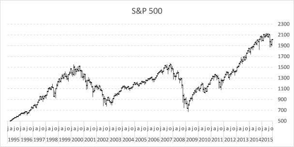
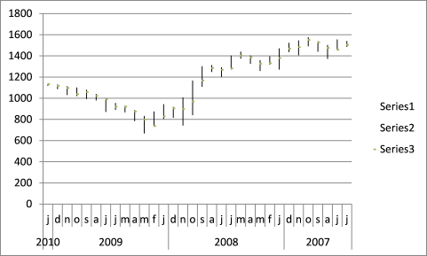
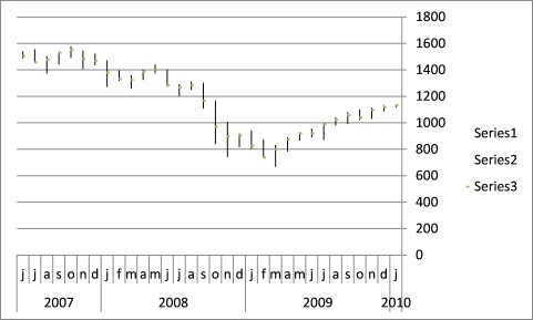
The examples shown in this post are based on S&P 500 index and larger trends. Charts show price data on a monthly scale and the date range is from 1995 to the present time.
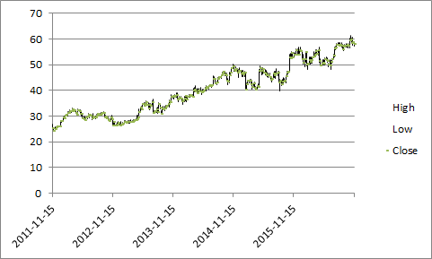
This Excel stock chart has a 10-month moving average. It can be calculated using the AVERAGE function on an excel worksheet.
What's on this page
- Calculate moving average
- How to add a moving average to an Excel stock chart
- Plot moving average turning points
- How to extract the moving average turning dates
- Get Excel file
- Plot buy and sell points in an Excel Chart based on two moving averages
- Follow stock market trends - trailing stop
- Add buy and sell markers to a stock chart
- How to calculate and plot pivots on an Excel chart
- Dynamic stock chart - Excel 365
- Dynamic stock chart - earlier Excel versions
- Build a stock chart with two series
1. Calculate moving average
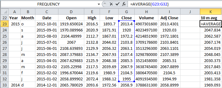
Formula in cell K23:
This function calculates the average from 10 latest closing prices. Copy cell K23 and paste to cells below as far as needed.
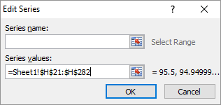
2. How to add a moving average to an Excel stock chart
- Press with right mouse button on on chart
- Press with mouse on "Select Data..."
- Press with left mouse button on "Add" button
- Select cell range $K$23:$K$272
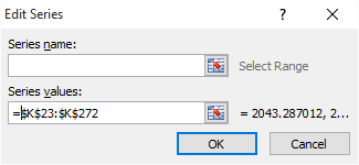
- Press with left mouse button on OK button
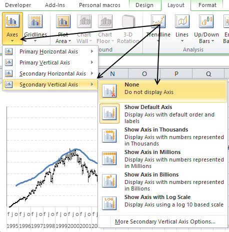
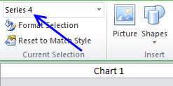
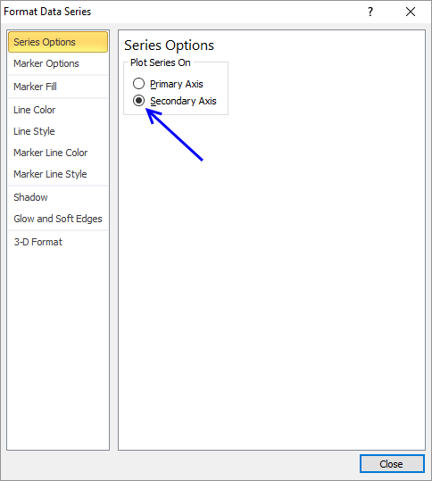
- Go to tab "Layout" on the ribbon.
- Select "Series 4"
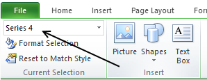
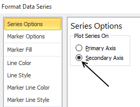
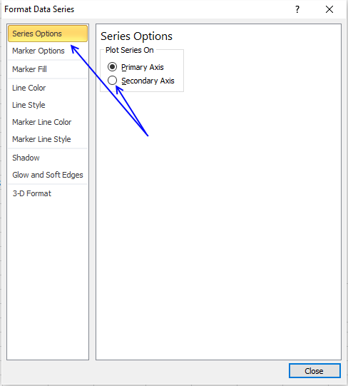
- Press with left mouse button on "Format Selection" button, see picture above.
- Select "Secondary Axis"
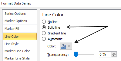
- Go to "Line Color"
- Select "Solid Line"
- Pick a color
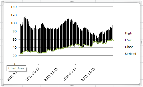
The chart now looks like this:
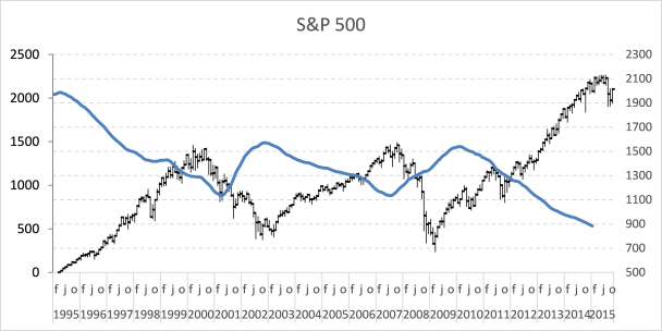
The data on the secondary axis has to be reversed.
- Select line on chart
- Go to tab "Layout" on the ribbon
- Press with left mouse button on "Axis" button and then "Secondary horizontal axis" and finally press with left mouse button on "Show right to left axis"
- Select and delete the horizontal axis above the chart
- Go to tab "Layout" on the ribbon
- Press with left mouse button on "Axis" button and "Secondary Vertical Axis" and finally "None"
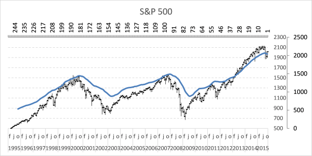
The chart looks like this:
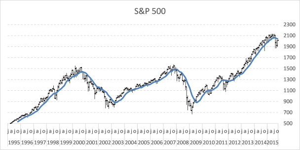
A moving average indicates if a market is about to go up or down in the long term.
3. Plot moving average turning points
Let's start with calculating when the moving average changes from moving down to up.
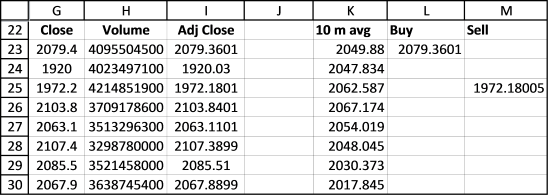
Buy formula in cell L23:
If the value in cell K23 is larger than cell K24 AND cell K24 is smaller than K25 THEN return the closing price. If not return nothing.
Read more about IF function.
The next formula calculates when the moving average changes from going up to going down.
Sell formula in cell M23:
Copy cell range L23:M23 and paste to cells below as far as needed. It is now time to plot these moving average turning points.
- Press with right mouse button on on chart
- Press with left mouse button on "Select Data..."
- Press with left mouse button on "Add" button
- Select cell range $L$23:$L$273
- Press with left mouse button on OK button
- Press with left mouse button on "Add" button again
- Select cell range $M$23:$M$273
- Press with left mouse button on OK button
- Press with left mouse button on OK button
Here is how to remove lines shown above and use markers instead.
- Go to tab "Layout"
- Select Series 5
- Press with left mouse button on "Format Selection"
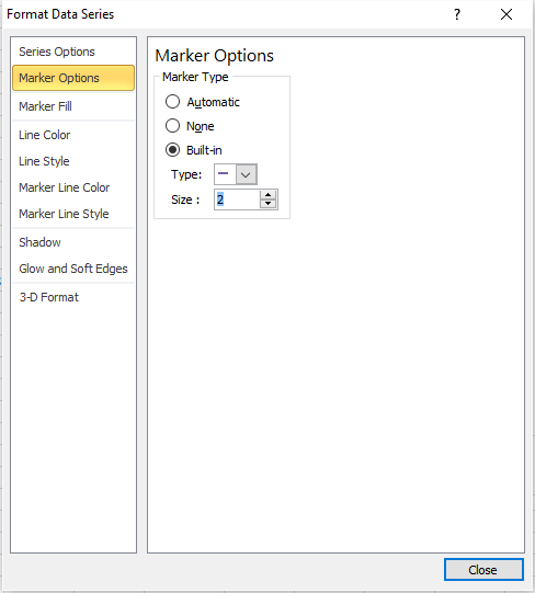
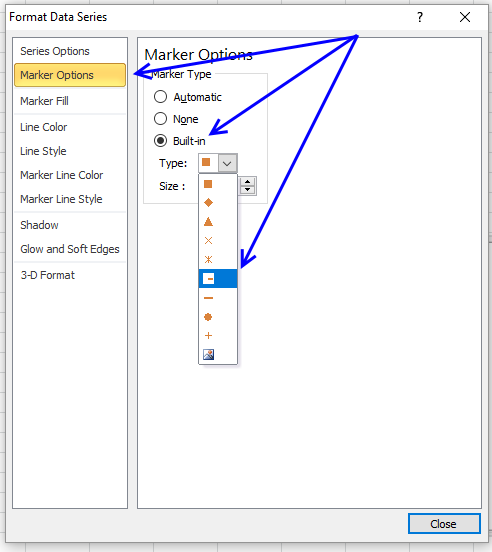
- Select "Marker Options"
- Select "Built-in"
- Pick a type
- Go to "Line Color"
- Select "No Line"
- Select "Series 6" on tab "Layout" on the ribbon
- Select "Marker Options"
- Select "Built-in"
- Pick a type
- Go to "Line Color"
- Select "No Line"
4. How to extract the moving average turning dates using Excel array formulas
Array formula (Buy) in cell P23:
Formula (Buy Date) in cell O23:
Array formula (Sell) in cell S23:
Formula (Sell Date) in cell R23:
4.1 How to enter an array formula
- Select cell P23
- Copy array formula
- Paste array formula in the formula bar
- Press and hold CTRL + SHIFT simultaneously
- Press Enter once
- Release all keys
If you did the above instructions correctly, the formula begins and ends with a curly bracket, like this {=formula}. Don´t enter these characters yourself.
Make sure you enter array formulas in cell P23 and S23. Then copy cell P23 and paste to cells below as far as needed. Repeat with cell S23, R23 and O23.
4.2 Explaining formula in cell P23
Step 1 - Check if each value in $K$23:$K$262 is larger than the next cell value below
The less than sign checks if the numerical value in a cell is less than the number in the next cell below.
$K$23:$K$262<$K$24:$K$263
The less than sign is a logical operator and the result is a boolean value, TRUE or FALSE.
Step 2 - Check if each value in $K$24:$K$263 is larger than the next cell value below
The larger than sign checks if the numerical value in a cell is larger than the number in the next cell below.
$K$24:$K$263>$K$25:$K$264
The larger than sign is also a logical operator and the result is a boolean value, TRUE or FALSE.
Step 3 - Multiply arrays
When we multiply arrays using the asterisk sign we apply AND-logic meaning TRUE is returned only if TRUE is present in the same position in both arrays.
TRUE * TRUE = TRUE
TRUE * FALSE = FALSE
FALSE * TRUE = FALSE
FALSE * FALSE = FALSE
($K$23:$K$262>$K$24:$K$263)*($K$24:$K$263<$K$25:$K$264)
The numerical equivalent is returned when two boolean values are multiplied.
TRUE = 1
FALSE = 0 (zero)
Step 4 - Create sequence from 1 to n
The ROW function returns a number representing the row based on a cell reference, for example, ROW(A1) returns 1.
This works also if we use a cell range as a cell reference, however, the formula is now an array formula. It calculates an array of values.
MATCH(ROW($G$23:$G$262), ROW($G$23:$G$262))
The MATCH function returns the relative position of a given value.
MATCH({23; 24; 25; ... ; 262}, {23; 24; 25; ... ; 262})
and returns {1; 2; 3; ... }.
Step 5 - Returns row number if logical expression is TRUE
The IF function returns one value if the logical test is TRUE and another value if the logical test is FALSE.
IF(logical_test, [value_if_true], [value_if_false])
IF(($K$23:$K$262>$K$24:$K$263)*($K$24:$K$263<$K$25:$K$264), MATCH(ROW($G$23:$G$262), ROW($G$23:$G$262)), "")
Step 6 - Extract the k-th smallest row number
The SMALL function returns the k-th smallest value from a group of numbers.
SMALL(array, k)
The ROWS function returns the number of rows based on a cell reference.
ROWS(array)
SMALL(IF(($K$23:$K$262>$K$24:$K$263)*($K$24:$K$263<$K$25:$K$264), MATCH(ROW($G$23:$G$262), ROW($G$23:$G$262)), ""), ROWS($A$1:A1)))
Step 7 - Get corresponding value from column G
The INDEX function returns a value from a cell range, you specify which value based on a row and column number.
INDEX(array, [row_num], [column_num])
INDEX($G$23:$G$262, SMALL(IF(($K$23:$K$262<$K$24:$K$263)*($K$24:$K$263>$K$25:$K$264), MATCH(ROW($G$23:$G$262), ROW($G$23:$G$262)), ""), ROWS($A$1:A1)))
Step 8 - Handle errors
The IFERROR function lets you catch most errors in Excel formulas.
IFERROR(value, value_if_error)
IFERROR(INDEX($G$23:$G$262, SMALL(IF(($K$23:$K$262>$K$24:$K$263)*($K$24:$K$263<$K$25:$K$264), MATCH(ROW($G$23:$G$262), ROW($G$23:$G$262)), ""), ROWS($A$1:A1))), "")
This template has dynamic named ranges for all chart series. This lets you change the date range and all chart data is adjusted automatically. I have not described how they work in this post, if you are curious
The template also contains a small custom function to fetch stock data from yahoo finance.
Tip! - Add data labels
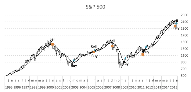
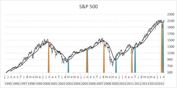
6. Plot buy and sell points in an Excel Chart based on two moving averages
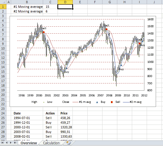
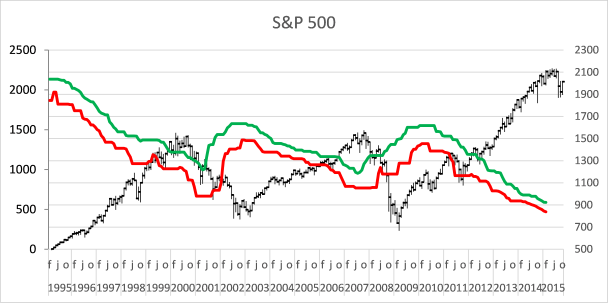
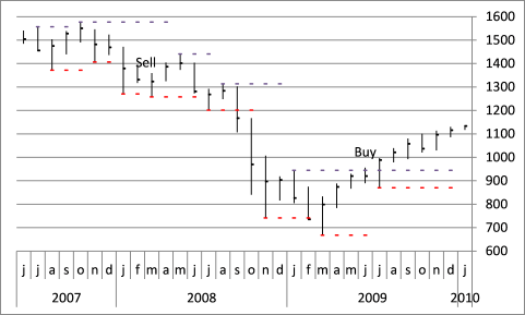
This article demonstrates how to display buy and sell signals on an Excel chart based on two moving averages, the workbook lets you change how these moving averages are calculated. There is a get link below.

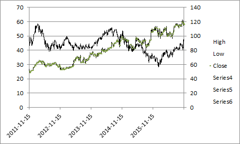
Above is an animated gif demonstrating a stock chart of S&P 500 with monthly prices. Two moving averages #1, #2, buy and sell points are plotted in this chart.
When the moving averages intersects a buy or sell point is created. If you use the value 7 in cell C1, moving average #1 uses the average of 7 months.
As you can see using a 15 month average (#1) returns better and fewer buy and sell points.
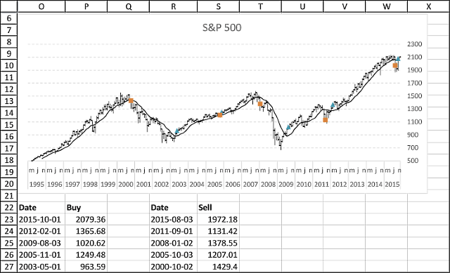
Extracting buy and sell points
Not only is the chart refreshed as you type new values in cell C1 and C2, the data below the chart is also instantly refreshed.
Array formula in cell B25:
Array formula in cell C25:
Array formula in cell D25:
How to create an array formula
- Copy array formula above
- Select cell B25
- Paste formula to cell
- Make sure you see the prompt in the cell, double press with left mouse button on the cell if you don't.
- Press and hold Ctrl+ Shift simultaneously
- Press Enter once
- Release all keys
How to copy array formula
- Select cell B25
- Copy cell (not formula in formula bar)
- Select cell range B26:B50
- Paste
Explaining formula in cell B25
Step 1 - Remove errors
The IFERROR function removes errors and returns an array containing values or nothing, errors are filtered out.
IFERROR(Calculation!$M$2:$M$247, "")
Step 2 - Check if cell is empty
The less than and greater than sign combined means "not equal to", in this case the logical operators make sure that the value is not equal to nothing. It returns boolean values TRUE or FALSE.
IFERROR(Calculation!$M$2:$M$247, "")<>""
Step 3 - Check column N as well
Actions described in step 1 and 2 are also applied to column N.
(IFERROR(Calculation!$N$2:$N$247, "")<>"")
Step 4 - If cells are not empty return the corresponding relative row number
The + sign between the logical expressions performs an OR calculation meaning if the cell in column M is not equal to nothing OR if the cell in column N is not equal to nothing then return TRUE, both logical expressions must return FALSE in order to return a FALSE.
(IFERROR(Calculation!$M$2:$M$247, "")<>"")+(IFERROR(Calculation!$N$2:$N$247, "")<>"")
The IF function then returns the second argument if the logical expression returns TRUE.
IF((IFERROR(Calculation!$M$2:$M$247, "")<>"")+(IFERROR(Calculation!$N$2:$N$247, "")<>""), MATCH(ROW(Calculation!$M$2:$M$247), ROW(Calculation!$M$2:$M$247)), "")
The second argument is the corresponding row number and the third argument is nothing.
MATCH(ROW(Calculation!$M$2:$M$247), ROW(Calculation!$M$2:$M$247)
Step 5 - Extract the k-th largest row number
The LARGE function extracts the k-th largest value in the array. LARGE( array, k)
LARGE(IF((IFERROR(Calculation!$M$2:$M$247, "")<>"")+(IFERROR(Calculation!$N$2:$N$247, "")<>""), MATCH(ROW(Calculation!$M$2:$M$247), ROW(Calculation!$M$2:$M$247)), ""), ROW(A1))
Argument k is a relative cell reference that changes when the cell is copied, this makes it possible to extract different values.
Step 6 - Return value from column D based on row number
The INDEX function returns a value from a cell range based on a row and column number.
INDEX(Calculation!$D$2:$D$247, LARGE(IF((IFERROR(Calculation!$M$2:$M$247, "")<>"")+(IFERROR(Calculation!$N$2:$N$247, "")<>""), MATCH(ROW(Calculation!$M$2:$M$247), ROW(Calculation!$M$2:$M$247)), ""), ROW(A1)))
Calculating buy and sell points
Sheet: Calculation

Array formula in cell K2:
Array formula in cell L2:
Formula in cell M2:
Formula in cell N2:
Copy cells and paste down as far as needed.
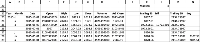
The calculation sheet imports historical prices using this user defined function:
Excel udf: Import historical stock prices from yahoo – added features
Further reading
If you want to know how to plot buy and sell points in an excel stock chart, read this post:
Add buy and sell points to a stock chart
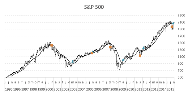
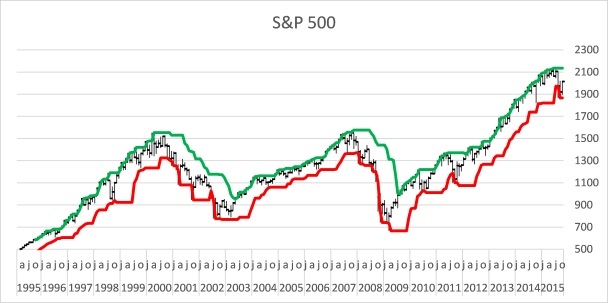
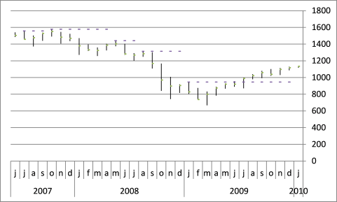
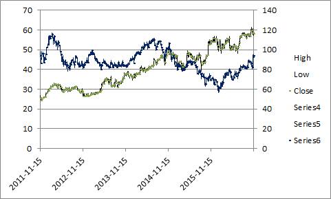
7. Follow stock market trends - trailing stop

Now I want to demonstrate an alternative way to identify a major trend in the stock market. The previous post showed you how to identify the trend using moving averages.
The picture above shows you a chart of S&P 500 with two lines, one is green and one is red. If the stock price moves above the green line a buy signal is returned, if the price moves below the red line a sell signal is generated.
What's on this section
- How trailing stops work
- How to build this stock chart
- How to add lines to stock chart
- How to add breakout signs to a stock chart
- Get Excel file
7.1. How trailing stops work
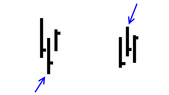
In a bull market, the price moves above the green line again and again, and in a bear market the price moves repeatedly below the red line. The trailing stop method makes it easier to identify when a bull market becomes a bear market and vice versa. Let me explain how these colored lines are constructed.
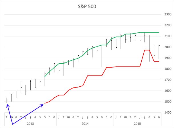
The red line shows the smallest value out of the last eight months' price bars, see blue arrows on the picture above. In October 2013 the smallest value is found from the first price quote (February 2013). In November 2013 the smallest value is found in the price quote March 2013.
As time moves on the red line advances higher and higher until August 2015. The price moves below the red line and the first sell signal is generated.
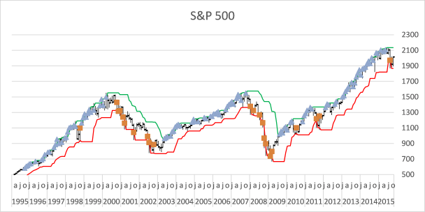
This chart shows with blue markers each time a price bar moves above the green line and with red markers each time a price bar moves below the red line. As you can see this method is not perfect, sometimes it generates false signals, see markers in year 1998, 2010 and 2011. Who knows if sell signal in August 2015 is correct? Only time can tell.
7.2. How to build this stock chart
The following formula allows you to change the number of calculated months, you can do that by changing the number in cell L20.
The red line formula in cell K23:
7.2.1 Explaining formula in cell K23
Step 1 - Calculate cell based on value in cell L20
The OFFSET function returns a reference to a range that is a given number of rows and columns from a given reference.
OFFSET(reference, rows, columns, [height], [width])
OFFSET(F24,$L$20-1,0)
becomes
OFFSET(F24,8-1,0)
becomes
OFFSET(F24, 7, 0)
and returns a reference to cell F31.
Step 2 - Create a reference to a cell range
The colon allows you to create a cell reference to a cell range.
F24:OFFSET(F24,$L$20-1,0)
returns F24:F31.
Step 3 -
MIN(F24:OFFSET(F24,$L$20-1,0))
The green line formula in cell M23:
Copy cell K23 and paste to cells below as far as needed. Repeat with cell M23.
7.3. Add lines to the stock chart
- Press with right mouse button on on the chart.
- Press with mouse on "Select Data...".
- Press with mouse on the "Add" button.
- Select values in column K ($K$23:$K$271).
- Press with left mouse button on OK.
- Press with left mouse button on OK.
- Select chart.
- Go to tab "Layout" on the ribbon.
- Select Series 4 for on the top left corner.
- Press with left mouse button on the "Format Selection" button.
- Make sure values are plotted on the "Secondary axis" (enabled).
- Go to "Line Color".
- Select "Solid Line" and pick a color.
Repeat above steps (add a new series with values from column M ($M$23:$M$271).
As you can see the two lines are in reverse order compared to the stock price bars.
- Select one of the lines, it does not matter which one.
- Go to tab "Layout" on the ribbon.
- Press with left mouse button on the "Axes" button and then "Secondary horizontal axis" and finally "Show axis left to right".
- Press with right mouse button on on the horizontal secondary axis (above the plot area).
- Press with left mouse button on "Format Axis...".
- Enable "Categories in reverse order".
- Delete the horizontal secondary axis (above the plot area).
- Select one of the lines.
- Press with left mouse button on the "Axes" button and then "Secondary vertical axis" and finally press with left mouse button on "Show none".
7.4. Add breakout signs to the chart
Sell formula in L23:
Buy formula in N23:
Copy cell L23 and paste to cells below as far as needed. Repeat with cell N23.
Now add two more markers series, see instructions above. Here is a small recap:
- Add two series (values in columns L and N).
- Plot series on the secondary axis.
- Use markers instead of solid lines.
This post shows you in greater detail how to add markers.
This template has dynamic named ranges for all chart series. This lets you change the date range and all chart data is adjusted automatically. I have not described how they work in this post.
The template also contains a small custom function to automatically fetch stock data from yahoo finance.
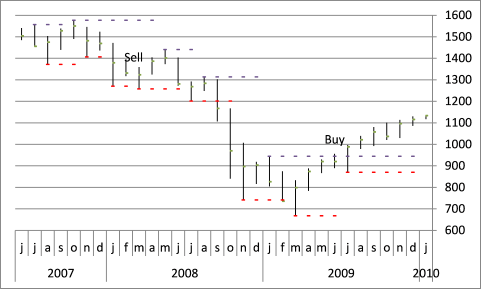
8. Add buy and sell markers to a stock chart

The image above shows an Excel chart of the S&P 500 with buy and sell signals based on a 50 day average.
It is easy to create a stock chart in Excel. In this article, I am going to describe how to insert buy and sell points to an Excel chart.
To simplify things I will use a 50 day moving average as an indicator. If the 50day average changes from negative to positive a buy signal is generated and a sell signal when the average moves from positive to a negative trend.
I have copied stock data from the Yahoo Finance website, you can easily pick a stock or index and get historical data.

Calculating moving average
The AVERAGE function calculates the moving average, remember to use the last 50 days as an argument. I am using a relative cell reference that changes accordingly when the cell is copied to cells below.
In cell K2:
Copy cell K2 and paste down as far as needed.
Find buy and sell dates
The following formulas check if the 50-day average is higher or lower than the previous day and the day before that, this will return the close value only if there is a change in trend.
In other words multiple buy or sell signals won't be displayed, only the first one. The first IF function has two logical expressions (K2-K3>0) and (K3-K4<0), both these conditions must be true to return the value in K2.
In cell L2:
In cell M2:
Copy cell L2 and M2 and paste down as far as needed.
Extract year and month from date
Let's extract year and month from dates to avoid a mess on the x axis in our stock chart. The YEAR function returns the year based on an Excel date.
Chandoo has a great post: Show Months & Years in Charts without Cluttering
In cell B2:
In cell B3:
The TEXT function formats an Excel date in this particular example, and displays the month formatted with only first three visible characters.
The IF function makes sure that the formatted month name is shown only when the month changes, this to avoid repeated months.
Cell C2:
Copy cell B3 and C2 and paste down as far as needed.
Create stock chart
It is important that the data is arranged in this order: High, Low and Close.
- Select cell range F1:H300
- Go to tab "Insert"
- Press with left mouse button on "Other charts"
- Press with left mouse button on "High Low Close stock chart"

Adjust vertical axis min and max values
If your chart is zoomed out too far you can simply adjust the visible axis range by following these steps.
- Select vertical axis
- Press with right mouse button on on vertical axis
- Press with left mouse button on "Format axis..."
- Press with left mouse button on "Axis Options"
- Press with left mouse button on Minimum fixed and type 1050.
- Press with left mouse button on Maximum fixed and type 1450.

Change horizontal axis labels
These steps change the x-axis numbers to years and months based on the values in column B and C.
- Press with right mouse button on on chart
- Press with left mouse button on "Select data"

- Press with left mouse button on "Edit" button
- Select cell range B2:C300
- Press with left mouse button on OK
Reverse horizontal (category) axis
If the dates are backward then these steps tell you how to change the order.
- Select horizontal axis
- Press with right mouse button on on horizontal axis
- Press with left mouse button on "Format axis.."
- Press with left mouse button on "Axis Options"
- Press with left mouse button on "Categories in reverse order"
- Select "Major tick mark type:" None
- Press with left mouse button on OK
Add moving average
These steps explains how to display the moving average on an Excel chart.
- Select cell range K1:K300
- Copy
- Select chart
- Got to tab "Home"
- Press with left mouse button on "Paste"
- Press with left mouse button on "Paste Special.."

- Press with left mouse button on "Ok"
- Press with mouse on chart
- Go to tab "Format"
- Select "50 day m-avg"

- Press with left mouse button on "Format selection"
- Press with left mouse button on "Series Options"
- Press with left mouse button on "Secondary axis"
- Press with left mouse button on "Line color" and select: Solid Line
- Press with left mouse button on Close button
How to display buy and sell signals on an Excel chart?
- Select cell range L2:L300
- Copy
- Select chart
- Go to tab "Home"
- Press with left mouse button on "Paste"
- Press with left mouse button on "Paste special"
- Press with left mouse button on Ok
Select cell range M2:M300 and repeat above steps.
- Press with left mouse button on on chart to select it
- Go to tab "Format"
- Select "Buy"
- Press with left mouse button on "Format Selection"
- Press with left mouse button on "Marker Options"
- Press with left mouse button on "Bulit-in"
- Select a marker type and size
- Select "Marker Fill"
- Press with left mouse button on "Solid Fill"
- Select "Line Color": No line
- Press with left mouse button on Close
Repeat above steps with "Sell"
Change secondary vertical axis
- Select and press with right mouse button on on the vertical axis to the left
- Change minimum and maximum values. They must match the primary axis.
- Select and press with right mouse button on on the vertical axis to the right
- Press with left mouse button on "Delete"
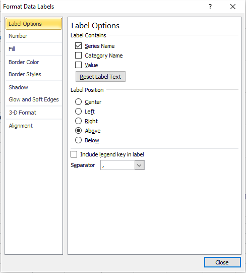
Add Data Labels
Buy series
- Press with left mouse button on on chart to select it
- Go to tab "Layout"
- Select "Buy" series
- Press with left mouse button on "Data Labels"
- Press with left mouse button on "More Data Label Options"
- Press with left mouse button on "Label options"
- Deselect "Values"
- Select "Series Name"
- Label position: Below
- Press with left mouse button on Close
Sell series
- Press with left mouse button on on chart to select it
- Go to tab "Layout"
- Select "Sell" series
- Press with left mouse button on "Data Labels"
- Press with left mouse button on "More Data Label Options"
- Press with left mouse button on "Label options"
- Deselect "Values"
- Select "Series Name"
- Label position: Above
- Press with left mouse button on Close
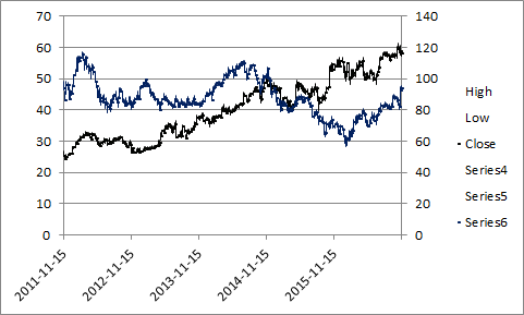
9. How to calculate and plot pivots on an Excel chart

If you study a stock chart you will discover that sometimes significant trend reversals happen when a stock chart bar is higher than the previous bar and the following bar, especially in a monthly bar chart. Excel is a fantastic tool as you know, it can help us identify these major turning points or pivots.
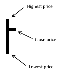
The picture above shows the simple logic, a bar that is lower than the previous and next bar is interesting to analyze if the stock market is going up (bull market).
Likewise, if a bar is higher than the previous and the following one, keep an eye on these pivots if the market is going down.
What's on this section
- Introduction
- Formulas
- Named ranges
- Setting up the chart
- Reverse horizontal axis
- Add remaining series
- Change the marker type
- Add Data Labels
- Change minimum and maximum value on the vertical axis
- Change bar color
- Resize chart
- Get Excel file
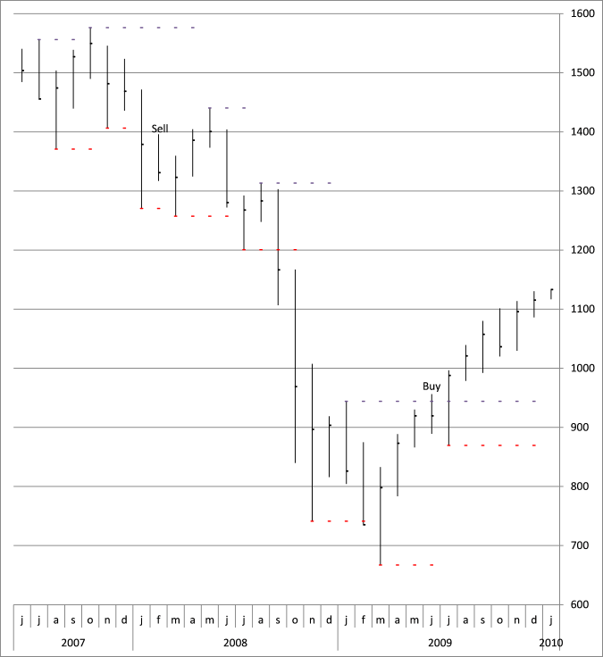
Major turning points often happen when the price moves past a pivot. See the picture below.
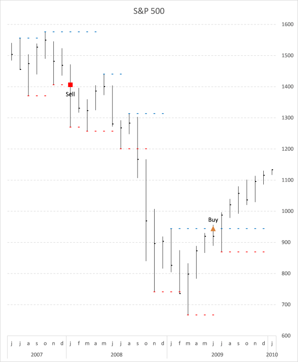
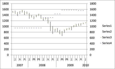
The chart above shows the S&P500 during the house market crash 2007-2009, Each pivot excel identifies has a dotted line and if it is breached a buy or sell signal is generated. Subsequent signals of the same kind are not shown in the chart.
A blue dotted line shows "high" pivots and a red dotted line shows "low" pivots if a new pivot is found the old one's dotted line ends.
9.2. Formulas
Here is the sheet that made it possible, you can press with left mouse button on to enlarge.
The user defined array formula in cell C23:I355:
Enter this udf array formula in cell range C23:I355. It fetches data from yahoo and a stock ticker you specify. You can read more about this udf here: Excel udf: Import historical stock prices from yahoo
Formula in cell A23:
This formula returns the YEAR from a date in cell C23.
Formula in cell B23:
This formula returns the first letter from a month.
Formula in cell K24:
This formula checks if the high is higher than the previous and next values. If TRUE change the value to the new high, if FALSE repeat the previous high value.
Formula in cell L24:
This formula checks if the low is lower than the previous and next values. If TRUE change the value to the new low, if FALSE repeat the previous low value.
Formula in cell M24:
This keeps track of whether a buy or sell was the latest signal.
Formula in cell N24:
Checks if the highest price point is above buy pivot. IF TRUE display buy pivot price.
Formula in cell O24:
Checks if the lowest price point is below sell pivot. IF TRUE display sell pivot price.
Formula in cell P24:
Returns the buy pivot price if the last signal was a sell signal. This avoids subsequent buy signals of the same kind.
Formula in cell Q24:
Returns the sell pivot price if the last signal was a buy signal. This avoids subsequent sell signals of the same kind.
Copy cells and paste below as far as needed.
9.3. Named ranges
The purpose of these named ranges is that if you change the date range the chart will automatically use the new range. Basically, it looks for the last row not equal to "#N/A" in column C and returns a cell range we can use in the chart.
MClose
MHigh200
MLow200
BPivotlines
BuyPivots
Dates200
Sellm200
SellPivots
SPivotlines
9.4. Setting up the chart
Insert a new stock chart
- Go to tab "Insert" on the ribbon.
- Select cell range E23:G46 on your worksheet.
- Press with left mouse button on the "Other Charts" button.
- Press with left mouse button on the "High-Low-Close" chart button.
- Press with right mouse button on on the chart you just created.
- Press with left mouse button on "Select Data..".
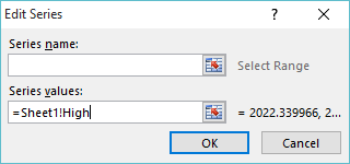
- Select "Series1" and press with left mouse button on the "Edit" button.
- Change Series values to: =Pivots!MHigh200
- Press with left mouse button on OK.
- Select "Series2" and press with left mouse button on the "Edit" button.
- Change Series values to: =Pivots!MLow200
- Select "Series3" and press with left mouse button on the "Edit" button.
- Change Series values to: =Pivots!MClose
- Press with left mouse button on OK.
- Press with left mouse button on "Edit" button below Horizontal (Category) Axis Labels.
- Change Axis Label range to: =Pivots!Dates200.
- Press with left mouse button on OK.
- Press with left mouse button on OK.
9.5. Reverse horizontal axis
- Press with right mouse button on on the horizontal axis
- Press with left mouse button on "Format Axis..."
- Enable "Categories in reverse order"
- Press with left mouse button on OK
Add "High" pivots to chart
- Press with right mouse button on on chart
- Press with left mouse button on "Select Data..."
- Press with left mouse button on "Add" button below Legend Entries (Series)
- Type Pivots!BPivotlines in Series values
- Press with left mouse button on OK button
- Press with left mouse button on Ok
- Go to tab "Layout" on the ribbon. If you can't find it make sure you have the chart selected
- Select chart element "Series 4" in the drop down list
- Press with left mouse button on "Format Selection" button
- Press with left mouse button on "Secondary Axis"
- Go to "Marker Options" on the menu to the left
- Press with left mouse button on Built-in and select a type and size
- Press with left mouse button on Close button
Reverse Series 4
- Select Series 4 on the chart
- Go to tab Layout on the ribbon
- Press with left mouse button on "Axis button, press with left mouse button on "Secondary Horizontal Axis" and then press with left mouse button on "Show Left to Right"
- Press with right mouse button on on the secondary horizontal axis
- Press with left mouse button on "Format Axis"
- Press with left mouse button on "Categories in reverse order"
- Press with left mouse button on Close
- Select secondary horizontal axis again and delete
- Select the chart legend and delete
- Select Series 4
- Go to tab Layout on the ribbon
- Press with left mouse button on button "Axis"
- Go to secondary vertical axis
- Press with left mouse button on None
9.6. Add remaining series
- Repeat above steps described in "Add High pivots to chart" and "Reverse Series 4" with Low Pivots, Buy and Sell signals
- Here are the named ranges:
Low Pivots - SPivotlines
Buy - BuyPivots
Sell - SellPivots
9.7. Change the marker type
- Go to tab "Layout" and Select Buy (Series 6)
- Press with left mouse button on "Fomat Selection"
- Go to "Marker Options" and choose a Built-in one
- Now select Sell (Series 7)
- Press with left mouse button on "Format Selection" button
- Go to "Marker Options" and choose a Built-in one
9.8. Add Data Labels
- Go to tab "Layout" and Select Buy (Series 6)
- Press with left mouse button on "Data Labels" button
- Press with left mouse button on "More Data Label Options.."
- Make sure "Series Name" and "Above" is enabled, see picture above.
- Press with left mouse button on Close
- Repeat above steps with Sell (Series 7)
9.9. Change minimum and maximum value on the vertical axis
- Press with right mouse button on on vertical axis
- Press with left mouse button on "Format Axis"
- Change minimum value to 600
- Change maximum value to 1600
9.10. Change bar color
- Go to tab "Layout" on the ribbon
- Select "Series 3"
- Press with left mouse button on "Format Selection"
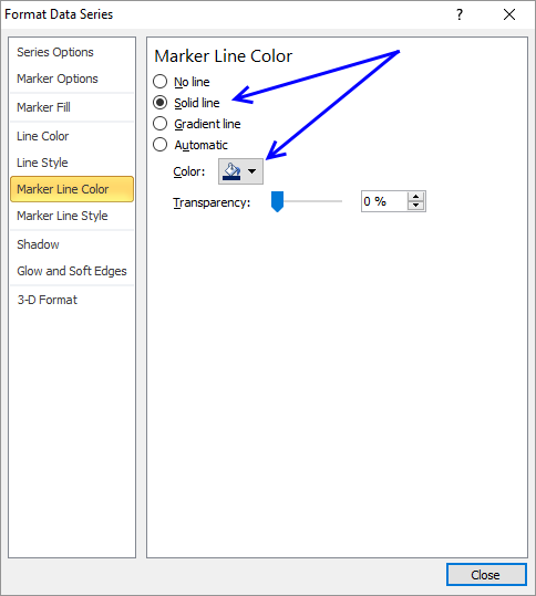
- Go to "Marker Line Color"
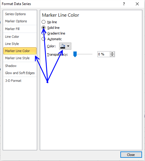
- Press with left mouse button on "Solid Line" and pick a color, I chose black.
- Press with left mouse button on Close
9.11. Resize chart
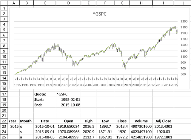
10. Dynamic stock chart - Excel 365

The image above demonstrates a dynamic stock chart, enter the stock quote in cell C2. The start and end date in cells C3 and C4, specify daily, weekly or monthly in cell C5.
The STOCKHISTORY function wants the corresponding number instead of daily, weekly, and monthly in order to work properly. We need a formula that converts the text to a number.
0 - daily
1 - weekly
2 - monthly
Formula in cell D5:
Explaining the formula in cell D5
Step 1 - Populate arguments
The MATCH function returns the relative position of an item in an array that matches a specified value in a specific order.
Function syntax: MATCH(lookup_value, lookup_array, [match_type])
becomes
MATCH(C5,{"Daily","weekly","monthly"},0)
Step 2 - Evaluate MATCH function
MATCH(C5,{"Daily","weekly","monthly"},0)
becomes
MATCH("weekly",{"Daily","weekly","monthly"},0)
and returns 2. "weekly" is the second value in the array.
Step 3 - Subtract with one
MATCH(C5,{"Daily","weekly","monthly"},0)-1
becomes
2-1
and returns 1.
0 - daily
1 - weekly
2 - monthly

Excel 365 dynamic array formula in cell B2:
Explaining the formula in cell B2
Step 1 - Populate arguments
The STOCKHISTORY function downloads stock prices based on a stock quote
Function syntax: STOCKHISTORY(stock, start_date, [end_date], [interval], [headers], [property0], [property1], [property2], [property3], [property4], [property5])
becomes
STOCKHISTORY(Sheet1!C2,Sheet1!C3,Sheet1!C4,Sheet1!D5,1,0,3,4,1)
Step 2 - Evaluate STOCKHISTORY function
STOCKHISTORY(Sheet1!C2,Sheet1!C3,Sheet1!C4,Sheet1!D5,1,0,3,4,1)
becomes
STOCKHISTORY("GOOGL",44197,44967,1,1,0,3,4,1)
and returns
{"Date","High","Low","Close";44193,89.4235,86.4,87.632;44200, ... ,95.01}
11. Dynamic stock chart - earlier Excel versions
Here is how to build this chart.
11.1. Create a date range
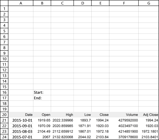
I entered "Start:" and "End:" in cell range B16:B17. The date values in cells C16 and C17 will determine when the date range begins and ends.
11.2. Copy data
I found the stock price data on the yahoo finance website, here is a link to S&P 500 historical prices.
- Press with left mouse button on the "Get to spreadsheet" link to the get file, you can find the link below historical data.
- Open the geted file in Excel.
- Copy data from the geted file.
- Paste to cell A20 on your worksheet.
The data starts from the 1950s but I can't show all data, for obvious reasons.
11.3. Build dynamic named ranges
We want the chart to change depending on the start and end date in cell range B16:B17. "Named ranges" is what we are looking for, it can return a cell range of variable size.
- Go to "Formulas" on the ribbon.
- Press with left mouse button on "Named Ranges".
- Press with left mouse button on the "New" button.
- Name it "Date".
- Refers to:
=INDEX(Sheet1!$A$21:$A$810, MATCH(Sheet1!$C$16,Sheet1!$A$21:$A$810,-1)):INDEX(Sheet1!$A$21:$A$810, MATCH(Sheet1!$C$17, Sheet1!$A$21:$A$810, -1))
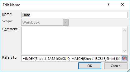
- Press with left mouse button on "OK".
- Press with left mouse button on "New" button.
- Name it "High".
- Refers to:
=INDEX(Sheet1!$C$21:$C$810, MATCH(Sheet1!$C$16,Sheet1!$A$21:$A$810, -1)):INDEX(Sheet1!$C$21:$C$810, MATCH(Sheet1!$C$17, Sheet1!$A$21:$A$810, -1))
- Press with left mouse button on OK.
- Press with left mouse button on "New".
- Name it "Low".
- Refers to:
=INDEX(Sheet1!$D$21:$D$810, MATCH(Sheet1!$C$16, Sheet1!$A$21:$A$810, -1)):INDEX(Sheet1!$D$21:$D$810, MATCH(Sheet1!$C$17, Sheet1!$A$21:$A$810, -1))
- Press with left mouse button on OK.
- Press with left mouse button on "New".
- Name it "Close".
- Refers to:
=INDEX(Sheet1!$E$21:$E$810, MATCH(Sheet1!$C$16, Sheet1!$A$21:$A$810, -1)):INDEX(Sheet1!$E$21:$E$810, MATCH(Sheet1!$C$17, Sheet1!$A$21:$A$810, -1))
- Press with left mouse button on OK.
You have now created 4 different named ranges which are to be used in the stock chart. You can find a formula explanation later in this post. But first, let's insert a stock chart above the date range.
11.4. Insert a stock chart
- Select cell range C21:E29, column C:E contain high, low and close values.
- Go to tab "Insert" on the ribbon
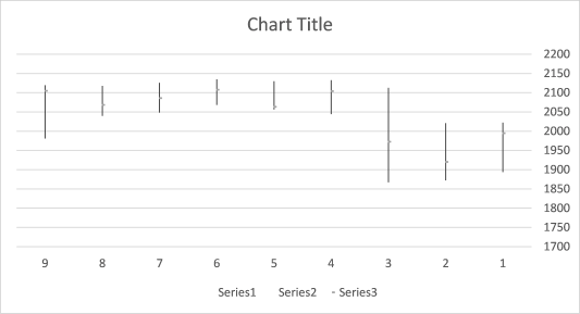
- Press with left mouse button on "Stock chart" button
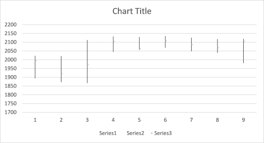
The values are in an incorrect order, they need to be reversed.
- Press with right mouse button on on x axis
- Select "Format Axis..."
- Enable option "Categories in reverse order"
11.5. Change series values
It is now time to use the dynamic named ranges we created earlier. They help us quickly change the cell range we want to be shown in the chart.
- Press with right mouse button on on the chart.
- Press with left mouse button on "Select Data...".
- Select Series1.
- Press with left mouse button on the "Edit" button.
- Series values:
=Sheet1!High
(Don't forget to type the sheet name before the named range.)
- Press with left mouse button on OK.
- Select Series2.
- Press with left mouse button on the "Edit" button.
- Series values:
=Sheet1!Low
- Press with left mouse button on OK.
- Select Series3.
- Press with left mouse button on the "Edit" button.
- Series values:
=Sheet1!Close
- Press with left mouse button on OK.
- Press with left mouse button on the "Edit" button below Horizontal (Category) Axis Labels.
- Axis label range:
=Sheet1!Dates
11.6. Explaining the named range (Date) formula
Step 1 - Find the position of value cell C16 in cell range A21:A810
The MATCH function returns a number representing the relative position of a given value in a cell range or array.
MATCH(lookup_value, lookup_array, [match_type])
MATCH(Sheet1!$C$16,Sheet1!$A$21:$A$810,-1)
becomes
MATCH(42248,Sheet1!$A$21:$A$810,-1)
and returns 2.
Step 2 - Calculate the first cell ref in the cell range
The INDEX function returns a value or a cell reference based on a row and column number.
INDEX(array, [row_num], [column_num])
INDEX(Sheet1!$A$21:$A$810, MATCH(Sheet1!$C$16,Sheet1!$A$21:$A$810,-1))
becomes
INDEX(Sheet1!$A$21:$A$810, 2)
and returns cell ref A22.
Step 3 - Find the position of value cell C17 in cell range A21:A810
The MATCH function returns a number representing the relative position of a given value in a cell range or array.
MATCH(lookup_value, lookup_array, [match_type])
MATCH(Sheet1!$C$17,Sheet1!$A$21:$A$810,-1)
becomes
MATCH(38353,Sheet1!$A$21:$A$810,-1)
and returns 130.
Step 4 - Calculate the second cell ref in the cell range
The INDEX function returns a value or a cell reference based on a row and column number.
INDEX(array, [row_num], [column_num])
INDEX(Sheet1!$A$21:$A$810, MATCH(Sheet1!$C$17, Sheet1!$A$21:$A$810, -1))
becomes
INDEX(Sheet1!$A$21:$A$810, 130)
and returns cell ref A151.
Step 5 - Combine cell refs to a cell range
You can concatenate two cell references using the colon character to create a cell reference to a cell range.
INDEX(Sheet1!$A$21:$A$810, MATCH(Sheet1!$C$16,Sheet1!$A$21:$A$810,-1)):INDEX(Sheet1!$A$21:$A$810, MATCH(Sheet1!$C$17, Sheet1!$A$21:$A$810, -1))
returns A22:A151.
11.7. How to make the chart even more dynamic
This user defined function allows you to fetch past data for any quote on yahoo finance. You don't have to go to the yahoo finance website and copy/paste the data, this udf does it for you automatically. Just type the stock quote in cell D17 and press enter.
If you are looking for a particular company, index or commodity go to yahoo finance and use their "Quote lookup" to find the quote you are looking for.
Yes, you still need to manually adjust the y axis values on the chart every time you change the date range or stock quote unless you check out this post.
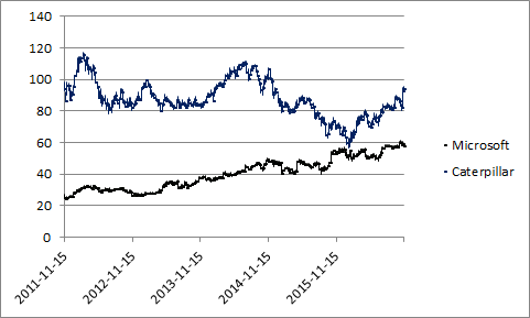
12. Build a stock chart with two series
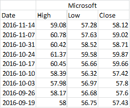
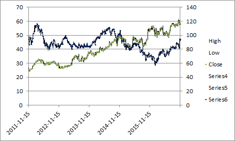
This article demonstrates how to create a stock chart with two series.
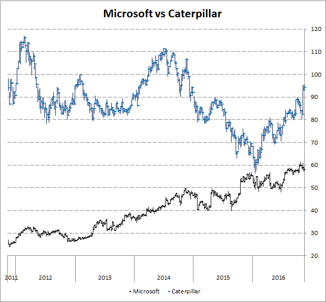
The picture above shows a weekly stock bar chart of Microsoft and Caterpillar. One bar shows you the highest price and the lowest price during that specific week, it also shows the closing price which is the price of the last deal done that week.
Instructions
- Rearrange columns like this: high, low and close
- Select columns High, Low and close
- Go to tab "Insert" on the ribbon
- Press with left mouse button on "Other Charts" and then "High-Low-Close"
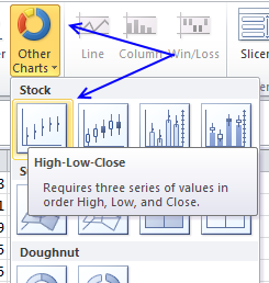
- A chart is inserted on your active sheet
- Press with right mouse button on on chart and press with left mouse button on "Select Data..."
- Press with left mouse button on Edit button below Horizontal (Category) Axis Labels
- Select your date range
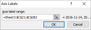
- Press with left mouse button on OK button twice
- Press with right mouse button on on chart again
- Press with mouse on "Select Data"
- Press with mouse on "Add" button below Legend Entries (Series)
- Select High column for the other stock you want plotted
- Press with left mouse button on OK twice
- Select the chart
- Go to tab "Layout" on the ribbon
- Select series 4
- Press with left mouse button on "Format Selection" below Series 4
- Change to "Secondary Axis"
- Press with left mouse button on Close
- Press with right mouse button on on chart again and press with left mouse button on "Select Data..."
- Add Low and Close series
- Go to tab "Layout" on the ribbon
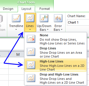
- Select "Series 4"
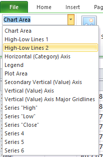
- Press with mouse on "Lines" button and then "High-Low" Lines
- Select "Series 6" (Close)
- Press with left mouse button on "Format Selection"
- Go to "Marker Options", choose built-in marker type and the sixth symbol from the top.
- Select size 3
- Go to "Marker Line Color", select "Solid Line" and finally pick a color. I chose dark blue.
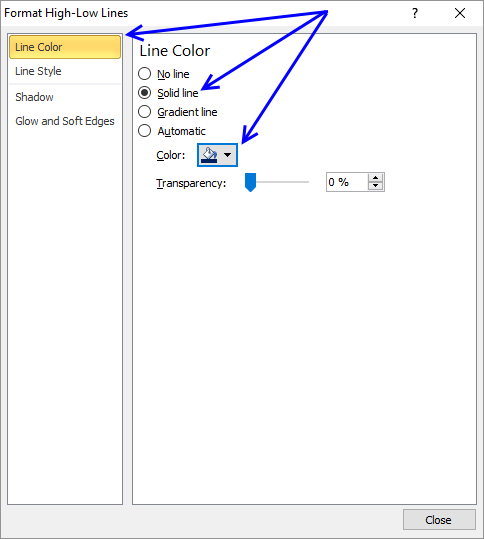
- Select "High Low Lines 2"
- Select "Solid Line" and select a color
- Press with left mouse button on Close
You now know how to change the color of high low lines and the closing line. Change the line color of all series (High, Low and Close) on the primary axis.
I chose black. Now delete the secondary axis and remove entries on the legend except "Close" and "Series 6". Change the name of series "Close" to Microsoft and "Series 6" to Caterpillar.
Get excel *.xlsx file
build-a-stock-chart-with-two-series.xlsx
Stock market trend category
More than 1300 Excel formulasExcel categories
5 Responses to “Follow stock market trends – Moving Average”
Leave a Reply
How to comment
How to add a formula to your comment
<code>Insert your formula here.</code>
Convert less than and larger than signs
Use html character entities instead of less than and larger than signs.
< becomes < and > becomes >
How to add VBA code to your comment
[vb 1="vbnet" language=","]
Put your VBA code here.
[/vb]
How to add a picture to your comment:
Upload picture to postimage.org or imgur
Paste image link to your comment.
Hi Oscar,
This post is awesome! But when I tired to play with the attached Excel sheet, I got a blank plot on "Overview tab" with #DIV/0! displayed under the columns of ave, buy and sells on "Calculation tab".
The Excel version I'm using is 2007 and I've tried quite long time to get it work in vain. Really appreciate if you can point out what could be the issues. (I thought it could be caused by the fact that the AVERAGE function is trying to work on the retrieved stock price in "text/date" format while "number" format is actually required. However, your post shows the screen capture of the Excel in action. Unless the version I got following the above link is different all I must have missed something important. Keep wondering ...)
Thanks!
Smith
Thanks for letting me know. I have uploaded a new file:
excel-stock-chart-two-moving-averagesv2.xlsm
See above.
[…] ← Previous post - […]
Your site is wonderful and educational. I wanted to thank you for your generosity. I'm new at Excel and Investing so it's going to take some time mastering VBA. All the programming I've done is VB6 and there is a lot of overlap.
Thanx
Warren
Hi There, is there a chance you could update using STOCKHISTORY as Yahoo unavailble