'Chart basics' category
Excel charts tips and tricks
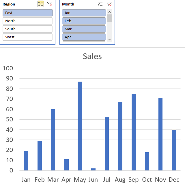
Table of Contents How to add lines between stacked columns/bars (Excel charts) Use slicers to quickly filter chart data How […]
Table of Contents How to add lines between stacked columns/bars (Excel charts) Use slicers to quickly filter chart data How […]