How to improve your Excel Chart
What's on this page
Custom data labels
- Improve your X Y Scatter Chart with custom data labels
- How to apply custom data labels in Excel 2013 and later versions
- Workaround for earlier Excel versions
- Label line chart series
- Custom data labels in a column chart
How to add a secondary axis to an Excel Chart
1. Improve your X Y Scatter Chart with custom data labels

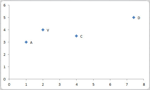
The picture above shows a chart that has custom data labels, they are linked to specific cell values.
This means that you can build a dynamic chart and automatically change the labels depending on what is shown on the chart.
I have demonstrated how to build dynamic data labels in a previous article if you are interested in using those in a chart.
In a post from March 2013 I demonstrated how to create Custom data labels in a chart.
Unfortunately, that technique worked only for bar and column charts.
You can't apply the same technique for an x y scatter chart, as far as I know.
Luckily the people at Microsoft have heard our prayers.
They have implemented a feature into Excel 2013 that allows you to assign a cell to a chart data point label a, in an x y scatter chart.
I will demonstrate how to do this for Excel 2013 and later versions and a workaround for earlier versions in this article.
1.1 How to apply custom data labels in Excel 2013 and later versions
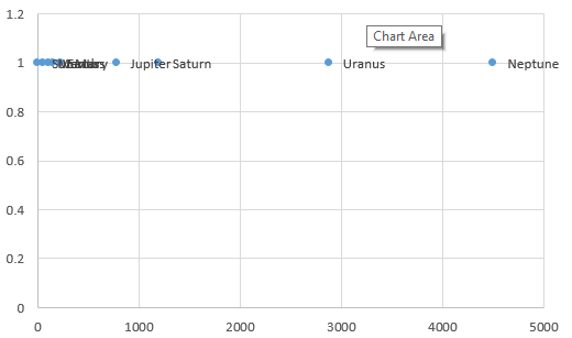
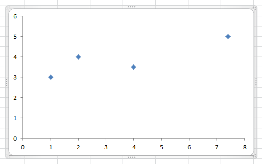
This example chart shows the distance between the planets in our solar system, in an x y scatter chart.

The first 3 steps tell you how to build a scatter chart.
- Select cell range B3:C11
- Go to tab "Insert"
- Press with left mouse button on the "scatter" button
- Press with right mouse button on on a chart dot and press with left mouse button on on "Add Data Labels"
- Press with right mouse button on on any dot again and press with left mouse button on "Format Data Labels"
- A new window appears to the right, deselect X and Y Value.
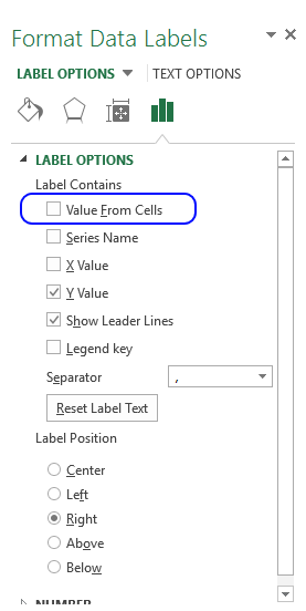
- Enable "Value from cells"

- Select cell range D3:D11
- Press with left mouse button on OK
This is what the chart shows, as you can see you need to manually rearrange the data labels and add data label shapes.
1.1 Video
The following video shows you how to add data labels in an X Y Scatter Chart [Excel 2013 and later versions].
Learn more
Axis | Chart Area | Chart Title | Axis Titles | Axis lines | Chart Legend | Tick Marks | Plot Area | Data Series | Data Labels | Gridlines
1.2 How to add data label shapes
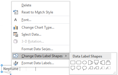 Press with right mouse button on on a data label.
- Press with mouse on "Change data label shapes".
- Select a shape.
1.3 How to change data label locations
You can manually press with left mouse button on and drag data labels as needed. You can also let excel change the position of all data labels, choose between center, left, right, above and below.
- Press with right mouse button on on a data label
- Press with left mouse button on "Format Data Labels"
- Select a new label position.
Learn more
Secondary Axis | Linear trendline | Logarithmic Trendline | Moving Average | Error Bars
2. Workaround for earlier Excel versions
This workaround is for Excel 2010 and 2007, it is best for a small number of chart data points.
- Press with left mouse button on twice on a label to select it.
- Press with left mouse button on in formula bar.
- Type =
- Use your mouse to press with left mouse button on a cell that contains the value you want to use.
- The formula bar changes to perhaps =Sheet1!$D$3

- Repeat step 1 to 5 with remaining data labels.
Change the value in cell D3 and see how the data label on the chart instantly changes.
The following animated picture demonstrates how to link a cell value to a specific chart data point.

If your chart has many data points this method becomes quickly tedious and time-consuming.
I have automated these steps for you in a macro that you can read about below, there is also an example workbook that you can get.
Learn more
Column | Bar | Line | Area | Pie | Doughnut | Scatter | Bubble | Funnel | Stock | Candlestick | Surface | Radar | Map
2.1 Apply custom data labels (VBA Macro)
This macro adds a cell reference to each data label, the value in the referenced cell is then linked to the label. If you change the value in the cell the label value changes as well.
'Name macro
Sub AddDataLabels()

'Enable error handling
On Error Resume Next

'Display an inputbox and ask the user for a cell range
Set Rng = Application.InputBox(prompt:="Select cells to link" _
, Title:="Select data label values", Default:=ActiveCell.Address, Type:=8)

'Disable error handling
On Error GoTo 0

With ActiveChart

    'Iterate through each series in chart
    For Each ChSer In .SeriesCollection

        'Save chart point to object SerPo
        Set SerPo = ChSer.Points

        'Save the number of points in chart to variable j
        j = SerPo.Count

        'Iterate though each point in current series
        For i = 1 To j

            'Enable data label for current chart point
            SerPo(i).ApplyDataLabels Type:=xlShowValue

            'Save cell reference to chart point
            SerPo(i).DataLabel.Formula = "=" & ActiveSheet.Name _
            & "!" & Rng.Cells(i).Address(ReferenceStyle:=xlR1C1)
        Next
    Next
End With
End Sub
Learn more
Waterfall | Treemap | Sunburst | Histogram | Pareto | Box & Whisker
2.2 Where to put the code?
- Copy macro (CTRL + c)
- Go to the VB Editor (Alt + F11)
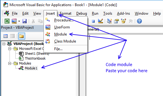
- Press with left mouse button on "Insert" on the top menu.
- Press with left mouse button on "Module" to insert a code module to your workbook.
- Paste code to the module. (CTRL + v)
- Return to Excel.
- Save your workbook as a macro-enabled workbook (*.xlsm file).
If you don't the macro will be gone the next time you open the same workbook.
Learn more
Arrow | Normal distribution | Equation | Comparison | Heat map | Gantt
2.3 How to use macro
- Select the x y scatter chart.
- Press Alt+F8 to view a list of macros available.
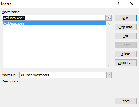
- Select "AddDataLabels".
- Press with left mouse button on "Run" button.
- Select the custom data labels you want to assign to your chart.
Make sure you select as many cells as there are data points in your chart.

- Press with left mouse button on OK button.
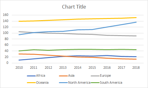
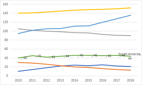
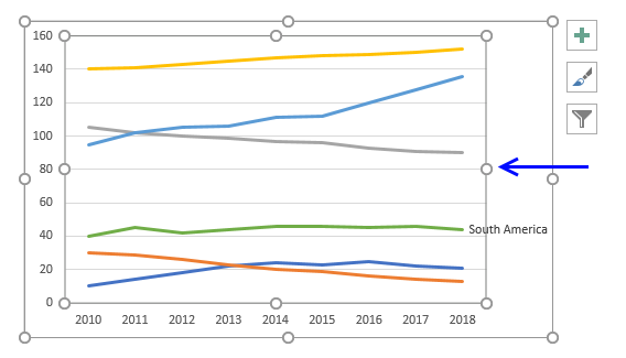
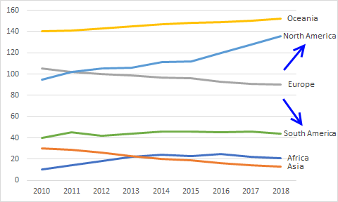
2. Label line chart series

The chart above contains no legend instead data labels are used to show what each line represents.

2.1. How to build
- Insert a line chart.
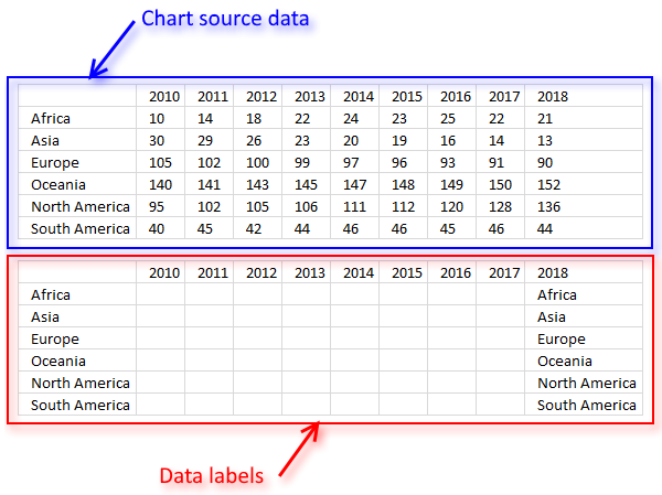
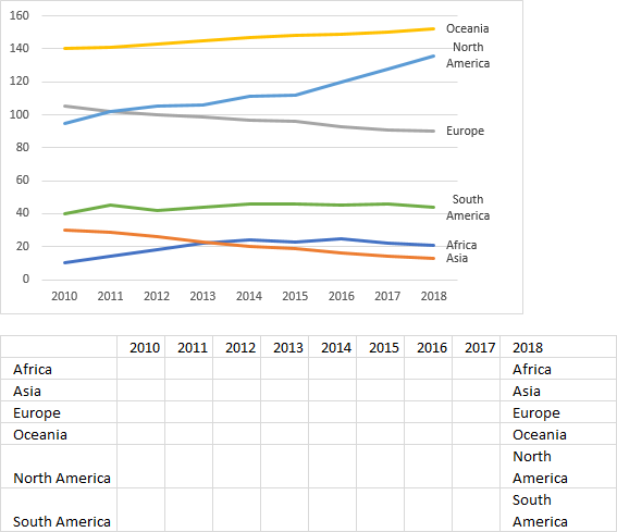
- To label each line we need a cell range with the same size as the chart source data. Simply copy the chart source data range and paste it to your worksheet, then delete all data.
- All cells are now empty. Copy categories (Regions in this example) and paste to the last column (2018).
Those correspond to the last data points in each series.
- Press with right mouse button on on a data series and select "Add Data Labels".
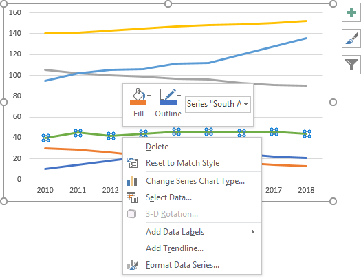
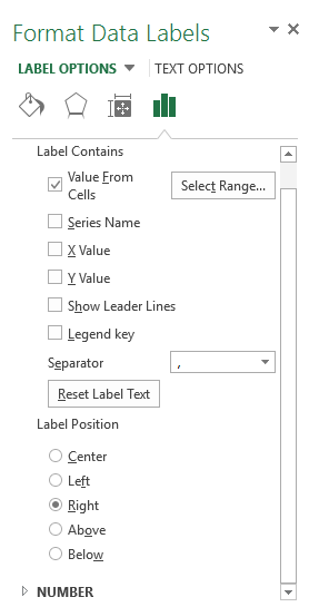
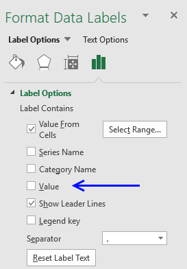
- Double press with left mouse button on with left mouse button on one of the data labels you just inserted to open the task pane window.

- Select checkbox "Value from cells".
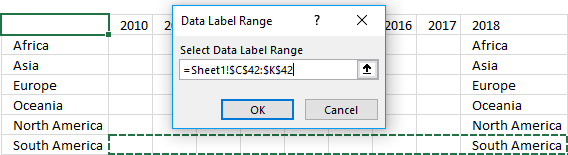
- Select data label cell range we created earlier in step 3 and 4, that corresponds to the same line series. Use the legend to identify line series.
In this example the data labels correspond to "South America", see image below.
- The data labels now show both numerical values and the last text value.
To hide the numerical values simply double press with left mouse button on on the data labels to open the task pane. - Deselect check box "Value".
- All numerical values are now deleted from the data labels, only the last data point has a data label, see image below.
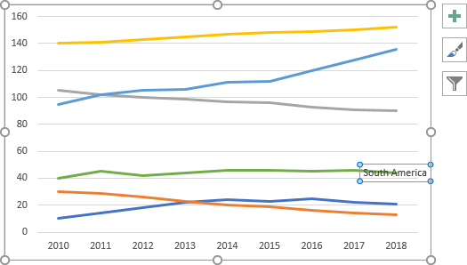
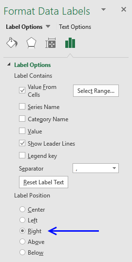
- Position the data label to the right of the data point using the task pane.
- Resize the plot area so the data label doesn't collide with the line.
- Repeat step 4-12 with the remaining line series.
2.2. How to wrap data label text
- Double press with left mouse button on the cell that contains the data label.
- Put the prompt between the words.
- Press Alt + Enter.
- Press Enter.
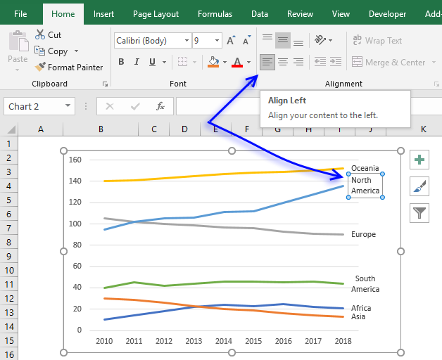
2.3. Align data labels
- If you want the labels to be aligned to the left simply select the data label.
- Go to tab "Home" on the ribbon.
- Press with left mouse button on the "Align Left" button.
2.4 Get Excel *.xlsx file
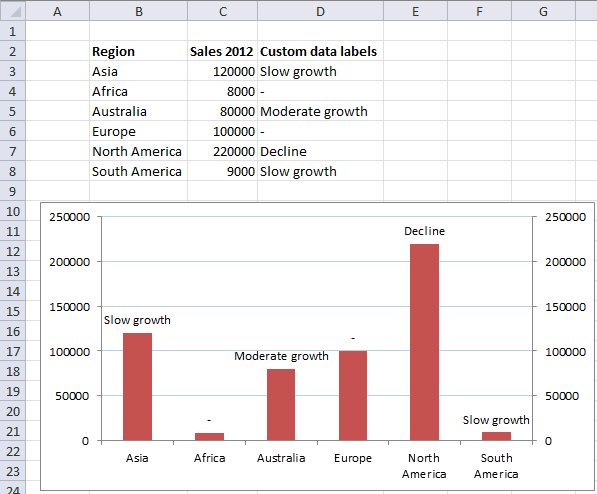
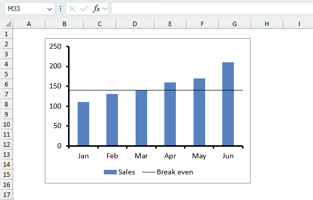
3. Custom data labels in a column chart

You can easily change data labels in a chart. Select a single data label and enter a reference to a cell in the formula bar. You can also edit data labels, one by one, on the chart.
With many data labels, the task becomes quickly boring and time-consuming. But wait, there is a third option using a duplicate series on a secondary axis.
The animated image above shows you dynamic custom data labels. Here is how you build them.
Note! Before you continue reading. If you own Excel 2013 or a later version you don't have to do the work-around presented below this yellow box.
- Press with right mouse button on on any data series displayed in the chart.
- Press with mouse on "Add Data Labels".
- Press with mouse on Add Data Labels".

- Double press with left mouse button on any data label to expand the "Format Data Series" pane.
- Enable checkbox "Value from cells".

A small dialog box prompts for a cell range containing the values you want to use a s data labels. - Select the cell range and press with left mouse button on OK button.
The chart shows the values you selected as data labels.
3.1 Create a chart
- Select a cell range
- Go to "Insert" tab
- Press with left mouse button on "Column" button
- Select the first 2-D Column chart

3.2 Add another series to the chart
- Press with right mouse button on on chart
- Press with left mouse button on Select data
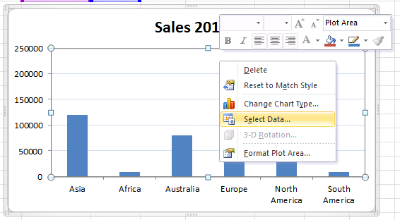
- Press with left mouse button on "Add" button
- Select a series name, cell C2
- Select series values, C3:C8
- Press with left mouse button on Ok
- Press with left mouse button on Ok
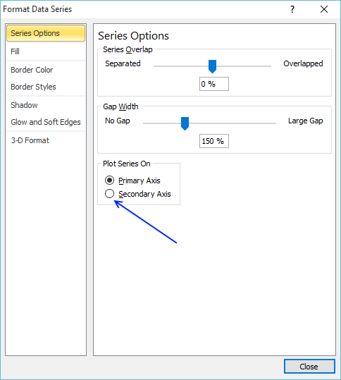
3.3 Plot series on the secondary axis
- Press with left mouse button on the second series on the chart
- Press with right mouse button on on a "second series" column

- Press with left mouse button on "Format Data Series..."
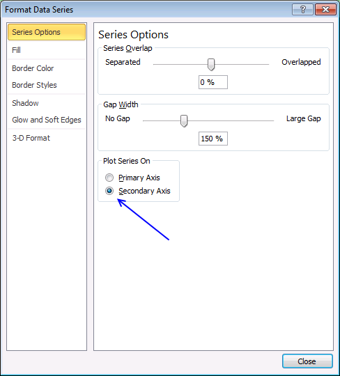
- Select "Secondary Axis"
- Press with left mouse button on Close
The following article shows you another trick using the secondary axis in a way it wasn't intended to do:
Recommended articles
This article demonstrates how to highlight a bar in a chart, it allows you to quickly bring attention to a […]
3.4 Change the second series data source
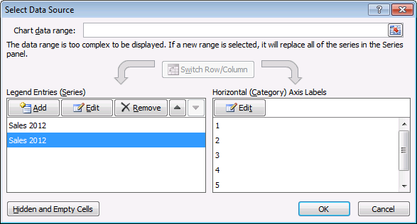
- Press with right mouse button on on the chart
- Press with left mouse button on "Select Data"
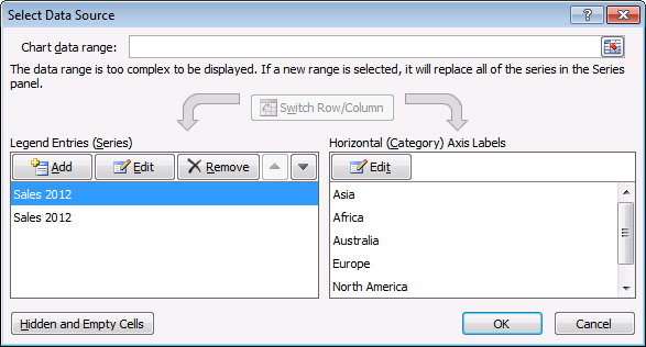
- Select the second series
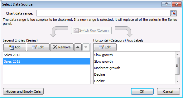
- Press with left mouse button on "Edit" button (Horizontal (Category) Axis Labels)
- Select cell range D3:D8
- Press with left mouse button on OK
- Press with left mouse button on OK
3.5 Add data labels
- Press with right mouse button on on a column
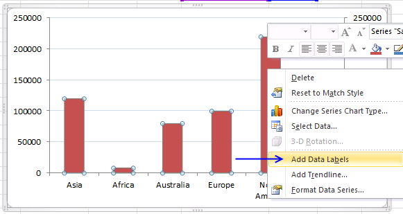
- Press with left mouse button on "Add Data Labels"
- Double press with left mouse button on a data label
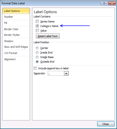
- Deselect Value
- Select Category name
- Press with left mouse button on Close
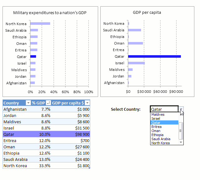
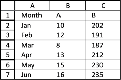
6. How to add a secondary axis to an Excel Chart

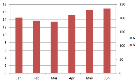
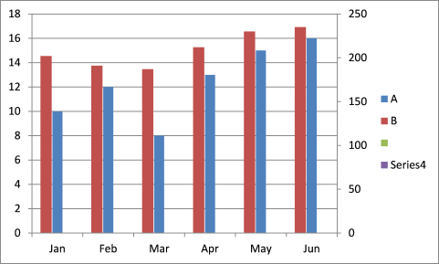
It might be impossible to read the smaller series values on the y-axis if you have two series of data plotted on a chart and one of the series has much smaller values, see the image above.
Data in series A on the Excel chart above is really hard to compare and analyze. You can solve this problem by moving series B to a secondary axis.
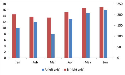
Follow these steps to add a secondary axis to an Excel Chart
- Press with right mouse button on on series B.
- Press with left mouse button on "Format Data Series...".
- Select "Secondary Axis".
- Press with left mouse button on Close button.
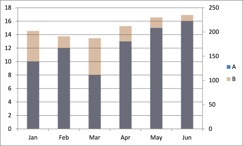
If you are unlucky, one of the data series is hidden. In this case, series A is totally hidden behind series B, see chart above. You can change the transparency for series B but in my opinion, it makes the chart better but not great.
Yes, you can see both data series but it is still a mess and the colors in the legend and the columns don't match, see chart above. Don't add transparency, try separating the two series instead. Instructions, below.
6.1 Add two blank series
This is the data I am working with.
Here is how to add a blank series.
- Press with right mouse button on on the chart.
- Press with mouse on "Select Data...".
- Press with left mouse button on the "Add" button, see the image below.
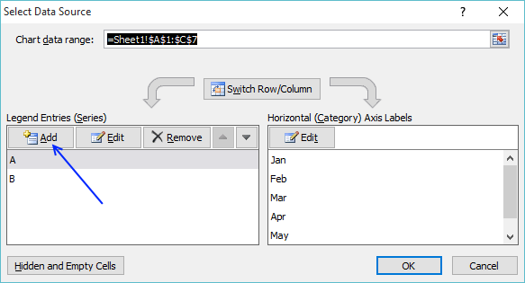
- Select a blank cell range, in this case D2:D7.
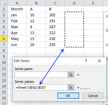
- Press with left mouse button on OK button.
Repeat steps 3 to 6 to add a fourth blank series, you can use the same cell range. Then press with left mouse button on the OK button. The chart now looks like this:
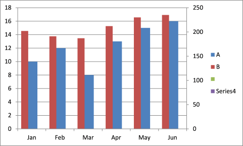
6.2 Add spaces between columns series
- Press with right mouse button on on series A on the chart.
- Press with left mouse button on "Format Data Series...".
- Add "Gap width" to 400%.
- Press with left mouse button on OK.
6.3 How to customize the chart legend
The steps below describe how to edit the legend and tell the user which chart series belong to which y-axis.
- Press with mouse on the empty legend entry and delete.
- Do the same with Series4.
- Move the legend below.
- Add more descriptive text.
- Delete grid lines.
7. How to add data labels to chart series

One way to make the second smaller series easier to read is to add labels to each column/bar, however, the size of the columns still makes it hard for a quick comparison.
- Press with right mouse button on on one of the second series' columns/bars.

- Press with mouse on "Add Data Labels".

This article explains how to customize data labels: How to add and customize chart data labels
8. Adjust axis min and max value

The image above displays a chart that has both the min and max values of the y-axis changed. This makes it easier to compare chart column sizes, however, it also may make the increase or decrease more pronounced and more serious than it really is.
- Press with right mouse button on on one y-axis.
- Press with mouse on "Format Axis...".
- A dialog box appears or a settings pane if you use a more recent Excel version.

- Change the minimum and the maximum values. Choose values that are closer to the largest and smallest series values.
- Exit the dialog box or settings pane.
Charts category
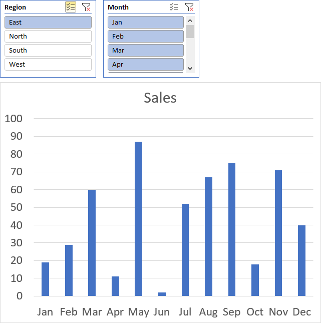
Table of Contents How to add lines between stacked columns/bars (Excel charts) Use slicers to quickly filter chart data How […]
Table of Contents How to create an interactive Excel chart How to filter chart data How to build an interactive […]
Table of Contents How to graph a normal distribution How to build an arrow chart How to graph an equation […]
Scatter x y chart category
Table of Contents How to graph a normal distribution How to build an arrow chart How to graph an equation […]
This tutorial shows you how to add a horizontal/vertical line to a chart. Excel allows you to combine two types […]
Excel categories
27 Responses to “How to improve your Excel Chart”
Leave a Reply
How to comment
How to add a formula to your comment
<code>Insert your formula here.</code>
Convert less than and larger than signs
Use html character entities instead of less than and larger than signs.
< becomes < and > becomes >
How to add VBA code to your comment
[vb 1="vbnet" language=","]
Put your VBA code here.
[/vb]
How to add a picture to your comment:
Upload picture to postimage.org or imgur
Paste image link to your comment.
Or for the slothful there's the beautiful free addin from Rob Covey called "XY Chart Labeler" and in it does just this very thing in couple of steps!
I have to try it!
Here is a link: https://www.appspro.com/Utilities/ChartLabeler.htm
Thank you for commenting!
I tried the solution above and it worked!
Tom,
I am happy you got it working!
I'm sure that's great for bar charts, but it doesn't work for x-y scatter plots. No matter what, the option to edit 'Horizontal (category) axis labels'(step 3 above) is always greyed out and thus unavailable. Any other options? It does seem daft that you can label x-y points on a 'map' with either x or y value, but not something useful....
After you have added the second series on the secondary axis (the copy of the first). Press with right mouse button and change the series chart type.
Select the clustered bar. Now it's changed to a bar chart that you will be able to change the horizontal axis label on it.
Once you have the labels in place then right press with mouse on the bar series and select 'format data series'. Now change the Fill to Solid Fill and make it the same color as the background. Now make the transparency 100%.
This should make your bar chart series 'disappear' but retain the labels.
Sean Foster,
Very interesting but I can't get that to work?
My workbook: https://www.get-digital-help.com/wp-content/uploads/2013/03/xy-scatter-chart-custom-labels1.xlsx
What am I doing wrong?
[…] demonstrated in a post from March 2013 how to create Custom data labels in a chart. Unfortunately that technique worked only for bar and column charts, there was no way you could […]
great
thanks
Oscar
Thanks a lot. It's very helpful hint.
Unfortunately it doesn't work with scatter plots.
Though i bet MS Office 2013 has some additional options for that.
Best regards
DP
Denis Pro
Thank you.
If you have excel 2013 you can use custom data labels on a scatter chart.
1. Right press with mouse on a series
2. Press with left mouse button on "Add Data Labels"
3. Right press with mouse again on a series
4. Press with left mouse button on "Format Data Labels"
5. Enable check box "Value from cells"
6. Select a cell range
7. Disable check box "Y Value"
Thank you very much! This and so many other basic aspects of something as basic to anyone who crunches numbers are so arcane in Excel, I was thinking I'd have to write some C# to do this. Thanks Oscar!
This does not appear to work, at least not with Excel for Mac. "Value From Cells" is not an option listed in the Data Label options. The only options given are Series Name, X Value, Y Value, and Bubble Size. On a more general note, Microsoft has consistently under-delivered with Office for Mac vs. their Windows edition. Charting options have improved a little but the UX is still woefully inadequate and convoluted.
Thank you for your Excel 2010 workaround for custom data labels in XY scatter charts. It basically works for me until I insert a new row in the worksheet associated with the chart. Doing so breaks the absolute references to data labels after the inserted row and Excel won't let me change the data labels to relative references. Do you know a work around for that?
Brian
Try building a named range.
1. Select the cell range you want to use.
2. Type the name of the named range in the name box (next to the formula bar).
3. Press Enter
4. Use the name in your chart. I believe you need to provide the sheet name as well. =Sheet1!NamedRange
¨Value from cells¨ does not appear in my Format Data Labels sidebar menu :/ Any ideas how to fix that? I would try work arounds but would prefer having the straightforward way available.
Thanks for the great article :)
Lora
Which Excel version do you use?
This doesn't work on the Mac version. I can get to "Format Data Labels", and there are choices for X value, Y value, Series Name, Show Leader Lines, and Legend Key, but not "Value from Cell". How do I do this on mac?
Someone wrote this comment on the Peltier blog:
The thing is that I work on a Mac and, as you already know, the “”Value from Cells” doesn’t exist. I had to open the file on a Windows computer, did the job, re-opened in my Mac again and it worked pretty well.
https://peltiertech.com/apply-custom-data-labels-to-charted-points/#comment-838263
My problem is I need to have data labels added automatically as data is added; however, I have multiple series feeding the scatter plot so the data labels are specific per series. Series 1: Column 1 = X Values; Column 2 = Y value; Column 3 = Bubble Size; Column 4 = Bubble (Data) Label and repeat this for an additional 56 series. Some cells will be blank as well so count 1 does not work for me (or at least not the code I was using).
I can rearrange my columns; however, I need to accomplish the automatic population of data labels.
Great!
I have one problem and that is in the script you use for the work around for older excel versions.
In the last step of the for loop:
SerPo(i).DataLabel.Formula = "=" & ActiveSheet.Name _
& "!" & Rng.Cells(i).Address(ReferenceStyle:=xlR1C1)
This only works with DATA on the same sheet as the scatter graph to be used as labels.
I have my DATA on another sheet and not the same active sheet as the scatter graph.
How would you modify this so DATA on a different sheet can be used as data labels?
Thanks!
Thanks for sharing a really useful and cool chart trick.
Thanks for this article! Helped me a lot.
How to show a connector indicating which data value is allocated to which data level??
Many thanks Oscar, finding out how to add labels to scatterplots is a game changer. I'm sure I'll be back to learn some of the other chart enhancements!
Oscar: Really appreciate this article on data labels. Well done. I had been tinkering with trying to substitute a letter for the line and this did the trick. (Letters would allow the reader to better identify the data since I was using color for a different purpose and line shape (i.e. dotted) also for a different purpose. Fabulous article. James
James D Russel,
thank you.