How to create charts in Excel
What is on this page?
- Built-in charts
- How to create a column chart
- How to create a stacked column chart
- How to create a 100% stacked column chart
- How to create a bar chart
- How to create a line chart
- How to create an area chart
- How to create a pie chart
- How to create a doughnut chart
- How to create a scatter chart
- How to create a bubble chart
- How to create a waterfall chart
- How to create a funnel chart
- How to create a stock chart
- How to create a candlestick chart
- How to create a surface chart
- How to create a radar chart
- How to create a treemap chart
- How to create a sunburst chart
- How to create a histogram chart
- How to create a pareto chart
- How to create a Box and Whisker chart
- How to create a map chart
- Combined charts
- Spark lines
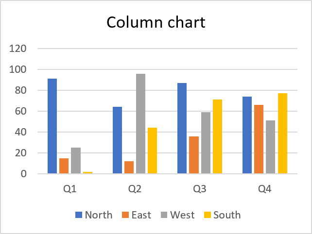
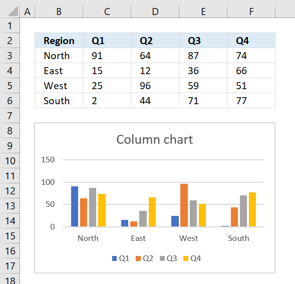
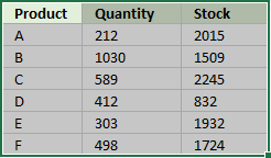
1. How to create a column chart
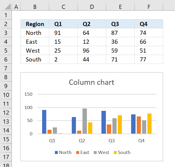
The clustered column chart allows you to graph data in vertical bars, this layout makes it easy to compare values across categories.
Use this chart type when order of categories is not important. The categories are displayed on the x-axis.
Instructions
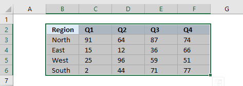
- Select the data you want to graph.
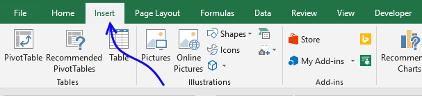
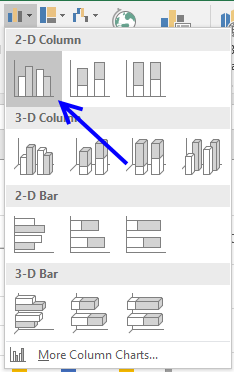
- Go to tab "Insert" on the ribbon.
- Press with mouse on the column chart button.
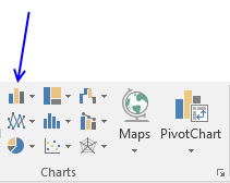
- Press with mouse on "Clustered" column chart button.
The chart is now visible on your worksheet. Press and hold with left mouse to drag the chart to the desired location.
Tip! If you want to switch series and categories follow these steps.
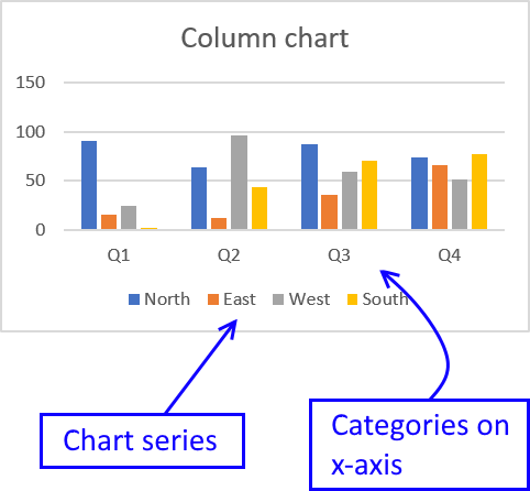
- Press with right mouse button on on the chart.

- Press with mouse on "Select Data...".
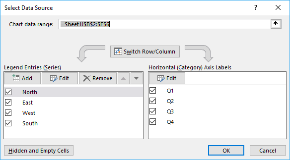
- Press with mouse on "Switch Row/Column" button
2. How to create a stacked column chart
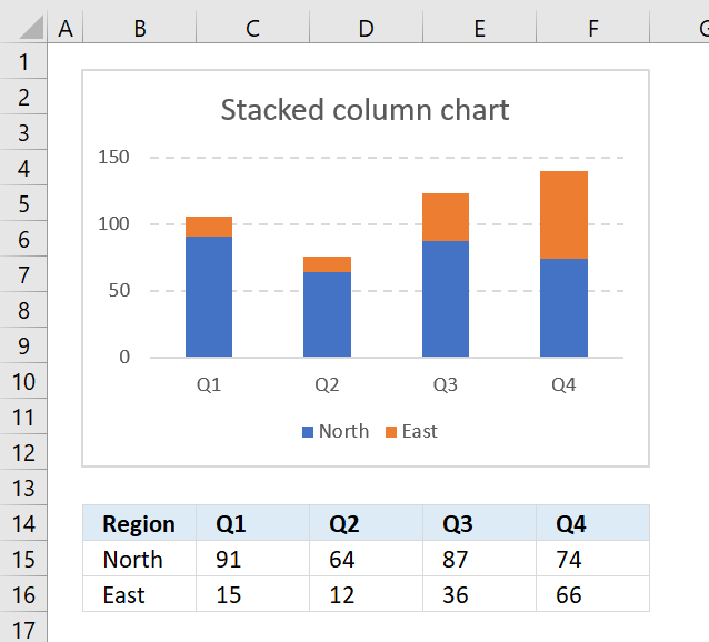
The stacked column chart is great for comparing parts of a whole and how they change over time or categories.
Unfortunately, the stacked column chart becomes more cluttered as you add more series to the chart.
This makes it a lot harder to compare parts across the x-axis, see picture below.
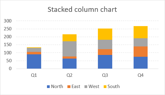
The first series "North" is easy to compare as each part is aligned to the x-axis, however, the remaining series are a lot more difficult to discern and also compare.
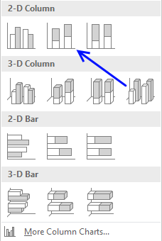
Step by step guide to insert a stacked column chart
Here are the instructions on how to insert a stacked column chart to you workbook:
- Select the data you want to chart.
- Go to tab "Insert" on the ribbon.
- Press with mouse on "Column" chart button.
- Press with mouse on "Stacked Column Chart" button.
To move the chart to the location you want simply press and hold with left mouse button on the chart and drag to the location.
Now resize or perhaps align the chart to the cell grid if you prefer.
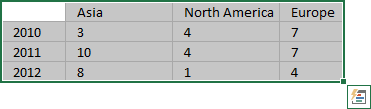
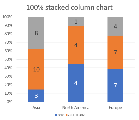
3. How to create a 100% stacked column chart

The 100% stacked column chart lets you graph values in a group. Each value in a group is a stacked column and the total of the stacked columns is always 100%.
The image above shows numbers for 2010,2011 and 2012 grouped for each region. The values are relative to each group meaning you can't compare values for 2010 between, for example, North America and Europe.
I tell you why, the column for 2010 in group North America is bigger than the corresponding column for Europe, however, if you look at the values below the chart you will see that the number is actually larger for Europe than North America.
Why is that? Because the columns are relative in size to each region, not to each year. This makes the chart useful for comparing values to other values in the same stacked column.
Obviously, the chart is pointless if you have many data points in each group making the chart really hard to read.
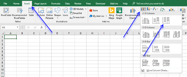
Build the chart
- Select the cell range you want to chart.
- Go to tab "Insert" on the ribbon.
- Press with left mouse button on "100% stacked column" button.
Make the chart easier to read
What can you do to make the chart easier to read? Display the values as data labels on the columns.
- Press with right mouse button on on a stacked column
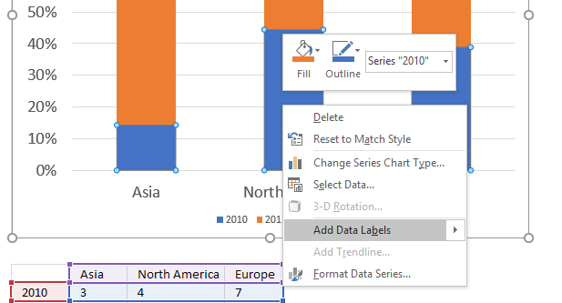
- Press with left mouse button on "Add Data Labels"
- Repeat step 1 and 2 for each column color.
- Select the data labels and change the font size and color if needed.
Arrange values
You may need to rearrange values in order to build a 100% stacked column chart.
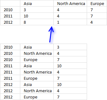
Building a pivot table might be what you are looking for before you create a 100% stacked column chart.
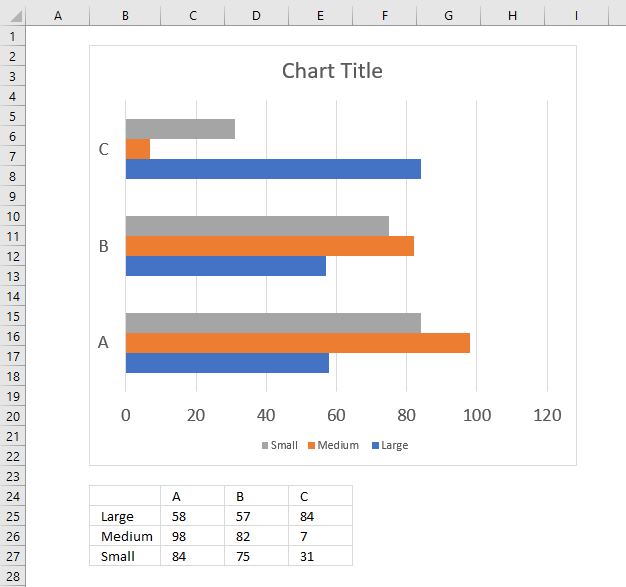
4. How to create a bar chart
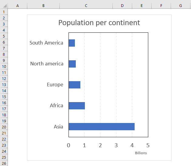
The bar chart is simply a column chart rotated 90 degrees right, this makes it great if you have long item names.
It lets you easily compare values across items and categories making it probably one of the most used charts in Excel.
How to build
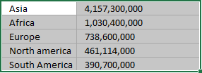
- Select the cell range that contains the values you want to chart.
- Go to tab "Insert" on the ribbon.
- Press with left mouse button on the "Column or Bar Chart" button.
- Press with left mouse button on the "Clustered Bar" button.
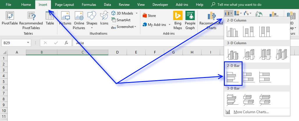
Chart multiple categories
Simply arrange your values as shown in the above image to easily build a bar chart containing values across multiple categories.
5. How to create a line chart
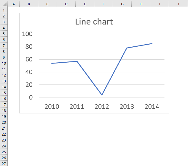
The line chart lets you chart data points as a line, this chart type is useful if you have many data points. It allows you to show values over time or categories, use this chart if the order of x values are important.
The data points are connected with lines so the order of categories or dates is really important with this chart. Example, you don't want x-axis values to be in this order 2015, 2010, 2014, 2011, 2013, 2012 if you are trying to see trends over years.
If your data is distributed evenly over, for example, years then the line chart is an excellent option, however, if your data is unevenly distributed then use the scatter chart. Use a line chart if your data contains non-numeric x values and scatter chart for numeric x values, scatter charts gives you better options to customize the x-axis.
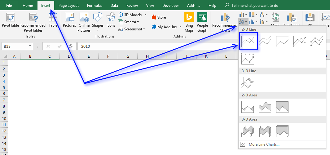
How to build the chart
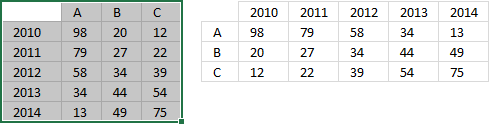
- Select the data points. They don't need to be arranged row-wise or column-wise specifically, both work fine.
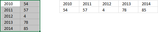
The above picture shows how the values may be arranged. - Go to tab "Insert" on the ribbon.
- Press with left mouse button on the "Insert Line or Area Chart" button to see chart types in this category.
- Press with left mouse button on the Line Chart" button.
How to use multiple data series
- Select the data points you want to chart. Excel behaves intelligently here, you can have the data points arranged like the values to the right of the selection as well, in the image below.
The result will be the same. - Go to tab "Insert" on the ribbon.
- Press with left mouse button on the "Insert Line or Area Chart" button to see chart types in this category.
- Press with left mouse button on the Line Chart" button.
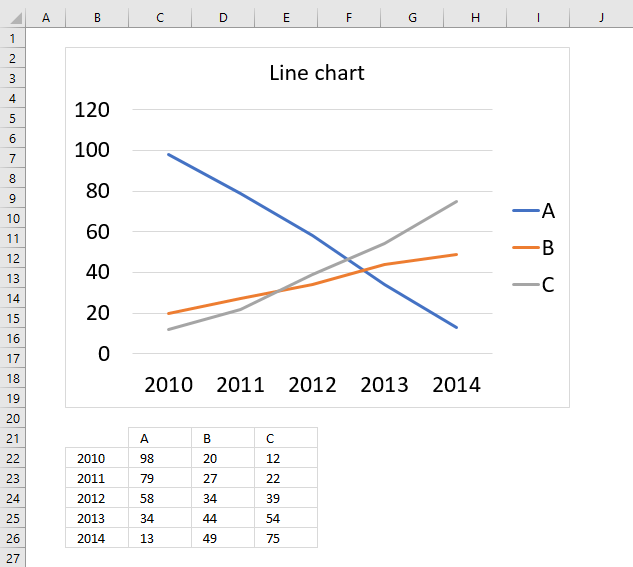
The following chart demonstrates three data point series in a line chart and the source data below the chart.
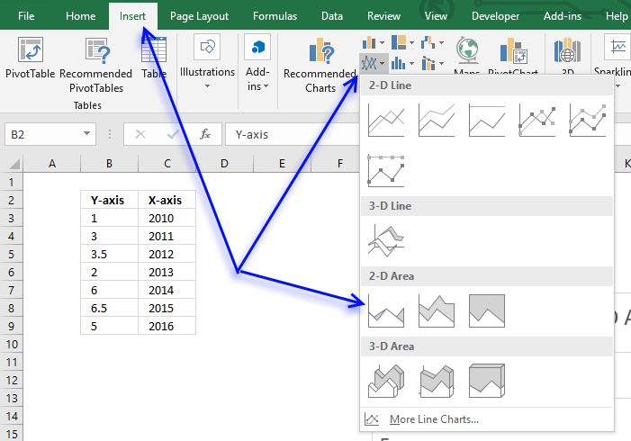
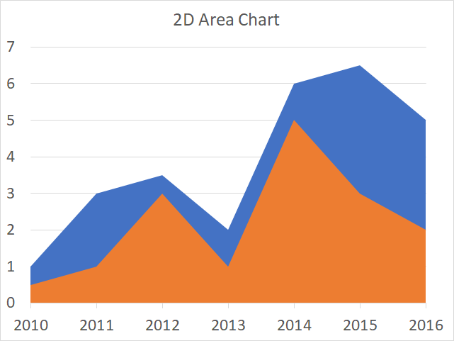
6. How to create an area chart
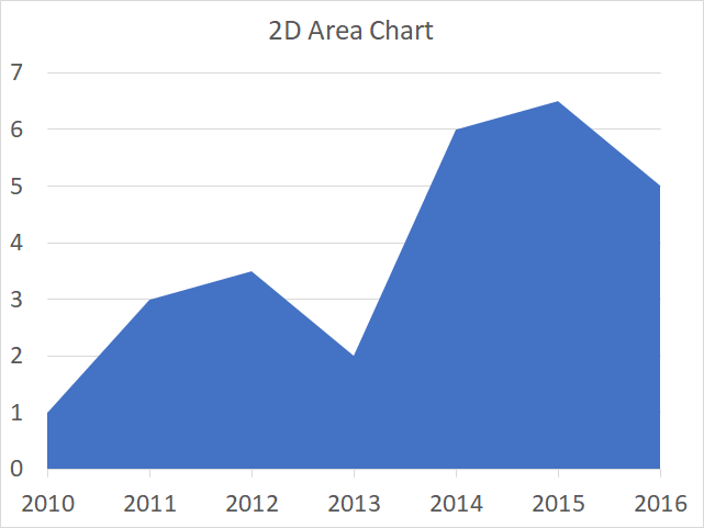
The area chart is similar to the line chart except that the area below the line is filled, use this chart to plot data over time or categories (non-numeric).
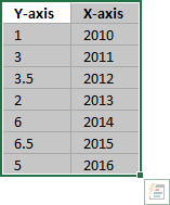
The time interval must be evenly distributed, use the scatter chart if not. The image above demonstrates time values (years) evenly distributed from 2010 to 2016 (x-axis).
How to build
- Select the data you want to graph.
- Go to tab "Insert".
- Press with left mouse button on the "Insert line or area chart" button.
- Press with left mouse button on the "Area" button.
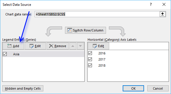
How to add a second series
- Press with right mouse button on on chart.
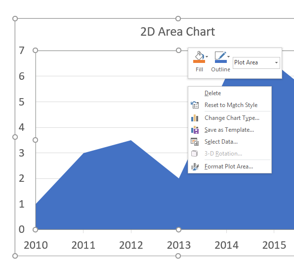
- Press with mouse on "Select Data...".
- Press with left mouse button on "Add" button.
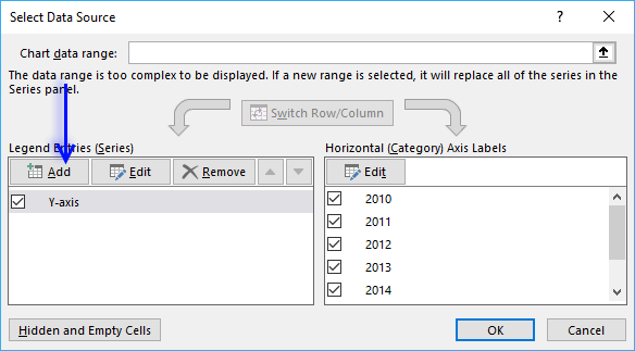
- Press with left mouse button on "Series values:" button.
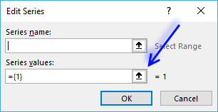
- Select the data source.
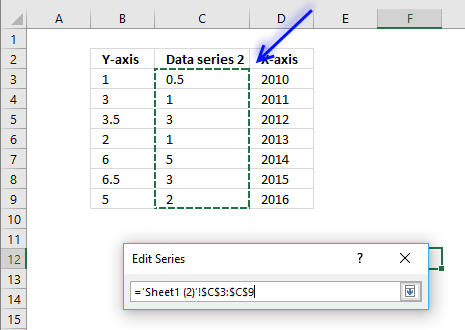
- Press Enter
- Press with left mouse button on OK button.
- Press with left mouse button on OK button.
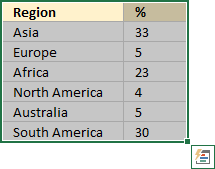
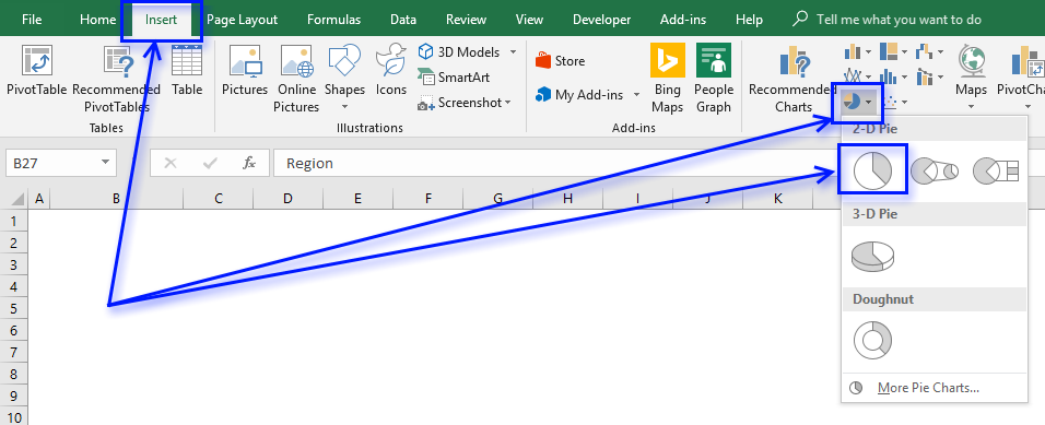
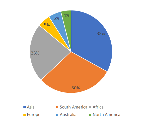
7. How to create a pie chart
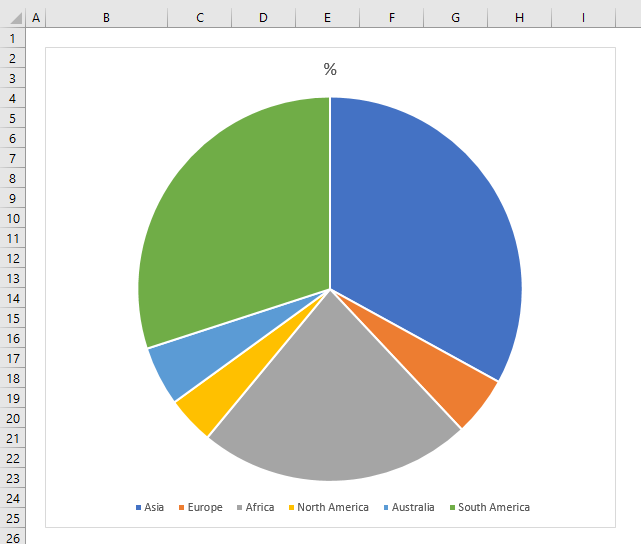
The pie chart is used to graph parts of a whole, the total of our numbers must be 100%. The pie chart is, unfortunately, one of the most use charts, you see them often in newspapers and magazines. You shouldn't use them at all, in my opinion, they are hard to read and not that useful.
How to build
- Select the cell range that contains the values you want to chart.
- Go to tab "Insert" on the ribbon.
- Press with left mouse button on the "Pie or Doughnut Chart" button.
- Press with left mouse button on the "Pie Chart" button.
Improve the pie chart
There are a few things we can do to make the pie chart a little easier to read.
Add data labels
- Press with right mouse button on on chart to open a menu.
- Press with mouse on "Add Data Labels".
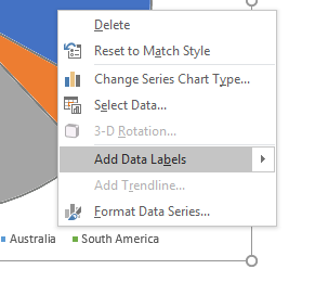
- Select the data labels and change the font size.
Sort values
- Press with right mouse button on on one of the chart data source values.
- Press with left mouse button on "Sort" then press with left mouse button on "Sort Largest to Smallest".
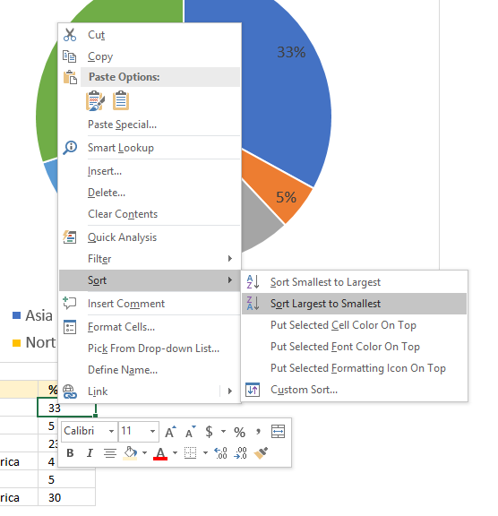
The chart pies are now sorted from largest to smallest and the data labels show how large they are.
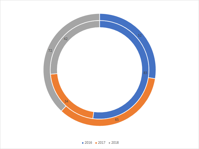
8. How to create a doughnut chart
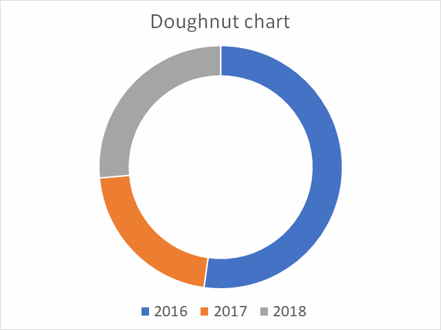
A doughnut chart is just like a pie chart showing the relationships of segments to a total except that the it also may contain multiple data series. Each ring in the chart represents a data series and the first series is closest to the center of the ring.
The doughnut chart is not a chart that I would recommend, it has the same issues as the pie chart, but also the rings are distorted because of their different sizes. This makes it really hard to compare the parts between rings, data labels must be used. The nature of this chart also makes it not practical to include more than 7 categories, each part becoming smaller and smaller for each category you add.
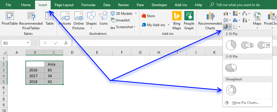
How to build
- Select data.
- Go to tab "Insert" on the ribbon.
- Press with mouse on "Insert Pie or Doughnut Chart" button.
- Press with left mouse button on the "Doughnut" button.
Add a second series
- Press with right mouse button on on chart.
- Press with mouse on "Select Data...".
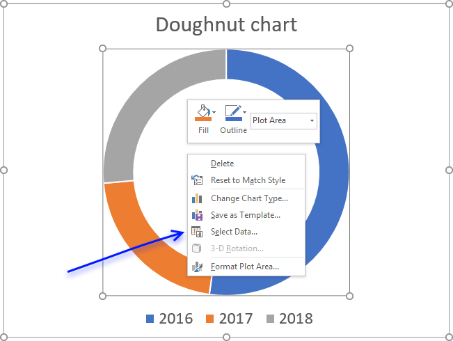
- Press with left mouse button on "Add" button.
- Select the new series values you want to add to the chart.
- Select the series name as well.
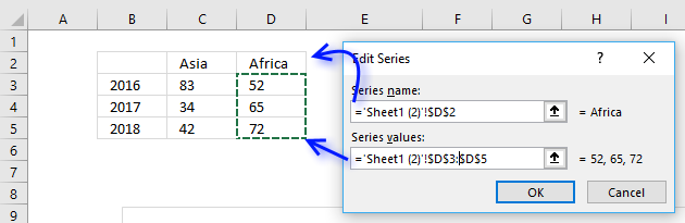
- Press with left mouse button on OK button.
- Press with left mouse button on OK button.
Add data labels
- Press with right mouse button on on a ring.
- Press with mouse on "Add Data Labels..."
- Repeat step 1 - 2 with remaining doughnut rings.
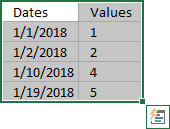
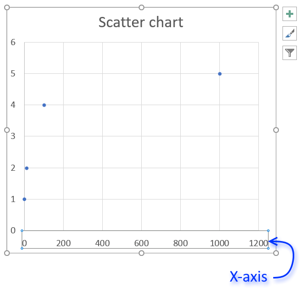
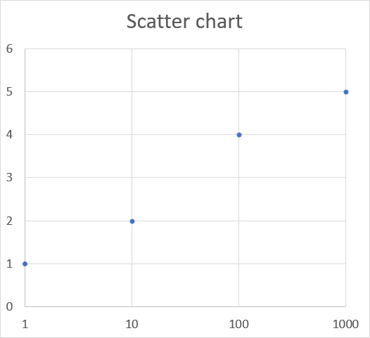
9. How to create a scatter chart
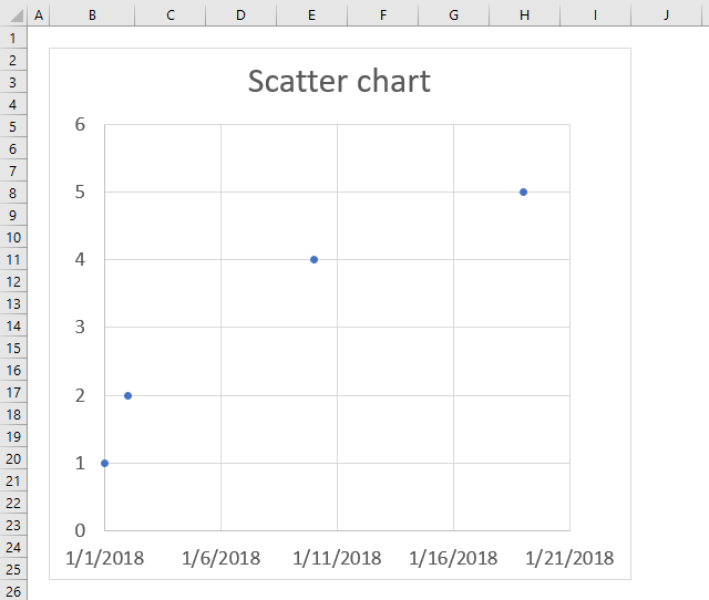
The scatter chart is great for charting numeric values in pairs, for example, coordinates. It lets you compare multiple data series easily and you have more options when it comes to the axis settings than the line chart.
The scatter chart is an excellent choice if you want to graph data from engineering, science, and statistics. The image above shows data distributed unevenly across the x-axis, unlike the line chart.
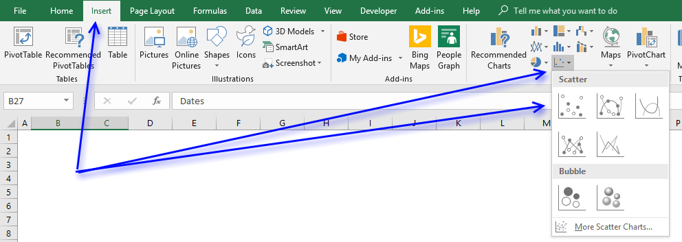
How to build the chart
- Select the data.
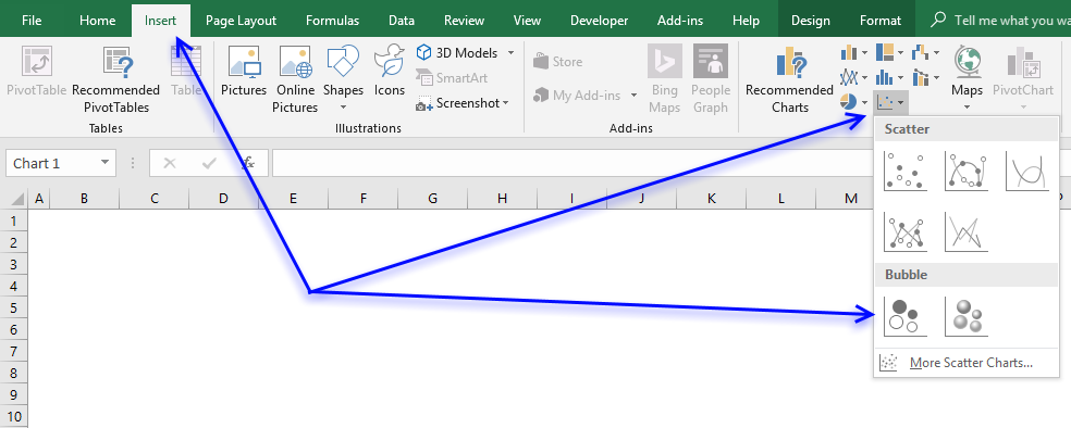
- Go to tab "Insert" on the ribbon.
- Press with left mouse button on the "Insert (x,y) scatter or bubble chart" button.
- Press with left mouse button on the "Scatter" button.
X-axis logarithmic
The scatter chart lets you plot data with an x-axis set to logarithmic.
- Double press with left mouse button on with left mouse button on x-axis.
- Go to the "Axis Options" on the settings pane.
- Press with mouse on check box "Logarithmic scale".
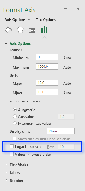
- Change the base to 10.
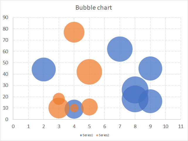
10. How to create a bubble chart
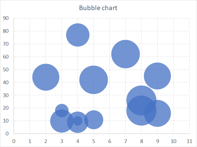
The bubble chart allows you to plot data just like the scatter chart but also the size of the bubbles.
How to build
- Select data.
- Go to tab"Insert" on the ribbon.
- Press with left mouse button on "Insert scatter or bubble chart" button.
- Press with left mouse button on the "Bubble" button to insert a bubble chart to your worksheet.
Build a chart with 2 or more data series
- Press with right mouse button on on bubble chart.
- Press with left mouse button on "Select Data...".
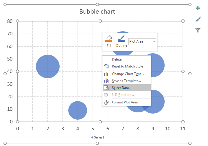
- Press with left mouse button on "Add" button.
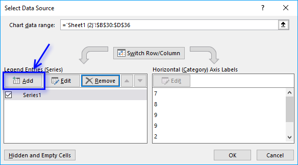
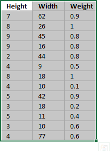
- Select the data for x, y and bubble sizes.
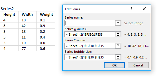
- Press with left mouse button on OK button.
- Press with left mouse button on OK button.
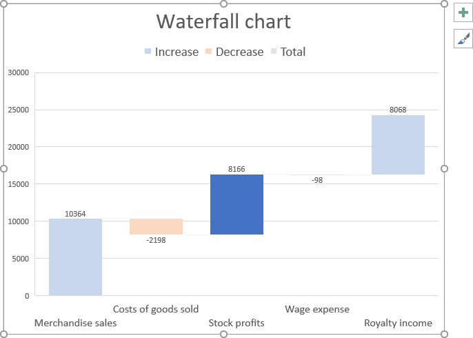
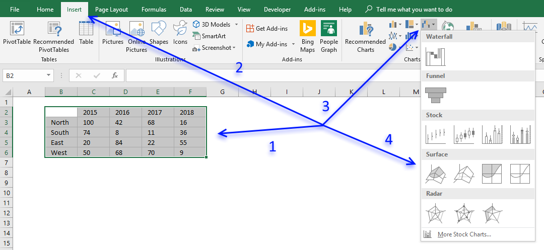
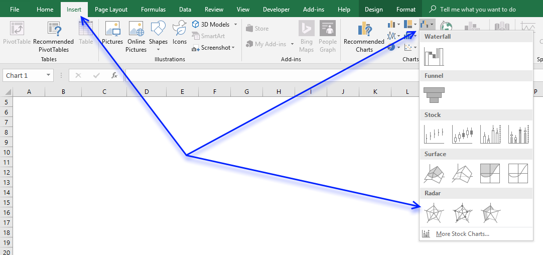
11. How to create a waterfall chart
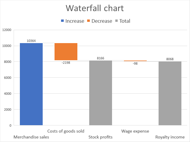
The waterfall chart allows you to plot values as bars, however, depending on whether they are negative or positive numbers the total is added or subtracted. The columns have different colors based on if the value is less than 0 (zero) or larger than 0 (zero) and they are connected with lines to make it easier for the reader to follow.
The waterfall chart is great for displaying financial information like income statements. It shows the cumulative effect for each activity and the outcome.
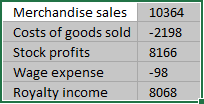
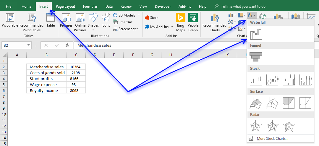
How to build
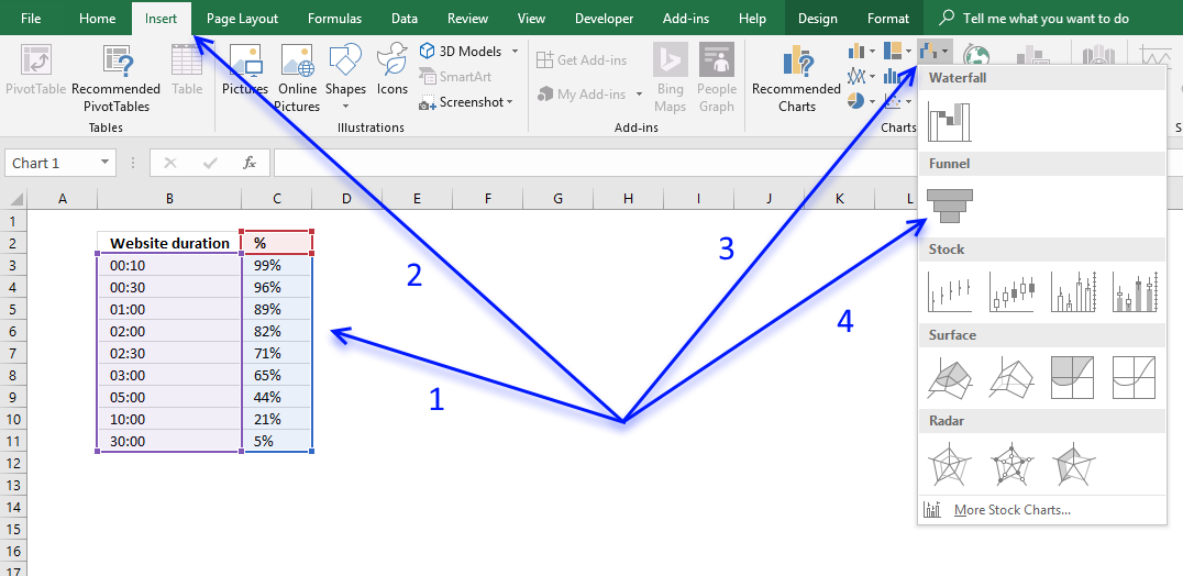
- Select data.
- Go to tab "Insert" on the ribbon.
- Press with left mouse button on "Insert Waterfall, Funnel, Stock, Surface or Radar chart" button
- Press with left mouse button on "Waterfall chart" button.
- The chart now looks like this.
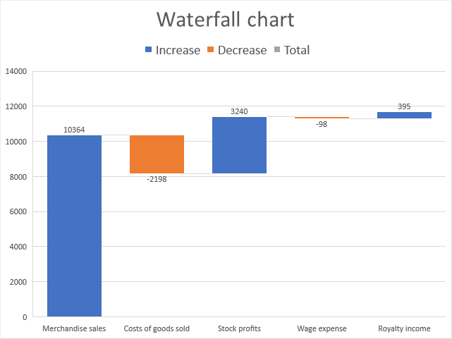
- Double press with left mouse button on on chart column "Costs of goods sold" to open the task pane.
- Press with mouse on chart column "Costs of goods sold" until only the column is selected The other columns are faded out if only one column is selected.
- Press with left mouse button on checkbox "Set as total".
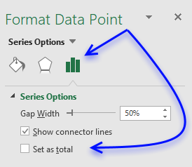
- Repeat step 7 - 8 with remaining columns containing positive values.
12. How to create a funnel chart
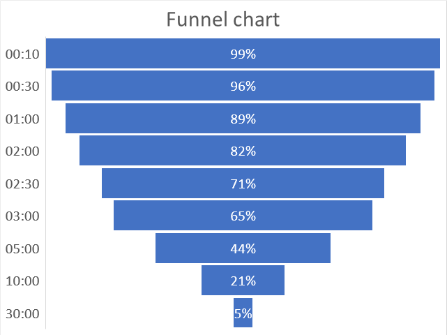
A funnel chart is mostly used to display a series of steps within a process, each step shows a proportion of a total that decreases from top to bottom. The top part is called the head and the bottom is the neck.
How to build
- Select data.
- Go to tab "Insert" on the ribbon.
- Press with left mouse button on the "Insert Waterfall, Funnel, Stock, Surface or Radar chart" button.
- Press with left mouse button on the "Funnel chart" button.
(Press with left mouse button on to see full image)
13. How to create a stock chart
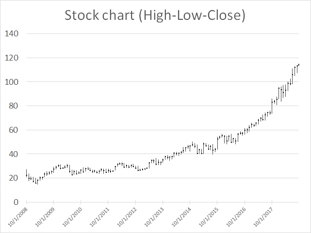
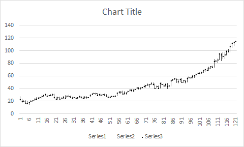
The high-low-close stock chart displays the high, low and closing price for a given date range. Each line represents a day, week, month or year determined by your data values. The image above shows a monthly stock chart from year 2009 to 2018.
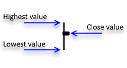
The highest/smallest value is the value that the stock was traded during that particular day/week/month or year. The close price is the marker shown above, it indicates the price the last trade for that given day/week/month or year was traded at.
13.1 How to build
- Select data. It must be arranged High-Low-Close.
- Go to tab "Insert" on the ribbon.
- Press with left mouse button on the "Insert Waterfall, Funnel, Stock, Surface, or Radar Chart" button.
- Press with left mouse button on the "High-Low-Close" button.
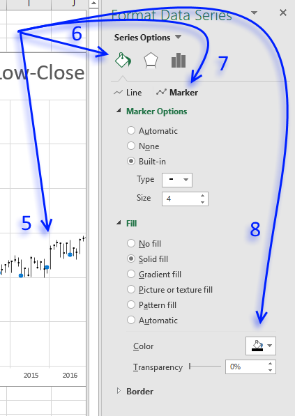
- To change the color of the marker double press with left mouse button on the data series, this opens the task pane.
- Press with left mouse button on "Fill & Line".
- Press with left mouse button on "Marker".
- Pick a "Fill" and "Border" marker color, I chose black.
13.2 Add dates to x-axis
- Press with right mouse button on on chart.
- Press with left mouse button on "Select Data...".
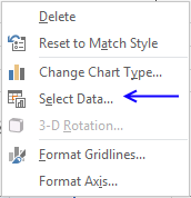
- Press with left mouse button on "Edit" button.
- Select your date values.
- Press with left mouse button on OK button.
- Press with left mouse button on OK button.
13.3 Create a stock chart in excel 2003
This tutorial will show you how to create stock charts in excel 2003.
13.4 How to copy historical stock prices to excel
Search for a company in Yahoo Finance and go to historical prices. Select and copy historical prices.

Go back to excel. Paste the values to a sheet.
13.5 Insert the stock chart
Select the data below "High", "Low" and "Close" in your excel sheet.

Go to "Insert" and press with left mouse button on "Chart..." in the top menu in Excel.

Press "Finish".
Chart settings
To change the gray background to white, press with right mouse button on the grey area and select "Format plot area". Select a background color.

13.6 Create a stock chart in excel 2007/2010
To make things more interesting than copying historical prices from yahoo I am going to use a modified version of the user defined function in this post:
Excel udf: Import historical stock prices from yahoo – added features
The user defined function makes it easy to import historical prices from yahoo finance.

This chart is a mess.

13.7 Change the vertical axis minimum and maximum values
- Select vertical axis
- Press with right mouse button on on vertical axis
- Press with left mouse button on "Format Axis..."

- Press with left mouse button on Minimum: Fixed and type 24
- Press with left mouse button on Maximum: Fixed and type 32

- Press with left mouse button on Close
13.8 Add months to stock chart
In cell A1 type : Months
In cell A2:
=TEXT(B2, "MMM")
In cell A3:
=IF(TEXT(B3, "MMM")=TEXT(B2, "MMM"), "", TEXT(B3, "MMM"))
Copy cell A3 and paste down as far as needed.
- Select stock chart
- Press with right mouse button on on stock chart
- Press with left mouse button on "Select Data"

- Press with left mouse button on "Edit" button
- Select cell range A2:A113
- Press with left mouse button on OK
- Press with left mouse button on OK
- Select horizontal axis
- Press with right mouse button on on horizontal axis
- Press with left mouse button on "Format Axis..."
- Go to "Alignment"
- Change custom angle to 1
- Press with left mouse button on Close

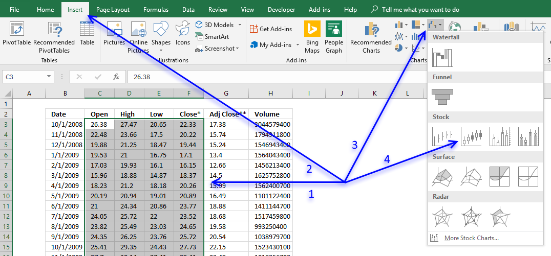
14. How to create a candlestick chart
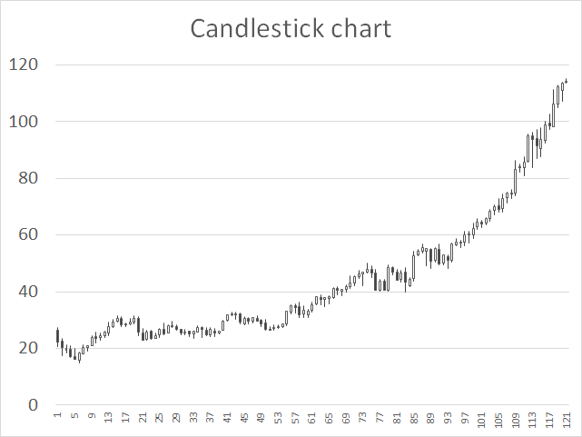
The candlestick chart allows you to plot price movements of stocks, derivates, bonds and currencies.
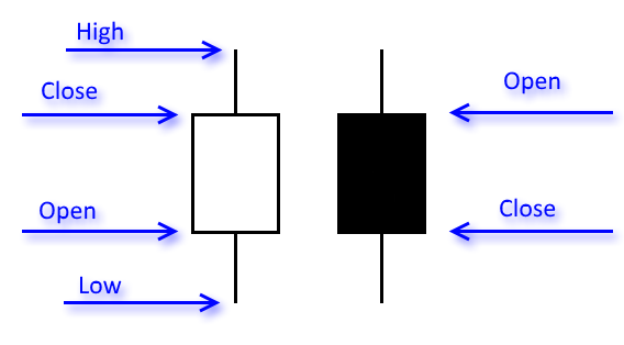
A black candlestick in Excel tells you that the closing price is below the opening price and a white candlestick indicates that the closing price is above the opening price.
How to build
- Select data.
- Go to tab "Insert" on the ribbon.
- Press with left mouse button on the "Insert Waterfall, Funnel, Stock, Surface or Radar chart" button.
- Press with left mouse button on the "Open-High-Low-Close" button.
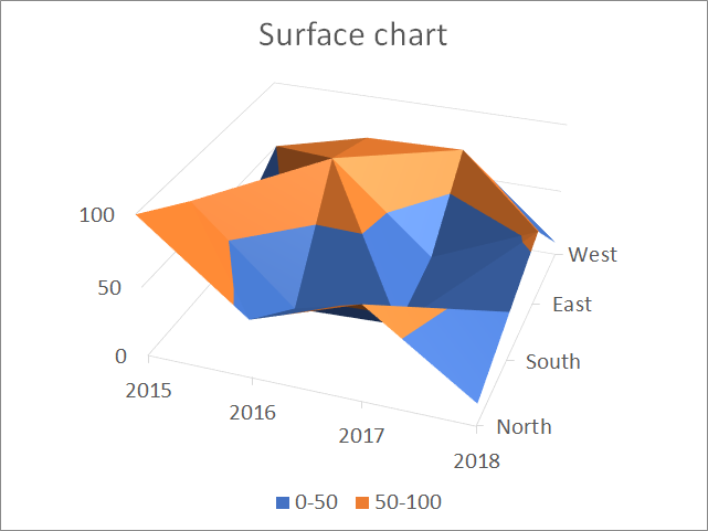
15. How to create a surface chart
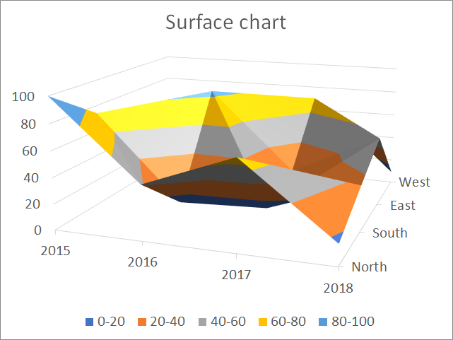
The surface chart allows you to graph multiple data series in a 3D chart, color-coded to make the chart easier to read, however, as you perhaps already have discovered, data series may obscure each other depending on rotation and perspective.
How to build
- Select data.
- Go to tab "Insert" on the ribbon.
- Press with left mouse button on the "Insert Waterfall, Funnel, Stock, Surface or Radar chart" button.
- Press with left mouse button on the "Surface chart" button.
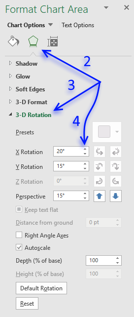
Rotate chart
It is possible to rotate the chart if one or more data points are hidden. Here is how:
- Double press with left mouse button on the chart to open the settings pane.
- Press with left mouse button on the "Effects" button on the top menu.
- Press with left mouse button on "3-D Rotation" to expand settings.
- Press with left mouse button on the arrow buttons to change the x, y rotation and perspective or simply type the value you want in the corresponding fields.
16. How to create a radar chart
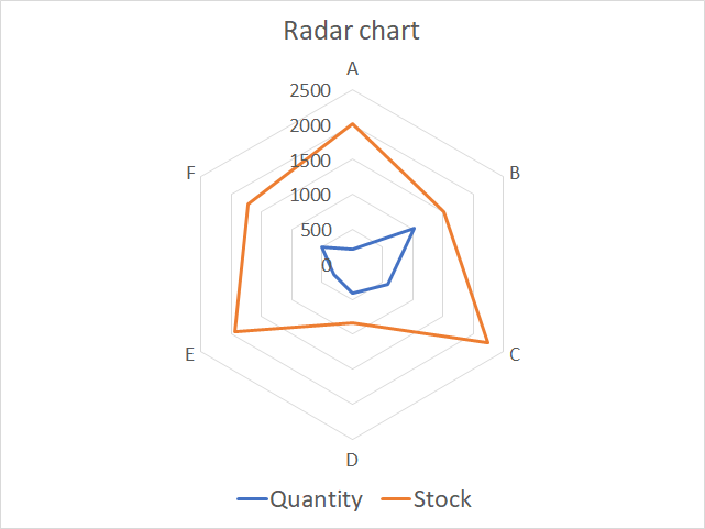
The radar chart allows you to plot values based on a center point and outwards to categories you specify. Each corner in the chart is a category that makes it look like a spider web. The data series has to be somewhat in the same numerical range or the chart will be hard to read.
This chart is known as a spider, web, star, cobweb, kiviat or polar chart and is often used to graph multivariate observations in statistics, where each corner shows a single observation.
It is hard to compare values despite the gridlines, however, it is easy to spot a data point that is far out from the others.
How to build
- Select the data.
- Go to tab "Insert" on the ribbon.
- Press with left mouse button on the "Insert waterfall, funnel, stock, surface radar chart" button.
- Press with left mouse button on the "Radar chart" button.
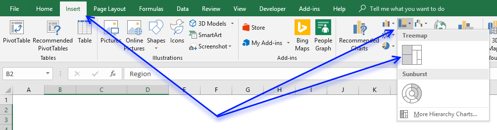
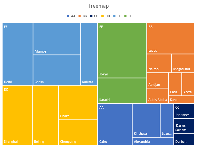
17. How to create a treemap chart
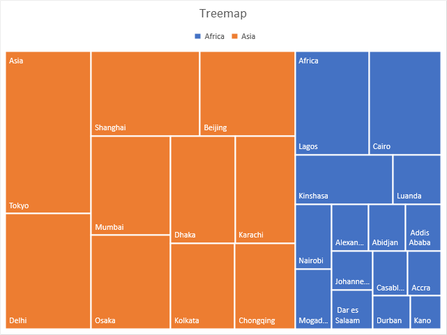
Use the treemap chart when you want to compare segments to a total and you have categories in a hierarchy. The treemap chart is best for categories with few hierarchy levels, use the sunburst chart if you have many hierarchy levels.
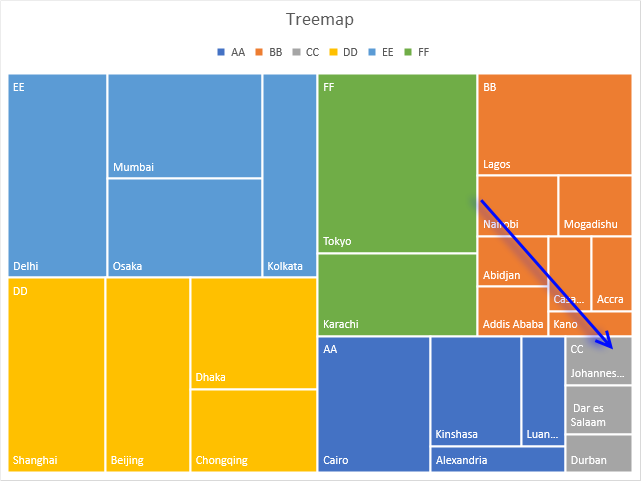
The treemap chart graphs data as rectangles and the color represents the category, the rectangles allows you to compare the values since the proportions are relative to each other and the whole.
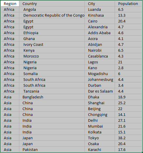
The chart above shows the largest cities in Africa and Asia, cities in Asia are colored orange and blue for Africa. The largest rectangle is Tokyo and it corresponds to the population in Tokyo.
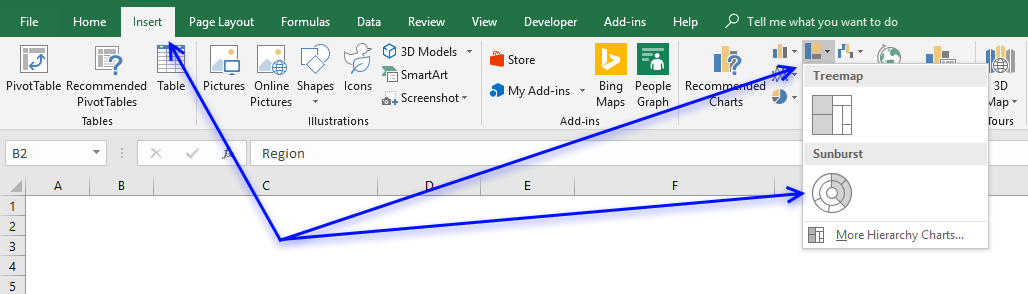
How to build
- Select data.
- Go to tab "Insert" on the ribbon.
- Press with left mouse button on the "Insert hierarchy chart" button.
- Press with left mouse button on the "Treemap" button.
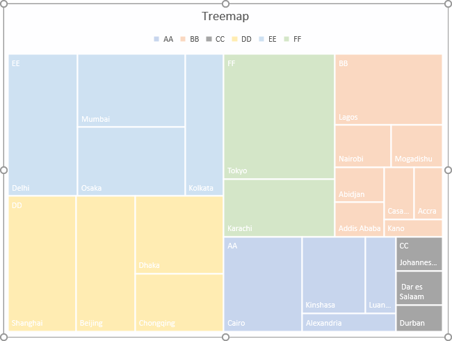
How to change the color of a category
I want to change the color of all rectangles in category CC, see picture above. To change the category color follow these steps.
- Press with mouse on a rectangle that belongs to category CC repeatedly until all rectangles in category CC are selected.
The other rectangles are now faded.
- Go to tab "Home" on the ribbon.
- Press with left mouse button on the "Fill color" button and pick a color.
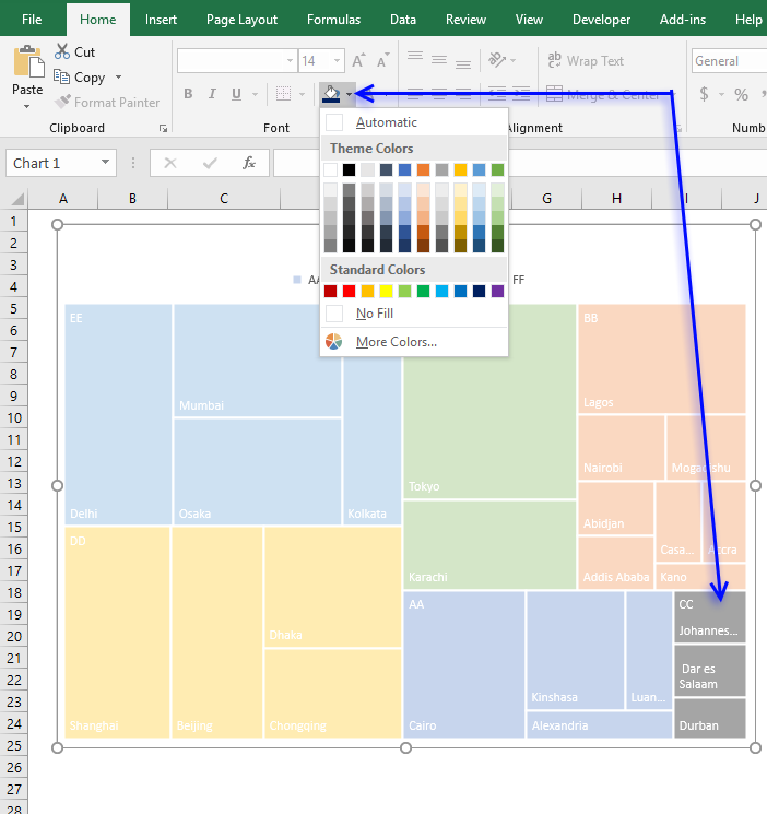
- The rectangles in category CC have now changed color.
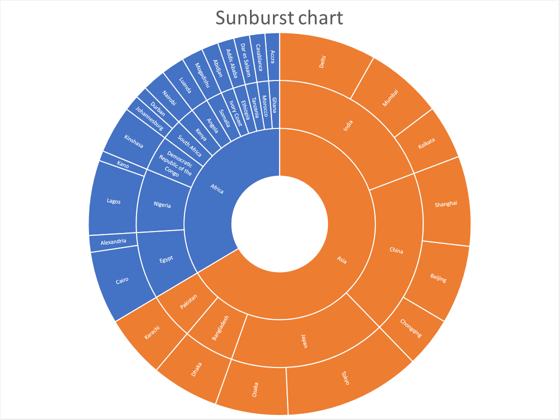
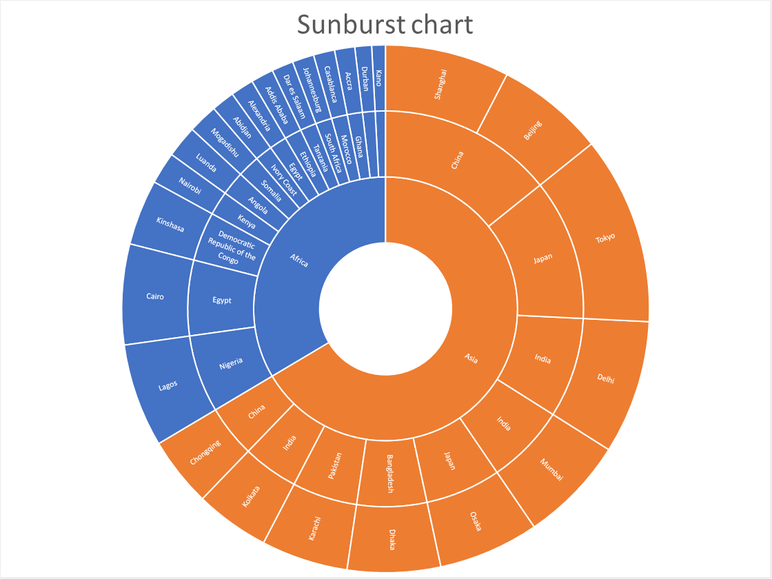
18. How to create a sunburst chart
(Press with left mouse button on to expand image)
The sunburst chart is great for showing relationships of hierarchical data and their sizes. Each ring corresponds to a level in the hierarchy. A sunburst chart is more advanced than the doughnut chart as it not only shows the sizes but also shows the relationships in the hierarchy.
The data labels make the sunburst chart quickly quite big if you have much data to graph, a smaller sunburst chart hides the data labels. The treemap is a better choice if you want to more easily compare their sizes.
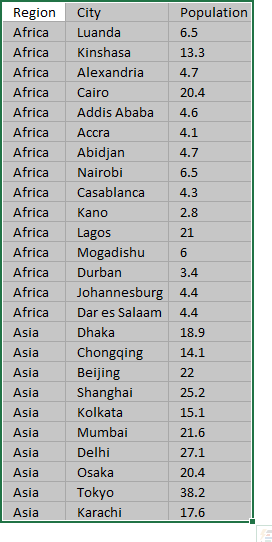
The image above shows the largest city populations in Africa and Asia.
How to build
- Select the data set.
- Go to tab "Insert" on the ribbon.
- Press with left mouse button on the "Insert Hierarchy chart" button.
- Press with left mouse button on the "Sunburst chart" button.
Sort outer ring categories based on value
The sunburst chart will break if you try to sort the data based only on population, you need to have the first hierarchy level sorted and then sort on population. Follow these steps:
- Press with right mouse button on on a cell in your data source.
- Press with mouse on "Sort".
- Press with mouse on "Custom Sort..."
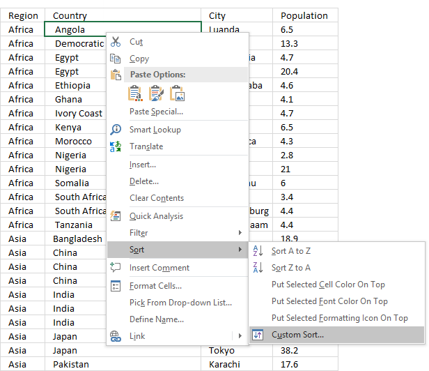
- Sort on the first hierarchy level (Region) and A to Z.
- Press with left mouse button on "Add Level" button to add another level.
- Select "Population" and "Largest to Smallest" in the drop-down lists.
- Press with left mouse button on OK button.
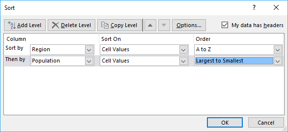
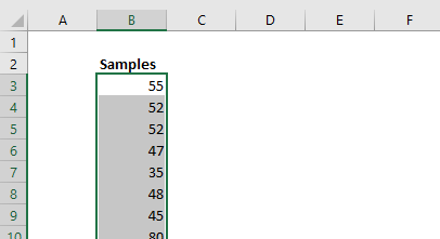
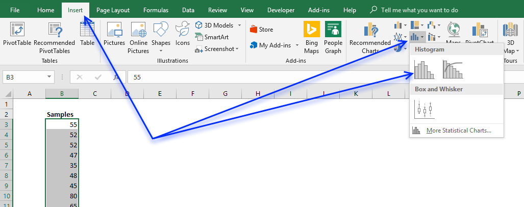
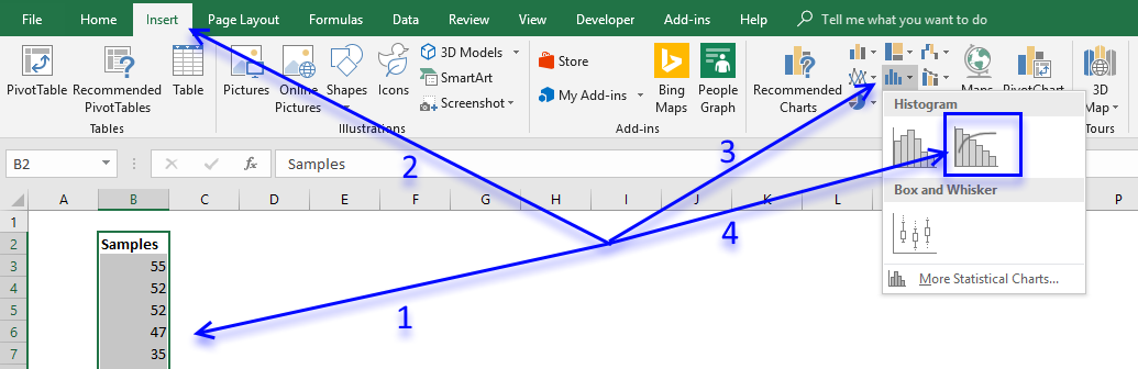
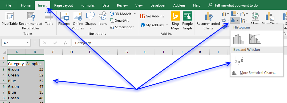
19. How to create a histogram chart
The histogram chart lets you automatically group data values in intervals you specify, it is often used in statistics to show how data is distributed.
How to build
- Select data.
- Go to tab "Insert" on the ribbon.
- Press with left mouse button on the "Statistic chart" button.
- Press with left mouse button on the "Histogram" button.
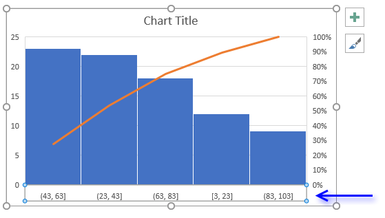
- Double-press with left mouse button on the x-axis to open the task pane.
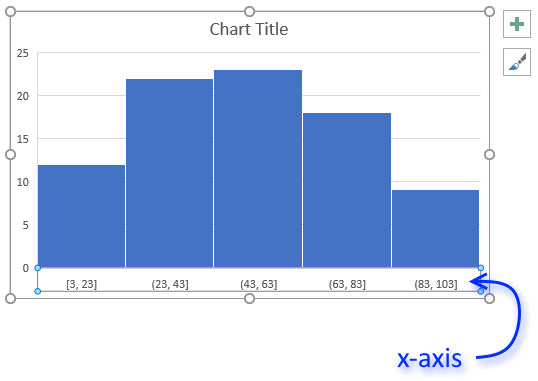
- Select "Bin width:" and type 5, you may have to try different values here depending on the data you have.
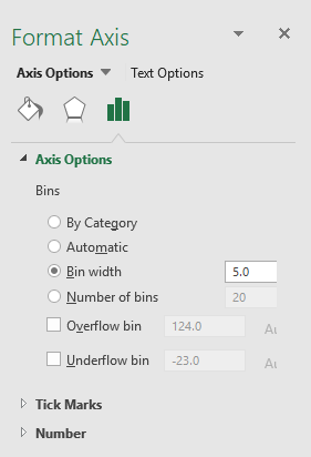
- "By Category" allows you to use text values, Excel will count text strings and plot the chart based on the number of text strings.
- Automatic is the default setting. The intervals are created evenly based on the minimum and maximum value.
- "Bin width" allows you to specify the range you want to use.
- Select "Number of bins" if you want to specify the number of intervals to use.
- Select "Overflow bin" and "Underflow bin" to create an interval for all values above/below a threshold.
20. How to create a pareto chart
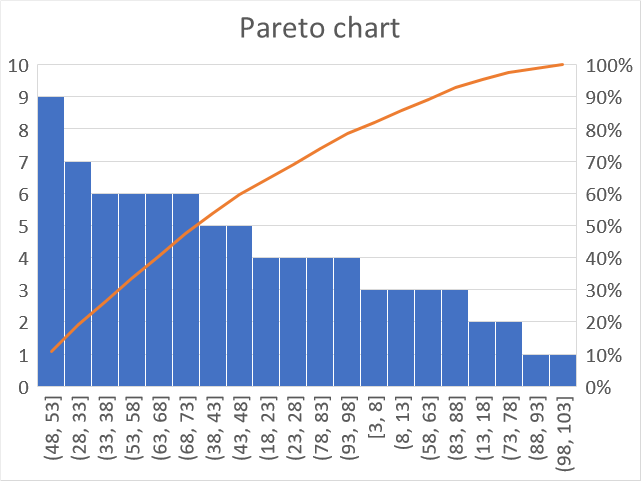
A Pareto chart is often used in statistics to demonstrate how sample values are distributed across given ranges, the values are grouped in equal bins (ranges) and sorted in a descending order, based on the number of samples in each group.
A Pareto chart is a sorted histogram with an additional line describing how each group contributes to the total. Like the histogram, the Pareto chart automatically creates groups and counts the samples that match the range. The columns show the number of samples in that range.
How to build
- Select your data.
- Go to tab "Insert" on the ribbon.
- Press with left mouse button on "Insert statistics chart" button.
- Press with left mouse button on "Pareto chart" button.
- Double-press with left mouse button on the x-axis to open the task pane.
- Select "Bin width:" and type 5, you may have to try different values here depending on the data you have.
- "By Category" allows you to use text values, Excel will count text strings and plot the chart based on the number of text strings.
- Automatic is the default setting. The intervals are created evenly based on the minimum and maximum value.
- "Bin width" allows you to specify the range you want to use.
- Select "Number of bins" if you want to specify the number of intervals to use.
- Select "Overflow bin" and "Underflow bin" to create an interval for all values above/below a threshold.
21. How to create a Box and Whisker chart
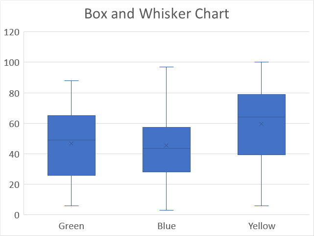
The Box and Whisker chart allows you to plot distributions in statistics, it also displays local minimum, first quartile, median, mean, third quartile and outliers.
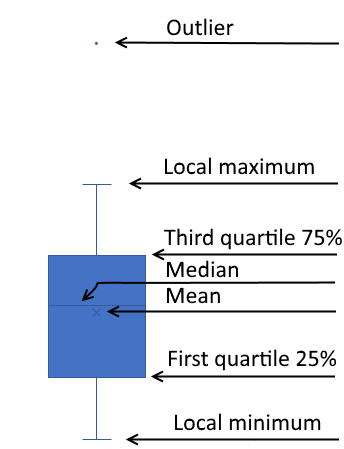
Microsoft designed the Box and Whisker chart to follow the Tukey industry standard. A value is considered an outlier if it is equal to or more than 1.5 length of the box from one of the ends of the box.
How to build
- Select data.
- Go to tab "Insert" on the ribbon.
- Press with left mouse button on "Insert Statistic Chart" button.
- Press with left mouse button on "Box & Whisker chart" button.
22. How to create a map chart
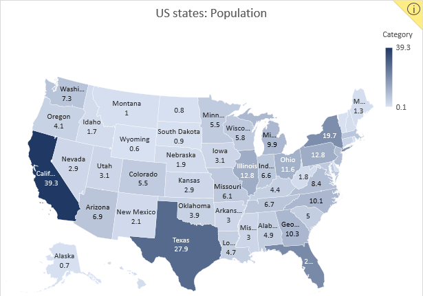
Excel 2016 owners with an office 365 subscription can now easily build beautiful map charts. Excel uses maps from Bing and it works very well, all you need to do is provide data.
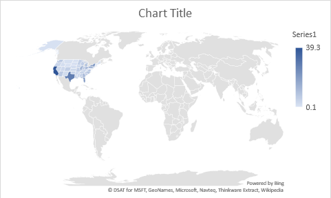
The map chart below shows US states by population and I will show how I made this.
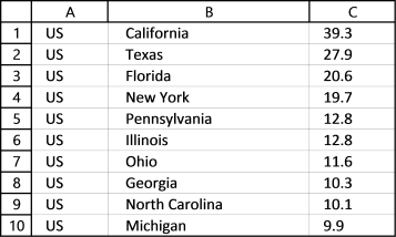
22.1. Get data for map chart
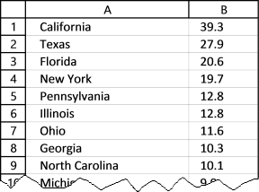
I copied US population data from Wikipedia and rounded values to millions with one decimal.
22.2. How to insert a map chart
- Select data (A1:B56)
- Go to tab "Insert" on the ribbon
- Press with left mouse button on the "Maps" icon
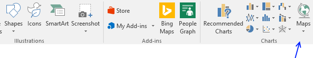
This world map shows up, US states are barely visible. This is not what we want.
22.3. Map Chart settings
Double press with the left mouse button on the map to access chart formatting, see the image below.
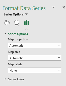
Here we have three options we can modify, map projection, map area, and map labels.
Map projection
- Automatic - Self-explanatory
- Mercator - Cylindrical map projection
- Miller - Modified Mercator projection
- Robinson - Showing the globe as a flat image
Map area
- Automatic
- Only regions with data
- World
Select "Only regions with data" and the chart changes to this:
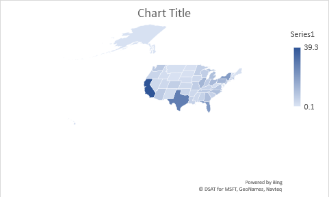
Still not good, US state Alaska is so big it is hard to see the other states.
However, this setting shows different options if we add a third column to our data. Column A has value US in all 52 cells, see picture below.
Now change the data source to include column A, here is how:
- Press with the right mouse button on the chart.
- Select "Select Data...".
- Change the cell reference to A1:C56, see the image below.
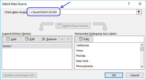
- Press with the left mouse button on the OK button.
The map chart changes once again, see the image below.
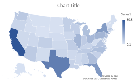
Let's look at the formatting options. There are now five different map areas and the "Automatic" setting shows the above map chart.
- Automatic
- Only regions with data
- Country/Region
- Multiple countries/regions
- World
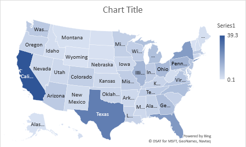
Map labels setting lets you display state names: None, best fit only or show all. I have selected "Show all" and this is what the map chart looks like.
22.4. How to show hidden map names?
If you resize the chart, even more state names are visible.
- Press with mouse on the map chart with the left mouse button to select it. Rounded chart handles appear in each corner of the chart and on midpoints.
- Press and hold with the left mouse button on one of these handles.
- Drag with mouse to resize the chart.
- Release the left mouse button when you found the right size.
22.5. How to add Data Labels to a map chart?

You can also add the population number to a map.
Press with the right mouse button on the map and then press with left mouse button on "Add Data Labels", see the chart above.
22.6. How to change the map colors?
If you don't like the state or country colors you can change that, as well.
- Double press with the left mouse button on the map and then
- Press with the left mouse button on a state or country, the format object task pane appears to the right-hand side of the excel window, see the picture above.
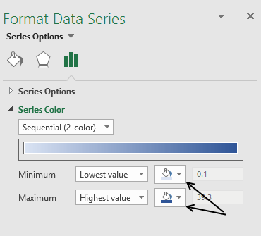
- Press with the left mouse button on "Series Options" and then "Series Color" to see map chart color settings.
- Press with the left mouse button on the "Fill color" buttons and pick the lowest value color and the highest value color.
2.1 How to create a combined stacked area and a clustered column chart
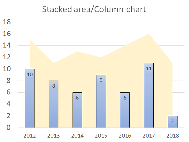
Combine the stacked area chart and the clustered column chart if you want to differentiate at least two data series to make the chart easier to read.
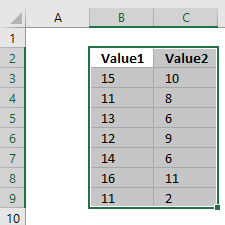
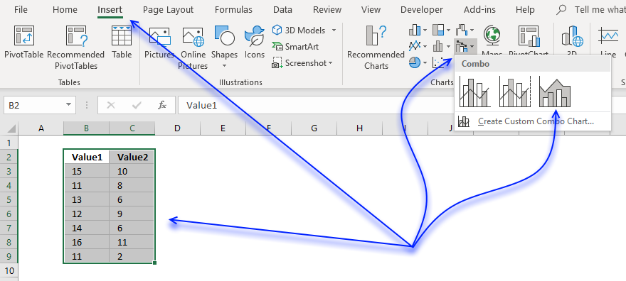
How to build
- Select data.
- Go to tab "Insert" on the ribbon.
- Press with left mouse button on the "Insert Combo chart" button.
- Press with left mouse button on "Stacked area - Clustered Column" button.
Add values to the x-axis
- Press with right mouse button on on chart.
- Press with left mouse button on "Select Data...".
- Press with left mouse button on "Edit" button.
- Select x-axis values.
- Press Enter.
- Press with left mouse button on "OK" button.
- Press with left mouse button on "OK" button.
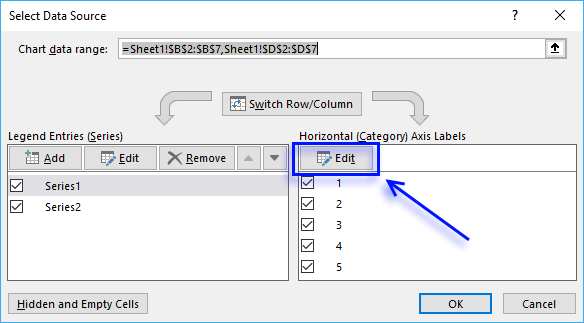
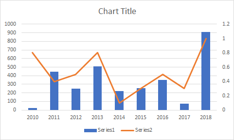
2.2 How to create a combined chart - Column and Line on secondary axis
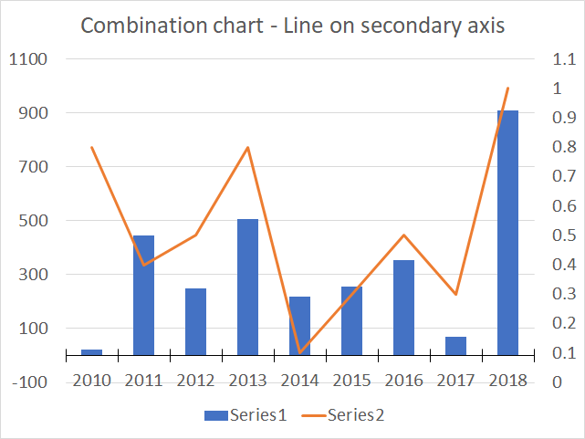
The combination chart category lets you build a chart that has columns on the primary axis and the line on a secondary axis which is great if the ranges are vastly different.
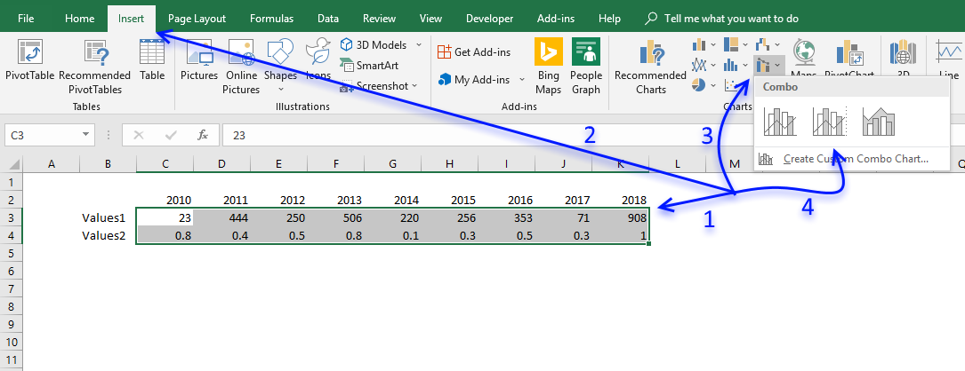
How to build
- Select cell range.
- Go to tab "Insert" on the ribbon.
- Press with left mouse button on "Insert Combo Chart" button.
- Press with left mouse button on "Clustered Column - Line on secondary axis" button.
- The chart appears.

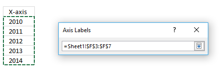
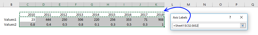
- The x-axis values are missing, press with right mouse button on on chart.
- Press with mouse on "Select Data..." to open the "Select Data Source" dialog box.
- Press with left mouse button on "Edit" button.
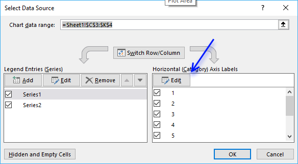
- Select x-axis values and then press Enter.
- Press with left mouse button on OK button.
- Press with left mouse button on OK button.
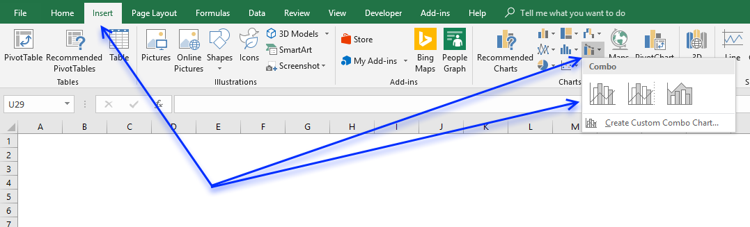
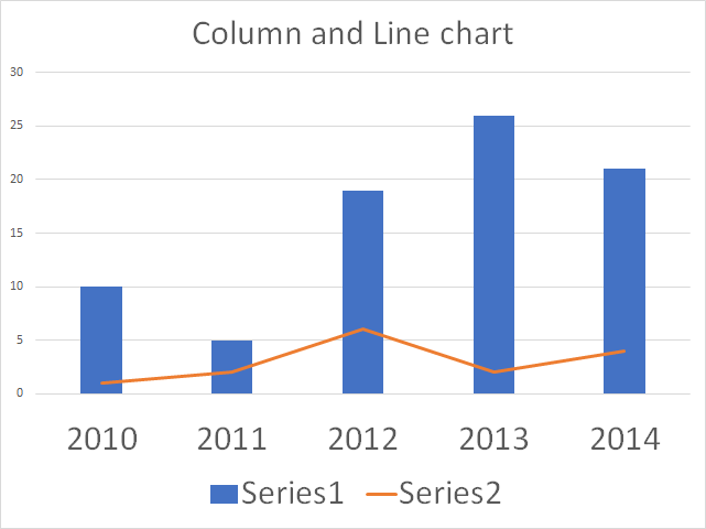
2.3 How to create a combined Column and Line chart
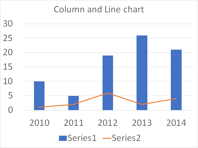
The Column and Line combo chart is a great choice if you want to differentiate two data series and make the chart easier to read.
How to build
- Select data.
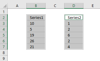
- Go to tab "Insert" on the ribbon.
- Press with left mouse button on the "Insert Combo chart" button.
- Press with left mouse button on "Clustered Column - Line"
Add values to the x-axis
- Press with right mouse button on on chart
- Press with left mouse button on "Select Data..."
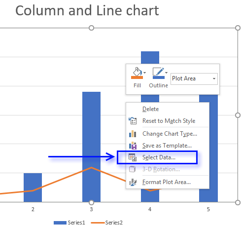
- Press with left mouse button on "Edit" button.
- Select x-axis values.
- Press with left mouse button on "OK" button.
- Press with left mouse button on "OK" button.
3.1 How to create a Win/Loss spark line
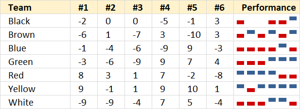
A win/loss sparkline is a visual representation of a data series in only one cell, the image above shows a blue column if the corresponding value is positive, nothing if zero and a red column if the value is negative.
How to build
- Press with mouse on a cell where you want the sparkline.
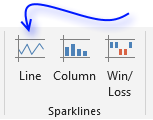
- Go to tab "Insert" on the ribbon.
- Press with left mouse button on "Win/Loss sparkline" button to open the "Create Sparklines" dialog box.
- Select the cell range that contains the data.
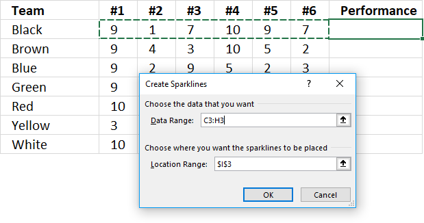
- Press with left mouse button on OK button.
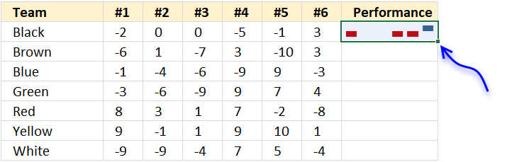
- Press and hold with left mouse button on the dot shown in the above image, then drag down as far as necessary to create sparklines for each data series.
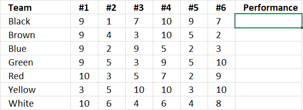
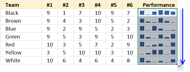
3.2 How to create a sparkline – Column
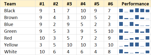
A sparkline is a visual representation of a data series in only one cell, the image above shows sparklines next to each team's performance data. There are no visible axes and axes values, only columns that quickly highlights the trend, min and max values.
How to build
- Press with mouse on a cell where you want the sparkline.
- Go to tab "Insert" on the ribbon.
- Press with left mouse button on "Column Sparkline" button to open the "Create Sparklines" dialog box.
- Select the cell range that contains the data.
- Press with left mouse button on OK button.
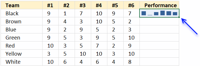
- Press and hold with left mouse button on the dot shown in above image, then drag down as far as necessary to create sparklines for each data series.
3.3 How to create a sparkline – Line
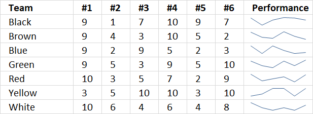
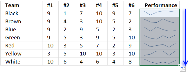
A sparkline is a visual representation of a data series in only one cell, the image above shows sparklines next to each team's performance data. There are no visible axes and axes values, only a line that quickly highlights the trend, min and max values.
How to build
- Press with mouse on a cell where you want the sparkline.
- Go to tab "Insert" on the ribbon.
- Press with left mouse button on "Line Sparkline" button to open the "Create Sparklines" dialog box.
- Select the cell range that contains the data.
- Press with left mouse button on OK button.
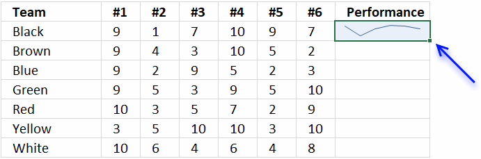
- Press and hold with left mouse button on the dot shown in above image, then drag down as far as necessary to create sparklines for each data series.
Built-in Charts
Combo Charts
Combined stacked area and a clustered column chartCombined chart – Column and Line on secondary axis
Combined Column and Line chart
Chart elements
Chart basics
How to create a dynamic chartRearrange data source in order to create a dynamic chart
Use slicers to quickly filter chart data
Four ways to resize a chart
How to align chart with cell grid
Group chart categories
Excel charts tips and tricks
Custom charts
How to build an arrow chartAdvanced Excel Chart Techniques
How to graph an equation
Build a comparison table/chart
Heat map yearly calendar
Advanced Gantt Chart Template
Sparklines
Win/Loss Column LineHighlight chart elements
Highlight a column in a stacked column chart no vbaHighlight a group of chart bars
Highlight a data series in a line chart
Highlight a data series in a chart
Highlight a bar in a chart
Interactive charts
How to filter chart dataHover with mouse cursor to change stock in a candlestick chart
How to build an interactive map in Excel
Highlight group of values in an x y scatter chart programmatically
Use drop down lists and named ranges to filter chart values
How to use mouse hover on a worksheet [VBA]
How to create an interactive Excel chart
Change chart series by clicking on data [VBA]
Change chart data range using a Drop Down List [VBA]
How to create a dynamic chart
Animate
Line chart Excel Bar Chart Excel chartAdvanced charts
Custom data labels in a chartHow to improve your Excel Chart
Label line chart series
How to position month and year between chart tick marks
How to add horizontal line to chart
Add pictures to a chart axis
How to color chart bars based on their values
Excel chart problem: Hard to read series values
Build a stock chart with two series
Change chart axis range programmatically
Change column/bar color in charts
Hide specific columns programmatically
Dynamic stock chart
How to replace columns with pictures in a column chart
Color chart columns based on cell color
Heat map using pictures
Dynamic Gantt charts
Stock charts
Build a stock chart with two seriesDynamic stock chart
Change chart axis range programmatically
How to create a stock chart
Excel categories
Leave a Reply
How to comment
How to add a formula to your comment
<code>Insert your formula here.</code>
Convert less than and larger than signs
Use html character entities instead of less than and larger than signs.
< becomes < and > becomes >
How to add VBA code to your comment
[vb 1="vbnet" language=","]
Put your VBA code here.
[/vb]
How to add a picture to your comment:
Upload picture to postimage.org or imgur
Paste image link to your comment.