Excel charts tips and tricks
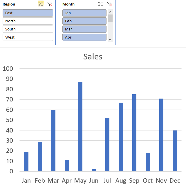
Table of Contents
- How to add lines between stacked columns/bars (Excel charts)
- Use slicers to quickly filter chart data
- How to group chart categories
- Four ways to resize a chart
- How to align chart with cell grid
- How to create a dynamic chart
- Rearrange data source in order to create a dynamic chart
- Change column/bar color in charts based on growth
- How to position month and year between chart tick marks
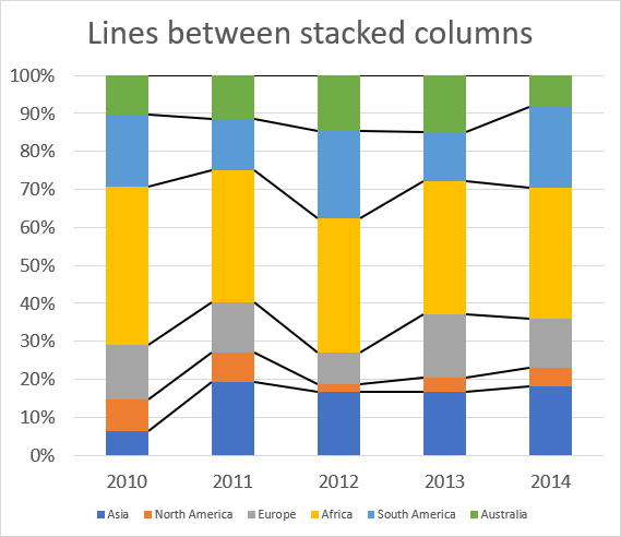
1. How to add lines between stacked columns/bars (Excel charts)
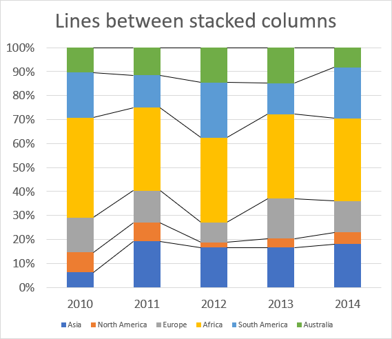
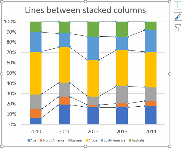
The image above shows lines between each colored column, here is how to add them automatically to your chart.
- Select chart.
- Go to tab "Design" on the ribbon.
- Press with left mouse button on "Add Chart Element" button.
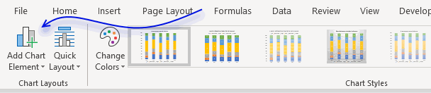
- Press with left mouse button on "Lines".
- Press with left mouse button on "Series Lines".
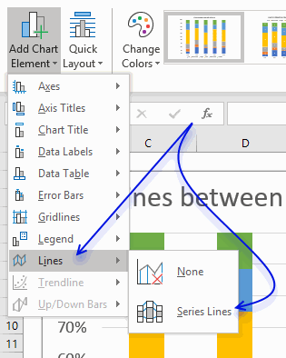
Lines are now visible between the columns.
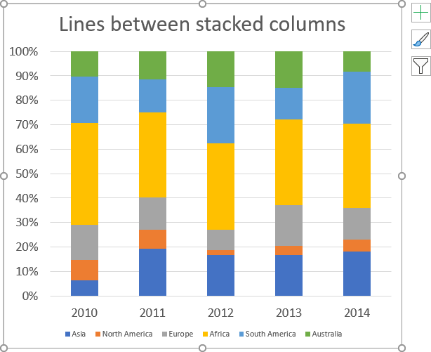
How to change line thickness
- Press with mouse once on one line between columns to select them all.
- Go to tab "Format" on the ribbon.
- Press with mouse on arrow to display all Shape Styles.
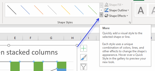
- Select a line thickness and color.
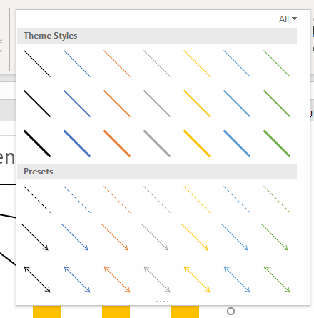
- Hovering over a line and the chart shows a preview in real time.
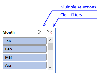
2. How to use slicers to quickly filter chart data
Slicers let you control data displayed in a chart, simply press with left mouse button on a button to quickly filter data.
How to add a slicer
You need to convert your data into an Excel defined table before you can add a slicer.
- Select a cell in your data set, this is needed so Excel knows which data you want to convert.
- Press and hold CTRL then press T, release all keys.
- A dialog box appears.
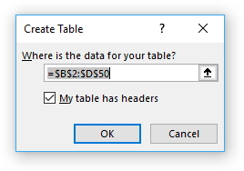
- Press with left mouse button on "OK" button.
Now finally we can add a slicer.
- Go to tab "Insert" on the ribbon.
- Press with left mouse button on a cell in the Excel defined table.
- Press with left mouse button on the "Slicer" button on the ribbon.
- Another dialog box appears, select the checkboxes corresponding to the values you want to filer.
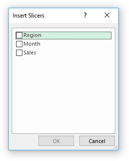
- Press with left mouse button on "OK" button.
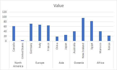
3. How to group chart categories
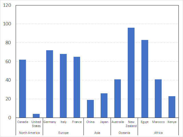
The image above shows you categories (countries) grouped into regions making this chart a lot cleaner and easier to read.
How to construct
This image shows the countries in a simple column chart without groups and the data used to build the chart. Follow these steps to group the categories (countries).
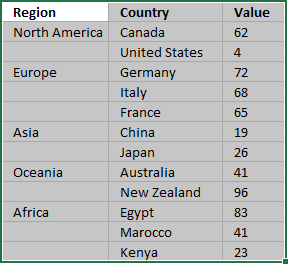
- Insert a new column before the Category column (Country).
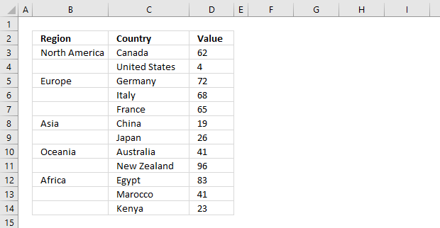
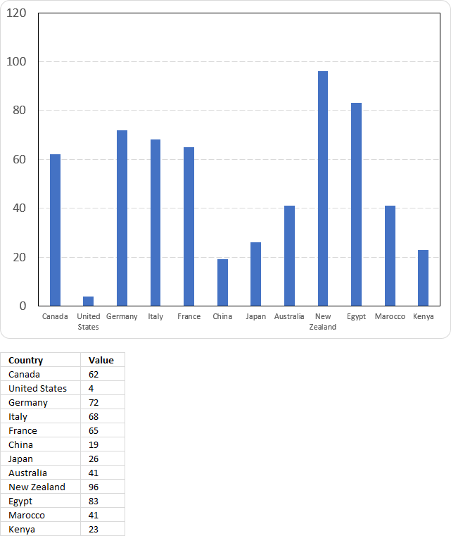
Column B contains the group names, however, they are located at the very first category (country) name and there is only one instance. - Select the data.
- Go to tab "Insert" on the ribbon.
- Press with left mouse button on the "Insert Column or Bar Chart" button open a menu.
- Press with left mouse button on the "Clustered Column Chart" button.
- Change the chart title, resize the chart so the category names may fit the chart area without being rotated if you prefer.
Adjust chart data range
If you already have a chart created you simply need to change the chart data source.
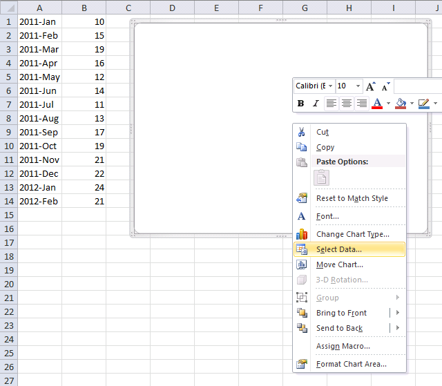
- Press with right mouse button on on chart.
- Press with left mouse button on "Select Data..."
- Press with left mouse button on the "arrow" button to select a new chart data range.
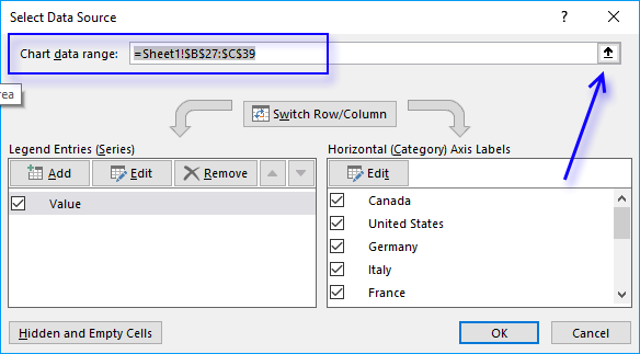
- Select the data.
The chart changes to something like this.
Get Excel *.xlsx file
4. Four ways to resize a chart
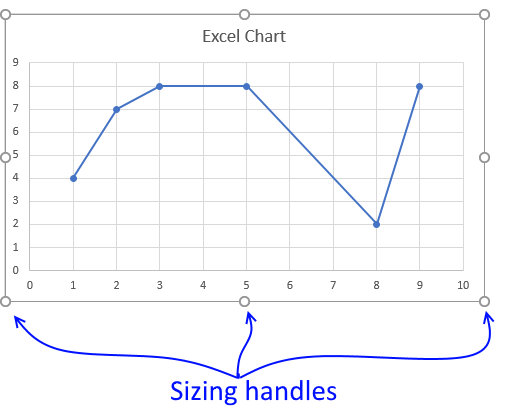
To be able to resize a chart you must first select it, you do that by press with left mouse button on on the chart with the mouse.
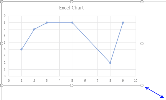
Press and hold with left mouse button on dots, then drag to resize.
The corner dots behave differently, they change two sides of the chart simultaneously.
Hold SHIFT key while dragging to keep the chart aspect ratio. The aspect ratio is the proportional relationship between its width and its height.
If you change the width the height must also change in order to keep the same aspect ratio.
An aspect ratio of 1:1 means that the height and width have the same size.
Resize chart by changing column width and row height
If you happen to change the row height or column width the chart will resize and "follow" the cell grid.
Follow these steps if you don't want the chart to move or size with cells.
- Press with right mouse button on on the chart.
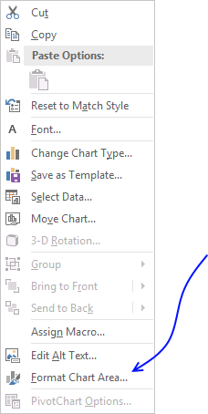
- Press with mouse on "Format Chart Area..."
- Press with mouse on "Properties" to expand settings.
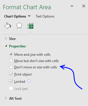
- Select "Don't move or size with cells".
Chart settings - height and width
You can also change the chart size by going into the chart settings and change the height or width.
- Press with right mouse button on on a chart with the mouse.
- Press with mouse on "Format Chart Area..."
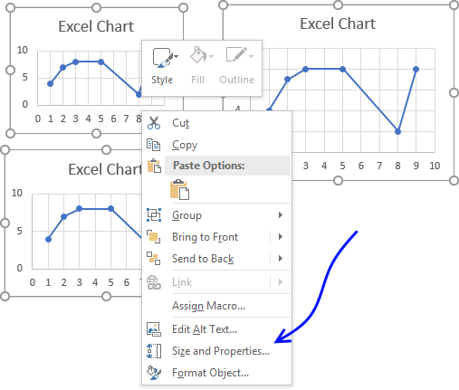
- Press with mouse on "Size & Properties" button.
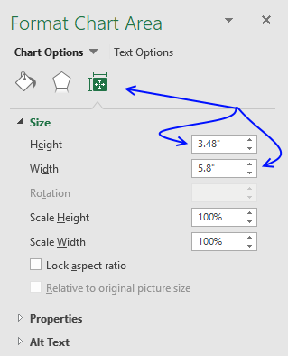
- Change the height and width.
Resize multiple charts simultaneously
There are two ways to resize multiple charts, going into the chart settings or resize using the mouse.
Chart settings
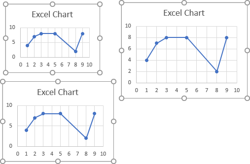
To resize multiple charts you must select all charts with left mouse button while holding the CTRL key.
Release everything, now press with right mouse button on on one of the charts with the mouse.
Press with mouse on "Size and Properties...".
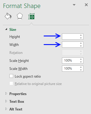
Enter the height and width.
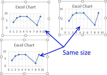
All charts now have the same height and width.
Resize using the mouse
Select all charts with left mouse button while holding the CTRL key.
Now press and hold with left mouse button on a dot and then drag, the other charts will follow.
VBA Macro
The following macro loops through each chart on sheet1 and changes the chart height and width.
Sub Macro1()
For Each chrt In Worksheets("Sheet1").ChartObjects
        chrt.Height = 144
        chrt.Width = 216
Next chrt
End Sub
Get Excel *.xlsm file
Three ways to resize an Excel chart.xlsm
5. How to align chart with cell grid
This trick is so simple and also an incredible time-saver if you want to build beautiful worksheets or dashboards where charts and data live happily together.
Begin selecting the chart you want to align.
The dots surrounding the chart allow you to resize the chart as you please.
Simply press and hold on one of these dots with left mouse button, then press the Alt key while you drag the dot.
This will snap the dot to a grid line, if you are not happy with the location simply drag the dot to the line you want to align.
Repeat above step with the remaining three chart corner dots.
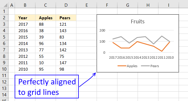
Remember that if you resize columns or rows the chart will follow and resize automatically.
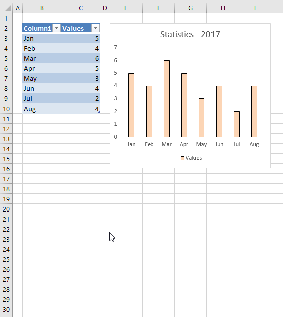
6. How to create a dynamic chart
Question: How do I create a chart that dynamically adds the values, as i type them on the worksheet?
Answer:
The following animated picture demonstrates what an excel defined table can do for your charts:
The excel table expands automatically when you add new data. Use the tab key to move to next cell in an excel defined table.
Create an excel defined table
- Select A1:B3
- Press with left mouse button on "Insert" tab
- Press with left mouse button on "Table" button
- Press with left mouse button on OK!
Recommended articles
An Excel table allows you to easily sort, filter and sum values in a data set where values are related.
Create a chart
- Select a cell on the excel defined table
- Go to tab "Insert" on the ribbon
- Press with left mouse button on "Column chart" button
Recommended article:
Recommended articles
Table of Contents How to create an interactive Excel chart How to filter chart data How to build an interactive […]
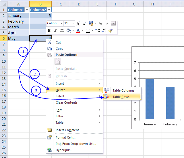
How to temporarily hide rows or columns
The following animated picture shows you how to hide columns or rows.
Instructions on how to hide columns:
- Select columns by selecting column letters above grid
- Press with right mouse button on on selection
- Press with mouse on "Hide"
Here is a post I did about how to hide columns using vba:
Recommended articles
This article describes a macro that hides specific columns automatically based on values in two given cells. I am also […]
How to remove rows / columns
- Press with right mouse button on on a cell
- Press with left mouse button on "Delete"
- Press with left mouse button on "Table Rows" or "Table Columns"
Get excel *.xlsx file
Dynamic-chartv2.xlsx
(Excel 2007 Workbook *.xlsx)
Recommended post
The following article shows you how to create dynamic chart data labels:
Recommended articles

You can easily change data labels in a chart. Select a single data label and enter a reference to a […]
This post demonstrates how to animate a chart:
Recommended articles
This article demonstrates how to create a chart that animates the columns when filtering chart data. The columns change incrementally […]
Make a dynamic chart for the most recent 12 months data
The following instructions are made in excel 2007. If you are an excel 2003 user, first read excel 2003 instructions below to understand how to create named ranges in excel 2003.
Create two named ranges
- Go to tab "Formulas"
- Press with left mouse button on "Define name"
- Name it "recentmonths"
- Type "=OFFSET('recent 12 months'!$A$1,COUNTA('recent 12 months'!$A:$A)-12,0,12)" in "Refers to:"
- Press with left mouse button on ok!
- Press with left mouse button on "Define name"
- Name it "recentvalues"
- Type "=OFFSET('recent 12 months'!$B$1,COUNTA('recent 12 months'!$A:$A)-12,0,12) " in "Refers to:"
- Press with left mouse button on ok!
Insert chart
- Go to tab "Insert"
- Press with left mouse button on "Column chart" button
- Press with left mouse button on "Clustered column chart" button
- Press with right mouse button on on empty chart
- Press with left mouse button on "Select Data..."
- Press with left mouse button on "Add" button
- Type in "Series values:" =Sheet1!recentmonths
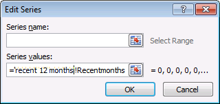
- Press with left mouse button on OK
Repeat above steps and add a new series using the named range ='recent 12 months'!recentvalues.
Change horizontal axis labels
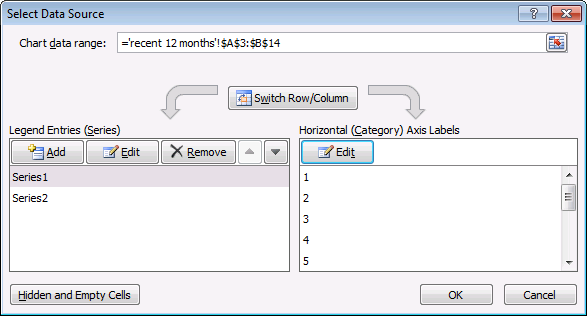
- Press with left mouse button on "Edit" button
- Type: ='recent 12 months'!Recentmonths
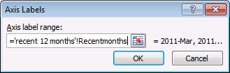
- Press OK
- Press with left mouse button on OK
Excel 2003 - Dynamic named range -> Dynamic chart
This animated picture demonstrates how a dynamic named range automatically adds new values to the excel chart, as they are typed.

Let´s say you created this basic chart below. Now you need to setup named ranges, they expand automatically whenever new data is added.

Excel 2003 instructions:
- From the menu bar, press with left mouse button on "Insert"
- From the drop-down menu select "Name"
- Press with left mouse button on Define
- Name it "months"
- In "Refers to:" text box, type =OFFSET(Sheet1!$A$1,0,0,COUNTA(Sheet1!$A:$A),1)
- Press with left mouse button on OK
Repeat above steps and create a named range named "numbers". Use this named range formula:
=OFFSET(Sheet1!$B$1,0,0,COUNTA(Sheet1!$A:$A),1)
The named range formula is made assuming your data begins in cell A1 and that there are no headers.
Create a chart
- From the menu bar, press with left mouse button on Insert and Chart
- Select a column chart
- Press with left mouse button on Next
- Go to Series tab
- Add a series
- Type in values: =Sheet1!months
- Add another series
- Type in values: =Sheet1!numbers
- Press with left mouse button on Finish
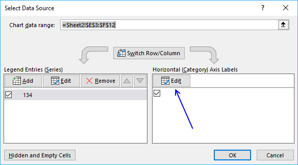
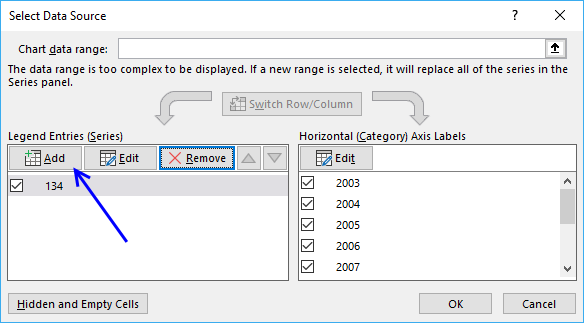
7. Rearrange data source in order to create a dynamic chart

Going back to my question, I had created a table and used the data to create a chart. However, something happened with the chart and now it is not updating when new data is added to the table.
I have multiple employee names in column A, Open and Closed Tickets for each employee in Column B and the date ranges in columns C- X. I have to create an individual chart for each employee showing Open and Closed Tickets per line chart.
I was trying to use the named ranges and that is not working. I believe using table and charts will be the best option but something has happened and now the chart is not updating. It has converted back to static where I will have to update it manually.
It is very frustrating and time-consuming to have to manually update each series for each employee. Your help is greatly appreciated!!!!
Thank you so much.
Here is the sample data
Column A - Employee Name
Row A2 - Employee1
Row A3 - Employee1
Column B - Activity
Row B2 - Open Activity
Row B3 - Close Activity
Column C:X - Date Range (Jan 2010-Oct 2011) with additional months added
Rows C2:X3 - # of tickets for each activity
Row A4 - Employee2
Row A5 - Employee2
Column B - Activity
Row B4 - Open Activity
Row B5 - Close Activity
Rows C4:X5 - # of tickets for each activity
There are about 8 employees I am tracking.
The data was arranged in one table and I was trying to create a chart for each employee such that when a new month is added, I will not have to manually go in and update the chart but it will automatically update with the new month data for each employee. am creating a line chart to show each activity per employee and adding trend lines.
Thank you so much for your assistance.
Fatou
Answer:
I recommend that you rearrange your data, that way you don't need to set up complicated dynamic named ranges. You can use an Excel defined Table, it is dynamic by default.
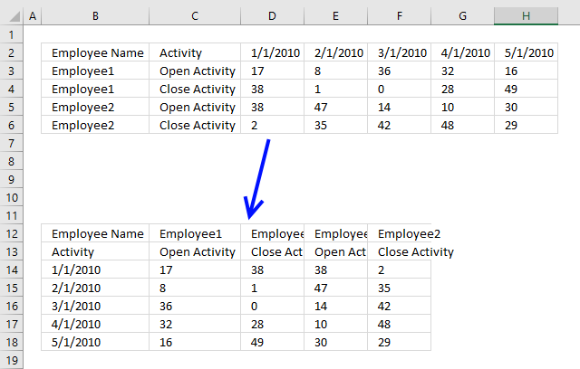
To rearrange data simply select data, in the image above it is cell range B2:H6. Copy the cell range, you can do that quickly by using the shortcut keys CTRL + c.
Now press with right mouse button on on the destination cell, then press with left mouse button on "Paste Special...".
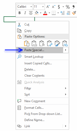
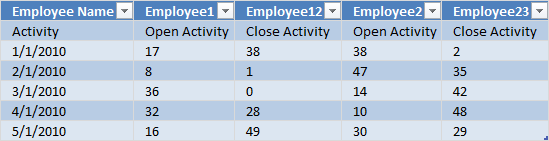
Press with mouse on checkbox Transpose to enable it.
![]()
Press with mouse on OK button. To convert the transposed range into an Excel defined Table simply select any cell within the dataset.
Press short cut keys CTRL + T, a dialog box appears.
Press with left mouse button on check box "My table has headers" then press with left mouse button on "OK" button. The dataset now looks like this:
Press with left mouse button on any cell within the Excel defined Table. Go to tab "Insert" on the ribbon. Press with left mouse button on "Line chart" button.
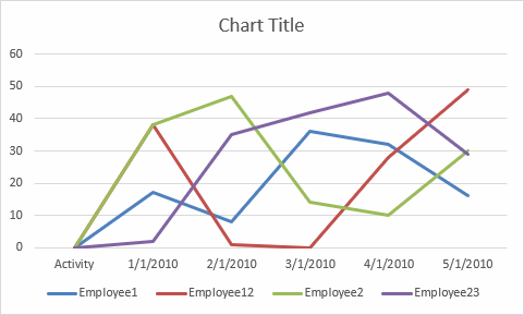
The chart appears. When you add new records to the Excel defined Table it automatically expands and the chart grows accordingly as well.
8. Change column/bar color in charts
This article demonstrates how to set up a chart so it shows one color for increasing bars/columns and another color for decreasing bars/columns.
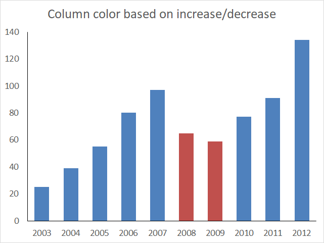
The image above shows a chart with blue and red columns, the blue columns are increasing based on the previous column and the red columns are decreasing meaning they are smaller than the previous column.
Hello,
I’m new working with dynamic charts using Excel 2007. I created a dynamic bar chart using 2 series of yearly sales. I have defined range names FW for series 1 and SS for Series 2. I would like to display each respective bar from each series in blue each time sales increase from the previous year and in red each time the sales decrease from previous year.
How would I go about doing this?
Thanks.
Peter
The image below shows the data behind the chart above, two formulas are used to separate decreasing and increasing values from the original source in cell range B3:C12.
It is important that increasing values are in one column and decreasing values are in another column. This makes it easier to separate the values into different chart series.
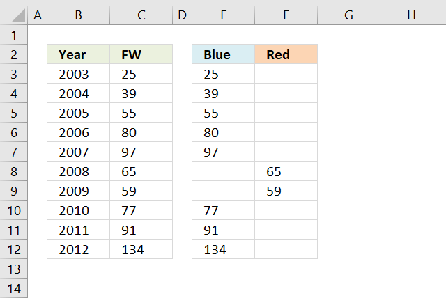
Increasing values are extracted with the following formula in cell E3:
Decreasing values are extracted with the following formula in cell F3:
Copy cell E3 and paste to cells below as far as needed, repeat with cell F3.
Explaining formula in cell E4
Step 1 - Check if above cell is text
The ISTEXT function will tell us if the cell is the first one in the column. We want to avoid comparing a number with text.
IF(ISTEXT(C3),C4,IF(C4>C3,C4,""))
becomes
IF(FALSE,C4,IF(C4>C3,C4,""))
Step 2 - Compare number with cell above
The IF function allows you to return a value if the logical expression evaluates to TRUE and another if FALSE.
IF(FALSE,C4,IF(C4>C3,C4,""))
becomes
IF(FALSE,C4,IF(39>25,C4,""))
becomes
IF(FALSE,C4,IF(TRUE,C4,""))
and returns 39 in cell E4.
Setting up the chart
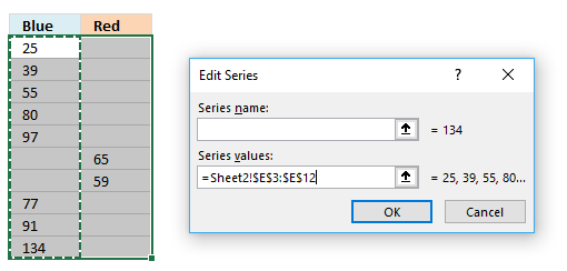
We now have data in separate columns, this way we can use two data series to color bars/columns differently.
- Select cell range E3:F12.
- Go to tab "Insert" on the ribbon.
- Press with left mouse button on "Insert column or bar chart" button.
- Press with mouse on "Clustered column" button.
- Press with right mouse button on on chart.
- Press with left mouse button on "Select Data...".
- Press with left mouse button on "Edit" button.
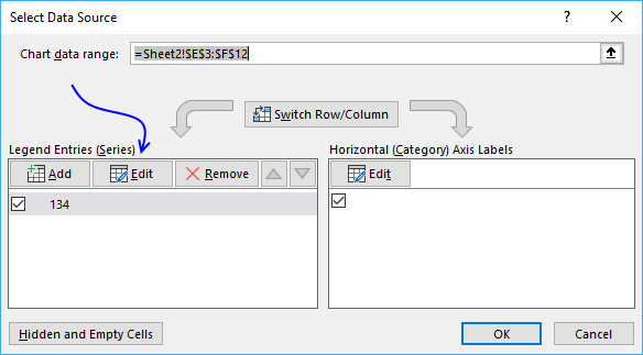
- Select cell range E3:E12.
- Press with left mouse button on OK button.
- Press with left mouse button on the other "Edit" button.
- Select cell range B3:B12.
- Press with left mouse button on OK button.
- Press with left mouse button on the "Add" button.
- Select cell range F3:F12.
- Press with left mouse button on OK button.
- Press with left mouse button on OK button.

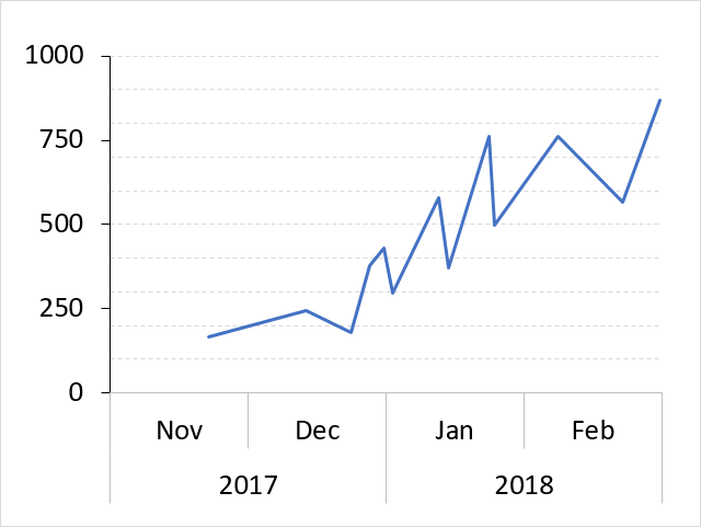
9. How to position month and year between chart tick marks
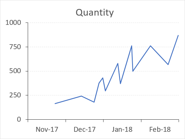
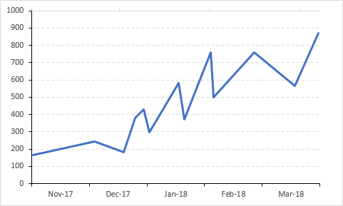
The picture above shows a line chart with month and year labels between tick marks instead of date values below each tick mark.
This tutorial demonstrates in great detail how to position month and year values between chart tick marks. You will need an additional series and a secondary axis to accomplish this.
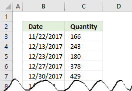 To insert a line chart simply select the values you want to use, I am using the values shown in the image to the right.
Then press with left mouse button on the "Insert" tab on the ribbon, press with left mouse button on the "Line" chart button and a line chart instantly appears.
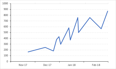
The chart shown below is the default chart Excel creates when you insert a line chart.
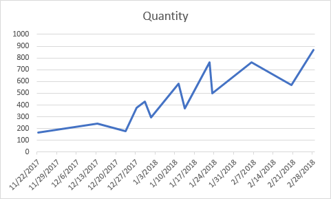
The line chart x-axis shows dates with seven days interval to the next tick mark beginning with 11/22/2017.
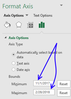
Double press with left mouse button on with left mouse button on the dates right below the chart x-axis to open the Format Axis Task Pane.
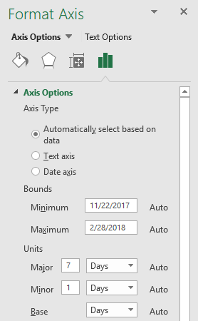 Here you can easily change which date the x-axis begins with and ends with, it also allows you to specify the interval.
Change Minimum Bounds to 11/1/2017.
Change Major Units from 7 to 1 and also change Days to Months.
This will change how the x-axis will display the dates, it will begin with 11/1/2017 and the next tick mark is going to have the first date in the next month.
This, however, is not what we are looking for.
We want month and year between tick marks, not the entire date below tick marks.
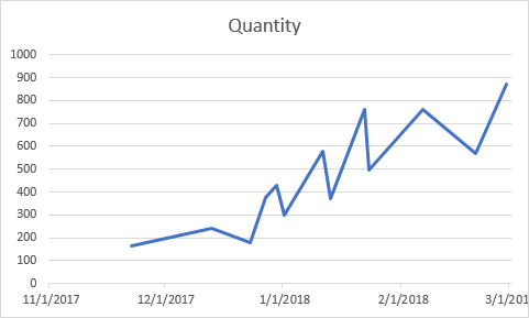
The chart above shows the first date in each month right below tick marks.
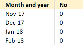
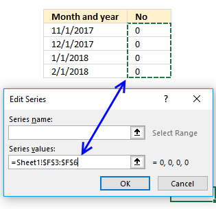
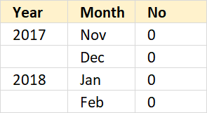
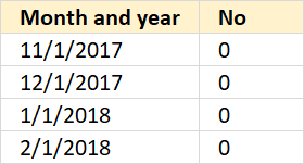 To position dates between tick marks we need an additional series, I am going to use the values displayed to the right.
My dates in the first dataset start in November 2017 and end in February 2018, this series also has month and year values in the same date range as my first data set.
The dates look like this 11/1/2017, 12/1/2017, 1/1/2018 and 2/1/2018.
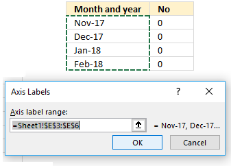
To format the dates simply select the dates, press CTRL + 1 to open the Format Cells dialog box.
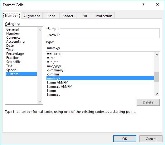
Here press with left mouse button on "Custom" and type: mmm-yy
Press with left mouse button on OK button.
 The dates show only month and year now, see picture to the right.
The next column contains 0's (zeros), these values are not needed.
They are not shown in the chart and I will show you how to hide them.
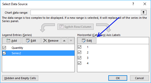
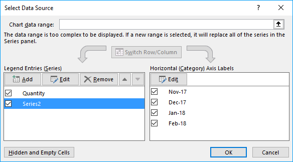
Now, press with right mouse button on on the chart and select "Select Data...".
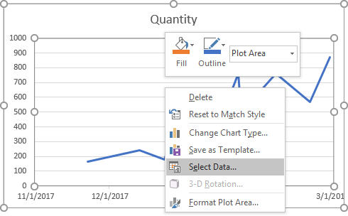
The "Select Data Source" dialog box appears.
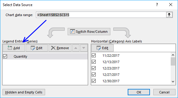
Press with left mouse button on the "Add" button, demonstrated in the image above.
Select the cell range containing the 0's (zeros) and press with left mouse button on the OK button. Press with left mouse button on the next OK button, as well.
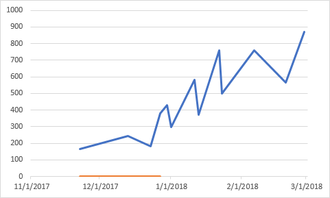
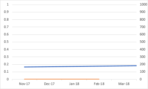
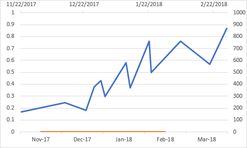
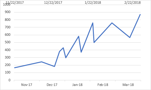
The chart above shows the second series in orange.
Double press with left mouse button on with left mouse button on the first series (blue line in above chart).
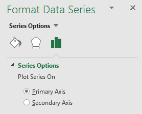 The Format Data Series Task Pane appears, select "Secondary Axis".
This will move the first series to a secondary axis allowing you to choose the axis you want to be displayed.
This made the chart look like it broke or something, however, don't panic.
We just need to customize the chart so the right axis and values are displayed.
Press with right mouse button on on the chart, press with left mouse button on "Select Data...".
Select Series2, press with left mouse button on the "Edit" button.
Select the dates formatted as month and year (mmm-yy). Press with left mouse button on OK button.
Press with left mouse button on the next OK button.
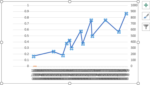
The month and year values are now in the correct positions, however, the blue series is missing data points.
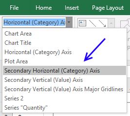
Now add a secondary horizontal axis, first select the chart.
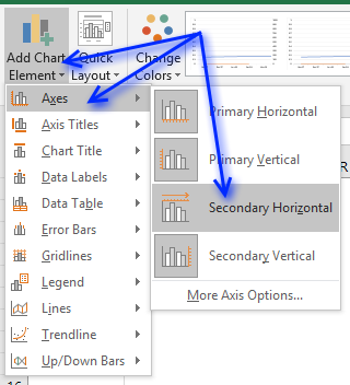
Press with left mouse button on "Design" tab on the ribbon, and then "Add Chart Element". Press with mouse on "Axes" and then "Secondary Horizontal.
You are almost there, we need to hide the orange series and a few axes.
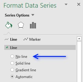 To hide the orange series double-press with left mouse button on the orange series to open the Format Data Series task pane.
Select "No line" shown in the picture to the right.
If you have markers, hide those as well.
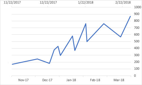
The orange series is now hidden, however, the axes are still visible.
You can now delete the left vertical axis, simply select the left vertical axis and then press Delete on your keyboard.
It is now time to move the right vertical axis to the left side of the chart area, double press with left mouse button on the top horizontal axis to open the task pane.
 It may seem counter-intuitive to select the top horizontal category when you want to move the right vertical axis, however, the two axes are connected, meaning you can choose where you want the axis relative to the other axis.
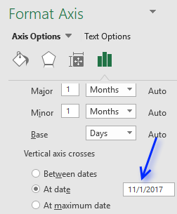
Select "At date" below "Vertical axis crosses" and type the earliest date in your data series.
In this case 11/1/2017.
The chart now looks like this.
One last thing to do, hide the top horizontal axis.
 Double press with left mouse button on the top horizontal axis to open the task pane.
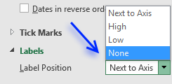
Press with mouse on the black arrow next to "Labels" to expand settings.
Press with mouse on drop-down list next to "Label Position" and select "None", see picture to the right.
The chart is now complete but the first value is not in the beginning of November 2017? It is 22/11/2017.
We need to use the same start date and end date on both the hidden horizontal axis and the visible one.
 Double press with left mouse button on the bottom horizontal axis to open the Format Axis task pane.
Use the following start date: 11/1/2017 and end date: 2/28/2018
See picture to the right.
Apply the same minimum and maximum bound to the hidden top horizontal axis.
 Go to "Format" tab on the ribbon, if the tab is not visible select the chart again.
Select the other horizontal axis, see picture to the right.
Make sure the minimum and maximum bound values shown in the Format Axis task pane are the same.
In this case, the start date is 11/1/2017 and end date is 2/28/2018.
The picture below shows what the chart looks like when both horizontal axes are aligned with the same start and end date.
I have added axes lines and changed major grid lines, see this post if you are interested in how:
Components of an Excel chart
Get Excel *.xlsx file
How to center month and year between chart tick marks.xlsx
Use the same technique to separate months and years, see picture above.
Simply use another column containing dates formatted as years.
Get the following file to see how this chart is constructed.
Get Excel *.xlsx file
How to center month and year between chart tick marks_test.xlsx
Built-in Charts
Combo Charts
Combined stacked area and a clustered column chartCombined chart – Column and Line on secondary axis
Combined Column and Line chart
Chart elements
Chart basics
How to create a dynamic chartRearrange data source in order to create a dynamic chart
Use slicers to quickly filter chart data
Four ways to resize a chart
How to align chart with cell grid
Group chart categories
Excel charts tips and tricks
Custom charts
How to build an arrow chartAdvanced Excel Chart Techniques
How to graph an equation
Build a comparison table/chart
Heat map yearly calendar
Advanced Gantt Chart Template
Sparklines
Win/Loss Column LineHighlight chart elements
Highlight a column in a stacked column chart no vbaHighlight a group of chart bars
Highlight a data series in a line chart
Highlight a data series in a chart
Highlight a bar in a chart
Interactive charts
How to filter chart dataHover with mouse cursor to change stock in a candlestick chart
How to build an interactive map in Excel
Highlight group of values in an x y scatter chart programmatically
Use drop down lists and named ranges to filter chart values
How to use mouse hover on a worksheet [VBA]
How to create an interactive Excel chart
Change chart series by clicking on data [VBA]
Change chart data range using a Drop Down List [VBA]
How to create a dynamic chart
Animate
Line chart Excel Bar Chart Excel chartAdvanced charts
Custom data labels in a chartHow to improve your Excel Chart
Label line chart series
How to position month and year between chart tick marks
How to add horizontal line to chart
Add pictures to a chart axis
How to color chart bars based on their values
Excel chart problem: Hard to read series values
Build a stock chart with two series
Change chart axis range programmatically
Change column/bar color in charts
Hide specific columns programmatically
Dynamic stock chart
How to replace columns with pictures in a column chart
Color chart columns based on cell color
Heat map using pictures
Dynamic Gantt charts
Stock charts
Build a stock chart with two seriesDynamic stock chart
Change chart axis range programmatically
How to create a stock chart
Excel categories
176 Responses to “Excel charts tips and tricks”
Leave a Reply
How to comment
How to add a formula to your comment
<code>Insert your formula here.</code>
Convert less than and larger than signs
Use html character entities instead of less than and larger than signs.
< becomes < and > becomes >
How to add VBA code to your comment
[vb 1="vbnet" language=","]
Put your VBA code here.
[/vb]
How to add a picture to your comment:
Upload picture to postimage.org or imgur
Paste image link to your comment.
Thanks a lot for this illustrative and easy way to do a dynamic chart. Really helped me a lot!
Hi
This is great if your data (rows or columns) is increasing in size. However, doesn't seem to work if you reduce the number of columns, the graph still displays blanks for the 'missing' data
Can you help?
Excel seems to not let me enter the new series equation in the formula bar. I can type it, but pressing enter or the check mark doesn't do anything. If I do it from "Select chart data", it determines the initial state and then uses that cell reference from then on.
For example, "=SERIES(,O!OpDescriptions,O!CycleTimeValues,1)" would become "=SERIES(,O!$C$2:$C$12,O!$E$2:$E$12,1)" after initial entry. Any ideas?
erik,
change it manually via "Select Chart Data", series by series.
changing it via formula bar wont work (testd on Excel 2007).
The reason cutting and pasting doesn't work is that his examples have commas, and instead it should be semicolon (;). In the description of the functions, in fact, he uses semicolons. If you substitute commas with semicolons it works. Thank you for this tutorial!
giulia tonelli,
It has to do with regional settings. I use ; but most of my readers are americans and they use ,. That is why I use , on this blog.
I know david's post was a while back, but I really appreciate your post. I have the same problem Erik listed. I've spent hours trying to resolve - updates, etc. Using "Select Data" worked. Thanks for the article and allowing the comments.
Marvin,
You are welcome!
If you have your data in a table, you don't need to use the OFFSET function or defined name ranges (Excel 2007 only)
How do you edit the data if you have multiple series? I do not want to edit each one manually.
if there are two or more blank rows? as shown the following
janurary 5
feburary 4
march 6
apr 2
july 7
aug 8
zhen qin,
I am not sure what you are trying to accomplish. If you want two or more blank nonexisting bars in your chart, try changing the named ranges to:
Named Ranges
Month: =OFFSET(Sheet1!$A$1, 0, 0, MATCH(9,9999E+307, Sheet1!$B:$B))
Numbers: =OFFSET(Sheet1!$B$1, 0, 0, MATCH(9,9999E+307, Sheet1!$B:$B))
Where exactly do i find the chart bar. I am working in EXCEL 2007 and I don't see that.
Keith,
Thanks for asking, I have added pictures to this post.
This was a big help.
Thanks!!
tina
Tina,
I appreciate your comment! :-)
Thanks!
Help! What if my data range includes a set of "IF" formulae that sit blank until other datasets are completed elsewhere, (i.e. i have 20 rows, but currently only 5 have data, but the others are formulaed and the data will appear as data is added elsewhere). It appears that the dynamic graph still considers them as values and includes them?!
(btw, otherwise thanks for this - really useful!)
James,
Named range Month
Named range Number
You, my friend, are a legend. Many thanks!
Thanks a ton !
James and Neha,
You are most welcome!
Oscar,
I am trying to implement your response to James's question as I am working on the exact same problem. When I use the below;
=OFFSET(Sheet1!$B$1,0,0,SUM(--(Sheet1!$B$1:$B$20"")))
I get an error. "A formula in this worksheet contains an one or more invalid references"
Your insights are greatly appreciated
Thanks
CM
CM,
Maybe this example file is helpful:
Dynamic-chart-IF.xlsx
Excel 2007 *.xlsx
Oscar,
Thanks for the prompt response. I should have mentioned that I am trying to create a line chart. And if I have a month populated but not the number the line drops to the x axis which I am trying to avoid. This is a multi series chart. Any thoughts?
Thanks
CM
CM,
And if I have a month populated but not the number the line drops to the x axis which I am trying to avoid.
Strange, the line doesn´t drop here. What formula is shown when you press with left mouse button on a chart line?
Hi
Thanks for this, it's just what I needed, however I need to take it a step further.
If looking at your example, my 'Numbers' are created from an If Statement. entering "" for blank cells. Excel doesn't seem to recognise this as an empty cell and thus plots it on the graph anyway.
Do you know of a way I can use get the chart to exclude these items?
Many thanks in advance
MK
MK,
Create a table.
Press with left mouse button on the black arrow on column header.
Deselect blanks.
Get the Excel 2007 *.xlsx file
MK.xlsx
Hi Oscar
Thank you very much. This has made my charts a thing of joy!
MK
Hello Oscar,
Using your example above, how would the "define name" functions/formulas change if I wanted to remove one data point for every one I add? (i.e. right after I add "April" to the data series, not only would I like "April" to automatically be added to the graph but also for "January" to be removed).
Thanks for your time!!!
Philip,
Named Range - Month
Named Range - Numbers
Get the Excel *.xlsx file
Dynamic-chart-dynamic-range.xlsx
Dear Oscar,
Many thanks for the interesting site!
Please could you advise how to apply this dynamic formating to include more data for example:-
Expenses January Febuary March
Petrol 45 60 50
Cellphone 25 30 25
Hotel 65 75 50
Thank you in advance for any assistance you may be able to offer!
Kind regards,
J13
Jungleist13,
Example, excel table and a bar chart.
What excel version are you using and what chart?
Dear Oscar,
Many thanks for your swift response!
Excel 2007 not really bothered about type of chart, column is sufficient I just need to understand haw to apply the dynamic features to it? I can,t figure out how to alter the formating to cover the additional series?
Kind regards,
Jungleist13
Hi -- I am trying to build a line graph that needs 2 series displayed dynamically. How would i go about building that? I underrstand how to do it for one series, but cannot figure out for 2.
Thanks.
Katy
Katy,
Is this what you had in mind?
yes -- where the total number of records being plotted can vary
This is great! I was able to make it work. I do have a concern and a question on this issue that you may be able to help me with. 1) When adding a new date/month to the bottom of your list, the x-axis updates in the graph with the prior data remaining in place. This could lead to an incorrect graph if the data is also not updated. Shouldn't the data also shift over to the left so the added date/month shows blank data in the graph? If so, how? 2) How would this be adjusted for a table where the dates are already pre-populated, only adding in the data each day/week/month?
Clarification - 2) How would this be adjusted for a table where the dates are already pre-populated, only adding in the data each day/week/month?
In this instance, the data table is pre-populated with dates. The graph only shows the most recent 13 entries, rolling each week/month as data is added. To clarify, not all dates are showing in the graph at one time - only the most recent 13.
Eureka! I figured it out - I changed my offset formula for the "months" to reference the month row but count the data row. This results in the table updating the date and data only once the data has been added!!!
Oscar, Thank you SOOOO much. I cannot tell you how much time this will save me on my weekly/monthly reporting! I've been mulling this over for quite some time, not knowing how to do it. You've been a godsend!
Oscar, in line with the questions above, I'm looking to add further columns of data for each month, e.g. Months, Numbers1, Numbers2 etc.
How do you adjust the "=SERIES(,Book3.xlsx!Months,Book3.xlsx!Numbers,1)" formula to include third, fourth and fifth columns?
Question on the NAMES and "SERIES" formulas. Should the NAMES be saved in the SCOPE of "workbook" or the specific worksheet and does that impact the "SERIES" formula? Always use the workbook name or worksheet name instead, depending on how the NAMES were set up? Please advise.
Katy,
Get the workbook *.xlsx
katy.xlsx
Instructions excel 2007
1. Create a table
2. Go to "Insert" tab
3. Press with left mouse button on the "Line charts" button
New question - I've used these formulas successfully now on a number of graphs. Now, my data is designed horizontally, not vertically and I'm having difficulty converting the formula accordingly. I've tried using "COUNTA(sheet1!$B$2:$RXM$2)" and also changing the last two numbers from "0,13" to "13,0" to no avail. i.e. Months run across row 1 with data in rows underneath with row headers in column A. Please advise.
Another new question - I have difficulty each time I wish to automate a graph with multiple series even thought I have changed the final number in the series (i.e. 1,2,3, etc.) I have charts with stacked columns, and others with two columns with a third series line. When I attempt to change the series information on the graph, it doesn't accept it - no error, nothing, I hit enter to submit it and it just sits there and doesn't change it. Also, is there a limit to the number of names used within a single workbook? Please advise.
Max,
Oscar, in line with the questions above, I'm looking to add further columns of data for each month, e.g. Months, Numbers1, Numbers2 etc.
How do you adjust the "=SERIES(,Book3.xlsx!Months,Book3.xlsx!Numbers,1)" formula to include third, fourth and fifth columns?
Excel 2007:
Create a table
1. Select cell range
2. Press with left mouse button on the "Insert" tab
3. Press with left mouse button on the "Table" button
Create a clustered column chart
1. Select table
2. Press with left mouse button on the "Insert" tab
3. Press with left mouse button on the "Column" in charts window on the ribbon.
4. Press with left mouse button on the "Clustered Column Chart"
Oscar,
I have used your suggestions above which work as expected, but I have a slight twist on what I am trying to do...
So, firstly I am trying to create a dynamic chart with daily data being added to a column with a weekly total in the eighth row.
I am trying to chart the weekly totals only (ie every eighth row). I seem to be able to do either:
1. Chart Dynamic data
2. Chart every eighth row
But not both together :( Any suggestions? Any advice appreciated.
Missy,
Question on the NAMES and "SERIES" formulas. Should the NAMES be saved in the SCOPE of "workbook" or the specific worksheet and does that impact the "SERIES" formula? Always use the workbook name or worksheet name instead, depending on how the NAMES were set up? Please advise.
The names are Named Ranges and does NOT impact the "SERIES" formula. You have to use the full name: excelfile!Named_range in the series forumla.
Example:
Book3.xlsx!Month
Excel 2007 and 2010 users can happily create a table and then create a chart. Nothing to worry about series formulas or named ranges. And yes, I know, the blog post title says Excel 2007:How to create a dynamic chart..
Oscar, can you please help me modify the Name Ranges and SERIES formula for a table where the months (to use your example) are set up horizontally instead of vertically? I am using historical tables that go back five years or so. Changing their layout is not prudent. What I have is column headers with mmm-yy, with multiple row labels of varying categories. I have made attempts by changing the range from columns $A:$A, for example, to rows $A$2:$XX$2, to no avail. Please advise.
Missy,
see this attached file:Missy.xls
Hi Oscar.
I have data similar to what you have but it's more than one row of values. how would i set up it up going across.
Example
months: jan feb mar
values: 1 2 3
values 4 5 6
Values: 7 8 9
I'm not sure how the offset formula will look like so the graph can update automatically when new data is entered. This is the offset that I have for values.
=OFFSET(sheet1!$A$162,0,1,1,COUNTA(sheet1!$162:$162)-1)
Thanks!
jimmy,
I am not sure you can do that in excel 2003 and previous versions. I don´t have excel 2003 but try to convert your data set to an excel defined list and use that list when you build your chart.
If you have excel 2007 and later versions, create an excel defined table.
Thank you Oscar. I shall try this and let you know how it turns out.
Oscar,
Thank you so so much for providing this useful information - your site has the best instructions yet.
However, I do not understand your explanation to Max's question and I have the same question: How do you adjust the "=SERIES(,Book3.xlsx!Months,Book3.xlsx!Numbers,1)" formula to include third, fourth and fifth columns?
Can you please be a little more clear and provide more formulas? Dynamic charts are very new to me and I do not understand it fully yet.
Jennifer,
You don´t need to adjust the formula to include a third, fourth and a fifth column.
Convert your cell range into a table and then create a chart.
In excel 2007 and later versions, a table automatically adds new columns or rows and the chart is instantly updated.
I really like the idea of the dynamic chart, but it doesn't seem to work for me. I have tried changing the source data for the chart to use dynamic named ranges. However, it immediately extracts the range the name references and uses that instead of the keeping the same. What I mean is that, if the current state of the dynamically named range refers to B2:B6, then the chart sets the source data range to B2:B6 and keeps it at that setting, even when the dynamically named range changes. When I look at the source data selection again, it refers to whatever the initial state of the named range was, rather than the named range itself. Am I doing this wrong?
Thanks for any help you can offer.
Paul,
Maybe you have workbook calculation: Manual?
Change it to automatic.
Thanks Oscar, but I think figured it out. I was putting the named range into the slot that pops up with you right Press with right mouse button on the graph and choose "select data." The box says "Chart data range" on it. When I used that box, it always converted the named range into an absolute reference. However, when I went to edit the series (there is only one in my graph), and put the named range in the "Series values" box, it stayed as a named range and my chart updates automatically. I'm not sure why the "chart data range" box would convert a named range to an absolute reference but the "series values" box would not, but that appears to be the situation.
Thank you so much for the info on the charts.
Going back to the Katy chart example, can you convert a regular chart to one that pulls data from a table so that the data will automatically update when new lines/colums are added.
Thanks.
Fatou,
I have simplified this post. I believe it now answers your question.
Thanks for commenting!
i would like my graph to show only the most recent 12 months data. What should i do?
Icjun:
You can have your named range find the last n rows or columns in your data set. Here is an example of some code I used to define a named range:
=OFFSET(Data!$H$43,0,COUNTA(Data!$H$42:$ZZ$42)-2,1,2)
This is based on the idea that there is a 2-row set of data that begins at H42. The values I really want are the last two numbers in row 43. My data set sometimes has holes, so instead of counting the number of items in row 43, I count the header row (42), which I know will be filled in completely, but only up until the last month I want to use. I create a named range using the code above, and then edit a series in my graph to refer to that named range. Now, since you are dealing with the latest 12 months, you might want to have "-12" instead of "-2" after the COUNTA function.
Hi, thanks for providing this information - it's been a great help.
However, I am still struggling to apply the logic to my solution. My data range is made up of: Products in Column A, Months in columns B to M, values (per month per product) in the cross sections.
The Products dimesnion is the one that can grow (or shrink) in my data range. Therefore I want my dynamic chart to show whatever products appear in the data dump
I have defined products as a name. Upon testing, whenever I add a new product it appears as a series in my chart.
However, I am not sure how to display the months (and the values per month, per product) on the chart. In teh "Select data source" tab/Horizontal axix labels - I have manually selected B1:M1. However, only one month is appearing on the X axix of the chart and no data.
Any help would be much appreciated.
Many Thanks
Mike
Hi Oscar,
Going back to my question, I had created a table and used the data to create a chart. However, something happened with the chart and now it is not updating when new data is added to the table. I have multiple employee names in column A, Open and Closed Tickets for each employee in Column B and the date ranges in columns C- X. I have to create an individual chart for each employee showing Open and Closed Tickets per line chart. I was trying to use the named ranges and that is not working. I believe using table and charts will be the best option but something has happened and now the chart is not updating. It has converted back to static where I will have to update it manually. It is very frustrating and time consuming to have to manually update each series for each employee. Your help is greatly appreciated!!!!
Thank you so much.
Fatou
Hi Fatou,
I was having the same problem with the chart converting named ranges to static references. My solution was to use a different named range for each series. Then, when I go to select data, I pick the particular series, edit the data for that, and enter the named range at that location. That seems to work much better than having a named range for the entire data set. The only problem is that it won't work if the number of series in your chart changes (in that case you would have to update the chart manually by adding or removing series).
icjun,
Here are some great resources:
Chart the Last 12 Months Dynamically.
Using named ranges to create dynamic charts in Excel
Mike,
Hi, thanks for providing this information - it's been a great help.
However, I am still struggling to apply the logic to my solution. My data range is made up of: Products in Column A, Months in columns B to M, values (per month per product) in the cross sections.
The Products dimesnion is the one that can grow (or shrink) in my data range. Therefore I want my dynamic chart to show whatever products appear in the data dump
I have defined products as a name. Upon testing, whenever I add a new product it appears as a series in my chart.
However, I am not sure how to display the months (and the values per month, per product) on the chart. In teh "Select data source" tab/Horizontal axix labels - I have manually selected B1:M1. However, only one month is appearing on the X axix of the chart and no data.
Any help would be much appreciated.
Many Thanks
Excel 2007 instructions
Convert data range to a table
1. Select your range (A1:M5)
2. Go to tab "Insert"
3. Press with left mouse button on the Table button
4. Press with left mouse button on OK button
Change chart data range
1. Press with right mouse button on your chart
2. Press with left mouse button on "Select data..."
3. Type =Table1 in chart data range:
Chart settings
1. Press with right mouse button on chart
2. Press with left mouse button on "Select data..."
3. Press with left mouse button on "Switch column/row" button
4. Press with left mouse button on Edit button in Horizontal (Category) Axis Labels window
5. Select column headers (B1:M1)
6. Press with left mouse button on OK button
7. Press with left mouse button on OK button
Get the Excel file
Sheet1 changes chart data range using vba. Press with right mouse button on sheet1 and press with left mouse button on "view code".
Sheet2 changes chart data range using tables (no vba).
dynamic-charts-vba.xlsm
Hi Oscar,
Very good and extensive instructions. Thanks alot!
Fatou,
Can you provide some sample data?
Hi Oscar,
Thank you for responding back. Here is the sample data
Column A - Employee Name
Row A2 - Employee1
Row A3 - Employee1
Column B - Activity
Row B2 - Open Activity
Row B3 - Close Activity
Column C:X - Date Range (Jan 2010-Oct 2011) with additional months added
Rows C2:X3 - # of tickets for each activity
Row A4 - Employee2
Row A5 - Employee2
Column B - Activity
Row B4 - Open Activity
Row B5 - Close Activity
Rows C4:X5 - # of tickets for each activity
There are about 8 employees I am tracking.
The data was arranged in one table and I was trying to create a chart for each employee such that when a new month is added, I will not have to manually go in and update the chart but it will automatically update with the new month data for each employee. am creating a line chart to show each activity per employee and adding trend lines.
Thank you so much for your assistance.
Fatou
Fatou,
When I convert a cell range to a table, it automatically adds new values and the chart is immediately updated. It works here.
What is your excel version?
Did you change chart data range to the table? (See instructions above in my comment to Mike)
You can select an employee using the table filters and the chart is instantly updated.
Oscar,
Thanks for reviewing my question.
My Excel version is 2007.
Maybe my description is not very clear.
I changed the chart data range to the table and it shows me all the information in the table in one chart. However, I need to show each employee in a separate chart and have that chart update when a new month is added. In essence, I will have 8 charts updated when Nov data is added. I am using the one table to showcase all the employees. Do I need to have I need to have 8 tables for each chart in order for this to work.
Thanks!
Fatou,
read this: Excel charts: Multiple series and named ranges
Thank you so very much! It works now. I am not sure what had happened with the data but it took a couple of tries before I got it to work. You have been a tremendous help and a life saver. This will definitely cut down drastically the amount of time it will take to update my reports. I appreciate it. Merci Beaucoup.
Thank you so very much! It works now. I am not sure what had happened before and it took a couple of tries before I got it to work.
You have been a tremendous help and a life saver. This will definitely cut down drastically the amount of time it will take to update my reports. I appreciate it.
Merci Beaucoup.
Fatou
Oscar,
Using the Missy.xlsx example above you provided on October 17th, 2011 at 8:44 am, I'd like to know how to fix the problem when you have no data to enter for month. For example, using your missy.xlsx file, I added april and may with a value of 4 and 5 respectively. I then deleted the number 3 value under March. When I do that, the chart messes up and doesn't include May. In fact, if you add new months, the chart always leaves off the most recent mont added if you have no value in a cell. It gets worse when you have multiple months with no values. I don't want to use zero as a value since I'm using error bars, which indicate error by 1 standard deviation. If I use zero as a value, the error bars adjust to reflect the zero value. In some months I just won't have data and I need the graph so simply reflect that without dropping off the most recent month or more.
Replying to Seth, because the formula is COUNTING non-blank cells, your theory is throwing off the count. I resolved the same issue using a "-" in an empty cell. It is counted because it is no longer blank, but it has no graphable value. Let me know if this helps.
Missy - Your suggestion fixes only one of my two problems. Yes, it does keep the count going so all months show up on the graph. However, I am using error bars on my graph, which places vertical lines representing 1 standard deviation. This is for my employees to see if their monthly value falls into an exceptable range. Unfortunately, even "--" or "-" or "'--" as a monthly entry makes affects the vertical error bars. The computer thinks the entry is equal to zero and therefore, the standard deviation widens allowing for more error, which is actually incorrect.
Seth, unfortunately I do not have experience using the error bars. However, might I suggest searching the Internet for entries on how to exclude zero value cells from your graphs. I bet you can find something there.
I've been looking and will continue to search. I bet there is something out there too. Thanks for your replies.
I believe I found the answer. Be entering "=NA()", excluding the quotation marks, for any month with no data, it counts the cell and it is not seen as a zero value. Works well!
Seth,
Named range Months formula:
Named range Values formula:
Get the Excel *.xlsx file
Seth.xlsx
Hi Oscar,
I am using excel 2007.
I have created a dynamic chart for applications/ issue category.
I have 5 teams working on different applications. One team is having more than 1 application.
So how can I make one template, which can be used for all the teams. Also all the issues are not reported in a month so how to exclude those while creating chart.
I am using Excel 2011 for Mac
I have data with alpha headers in A1:P1
Numeric data builds up in rows 2 to 16.
Headers and data are ALL formula derived from other sheets
Converting the data to a table and creating a chart works with 2 issues
1 - conversion to a table changes the alpha headers from formula to text after a warning
2 - the chart data is NOT dynamic and displays for all numeric data cells whether a value or a null
So is there a way to get around to make the chart dynamic where formula derived nulls are ignored?
Or do I have to create named ranges as shown by Oscar in his reply to James (July 14th 2011). If so do I have to define a series for each column, does the chart source data include the header row?
Finally an Excel complaint(!) the boxes to enter formulae when defining a range or chart source data do not expand as you type so it can be awkward to revisit or to find an error
Deep Singh,
Read my answer to seth: https://www.get-digital-help.com/excel-2007-how-to-create-a-dynamic-chart/comment-page-2/#comment-42350
Can you describe how the template should look like in greater detail?
Paul,
1, I don´t have an answer to you headers problem.
2, You can´t use multicell formulas in a table, convert them into single cell formulas.
You could check if values are empty, something like: =IF(table[ALL]<>"", table[ALL], "")
1. For now I could live with this but take your advice to check with the Office for Mac forum to see if anyone else has tried successfully the same approach to charting
2. Changing the data formula in the data cells to check for nulls in the source does stop the line chart plunging to nothing but the chart's X-axis still extends to the full extent of the table.
=IF(SHEET1!E2='"",NA(),SHEET1!E2)
Unless someone comes up with a solution I will next try a non table approach with a series for each column with a Named Range for the X-axis, somewhere else in my workbook is a count of the number of row entries
Hi Oscar,
I have another question regarding charting the Last 12 months dynamically. Using the same example above, how can I chart the last 12 months when the data is laid out with Months on the columns and the datavalues are the rows.
I got it to work using the link you had for charting the Last 12 Months but my data is laid out differently.
Your help is greatly appreciated. Thank you.
Fatou.
Fatou,
Check out the attached file:
Fatou2.xlsx
Hi oscar,
I am quite new to excel for my project i wanted to create dynamic chart, and i am able to render the chart in excel sheet, using the name range and offset formulas , but i am stuck with one problem , i wanted to show two named series on axis label like this : =temp!$C$64:$D$88 for this i am writing named range =temp!nameRange1:temp!nameRange2 but its showing Error for me . please help !!
Thanks
malay,
Can you provide an example workbook?
Upload here
Oscar,
Thank you! It works. Another thing I did which makes it easier to update the names is to use the name definition in the data values. For example, instead of copying the same Offset formula for each data value like below,
xaxis =OFFSET(Sheet1!$C$1,0,COUNTA(Sheet1!$1:$1)-14,1,12)
EmoloyeeC =OFFSET(Sheet1!$C$3,0,COUNTA(Sheet1!$1:$1)-14,1,12)
EmployeeO =OFFSET(Sheet1!$C$2,0,COUNTA(Sheet1!$1:$1)-14,1,12)
I did this
xaxis =OFFSET(Sheet1!$C$1,0,COUNTA(Sheet1!$1:$1)-14,1,12)
EmployeeC =OFFSET(xaxis,3,0)
EmployeeO =OFFSET(xaxis,2,0)
It saves me time especially when updating a whole bunch of name ranges.
Thanks again for your invaluable help.
Fatou
Fatou,
thanks for your time saving techniques!
Hi, I'm back! I've had great success with these formulas but now I have a new challenge for you. I'm trying to automate reporting as much as possible. This includes prepopulating cells in dependent workbooks with formulas referencing the master workbook, which will be updated with new data. How can I make a dynamic chart in these dependent worksbooks when the cells are already pre-populated? I've tried using date matching to no avail and have thought of adding a new row/column where I'd place a marker to satisfy the "count" but that's not ideal either - I want to not have to update the dependent workbook at all. Any ideas?
Missy,
Can you describe your workbooks in greater detail?
How can I make a dynamic chart in these dependent worksbooks when the cells are already pre-populated?
What do you mean by pre-populated?
Sure. What I mean is that the MASTER workbook is already set up with row labels for each month of the current year. The data columns for these rows are blank, with new data to be entered each month. The DEPENDENT workbook is set up with the same row labels for each month but the data columns are set up with formulas to read or calculate the currently blank cells in the MASTER workbook. This way, I don't have to update the DEPENDENT workbook each month - the formulas are already there waiting and the value will update once the data is entered in the MASTER workbook. If I am graphing from the DEPENDENT workbook, I cannot COUNT the non-blank cells, because there are none - the cells are populated with formulas. My temporary fix is to add a new column with an "X" value to identify the most recent graphing month and the COUNT would work on this column. Ideally, I don't want to have this "X" column or have to update the workbook at all.
Hi Paul,
Re:"Finally an Excel complaint(!) the boxes to enter formulae when defining a range or chart source data do not expand as you type so it can be awkward to revisit or to find an error..."
Yes it does...
On the left of the formula bar you'll notice the "fx" sign, and on the right side of the formula bar you'll see a box with an arrow down...
Press with left mouse button on the arrow and drag the lower portion of the formula bar to the desired length...
2. ... but the chart's X-axis still extends to the full extent of the table.
mean to say your #N/A are not plotted, but the range in x are fixed to a value that is not present in your data? Is that correct? is your range set on manual or automatic? if auto it should resize with the new range...
I wish I could be of more assistance but I do not understand fully what problem you encountered...
can you share a sample of your file?
Cheers
Cyril.
I would willingly send a sample file if I knew how to do it! Please let me know, feeble excuse is that I am new to this sort of thing!
Paul you can use an external page such as (https://uploading.com/) but I suggest that you directly ask Oscar since this is is web page, I am quite sure he has all the answers you may ask, mine are quite limited... I am however quite interested in your query since you encounter some problems on excel2011.
I tried the create a file following your descriptions and so far it works as Oscar explained, but you might be referring to something different. (I am using v14.1.4).
How do I contact Oscar? The link at the top of the post tries to access something that is not there.
My version of Excel for Mac 2011 is also v14.1.4
Paul, upload a sample to the link I mentioned, i'll have a look since i am using mac, just let us know the name of the file... As I said Oscar is the authority here but since what is described here works with me, and since it might be a mac related problem... awaiting your feedback.
Missy,
Check out the attached file:
Missy1.xlsx
The chart uses a dynamic named range (Rng). Column B have formulas and they get their values from column A.
Cyril
file W_L test.xlsx should be available at uploading.com
Paul
Paul, kindly give the file links it should look like this:
https://uploading.com/files/m6aa3fb3/W_L test.xlsx/
go to upload web site, login, press with left mouse button on your file, press with left mouse button on the "share" button and copy the "File Links"
sorry for the delay...
Having trouble signing on to Uploading site. Will get back to you ASAP
Cyril
Oscar has provided a solution. Simply when I defined the chart "data source" range I included empty row cells. I did not realise that the data source range expands as data is entered.
Have not heard from Uploading support as to why I cannot login
Thanks for your patience, it was/is appreciated
Paul,
Glad you found out.
Cheers.
Hi all, do you know how to create the dynamic Range chart from a SINGLE column. Example
Age
----
1
2
2
1
Thus in my Chart it caculates how many times, "2" occurs and "1" occurs. Is this possible. Pivot it is possible, but I need to manually refresh it.
Thanks
Joseph,
Oscar will definitely give you the answer, but coud you clarify, you are just looking for the count?
Hence 1 =2 and 2=2 then your graph will display a value of 2 for age 1 and a value of 2 for age 2?
Joseph,
something like that?
Type new age in Column A "age"
https://uploading.com/files/6b7mf4m6/joseph.xlsx/
although I find this cumbersome...
Column "occurrence" will count how many times each age appears in the list
Column "age sorted" is to avoid redundancy and clear the graph with only one value per age
Column "count" is the one giving you the graph.
the list is dynamic, the chart as well.
Oscar will definitely come up with something better.
Cheers.
Joseph,
Sorry for the late answer.
Named range:
Is this what you are looking for?
Hi,
Can named ranges be used in error bars?
I've set up a line graph to dynamically change using the offset function but when I try and enter a named range for the error bars I get an error or it defaults to 0 or 1.
Thanks
Tom
As a follow up question to your response about Tables in Excel 2007 on August 22, 2011, the data I am drawing from in Column A (on Sheet3) of my Table that becomes the data on my horizontal axis is based on input from another page (i.e. user inputs "54" on Sheet1 and the horizonal axis for my chart on Sheet2 draws from the first 54 inputs in the table on Sheet3). So in order for the horizontal axis to be updated I have to go in each time press with left mouse button on the filter icon on top of Column A, then press with left mouse button on okay. Any suggestions?
Scott,
So in order for the horizontal axis to be updated I have to go in each time press with left mouse button on the filter icon on top of Column A, then press with left mouse button on okay.
Yes, or create a macro. Change table name in the macro below.
Private Sub Worksheet_Change(ByVal Target As Range)

If Not Intersect(Target, Range("A:A")) Is Nothing Then
ActiveSheet.ListObjects("Table1").Range.AutoFilter Field:=1, Criteria1:= _
        "<>"
End IF

End Sub
1. Press with right mouse button on sheet name
2. Paste code in sheet module
3. Exit vbEditor
Hi Everybody,
Can anybody help me out in creating Dynamic Chart of the this type.
Here i have used Stacked Bar Chart but in order to create the required display , i have used the option " Switched Rows/Column" and after switching i am not able to make the graph Dynamic.
A Quick help would be really grateful.
I Dont know how to attach the Sheet so here's the screenshot of the data and the chart which i need to make Dynamic :
A 10 15
B 20 35
C 40 55
And the chart type would be 1. Stacked Bar Chart and then Switched Rows/Column.
I am not getting an option for attcahing the Excel.
Can anybody help me out?
Thanks.
Oscar,
I used your method from your July 14th 2011 post to create a dynamic chart that had data derived from if functions. This worked in a simple practice workbook but when I try to use the same process in my actual workbook I get an error when i try to edit the ranges like in steps 4 through 7 of Setting Up the Chart as shown at the top of this page.
The error reads....A formula in this worksheet contains one or more invalid references. Verify that your formulas contain a valid path, workbook, range name, and cell reference.
Any suggestions?
My guess is you forgot to add the sheet reference, in my example Sheet1!Numbers
Hello!
I am struggling here big time.. And I would really appreciate your help!
I have a table where names of columns are dates (updated every week so are formulas) -> for this reason I cant use Insert -> Table because then formulas will become the text.
Category 01/01/2011 01/02/2011 etc etc
Product 1
Product 2
Based on drop down menu, the number of products varies but number of columns (weeks) stay always the same. I cant build any dynamic chart that would accept 2 products and show ONLY these two products in the line chart, and at the same time also accept 12 products once selected in drop down menu...
Could you please help me?
Thank you!!!!
Jana,
I am struggling here big time.. And I would really appreciate your help!
I have a table where names of columns are dates (updated every week so are formulas) -> for this reason I cant use Insert -> Table because then formulas will become the text.
Category 01/01/2011 01/02/2011 etc etc
Product 1
Product 2
I am not getting formulas converted to text when creating a table. What excel version are you using?
Hi,
in series values in select data windows I'd like to write
=Sheet1!A2:INDEX(A2:A6;B1;1)
I'd like to plot A2 to rows that indicated in B1
pls help
morteza,
Create a named range
Rows : =Sheet1!$A$2:INDEX(Sheet1!$A$2:$A$6, Sheet1!$B$1)
Change series values in chart
1. Press with right mouse button on on chart
2. Select "Select data"
3. Press with left mouse button on "Edit" button (below Legend Entries)
4. Type in series values: =Sheet1!Rows
5. Press with left mouse button on Ok!
6. Press with left mouse button on Ok!
Get the Excel *.xlsx file
Dynamic-chart-morteza.xlsx
Thanks a lot
Dear Oscar,
I currently have a number of worksheets: some contain data from A3:X367, other worksheets contain data from A3:AV367.
This data describes hourly and half-hourly data of a building respectively: the rows signify the days, columns the hour or half-hour.
I would like to create a macro which automatically creates a scatter-graph (with smoothed lines) showing the data on the y-axis. On the x-axis, instead of the time the data represents, I would like the month to be shown. So for example, data from rows A3:34 would fall under January and so forth. I would like this macro to work on worksheets which contain both hourly and half-hourly data.
Is it possible for this to be achieved and if so, could you please help me?
Thank you very much Oscar.
Sincerely,
Joseph
Hi Oscar,
I am sorry if you previously answered this question. But i cannot find an answer anywhere i look.
How do you make a dynamic graph that automatically only keeps say the 14 previous weeks worth of data in the graph?
I hope this makes sense,
Many thanks,
Amy
Amy, I use this all the time for a 13 week trending graph.
Set up "Names" using this formula: =OFFSET(Worksheet!$A$33,0,COUNTA(Worksheet!$17:$17)-13,1,13)
(Use the fx feature to determine what each component means; in your instance, change the 13 to a 14; also THIS is for when the dates are set up horizontally across the workbook)
The graph SERIES is then =SERIES(wORKSHEET!$B$11,'WORKBOOK.xlsx'!Months,'WORKBOOK.xlsx'!DATA,1) where "Months" and "DATA" are Names in the workbook.
If the data is set up vertically on the page, the Names formula becomes =OFFSET(WORKSHEET!$C$1,COUNTA(WORKSHEET!$E:$E)-13,0,13)
I hope this helps!
Hello,
I’m new working with dynamic charts using Excel 2007. I created a dynamic bar chart using 2 series of yearly sales. I have defined range names FW for series 1 and SS for Series 2. I would like to display each respective bar from each series in blue each time sales increase from the previous year and in red each time the sales decrease from previous year.
How would I go about doing this?
Thanks.
Peter
Peter,
see this post:
Change bar color in charts (vba)
[...] charts (vba)Filed in Charts, Excel, vba on Oct.12, 2012. Email This article to a Friend Peter asks:Hello, I’m new working with dynamic charts using Excel 2007. I created a dynamic bar chart using 2 [...]
Thanks for the post, really helped me a lot today...
Steven,
I am happy you liked it!
Hi
Please help me to merge two table in a chart.
Data in table 1 :
Pass: 23%
Fail : 40%
executed :20 %
Data in Table 2:
Pass: 13%
Fail : 50%
executed :10 %
I have created two seperated bar charts
but i want to have one chart that gives a comparision between two charts in one.
some what like you explained in
December 1, 2011 at 2:09 pm responce.
I am using excel 2003 version please proved step to do so .
on x axis i want to have pass, fail, executed
on y axis the %age.
[...] Excel 2007: How to create a dynamic chart [...]
hi oscar,
i have an excel file as
country aug sep oct
--------------------------
ind 30 60 90
aus 40 50 60
us 60 90 90
I want to draw a dynamic chart, by having ind, aus, us in y axis and aug, sep, oct in x axiz
and any new values are inserted, chart has to be updated dynamically.
Hi Oscar,
pls reply to my above query as I follow your method to create references and work fine when ind, aus, us in X-axis and aug, sep, oct in Y axiz but when I press with left mouse button on switch row/column it won't work dynamically. my new values were not updated to the chart.
(I want to work it dynamically when ind, aus, us in Y-axis and aug, sep, oct in X axis)
revanth,
I think this is what you are looking for:
Dynamic chart – Display values from a table row or column
hi Oscar, i have this data in my excel file
country aug sep oct
--------------------------
ind 30 60 90
aus 40 50 60
us 60 90 90
i wrote 4 named ranges as country = =OFFSET(Sheet1!$A$2,0,0,COUNTA(Sheet1!$A:$A)-1)
aug = =OFFSET(Sheet1!$B$2,0,0,COUNTA(Sheet1!$B:$B)-1)
sep = =OFFSET(Sheet1!$C$2,0,0,COUNTA(Sheet1!$C:$C)-1)
oct = =OFFSET(Sheet1!$D$2,0,0,COUNTA(Sheet1!$D:$D)-1)
and press with left mouse button on chart and add these named ranges to the series values "aug,sep,oct" and add named range country to axis labels.
so, it works fine when i have added new rows to the sheet, chart gets updated.
but, when i have pressed with left mouse button on switch row/column it does not gets updated with new values.
why i have press with left mouse button on switch row/column is I want country as series and aug,sep,oct as axis lables.
highlighted point is I want country as series and aug,sep,oct as axis lables.(generally when we add a 2d column chart it comes with aug,sep.oct as series and country as axis lables)
I am not sure whether i have followed the correct way or not, but the above stated is my input data and i want
a dynamically updated chart with country as series and aug,sep,oct as axis lables.
pls reply oscar it is critical for us
hi oscar,
what i mean to say is in the first example Dynamic chart.xlsx you have use January, February, March... in x-axis and use values in y-axis I want to reverse these and work dynamically when update values chart gets update
revanth,
is this what you are looking for?
I copied your table (cell range A1:D4).
Paste special (transpose) to cell A6.
Create a table
Select the table
Insert a column chart
Add more values to the table and the chart expands automatically.
hi oscar,
this is the resulted chart i am looking for, but dont want to change the table structure, more over we are using a third party tool talend and from that data will come automatically and insert into cells and chart gets updated.
but using dynamic table we need to manually press tab button , then only data gets updated in chart.
But by using our tool data will just come and inserted into respective cells..
revanth,
Here is the original table structure.
I switched row/column and then I added data (nov) and the chart expands automatically. What excel version are you using?
Thanks Oscar, this helped me alot..
Hi Oscar,
Thanks for a very good example above.
I am new to excel, your solution works if the x-axis has dynamic ranges. In addition to having dynamic x-axis i have n no. of employees how would i approach it? Your comments will be of great help.
Oscar,
I see above you used the "MATCH" function when the data was in rows and one cell was blank. I have a dynamic graph that has data entered in columns with some cells being blank. I copied the example you gave Seth in Jan 2012, but keep getting an error when trying to adapt it.
Here is what I have
Date Column: =OFFSET(Dynamic!$A$2,0,0,MATCH("ZZZZZZZZZZZZZZZ", Dynamic!$A:$A)-1)
Data Column: =OFFSET(Dynamic!$H$2,0,0,MATCH("ZZZZZZZZZZZZZZZ", Dynamic!$H:$H)-1)
and get an error about an invalid reference and am asked to "Verify that you formula contains a valid path, workbook, range name, and cell reference".
Thanks for any insight you can provide.
Shane,
I think you are using excel 2003?
Try this formula:
=OFFSET(Dynamic!$A$2,0,0,MATCH("ZZZZZZZZZZZZZZZ", Dynamic!$A$1:$A$65000)-1)
Hi Oscar,
I'm wondering if this approach could be modified to provide "consistent" formatting between charts?
My situation is that I have two charts forecasting staff and workforce levels by month. Source data shows the forecast levels for actual work (current projects and head office) and tenders, with two similar tables i.e. one for staff, one for workforce, each driving its respective chart. The data is organised with each row representing one job or tender, and the figures by month spread across by columns...
To help highlight the "current work" vs "tender" split, I (so far) manually adjust the fill transparency of the tender forecasts to 20% and leave the current work at 0%. Problem is, with two charts I then have to flick back and forth between charts to provide consistency between the same job or tender (i.e. if Job A uses "turquoise" on the staff chart, I want it to use the same colour on the workforce chart, if Tender Y has "tan 20%" on staff it should be the same on the workforce chart, and so on).
Could this be automated or assigned against the tables? Note that this is a monthly report so the data may change i.e. in terms of the listed projects and tenders, but the range of the report remains steady (36 mths).
Thanks,
Mark.
RE: Excel 2007 & 2010 Charts from a table.
I have tried this over and over but the chart will not expand when new data is added. It is only one column with numbers 0-365 in them. I think it may be because there is a formula in the column. It calulates days over due from columns B and P and the formula puts in the number in column W;-the table I made.
the formula in W is =IF(B26=0, " ", IF(P26="",DAYS360(B26, TODAY()),DAYS360(B26,P26))) I have tried the old 'define name' system but the same results. ..also calc is set to auto and all that stuff. Any Ideas??? Pleeeese.
Thanks in advance....Dan P.
DanielP,
That is weird. The third column (New Amount) contains formula. When I add a new record to the table the formula is automatically copied to the new row.
Thanks, After looking at your example I thought maybe because I only made a table for column W, that may be my dilemma; So I made a new table for the entire data series; A1 thru W25,( the last entry). So..I input data for the next row and wala! It worked! BUT..It would only do 1 row (26). When entering more data, rows 27,28 ect. It did not carry down the formula so the chart would update. Under Options/ Proofing & advanced settings all are checked to extend tables and formulas. (default). I know I must be doing something wrong..It's driving me nuts. :( I'll keep trying.
Dan P
O.K. I think I figured it out. I can get this to work IF I enter 'TAB' in the last row & column of the table. However, users will only input data in colum B & P, then they save and close the sheet. Column W is auto calculated by the formula to give a number;(for the chart). No users will ever be in column W. I will need to find a new way to accomplish this. Suggestions greatly appreciated.
Dan P
DanielP,
users will only input data in colum B & P
If they add data to the row below the excel defined table, it automatically appends the new data.
Just want to ask, what if I got title headings for A1 and B1 (such as month and sales). I don't want them to count it as part of the data.
Thanks
S.Wong
I assume you talk about named ranges.
=OFFSET(Sheet1!$A$1,0,0,COUNTA(Sheet1!$A:$A))
becomes
=OFFSET(Sheet1!$A$2,0,0,COUNTA(Sheet1!$A:$A)-1)
Hi Oscar,
Firstly, your website ROCKS. Valuable info and great examples.
On to my questions:
1. My chart looks the same whether I have COUNTA "-1" or "1". What is the difference?
2. How would I do a sum for distinct names? For example,
John 2
Jack 4
Larry 9
John 5
Mary 2
John 3
I want my chart to show one instance of John with 10.
Thank you.
Hi all, thanks for the great thread & informative comments, it really helps me understand these functions!
I have a slight (but interesting) variation on this exact theme. Basically I have one sheet with a list of names across Row 1, and some raw data under each name. I don't know how long that list of names will be from month to month, but it changes each month.
In the next sheet I process the raw data captured under those names*. When I chart the data, I want to chart the processed data against those names (dynamically, of course), but I don't know how many names (or x axis categories) there will be.
Then if I name a range "xaxis", I think I want it to be as follows:
=OFFSET(Sheet1!$A$1,0,0,1,COUNTA(Sheet1!$A$1:$AR$1))
This appears to work, since when I select the formula for that named range, it only selects the cells with names in, and leaves the rest unselected.
The problem is when charting, the x axis contains 0 values for all the cells in Row 1 across the whole range, even if there is no name in that cell. The reason (I think) is the formulae processing the data in Sheet1 extend wider than the list of names, to dynamically update up to a given population size. I see a possible solution to my problem: name dynamic ranges on which to implement those processing formulae, then I don't have extraneous cells with formulae in them. However, I can't for the life of me figure out how just now.
So, my current problem is the chart data is squashed over to the left of the chart, to make room for all those 0's.
Any assistance to make the chart axis display only names and no 0's would be very much appreciated. One way to rephrase would be to get the chart to ignore data cells with formulae in, sticking to those x axis categories that have a value.
* Names are copied using a formula applied to more cells in Row 1 than I will ever need, formula:
=IF(Sheet1!A1>0,Sheet1!A1,"")
PS I found a possible solution here: https://www.excelforum.com/excel-charting-and-pivots/834300-dynamic-graph-do-not-want-x-axis-to-plot-blank-or-zero-values.html
But, that site won't let me access the files so I can't see what their solution was :(
I can make an example file if it will help :)
James,
Yes, please upload an example file.
I wanted to see data of latest 5 rows/columns and previous data should not be shown in chart. Means only 5 bars will be seen in chart.
How to accomplish this, I tried with the way mention in this thread but could not get what I wanted.
Thank you,
Kishor
Kishor,
I think this might be helpful:
https://peltiertech.com/Excel/Charts/DynamicLast12.html
Thank a lot,
It solved my problem.
Regards,
Kishor
Hi
I'm trying to build multiple graphs , each graph in a different sheet and from ranges of diferent series.All of it into a macro procedure.
My database has 3 columns:Block , Brix and Tan headers.In the first column i have a text format.The second and third column i have values.I 'm trying to get a different bar graph everytime the text in column a changes.Do you have any ideas how to build it ?Let me know if you have more questions.Thank you very much for your help.
Natan
natan,
Upload an example file and I´ll see what I can do.
Good afternoon,
I wonder if you can help. I am using 2007 and I would like to create a dynamic chart. I can use the table function and this works well. However, I dont want to manually go into my axcel rport weekly and update the data, I want to output the data from a SAS dataset to excel and the charts update themselves. I cannot get a formula to work. Basically my data would be a rolling 4 weeks data changing as below and I would like my line graphs to update accordingly. Does anyone know if this can be done and how I can do this without the report requiring manual intervention?
First Week Example
WK_Beg BOOK SHOES SOCKS
02/09/13 125.69 25498.24 215.14
09/09/13 25.48 7895.15 1596.45
16/09/13 1234.25 157894.29 1.25
23/09/13 25.96 4584.59 259.67
Second Week Example
WK_Beg BOOK SHOES SOCKS
09/09/13 25.48 7895.15 1596.45
16/09/13 1234.25 157894.29 1.25
23/09/13 25.96 4584.59 259.67
30/09/13 1597.57 15973.27 1579.98
Kind Regards
hi,
Can you able to help in this. I am having an issue with my dynamic chart. I don't want to display the table last calculated row in my chart. Upto before the last row, i need to display in chart. But the table content is dynamic. Can you please tell me how to create a dynamic chart for all my rows except the last row.
for example
Please find the below image.
https://postimg.org/image/q1wmig98j/
In this image if you see my data will fall between the red mark. it will update dynamically. so my chart also have to create dynamically based on the value. how shall i get this chart. if i am using offset function , i am having problem with the last row of my data. i want to eliminate the last row data in chart.
Thanks and Regards
Ava
ava,
I am not sure I understand. You want the last row (CAD) removed from the chart?
Are you using an excel defined table? If that is the case, filter the Currency column, uncheck CAD. Press with left mouse button on OK.
Hello,
I'm hoping you can help, Please.
The spreadsheet I'm trying to create a bar graph for, has the names of the salespeople (column A), Weekly data (column B - 2/1/14, column C - 2/8/14, column D - 2/15/14, column E - 2/22/14), Monthly data (formula to add the weekly numbers - column F - Feb 14). (This is for each month.) I highlighted the salespeople (column A) and the four week dates (column B, C, D, E), pressed on Insert, Column chart, 2-D bar chart, press with left mouse button on Switch Row/Column. This is what I want, however it automatically adds additional dates in between the weekly dates. I cannot figure out how to eliminate the additional dates. I just know there's a simple fix for this, but for the life of me can't figure it out. Can you please help?
Thank you in advance,
Desi
See...
All I needed to do was type this all out....
I just figured it out.
Thank you!
Have a GREAT day and an even better weekend!!
Hi Oscar,
Thanks for helping so many people! I have a question myself about dynamic graphing. I have been following the instructions from https://blog.contextures.com/archives/2009/05/03/select-excel-chart-dates-from-a-drop-down-list/#comment-84820 because I have excel graph from point A to point B.
However, the last step, changing the series range, does not work for some reason. I am using a pivot table because all of my data is in another sheet. The table includes values and dates. Also, changing the series manually as David said does not work for me - it is grayed out.
Thanks for the help.
Best,
Ameya
Hi There,
I have 2 questions
1) If I have formulas in one cell but they get populated from another sheet when there is data. However, it looks like my dynamically updating chart is taking those formulas as filled cells and updating the graph. How can we avoid this happening?
2) If we have 3 data fields on a monthly graph, how do I create a dynamically updating stacked graph?
thanks!
[…] Excel 2007 : How to create a dynamic chart | Get Digital … – Question: How do I create a chart that dynamically updates the values, as i type them in the workbook? Answer: Excel 2007 (and later versions) users, create… […]
Hello,
Need help in creating the chart which pulls the data from different sheets, i just need to dump the set of data in sheet2 and it should pull the data from sheet2 and prepare the chart in Sheet1 (main sheet), can this be done. Please let me know.
Waiting for the soonest response, thanks advance.
Thanks
Hello!
Please help me!
I have area from L2 to N273 that contains info`s from another area and records will still be added further.
Records entered in the table from L2 to N273 are bringed with this formula:
=IFERROR(INDEX($C$2:$E$273,$H2,COLUMNS($L$2:L2)),"")
In column M and N is the same thing, only changed is L to M or N.
So:
L column contains date(ex: 12-Mar-2012)
M= Recorded info 1(ex: 3.5%)
N=Record info 2(ex: 1.2%)
I created a dropdown list that does next: when a option(Year 2012/Year 2013/Year 2014/….) is selected the table change his containing info. So, there are blank cells in L2:N273 area
Now I want to create a chart to change automatically with this table from L2 to N273, but not to show me blank spaces on the chart. For example when I select year 2012(where I have only 7 records L2:N8) the chart is showing a lot of unused space(from L8 to N273). When I select year 2013(where I have 100 records L2:N102) the graph is rescaling but there is still a lot of unused space(from L103 to N273).
As far as I can tell the chart is displaying the full period from 09-Dec-2012 to 10-Feb-2016(L column) but I want it to be active only on selected period from the list.
Thanks!
Hi,
I have strange problem. Using excell 2007. Have table with 5 series represented on a single chart. When I wanted to increase range of series (edit series values) excell did not accept OK button - simply do not allow me this action. It allows me simple operation like selection of data in a row but my values are taken for every odd line.
I can solve this problem in a way to create two separate tables, A with lines 1,3,5,7... and B with 2,4,6,8,... and to make series values without line skipping. But its not my level!
Problem occurred when I moved from one PC to another, but the same Office 2007 installed. While it works on the first one, do not on the another one. Why? Where to seek for problem? Settings are the same.
I cant sleep for days, this is killing me...
HI,
I am trying to plot XIRR ( x axis) against asset weightage. Also want to show a bar showing the average. How to create a graph where this dynamic bar changes as the weightage of the portfolio changes?? Please advise
[…] details here: How to create a dynamic chart Back to […]