How to add chart elements
What are chart elements?
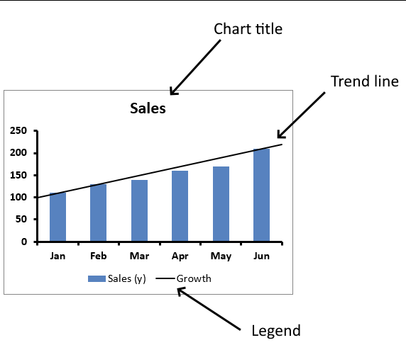
Chart elements are the title, legend, grid lines, and data labels etc. This article demonstrates how to add these elements to your charts.
Table of Contents
1. Introduction
What is the chart title?
The chart title is the heading displayed at the top of the chart describing what the chart represents. It helps users understand the purpose of the graph.
What is the chart legend?
The chart legend explains the columns, lines, colors, patterns, or markers used in the chart to represent different data series. It helps users identify which data points correspond to which category.
What is a chart data label?
A chart data label is a number or text displayed directly on data points in a chart showing the exact value of each point. This makes it easier to interpret the data without referring to the axes.
What is a chart grid line?
An Excel chart grid line is a horizontal or vertical line that extends across the chart to improve readability by aligning data points with the axis values. Grid lines help users visually compare data points and interpret trends more easily.
Why two y-axis on a chart?
A chart can have two y-axes (primary and secondary) when comparing datasets with different units or scales. For example, in a sales chart, one y-axis could show revenue in dollars while the other shows the number of units sold.
What is a chart trend line?
A chart trend line is a line added to a chart to show the overall direction or trend of data points. It helps identify patterns such as upward or downward trends over time.
What is a logarithmic trend line?
A logarithmic trend line is a curved line used in data that increases or decreases rapidly at first but then slows over time. It is useful for modeling growth rates such as population growth or learning curves.
What is a moving average?
A moving average is a trend line that smooths out fluctuations in data by averaging values over a specific number of periods. It helps highlight long-term trends by reducing short-term variations.
What is a chart error bar?
Error bars are graphical representations of data variability. They show the uncertainty or potential error in the measured values helping users understand the reliability of the data.
2. How to add chart grid lines
Chart gridlines are great for making the chart data more readable and detailed, Excel allows you to add major and minor gridlines to a chart. The major gridlines coincide with axis values and major tick marks.
How to insert
- Select the chart.
- Press with left mouse button on "plus" sign.
- Press with left mouse button on checkbox "Gridlines".
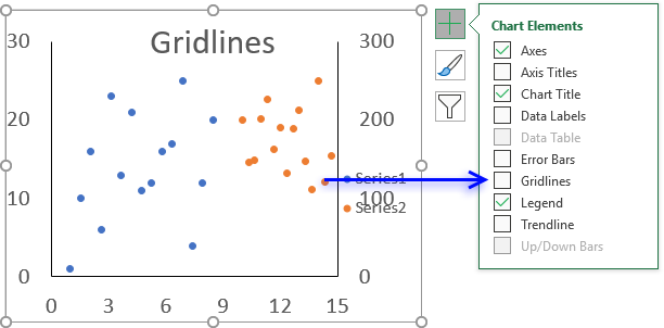
- Press with left mouse button on the arrow to expand options.
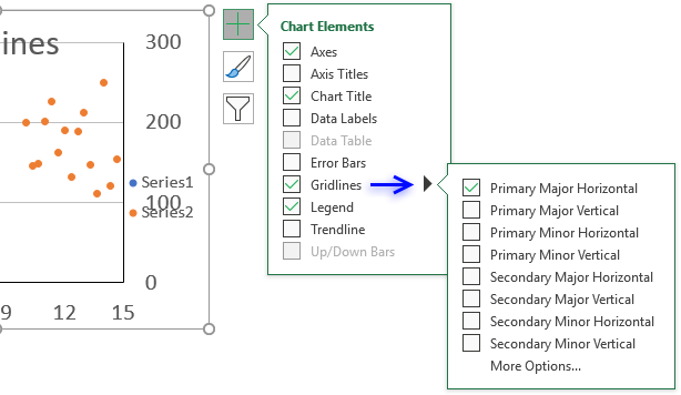
- Now select the gridlines you want on your chart:
- Primary Major horizontal
- Primary Major vertical
- Primary Minor horizontal
- Primary Minor vertical
- Secondary Major horizontal
- Secondary Major vertical
- Secondary Minor horizontal
- Secondary Minor vertical
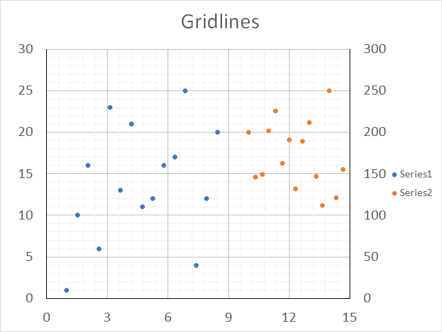
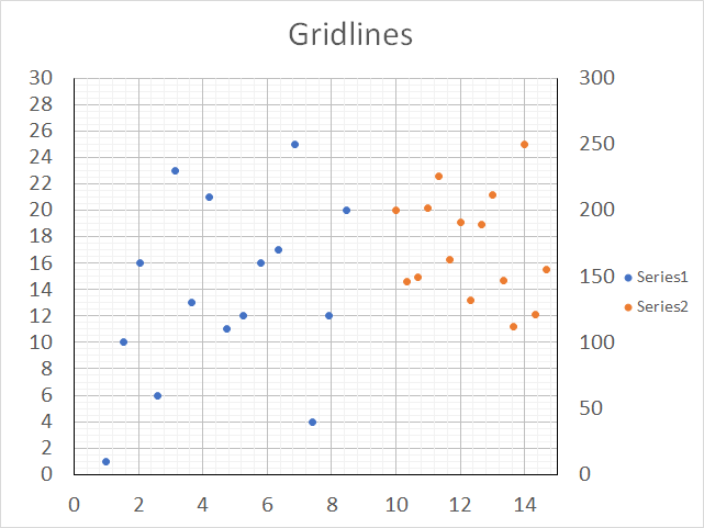
The following chart shows both major and minor gridlines in an x y scatter chart.
How to change gridline interval
- Double-press with left mouse button on with left mouse button on axis values to open the task pane on the right side of your Excel window.
Double press with left mouse button on the x axis values if you want to change the interval of vertical major and minor gridlines and vice versa. 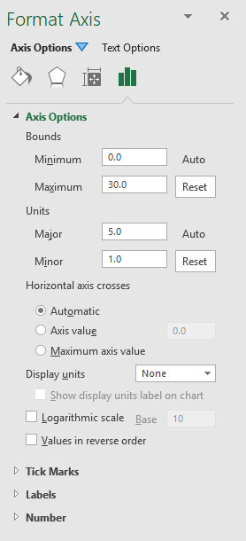 Go to tab "Axis Options" on the task pane.
- Press with mouse on "Axis Options" arrow to expand settings.
- Change the major and minor units in order to change the gridline interval.
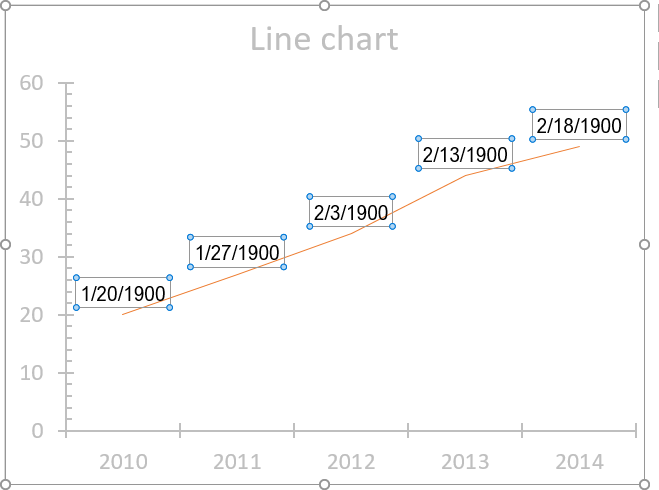
3. How to add and customize chart data labels
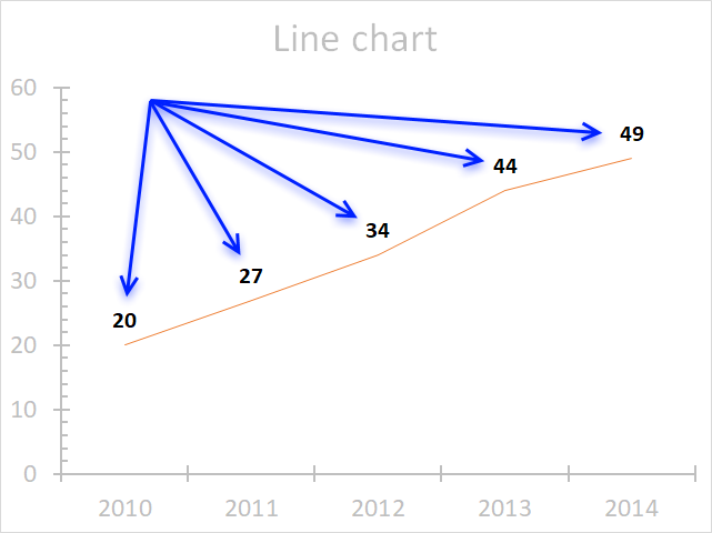
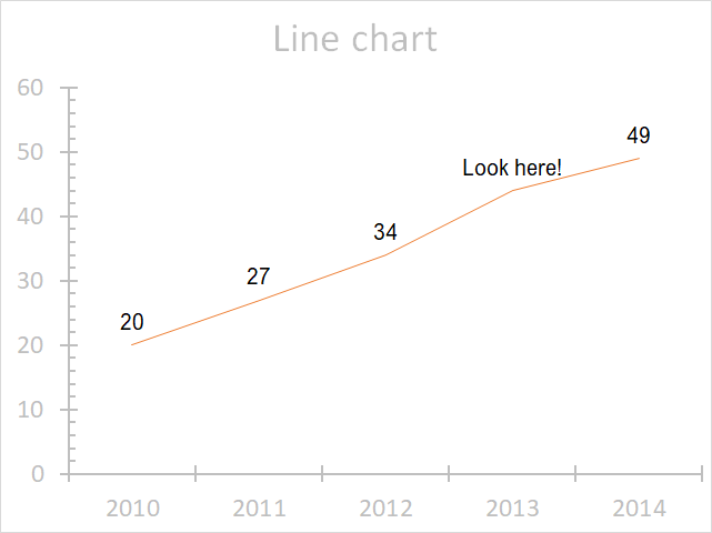
The image above demonstrates data labels in a line chart, each data point in the chart series has a visible data label.
3.1 How to edit data labels
Excel allows you to edit the data label value manually, simply press with left mouse button on a data label until it is selected. Press with left mouse button on again to select the text, you can now type any value you want.
I changed the data label value to "Look here!".
You can link a group of data labels to a cell range so you don't need to edit each data label, read this article: Custom chart data labels
3.2 How to customize the data labels
You can easily change the font, font size, and font color. Simply select the data labels.
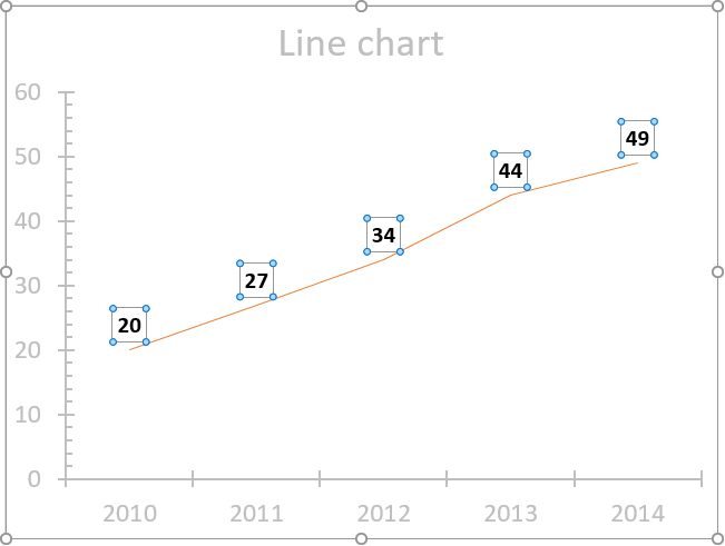
Go to tab "Home" on the ribbon if you are not already there.
The font and font size drop-down lists allow you to pick a font and size for your data labels, the "fill color" button lets you choose a background color and the "Font color" button lets you change the font color of the data labels.
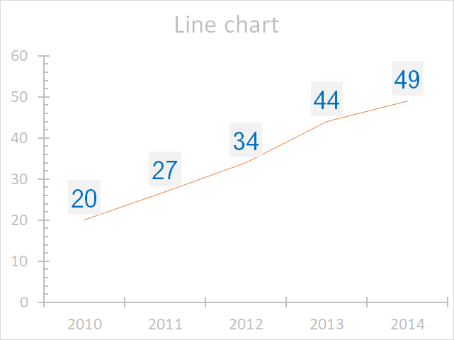
The image above shows a grey background color, blue font color, and a different font.
3.2.1 How to change the contents of data labels
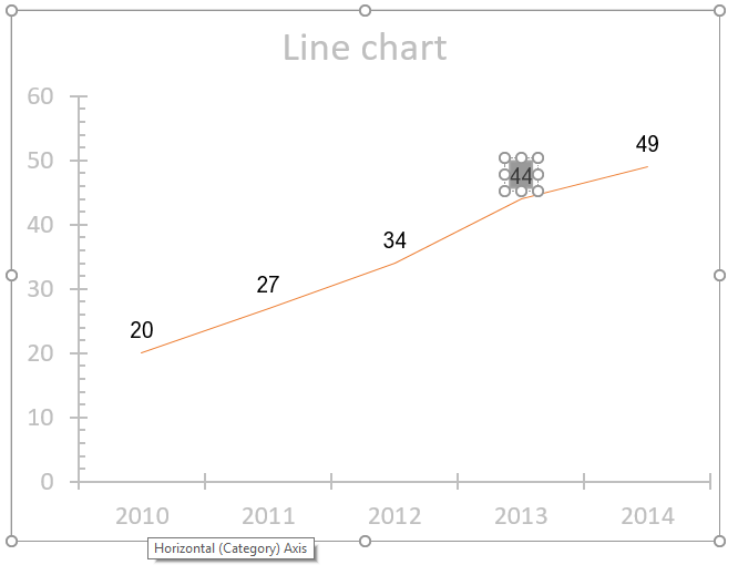
Double press with left mouse button on with left mouse button on a data label series to open the settings pane.
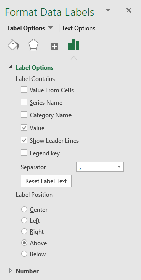 Go to tab "Label Options" see image to the right.
The checkboxes let you select what values you want to use as data labels.
Value from cells - Lets you select a cell range that contains the values you want to use.
Series name - The name of the data series.
Category name - The same value as the x-axis value.
Value - The y-axis value (default).
Legend key - Color of the chart element (line, bar, column, etc..) of the data series.
3.2.2 How to position data labels
Double press with left mouse button on with left mouse button on a data label series to open the settings pane.
Go to tab "Label Options" see image to the right.
You have here the option to change the data label position relative to the data point.
Center - This places the data label right on the data point.
Left - The data label is on the left side of the data point.
Right - The data label is on the right side of the data point.
Above - The data label is above the data point. (Default value)
Below - The data label is below the data point.
3.2.3 How to change the data label number formatting
Double press with left mouse button on with left mouse button on a data label series to open the settings pane.
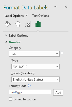 Go to tab "Label Options" see image to the right.
This setting allows you to change the number formatting of the data labels.
The image below shows numbers formatted as dates.
3.2.4 How to add background fill to data labels
Double press with left mouse button on with left mouse button on a data label series to open the settings pane.
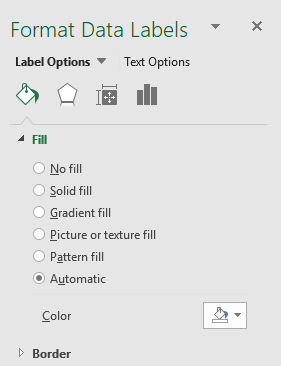 Go to tab "Fill & Line" and expand "Fill" settings, see image to the right.
These settings allow you to change the background to a solid fill, gradient fill, picture or texture fill, pattern fill, or Automatic.
3.2.5 How to add borders to data labels
Double press with left mouse button on with left mouse button on a data label series to open the settings pane.
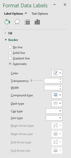 Go to tab "Fill & Line" and expand "Border" settings, see image to the right.
These settings let you add and customize a border around the data labels.
3.2.6 How to add effects to data labels
Double press with left mouse button on with left mouse button on a data label series to open the settings pane.
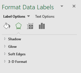 Go to tab "Effects", see image to the right.
These settings allow you to apply shadows, glow, soft edges and 3-D-Format to data labels.
3.2.7 How to change the text direction of data labels
Double press with left mouse button on with left mouse button on a data label series to open the settings pane.
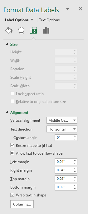 Go to tab "Size & properties", see image to the right.
These settings let you chosse vertical alignment and text direction.
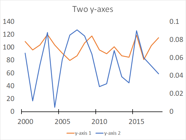
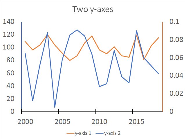
4. How to add two y-axes in one chart
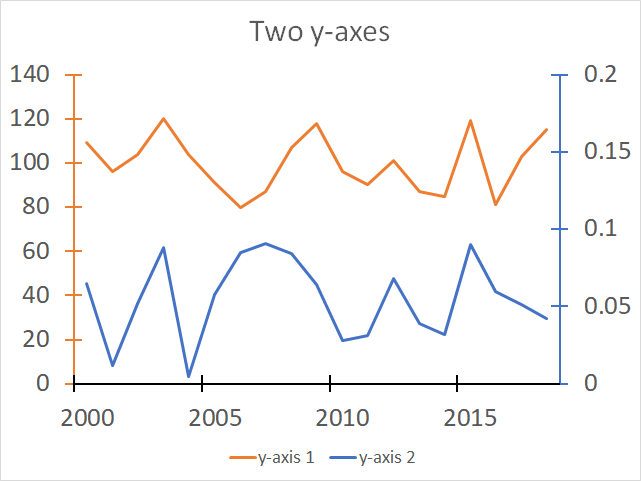
The image above demonstrates a line chart containing two data series and two y-axes, one for each data series. I changed the color of the y-axes so they match the corresponding color of the data series.
A secondary y-axis is very useful if the data points of the second data series are way off. You won't be able to read the chart if they share the same y-axis, here is an example:
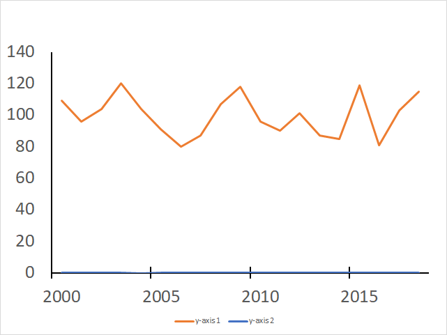
This chart shows two data series, however, only one is readable. Here is how to add a secondary axis:
- Double-press with left mouse button on one of the two data series in the chart to open the task pane.
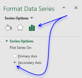
- Go to tab "Series Options".
- Select "Secondary Axis".
4.1 Add y-axes lines
These steps demonstrates how to change the color of the y axis lines. They correspond to the line color making it easier to identify which series belong to which y-axis.
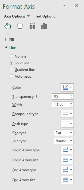 Double-press with left mouse button on left y-axis values to open the settings pane.
- Go to tab "Fill & Line"
- Expand Line settings.
- Press with left mouse button on "Solid Line"
- Pick a color.
- Repeat steps 1 to 5 with the right y-axis.
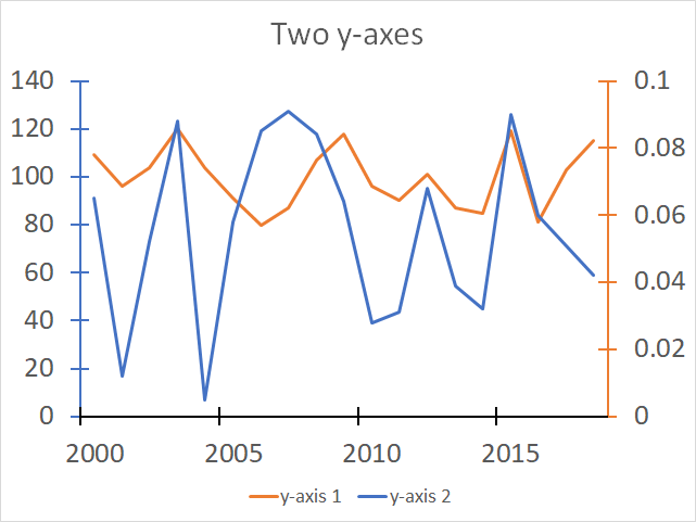
4.2 Add major tick marks
- Go to tab "Axis options".
- Expand "Tick Marks" settings.
- Pick a major type tick mark.
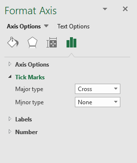
- Repeat step 1 to 3 with the right y-axis.
4.3 Change the right y-axis boundary
The data series collide and to make it better looking we can adjust the upper and lower y-axis range.
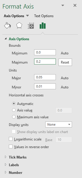 Double-press with left mouse button on the right y-axis to open the settings pane.
- Expand "Axis Options".
- Change Maximum to 0.2
- Close the settings pane.
5. How to add a linear trendline to a chart
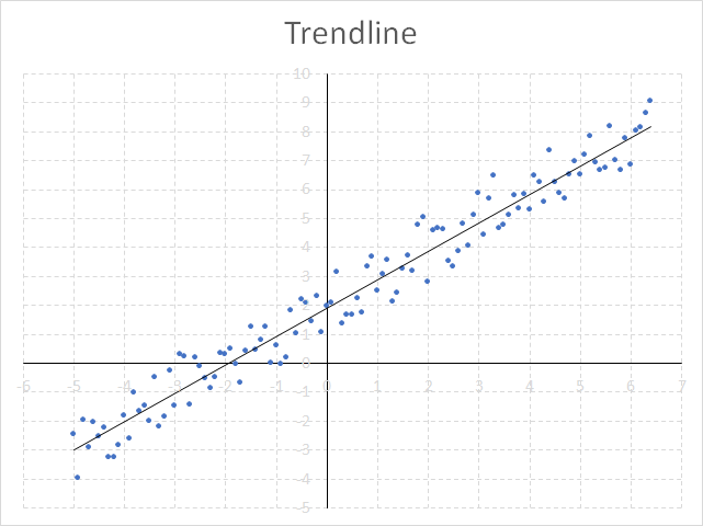
Excel allows you to insert a linear chart trendline that displays a straight line calculated based on the method of least squares of your data series, it is often used in statistical regression analysis.
How to build
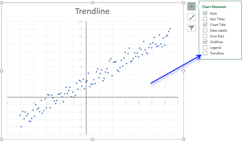
- Select the chart.
- Press with left mouse button on the "plus" sign next to the chart.
- Press with left mouse button on checkbox "Trendline".
How to display the linear equation on the chart
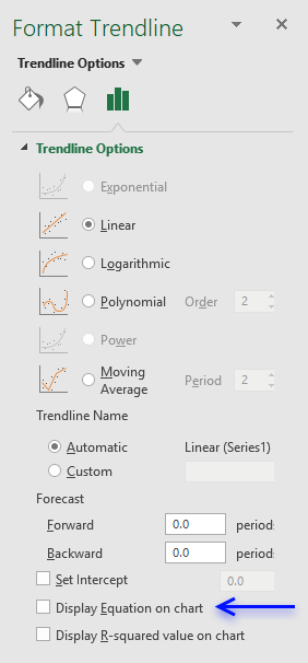
- Doublepress with left mouse button on the trendline to open the settings pane.
- Press with left mouse button on the checkbox "Display Equation on chart".
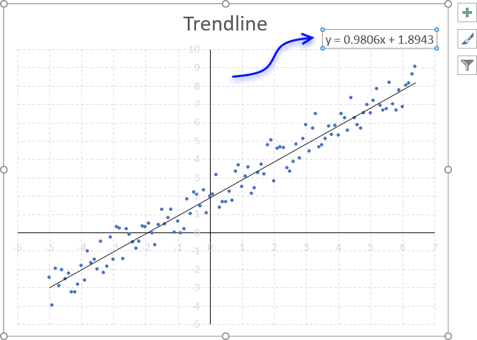
You can build the linear equation manually in Excel using the SLOPE function to get the slope of the regression line. Use the INTERCEPT function to calculate the point at which the line will intersect the y-axis.
6. How to add a logarithmic trend line
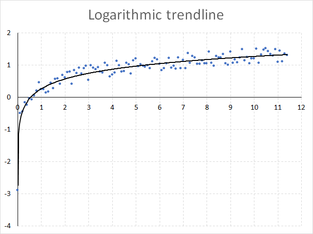
Excel lets you easily add a best-fit curved logarithmic trendline calculated based on the method of least squares.
How to build
- Select the chart.
- Press with left mouse button on the "plus" sign next to the chart.
- Press with left mouse button on arrow next to "Trendline".
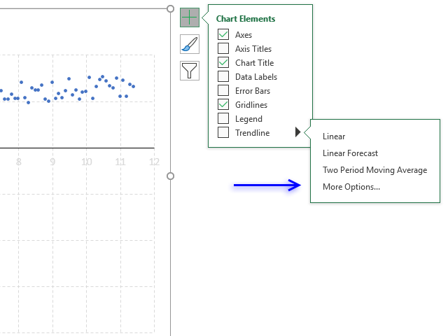
- Press with left mouse button on "More Options..." to open the task pane.
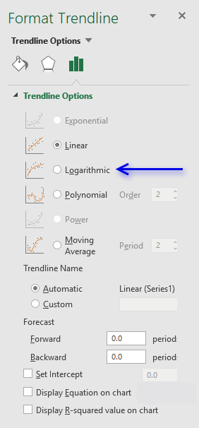
- Press with left mouse button on radio button "Logarithmic".
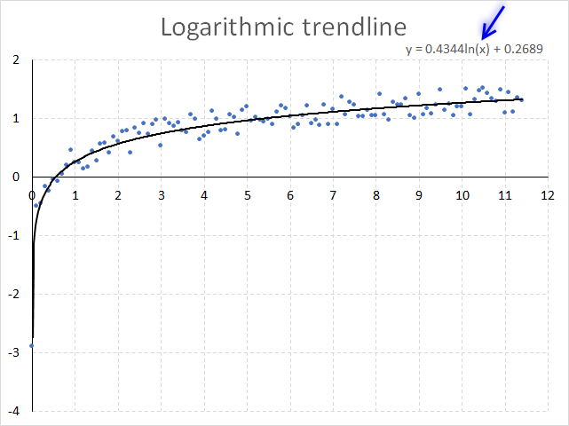
6.1 How to display the logarithmic equation on the chart
- Doublepress with mouse on the trendline to open the settings pane.
- Press with left mouse button on the checkbox "Display Equation on chart".
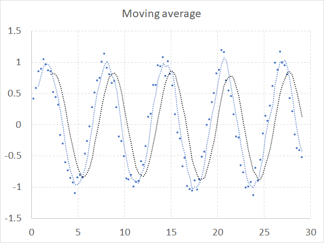
7. How to add a moving average to a chart
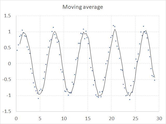
A moving average smooths out short-term variations to show a long-term trend or cycle. The chart above shows random values combined with a sinus curve, the moving average is calculated, in this case, based on the last three values.
How to build
- Select the chart.
- Press with mouse on the "plus" sign next to the chart.
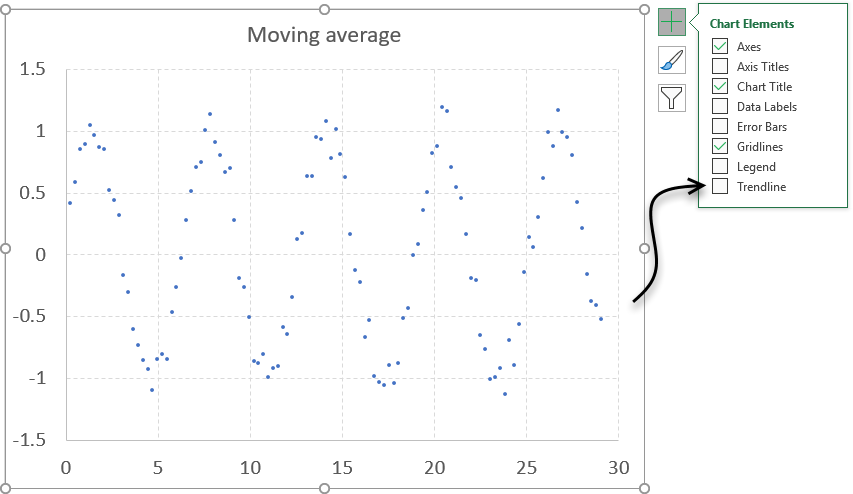
- Press with left mouse button on "Trendline"
- The settings pane appears.
- Press with mouse on radio button "Moving Average".
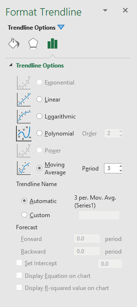
- Change the period value, the chart will update instantly with the new value.
- Go to tab "Fill & Line" to customize the moving average to your preference.
How to add a second moving average
- Simply press with right mouse button on on the data series.
- Press with mouse on "Add Trendline...".
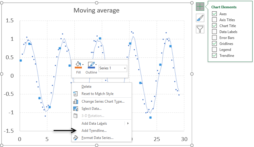
- A second moving average appears.
- Select it and then go to tab "Fill & Line" to customize it.
8. How to add Error Bars to a chart
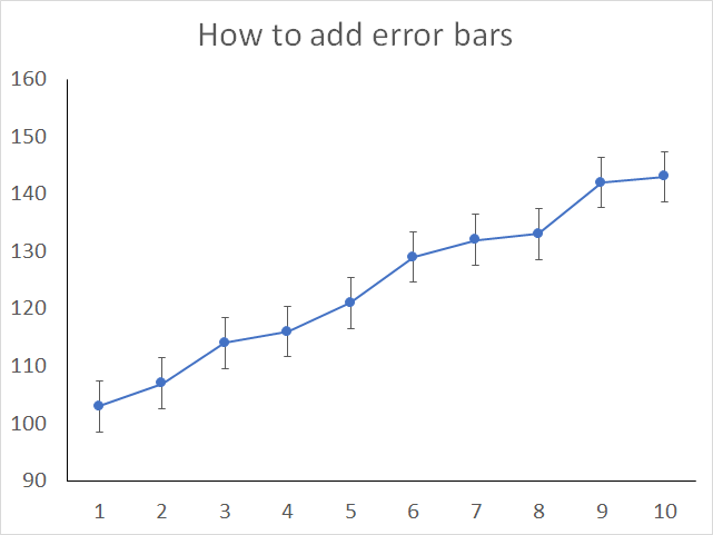
Enable error bars when you want to show, for example, standard deviations in a chart, Excel lets you insert error bars to the following charts:
- 2-D area chart
- Bar chart
- Column chart
- Line chart
- x y scatter chart
- Bubble chart
Scatter and bubble charts let you show error bars for both x and y values.
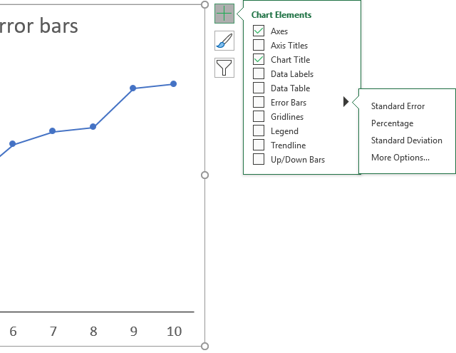
How to enable
- Select chart.
- Press with mouse on "plus" sign next to chart.
- Press with mouse on checkbox "Error Bars" to enable it.
- The arrow next to the "Error Bars" checkbox lets you choose between 3 different error bars:
- Standard error
- Percentage
- Standard deviation
- More Options...
How to customize error bars
- Double-press with left mouse button on one of the error bars to open the task pane.
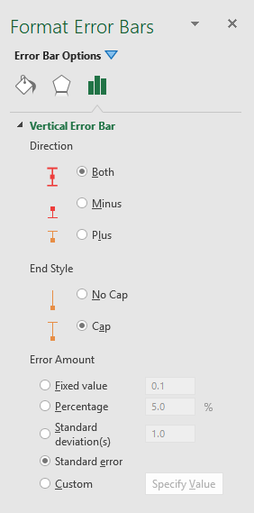
- Press with left mouse button on "Error bars options" tab to display the settings above.
Excel lets you change the direction of the error bar, the end style and the error amount.
Built-in Charts
Combo Charts
Combined stacked area and a clustered column chartCombined chart – Column and Line on secondary axis
Combined Column and Line chart
Chart elements
Chart basics
How to create a dynamic chartRearrange data source in order to create a dynamic chart
Use slicers to quickly filter chart data
Four ways to resize a chart
How to align chart with cell grid
Group chart categories
Excel charts tips and tricks
Custom charts
How to build an arrow chartAdvanced Excel Chart Techniques
How to graph an equation
Build a comparison table/chart
Heat map yearly calendar
Advanced Gantt Chart Template
Sparklines
Win/Loss Column LineHighlight chart elements
Highlight a column in a stacked column chart no vbaHighlight a group of chart bars
Highlight a data series in a line chart
Highlight a data series in a chart
Highlight a bar in a chart
Interactive charts
How to filter chart dataHover with mouse cursor to change stock in a candlestick chart
How to build an interactive map in Excel
Highlight group of values in an x y scatter chart programmatically
Use drop down lists and named ranges to filter chart values
How to use mouse hover on a worksheet [VBA]
How to create an interactive Excel chart
Change chart series by clicking on data [VBA]
Change chart data range using a Drop Down List [VBA]
How to create a dynamic chart
Animate
Line chart Excel Bar Chart Excel chartAdvanced charts
Custom data labels in a chartHow to improve your Excel Chart
Label line chart series
How to position month and year between chart tick marks
How to add horizontal line to chart
Add pictures to a chart axis
How to color chart bars based on their values
Excel chart problem: Hard to read series values
Build a stock chart with two series
Change chart axis range programmatically
Change column/bar color in charts
Hide specific columns programmatically
Dynamic stock chart
How to replace columns with pictures in a column chart
Color chart columns based on cell color
Heat map using pictures
Dynamic Gantt charts
Stock charts
Build a stock chart with two seriesDynamic stock chart
Change chart axis range programmatically
How to create a stock chart
Excel categories
Leave a Reply
How to comment
How to add a formula to your comment
<code>Insert your formula here.</code>
Convert less than and larger than signs
Use html character entities instead of less than and larger than signs.
< becomes < and > becomes >
How to add VBA code to your comment
[vb 1="vbnet" language=","]
Put your VBA code here.
[/vb]
How to add a picture to your comment:
Upload picture to postimage.org or imgur
Paste image link to your comment.