Excel Charts & Graphs
Built-in Charts
Combo Charts
Combined stacked area and a clustered column chartCombined chart – Column and Line on secondary axis
Combined Column and Line chart
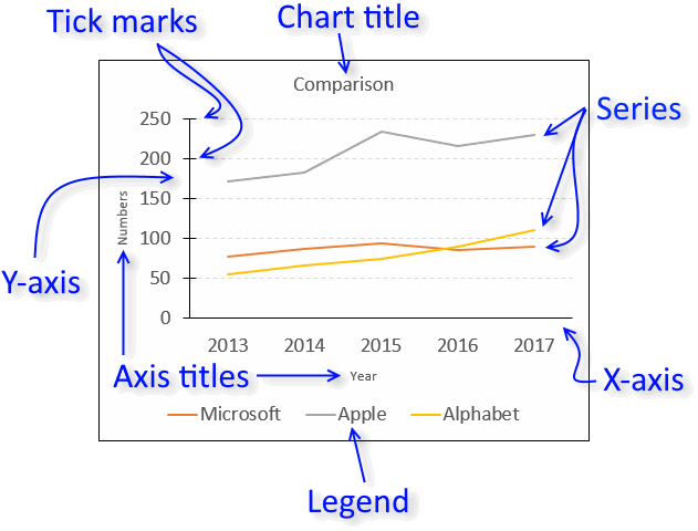
Chart elements
Chart basics
How to create a dynamic chartRearrange data source in order to create a dynamic chart
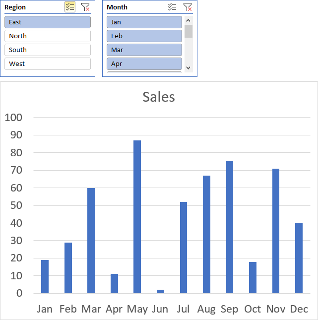
Use slicers to quickly filter chart data
Four ways to resize a chart
How to align chart with cell grid
Group chart categories
Excel charts tips and tricks
Custom charts
How to build an arrow chartAdvanced Excel Chart Techniques
How to graph an equation
Build a comparison table/chart
Heat map yearly calendar
Advanced Gantt Chart Template
Sparklines
Win/Loss Column LineHighlight chart elements
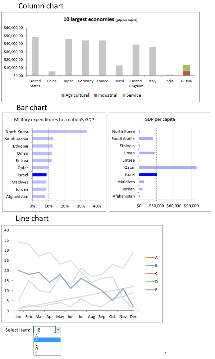
Highlight a column in a stacked column chart no vbaHighlight a group of chart bars
Highlight a data series in a line chart
Highlight a data series in a chart
Highlight a bar in a chart
Interactive charts
How to filter chart dataHover with mouse cursor to change stock in a candlestick chart
How to build an interactive map in Excel
Highlight group of values in an x y scatter chart programmatically
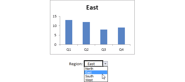
Use drop down lists and named ranges to filter chart values
How to use mouse hover on a worksheet [VBA]
How to create an interactive Excel chart
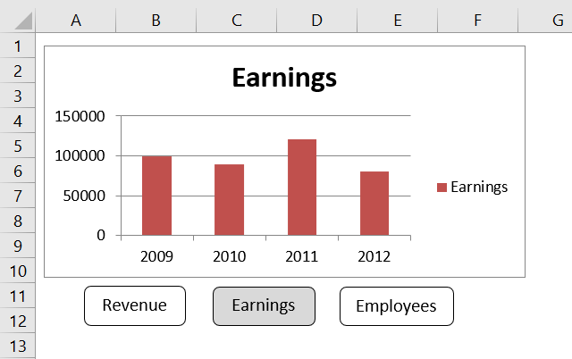
Change chart series by clicking on data [VBA]
Change chart data range using a Drop Down List [VBA]
How to create a dynamic chart
Animate
Line chart Excel Bar Chart Excel chartAdvanced charts
Custom data labels in a chartHow to improve your Excel Chart
Label line chart series
How to position month and year between chart tick marks
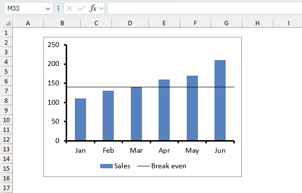
How to add horizontal line to chart
Add pictures to a chart axis
How to color chart bars based on their values
Excel chart problem: Hard to read series values
Build a stock chart with two series
Change chart axis range programmatically
Change column/bar color in charts
Hide specific columns programmatically
Dynamic stock chart
How to replace columns with pictures in a column chart
Color chart columns based on cell color
Heat map using pictures
Dynamic Gantt charts
Stock charts
Build a stock chart with two seriesDynamic stock chart
Change chart axis range programmatically
How to create a stock chart
The sidebar (or click the hamburger icon if you are on mobile) shows a list of chart articles, I hope you will find them interesting and useful.
Table of Contents
- How do I create a chart/graph in Excel?
- How do you show a legend in a chart?
- How do you show a title in a chart?
- How do I select all data points in a chart?
- What is a data series?
- How do I select a single data point in a chart?
- How do I add data to all chart series?
- How do I add data to a single chart series?
- How do I add a data series to a chart?
- How do I use a chart style?
- How do I add chart elements?
- How do I remove chart elements?
- How do I combine charts?
- How can I show two x-axis on a chart?
- How do I show two y-axis on a chart?
- How can I highlight a single data point in a chart?
- How do I add data labels?
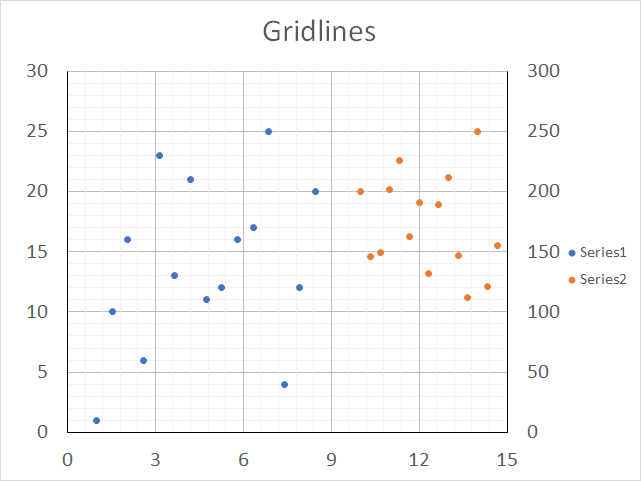
- How do I add grid lines?
- What are the latest charts?
- How do I add a moving average?
- How do I create an interactive chart?
- How do I change chart font and font size?
- How do I change line thickness?
- How do I change column/bar thickness?
- How do I change line/column/bar color?
How do I create a chart/graph in Excel?
- Select the data you want to chart.
- Go to tab "Insert" on the ribbon.
- Click a chart button, there are 9 different categories to choose from.

They are:- Column/Bar charts
- Line/Area charts
- Pie/Doughnut charts
- Hierarchy charts
- Statistic charts
- Scatter/Bubble charts
- Waterfall/Funnel/Stock/Surface/Radar charts
- Combo charts
- Map charts
- Pick a chart in the chosen category.
Back to top
How do you show a legend/series names in a chart?
- Select the chart.
- Click the plus sign next to the chart to see chart elements.
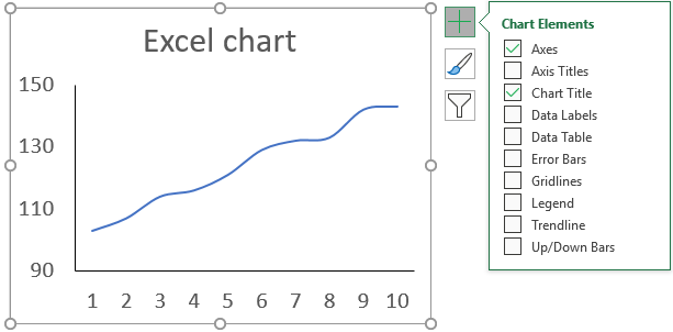
- Click the "Legend" check box to enable it.
Back to top
How do you show a title in a chart?
- Select the chart.
- Click the plus sign next to the chart to see chart elements.

- Click the "Chart Title" check box to enable it.
Back to top
How do I select all data points in a chart?
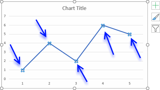
Click once on the line/column/bar, if all data points are highlighted you know you succeeded. You can only select one data series at a time.
Back to top
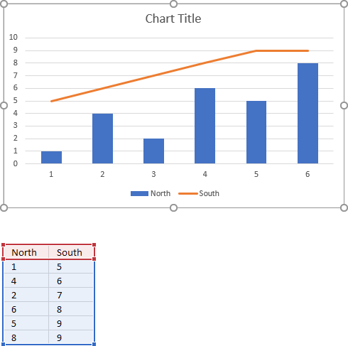
What is a data series?
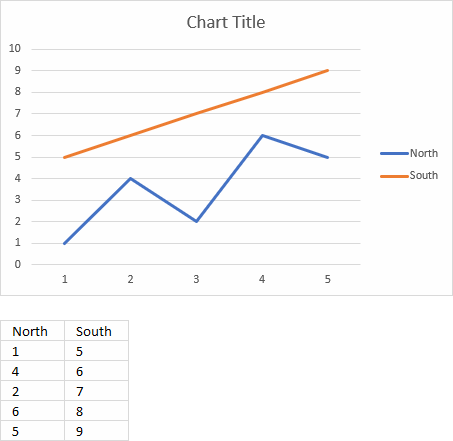
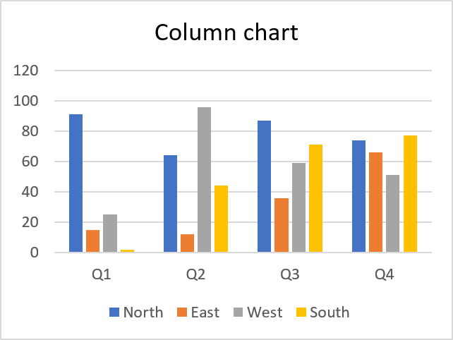
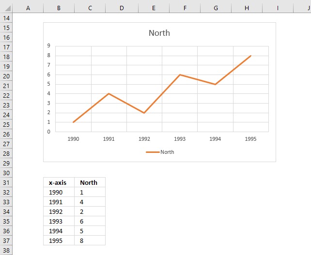
The chart above shows two data series. North and South. The legend to the right shows the name and color of each data series.
Below the chart is a dataset containing both data series in a column each.
Back to top
How do I select a single data point in a chart?
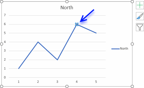
Click twice on a data point to select it.
Back to top
How do I add data to all chart series?
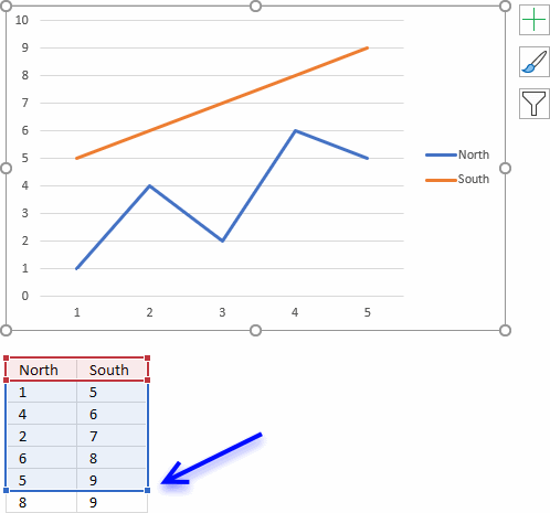
- Click on chart to select it.
- The cell range of the chart data source is now visible. Click and hold on the dot in the bottom right corner.
- Drag down as far as needed to include new values.
Back to top
How do I add data to a single chart series?
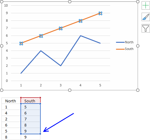
- Click on data series to select it.
- The cell range of the selected chart data source is now visible. Click and hold on the dot in the bottom right corner.
- Drag down as far as needed to include new values.
Back to top
How do I add a data series to a chart?
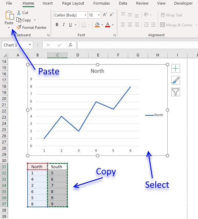
- Copy data series.
- Select chart.
- Paste to chart.
Back to top
How do I use a chart style?
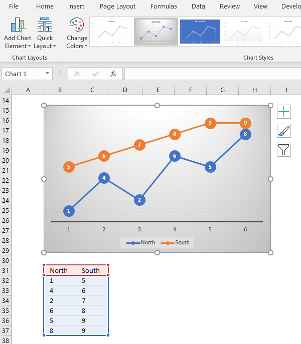
- Select chart.
- Go to tab "Design".
- Select a chart style.
Back to top
How to add/remove chart elements
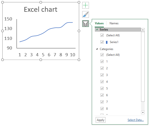
Did you know that you can add or remove most chart elements by clicking on the "plus" sign next to the chart, this lets you enable axes, axis titles, chart title, data labels, data table, error bars, gridlines, legend, trendlines and up/down bars for the selected chart.

To access more detailed settings simply double click the chart element to open the task pane that usually appears on the right side of the Excel window.
The next button below the "plus" sign lets you apply a chart style and color scheme.
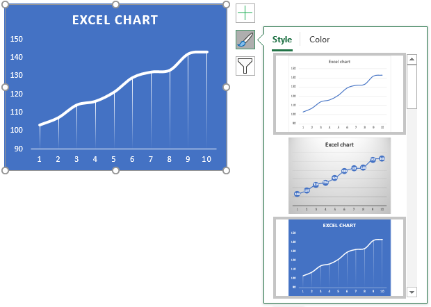
Hover over a chart style to see what your chart would look like, see image above.
The next tab lets you pick a color scheme for your chart, use the scroll bar to see all available schemes.
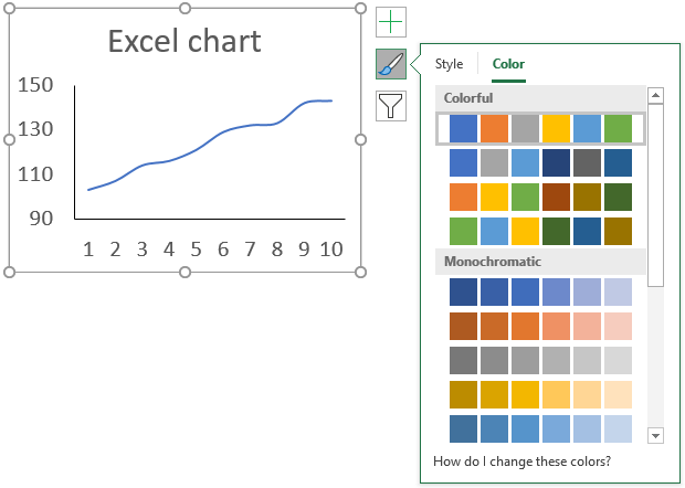
The last button allows you to filter specific values, simply click a check box to show or hide a data series or a value in the chart.
How do I combine charts?
- Select at least two data series.
- Go to tab "Insert".
- Click "Combo Charts" button.
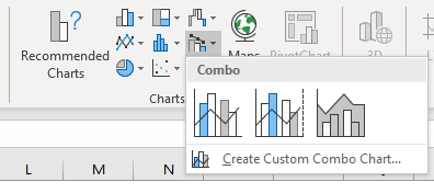
- Pick a combo chart...
In case you can't find the combo you are looking for then click "Create Custom Combo Chart..". The following dialog box appears.
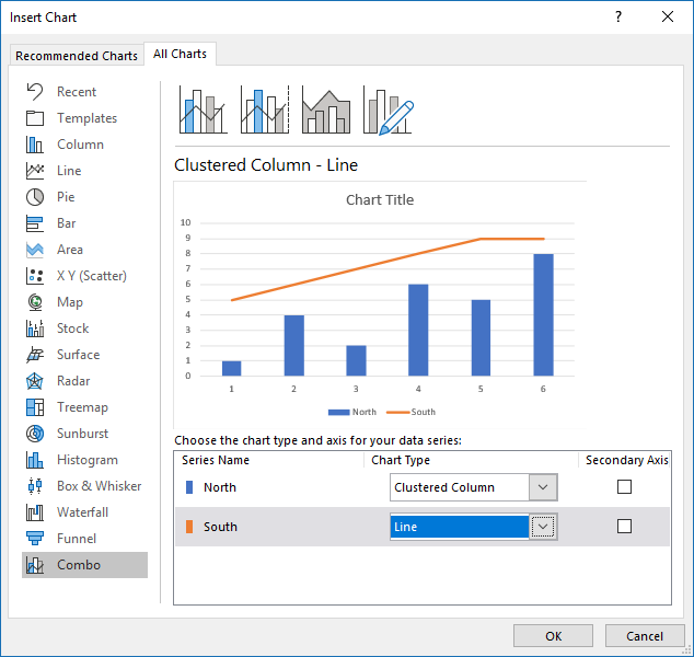
It allows you to choose which chart types you want to combine.
Back to top
How can I show two x-axis on a chart?
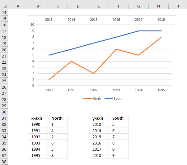
- Create a chart with two data series.
- Double-click on one of the data series. The Format pane appears.
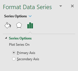
- Click radio button "Secondary Axis".
- Click on the secondary vertical axis and delete it.
- Right click on chart and click on "Select Data...".
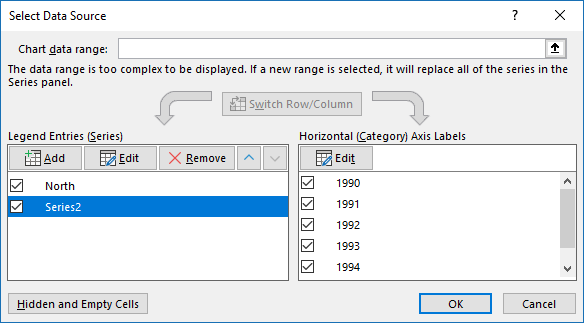
- Click "Edit" button and add the x-axis values for the secondary data series.
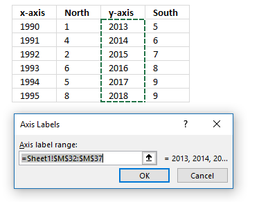
- Click OK button.
- Click OK button.
Back to top
How do I show two y-axis on a chart?
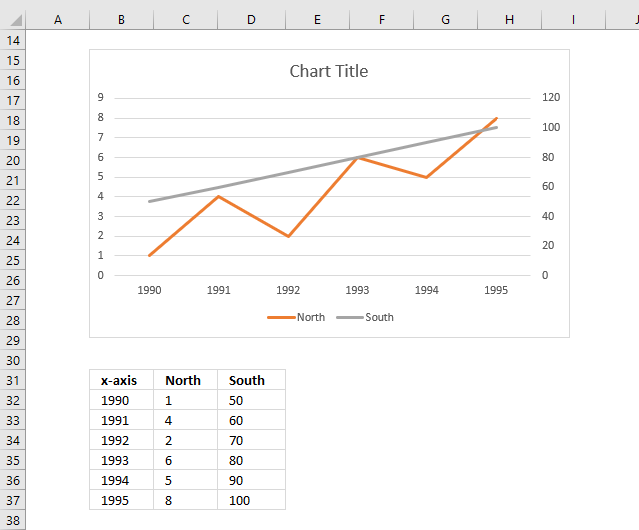
- Create a chart with two data series.
- Double-click on one of the data series. The Format pane appears.

- Click radio button "Secondary Axis".
Back to top
How can I highlight a single data point in a chart?
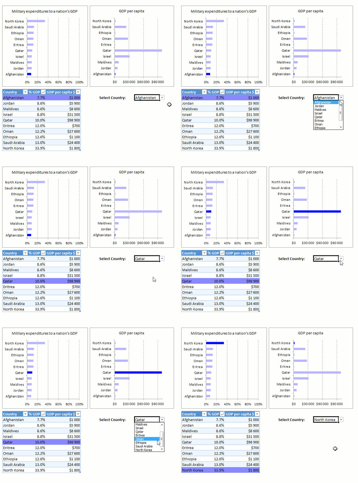
The following category contains articles demonstrating how to highlight a data point: Highlight elements in charts
Back to top
How do I add data labels?
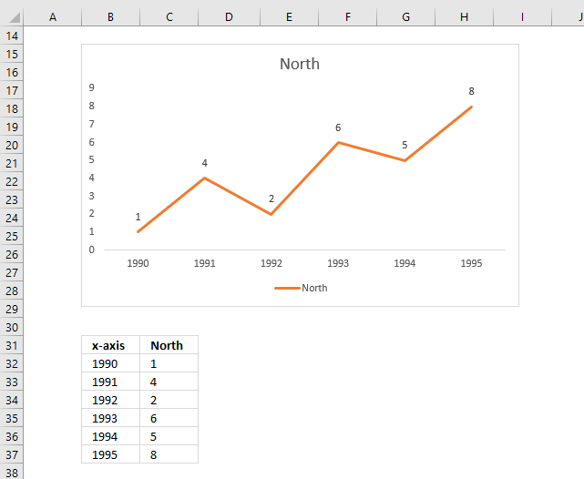
- Right click on a data series.
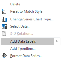
- Click on "Add Data Labels..".
Back to top
How do I add gridlines?
- Right click on the vertical or horizontal axis values.
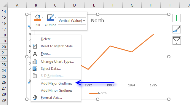
- Click on "Add Major Gridlines".
Back to top
What are the latest charts?
The following charts were introduced in Excel 2016.
- Waterfall chart [2016]
- Treemap chart [2016]
- Sunburst chart [2016]
- Histogram chart [2016]
- Pareto chart [2016]
- Box and Whisker [2016]
Back to top
How do I add a moving average?
This article explains how to add a moving average: Moving averages
Back to top
How do I create an interactive chart?
Check this category out: Interactive charts category
Back to top
How do I change chart font and font size?
The following article explains how to change the font and font size of a chart element: Change font and font size
Back to top
How do I change line thickness?
- Double click on a line to open the Format Pane.
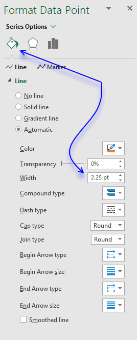
- Go to tab "Fill & Line".
- Change line width using the scroll buttons or type a number that represents the thickness.
Back to top
How do I change column/bar thickness?
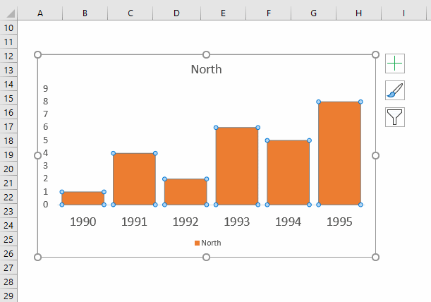
- Double click on a line to open the Format Pane.
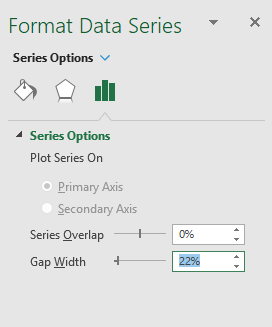
- Go to tab "Series Options".
- Change gap width.
Back to top
How do I change bar/line/column color?
This article explains how to change font and font size of a chart element.
Back to top
