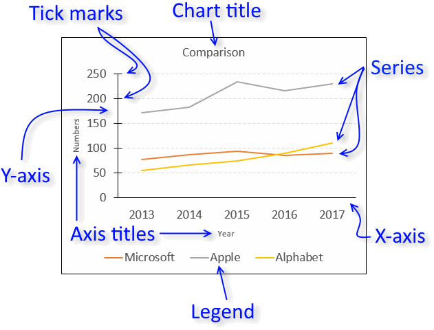
Excel chart components
Charts in Microsoft Excel lets you visualize, analyze and explain data. Charting in Excel is very easy and you will be amazed how quickly you can produce a clear visual representation of your data.
This article explains the different elements that exist in the most popular Excel charts. The links below allow you to quickly move to a section in this article.
What's on this page
Check out the 'Chart Basics' category for more tips and tricks.
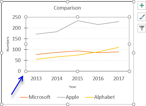
1. How to customize the chart area
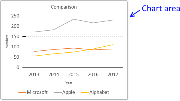
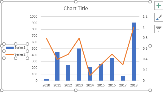
The chart area contains all components. If you choose to format the chart area you can change things like border, shadow, background color, etc.
For example, the picture above shows you a black line around the chart area and a shadow applied to the chart.
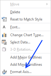
To format the chart area simply press with right mouse button on on the chart and then press with left mouse button on "Format Chart Area".

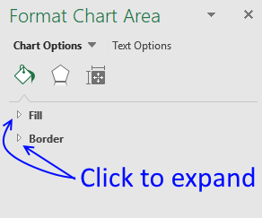
The "Format Chart Area" pane has three different tabs, see the picture below.
- Fill and Line
- Effects
- Size and properties
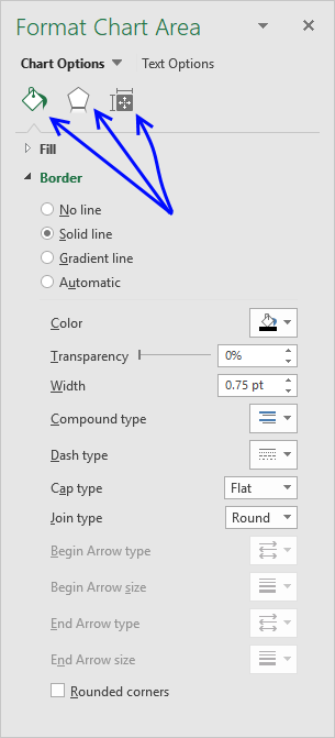
1.1 Fill and Line
The "Fill & Line" tab has two settings, Fill and border. Press with mouse on the arrows to expand all settings.
The "Fill" settings allow you to change the background color, gradient or use a background picture.
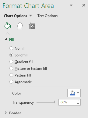
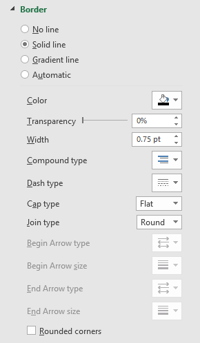
The "Border" settings let you change the border size, color, line properties etc.
1.2 Effects
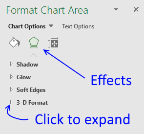
The Effects tab allows you to apply and customize shadows, glow, soft edges, and a 3d-effect to your chart.
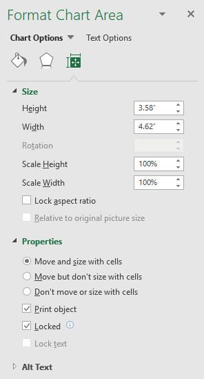
1.3 Size & properties
The size and properties tab lets you change the chart size and if the chart should move and size with cells.
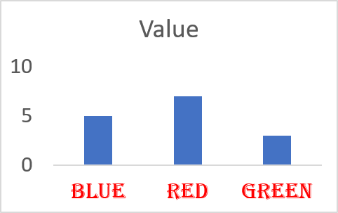
2. How to customize the chart title
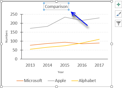
I recommend a chart title that is short and easy to understand.
2.1 How to add a chart title
Follow these steps to add a chart title to your chart.
- Press with mouse on the chart that you want to add a chart title to.
- Press with mouse on tab "Design" on the ribbon.
- Press with left mouse button on "Add Chart Elements" button.
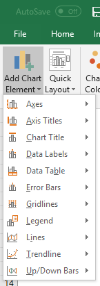
- Press with mouse on "Chart title".
- Press with mouse on "Above Chart".
2.2 How to delete the chart title
Press with mouse on the chart title with left mouse button.
The chart now shows that the chart title selected.
Press Delete key on your keyboard.
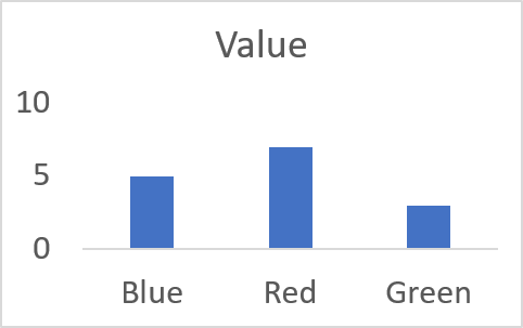
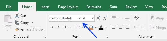
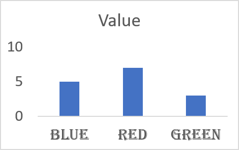
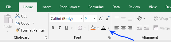
2.3 How to customize the chart title
You can easily change the font, font size and color of the chart title.
- Select chart title.
- Go to tab "Home" on the ribbon.
- Press with mouse on "Font text" to change the font.
- Press with mouse on "Font size" to change the font size.
- Press with mouse on letter A to pick a font color.
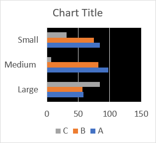
3. Plot area
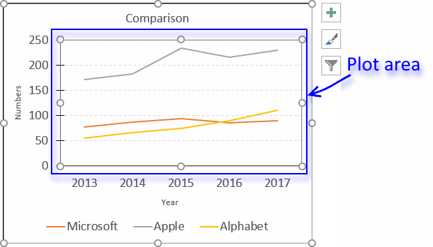
The plot area refers to the location of the chart that displays the actual data represented by lines, bars, columns, dots etc. You can easily customize this area, both in size and appearance.
3.1 Plot area size
To change the plot area size simply press with left mouse button on it until it is selected, you know it is selected when you see dots around the plot area. The dots around the chart are sizing handles that allow you to resize the plot area inside the chart area.
Press and hold with left mouse button on one of these dots, then drag with mouse to change the size of the plot area, however, you can't make it larger than the chart area.
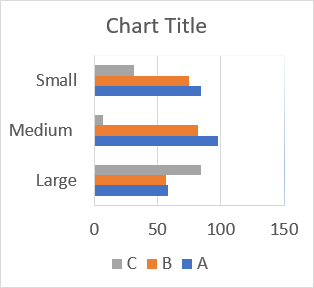
3.2 Customize the plot area
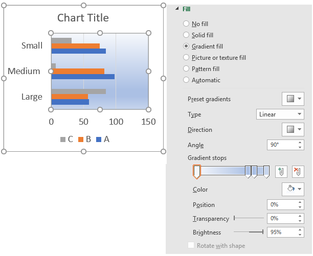
To display the plot area settings simply double-press with left mouse button on with left mouse button on the plot area to open the settings pane.
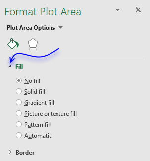
"Gradient fill" lets you create a background gradient, there are a plethora of options if you select this.
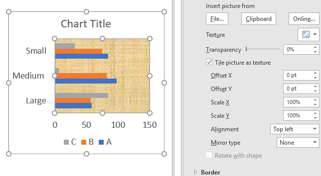
"Picture or texture fill" lets you pick a background image on your hard drive or online, you can also use a clipart picture.
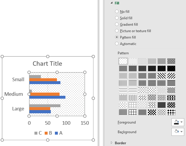
"Pattern fill" lets you pick a pattern.
The "Automatic" option lets you pick a color if you are not happy with the default one.
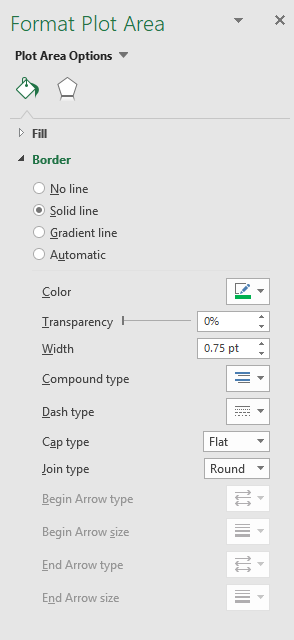
The border settings allows you to specify a border around the plot area. The "Solid line" gives you plenty of options to customize the line, color, transparency, width etc.
A "Gradient line" lets you specify many options like type, direction, angle, color, position, etc.
The "Automatic" setting is more or less like the "Solid line" setting.
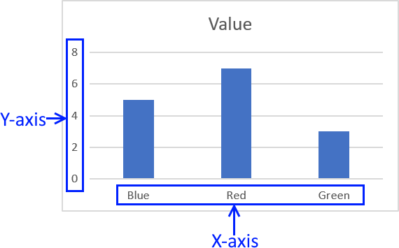
4. Axis titles
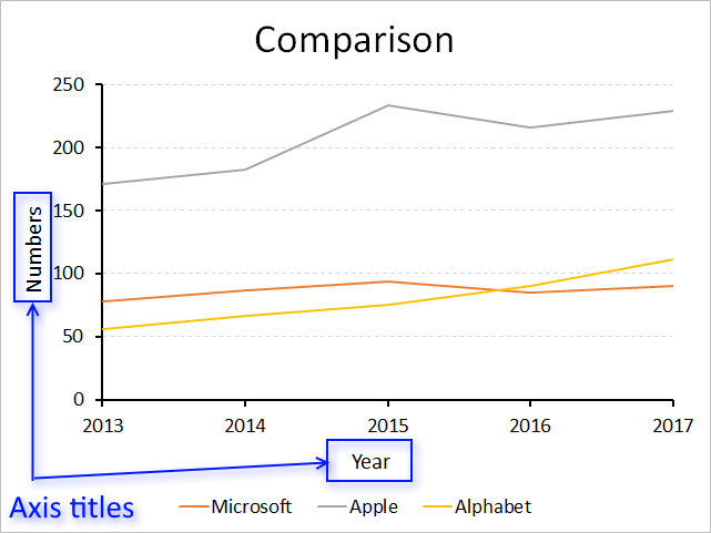
The x-axis and y-axis titles are just as easy to format and customize as the other chart elements.
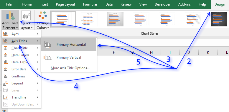
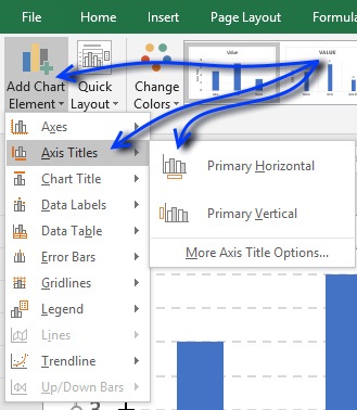
4.1 How to add axis titles to a chart
- Select the chart.
- Go to tab "Design" on the ribbon.
- Press with left mouse button on "Add Chart Element" button to display the menu.
- Press with mouse on "Axis Titles".
- Press with mouse on "Primary Horizontal" or "Primary Vertical".
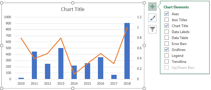
You can also press with left mouse button on the "plus" sign next to the chart to see available chart elements.
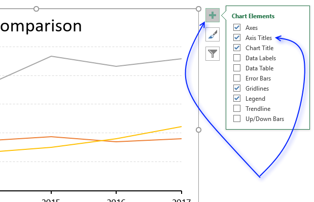
Press with left mouse button on "checkbox" "Axis Titles" to display them on the chart.
4.2 Axis title font properties
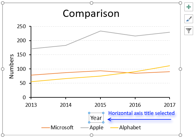
To change the font, font size, font color etc, simply select the axis title you want to change.
- Select an axis title.
- Go to tab "Home" on the ribbon.
- Press with mouse on "Font text" to change the font.
- Press with mouse on "Font size" to change the font size.
- Press with mouse on letter A to choose a font color.
4.3 Axis title settings
There are more things you can use to build a better-looking chart.
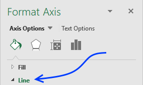
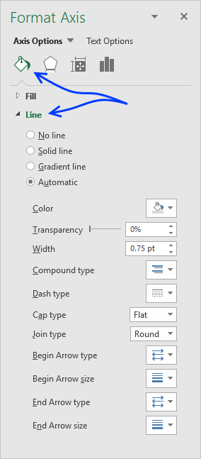
Simply press with right mouse button on on the axis title.
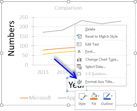
Press with mouse on "Format Axis Title...". The Format Axis settings show up probably on the right side of your screen.
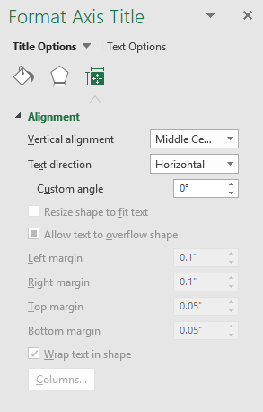
Here you have three tabs, Fill and Line, Effects, Size & Properties. The picture above displays the Size & Properties tab, here you change the text alignment and direction/angle.
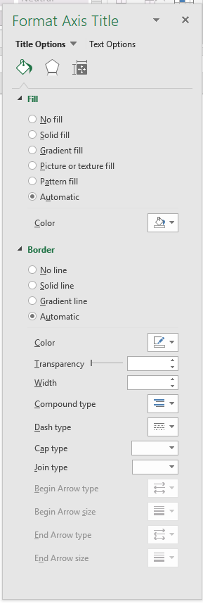
The Fill & line tab lets you change the background to a color, picture or gradient. It also allows you to apply a border around the title.
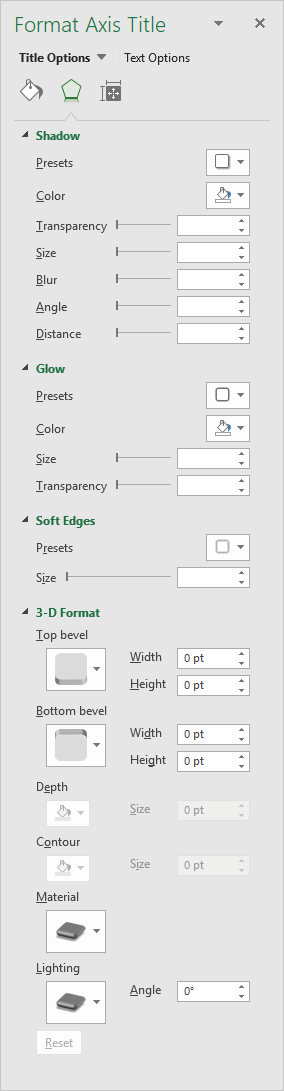
The Effects tab contains settings that allow you to apply a border, glow, soft edges or a 3d-effect to the selected axis title.
4.4 Axis values
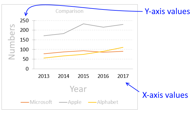
Excel lets you customize one of the chart axes and their corresponding values combined, for example, you can't only customize the axis line and apply a different formatting to the corresponding axis values.
The axes values are located next to the axes lines, the x-axis values are next to the horizontal axis line and the y-axis values are next to the vertical axis line.
4.5 Axis values font properties
To change the font, font size, font color etc, simply select the axis values you want to change.
- Select axis values.
- Go to tab "Home" on the ribbon.
- Press with mouse on "Font text" to change the font.
- Press with mouse on "Font size" to change the font size.
- Press with mouse on letter A to choose a font color.
4.6 Axis settings
Simply double-press with left mouse button on axis values to open the settings pane.
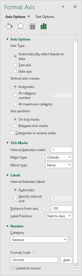 Four different tabs show up, the Axis Options tab is displayed in the picture to the right.
The axis options on tab "Axis Options" allow you to change:
- The axis type
- Automatically select based on data
- Text axis
- Date axis
- Where the vertical axis (y-axis) crosses the x-axis.
- Where to position axis, on tick marks or between tick marks.
- Tick marks
- Interval between marks
- Major type (corresponds to major gridlines)
- None
- Inside
- Outside
- Cross
- Minor type (corresponds to minor gridlines)
- None
- Inside
- Outside
- Cross
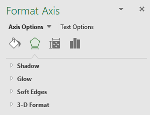 The "Effects" tab lets you add and customize:
- Shadows
- Glow
- Soft Edges
- 3d-Effects
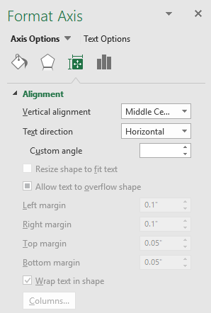 The "Size & Properties" tab lets you change
- Text alignment.
- Text direction.
- Text angle.
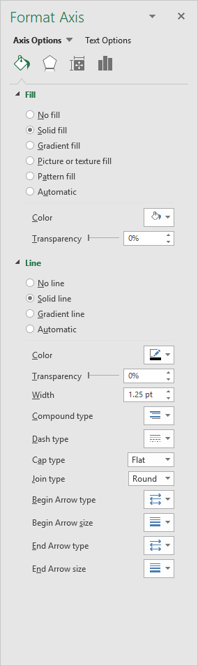 The "Fill & Line" tab allows you to change
- Axis line color
- Axis line thickness
- Axis line properties
- Axis values background-color
- Axis values background picture
- Axis values background gradient
</div id="pushcontent">
4.7 Copy and paste formatting
If you need to apply the same formatting to both the horizontal and vertical axis values you can't select both while pressing the CTRL key, you have to select one of them and apply the formatting.
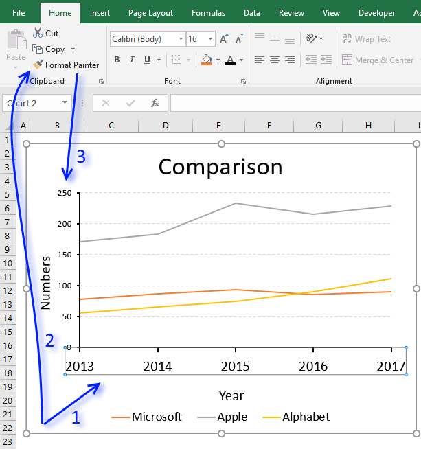
Then repeat the steps with the other axis values or you can select the formatted axis values and press the "Format Painter" button located on tab "Home" on the ribbon. Now press with left mouse button on the other axis values to apply the same formatting.
5. Chart series
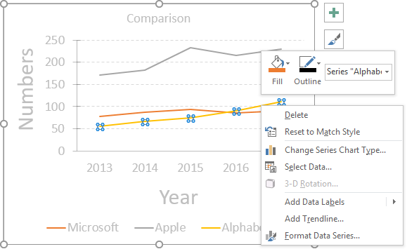
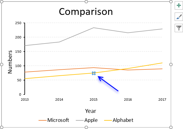
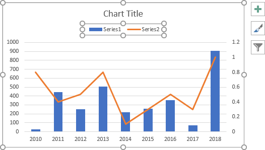
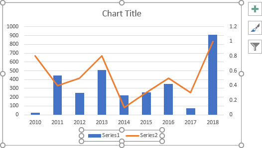
To change the looks of a data series simply double-press with left mouse button on with left mouse button on the data series. If you want to only select a data point in the data series simply press with left mouse button on again on the data point.
You know if you have the data series or a single data point selected based on the "selection markers". The top image shows selection markers around all data points for the yellow data series, the image below shows a single data point selected.
You can also press with right mouse button on on the chart element and then press with left mouse button on "Format Data Series...", see the top image. This opens the "Format Data Series" settings pane usually on the right side of the Excel window, see image below.
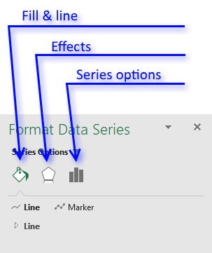
There are three tabs, Fill & Line, Effects and Series options.
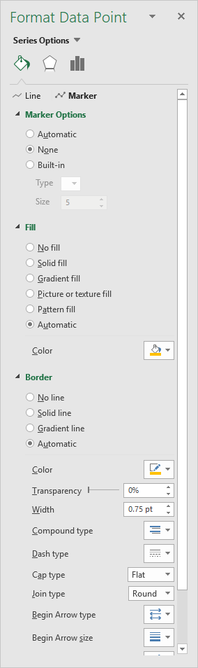 The "Fill & Line" tab lets you change the looks of the line and markers.
You can change the thickness, color, line type, transparency etc.
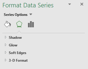 The Effects tab lets you apply a shadow, glow, soft edges and 3D-Format to a data series.
Press with mouse on an arrow to expand the settings for that particular item.
6. Chart legend - change font, font size, and font color
You can easily customize the font, font size, font color etc of the chart legend:
- Select legend.
- Go to tab "Home" on the ribbon.
- Press with mouse on "Font text" to change the font.
- Press with mouse on "Font size" to change the font size.
- Press with mouse on letter A to choose a font color.
6.1 How to change the position of the chart legend
Double press with left mouse button on the legend with the left mouse button to open "Format Legend" settings.
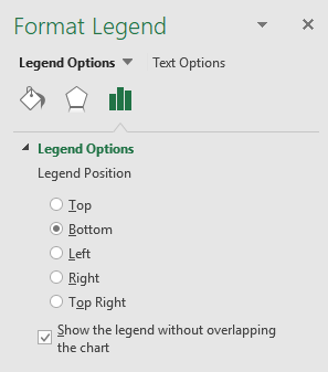
Here you can choose where you want to position the legend relative to the plot area.
- Top
- Bottom
- Left
- Right
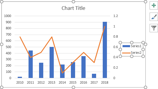
- Top right
6.2 Position chart legend manually

You also have the option to move the legend manually. Press and hold with the left mouse button on the legend and then drag the legend to the position you want.
6.3 Chart legend settings - Fill, border, shadow, glow, and soft edges
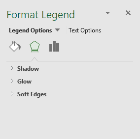 The usual effects like shadows, glow, soft and 3-d are also available for you if you press with left mouse button on the "Effects" tab button.
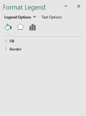 More important, in my opinion, is the "Fill and Line" tab where you can customize the background color, picture, and gradient or apply a border around the legend.
6.4 How to remove the legend
- Select the legend.
- Press with left mouse button on "Delete" button on your keyboard.
6.5 How to show the legend
- Select the chart.
- Press with left mouse button on "plus" sign next to the chart.
- Press with mouse on checkbox "Legend" to show the legend.
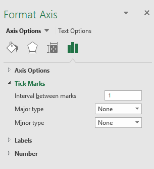
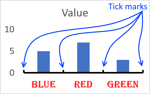
7. Tick marks
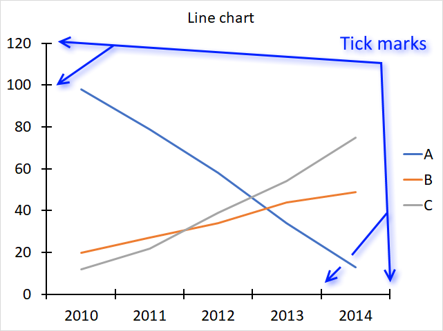
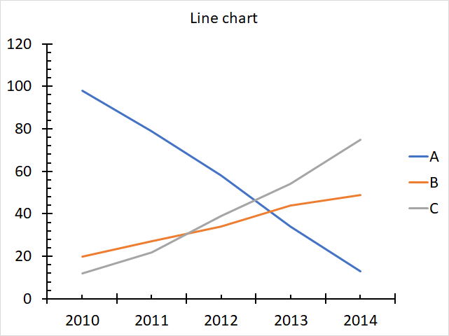
The image above shows tick mars in a line chart, there are two types of tick marks, major and minor tick marks. The chart above shows only major tick marks and the chart below displays both major and minor tick marks on both the x-axis and y-axis.
7.1 How to add chart axis tick marks
- Press with right mouse button on on an axis.
- Press with mouse on "Format Axis..."
- Press with mouse on "Axis Options" button.
- Expand "Tick Marks".
- Change "Major Type" to Inside.
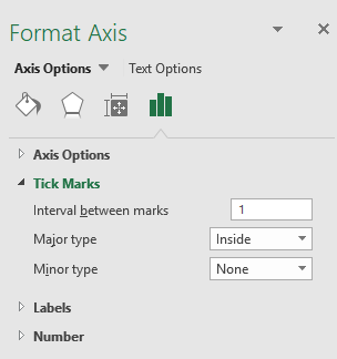
You have three options, tick marks inside, outside or cross. Above picture displays inside tick marks.
7.2 Axis line tick marks interval
- Press with right mouse button on on an axis.
- Press with mouse on "Format Axis..."
- Press with mouse on "Axis Options" button.
- Expand "Tick Marks".
- Change the Interval between marks.
Final words
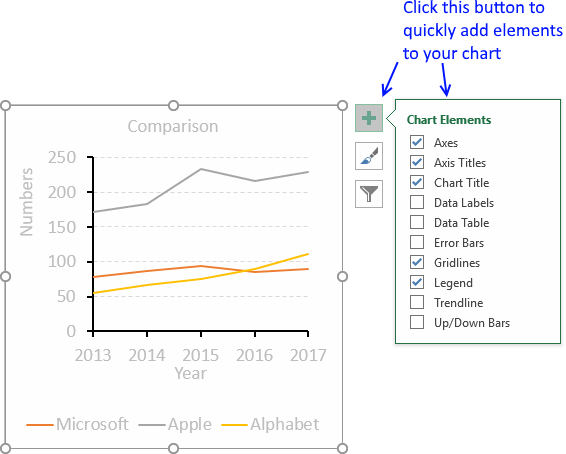
There is a really quick way to add chart elements, simply select the chart.
Press with left mouse button on the "plus" sign and all chart elements show up. Select or deselect the elements you want.
8. How to customize chart axis
Most Excel charts consist of an x-axis and a y-axis, Excel allows you to easily change the looks of the chart axis.
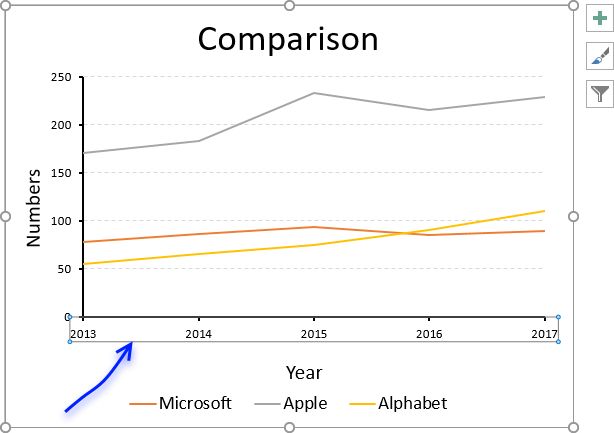
The chart below is what Excel returns using a few random values as a data source, there are, however, no axis lines.
I have drawn a blue rectangle surrounding each group of axis values in the chart above.
To make it easier to see the changes I am about to do, I am now going to remove the major horizontal grid lines.
Simply press with left mouse button on the gridlines and press delete on your keyboard to remove them.
Table of Contents
1. Font size of axis values
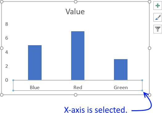
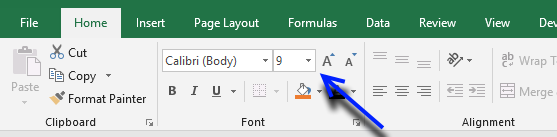
To change the font size of the axis values select the axis you want to change.
Go to tab "Home" on the ribbon then press with left mouse button on font size.
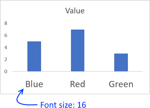
I chose font size 16.
Tip! If you want to quickly format the y-axis with the same font size, follow these steps.
- Select the x-axis.
- Go to tab "Home" on the ribbon.
- Press with mouse on "Format Painter" button.
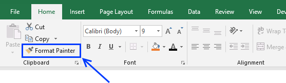
- Press with mouse on y-axis.
Both chart axis now have the same font size, this technique can be used on many different Excel objects, not only charts.
2. Axis value font type
- Press with mouse on the axis values you want to change.
- Go to tab "Home" on the ribbon.
- Press with mouse on font.
- Select a font.
3. Axis value font color
- Select axis values
- Press with mouse on font color button.
- Pick a font color.
4. Customize axis line
- Press with right mouse button on on x-axis values.
- Press with mouse on "Format Axis..."
- Press with mouse on the "Fill and Line" button.
- Press with mouse on Line to expand the Line settings
- Now you can change the color of the axis line, thickness, dashed or dotted and so on.
I exaggerated the axis line thickness and changed the color black to make it stand out.

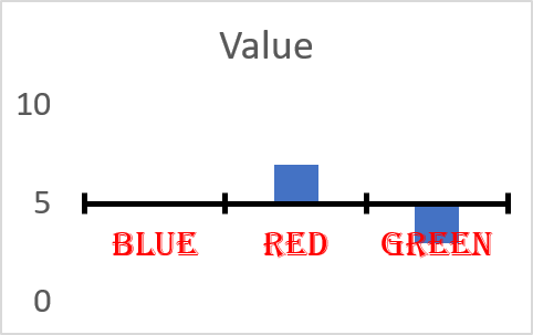
5. Axis line position
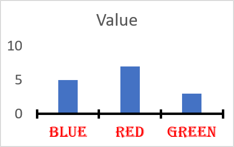
- To change the position of the x-axis you must press with right mouse button on on the y-axis and vice versa.
- Press with mouse on "Format Axis..."
- Press with mouse on the "Axis Options" button.
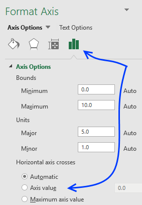
- Find Horizontal Axis crosses and select Axis value.
- Change it to the value on the y-axis you want the x-axis to cross, or vice versa.
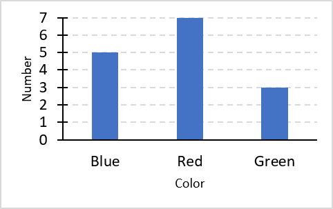
6. Add axis title text
The chart above has no descriptive titles, follow these simple steps to add chart axis titles.
- Select chart.
- Go to tab "Design" on the ribbon. The tab will appear as soon as you select the chart.
- Press with mouse on "Add Chart Element".
- Press with left mouse button on "Axis Titles".
- Press with mouse on "Primary Horizontal" or "Primary Vertical"
Built-in Charts
Combo Charts
Combined stacked area and a clustered column chartCombined chart – Column and Line on secondary axis
Combined Column and Line chart
Chart elements
Chart basics
How to create a dynamic chartRearrange data source in order to create a dynamic chart
Use slicers to quickly filter chart data
Four ways to resize a chart
How to align chart with cell grid
Group chart categories
Excel charts tips and tricks
Custom charts
How to build an arrow chartAdvanced Excel Chart Techniques
How to graph an equation
Build a comparison table/chart
Heat map yearly calendar
Advanced Gantt Chart Template
Sparklines
Win/Loss Column LineHighlight chart elements
Highlight a column in a stacked column chart no vbaHighlight a group of chart bars
Highlight a data series in a line chart
Highlight a data series in a chart
Highlight a bar in a chart
Interactive charts
How to filter chart dataHover with mouse cursor to change stock in a candlestick chart
How to build an interactive map in Excel
Highlight group of values in an x y scatter chart programmatically
Use drop down lists and named ranges to filter chart values
How to use mouse hover on a worksheet [VBA]
How to create an interactive Excel chart
Change chart series by clicking on data [VBA]
Change chart data range using a Drop Down List [VBA]
How to create a dynamic chart
Animate
Line chart Excel Bar Chart Excel chartAdvanced charts
Custom data labels in a chartHow to improve your Excel Chart
Label line chart series
How to position month and year between chart tick marks
How to add horizontal line to chart
Add pictures to a chart axis
How to color chart bars based on their values
Excel chart problem: Hard to read series values
Build a stock chart with two series
Change chart axis range programmatically
Change column/bar color in charts
Hide specific columns programmatically
Dynamic stock chart
How to replace columns with pictures in a column chart
Color chart columns based on cell color
Heat map using pictures
Dynamic Gantt charts
Stock charts
Build a stock chart with two seriesDynamic stock chart
Change chart axis range programmatically
How to create a stock chart
Excel categories
How to comment
How to add a formula to your comment
<code>Insert your formula here.</code>
Convert less than and larger than signs
Use html character entities instead of less than and larger than signs.
< becomes < and > becomes >
How to add VBA code to your comment
[vb 1="vbnet" language=","]
Put your VBA code here.
[/vb]
How to add a picture to your comment:
Upload picture to postimage.org or imgur
Paste image link to your comment.