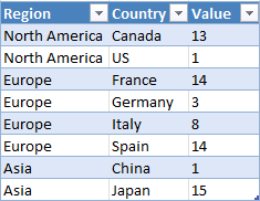
Highlight a data series in a chart

This article demonstrates how to highlight a bar, group of bars, a line, and a column in their charts respectively.
What's on this webpage
1. Highlight a column in a stacked column chart (VBA)
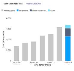
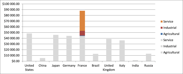
I discovered this chart from Google Public policy blog and it got me thinking if I could do the same thing in Excel.
The Google chart is static, only the last column is divided into vertical rectangles, however, I will in this article demonstrate that I can build this and more.
I will show you how to build a dynamic stacked column chart that allows you to select and highlight any column in the chart using spin buttons.
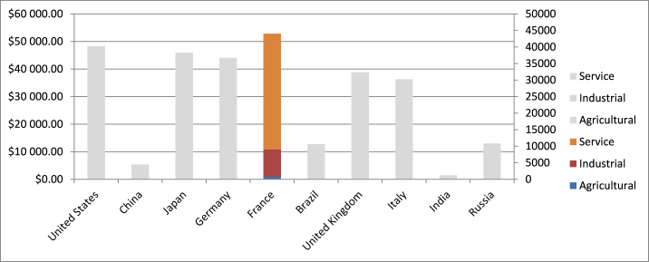
When highlighted the column becomes a stacked column providing more information and is also more visually appealing because of the colors.
The Excel user simply press with left mouse button ons on one of the spin buttons and the chart highlights the previous/next column automatically.
The following animated image shows how the spin buttons control the chart and also highlights the corresponding record in the Excel Table.
The spin buttons are linked to cell D14 and the value is hidden behind the actual spin buttons, they are also linked to a VBA macro that changes the colors for the selected column.
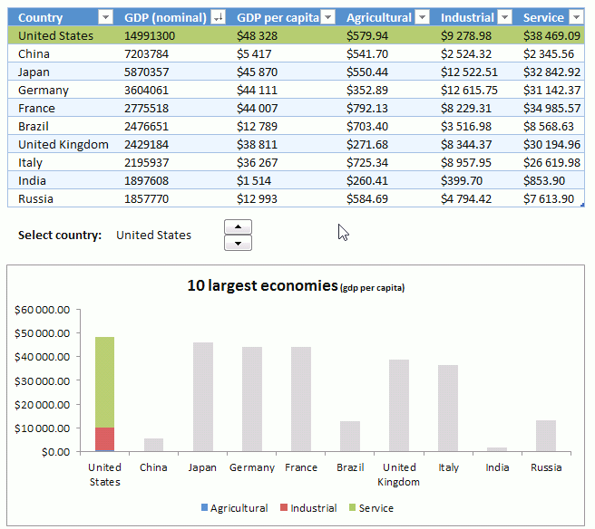
The original chart is also a stacked column chart, however, all parts of the column have the same color applied to make them look like a regular column.
Here is how I did it.
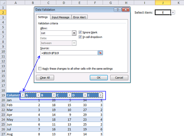
1.1 Select country

Cell C14 displays the selected country, it changes when you press with left mouse button one of the spin buttons. Cell C14 contains the following formula.
The INDEX function returns a value from column Country in the Excel Table Table1 based on the hidden value in cell D14. Press with left mouse button on the spin button with an arrow pointing down and the value in cell D14 will increment by 1 with each press with left mouse button on.
The spin button with an arrow pointing up will decrease the number in cell D14 by 1. The value in cell D14 can't be smaller than 1 and larger than the number of countries in your Excel Table.
I will show you later on in the next section of this article how to change the min and max value of the spin buttons.
1.2 How to create spin buttons

The spin buttons allow you to increase or decrease a value, this makes the worksheet interactive and more user-friendly.
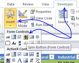
- Go to tab "Developer" on the ribbon. Developer tab missing?
- Press with left mouse button on the "Insert" button.
- Press with mouse on the "Spin button" (Form Controls), see image below.

- Create a spin button by press with left mouse button oning and hold with left mouse button on the desired location in your worksheet.
Now drag with mouse to change the spin button size, you change this later if you are not happy with the result. - Press with right mouse button on on spin button.

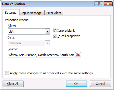
- Press with mouse on "Format Control..." and the following dialog box appears.
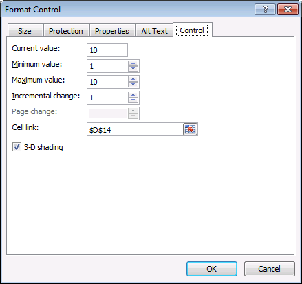
- Enter values in each field. Make sure to use a maximum value that is equal to the number of items (Countries) in the column.
The minimum value is always 1, so is the incremental change value as well. - Link to cell D14 by press with left mouse button oning on the button next to cell reference $D$14, see image above.
- Press with left mouse button on OK
1.3 Hide contents of cell D14

You can use cell formatting to hide the value in the cell if you don't want to place the spin button above cell D14 so it hides the value.
The value is still there but not visible, you can verify that by examining the formula bar while the empty looking cell is selected.
- Press with right mouse button on on cell D14 and press with left mouse button on "Format Cells..." and the "Format Cells" dialog box appears.
- Select "Custom" Category.
- Type: ;;;

- Press with left mouse button on OK button to apply changes.
1.4 VBA
Copy the VBA code below and paste it to a code module in your workbook, detailed instructions below. The macro described below will change the color of the stacked columns for the selected item.
'Name macro
Sub ChangeSelection()
'Dimension variable and declare data type
Dim r As Integer
'The FOR ... NEXT statement iterates from 1 to the number of rows in column Country in Table1 using variable r
For r = 1 To Range("Table1[Country]").Rows.Count
The With ... End With statement allows you to write shorter code by referring to an object only once instead of using it with each property.
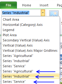
With ActiveSheet.ChartObjects(1).Chart
'Check if r is equal to the relative position of the selected value in column Country in Table1
If Application.WorksheetFunction.Match(Range("$C$14"), Range("Table1[Country]"), 0) = r Then
'Change column colors for series collections 1,2 and 3
.SeriesCollection(1).Points(r).Interior.Color = RGB(82, 130, 189)
.SeriesCollection(2).Points(r).Interior.Color = RGB(198, 81, 82)
.SeriesCollection(3).Points(r).Interior.Color = RGB(165, 190, 99)
Else
'Apply the same color to series collections 1,2 and 3
.SeriesCollection(1).Points(r).Interior.Color = RGB(198, 198, 198)
.SeriesCollection(2).Points(r).Interior.Color = RGB(198, 198, 198)
.SeriesCollection(3).Points(r).Interior.Color = RGB(198, 198, 198)
End If
End With
Next r
End Sub
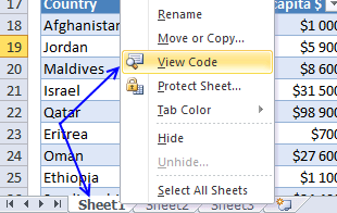
1.5 Where to put the code?
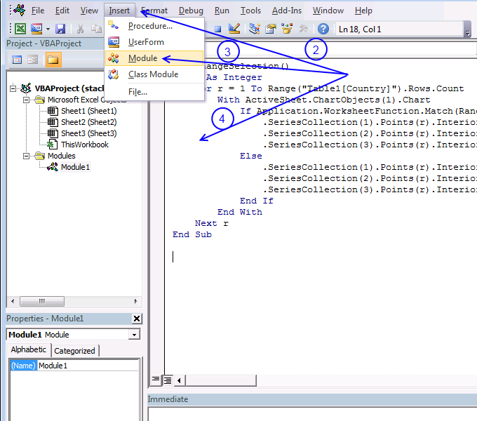
- Press Alt + F11 to open the VB Editor.
- Press with left mouse button on "Insert" on the menu, see image above.
- Press with left mouse button on "Module" to create a new module.
- Paste above VBA code to code module.
1.6 Assign Spin button macro

- Press with right mouse button on on spin button.
- Press with left mouse button on "Assign macro..." and dialog box "Assign macro" appears.

- Select macro "ChangeSelection".
- Press with left mouse button on OK button to apply changes.
1.7 Conditional formatting

I will now describe how to highlight the entire record in the Excel Table based on the select country.
- Select the entire Excel table Table1.
- Go to tab "Home" on the ribbon.
- Press with mouse on the "Conditional formatting" button.
- Press with left mouse button on "New Rule...".
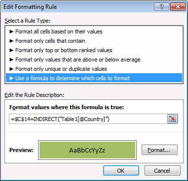
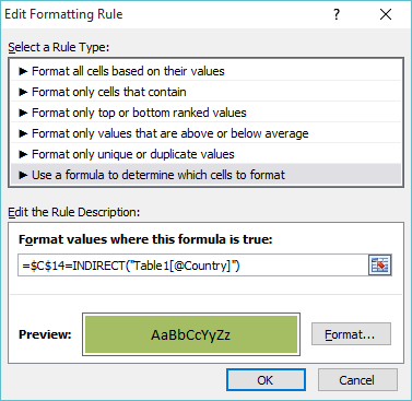
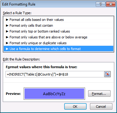
- Press with left mouse button on "Use a formula to determine which cells to format".
- Format values where this formula is true:
=$C$14=INDIRECT("Table1[@Country]")
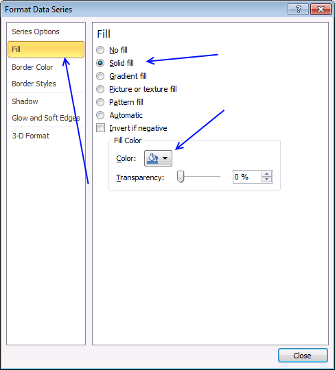
- Press with left mouse button on "Format..."
- Go to tab "Fill".
- Pick a color.
- Press with left mouse button on OK button.
- Press with left mouse button on OK button again.
2. Highlight a column in a stacked column chart (no VBA)

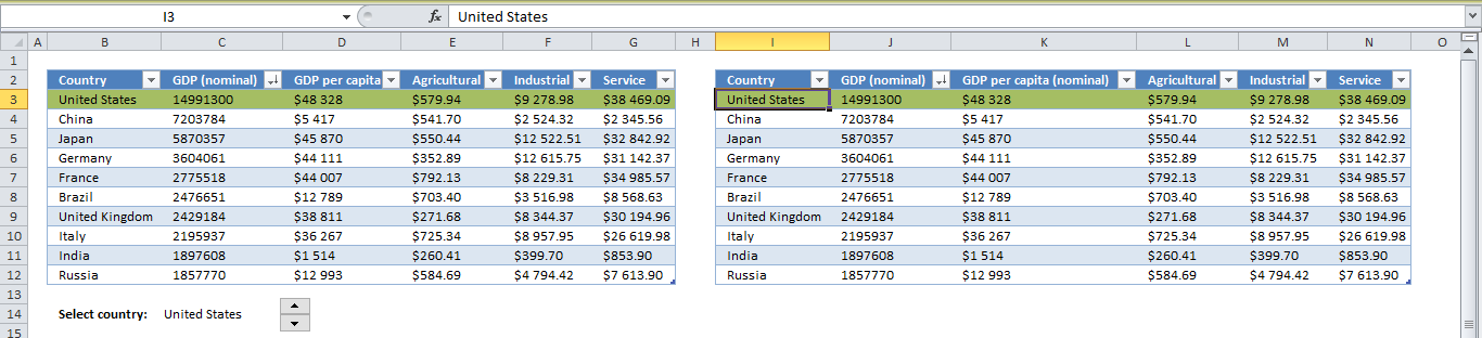
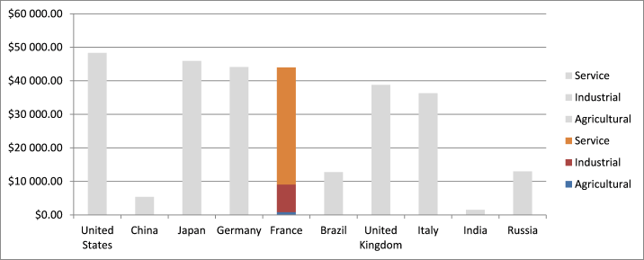
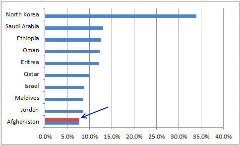
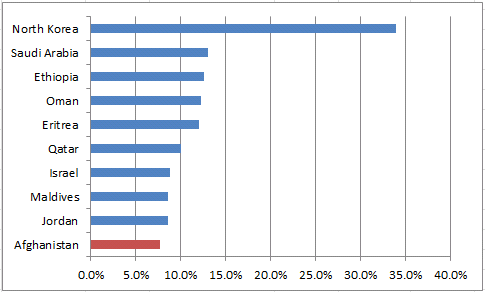
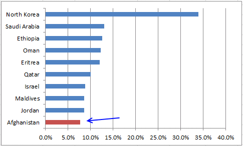
This interactive chart allows you to select a country by press with left mouse button oning on a spin button. The chart and table show the selected country.
I have made something very similar in the year 2013, Highlight a column in a stacked column chart but using Visual Basic for Applications (VBA). This article explains how to build and make it work without VBA.
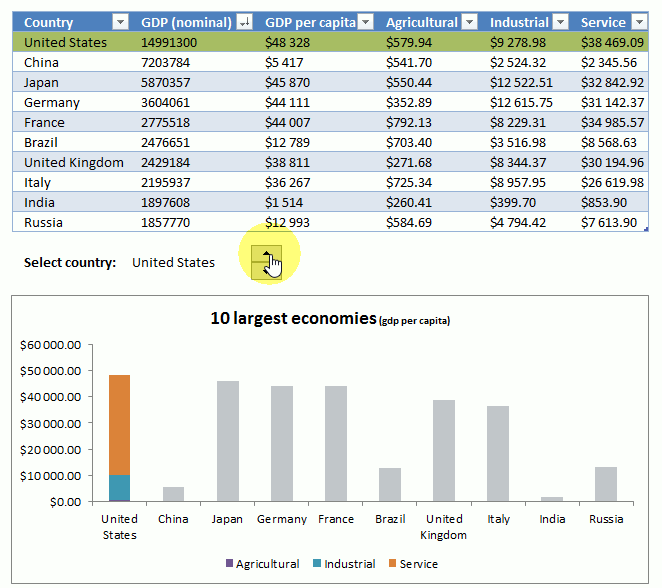
The animated image above demonstrates a stacked column chart with a highlighted column based on the selected item using a spin button.
The corresponding row in the Excel Table is also highlighted and the selected country is displayed in cell C14.
2.1 How to insert a spin button (Form Control)
- Go to tab "Developer" on the ribbon.
- Press with left mouse button on the "Insert" controls button, see the image below.
- Press with left mouse button on "Spin Button" in group "Form Controls".
- Press and hold with left mouse button on the worksheet.
- Drag with mouse on the worksheet to size the spin button.
- Release the left mouse button.
2.2 How to configure spin button
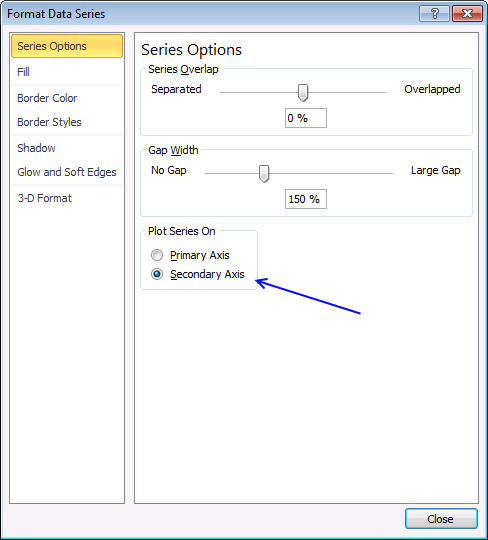
- Press with right mouse button on on spin button
- Press with left mouse button on "Format Control..."
- Go to tab "Control"
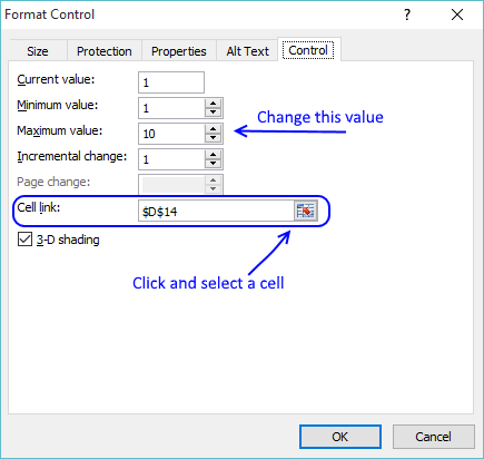
- Change the maximum value, if you have 10 countries use value 10. 20 countries use value 20.
- Select a cell to link the spin button to, see the image above.
- Press with left mouse button on OK button to apply changes.
2.3 How to link a spin button to a cell value?

Cell C14 shows the selected country, the cell is linked to the spin button using a formula and refreshes every time you press with left mouse button on the spin button.
- Double-press with left mouse button on with left mouse button on cell C14.
- Type this formula:
=INDEX(Table13[Country],D14)
- Press Enter.
The value changes in cell C14 when you press with left mouse button on the spin buttons. The spin button is linked to cell D14.
The formula in cell C14 then uses the value in cell D14 to get the country name in column Country in table Table13. The value is shown in cell C14.
2.4 How to apply Conditional Formatting to an Excel table
- Select all values in the Excel Table.
- Go to tab "Home" on the ribbon.
- Press with left mouse button on the "Conditional formatting" button.
- Press with left mouse button on "New Rule...". A dialog box appears on the screen, see the image below.
- Press with mouse on "Use a formula to determine which cells to format" to select it.
- Type in "Format values where this formula is true:"
=$C$14=INDIRECT("Table1[@Country]")
- Press with left mouse button on "Format..." button. Another dialog box appears.
- Pick a color.
- Press with left mouse button on OK button to return to the first dialog box.
- Press with left mouse button on OK button to dismiss the first dialog box.
This formula
compares the value in cell C14 with each of the values in column Country, Table13. If a value is a match the entire row is highlighted.
Explaining Conditional Formatting formula
Step 1 - Create a structured reference
A cell reference pointing to a value in an Excel Table is different than regular cell references.
Table13[@Country]
The first value is the Table name, in this example: Table13
The item in brackets is the column name in the Excel Table, the @ character points to a cell that is on the same row as the CF formula itself.
Table13[@Country]
Step 2 - Workaround for Excel Tables in CF formulas
The INDIRECT function is needed in order to use a structured reference in a Conditional Formatting formula.
INDIRECT("Table13[@Country]")
Step 3 - Compare values in column "Country" to value in cell C14
The equal sign lets you compare two or more values to a condition.
$C$14=INDIRECT("Table13[@Country]")
An expression using logical operators (equal sign is one of them) is called a logical test or logical expression. The return TRUE or FALSE or their equivalent numerical digit TRUE - 1 or FALSE - 0 (zero).
The Conditional Formatting formula highlights the row if the logical expression returns TRUE and nothing happens if it evaluates to FALSE.
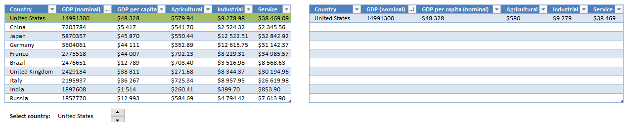
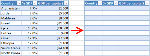
2.5 Copy Excel Table and new formulas
- Copy table13
- Paste it next to table 13 but keep at least one blank column between tables.
(Press with left mouse button on to enlarge) - Delete all values except headers in the new table
- Select the first cell (I3) in the new table and type: =IF(Table13[@Country]=$C$14,Table13[@Country],""). You don´t need to copy the formula to cells below, the table takes care of that.
- Cell J3: =IF([@Country]<>"",Table13[@[GDP (nominal)]],"")
- Cell K3: =IF([@[GDP (nominal)]]<>"",Table13[@[GDP per capita (nominal)]],"")
- Cell L3: =IF([@[GDP (nominal)]]<>"",Table13[@Agricultural],"")
- Cell M3: =IF([@[GDP per capita (nominal)]]<>"",Table13[@Industrial],"")
- Cell N3: =IF([@[GDP per capita (nominal)]]<>"",Table13[@Service],"")
(Press with left mouse button on for larger picture)
We are using the second table to populate the second series in a chart. If this doesn't make sense to you, don't worry.
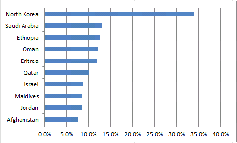
2.6 Insert a column chart
- Select table13 data.
- Go to tab "Insert".
- Press with left mouse button on "Column Chart" button.
- Press with left mouse button on "Stacked Column" button.
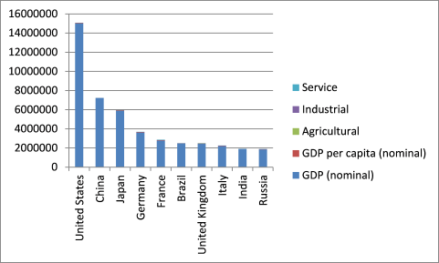
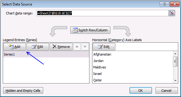
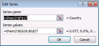
- Press with right mouse button on on chart and press with left mouse button on "Select Data...".
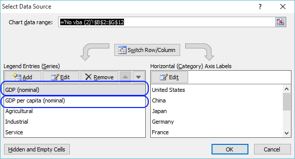
- Remove GDP (nominal).
- Remove GDP per capita (nominal).
- Press with left mouse button on OK.
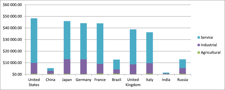
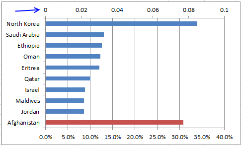
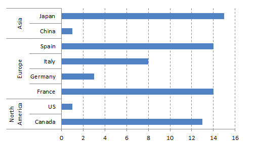
This is what the chart looks like now.
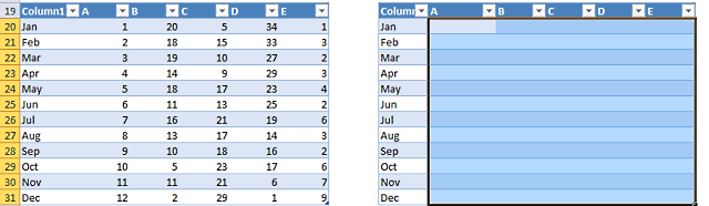
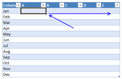
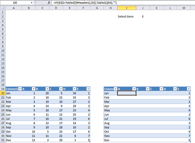
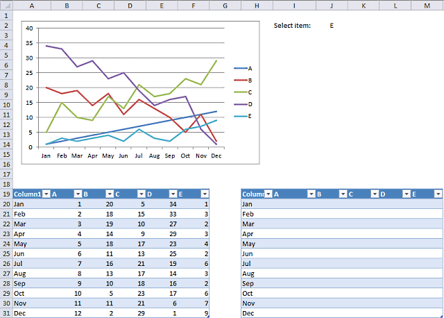
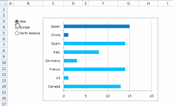
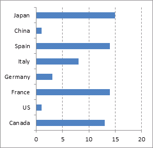
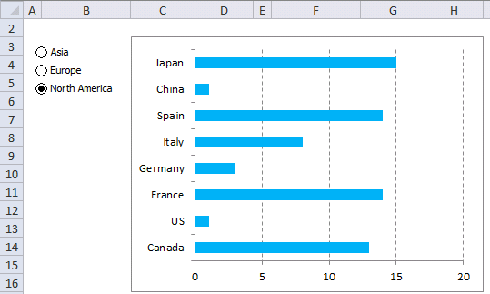
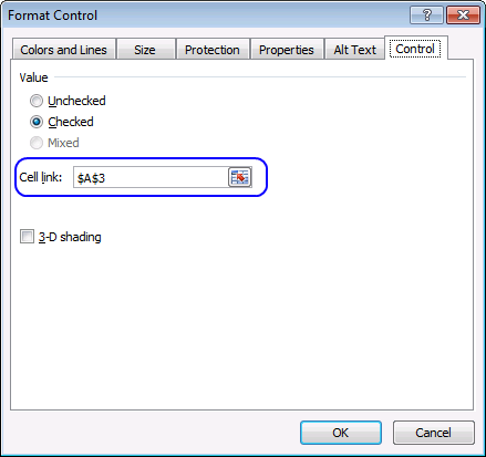
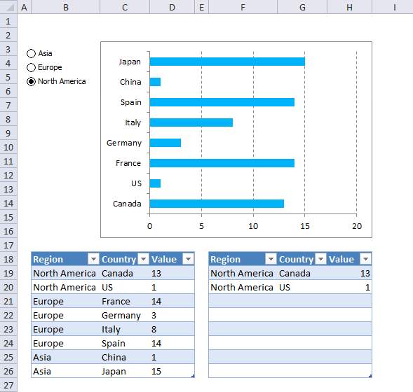
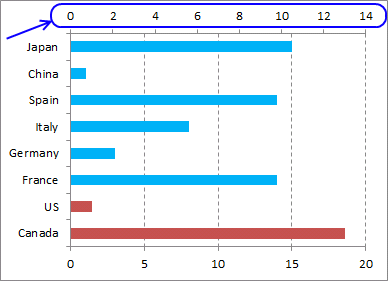
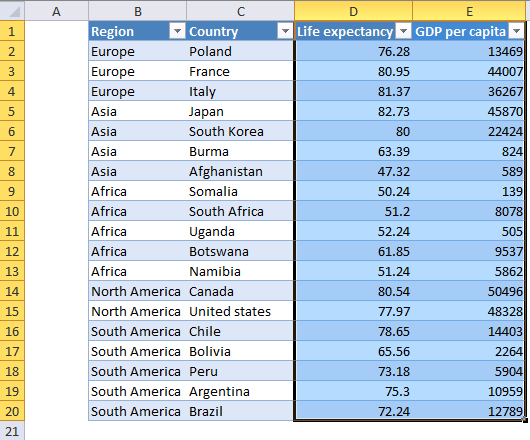
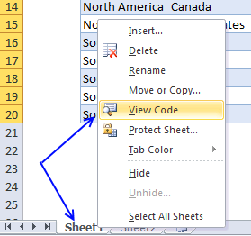
Back to top This article demonstrates how to highlight a line in a chart based on the selected item in a drop-down list. The method used here is to have the thinner lines on the primary axis and the highlighted lines on the secondary axis. A formula then hides all series values except the chart series that is selected in the drop-down list. This is possible without using VBA och UDFs. What you will learn in this article: One of the great things about Excel Tables is that they are easy to reference. If the table grows or shrinks the reference stays the same which makes them really easy to work with. No need to adjust references like regular cell references in formulas. The correct term is structured references and they work somewhat differently than regular cell references. I will tell you more about it when I explain the formulas below. The data set is now converted to an Excel Table, Excel has automatically changed the cell formatting and given it a name. Press with mouse on one of the cells in the Excel Table, go to tab "Table Design" on the ribbon. You can find the Table name in the very top left corner of your Excel screen. A drop-down list is a list that extends when you press with left mouse button on the arrow next to the cell. You must select the cell to see the arrow, see image above. It is a good idea to format the cell or add a value to the adjacent cell so the user understands that you have to choose a value. The first table values will populate the primary axis and the second table will populate the secondary axis. The primary axis contains the greyed out lines and the secondary axis contains the highlighted line (chart series). This formula will return values if the selected drop-down list value is equal to the column Header and blanks if not. IF($J$2=Table2[[#Headers],[A]],Table1[@A],"") Cell J2 contains the selected drop-down list value. We use an absolute cell reference meaning it will not change when we copy the formula across the table, the cell reference becomes $J$2. Table2[[#Headers],[A]] is a structured reference pointing to column header name A in Excel Table named Table2. $J$2=Table2[[#Headers],[A]] becomes "E"="A" and returns FALSE The IF function returns the corresponding value from Excel Table Table1, note that the reference changes when you copy the cell to the remaining cells in Table2. IF($J$2=Table2[[#Headers],[A]],Table1[@A],"") becomes IF(FALSE ,[A]],Table1[@A],"") becomes IF(FALSE, 1, "") and returns "" in cell I20. The Line Chart is great for graphing data series, they are easy to create and modify. Use the scatter chart if you want to plot data that contains numbers in both the x and y-axis. A line chart appears populated with lines based on the data in Table1, see image above. Press and hold with left mouse button on the chart then drag to change the location. Press and hold SHIFT key simultaneously as you drag to move it horizontally or vertically. Press and hold the Alt key while you drag to align the chart border to the cell grid beneath. To select the chart simply press with left mouse button on it with the left mouse button, size handles appear. Press and hold with the left mouse button and then drag to resize the chart. This step will make the lines more subtle to make the selected line stand out a little more. Repeat line 1 to 7 with remaining data series. This step will plot the highlighted line on the secondary axis. Repeat above steps 1 - 15 with table column B, C, D and E. Remove secondary y axis, see picture below. Remove A to E colored gray from the legend. (Press with mouse on each character and press Delete) Delete major gridlines This example has a Drop Down List that lets the user choose a value from a list. The list is expanded when you press with left mouse button on the arrow next to the cell, make sure you have the cell selected if you don't see the arrow. I recommend that you show the user that a certain cell contains a drop down list, for example, create a border around the cell or change the cell color. So what happens when the user selects a value in the drop down list? Both the charts above the drop down list highlight instantly the corresponding bar and the Excel Table to the left of the drop down list highlights the record. The first part of this article explains how to highlight a chart bar with only formulas and a drop down list. We will start with how to create an Excel Table then copy the Table and paste to a new location. The copied Table will be different from the first Table, it will contain formulas that change based on the selected value in the drop down list. The bar chart will be linked to both these Excel defined Tables, one chart series to the first Excel Table and the second chart series to the second Excel Table that contains formulas. The Excel defined Table is great in many ways, the biggest advantage, in my opinion, is combined with a chart you don't need to change the data source reference when new values are added or deleted. The chart refreshes instantly if new values are added which makes it a great combo, here are the steps to create an Excel Table. Select the entire first Excel Table then copy it, I usually press CTRL + C to copy things in Excel which is the keyboard shortcut for copying. Select a new cell where you want to paste it, remember to not select an adjacent cell to the copied Excel Table, however, it must be next to the original Table meaning it must be on the same rows. Press CTRL + V to paste the Excel Table to the new location, this will create a new Excel Table identical to the first one, except for the Excel Table name. Two Excel Tables can't share the same name. Now delete all values except headers in the new Excel Table, see image above. The chart shows up on the worksheet, see image below. The Drop Down List contains all countries entered in the Excel Table, it will automatically add new countries. No need to adjust cell ranges, the Excel Table uses structured references which are dynamic. The INDIRECT function lets you use structured references in Drop Down Lists. The formulas described below will show the selected record based on the value in the Drop Down List, see image above. $H$18 is the cell reference to the Drop Down List. These IF functions will check the selected Drop Down List value with the Country on the same row as the formula, this is why it is important to place the Excel Table with formulas on the same rows as the original Excel Table. The record will be visible if the Drop Down List value matches the country. Repeat above steps with the second chart I created two bar charts based on the data in Excel Table Table1, this VBA example has only one Excel Table. VBA code changes chart series color based on the selected value in cell H18. The following VBA code is event code, it is triggered when a cell value in a worksheet is changed. This code won't work if you have more than two charts inserted to the worksheet. This article demonstrates how to highlight a group of bars in a chart bar, the techniques shown here works fine with column charts as well. Excel has some incredible tools for highlighting cells, rows, dates, comparing data and even series in line charts. A technique using the secondary axis allows you to highlight a bar in a bar chart or column chart. The following animated image shows a chart that highlights countries based on the selected region using radio (option) buttons. You select a region by pressing the left mouse button on an option button, to the left of the chart. I recommend converting the data range to an Excel Table, it allows you to easily organize, sort, and format data any way you like. That is how easy it is to create Excel Tables. It is very easy as well to create an Excel chart, you have plenty to choose from. The image above shows a bar chart and that is what I am going to insert now. The image above shows three radio buttons located to the left of the bar chart. The following steps describe how to create and link them to a worksheet. Formula in cell A4: The CHOOSE function returns a value from an array based on a number. CHOOSE(index_num, value1, [value2], ...) The number is in cell A3 and changes when the user selects a radio button. The above image shows that the third radio button is selected, cell A3 contains 3. CHOOSE(A3,"Asia","Europe","North America") becomes CHOOSE(3,"Asia","Europe","North America") and returns "North America" in cell A4. These steps demonstrate how to hide the cell values using cell formatting, however, the formula bar still shows the value if you select cell A3 or A4. The cell values in cell A3 and A4 will now change based on the selected radio button but the user can't see the values on the worksheet. I will now copy the Excel Table and use formulas to extract values from the first Excel Table based on which radio is selected. The IF function returns one value if the logical test evaluates to true and another value if false. IF(logical_test, [value_if_true], [value_if_false]) The logical_test argument is $A$4=Table1[@Region] It compares the value in cell A4 with a value on the same row in column Region in Table1. The dollar signs make the cell reference an absolute cell reference meaning it won't change if you copy the cell and paste to cells below. IF($A$4=Table1[@Region],Table1[@Region],"") becomes IF("North America"="North America",Table1[@Region],"") becomes IF(TRUE,Table1[@Region],"") becomes IF(TRUE,"North America","") and returns "North America" in cell F19. This chart has categorized the countries into regions with multi-level category labels. You can create great-looking categories by deleting some of the values in the region column. Make sure the region column is sorted and then delete all duplicates. See this picture. The region names are now centered on the chart. You can find this chart on sheet 2 on the attached file below. I will in this article demonstrate how to highlight a group of values plotted in an x y scatter chart using a Drop Down List and a small VBA macro. The example used here lets you select a region and the chart instantly highlights the corresponding countries, it also shows the names of those countries next to the values. The animated image below shows how the chart changes when a new region is selected. A regular Drop Down list in Excel is easy to create, it allows you to control the value in a given cell using Excel's Data Validation. Excel returns an error message if the value is not in the Drop Down List. The most significant disadvantage is they are easy to remove, copy a cell and paste it to the cell containing the Drop Down List and it is gone, you need VBA code to protect it from being overwritten if this is an issue for you. A smaller disadvantage is that you can't see if a cell contains a Drop Down List or not until you select the actual cell. I recommend that you change the cell color or create a cell border, so the user can quickly identify the Drop Down List. Here are the steps to create a Drop Down List: A scatter chart shows the relationships between two sets of values. My graph displays the relationship between GDP per Capita and life expectancy for a few countries. The Drop Down List allows the user to select a group of Countries to highlight data in the chosen region, making the chart more comfortable to read. It makes the worksheet more fun to use as it is now interactive allowing the user to examine the data in a way they prefer. Change y and x-axis formatting. Microsoft Excel lets you create programs called macros that you can use in your workbook, macros, and User-defined Functions consists of VBA code. VBA stands for Visual Basic for Applications, and a macro is easy to add to a workbook, there are detailed instructions below. This particular macro is an event macro that runs when a cell value changes in a worksheet. In this case, it looks for a change in cell I18. Event macros are a bit different than regular macros. They are located in a worksheet module and not in a regular module. I will explain how it works and how to implement it. Follow these instructions to access the sheet module for a specific worksheet.
2.8 Add new data to chart
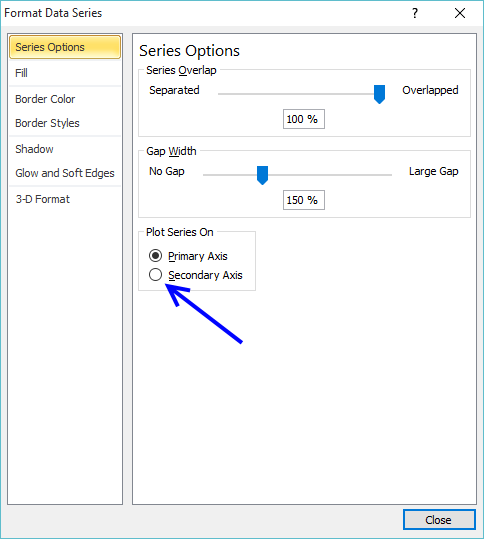
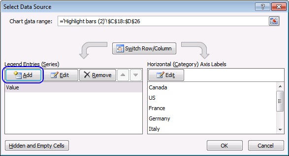
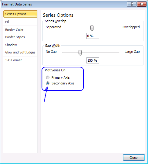
2.9 Plot series on the secondary axis
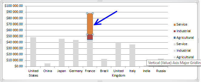
2.10 Delete secondary y-axis
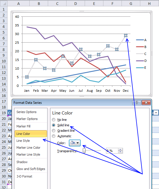
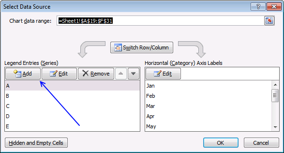
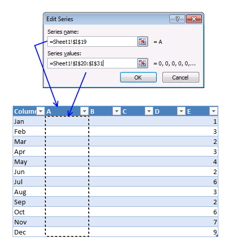
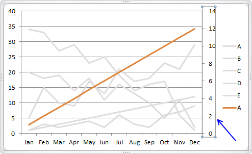
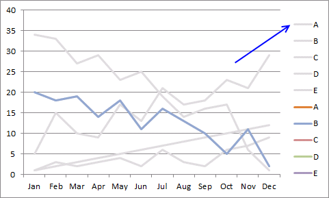
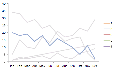
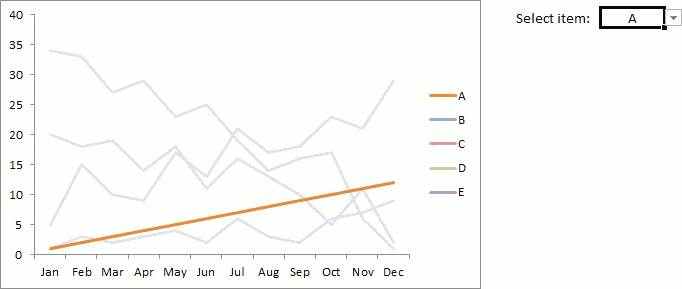
3. Highlight a data series in a line chart

Instructions
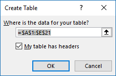
Step 1 - Convert data to an Excel Table


Step 2 - Create a drop down list
Step 3 - Copy table
Step 3 - Formula in the second Excel Table
Explaining formula
Step 4 - Insert a line chart
Step 5 - Color lines
Step 6 - Add the second Excel Table to the second axis
Step 7 - Remove series in first axis from legend
Animated image
4. Highlight a bar in a chart

Highlight a bar in a chart
Create an Excel table

Copy Excel Table
Create a bar chart
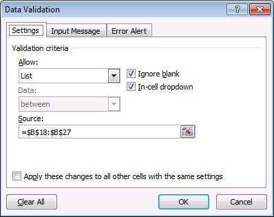
Create a drop down list


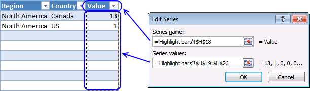
Enter formulas in empty Excel Table

Add a duplicate series to the secondary axis
Delete axis
Change bar color
5. Highlight a bar in a chart (VBA)

Drop down list
VBA Code
'Event code
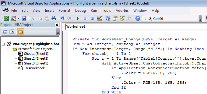
Private Sub Worksheet_Change(ByVal Target As Range)
'Dimension variables and declare data types
Dim r As Integer, chrtobj As Integer
'Check if cell is H18
If Target.Address = "$H$18" Then
'Iterate through 1 to 2
For chrtobj = 1 To 2
'Iterate through 1 to the number of countries in Table column Country
For r = 1 To Range("Table1[Country]").Rows.Count
'The With ... End With statement allows you to write shorter code by referring to an object only once instead of using it with each property.
With ActiveSheet.ChartObjects(chrtobj).Chart.SeriesCollection(1).Points(r).Interior
'Change chart series color to RGB(0, 0, 255) if row is equal to selected country
If Application.WorksheetFunction.Match(Range("H18"), Range("Table1[Country]"), 0) = r Then
.Color = RGB(0, 0, 255)
Else
.Color = RGB(165, 165, 255)
End If
End With
Next r
Next chrtobj
End If
End Sub
Where to put the code?
Apply Conditional Formatting to Excel Table rows
6. Highlight a group of chart bars

6.1 Create an Excel Table


6.2 How to create a bar chart
6.3 Build radio (option) buttons
6.4 How to insert radio buttons

6.5 How to edit radio button text

6.6 How to link radio buttons to a cell

6.7 Create formula based on selected radio button

6.8 Format cell values

6.9 Extract values
6.10 Explaining formula in cell F19

6.11 Add a second series to the bar chart

6.12 Group values in a bar chart

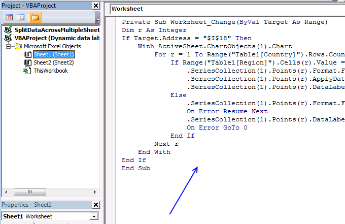
7. Highlight group of values in an x y scatter chart programmatically


Add a Drop Down List

Insert a scatter chart
VBA code
'Event macro
Private Sub Worksheet_Change(ByVal Target As Range)

'Dimension variable and declare data type
Dim r As Integer

'Check if cell is I18
If Target.Address = "$I$18" Then

    'The With ... End With statement allows you to write shorter code by referring to an object only once instead of using it with each property.
    With ActiveSheet.ChartObjects(1).Chart

        'The FOR ... NEXT statement iterates from 1 to the number of rows in column Country in Table1 using variable r as a container
        For r = 1 To Range("Table1[Country]").Rows.Count

            'Check if value in column Region in Excel table Table1 based on variable r is equal to the value in cell I18
            If Range("Table1[Region]").Cells(r).Value = Range("$I$18") Then

                'Change color of chart marker based on variable r
                .SeriesCollection(1).Points(r).Format.Fill.ForeColor.RGB = RGB(0, 0, 255)

                'Show Data Labels
                .SeriesCollection(1).Points(r).ApplyDataLabels

                'Use country name as Data Label text
                .SeriesCollection(1).Points(r).DataLabel.Text = Range("Table1[Country]").Cells(r).Value

            Else

                'Change marker color
                .SeriesCollection(1).Points(r).Format.Fill.ForeColor.RGB = RGB(198, 198, 198)

                'Enable errror handling
                On Error Resume Next

                'Delete Data Label
                .SeriesCollection(1).Points(r).DataLabel.Delete

                'Disable error handling
                On Error GoTo 0
            End If
        Next r
    End With
End If
End Sub
Where to put the VBA code?
Built-in Charts
Combo Charts
Combined stacked area and a clustered column chart
Combined chart – Column and Line on secondary axis
Combined Column and Line chartChart elements
Chart basics
How to create a dynamic chart
Rearrange data source in order to create a dynamic chart
Use slicers to quickly filter chart data
Four ways to resize a chart
How to align chart with cell grid
Group chart categories
Excel charts tips and tricksCustom charts
How to build an arrow chart
Advanced Excel Chart Techniques
How to graph an equation
Build a comparison table/chart
Heat map yearly calendar
Advanced Gantt Chart TemplateSparklines
Win/Loss Column Line Highlight chart elements
Highlight a column in a stacked column chart no vba
Highlight a group of chart bars
Highlight a data series in a line chart
Highlight a data series in a chart
Highlight a bar in a chartInteractive charts
How to filter chart data
Hover with mouse cursor to change stock in a candlestick chart
How to build an interactive map in Excel
Highlight group of values in an x y scatter chart programmatically
Use drop down lists and named ranges to filter chart values
How to use mouse hover on a worksheet [VBA]
How to create an interactive Excel chart
Change chart series by clicking on data [VBA]
Change chart data range using a Drop Down List [VBA]
How to create a dynamic chartAnimate
Line chart Excel Bar Chart Excel chart Advanced charts
Custom data labels in a chart
How to improve your Excel Chart
Label line chart series
How to position month and year between chart tick marks
How to add horizontal line to chart
Add pictures to a chart axis
How to color chart bars based on their values
Excel chart problem: Hard to read series values
Build a stock chart with two series
Change chart axis range programmatically
Change column/bar color in charts
Hide specific columns programmatically
Dynamic stock chart
How to replace columns with pictures in a column chart
Color chart columns based on cell color
Heat map using pictures
Dynamic Gantt chartsStock charts
Build a stock chart with two series
Dynamic stock chart
Change chart axis range programmatically
How to create a stock chartExcel categories
17 Responses to “Highlight a data series in a chart”
Leave a Reply
How to comment
How to add a formula to your comment
<code>Insert your formula here.</code>
Convert less than and larger than signs
Use html character entities instead of less than and larger than signs.
< becomes < and > becomes >
How to add VBA code to your comment
[vb 1="vbnet" language=","]
Put your VBA code here.
[/vb]
How to add a picture to your comment:
Upload picture to postimage.org or imgur
Paste image link to your comment.
Nice work!
David Hager,
Thank you!
Great Tutorial, opened a great world of Tables to be used in formulas. Drew me in to studying Table References!
chrisham,
thanks!
Oscar -
I use Excel 2007 and I fiddled with this code forever to try and make it work. The problem is in conditional formatting with your rule =$C$14=INDIRECT("Table1[@Country]")
The code that finally worked for me was
=$C14=INDIRECT("Table1[[#This Row],[Country]]")
Without the [#This Row] addition the conditional format you use always returns the first row of the table in Excel 2007, so it only highlights the table row when you pick the first country. I'm not sure what the @ symbol does in your formula - is it the Excel 2010 equivalent of [#This Row]?
Not that you need to stress-test your solutions against every Excel version, but hopefully this will help people like me who are stuck in older versions until their employer upgrades!
GMF,
is it the Excel 2010 equivalent of [#This Row]?
Yes, thank you for pointing that out.
Oscar -
Can you do the non-VBA equivalent for a stacked bar chart? You had a post on highlighting a row in a table and having the related stacked column chart (GDP sample data) highlight the color using VBA. I'd like to see this technique used for that (overlaying the existing stack with the selected one). I can get the overlay series to show correctly on the chart, but I can't figure out how to move it to a different X-Axis category from the first.
Very cool Mister (Oscar)
Thank you very much, you're a genius
[…] Using option buttons, Oscar Cronquist shows how to highlight groups of data in a bar chart. […]
Thanks for the post! I keep getting an error message saying "Method 'Range' of object'_Worksheet' failed.
When opening VB Editor the following code is highlighted in yellow:
For r = 1 To Range("Table1[Country]").Rows.Count
Any idea what I may be missing?
[…] Highlight a group of chart bars […]
Is this possible with pivot tables as well as normal tables?
I'm trying to make your exact chart as practice and then apply it to my data. In just making your chart I keep getting a bug error on this line "For r = 1 To Range("Table1[Country]").Rows.Count"
Is there a reason for this? I can't seem to make your exact chart.
Gretchen,
Table1[Country] is a reference to an Excel defined Table named Table1, [Country] is a reference to a column with a header named Country in Table1.
Make sure you adjust these references so they match the name of your Excel defined Table and header.
hello! This is great info. I'm curious once the graph is generated can it be pasted into a Powerpoint slide and will it still be interactive as it is in excel? Will it be able to highlight different data points while keeping the rest greyed out?
Thanks.
Thanks Oscar - Great stuff!
I was getting a second series to plot at 0,0,0,0,0,0,0,0,0,0,0,0
When I used this formula:
=IF($J$2=Table2[[#Headers],[A]],Table1[@A],"")
I was able to remove the 2nd series by changing the formula:
=IF(Chart!$T$12=Table13[[#Headers],[A]],Table1[@A],NA())
Is it possible to do the same on more than 2 charts?
Thanks.