Advanced Excel Chart Techniques
Table of Contents
- How to graph a normal distribution
- How to build an arrow chart
- How to graph an equation
- Build a comparison table/chart
- Heat map yearly calendar
- Advanced Gantt Chart Template
- Dynamic Gantt chart
- How to replace columns with pictures in a column chart
- Schedule project dates based on a finish date
- Color chart columns based on cell color
- How to color chart bars differently if the chart value is negative?
- How to color chart columns based on a condition?
- How to color chart bars/columns based on multiple conditions?
- Add pictures to a chart axis
1. How to graph a Normal Distribution
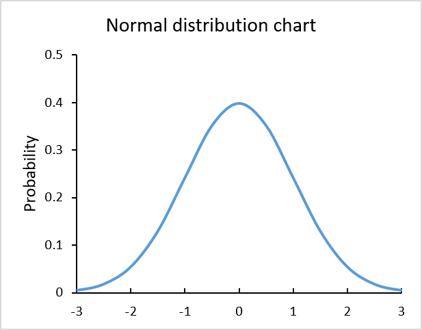
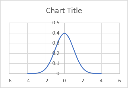
The chart above is built using the NORM.DIST function and is called Normal Distribution or Bell Curve chart.
This curve is often used in probability theory and mathematical statistics.
Instructions
First I'll show you how to construct the data needed, then insert a chart. Lastly, customize the chart to make it look better.
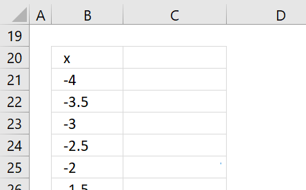
Normal distribution data
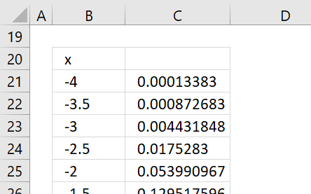
The chart requires two sets of data, x and y. Enter values from -4, -3.5, -3 ... to 4, they will be x-axis values shown in column B in the picture below.
The NORM.DIST function allows you to calculate the normal distribution for each x value.
Formula in cell C21:
Copy and paste this formula to cells below, as far as needed.
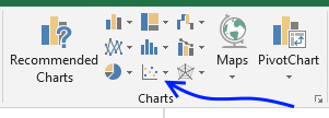
Insert a chart
Select the cell range, in my example B21:C37.
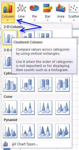
Go to tab "Insert" on the ribbon then press with left mouse button on the scatter chart button.
Press with mouse on "Scatter with smooth lines" button.
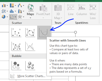
The chart shows up, clearly, we have to do a few changes to this chart.
Customize chart
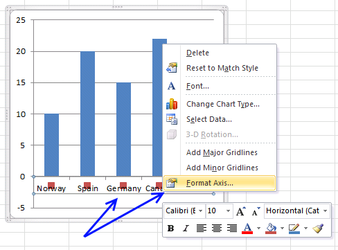
The y-axis values are in the middle of the graph if you want to move it to the left or right follow these steps.
- Press with right mouse button on on x-axis values. (Yes, x-axis.)
- Press with mouse on "Format Axis..."
- Find "Vertical axis crosses" setting.
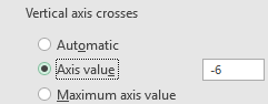
- Select Axis value and type a value. In my example, -6.
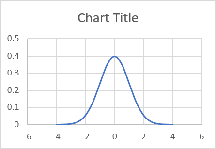
Press with mouse on major gridlines and press delete button to delete them, if you prefer.
Change the chart title.
Get Excel *.xlsx file
How to graph a normal distribution.xlsx
2. How to build an arrow chart
![]()
This chart is an arrow chart that has horizontal and vertical lines, positive arrows are green and negative arrows are red.
How to build an arrow chart
I am going to use a scatter chart to plot these lines, I will have two different series, one for the green arrows and one chart series for the red arrows.
The following data set shows how I arranged values in order to get an ending arrow for each group of chart values.
![]()
Select the first series (green arrows).
![]()
Go to tab "Insert" on the ribbon.
Press with left mouse button on the "Insert Scatter (X,Y) or Bubble chart" button.
Press with left mouse button on the "Scatter with Straight Lines and Markers" button.
![]()
Press with right mouse button on on chart and then press with left mouse button on "Select Data...".
![]()
Press with mouse on the "Add" button.
![]()
Select the x and y values.
![]()
Press with left mouse button on the "OK" buttons.
![]()
Doublepress with left mouse button one of the series to open the task pane.
![]()
Go to tab "Fill & Line", press with left mouse button on the "Marker" button and then press with left mouse button on radio button "None" to remove markers. Select the other chart series and repeat the steps once again to remove the markers for the second chart series.
![]()
Now go to "Line" and change the color for both chart series. If the smoothed line check box is checked then deselect that one as well.
Change the "End Arrow type" and the End Arrow size" to display arrows for each line.
![]()
3. How to graph an equation
Why graph an equation?
Graphs make it easier to analyze features of the equation like intercepts, increasing/decreasing, maxima/minima, concavity, etc. Examining a graph can reveal insights.
What are intercepts?
Intercepts refer to the points where a function or curve intersects the x-axis and y-axis. There are two main types of intercepts: x-intercepts and y-intercepts. Identifying these intercepts provides insight into the function and can help derive key characteristics.
What is an increasing/decreasing equation?
- Increasing - The graph is rising as it moves left to right. The y-values increase as x increases.
- Decreasing - The graph is falling as it moves left to right. The y-values decrease as x increases.
Identifying increasing/decreasing intervals helps understand the function's behavior.
What are maxima/minima?
Maxima and minima refer to the points where a function reaches its highest or lowest value.
- Local maxima is the highest value in a region and global maxima when absolute highest over all x values.
- Local minima is the lowest value in a region and global minima when absolute lowest over all x values.
What is concavity?
Concavity refers to the shape of the curve and whether it curves up or down.
The two types of concavity are:
- Concave up - The curve resembles a cup or smile shape opening upwards. Indicates the rate of change is increasing.
- Concave down - The curve resembles a frown shape curving downwards. Indicates the rate of change is decreasing.
What are inflection points?
An inflection point is a point on the curve where the concavity changes from concave up to concave down or vice versa.
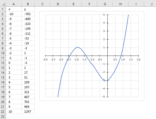
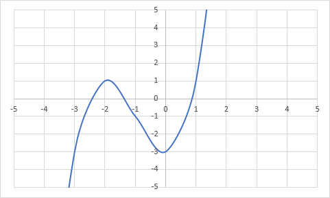
3.1 Chart an equation
The picture above shows the following equation
plotted on an x y scatter chart.
3.2 Calculate values
Here are the instructions on how I built this chart:
- Type -10 and -9 in cell A2:A3
- Select cell A2:A3 and press and hold on the black dot.
- Drag down until you see the number 10.
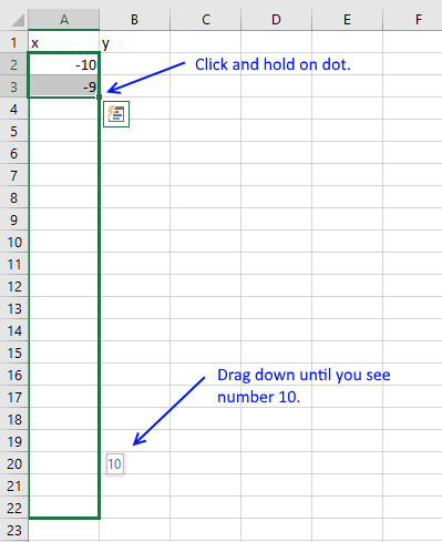
- Release the mouse button
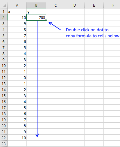
- Select cell B2 and type: =A2^3+3*A2^2-3
- Press Enter
- Double press with left mouse button on dot in the lower right corner. This copies the formula to cells below as far as there are cells containing values in column A.
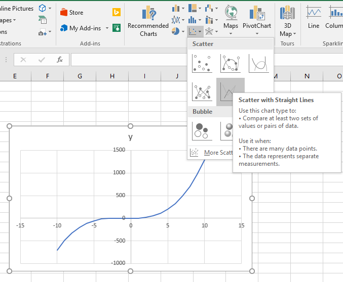
3.3 Insert x y scatter chart
- Go to tab "Insert" on the ribbon
- Press with mouse on scatter chart icon
- Press with mouse on the scatter chart you prefer, I chose Scatter with straight lines.
3.4 Change the x and y axis minimum and maximum value
- Press with right mouse button on on x axis
- Press with mouse on "Format axis..."
- Change minimum and maximum value
- Change major units
Repeat with y axis.
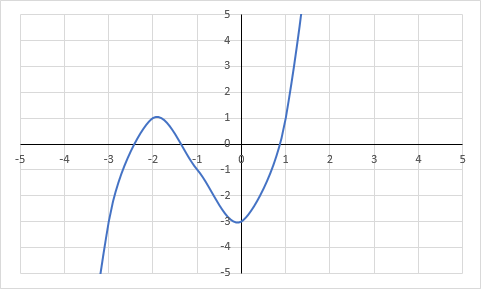
3.5 Format x and y axis
- Select x axis again
- Press with mouse on Fill and Line icon
- Select "Solid Line" and pick a color.
- Repeat with y axis
Useful resources
How to Plot an Equation in Excel
4. Build a comparison table/chart
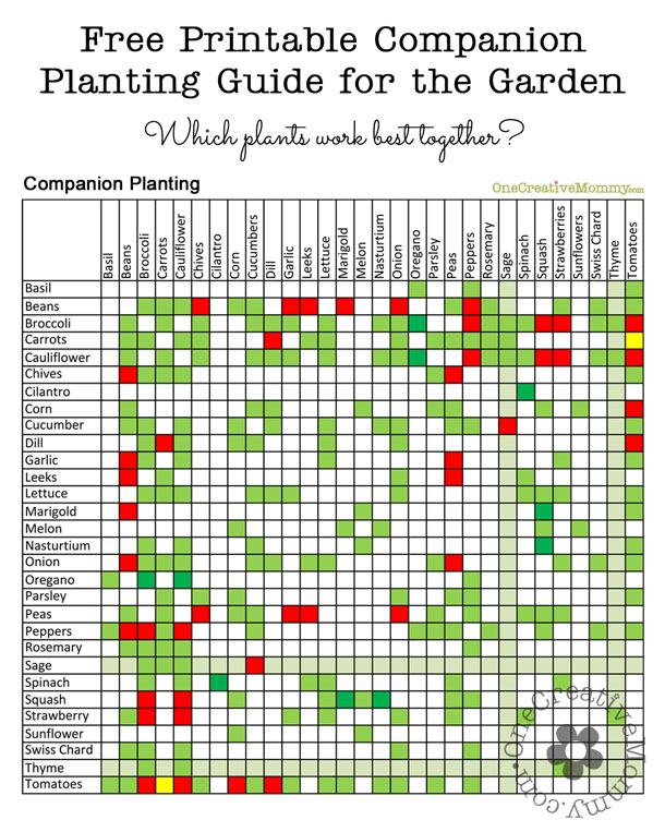
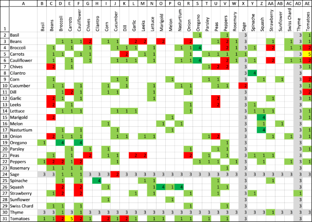
I found a chart that I wanted to show you how to build. It contains values both horizontally and vertically, the intersecting cells are colored based on conditions.
The printable planting guide is found here. This is what the color means:
Light green : Plants grow well together.
Red : Don't plant together.
Dark green : The combination helps bug control.
Yellow : Carrots will have good flavor but stunted roots.
Grey : Beneficial to the garden in general.
Start typing the plant names in cell A2 and continue with cells below.
4.1 How to transpose values vertically to horizontally?

The animated image above shows a smaller set of values being transposed.
- Select cells in cell range A2:A31.
- Copy cells.
- Select the destination cell.
- Press with left mouse button on the "Paste" button. A pop-up menu appears.
- Press with left mouse button on the "Transpose" button.
4.2 How to orient cell values vertically?

The image above shows cell values in B1:D1 aligned vertically.
- Select cell range B1:AE1.
- Press with right mouse button on on cell range B1:AE1. A pop-up menu appears.
- Press with left mouse button on "Format Cells..." on the pop-up menu. A dialog box shows up, see image below.
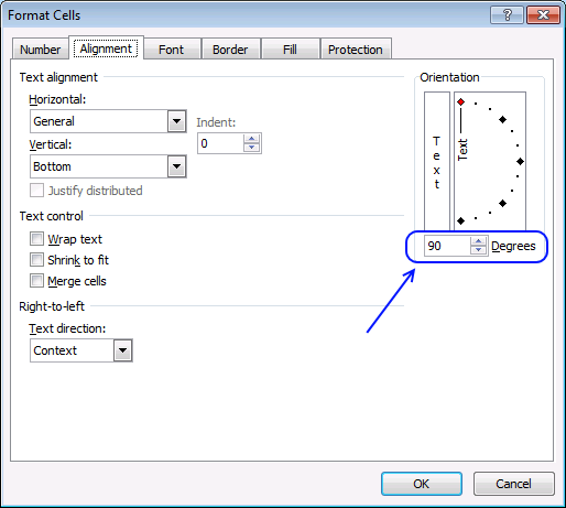
- Go to tab "Alignment".
- Change "Orientation" to 90 degrees, see image above.
- Press with left mouse button on OK button to apply settings..
4.3 How to change column width for multiple columns simultaneously?

The animated image above shows how to change column width by dragging the column border with the mouse.
- Select columns B:AE.
- Press and hold with left mouse button on any column border.
- Drag with mouse until column width is around 20 pixels,
- Release the left mouse button.
Tip!

- Select columns B:AE.
- Doublepress with left mouse button on with left mouse button on any column border in B:AE.
This adjusts the column width to the text.
4.4 How to apply cell background color using conditional formatting?
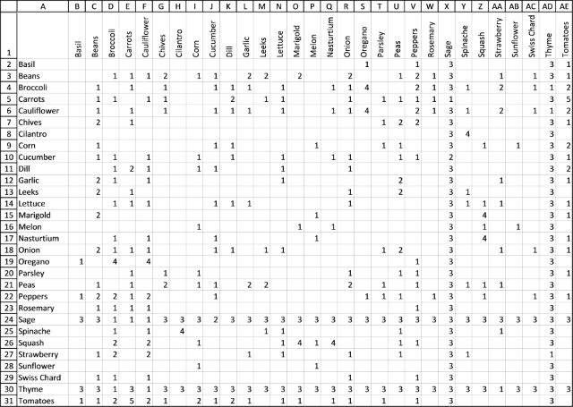
The image above shows the cell grid populated with numbers, we are going to color the cell background using Conditional Formatting based on these numbers.
- Type 1 for green, 2 for red, 3 for grey, 4 for dark green and 5 for yellow in cell range B2:AE31.
- Select cell range B2:AE31 and go to tab "Home" on the ribbon.
- Press with left mouse button on "Conditional formatting" button.
- Press with left mouse button on "New Rule..".
- Select "Use a formula to determine which cells to format", see image below.
- Type =B2=1
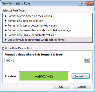
- Press with left mouse button on "Format..." button.
- Go to tab "Fill".
- Pick a color.
- Press with left mouse button on OK button twice.
Repeat above steps for cell values 2, 3, 4, and 5 but the formulas become =B2=2, =B2=3 , B2=4 and B2=5 and pick different fill colors.
4.4.1 Explaining conditional formatting formula
Conditional formatting formula:
Step 1 - Relative cell reference
B2 is a relative cell reference, it changes when the CF formula moves to the next cell. For example, the CF formula moves to cell B3 and the relative cell reference then changes to B3.
This evaluates the contents of each cell and colors the corresponding cell background based on the its cell value.
Step 2 - Cell value is equal to 1
The equal sign compares the contents of cell B2 to 1.
B2=1
becomes
""=1
and returns FALSE.
Step 3 - Evaluate TRUE and FALSE
If the logical expression returns TRUE the cell background changes to green. If FALSE then nothing happens.
4.5 How to hide cell values using cell formatting?
The image above shows the cell grid without the numbers only cell background colors. The numbers are still there, however, you can't see them. Select a cell and the number shows up in the Formula bar.
Here is how to hide the numbers in cell range B2:AE31.
- Select B2:AE31.
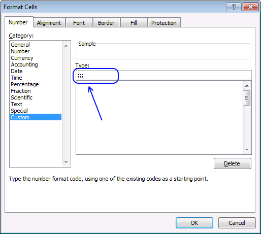
- Press CTRL + 1. A dialog box appears.
- Press with left mouse button on "Custom" category, see image below.
- Type ;;;
- Press with left mouse button on OK button to dismiss the dialog box and apply settings..
4.6 How to create cell borders?

The image above shows cell range A1:AE31 selected. Here is how to insert borders to cell range A1:AE31:
- Select A1:AE31.
- Go to the "Home" tab on the ribbon.
- Press with left mouse button on "Borders". A pop-up menu shows up.

- Select "All Borders".

You could color each cell manually, but in my opinion, building this chart is a lot easier using cell numbers.
5. Heat map yearly calendar
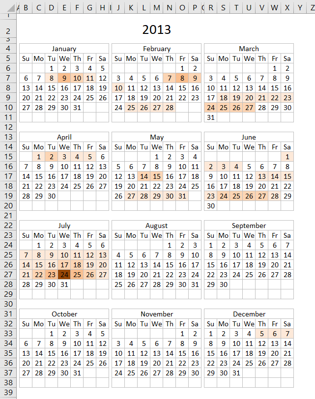
The calendar shown in the image above highlights events based on frequency. It is made only with a few conditional formatting formulas and an Excel defined table that allows you to add new events or edit/delete old ones.
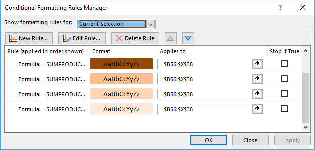
5.1 Conditional formatting formulas
What you perhaps want to customize is how events are highlighted. The following table shows how conditional formatting is used.
| Event frequency | CF formula |
| 1 | =SUMPRODUCT((INT(INDIRECT("Table1[Start]"))<=B6)* (INT(INDIRECT("Table1[End]"))>=B6))=1 |
| 2 | =SUMPRODUCT((INT(INDIRECT("Table1[Start]"))<=B6)* (INT(INDIRECT("Table1[End]"))>=B6))=2 |
| 3 | =SUMPRODUCT((INT(INDIRECT("Table1[Start]"))<=B6)* (INT(INDIRECT("Table1[End]"))>=B6))=3 |
| 4 | =SUMPRODUCT((INT(INDIRECT("Table1[Start]"))<=B6)* (INT(INDIRECT("Table1[End]"))>=B6))=4 |
This image shows the rules manager for conditional formatting formulas, it shows you the fill color I used and the calendar cell range it is applied to.
5.2 Explaining CF formula
The following CF formula is the one that identifies dates that have only one event scheduled.
Step 1 - Check date in calendar with start column in Excel table
The INDIRECT function returns the cell reference based on a text string and shows the content of that cell reference.
Function syntax: INDIRECT(ref_text, [a1])
Check if date in cell B6 is larger than or equal to start dates. The INDIRECT function is needed to be able to use an Excel table name in a Conditional Formatting formula.
The INT function removes the decimal part from positive numbers and returns the whole number (integer) except negative values are rounded down to the nearest integer.
Function syntax: INT(number)
INT(INDIRECT("Table1[Start]"))<=B6
becomes
INT({41282.375; 41330.3333333333; 41312.3333333333; 41351.4166666667; 41365.5; 41421.75; 41438.3333333333; 41448.625; 41283.3333333333; 41283.3333333333; 41312.3333333333; 41313.3333333333; 41314.3333333333; 41357.4166666667; 41366.5; 41408.75; 41408.75; 41449.75; 41462.75; 41472.75; 41613; 41477; 41478; 41479})<=B6
becomes
{41282; 41330; 41312; 41351; 41365; 41421; 41438; 41448; 41283; 41283; 41312; 41313; 41314; 41357; 41366; 41408; 41408; 41449; 41462; 41472; 41613; 41477; 41478; 41479}<=41273
and returns
{FALSE; FALSE; FALSE; FALSE; FALSE; FALSE; FALSE; FALSE; FALSE; FALSE; FALSE; FALSE; FALSE; FALSE; FALSE; FALSE; FALSE; FALSE; FALSE; FALSE; FALSE; FALSE; FALSE; FALSE}
Step 2 - Check date in calendar with end column in Excel table
INT(INDIRECT("Table1[End]"))>=B6))
returns
{TRUE; TRUE; TRUE; TRUE; TRUE; TRUE; TRUE; TRUE; TRUE; TRUE; TRUE; TRUE; TRUE; TRUE; TRUE; TRUE; TRUE; TRUE; TRUE; TRUE; TRUE; TRUE; TRUE; TRUE}
Step 3 - Multiply conditions (AND logic)
In order to identify a date inside an event range both conditions must be met.
(INT(INDIRECT("Table1[Start]"))<=B6)* (INT(INDIRECT("Table1[End]"))>=B6)
becomes
{FALSE; FALSE; FALSE; FALSE; FALSE; FALSE; FALSE; FALSE; FALSE; FALSE; FALSE; FALSE; FALSE; FALSE; FALSE; FALSE; FALSE; FALSE; FALSE; FALSE; FALSE; FALSE; FALSE; FALSE} * {TRUE; TRUE; TRUE; TRUE; TRUE; TRUE; TRUE; TRUE; TRUE; TRUE; TRUE; TRUE; TRUE; TRUE; TRUE; TRUE; TRUE; TRUE; TRUE; TRUE; TRUE; TRUE; TRUE; TRUE}
and returns
{0; 0; 0; 0; 0; 0; 0; 0; 0; 0; 0; 0; 0; 0; 0; 0; 0; 0; 0; 0; 0; 0; 0; 0}.
Step 4 - Sum events
Function syntax:
SUMPRODUCT((INT(INDIRECT("Table1[Start]"))<=B6)* (INT(INDIRECT("Table1[End]"))>=B6))
becomes
SUMPRODUCT({0; 0; 0; 0; 0; 0; 0; 0; 0; 0; 0; 0; 0; 0; 0; 0; 0; 0; 0; 0; 0; 0; 0; 0})
and returns 0 (zero).
Step 5 - Check if the number of events equal 1
If the sum is equal to 1 then the Conditional formatting formula returns TRUE and the cell is highlighted, if not then the formula returns FALSE and the cell is not highlighted.
SUMPRODUCT((INT(INDIRECT("Table1[Start]"))<=B6)* (INT(INDIRECT("Table1[End]"))>=B6))=1
becomes
0=1
and returns FALSE. Cell B6 is not highlighted.
5.3 Populating the Excel table
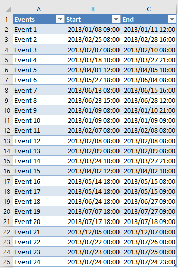
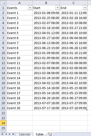
The following picture shows the Excel defined table containing the data about each event, the event name, when it starts and when it ends.
5.4 CF formula examples
If you want to highlight cells that have less then 5 events scheduled with a given color then use this CF formula:
If you want to highlight cells that have greater then 5 events and less than 10 events scheduled with a given color then use this CF formula:
There are also CF formulas that hide dates and formatting on each month because some cells show the previous or the next months dates. The calendar looks cleaner without them.
5.5 Get Excel *.xlsx
Note that no VBA is used in this workbook, however, there is a VBA solution demonstrated below if you prefer that.
5.6 Heat map - VBA Solution
Hi, I would like to use this example with my dataset, however, I'd like to visually show the number of events per date to understand when are we the busiest, slowest, etc. and be able to forecast using this data.
Ideally, I would like some sort of data bar or color change indicating the level for each date (Jan 1 has 10 items while Jan 2 has 3 and I can visually see that in each cell instead of seeing numbers or a solid color for each cell (here yellow and blue).
Answer:
This article demonstrates how to highlight events on a yearly calendar based on frequency per day. You will find a link to this workbook at the end of this article.
The color on the calendar gives a rough estimate on the number of events per date.
- No color no events.
- Light color one or a few events.
- Darker color means many events.
You add, edit or delete events to worksheet "Table" and every time you go back to worksheet "Calendar" the colors are refreshed by the macro below.
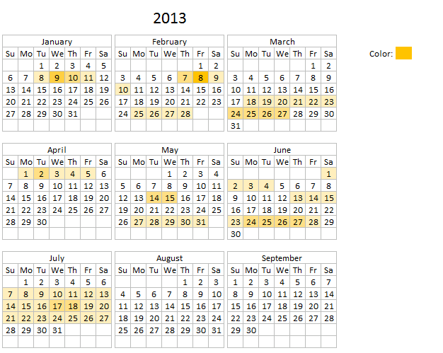
There is a specific cell next to the calendar that allows you to change the highlight color if you prefer. Press with mouse on that cell and change the cell color to a color you want.
5.6.1 VBA code
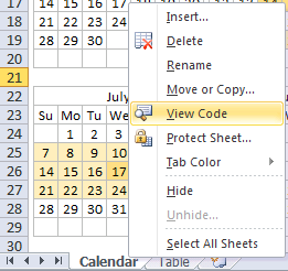
- Press with right mouse button on on sheet Calendar
- Press with left mouse button on "View Code"
- Copy vba code below
- Paste code to sheet module
- Exit VB Editor
Private Sub Worksheet_Activate()
Dim CRng As Variant
Dim Dt As Variant
Dim CDt As Variant
Dim Cnt As Integer
Dim r As Long
Dim c As Long
Dim St As Integer
Application.ScreenUpdating = False
CRng = Worksheets("Calendar").Range("B6:X38").Value
With Worksheets("Table")
    For r = 1 To UBound(CRng, 1)
        For c = 1 To UBound(CRng, 2)
            If CRng(r, c) <> "" Then
                For CDt = 1 To .Range("Table1[Start]").Cells.Count
                    If CRng(r, c) >= Int(.Range("Table1[Start]").Cells(CDt).Value) And CRng(r, c) <= Int(.Range("Table1[End]").Cells(CDt).Value) Then Cnt = Cnt + 1 End If Next CDt End If If Cnt > St Then St = Cnt
        Cnt = 0
        Next c
    Next r
End With
Set Rng = Worksheets("Calendar").Range("B6:X38")
    'Remove previous formatting
    With Rng.Interior
        .Pattern = xlNone
        .TintAndShade = 0
        .PatternTintAndShade = 0
    End With
    With Worksheets("Table")
        For Each Dt In Worksheets("Calendar").Range("B6:X38")
            For CDt = 1 To .Range("Table1[Start]").Cells.Count
                If Dt >= Int(.Range("Table1[Start]").Cells(CDt).Value) And Dt <= Int(.Range("Table1[End]").Cells(CDt).Value) Then Cnt = Cnt + 1 End If Next CDt If Cnt > 0 Then
            With Dt.Interior
                .Pattern = xlSolid
                .PatternColorIndex = xlAutomatic
                .Color = Worksheets("Calendar").Range("AB5").Interior.Color ' xlThemeColorAccent4 '
                .TintAndShade = 1 - (Cnt / St)
                .PatternTintAndShade = 0
            End With
            'Reset counter a
            Cnt = 0
            End If
        Next Dt
    End With
Application.ScreenUpdating = True
End Sub
5.6.2 WorkSheet "Table"
The picture below shows the events in an Excel defined table named [Table1].
You don't need to adjust cell references or formulas everything is automatic, Excel defined Tables are great in that aspect.
You can find a heat map monthly calendar here.
5.6.3 Get excel *.xlsm file
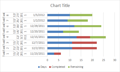
6. Advanced Gantt Chart Template
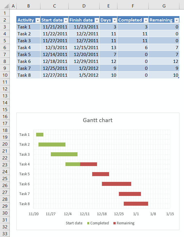
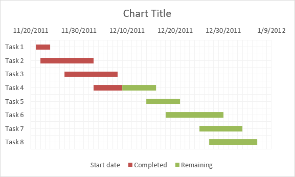
This Gantt chart uses a stacked bar chart to display the tasks and their corresponding date ranges. Completed days are green and remaining days are red, see image above.
The chart utilizes an Excel defined Table in a very efficient way, you don't need to adjust chart data source ranges when you add or delete records. The Excel defined Table takes care of that for you.
6.1 How to build worksheet
First you need to convert your data into an Excel defined Table.
6.1.1 Excel defined Table
- Select a cell in your data set.
- Press CTRL + T.
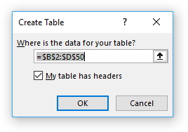
- Enable the checkbox if the data set contains column headers.
- Press with left mouse button on OK.
Now you need to create a stacked bar chart.
6.1.2 Insert a stacked bar chart
- Select one of the cells in the Excel defined Table.
- Go to tab "Insert" on the ribbon.
- Press with mouse on "Insert Column or Bar Chart" button.
- Press with mouse on "Stacked Bar chart" button.
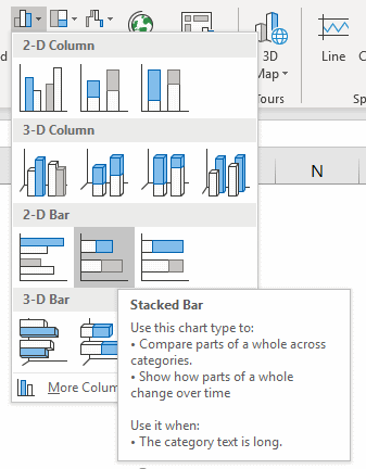
- A chart appears, however, we need to customize it quite a lot before we can use it.
6.2 Customize stacked bar chart
The data source ranges are not what we want but we can easily change those.
- Press with right mouse button on on chart
- Select "Data source..."
- Change the first Legend entry "Days" so i points to column "Start Date" in the Excel defined Table".
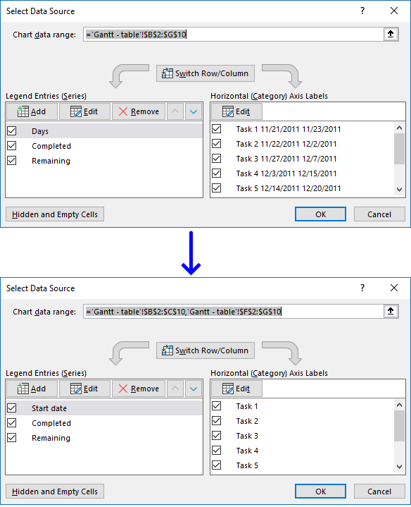
- Press with left mouse button on "Edit" button (Horizontal (Category) Axis Labels and change the cell reference so it points to the "Activity" column on the Excel defined Table.
- Press with left mouse button on OK button.
The chart now looks like this:
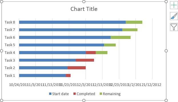
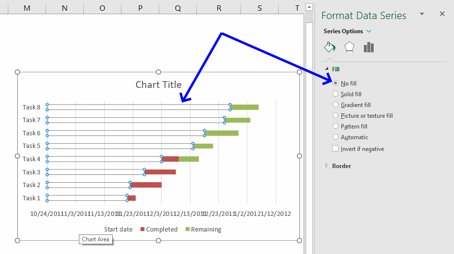
We are now going to remove the blue bar.
- Double-press with left mouse button on one of the blue bars to open the format pane.
- Press with mouse on the Fill & Line button.
- Select "No fill".
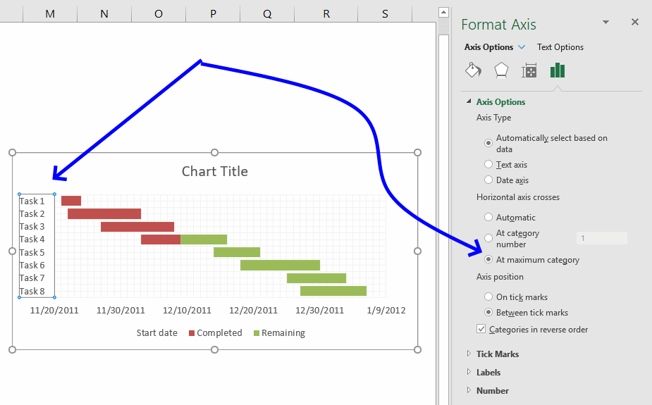
If you want the tasks to be arranged in reverse order then follow these steps.
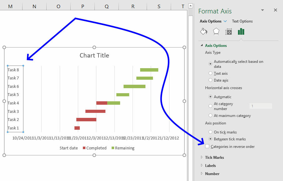
- Double press with left mouse button on the y-axis categories to open the Format Pane, see image above.
- Press with mouse on "Axis Options" button.
- Press with left mouse button on the checkbox "Categories in reverse order.
The image now looks like this, the dates are however in a mess.
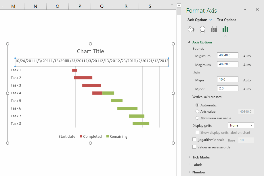
- Double-press with left mouse button on x-axis values to open the Format Pane.
- Press with mouse on "Axis Options" button.
- The "minimum" value is the number equivalent to an Excel date, in this case, 10/24/2011. The first date range starts at 20/11/2011 which is number 40868. I will use 40867.
- Feel free to change the maximum value as well.
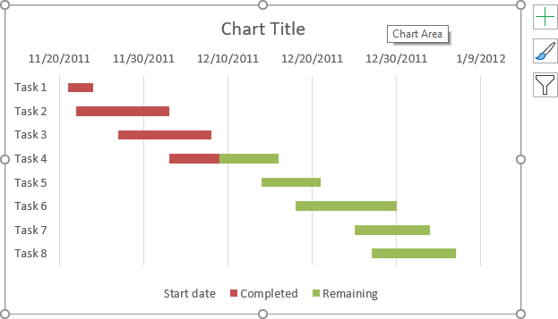
I recommend that you apply minor gridline to make the chart easier to read.
- Press with right mouse button on on x-axis values.
- Press with left mouse button on "Add minor gridlines".
- Change the "Minor" value to 1 in the Format Pane.
- Select and delete the major gridlines.
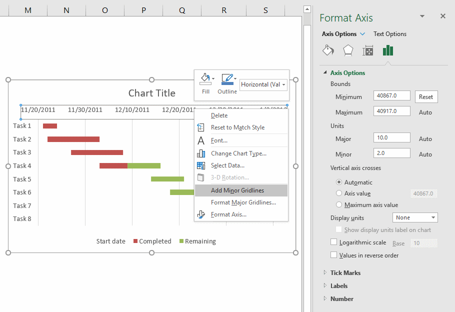
Repeat above steps but this time with y-axis values.
If you prefer the x-axis values below the chart then double-press with left mouse button on the y-axis values to open the Format Pane.
Press with left mouse button on "Horizontal axis crosses" At maximum category.
Recommended blog posts
Gantt Chart with Repeated Tasks via Excel XY Chart | Peltier Tech Blog
7. Dynamic Gantt chart

This section demonstrates how to create a dynamic Gantt chart. A Gantt chart helps you plan and track various elements of a project. A dynamic chart automatically adds new values to the chart. Let's start!
Create a table
- Select cell range (A1:D7)

- Press with left mouse button on "Insert" tab on the ribbon
- Press with left mouse button on "table" button
- Press with left mouse button on ok!
Create a stacked chart
- Select table
- Go to "Insert" tab
- Press with left mouse button on "Bar chart" button and then press with left mouse button on "Stacked bar" button.

Setting up the stacked chart
- Press with right mouse button on a blue bar

- Press with left mouse button on "Format Data Series..."
- Press with left mouse button on "Fill"
- Press with left mouse button on "No Fill"
- Press with left mouse button on OK!

- Press with right mouse button on on chart
- Press with left mouse button on "Select Data"

- Select "Finish Date"
- Press with left mouse button on "Remove" button
- Press with left mouse button on OK!

Format x-axis
- Press with right mouse button on on x axis dates

- Press with left mouse button on "Format axis.."

- Change "Minimum:" and "Major unit:" to fixed
- Change "Minimum" value to 40547.
- Change "Major unit:" value to 7.

- Press with left mouse button on "Alignment"
- Change "Text direction:" to Rotate all text 270
- Press with left mouse button on Close

Setting up the legend
- Press with left mouse button on text "Start date" in legend
- Delete
- Press with right mouse button on on chart
- Press with left mouse button on "Select Data"
- Press with left mouse button on "Duration"
- Press with left mouse button on Edit

- Change "Series name:" to Sheet4!$A$1 (Activity)
- Press with left mouse button on OK!

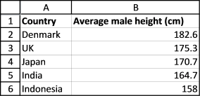
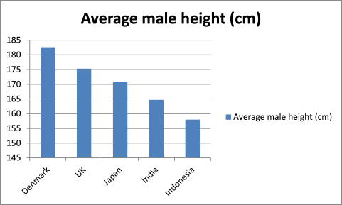
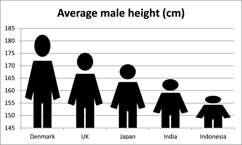
8. How to replace columns with pictures in a column chart
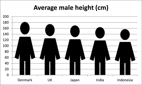
I found an interesting chart on CNN's website: Rise of the supersize rugby player It shows the average height of athletes for the past 40 years. Check it out.
It made me think how can I do this in Excel? First I drew this nice man, see the image below. I am going to use this picture in my chart. It is not as nice as the other chart but it will do for this demonstration.

8.1. Create a column chart

- Select the data, see image above.
- Go to tab "Insert" on the ribbon.
- Select a new clustered column chart.
8.2. Delete the chart legend

- Press with left mouse button on the chart legend to select it.
- Press Delete on your keyboard to remove it from the chart.

8.3. Change chart gap width

- Press with right mouse button on on the data series.
- Press with left mouse button on "Format Data Series...". You will now see a dialog box or a settings pane depending on what Excel version you are using.
- Press with left mouse button on Series Options.
- Change gap width to 20%.
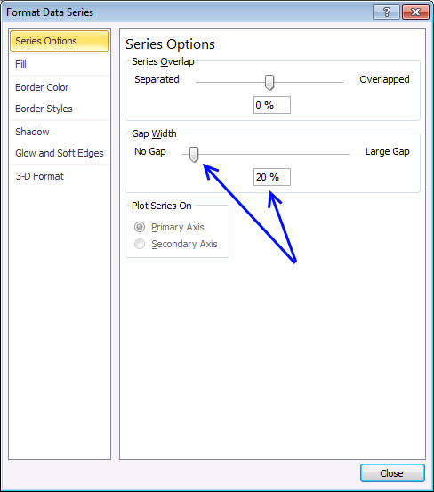
- Close the dialog box.

8.4. Insert a picture to chart column

- Press with left mouse button on "Fill and Line"
- Press with left mouse button on "Picture or texture fill".
- Press with left mouse button on the "Insert.." button.

- A dialog box appears. Select a picture file you want to use.
- Press with left mouse button on Insert.
8.5. Change min y-axis value

- Press with right mouse button on on chart y-axis, see image above. A popup menu shows up.
- Press with left mouse button on "Format axis..."
- Press with left mouse button on "Axis Options".

- Change the minimum value to 0 (zero).
- Press with left mouse button on OK.
9. Schedule project dates based on a finish date

I have a schedule that I am working with and based on one date (ie. 6/4/) different processes take different times to complete (ie. one step could only take a week, another could take up to 4 weeks).
Is there a formula I can use to calculate each step in the process based off of the date range of completion for the first step in the process?
So for example, if you look at the BBD date at the bottom, all of the steps above it take a certain amount of time to complete and have to be finished on time in order for the project to be complete by 1/4/.
Instead of typing in manually the date ranges I am trying to write a formula that will allow me to input the project date (ie 1/4/) and have all of the other steps populate themselves based on how long they take to complete (ie. the manuscript to CE step could take 2 weeks, the manuscript from CE could take 1 week and so on). I hope that makes sense??
ie. ONE ROUND From: To:
Manuscript turnover 6/25/ 7/30/
Manuscript to CE 8/6/
Manuscript from CE 8/20/
Manuscript to author 8/27/
Manuscript from author 9/10/
Ms to comp 9/3/2012 9/17/
Pages from comp 10/8/
Pages from author 10/22/
Pages to proofreader 10/29/
Pages from proofreader 11/12/
Pages to comp 11/19/
Confirming proofs 11/26/
Ship to printer 12/3/
BBD 1/4/
Answer:

I calculated the duration for each step (column E) and the days between each step (column F). I then used the calculations in column E and F to calculate new dates in cell range E15:D23 based on a new finish date in cell D24.
The following formula calculates the number of days between From: and To: dates.
Formula in cell E3:
The IF function checks if cell C3 is blank and then returns 0 (zero) if TRUE and D3-C3 if FALSE. Copy cell E3 and paste to cell range E4:E11.
The formula below calculates the number of days between tasks.
Formula in cell F3:
Copy cell F3 and paste to cell range F4:F11.
9.1 Calculate new dates based on finish date
The following formula in cell C15 checks if C3 is blank and returns a blank if TRUE or returns D15-E3 if FALSE. D15-E3 calculates the From: date by subtracting the duration from the To: date.
Formula in cell C15:
Copy cell C15 and paste to cell range C16:C23.
The formula below calculates the To: date by subtracting the number of days between the tasks from the To: date of the next task.
Formula in cell D15:
Copy cell D15 and paste to cell range D16:D23.
The formulas above make it possible to change the date in cell D24 and the other project dates will follow based on the calculations made in the first table.
This Gantt chart shows the processes and the days between, green days are the task duration and red days are the number of days between the current task and the next task.

Read more about Gantt charts here: Dynamic Gantt charts
10. Color chart columns based on cell color

This article demonstrates macros that automatically changes the chart bar colors based on the corresponding cell, the first example is based on a regular column chart and the second example shows a stacked bar chart.
The image above shows a data table in cell range A1:B6 containing continents in the world and a random number.
What's on this page
- Format fill color on a column chart based on cell color
- Get Excel *.xlsm file
- Change stacked bar colors
- Get Excel *.xlsm file
The chart graphs the regions and numbers using columns, categories are distributed horizontally (x-axis) and numbers vertically (y-axis) from 0 to 45 with increments of 5.
To the right of the data table is a button linked to a VBA macro. When you press the button named "Color chart columns" macro ColorChartColumnsbyCellColor is rund.
The VBA macro goes through each cell in the chart data source, copies the cell color and applies the same color to the corresponding chart column.
A little off topic question, but I am thinking outside the box a little.I have two charts that display different data sets for the same projects. I want the formatting of the series (projects) to be the same on each chart so they are recognizable Could similar VBA code be used to format the fill colour on the charts based on how you colour the series names in the data tables?
VBA code
'Name macro
Sub ColorChartColumnsbyCellColor()

'The With ... End With statement allows you to write shorter code by referring to an object only once instead of using it with each property.
With Sheets("Sheet1").ChartObjects("Chart 1").Chart.SeriesCollection(1)

'Save chart data source range from first chart on worksheet Sheet1
Set vAddress = ActiveSheet.Range(Split(Split(.Formula, ",")(1), "!")(1))

'Iterate through each cell in data source range
For i = 1 To vAddress.Cells.Count

'Copy color from cell to bar
.Points(i).Format.Fill.ForeColor.RGB = ThisWorkbook.Colors(vAddress.Cells(i).Interior.ColorIndex)

'Continue with next cell
Next i
End With
End Sub
Where to put the code?

The VB Editor allows you to build macros and UDFs in Excel. To the left is the "Project Explorer" window and to the right is a window where you put your code.
The Project Explorer window lets you choose which open workbook to use and if you want to save your macro in a worksheet module or a regular module.
- Copy VBA code.
- Press Alt + F11 to open the Visual Basic Editor.
- Press with mouse on "Insert" on the top menu.
- Press with mouse on "Module", the module name appears below your workbook in the "Project Explorer" window.
- Paste VBA code to window, see image above.
- Exit VB Editor and return to Excel.
How to create and link a button?

- Go to tab "Developer" on the ribbon.
- Press with mouse on the "Insert" button on the ribbon.
- Press with mouse on "Button".
- Press and hold with left mouse button on your worksheet.
- Drag with mouse until you got the size you want.
- Release left mouse button.
- A dialog box appears allowing you to assign a macro.
- Press with left mouse button on macro "ColorChartColumnsbyCellColor" to select it.
- Press with left mouse button on "OK" button.
You can now press with left mouse button on the button to trigger the macro.
Change stacked bar colors programmatically
The picture above shows a stacked bar chart and a data table with colored columns, each category has it's own color based on the corresponding data table column.
The macro below lets you color the bars with the same color as the source range.
How to use macro
You select the stacked bar chart you want to color differently. Make sure you have colored the source cell range. Go to "Developer" tab on the ribbon, press with left mouse button on "Macros" button. Select "ColorChartBarsbyCellColor" and press with left mouse button on OK.
Series 1 (Asia) has it's source values in cell range B2:B5. The color in that cell range matches the color in the stacked bar chart.
VBA
'Name macro
Sub ColorChartBarsbyCellColor()

'Dimension variables and declare data types
Dim txt As String, i As Integer

'Save the number of chart series to variable c
c = ActiveChart.SeriesCollection.Count

'Iterate through chart series
For i = 1 To c

'Save seriescollection formula to variable txt
txt = ActiveChart.SeriesCollection(i).Formula

'Split string save d to txt using a comma ","
arr = Split(txt, ",")

'The With ... End With statement allows you to write shorter code by referring to an object only once instead of using it with each property.
With ActiveChart.Legend.LegendEntries(i)

'The SET statement allows you to save an object reference to a variable, the image above demonstrates a macro that assigns a range reference to a range object.
'Save a range object based on variable arr to variable vAdress
Set vAddress = ActiveSheet.Range(arr(2))

'Copy cell color from cell and use it to color bar chart
.LegendKey.Interior.Color = ThisWorkbook.Colors(vAddress.Cells(1).Interior.ColorIndex)
End With

'Continue with next series
Next i
End Sub
11. How to color chart bars based on their values
All columns in this chart are blue.
- Press with right mouse button on on a column on the chart.
- Press with mouse on "Format Data Series...".
- Press with left mouse button on "Fill" button.
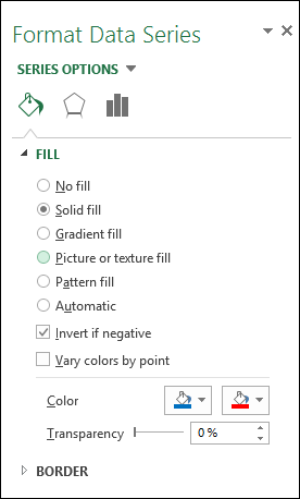
- Press with mouse on "Solid fill".
- Press with left mouse button on "Invert if negative", see the image above.
- Pick a color for positive values.
- Pick a color for negative values.
12. How to color chart columns based on a condition?
What if you want to color bars by comparing?
This chart example shows bars colored differently depending on the preceding value. If a value is larger than the previous one, it will be colored blue. Smaller than the previous value and the bar will be red.
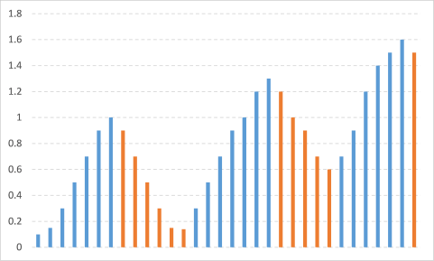
12.1 How to build
The trick here is to split data into two different chart series, you can do that by placing them in two columns using formulas.
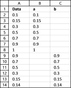
Formula in cell B2: =IF(A3>A2,A3,"")
Formula in cell C2: =IF(A3<A2,A3,"")
Copy these cells and paste them on cells below, as far as needed.
12.2 Insert chart
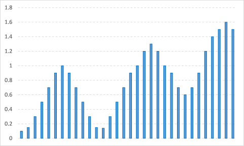
Now it is time to build the column chart, shown above.
- Select values in in column A
- Go to tab "Insert" on the ribbon
- Press with mouse on "Insert column chart" button
12.3 Add data series
- Press with right mouse button on on columns and press with left mouse button on "Select Data..."
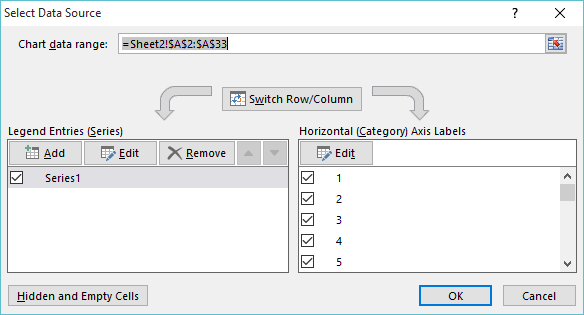
- Press with left mouse button on "Edit" button below "Legend Entries (Series)"

- Press with left mouse button on "Series values" button and select cell range B2:B33
- Press with left mouse button on OK
- Press with left mouse button on "Add" button
- Select cell range C2:C33
- Press with left mouse button on OK
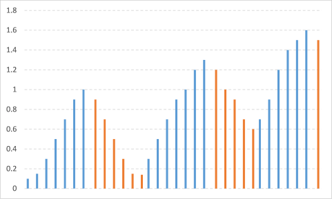
The chart changes to this:
12.4 Change chart gap width and series overlap
You can see that there are gaps between series.
- Press with right mouse button on on a column
- Press with left mouse button on "Format Data Series..."
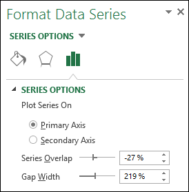
- Change "Series Overlap" to 100%
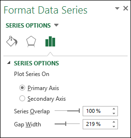
This is what the chart looks like:
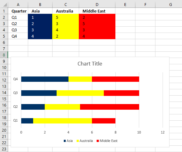
13. How to color chart bars/columns based on multiple conditions?

The image above demonstrates a chart that has bars/columns colored based on multiple conditions. It shows colored columns based on quarter, the color corresponds to the quarter number.
13.1 Prepare data

The image above shows the data, it is divided into four different columns. Each column corresponds to a quarter and is its own chart series.
You can create a formula that populates columns F to I accordingly based on the Month name in column D if you don't want to copy the values manually and paste them to their destinations cells.
Columns B and C are only there two create categories based on year and quarter for the months on the chart. The chart shows this on the x-axis (horizontal axis), the year and quarter are displayed below the months.
13.2 Explaining formula in cell F3
Step 1 - Calculate the relative position of the given item in the array
The MATCH function returns a number representing the relative position of an item in a cell range or array.
MATCH($D3, {"Jan"; "Feb"; "Mar"; "Apr"; "May"; "Jun"; "Jul"; "Aug"; "Sep"; "Oct"; "Nov"; "Dec"}, 0)
becomes
MATCH("Jan", {"Jan"; "Feb"; "Mar"; "Apr"; "May"; "Jun"; "Jul"; "Aug"; "Sep"; "Oct"; "Nov"; "Dec"}, 0)
and returns 1.
Step 2 - Calculate the quotient
The QUOTIENT function returns the integer portion of a division.
QUOTIENT(MATCH($D3, {"Jan"; "Feb"; "Mar"; "Apr"; "May"; "Jun"; "Jul"; "Aug"; "Sep"; "Oct"; "Nov"; "Dec"}, 0), 4)+1
becomes
QUOTIENT(1, 4)+1
becomes
0+1
and returns 1.
Step 3 - Compare with column
The equal sign compares the values and returns TRUE if they match and FALSE if not. The COLUMNS function returns a number representing the number of columns in a cell range.
(QUOTIENT(MATCH($D3, {"Jan"; "Feb"; "Mar"; "Apr"; "May"; "Jun"; "Jul"; "Aug"; "Sep"; "Oct"; "Nov"; "Dec"}, 0), 4)+1)=COLUMNS($F$2:F2)
becomes
1=COLUMNS($F$2:F2)
becomes
1=1
and returns TRUE.
Step 4 - Show value in cell if condition is met
The IF function returns one argument if the logical expression evaluates to TRUE and another if FALSE.
IF(logical_test, [value_if_true], [value_if_false])
IF((QUOTIENT(MATCH($D3, {"Jan"; "Feb"; "Mar"; "Apr"; "May"; "Jun"; "Jul"; "Aug"; "Sep"; "Oct"; "Nov"; "Dec"}, 0), 4)+1)=COLUMNS($F$2:F2), $E3, "")
becomes
IF(TRUE, $E3, "")
The IF function returns the value in cell E3 if TRUE and nothing if FALSE.
IF(TRUE, $E3, "")
becomes
IF(TRUE, 0.1, "")
and returns 0.1.
13.3 Insert column chart

- Select cell range F2:I26.
- Go to tab "Insert" on the ribbon.
- Press with mouse on "Column Chart" and a popup menu appears.
- Press with mouse on "Clustered Column", a chart appears on the screen see image above.
13.4 Add values to the x-axis

- Press with right mouse button on on the chart.
- Press with mouse on "Select Data...", a dialog box appears.

- Press with left mouse button on the "Edit" button. Another dialog box shows up on the screen.

- Select cell range B3:D26.
- Press Enter, press with left mouse button on "OK" button. You are now back to the first dialog box.
- Press with left mouse button on "OK" button to dismiss the dialog box.

13.5 Change gap width and series overlap

- Press with right mouse button on on any bar or column on the chart. A menu appears on the screen.
- Press with mouse on "Format Data Series...". A pane shows up on the right side of the screen, see image above.
- Press with mouse on "Series Options" button to access Series Overlap settings.
- Change "Series Overlap" to 65%.
- Change "Gap width" to 0%.
- Close pane.
13.6 Change column colors

- Press with right mouse button on on any bar or column on the chart. A menu appears on the screen.
- Press with mouse on "Format Data Series...". A pane shows up on the right side of the screen, see the image above.
- Press with left mouse button on the "Fill & Line" button.
- Press with mouse on the black triangle next to "Fill" to expand settings.
- Press with left mouse button on radio button "Solid fill".
- Press with mouse on Color, see image above.
- Pick a color.
- Press with mouse on another series on chart
- Repeat step steps 5 to 8 until all series have been changed.
- Close settings pane.
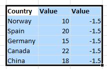
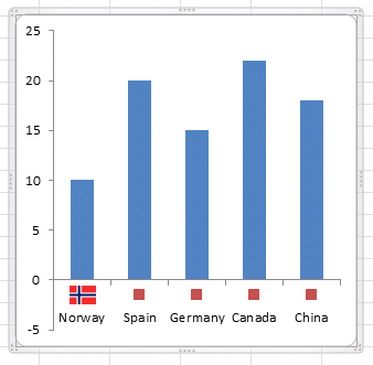
14. Add pictures to a chart axis
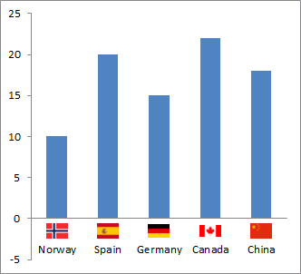
This section demonstrates how to insert pictures to a chart axis, the picture above shows a column chart with country names and their corresponding flags below each column.
What's on this section
- How to add pictures to a x-axis chart?
- How to add pictures next to chart columns?
- How to add pictures next to y-axis values?
- How to add pictures to a bar chart axis?
- Get Excel *.xlsx file
14.1. How to insert pictures above column chart item names
Watch this video to learn how to build the above chart or follow the instructions below the video.
14.1.1 How to create a column chart
- Select a data range
- Go to tab "Insert" on the ribbon.
- Press with left mouse button on the "Column" button, a pop-up menu appears. See the image below.
- Press with mouse on the "Clustered column" button.
14.1.2 How to insert pictures above column chart names
- Press with right mouse button on on the second series and press with left mouse button on "Change Series Chart Type...".
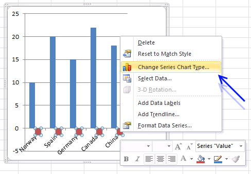
- Change it to x y (scatter) and press with left mouse button on "Scatter with only markers".
- Remove axis and legend
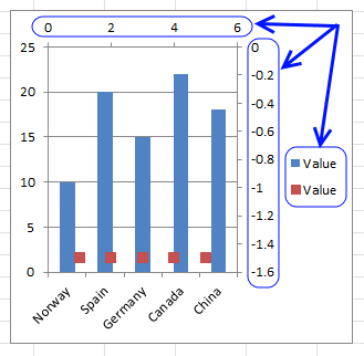
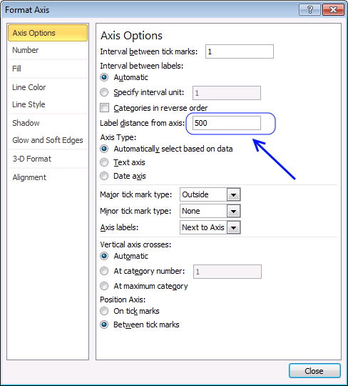
- Press with right mouse button on on x axis and press with left mouse button on "Format Axis..."
- Change label distance to 500
- Press with left mouse button on a x y scatter data point

- Paste a picture. I resized the picture to 25 px width first.
- Repeat step 7 and 8 with the remaining pictures.
14.2. How to add pictures above chart columns

The image above shows pictures above each column, I will below describe how I built this chart.
14.2.1 Insert column chart

- Select cell range B3:C7.
- Go to tab "Insert" on the ribbon.
- Press with left mouse button on the "Column" chart button. A popup menu appears.
- Press with left mouse button on the "Clustered column" button.
14.2.2 Add a second series

- Press with right mouse button on on the chart. A popup menu shows up.
- Press with mouse on "Select data...". A dialog box appears.
- Press with left mouse button on "Add" button. Another smaller dialog box is now visible on the screen, see image above.
- Press with left mouse button on "up pointing arrow" next to "Series values:".
- Select cell range D3:D7.
- Press with left mouse button on the OK button.
- Press with left mouse button on the OK button again.
14.2.3 Change chart type to scatter chart

- Press with right mouse button on on the second series shown on the chart. A popup menu appears.
- Press with mouse on "Change Chart Type...". A dialog box shows up.
- Change the second series to an x y scatter chart, see image above.
- Press with left mouse button on the OK button.

14.2.4 Add pictures to markers
- Doublepress with left mouse button on the first dot to open the settings pane.
- Press with left mouse button on again on it to select it. You don't want the entire series selected.
- Press with left mouse button on "Fill & Line" button on the settings pane.

- Press with mouse on "Marker Options" to expand settings.
- Press with left mouse button on radio button "Built-in".
- Press with left mouse button on drop-down list next to Type.
- Press with mouse on image button located at the very end of the drop down-list, see image above.
- Select "From a File".
- A dialog box appears, select a file name.
- Press with left mouse button on "Open".
Repeat above steps with remaining images.

Change the values in cell range D3:D7 so the images appear above the columns. You can also use the same value in all cells to align images above all columns if you prefer that.
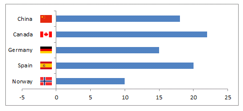
14.3. How to add pictures next to y-axis values

The image above shows pictures next to the y-axis in a column chart. I will below describe how I built this chart, basically, it is two different chart types combined into a combo chart.
14.3.1 Create a column chart

- Select cell range B3:C7.
- Go to tab "Insert" on the ribbon.
- Press with left mouse button on the "Insert column or bar chart" button. A pop-up menu appears.
- Press with left mouse button on the "Clustered column" button.
- A chart appears, see image above.
14.3.2 Add a second series

- Press with right mouse button on on the chart. A context menu appears.
- Press with mouse on "Select Data...". A dialog box shows up.
- Press with left mouse button on the "Add" button. Another smaller dialog box appears, see image above.
- Press with left mouse button on the "Arrow pointing up" button next to "Series values:".
- Select cell rage F3:F7.
- Press with left mouse button on "OK" button.
- Press with left mouse button on "OK" button again to dismiss the larger dialog box.
The chart now looks like the one above.
14.3.3 How to change the chart type of the secondary series?

- Press with right mouse button on on the second series. A popup menu shows up.
- Press with left mouse button on "Change Series Chart Type...". A dialog box appears, see image above.
- Press with left mouse button on the "drop-down" button that corresponds to "Series2".
- Press with left mouse button on the "Scatter" chart button to select it.
- Press with left mouse button on the "OK" button.
14.3.4 Add x-axis values to series2

- Press with right mouse button on on the red dots.
- Press with left mouse button on "Select data...". A dialog box appears.
- Press with mouse on "Series2" to select it.
- Press with mouse on the "Edit" button.
- Press with left mouse button on the "Arrow pointing up" next to Series X values:".
- Select cell range G3:G7.
- Press with left mouse button on "OK" button.
The chart now looks like the one shown in the above image.
14.3.5 Insert chart marker pictures

- Press with mouse on a red dot twice to select it.
- Press with right mouse button on on the selected dot. A popup menu appears.
- Press with mouse on "Format Data Point...". A settings pane appears probably on the right side of your screen.
- Press with mouse on the "Fill & Line" button, see the image below.

- Press with mouse on "Marker Options" to expand settings.
- Press with mouse on the radio button "Built-in".
- Press with mouse on the drop-down list to expand it.
- Press with mouse on the image button located at the very bottom.
- A dialog box appears.
- Press with mouse on "From a File". A dialog box shows up.
- Select the image you want to use.
- Press with left mouse button on "Open" to use it.
The image appears on the chart where the dot was located.
Repeat the above steps with the remaining dots and images you want to use.
14.3.6 Final adjustments

14.3.6.1 Remove major gridlines

- Press with mouse on a horizontal gridline to select all grid lines.
- Press with left mouse button on the "Delete" key to remove them.
14.3.6.2 Move y-axis to category 1

- Doublepress with left mouse button on the x-axis to open the settings pane.
- Press with mouse on the "Axis Options" button.

- Press with mouse on "Axis Options" to expand settings.
- Press with mouse on the radio button "At category number", type 1.
- Press with mouse on the worksheet to apply settings.

14.3.6.3 Add y-axis line

- Double press with left mouse button on y-axis values to open the settings pane.
- Press with mouse on "Fill & Line" button.
- Press with left mouse button on "Line" to expand settings.

- Press with left mouse button on "Solid Line"
- Pick a line color.

3.6.4 Remove 0 (zero) from chart axis
- Double-press with left mouse button on y-axis values to open the settings pane.

- Press with mouse on the "Axis Options" button.
- Press with mouse on "Number" to expand settings.
- Press with mouse on the drop-down list below "Category".
- Select "Custom".
- Change type to 0;;
- Press with mouse on the worksheet to apply settings.

14.4. How to add pictures to a bar chart axis
You can use the same technique with a bar chart.
Built-in Charts
Combo Charts
Combined stacked area and a clustered column chartCombined chart – Column and Line on secondary axis
Combined Column and Line chart
Chart elements
Chart basics
How to create a dynamic chartRearrange data source in order to create a dynamic chart
Use slicers to quickly filter chart data
Four ways to resize a chart
How to align chart with cell grid
Group chart categories
Excel charts tips and tricks
Custom charts
How to build an arrow chartAdvanced Excel Chart Techniques
How to graph an equation
Build a comparison table/chart
Heat map yearly calendar
Advanced Gantt Chart Template
Sparklines
Win/Loss Column LineHighlight chart elements
Highlight a column in a stacked column chart no vbaHighlight a group of chart bars
Highlight a data series in a line chart
Highlight a data series in a chart
Highlight a bar in a chart
Interactive charts
How to filter chart dataHover with mouse cursor to change stock in a candlestick chart
How to build an interactive map in Excel
Highlight group of values in an x y scatter chart programmatically
Use drop down lists and named ranges to filter chart values
How to use mouse hover on a worksheet [VBA]
How to create an interactive Excel chart
Change chart series by clicking on data [VBA]
Change chart data range using a Drop Down List [VBA]
How to create a dynamic chart
Animate
Line chart Excel Bar Chart Excel chartAdvanced charts
Custom data labels in a chartHow to improve your Excel Chart
Label line chart series
How to position month and year between chart tick marks
How to add horizontal line to chart
Add pictures to a chart axis
How to color chart bars based on their values
Excel chart problem: Hard to read series values
Build a stock chart with two series
Change chart axis range programmatically
Change column/bar color in charts
Hide specific columns programmatically
Dynamic stock chart
How to replace columns with pictures in a column chart
Color chart columns based on cell color
Heat map using pictures
Dynamic Gantt charts
Stock charts
Build a stock chart with two seriesDynamic stock chart
Change chart axis range programmatically
How to create a stock chart
Excel categories
57 Responses to “Advanced Excel Chart Techniques”
Leave a Reply
How to comment
How to add a formula to your comment
<code>Insert your formula here.</code>
Convert less than and larger than signs
Use html character entities instead of less than and larger than signs.
< becomes < and > becomes >
How to add VBA code to your comment
[vb 1="vbnet" language=","]
Put your VBA code here.
[/vb]
How to add a picture to your comment:
Upload picture to postimage.org or imgur
Paste image link to your comment.
Oscar,
This is brilliant!!! I love how this is set up because if the duration of one step changes I can update it and then my schedule will automatically change too! Thanks for your help! I'll def remember you in the future if I need help!
Danielle
Danielle,
you are most welcome! Thanks for commenting!
Ola boa noite
preciso de sua ajuda no seguinte
tenho na celula A1 a data de 23/01/2009
tenho na celula A2 a data de 28/06/2011
preciso de uma formula que me de como resultado os dias meses e anos que separam as duas datas ou seja como resultado quero 5/05/02
è que se fizer A2-A1 da-me como resultado mais um mes 5/06/02
Martins,
Hello good evening
I need your help in the following
I am in cell A1 to date 23/01/2009
I'm in cell A2 of the date 28/06/2011
I need a formula I as a result of the days, months and years between two dates or as a result I 05.05.02
è is made A1-A2 of me as a result over one month 06/05/02
I think this webpage answers your question:
https://www.cpearson.com/excel/datedif.aspx
Read: Calculating age
Hi Oscar,
I love this calendar, but I have a couple of questions about it,
1) Is there any way of having the Table appearing alongside the calendar so you don't have to flick between the two sheets each time you want to add something.
2) Say I selected cell Calendar! N7 (07/02/13), is there any way of highlighting events 3 and 11 on the table which affect this date.
Thanks,
Chris
Chris G,
Great comment!
Press with left mouse button on image to view larger version.
Get the Excel *.xlsm file
Heat-map-calendar-v2.xlsm
Hi Oscar,
I've opened the attached file for the second version, the table itself is visible, along with the refresh calendar option and it's working great, however it isn't highlighting the table like it does in the screenshot. How do I get it to highlight the related events for the date?
Thanks,
Chris
Chris G,
That is weird. I opened the file and it is working here.
The workbook contains some code in the sheet module:
Private Sub Worksheet_SelectionChange(ByVal Target As Range)
If Not Intersect(Target, Range("B6:X38")) Is Nothing Then
        Range("AD4") = Target.Value
Else
    Range("AD4") = ""
End If
End Sub
Press with right mouse button on sheet name and press with left mouse button on "View Code". The code should be there?
The sheet also has a conditional formatting formula applied to the table:
=(INT(INDIRECT("Table1[@Start]"))<=$AD$4) *(INT(INDIRECT("Table1[@End]"))>=$AD$4)
How about a Sparkline (single barchart) that fills the cell/background up to xx%.
//Ola
Ola,
I don´t think that is possible. Conditional format | Data bars uses the cell value and you can´t enter your own conditional formatting formula.
Hi Oscar ,
I am using Excel 2007 , and I had the same problem as Chris ; the CF coloring of the events table was not working.
I changed the CF formula to :
=(INT($AB7)=$AD$4)
after selecting the entire events table AA7:AC27.
Everything works correctly now.
Hi ,
The formula in my earlier post has been changed by the website software ! What I had copied was :
=(INT($AB7)<=$AD$4)*(INT($AB7)>=$AD$4)
is equal to (INT($AB7) is less than or equal to $AD$4) multiplied by (INT($AC7) is greater than or equal to $AD$4).
K. Narayan,
Thanks for sharing a solution! I changed your last comment.
I am not sure why wordpress removes greater than or less than signs.
Awesome Oscar, thanks so much!
Hi Oscar
Awesome solution.
I have a question: Do you know a solution for Fill Color of Column Chart with a match on cells with Conditional Format Colors. Example: Red for values 50. In this case each value is a part of One Series. Thanks for you reaction.
With Regards
Bert van Zandbergen, Beekbergen, The Netherlands
Bert van Zandbergen,
As far as I know, no.
Easy to understand an very reasonable for my jobs. The beginners among you can get more information on this site, which I use almost daily. https://www.excel-aid.com/excel-color-scale-customizing-the-color-scale-format-2.html
Great technique and one I have not seen before.
For those that may not know, you can add a custom number format to the axis to remove the negative numbers if you don't need them. Just press with right mouse button and format the axis. Then from number choose custom, and enter the positive number format, a semicolon, keep it blank for the negative numbers, a semicolon, and then the format that you want for zero (you can use a blank here if you want to remove the zero too) For example, I would use 0;;0 for this chart.
Darin Myers,
great comment!
Thanks for a great idea. I'll use it.
//Ola
Made one small improvement:
To auto-adjust the flag position when the maximum value change.
D3toD7: =MAX($C$3:$C$7)*(-1,5/22) -- chart size constant
and change...Format Axis, Bounds, Minimum to Auto
Ola,
thank you for your formula, it works fine.
Helo.
I find your comment interesting, but dont know where to type formula? And also i dont know why we dont just select the chrat and then inser the picture. It automaticly inserts picture into chart area. Then all you have to do is resize the picture manually.
Sorry for possible bad english.
Bye
Oscar - hey i really like how this is formatted -
however, would it be possible to change the calendar so instead of looking at how many events are on a certain day - it looked at a number associated with a day (1-100) and days with a high number are color coded red and days with a low number are color coded blue?
thanks!
Paul
Hi Oscar,
This is very useful but as i add more events i now get a Run-time error '5': Invalid procedure call or argument at the tint and shade line.
"with Dt.Interior
.TintandShade = 1 -(Cnt / St)
"
i think it has to do with the value being greater than 1.
Is there an alternate to the calculate i could use.
Thanks in advance and thankyou for your articles as i have learnt alot from them.
Regards Tammy
Tammyw,
can you upload an example file?
Hi Oscar,
Sorry for delay but having great trouble with your website access.
This is the code i'm using to stop the error.
[If (Cnt / St) > 1 Then
.TintAndShade = 1 - (Cnt / St) / 10
Else
.TintAndShade = 1 - (Cnt / St)
End If]
i have 52 rows of 'Deliverables' and 12 columns of dates (Periods 1 to 12), therefore a large count number of dates.
This solution works well for me at the moment.
Thanks again for your interesting posts,i have learnt a great deal from them.
Tammyw,
Sorry for delay but having great trouble with your website access.
Yes, I have had some trouble with the server database.
This is the code i'm using to stop the error.
i have 52 rows of 'Deliverables' and 12 columns of dates (Periods 1 to 12), therefore a large count number of dates.
This solution works well for me at the moment.
Thanks for posting!
Thanks again for your interesting posts,i have learnt a great deal from them.
Thank you!
Hi Oscar,
I need to chart task planned v's actuals and i'm stuck. i've tried gantt & x/y but can't get it to work for multiple calendar periods.
Example data
Deliverables Period11 Actuals11 Period 12 Actuals 12
Task 1 17/11/2014 12/11/2014 15/12/2014 17/12/2014
Task 2 19/11/2014 20/11/2014 17/12/2014
Task 3 20/11/2014 20/11/2014 18/12/2014
Task 4 20/11/2014 24/11/2014 18/12/2014
Any help appreciated.
Tammyw,
What are the calendar periods?
Task 1 17/11/2014 - 12/11/2014 and 15/12/2014 - 17/12/2014?
How do I use the same technique with a horizontal bar chart? When I lay ou tthe scatter points, they all lie on the same horizontally. If I try it vertically, they are not spaced in line with the bars. Thanks for this great guide!
Albert
How do I use the same technique with a horizontal bar chart?
A horizontal bar chart is a clustered column chart?
If I try it vertically, they are not spaced in line with the bars.
Look at step 4 above. Remove the second axis and both data series use the same axis. They will be spaced in line with the bars.
Hope that helps.
This is great thank you very much for sharing!!! Is there a way to make this cycle through all charts on the sheet?
How would I go about creating a code to filter according to certain events? Fore example if I wanted to filter in order to just show Holidays.
Hello Oscar! This is a really good file, thanks a lot for sharing. I have no idea about how VBA works but i want to make a calendar like this to see a heat map of revenue received throughout the year.
In my "Table" i only need 2 columns:
1. Date from Jan 1 to Dec 31
2. Revenue on each day
How do i get this to reflect on the calendar?
Since it's unlike an event with a start and end date, i'm not sure how i can amend this. Thank you so much for your time.
Runtime error 1004.
Nice try
thanks alot this was really helpfull
amal aloun,
thank you for your comment.
Hey Thanks heaps Oscar.
I'm trying to build a stack plan for a property that formats the colour of each data point based on its lease expiry.
I'm wondering whether this code would work for a stacked bar chart with multiple series?
Cheers
Andrew
I made a new macro, it works with a stacked bar chart with multiple series, read this: https://www.get-digital-help.com/format-fill-color-on-a-column-chart-based-on-cell-color/#bar
Be really good if it worked
Dan,
Is the attached file not working for you?
This works great. I am using the 2nd macro "ColorChartBarsbyCellColor()" and was wondering if there is a way to make it see conditional formatting I have created to color code data? If I format the colors via regular means it translates to the graph when I run the Macro, but when re-formatted with conditional formatting it does not pick that color up.
Basically I am taking time stamp data and creating a color-coded by event type timeline.
Hi Oscar,
Thank you for the VBA Code to colour the bar chart by cell colour (source).
It worked well for the first chart, and when I tried to run the same code on the second chart, it didn't work. I have 33 bar charts that would require me to apply the same colour format.
Can you help please as I have very limited knowledge of VBA coding. Thanks.
Thank you for your amazing tutorials! I'd like the bars on my chart to be colored based on either conditional formatting in my table, or unique text in my table (or their own labels which are based on a specified range in my table). Is there a tweak to your code to enable this?
Background info: I'm creating an hourly fitness class schedule in a column chart (similar to gantt). I've created a table which lists each person's name, class start time, class end time, class duration (auto calculated), and class name (with conditional formatting changing the cell color based on class name.)
My chart bar labels are deriving their values from my Class Name table column. But I'd like the bar colors to also change based on the conditional colors in my Class Name column. I'm new to excel vba/macros, but I tried your supplied code and there was an error because I don't have a legend/my legend references another column. Is there a way to make this work? Can a bar change colors based on label, or a specified table range w/conditional formatting? Any help is greatly appreciated!!
One other question!
Regarding the same chart, if one person is in a class at 3:30 for an hour, and then a different class at 4:30 for an hour... how can I show two bars in the same row, instead of the chart auto creating two rows for the same person? (Below is a general representation of the basic layout of my chart, and how I'd like two bars on one line/person)
3:30 4:30 5:30 6:30 7:30
Tom ________ ________
Dick ___________
Harry ________
Thank you!!!
You're help a lot, thanks so much.
Ferreira,
thank you!
Hi Oscar,
Thank you for sharing these very useful projects openly, I really appreciate that.
I am trying to lay down course schedules on a weekly calendar of all the first year courses, which could have shades of colors showing range of capacities for each schedule type (lectures, tutorials and labs). But there will be overlapping events. Every term, I am trying to find the void spots in student schedules to fit in my workshops to the gaps. This is how my data looks like:
Course Name Course Code Schedule Type Capacity Time Day
Chemistry II CHEM 1020U Lec 69 9:40 am - 12:30 pm M
Chemistry II CHEM 1020U Lec 69 9:40 am - 12:30 pm W
Chemistry II CHEM 1020U Lab 23 1:10 pm - 4:00 pm R
Chemistry II CHEM 1020U Lab 23 9:10 am - 12:00 pm F
Chemistry II CHEM 1020U Lab 23 1:10 pm - 4:00 pm F
Introduction to Programming ENGR 1200U Lec 75 1:10 pm - 4:00 pm T
Introduction to Programming ENGR 1200U Lec 75 1:10 pm - 4:00 pm R
Introduction to Programming ENGR 1200U Tut 75 5:40 pm - 7:30 pm M
Introduction to Programming ENGR 1200U Tut 75 5:40 pm - 7:30 pm W
Calculus II MATH 1020U Lec 234 9:10 am - 12:00 pm T
Calculus II MATH 1020U Lec 234 9:10 am - 12:00 pm R
Calculus II MATH 1020U Tut 36 4:10 pm - 7:00 pm T
Calculus II MATH 1020U Tut 36 4:10 pm - 7:00 pm R
Calculus II MATH 1020U Tut 36 12:10 pm - 3:00 pm F
Calculus II MATH 1020U Tut 36 9:10 am - 12:00 pm F
Calculus II MATH 1020U Tut 36 4:10 pm - 7:00 pm T
Calculus II MATH 1020U Tut 36 12:10 pm - 3:00 pm F
Calculus II MATH 1020U Tut 18 9:10 am - 12:00 pm F
Linear Algebra for Engineers MATH 1850U Lec 144 4:10 pm - 7:00 pm T
Linear Algebra for Engineers MATH 1850U Lec 144 4:10 pm - 7:00 pm R
Linear Algebra for Engineers MATH 1850U Tut 38 9:10 am - 12:00 pm F
Linear Algebra for Engineers MATH 1850U Tut 38 12:10 pm - 3:00 pm F
Linear Algebra for Engineers MATH 1850U Tut 38 9:10 am - 12:00 pm F
Linear Algebra for Engineers MATH 1850U Tut 38 12:10 pm - 3:00 pm F
Thanks in advance,
Eda
Eda Aydin,
Perhaps this weekly calendar will work for you?
https://www.get-digital-help.com/calendar-with-scheduling-in-excel-2007-vba/
Hi,
Thanks for sharing this!
While it changes colors based on cell colors its dose not give me the exact same color.
Example 1 - RED:
Red in my cell is RGB(0,176,80), while the color that appears in my graph is RGB(0,128,128)
Example 2 - GREEN:
Green in my cell is RGB(227,19,25), while the color that appears in my graph is RGB(255,0,0)
Excel is using a customized Color Theme. Could it be that VBA uses a different one? Or, how might I fix this?
Andreas,
try this macro:
Sub ColorChartColumnsbyCellColor() With Sheets("Color chart columns").ChartObjects(1).Chart.SeriesCollection(1) Set vAddress = ActiveSheet.Range(Split(Split(.Formula, ",")(1), "!")(1)) For i = 1 To vAddress.Cells.Count CS = ThisWorkbook.Colors(vAddress.Cells(i).Interior.ColorIndex) R = CS Mod 256 G = CS \ 256 Mod 256 B = CS \ 65536 Mod 256 .Points(i).Format.Fill.ForeColor.RGB = RGB(R, G, B) Next i End With End SubHi Oscar
This is great - though I am having the same trouble as Andreas and am unable to get the colours to match. I am a total beginner so would appreciate if you could give the whole code that I can replace the ColorChartBarsbyCellColor() Sub with. The one you posted in response to Andreas doesn't seem to work.
Thanks!
Hi, Oscar.
This code very usefull for 1 chart type, and I Have Question.
if i have more than 1 (ex. 3 chart) charts , can the code still be used?
Because i have 3 different/cathegory data.
So, Can the code still be used to changing color Bars for 3 chart in one time.
Thanks,
For chart #Color columns in chart based on cell color
thanks Oscar,
My requirement is bar color matching exactly same cell color. I have different color in each cell based on certain condition
How do i make a bar chart change colour between charts when i change the data series when i make selection from the drop down box - ie i select income and the chart shows bars jan to dec in blue, i select expenses and the chart bars jan to dec show in red. I select savings and the chart bars show from jan to dec in green?
Hello,
Thank you very much for your help and guidance.
I have a question regarding your post
https://www.get-digital-help.com/format-fill-color-on-a-column-chart-based-on-cell-color/
Its was very very helpful, but as other 3 people have said, the color of the cell dont match the color of the graph.
The code you gave:
Sub ColorChartColumnsbyCellColor()
With Sheets("Color chart columns").ChartObjects(1).Chart.SeriesCollection(1)
Set vAddress = ActiveSheet.Range(Split(Split(.Formula, ",")(1), "!")(1))
For i = 1 To vAddress.Cells.Count
CS = ThisWorkbook.Colors(vAddress.Cells(i).Interior.ColorIndex)
R = CS Mod 256
G = CS \ 256 Mod 256
B = CS \ 65536 Mod 256
.Points(i).Format.Fill.ForeColor.RGB = RGB(R, G, B)
Next i
End With
End Sub
didnt help to fix the problem. please may you help us?
Thank you very much and have a good day