'Chart elements' category
How to add chart elements
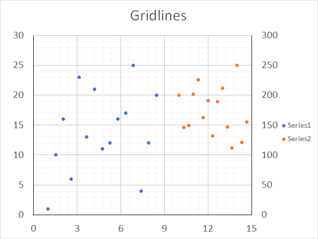
What are chart elements? Chart elements are the title, legend, grid lines, and data labels etc. This article demonstrates how […]
What are chart elements? Chart elements are the title, legend, grid lines, and data labels etc. This article demonstrates how […]
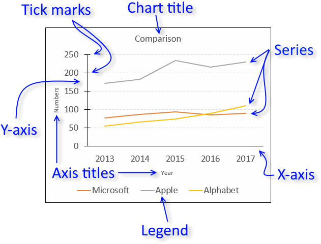
Excel chart components
Charts in Microsoft Excel lets you visualize, analyze and explain data. Charting in Excel is very easy and you […]
Charts in Microsoft Excel lets you visualize, analyze and explain data. Charting in Excel is very easy and you […]