'SCATTER (x y) chart' category
Advanced Excel Chart Techniques
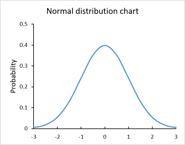
Table of Contents How to graph a normal distribution How to build an arrow chart How to graph an equation […]
Table of Contents How to graph a normal distribution How to build an arrow chart How to graph an equation […]
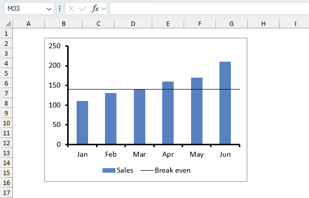
How to add horizontal line to chart
This tutorial shows you how to add a horizontal/vertical line to a chart. Excel allows you to combine two types […]
This tutorial shows you how to add a horizontal/vertical line to a chart. Excel allows you to combine two types […]

How to improve your Excel Chart
What's on this page Custom data labels Improve your X Y Scatter Chart with custom data labels How to apply custom […]
What's on this page Custom data labels Improve your X Y Scatter Chart with custom data labels How to apply custom […]