Excel Charts
What is on this page? Built-in charts How to create a column chart How to create a stacked column chart […]
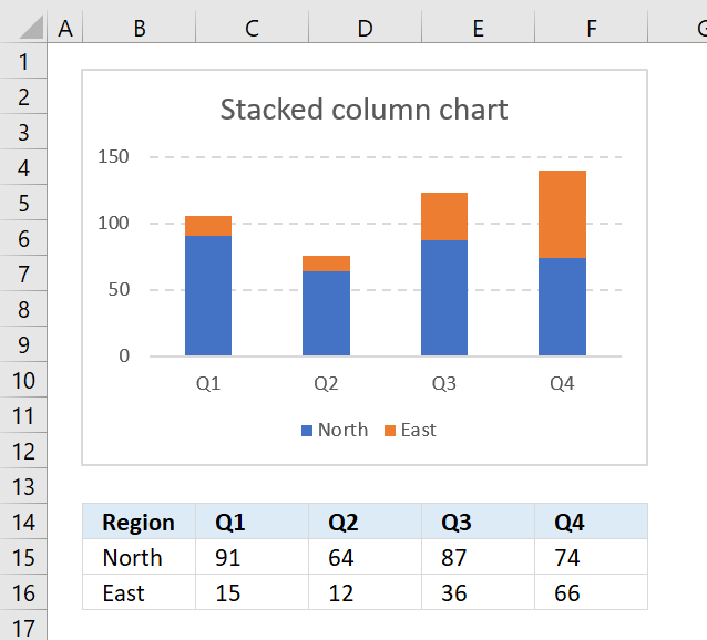
How to create a stacked column chart
The stacked column chart is great for comparing parts of a whole and how they change over time or categories. […]

How to create a 100% stacked column chart
The 100% stacked column chart lets you graph values in a group. Each value in a group is a stacked […]
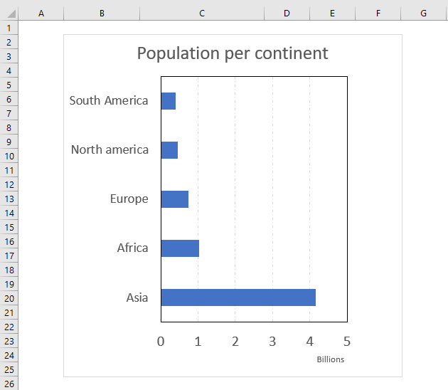
The bar chart is simply a column chart rotated 90 degrees right, this makes it great if you have long […]
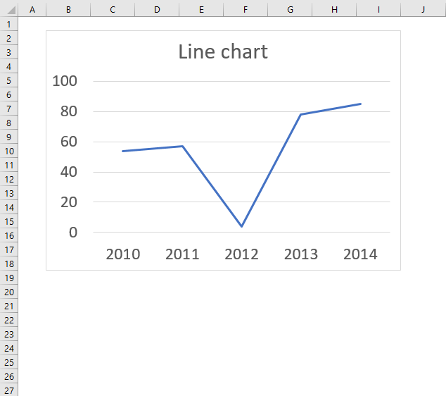
The line chart lets you chart data points as a line, this chart type is useful if you have many […]
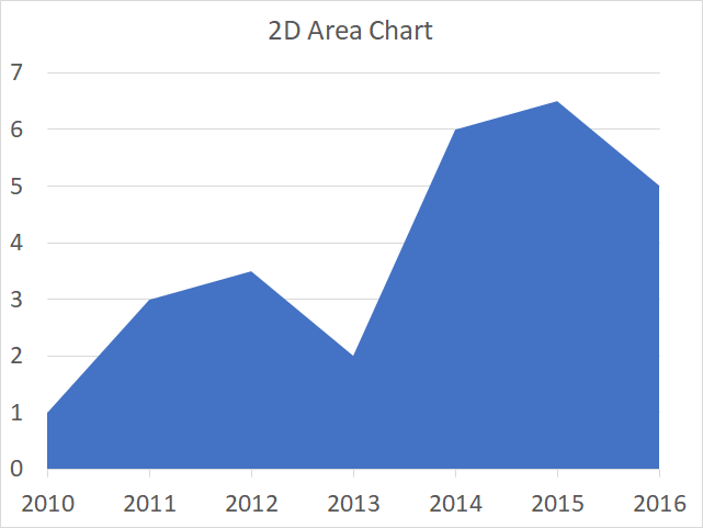
The area chart is similar to the line chart except that the area below the line is filled, use this […]
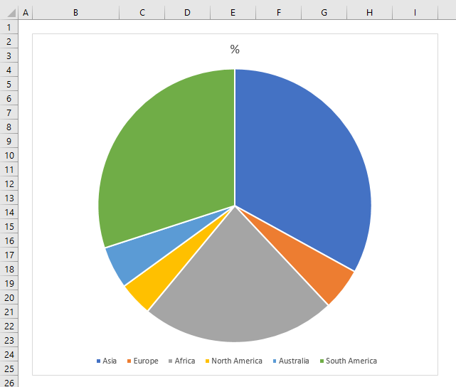
The pie chart is used to graph parts of a whole, the total of our numbers must be 100%. The […]
How to create a doughnut chart
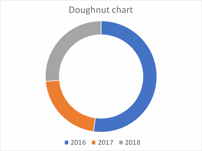
A doughnut chart is just like a pie chart showing the relationships of segments to a total except that the it […]
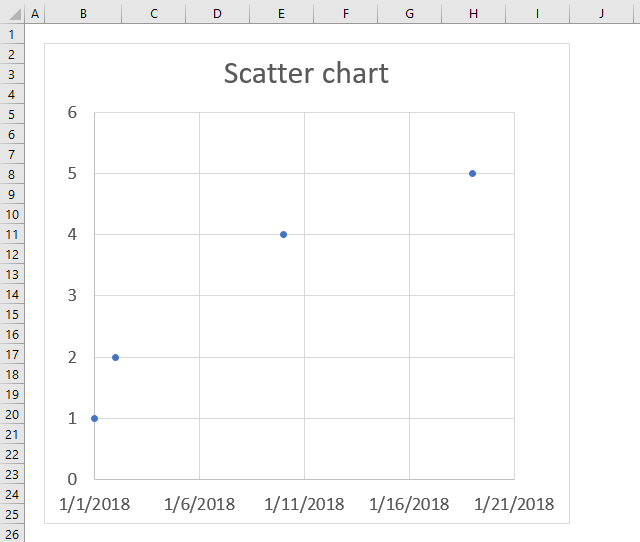
The scatter chart is great for charting numeric values in pairs, for example, coordinates. It lets you compare multiple data […]
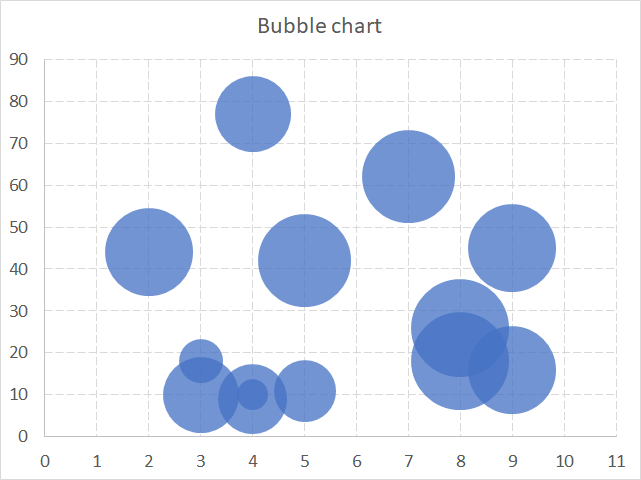
The bubble chart allows you to plot data just like the scatter chart but also the size of the bubbles. […]
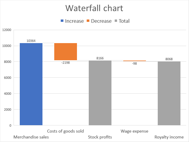
How to create a waterfall chart
The waterfall chart allows you to plot values as bars, however, depending on whether they are negative or positive […]
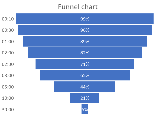
A funnel chart is mostly used to display a series of steps within a process, each step shows a proportion […]
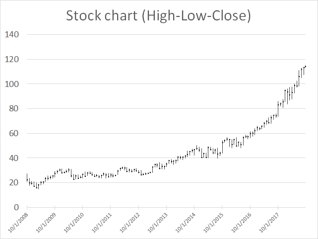
The high-low-close stock chart displays the high, low and closing price for a given date range. Each line represents a […]
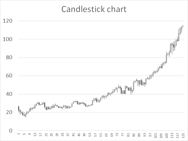
How to create a candlestick chart
The candlestick chart allows you to plot price movements of stocks, derivates, bonds and currencies. A black candlestick in Excel […]
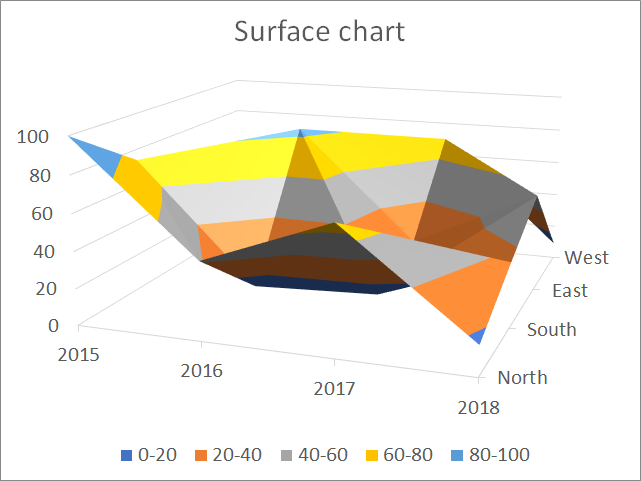
The surface chart allows you to graph multiple data series in a 3D chart, color-coded to make the chart easier […]
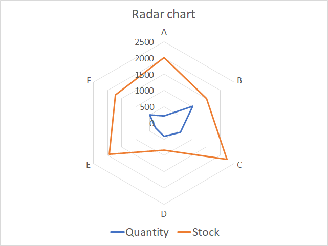
The radar chart allows you to plot values based on a center point and outwards to categories you specify. Each […]
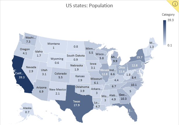
Excel 2016 owners with an office 365 subscription can now easily build beautiful map charts. Excel uses maps from Bing […]
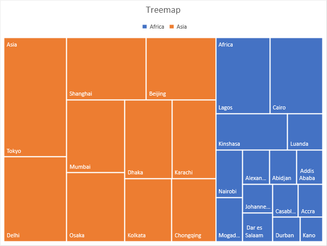
Use the treemap chart when you want to compare segments to a total and you have categories in a hierarchy. […]
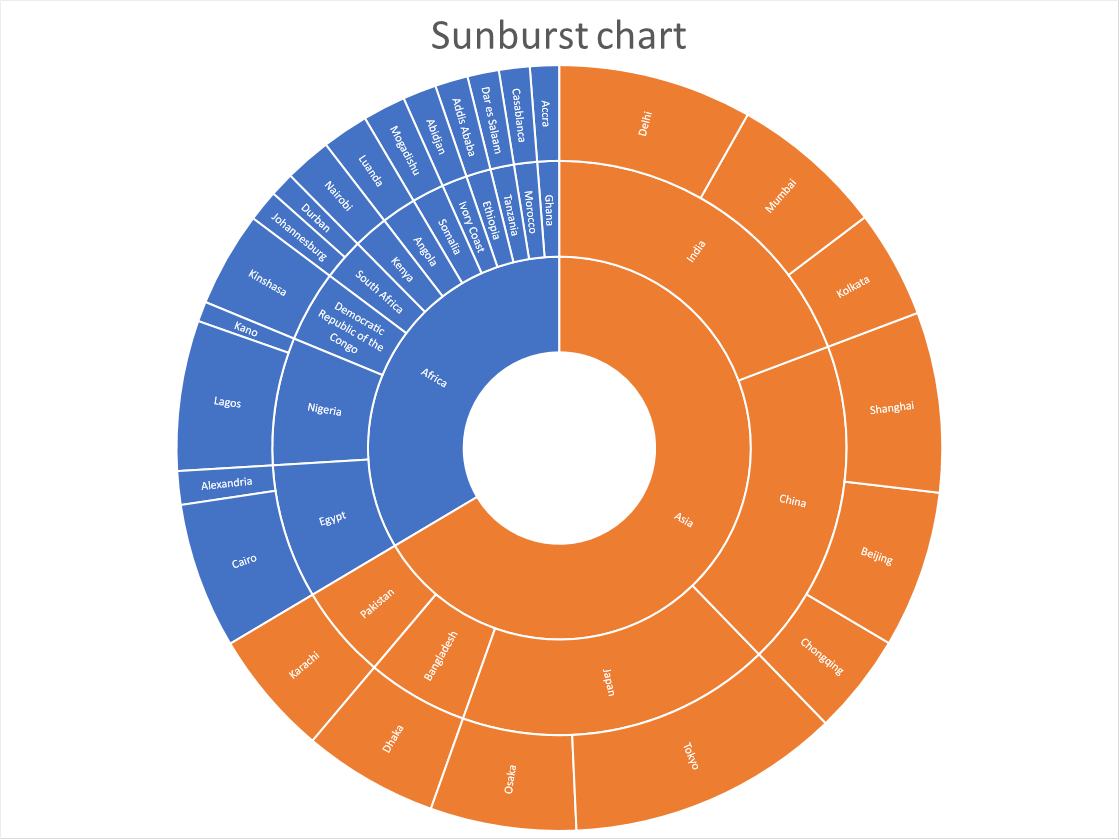
How to create a sunburst chart
(Press with left mouse button on to expand image) The sunburst chart is great for showing relationships of hierarchical data and […]
How to create a histogram chart
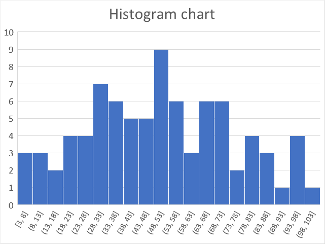
The histogram chart lets you automatically group data values in intervals you specify, it is often used in statistics to show […]
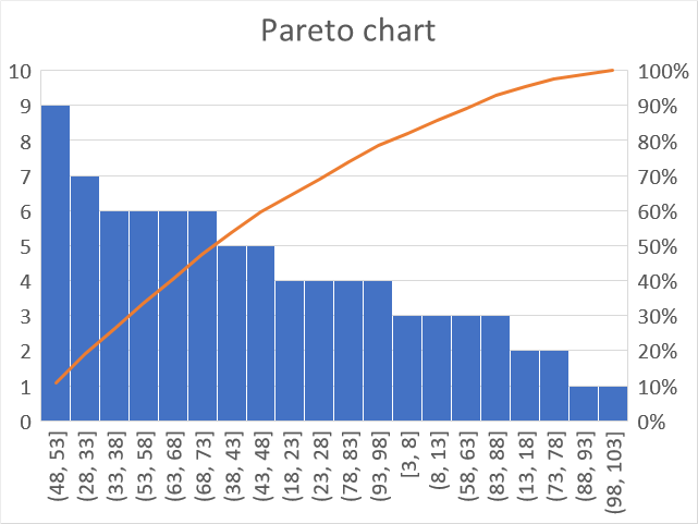
A Pareto chart is often used in statistics to demonstrate how sample values are distributed across given ranges, the values are […]
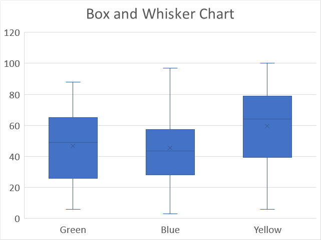
How to create a Box and Whisker chart
The Box and Whisker chart allows you to plot distributions in statistics, it also displays local minimum, first quartile, median, […]