How to create an interactive Excel chart
Table of Contents
- How to create an interactive Excel chart
- How to filter chart data
- How to build an interactive map in Excel
- Hover with mouse cursor to change stock in a candlestick chart
- Compare data in an Excel chart using drop down lists
- How to use mouse hover on a worksheet - VBA
- Use drop down lists and named ranges to filter chart values
- Heat map using pictures
- Change chart axis range programmatically
1. How to create an interactive Excel chart
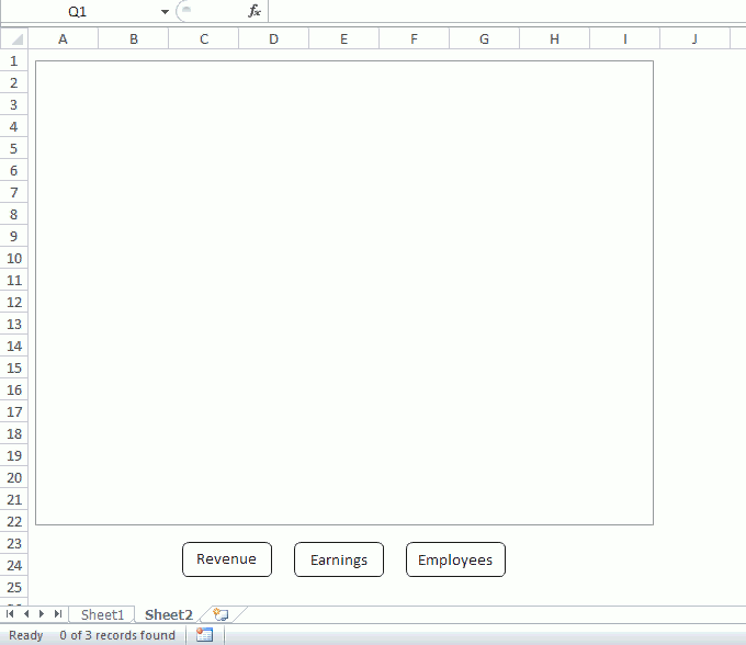
This section describes how to create an interactive chart, the user may press with left mouse button on a button or multiple buttons and the chart shows corresponding data based on the selected buttons.
Slicers were introduced in Excel 2010, see image above. I recommend you use slicers instead if you own Excel 2010 or a later version
No VBA code is required if you choose to use slicers. Slicers let you filter values in the Excel defined Table, the chart is instantly refreshed based on your selection.
Anyway, this article may still be interesting, you will in this article learn to
- Insert buttons to a worksheet.
- Create a macro in a code module.
- Link buttons to macro.
- Filter an Excel defined Table programmatically based on selected buttons.
- Highlight selected button programmatically.
- Remove highlight from button if press with left mouse button oned on a second time.
- Save button text to an array variable.
The animated image below demonstrates the functionality of these buttons.
Create a table
- Select a cell in your data set.
- Go to tab "Insert" on the ribbon.
- Press with left mouse button on "Table" button.
- Press with left mouse button on OK.
Create chart
- Select any cell in your Excel defined Table.
- Go to tab "Insert".
- Press with left mouse button on "Columns" button.
- Press with left mouse button on "2D Clustered column".
- Press with right mouse button on on chart.
- Select "Select data".
- Press with left mouse button on "Switch row/column" button.
- Press with left mouse button on OK.
Insert shapes
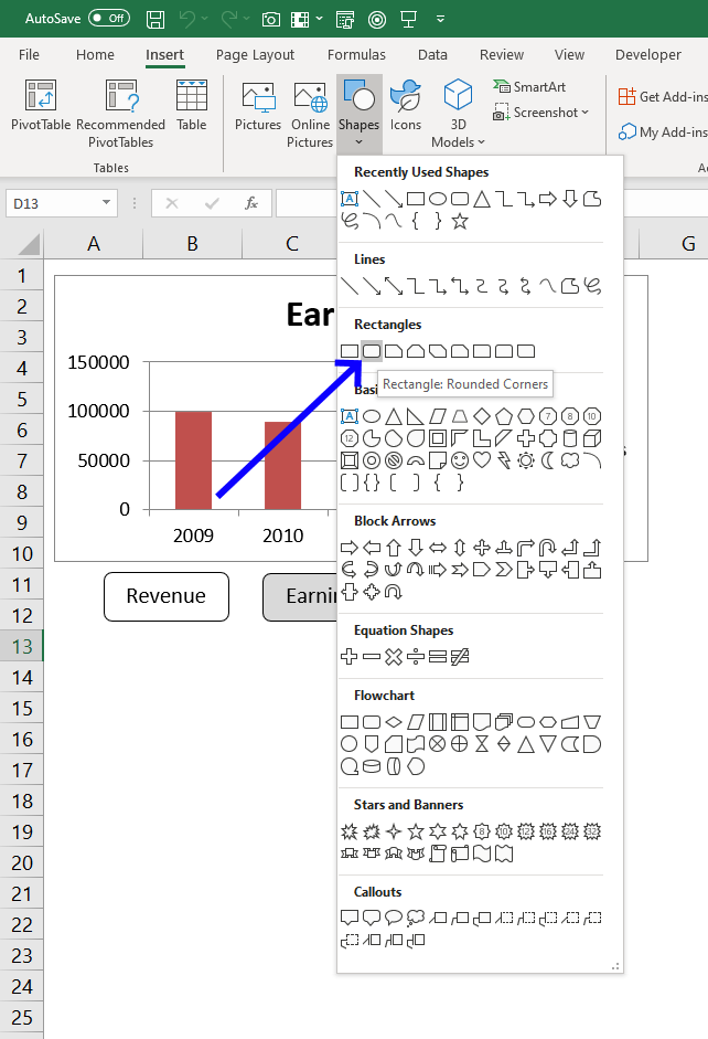
- Go to tab "Insert".
- Press with left mouse button on "Shapes" button.
- Press with left mouse button on "Rounded Rectangle".
- Create three rectangles below the chart.
- Press with right mouse button on on rectangle and select "Edit text".
- Type button names and make sure they match the table data in the first column (Revenue, Earnings and Employees).
VBA Code
'Name macro
Sub Chart()

'Dimension variables and declare data types
Dim temp As Variant
Dim Series() As String
Dim i As Single

'Redimension variable Series in order to make the array variable grow dynamically
ReDim Series(0)

'Don't show changes to user
Application.ScreenUpdating = False

'The With ... End With statement allows you to write shorter code by referring to an object only once instead of using it with each property.
'Application.Caller returns the object that started the macro
With ActiveSheet.Shapes(Application.Caller).Fill.ForeColor

    'Check if brightness property is 0 (zero) meaning check if button is deselected
    If .Brightness = 0 Then

        'Change brightness
        .Brightness = -0.150000006

    'If brightness property is NOT 0 (zero) meaning check if button is already selected
    Else

        'Change brightness to 0 (zero)
        .Brightness = 0
    End If
End With

'Save values to array variable temp, these names correspond to the button names
temp = Array("Rounded Rectangle 1", "Rounded Rectangle 2", "Rounded Rectangle 3")

'Iterate through values in array variable temp
For i = LBound(temp) To UBound(temp)

    'The With ... End With statement allows you to write shorter code by referring to an object only once instead of using it with each property.
    With ActiveSheet.Shapes(temp(i))

        'Check if brightness is -0.150000006
        If .Fill.ForeColor.Brightness = -0.150000006 Then

            'Save text in button to last container of array variable Series
            Series(UBound(Series)) = .TextFrame2.TextRange.Characters.Text

            'Add another container to array variable Series
            ReDim Preserve Series(UBound(Series) + 1)
        End If
    End With
Next i

'Check if Series variable has more than 1 container, if so remove the last container
If UBound(Series) > 0 Then ReDim Preserve Series(UBound(Series) - 1)

'Enable Autofilter for first column in Excel defined Table Table1
Worksheets("Sheet1").ListObjects("Table1").Range.AutoFilter Field:=1

'Apply filter based on values in variable Series to
Worksheets("Sheet1").ListObjects("Table1").Range.AutoFilter _
    Field:=1, Criteria1:=Series, Operator:=xlFilterValues

'Show changes to user
Application.ScreenUpdating = True
End Sub
Where to put the VBA code?
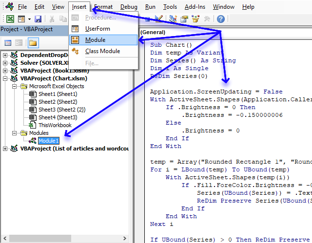
- Copy VBA code above.
- Press Alt + F11 to open the Visual Basic Editor.
- Select your workbook in the Project explorer.
- Press with left mouse button on "Insert" on the menu.
- Press with left mouse button on "Module".
- Paste to code window.
Assign macro
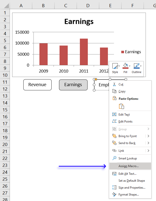
- Press with right mouse button on on one of the buttons to open a menu.
- Press with mouse on "Assign macro".
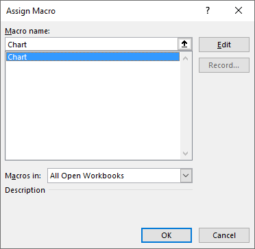
- Select the "chart" macro.
- Press with left mouse button on OK button.
Repeat above steps with the remaining rectangles.
Recommended article:
Interactive Sales Chart using MS Excel
2. How to filter chart data

What if you want to show a selection of a data set on a chart and easily change that selection? Later Excel versions have tools that make this easy, I will in this article describe the options you have and how to configure them.
The image above shows a chart and data, the chart shows only a part of the data and I will demonstrate in this article a few techniques you can use to filter chart data based on the Excel version.
If you are looking for a VBA solution then this article is something for you. Change chart data range using a drop down list (vba)
2.1. Manually changing chart data source
This technique works in all Excel versions, however, it is tedious to change the chart source every time you want to display another part of the data.
The image above shows the data in cell range B3:E14 and the column chart below shows months horizontally and the columns show temperatures for column D.
I will now describe how to change the chart data source manually, I don't recommend doing this on a daily basis. There are better options.
To change the item press with right mouse button on on the chart, press with left mouse button on "Select Data...". A dialog box appears.

Press with left mouse button on the "arrow" button, see image above.

Select cell range B2:B14. Press and hold the CTRL key while selecting cell range E2:E14. Press Enter to return to the dialog box.
Press with left mouse button on OK button on the dialog box named "Select Data Source" to apply the changes we made.

Another option is to select the chart to display the chart data source ranges. Press and hold with the left mouse button on a data source range line, then drag with the mouse to select a new range.

2.2. Filter chart data using an Excel Table

I recommend that you use an Excel Table if you can. The befits are great, the chart data source expands automatically if you add more records. Also, the chart data source range shrinks if you delete rows in the Excel Table.
Excel Tables came in Excel 2007 and works in all later versions.
I had to transpose the data to be able to filter based on an item. Skip this step if this is not needed in your worksheet.
Copy the original range, press with right mouse button on on a destination cell.

A popup menu appears, press with left mouse button on "Paste Special...". A dialog box shows up named "Paste Special".

Press with left mouse button on the checkbox next to Transpose, see image above. Press with left mouse button on OK button.

This will rearrange data so columns become rows and vice versa. This allows us to filter data based on an item.
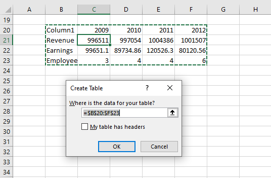
Delete the old data and move the transposed data to above the chart. Select the transposed data and Press CTRL + T.

A dialog box named "Create Table" shows up, press with left mouse button on OK button.

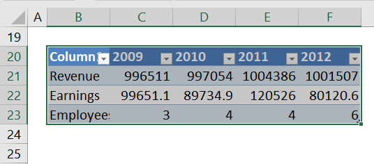
Press with left mouse button on the arrow next to column header Month, a popup menu appears.

Deselect all items except "London".
The chart shows only the filtered Excel Table data and is almost instantly refreshed.
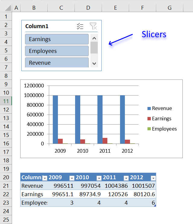
2.3. Filter chart data with Slicers

Slicers were introduced in Excel version 2010 and I highly recommend this tool if you need to quickly change the chart data source based on what the user selects.
They provide buttons that the user can press with left mouse button on which filter both the Excel Table and the chart simultaneously.
The image above shows a clustered column chart, an Excel Table below, and a slicer to the right. A slicer works only with Excel Tables so you need to convert data to an Excel Table which is quickly done. I describe how to create an Excel Table in the previous section above.

Press with mouse on an item and the Excel Table is filtered based on the selected value, see image above. The chart graphs what the Excel Table shows and the changes are almost instant.

To clear selections press with left mouse button on the button located on the top right corner of the slicer. I have described in another article how to create slicers, check it out: Use slicers to quickly filter chart data
Now, if you have an earlier version than Excel 2010 or slicers are not suitable for your worksheet then read on.
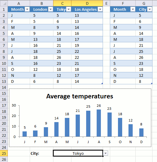
2.4. Use a named range to change chart data
The animated image above demonstrates a drop down list that allows you to show specific chart data based on the selected column name.
The named range contains a formula that uses the selected value in cell C25 to create a cell reference that the chart then uses to plot data.
Drop down list -> Named range - > Chart
Basically the same technique used here as in post Make a dynamic chart for the most recent 12 months data, however, the named range formula is different.
2.4.1 Drop down list

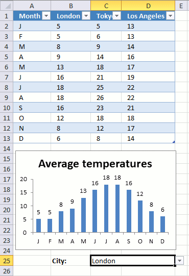
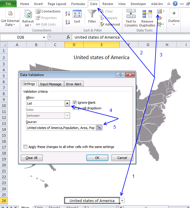
Here are the steps to create the drop-down list in cell C25:
- Select cell C25.
- Go to tab "Data" on the ribbon.
- Press with left mouse button on "Data Validation" button.
- Go to tab "Settings".
- Select List.
- Source: Select table headers.
- Press with left mouse button on OK button.
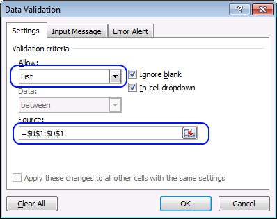
2.4.2 Create a named range
- Go to tab "Formulas".
- Press with left mouse button on "Name Manager" button.
- Press with left mouse button on "New.." button.
- Enter a name.
- Enter the following formula:
=INDEX(Table16,0, MATCH('Single - named range'!$C$25,Table16[[#Headers],[London]:[Los Angeles]],0)+1)
- Press with left mouse button on OK button.
2.4.3 Explaining the named range formula
Step 1 - Find column in Excel Table based on the selected drop-down list value
The MATCH function returns the relative position of an item in a cell range.
MATCH(lookup_value, lookup_array, [match_type])
The first argument lookup_value is the drop down list cell, the second argument is a cell reference to the Excel Table column header names, and the third argument is 0 (zero) which means there must be an exact match.
MATCH('Single - named range'!$C$25,Table16[[#Headers],[London]:[Los Angeles]],0)
becomes
MATCH("London",{"London","Tokyo","Los Angeles"},0)
and returns 1.
Step 2 - Return values from column
The INDEX function returns a single value or multiple values based on a row and optionally a column number.
INDEX(array, [row_num], [column_num])
The first argument is an array or a cell reference, in this case, a cell reference to Excel Table named Table16.
The second argument is the row number, however, if you use 0 (zero) the INDEx function returns all the value from the specified Excel Table column.
INDEX(Table16,0, MATCH('Single - named range'!$C$25,Table16[[#Headers],[London]:[Los Angeles]],0)+1)
becomes
INDEX(Table16,0, 1+1)
There is a column before the column name "London" in the Excel Table, that is why we need to add 1.
INDEX(Table16,0, 1+1)
becomes
INDEX(Table16,0, 1+1)
and returns {5; 5; 8; 9; 13; 16; 18; 18; 16; 12; 8; 6}.
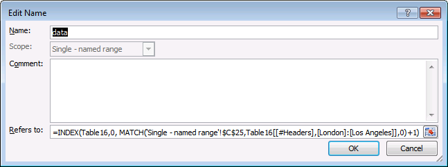
2.4.4 Setting up the chart

Here are the steps to create the chart:
- Press with right mouse button on on chart.
- Press with left mouse button on "Select Data...".
- Press with left mouse button on "Edit" button (Legend Entries).
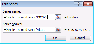
- Series name: Cell C25.
- Series values: The named range "data". Don't forget the worksheet name!
- Press with left mouse button on OK button.
- Press with left mouse button on OK button again.
2.5. "Helper" table
The following example has two tables and a drop-down list. The table to the right has "dynamic" values and they change depending on the chosen value in cell C25. But if you add values to the first table, the second table does not automatically include the new values. You have to change the table size yourself.
It is not as pretty as a named range but easier to work with if you want multiple data columns and chart series. The attached file below contains an example with multiple chart series.
2.5.1 Drop down list

- Select cell C25.
- Go to tab "Data" on the ribbon.
- Press with left mouse button on "Data Validation" button.
- Go to tab "Settings".
- Select List.
- Source: Select table headers.
- Press with left mouse button on OK button.
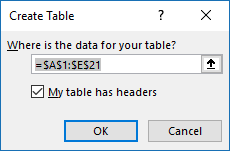
2.5.2 Create the second table

- Type month in cell F1 and city in cell G1.
- Select cell range F1:G13.
- Go to tab "Insert" on the ribbon.
- Press with left mouse button on "Table" button.
- Press with left mouse button on "My tables has headers".
- Press with left mouse button on OK.
2.5.3 Enter Excel Table formula

- Select cell F2.
- Type:
=Table1[@Month]
and press Enter.
- Select cell G2.
- Type:
=INDEX(Table1[@[London]:[Los Angeles]],MATCH($C$25,Table1[[#Headers],[London]:[Los Angeles]],0))
- Press Enter.
2.7. Change chart series by pressing on data - VBA

The image above shows a chart populated with data from an Excel defined Table. The worksheet contains event code that changes the shown cart series based on which cell is selected. See the animated image below.

You can also select multiple cells in the table by press and hold with the left mouse button and then drag with the mouse to select multiple cells.

If you want to select cells that are not adjacent you can press and CTRL key and then press with left mouse button on the cells you want to select. The corresponding chart series shows up in the chart automatically, this is made possible with event code.
VBA code
'Event code
Private Sub Worksheet_SelectionChange(ByVal Target As Range)

'Dimension variables and declare data types
Dim ACell As Range
Dim ActiveCellInTable As Boolean
Dim c As Single
Dim str As String

'Iterate every cell in selection
For Each ACell In Target

    'Enable error handling
    On Error Resume Next

    'If selected cell is in a table and the table name is Table1, save TRUE in ActiveCellInTable (boolean)
    ActiveCellInTable = (ACell.ListObject.Name = "Table1")

    'Resume normal error handling (stop if an error occurs)
    On Error GoTo 0

    If ActiveCellInTable = True Then

        'Save cell reference (First column in table) if str is empty
        If str = "" Then str = "Table1[[#ALL]," & ACell.ListObject.Range.Cells(1, 1).Value & "]"

        'Calculate selected cell's column number in table
        c = ACell.Column - ACell.ListObject.Range.Cells(1, 1).Column + 1

        'Check if column number is above 1
        If c > 1 Then

            'Add cell reference
            str = str & "," & "Table1[[#ALL]," & ACell.ListObject.Range.Cells(1, c).Value & "]"

            'Change "Chart 1" data source
            ChartObjects("Chart 1").Chart.SetSourceData Source:=Range(str)
        End If
    End If
Next ACell

End Sub
Where to put the code?

- Press Alt + F11 to open the Visual Basic Editor.
- Press with right mouse button on on sheet name Sheet1.
- Press with left mouse button on on "View Code".
- Copy/Paste VBA code to sheet module.
- Exit Visual Basic Editor and return to Excel.
2.8. Change chart data range using a Drop Down List - VBA

In this article I will demonstrate how to quickly change chart data range utilizing a combobox (drop-down list). The above image shows the drop-down list and the input range is cell range E2:E4.
Cell range E2:E4 contains the table names that points to Excel defined Tables located on sheet 2011, 2010 and 2009, see picture below. When you select a table name in the drop-down list, the chart is instantly populated and refreshed, see picture above.

Excel defined Tables are great to work with, they expand automatically when new values are added, this makes charts with data sources pointing to Excel defined Tables easy to work with. You don't need to adjust the cell references when records are added or deleted.
Here are the steps to set up this scenario:
Create a chart
- Go to "Insert" tab
- Press with left mouse button on "Column chart" button
- Press with left mouse button on "Clustered Column" chart button
Create Combo Box
- Go to "Developer" tab
- Press with left mouse button on "Insert controls" button
- Press with left mouse button on Combo Box (Form Control)
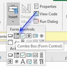
- Press with left mouse button on and drag on the worksheet to create the combobox.
Add VBA code to a module
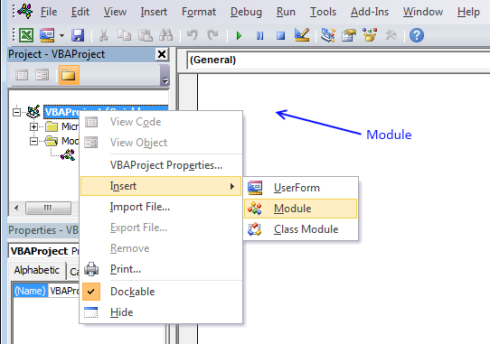
- Press Alt + F11 to open the VB Editor.
- Press with right mouse button on on your workbook in the Project Explorer window.
- Press with left mouse button on "Insert"
- Press with left mouse button on "Module" to insert a module to your workbook.
- Copy VBA code below (Ctrl + c)
- Paste VBA code to the code module, see image above.
- Return to Excel
VBA code
'Name macro
Sub SelectTable()

'Apply actions to selected drop-down list
With ActiveSheet.Shapes(Application.Caller).ControlFormat

    'Make sure the selected drop-down list name is "Drop Down 1"
    If ActiveSheet.Shapes(Application.Caller).Name = "Drop Down 1" Then

        'Change Chart 1 data source
        Worksheets("Chart").ChartObjects("Chart 1").Chart.SetSourceData Source:= _
        Range(.List(.Value) & "[#All]")
        Worksheets("Chart").ChartObjects("Chart 1").Chart.PlotBy = xlRows
    End If
End With

End Sub
Assign macro
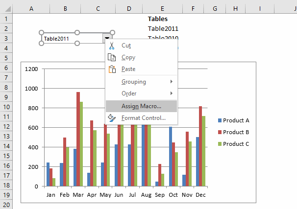
- Press with right mouse button on combo box.
- Press with left mouse button on "Assign macro...".
- Press with left mouse button on "SelectTable".
- Press with left mouse button on OK button.
Populate Combo Box
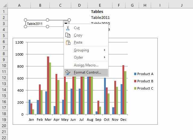
- Press with right mouse button on combo box.
- Press with left mouse button on "Format control..." and a dialog box appears, see image below.
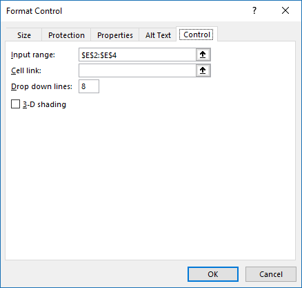
- Go to tab "Control".
- Press with left mouse button on "Input range" button.
- Select cell range E2:E4.
- Press with left mouse button on OK button.
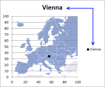
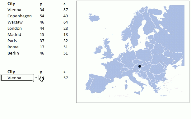
3. How to build an interactive map in Excel

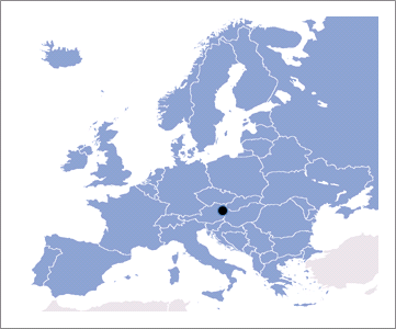
This article describes how to create a map in Excel, the map is an x y scatter chart with an inserted background picture.
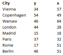
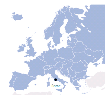
The image above shows the map to the right and a table with cities and their chart coordinates. A drop-down list in cell B14 lets you pick a city and a formula extracts the appropriate coordinates.
A block dot displays the location of the selected city on the map and it changes accordingly when a new city is selected. There is a workbook to get below if you want to try it out.
How I built this map
A scatter chart allows you to place dots based on x and y values which is great in this case. I will show you how to
- insert a scatter chart
- create a drop-down list
- create formulas
- create a dynamic chart
- insert a background picture
Insert a scatter chart
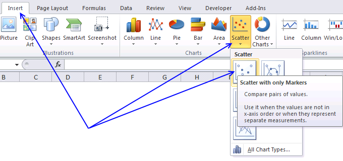
The following steps describe how to place a scatter chart on a worksheet.
- Go to "Insert" tab on the ribbon.
- Press with left mouse button on "Scatter" button.
- Press with left mouse button on "Scatter with only markers" button.
A blank chart shows up on the screen.

You can press and hold with the left mouse button on the chart and then drag to the desired location.

Press and hold on the handles then drag to resize the chart, see image above. Hold the shift key as you resize the chart to lock the relationship between height and width.
Hold the Alt key while resizing to snap the chart to the cell grid.
Create a drop down list
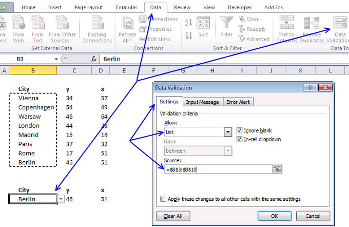
The drop-down list makes it easier for the user to select items, it is populated with values from cell range B3:B10. Change the values in cell B3:B10 and the drop-down list automatically changes the list accordingly.
If you know you will be adding more values later I recommend that you convert cell range B2:D10 to an Excel Table. That will save you time adjusting the drop-down source cell reference when you add new values.
Remember to use the INDIRECT function if you reference an Excel Table in a drop down list.
- Select cell B14.
- Go to tab "Data" on the ribbon.
- Press with left mouse button on "Data Validation" button.
- Go to "Settings" tab.
- Select "List".
- Select source range: B3:B10.
- Press with left mouse button on OK.
Formulas

The worksheet has two cells containing formulas, they extract x and y values respectively from the list based on the selected item in cell B14.
Formula in cell C14:
The MATCH function looks for the selected value in cell B14 in cell range B3:B10 and returns a number representing the position of that value.
MATCH($B$14, $B$3:$B$10, 0)
becomes
MATCH("Berlin", {"Vienna"; "Copenhagen"; "Warsaw"; "London"; "Madrid"; "Paris"; "Rome"; "Berlin"}, 0)
and returns 8. Berlin is the eight and last value in cell range B3:B10.
The INDEX function returns a value from cell range C3:C10 based on a row number which is provided by the MATCH function.
INDEX(C3:C10, MATCH($B$14, $B$3:$B$10, 0))
becomes
INDEX(C3:C10, 8)
becomes
INDEX({34; 54; 46; 44; 15; 37; 17; 46}, 8)
and returns 46 in cell C14.
Formula in cell D14:
This formula is exactly the same as the first one except that the INDEX function returns a value from D3:D10.
Adjust chart data source

The dot location on the chart is based on the values in cell C14 and D14, the following steps demonstrate how to change the data source to these two coordinates.
- Press with right mouse button on on the chart.
- Press with left mouse button on "Select Data" from the menu.
- Press with left mouse button on "Add" button.
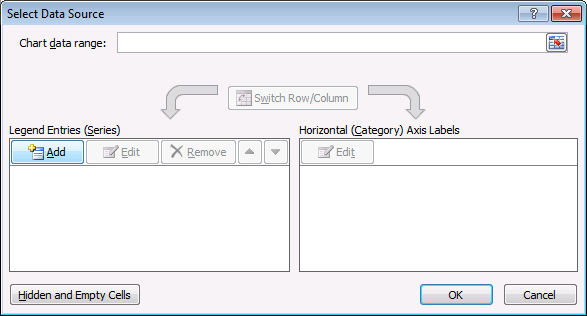
- Select a name, an x value, and a y value.
- Press with left mouse button on Ok.

Insert a background picture

The map will be the background picture in our chart, make sure the chart has the same ratio between height and width as the image. You will get a chart that looks stretched out horizontally or vertically if the don't match.
- Press with right mouse button on on the empty chart.
- Press with left mouse button on "Format Plot Area...".
- Press with left mouse button on "Fill".
- Select "Picture or texture fill".
- Press with left mouse button on "File..." button.
- Select a picture.
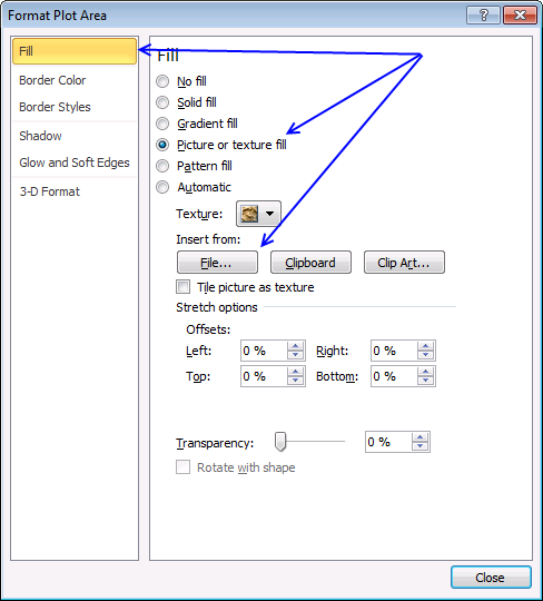
- Press with left mouse button on "Insert".
- If you like, change "Transparency" value.
- Press with left mouse button on "Close" button.
To check the image aspect ratio open windows file explorer and locate the image. Hover over the image file name with the mouse cursor and a box appears named tool tip. It contains the image width and height and also the image file size.
Divide the height with the width to get the aspect ratio we need. Now go back to Excel and double press with left mouse button on the chart.

A format pane shows up on the right side of the screen, press with left mouse button on the Size and properties button and then press with left mouse button on the black arrow next to "Size" to expand settings.
Make sure the height and width has the same aspect ratio as the background image.
Divide the chart height with the width to calculate the chart aspect ratio.
Change the chart height or width to make the aspect ratios match.
Chart settings
The chart has a horizontal, and a vertical axis, gridlines, a chart titel and a legend that is not needed, we are now going to remove those chart elements.
The marker type can be customized as well, I will describe how below.
- Press with mouse on the Legend and press Delete button to remove it from the chart. You can always get it back later if you change your mind. CTRL + z will undo your last action or go to "Chart Design" tab on the ribbon. Press with mouse on "Add Chart Element" button and press with left mouse button on the element you want back.
Now delete the chart title as well.
- Delete chart gridlines. You do that by press with left mouse button oning on the to select them and then press Delete.
- Change x and y axis minimum and maximum value to 0 and 100.
- Make sure x and y coordinates in the table are ok. If not, make appropriate adjustments.
- If you like, delete x and y axis.
- Select data series on the chart.
- Press with right mouse button on on data series.
- Press with left mouse button on "Format Data Series...".
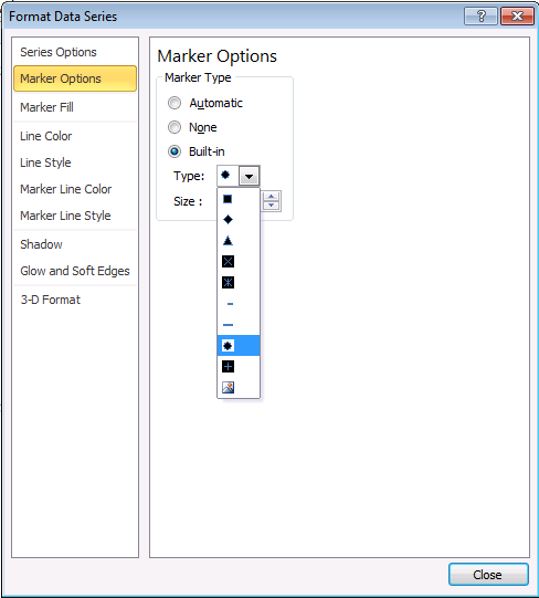
- Press with left mouse button on "Marker Options".
- Select "Built-in".
- Select a type.
- Press with left mouse button on "Marker Fill".
- Select "Solid fill".
- Pick a color.
- Press with left mouse button on Close.
Final notes
First I thought of using longitude and latitude coordinates but I gave that up really quickly. The map is geted from Wikimedia Commons.
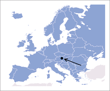
Tip! You can add a data label and use the series name to show the city name on the map.
- Press with right mouse button on on the marker.
- Press with mouse on "Add Data Labels".
- Double press with left mouse button on the data label next to the marker to open the Format pane.
- Select "Series Name" and deselect the remaining check boxes.

Recommended links
- Create a Map chart in Excel
- How to make a killer map using Excel in under 5 minutes with PowerMap plugin
- How to create an interactive Excel dashboard with slicers?
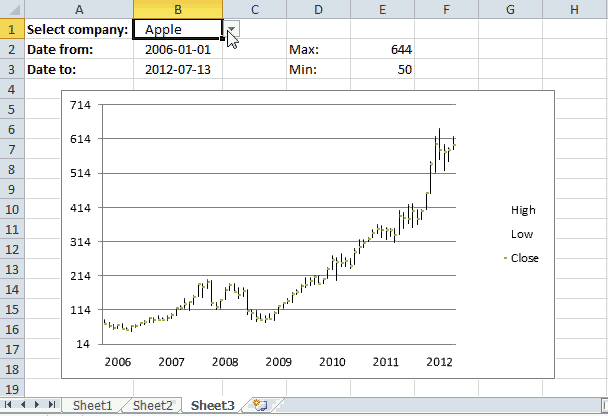
4. Hover with mouse cursor to change stock in a candlestick chart
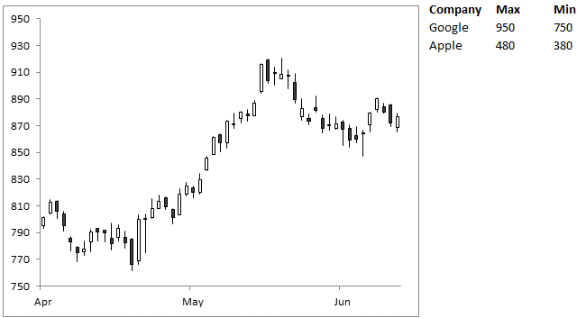
This article demonstrates how to change chart series while hovering with mouse cursor over a series name. The image above shows a stock chart and two company names in the top right corner.
Hover with the mouse cursor over a company name to trigger a macro. The macro checks which company and changes the chart data source accordingly.
The chart is instantly updated with the values corresponding to the chosen company (series name). The technique shown in this article can be applied to any kind of chart.
Rudy asks in this post Use a mouse hovering technique to create an interactive chart:
Is it possible to create this interactive chart into interactive candlestick chart to compare two or more charts ?
What you will learn in this article
- Create a hyperlink using the HYPERLINK function.
- Utilize a User defined Function (UDF) in the hyperlink formula.
- Explain how to change chart series programmatically.
- How to change axis min and max values programmatically.
- Where to put UDF code in a module of your workbook.
- Save the workbook with the correct file extension.
Hover over a company name and the chart instantly changes data source.
Create a hyperlink
To insert a hyperlink you have two options, manually add a hyperlink or use the HYPERLINK function. In this example, I will use the HYPERLINK function to create a hyperlink.
Formula in cell J2:
Formula in cell J3:
I will explain these formulas below.
Explaining formula in cell J2

I recommend that you use the "Evaluate Formula" tool to understand formula calculations in greater detail. Select a cell containing the formula you want to examine.
Go to tab "Formulas" on the ribbon. Press with left mouse button on "Evaluate Formula" button and a dialog box appear, see image above. Press with left mouse button on the "Evaluate" button to iterate through each step in the formula calculation, press with left mouse button on "Close" button to dismiss the dialog box.
Step 1 - HYPERLINK function
The HYPERLINK function has two arguments: HYPERLINK(link_location, [friendly_name])
Based on the docs the link_location argument can be the path to a file, file on a server, file on the internet, a workbook, webpage or a bookmark in a word document. However, it is also possible to use a User Defined Function that is rund when you hover over the link. This is not mentioned in the documentation.
The [friendly_name] argument is optional, we are going to use nothing "". If we type something here it will be formatted as a hyperlink in the worksheet which is not what we want. Step 3 below will explain how to show a text string without being formatted as a hyperlink.
HYPERLINK(MouseHover("Google"),"")
Step 2 - Prevent errors
The IFERROR function returns a value you specify if the first argument returns an error. This will prevent an error appearing if something goes wrong with the HYPERLINK function or the UDF.
IFERROR(HYPERLINK(MouseHover("Google"),""),"")
Step 3 - Append text
The ampersand character allows you to concatenate two or more strings. This will make sure that a value is shown in the cell. The hover will work anyway with an empty cell, however, it will certainly confuse the user when the UDF is rund perhaps by accident.
"Google"&IFERROR(HYPERLINK(MouseHover("Google"),""),"")
User defined function
'Name user defined function, dimension argument variable and declare it's data type
Function MouseHover(str As String)

'The With ... End With statement allows you to write shorter code by referring to an object only once instead of using it with each property.
With ActiveSheet.ChartObjects("Chart 2")

    'Check if variable str meets condition and value in cell A1 in sheet1 is not equal to variable str
    If str = "Google" And Sheet1.Range("A1") <> str Then

        'Save text string "Google" to cell A1
        Sheet1.Range("A1") = "Google"

        'Change chart source to "A2:A54,C2:F54" in worksheet name specified in cell A1
        .Chart.SetSourceData Source:=Sheets("" & Range("A1") & "").Range("A2:A54,C2:F54")

        'Change axis max value based on number in cell K2
        .Chart.Axes(xlValue).MaximumScale = Range("K2")

        'Change axis min value based on number in cell L2
        .Chart.Axes(xlValue).MinimumScale = Range("L2")

    'Check if variable str equals "Apple" and cell A1 is not equal to variable str
    ElseIf str = "Apple" And Sheet1.Range("A1") <> str Then

        'Change cell contents in cell A1
        Sheet1.Range("A1") = "Apple"

         'Change chart source to "A2:A54,C2:F54" in worksheet name specified in cell A1
        .Chart.SetSourceData Source:=Sheets("" & Range("A1") & "").Range("A2:A54,C2:F54")

        'Change axis max value based on number in cell K3
        .Chart.Axes(xlValue).MaximumScale = Range("K3")

        'Change axis min value based on number in cell L3
        .Chart.Axes(xlValue).MinimumScale = Range("L3")
    End If
End With
End Function
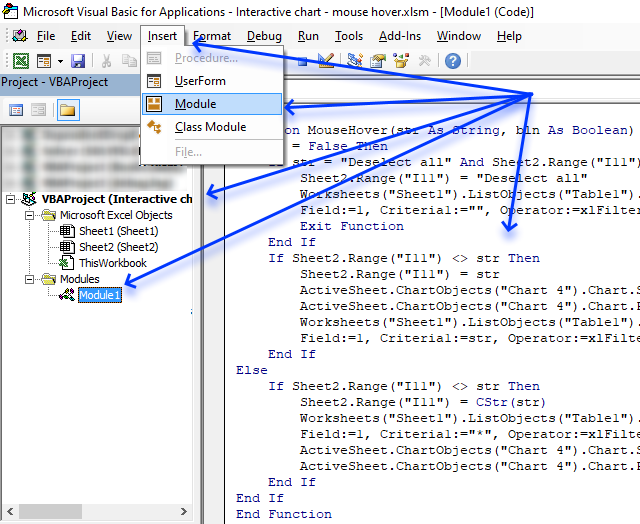
Where to put the code?

- Press Alt + F11 to open the Visual Basic Editor.
- Select your workbook in the Project Explorer.
- Press with left mouse button on "Insert" on the menu.
- Press with left mouse button on "Module" to create a module in your workbook.
- Copy above VBA code.
- Paste to code module, see image above.
Calculate max and min values for chart axis

The formulas below returns the min and max values for each chart source using the min and max values in cell range D2:D54.
Formula in cell K2:
Formula in cell K3:
Formula in cell L2:
Formula in cell L3:
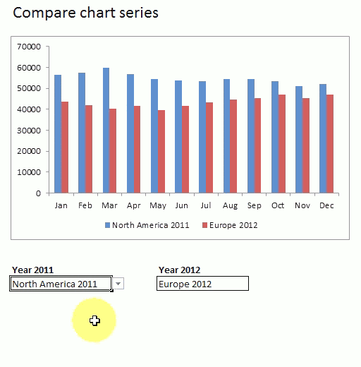
5. Compare data in an Excel chart using drop down lists

I will in this article demonstrate how to set up two drop down lists linked to an Excel chart, the drop down lists allow the Excel user to easily compare data series based on two Excel Tables.
The image above shows one drop down list in cell B21 and another in cell D21, the chart above those drop down lists displays the selected data series.
How to build
You will in this article learn how to:
- create drop down lists.
- link drop down list to Excel Table.
- create a named range containing a formula.
- insert a chart
- link chart data source to named range
5.1 Drop down lists
A drop down list allows you to control which values a user can enter in a cell. If the Excel user selects a cell containing a drop down list it changes and shows an arrow next to the cell.
Press with left mouse button on the arrow next to the cell with left mouse button and the cell displays all valid values you can choose from. Press with left mouse button on a value to select it and the cell will be populated with the selected value.
Note that you can't spot a drop down list on a worksheet, the arrow is only displayed if you select a cell containing a drop down list.
Be aware that it is really easy to enter an invalid value in a cell that contains a drop down list, copy a cell containing the value you want to use and paste it to the cell containing the drop down list. It will be overwritten with the new value and the drop down list is now gone.
Here are the steps to create a drop down list:
- Select cell B21.
- Go to tab "Data" on the ribbon.
- Press with left mouse button on the "Data Validation" button.
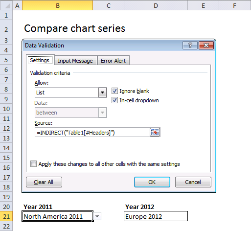
- Allow: Select List, see image above.
- Source: =INDIRECT("Table1[#Headers]")
Repeat above steps with cell D21 and use this Data Validation formula:
The INDIRECT function makes it possible to use structured references in drop down lists. A structured reference is basically a reference to an Excel Table, in this case it is a cell reference to the column headers in Table2 which is an Excel Table.
The following post explains in greater detail how to use table names in drop down lists and conditional formatting formulas: How to use a table name in data validation lists and conditional formatting formulas
5.2 Named ranges
A named range allows you to specify a name for a single cell or a cell range, constant, formula or a data set. This makes it easier to work with formulas, charts, etc. For example, a cell reference in a formula usually don't say much about what it contains whereas a named range makes it clear what it is, given that you use a descriptive name.
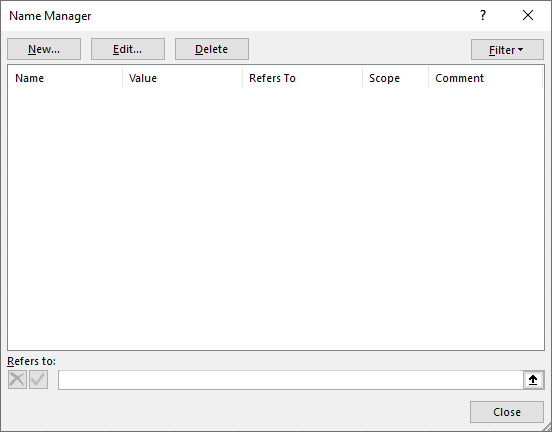
Compare cell reference Sheet4!B3:G6 with the named range Budget2019 and you understand the benefits of using named ranges. It is easy to manage named ranges, Excel has a tool for that named "Name manager". Go to tab "Formulas" on the ribbon, press with left mouse button on "Name manager" button.
The reason I am using a named range in this example is that it allows you to define a formula as a named range, I will be using that formula in a chart to display values based on the selected values in the drop down lists.
There are two tables in worksheet Calculation. Let's create named ranges and later we are going to use them as series values in a chart.
- Go to worksheet Calculation.
- Go to tab "Formulas" on the ribbon.
- Press with left mouse button on "Name Manager" button and a dialog box appears.
- Press with left mouse button on "New..." button.
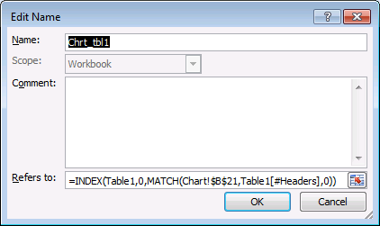
- Name: Chrt_tbl1
- Refers to: =INDEX(Table1,0,MATCH(Chart!$B$21,Table1[#Headers],0))
- Press with left mouse button on OK
Create another named range, named Chrt_tbl2 and use this formula: =INDEX(Table2, 0, MATCH(Chart!$D$21, Table2[#Headers], 0))
5.3 Explaining formula in named range Chrt_tbl1
Step 1 - Find position of selected value
The MATCH function returns a number representing the relative position of the value in cell Chart!$B$21 in Table1[#Headers].
MATCH(Chart!$B$21,Table1[#Headers],0)
becomes
MATCH("North America 2011",Table1[#Headers],0)
becomes
MATCH("North America 2011",{"Region", "Africa 2011", "Europe 2011", "North America 2011", "South America 2011", "Australia 2011", "Asia 2011"},0)
and returns 4.

"North America 2011" is the fourth header name in the Excel Table.
Step 2 - Return header name based on position
The INDEX function returns, in this case, an array of values based on the selected drop down value.
INDEX(array, [row_num], [column_num])
An array is returned if you use 0 (zero) in the [row_num] or [column_num] argument or in both. In this example the [row_num] is 0 (zero) and the INDEX function will return all values from a given column.
INDEX(Table1,0,MATCH(Chart!$B$21,Table1[#Headers],0))
becomes
INDEX(Table1, 0, 4)
and returns {56612.3491014125; 57438.8810088729; 59697.2292143781; 56747.2057561886; 54464.3935799677; 53768.3710509187; 53320.1658788137; 54348.2912056957; 54497.7912101573; 53331.9166437539; 51050.540119587; 51948.5058470412}.
5.4 Insert chart

- Go back to sheet "Chart".
- Go to tab "Insert" on the ribbon.
- Press with left mouse button on "Column" chart button | "Clustered column" chart button.
- Press with right mouse button on on the empty chart.
- Press with left mouse button on "Select Data...", see image above.
- Press with left mouse button on "Add" button.
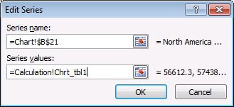
- Series name: Chart!$B$21
- Series values: =Calculation!Chrt_tbl1 (Don't forget to use the sheet reference)
- Press with left mouse button on OK button.
- Press with left mouse button on "Add" button again.

- Series name: Chart!$D$21.
- Series values: =Calculation!Chrt_tbl2 (Don't forget to use the sheet reference)
- Press with left mouse button on OK button.
- Press with left mouse button on OK button.
The following post shows you how to select a series using both an index column and an index row: Dynamic chart – Display values from a table row or column
5.5 Animated image
6. How to use mouse hover on a worksheet - VBA
I recently discovered an interesting technique about using a user defined function in a HYPERLINK function. Jordan at the Option Explicit VBA blog blogged about this more than a year ago. He made an amazing Periodic Table of Elements.
How to use the user defined function

I used his technique in this basic chart, see above animated image. I simply move the mouse pointer over a cell and the chart changes instantly, there is really nothing more to it. No need to press with left mouse button on cell to select it or anything like that.
Excel defined Table
My data is converted to an Excel defined Table located on a different sheet, shown in the picture below.
The great thing about Excel defined Tables is that they grow automatically if more data is added, you don't have to change cell references in formulas.
- Select any cell in the data set.
- Go to tab "Insert".
- Press with mouse on "Table" button.
- Press with left mouse button on OK button.
Hide value in cell I11
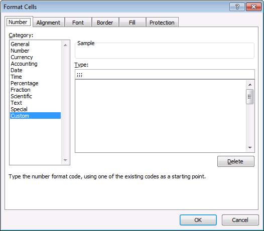
The user defined function saves a value in cell I11. I made it invisible by applying custom formatting to it: ;;; The value is still there, however, you can't see it on the worksheet unless you select the cell and check out the formula bar.
- Select cell I11.
- Press CTRL + 1 to open the Format Cell dialog box.
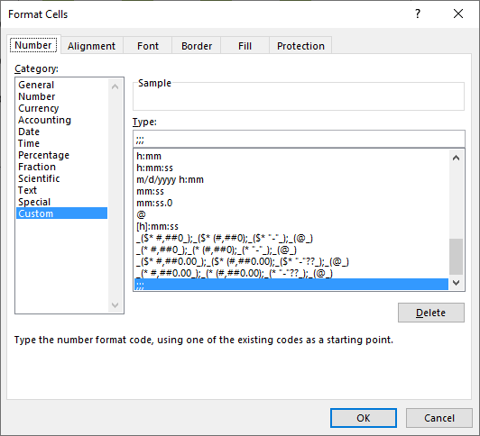
- Make sure you are on tab "Number".
- Press with left mouse button on Category: Custom to select it.
- Type ;;; (see image above).
- Press with left mouse button on OK button.
Formulas
Formula in cell I8:
Explaining formula in cell I8
Step 1 - User defined function
The user defined function MouseHover is triggered when the mouse pointer hovers over the cell. The first argument tells the UDF which value to use in order to sort the Excel defined Table. The second argument tells the UDF to either sort or change chart data source.
MouseHover("Apple", FALSE)
Step 2 - Create Hyperlink
The HYPERLINK function triggers the UDF when the mouse pointer is over a cell.
HYPERLINK(link_location, [friendly_name])
HYPERLINK(MouseHover("Apple", FALSE),"")
Step 3 - Remove error
The IFERROR function allows you to hide errors.
IFERROR(HYPERLINK(MouseHover("Apple", FALSE),""),"")
Step 4 - Remove hyperlink underline
I wanted to remove the hyperlink effect so I added "Apple"& to the formula.
"Apple"&IFERROR(HYPERLINK(MouseHover("Apple", FALSE),""),"")
Formula in cell I3:
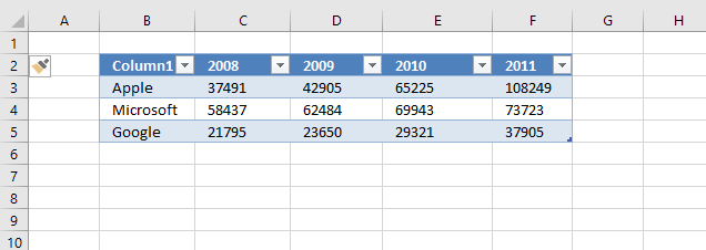
The user defined function MouseHover filters column 1 if mouse pointer is over any cell in cell range I8:I10. The chart data range is changed if mouse pointer hovers over any cell in cell range I3:I7 based on the value in the given cell.
The bln argument determines what to do, TRUE changes the data source range based on variable str and FALSE filters the Excel defined Table based on variable str.
Conditional Formatting
A conditional formatting formula highlights the value currently being hovered over, it simply compares the "invisble" value in cell I11 with the value in eac cell in cell range I8:I10.
VBA code
The boolean value bln determines if
'Name user defined function and dimension arguments and declare data types
Function MouseHover(str As String, bln As Boolean)

'Check if boolean variable bln is equal to False
If bln = False Then

    'Check if variable str is equal to "Deselect all" and cell value in cell I11, sheet2 is not equal to variable str
    If str = "Deselect all" And Sheet2.Range("I11") <> str Then

        'Save value "Deselect all" to cell I11 on sheet2
        Sheet2.Range("I11") = "Deselect all"

        'Apply Autofilter to Excel defined table named Table 1
        Worksheets("Sheet1").ListObjects("Table1").Range.AutoFilter _
        Field:=1, Criteria1:="", Operator:=xlFilterValues

        'Stop user defined function
        Exit Function
    End If

    'Check if value in cell I11 (sheet2) is not equal to variable str
    If Sheet2.Range("I11") <> str Then

        'Save value in variable str to cell I11 (sheet2)
        Sheet2.Range("I11") = str

        'Change data source to Excel defined table named Table1
        ActiveSheet.ChartObjects("Chart 4").Chart.SetSourceData Source:=Sheets("Sheet1").Range("Table1[#All]")

        'Plot data by rows on chart 4
        ActiveSheet.ChartObjects("Chart 4").Chart.PlotBy = xlRows

        'Use value in variable str as a condition in Excel defined Table Table1 and applied to first column
        Worksheets("Sheet1").ListObjects("Table1").Range.AutoFilter _
        Field:=1, Criteria1:=str, Operator:=xlFilterValues
    End If

'Proceed here if boolean variable bln is not equal to False
Else

    'Check if value in cell I11 (sheet2) is not equal to variable str
    If Sheet2.Range("I11") <> str Then

        'Convert value in variable str to string and save it to cell I11 (sheet2)
        Sheet2.Range("I11") = CStr(str)

        'The asterisk character makes the Excel defined Table show all values
        Worksheets("Sheet1").ListObjects("Table1").Range.AutoFilter _
        Field:=1, Criteria1:="*", Operator:=xlFilterValues

        'Change data source based on first argument
        ActiveSheet.ChartObjects("Chart 4").Chart.SetSourceData Source:=Sheets("Sheet1").Range("Table1[[#All],[Column1]], Table1[[#All],[" & str & "]]")

        'Change chart settings so it sets the way columns or rows are used as data series on the chart.
        ActiveSheet.ChartObjects("Chart 4").Chart.PlotBy = xlColumns
    End If
End If
End Function
Where to put the code?
- Create a backup of your workbook.
- Copy above VBA code.
- Press Alt + F11 to open the Visual Basic Editor.
Final notes
I found out that you can't clear a table filter from a user defined function:
'This won't work!
Worksheets("Sheet1").ListObjects("Table1").Range.AutoFilter Field:=1
I had to use "*" to show all values in table column 1.
'This works!
Worksheets("Sheet1").ListObjects("Table1").Range.AutoFilter _
Field:=1, Criteria1:="*", Operator:=xlFilterValues
7. Use drop down lists and named ranges to filter chart values
This section demonstrates how to use drop down lists combined with an Excel defined Table and a chart. This allows you to select which values to show on the chart. If you own Excel 2010 or a later version I highly recommend using slicers instead.
The first drop down list lets you choose which column to show on the chart based on the selected column header, the second drop down list allows you to choose a row to show on the chart based on values from an Excel defined Table.
What you will learn in this section
- Use drop down lists to filter values shown on a chart.
- Extract specific columns or rows from an Excel defined Table using a formula.
- Create a named range containing a formula that returns specific columns or rows.
- Extract columns and rows from an Excel defined Table based on drop down lists.
- Show specific values on a chart using an Excel defined Table as a data source based on selected drop down values.
How to use this worksheet
The following animated image shows you a sheet where you can select column (Region) or a row (Month) and the chart updates correspondingly. I am only using named ranges and a table to create the functionality.

The great thing with this dynamic chart is that you can easily add more rows or columns to the Excel defined table, you don't need to update the formulas every time you add or remove records.
Example,
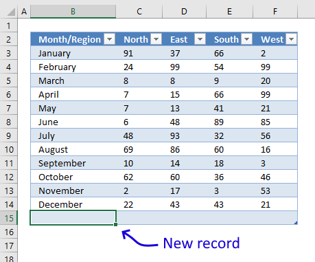
- Select cell F14.
- Press Tab key on your keyboard.
- Selected cell is now B15 which is the first cell of the new record. This creates a new row in the Excel defined Table.
- Type values in the empty cells.
You can also simply select cell B15 and type a value, the Excel defined Table gros as soon as you press Enter.
The table automatically expands and the drop down lists and chart are instantly refreshed with the new row or column values.
How I made this worksheet
This worksheet contains a few named ranges containing formulas, an Excel define Table that contains the source data, a chart and two drop down lists that let the user filter values on the chart.
How to convert data to an Excel defined Table
- Select any cell in your data set.
- Press CTRL + T to open the Table dialog box.
- Press with left mouse button on OK button.
Named ranges
I created five named ranges that allows me to use Excel defined Tables in drop down lists, you can also use the INDIRECT function to accomplish the same thing.
Here are the steps to add a named range:
- Go to tab "Formulas" on the ribbon.
- Press with left mouse button on "Name Manager" button to open the "Name Manager" dialog box.
- Press with mouse on "New..." button to create a new named range.
- Type a name based on the names displayed below.
- Copy/Paste the corresponding formulas to the "Refers to:" field.
- Press with left mouse button on OK button.
- Press with left mouse button on "Close" button.
Month - Formula:
Named range "Month" is used in drop down list in cell C17, instructions below on how to create drop down lists and edit chart settings.
Region - Formula:
Named range "Region" is used in drop down list in cell C16.
Chart - Formula:
Named range "Chart" is used as Series values in the chart.
ChartCat - Formula:
Named range "ChartCat" is used as category values in the chart.
Series - Formula:
Named range "Series" is used as series name in the chart.
Explaining "ChartCat " Formula
The ChartCat formula extracts the category values based on which drop down list is being used.
Step 1 - Return headers or column values?
The IF function checks if cell C16 is not empty, if TRUE then return column Month/Region values, if FALSE then return headers except the first one.
IF(Sheet1!$C$16<>"", INDEX(Table1[Month/Region], 0, 0), OFFSET(Table1[#Headers], 0, 1, , COUNTA(Table1[#Headers])-1))
becomes
IF("East"<>"", INDEX(Table1[Month/Region], 0, 0), OFFSET(Table1[#Headers], 0, 1, , COUNTA(Table1[#Headers])-1))
and returns
IF(TRUE, INDEX(Table1[Month/Region], 0, 0), OFFSET(Table1[#Headers], 0, 1, , COUNTA(Table1[#Headers])-1))
Step 2 - Return an array of values
The INDEX function allows you to get a value from a cell range, however, if you use a 0 (zero) as a row or column argument then you will get the entire row or column as an array. If you use 0's (zeros) in both row and column arguments you will get the entire cell range.
IF(TRUE, INDEX(Table1[Month/Region], 0, 0), OFFSET(Table1[#Headers], 0, 1, , COUNTA(Table1[#Headers])-1))
becomes
IF(TRUE, {"January"; "February"; ... ; "December"}, OFFSET(Table1[#Headers], 0, 1, , COUNTA(Table1[#Headers])-1))
and returns
{"January"; "February"; ... ; "December"}.
Step 3 - Return headers
If the logical expression returns FALSE the following will happen.
IF(Sheet1!$C$16<>"", INDEX(Table1[Month/Region], 0, 0), OFFSET(Table1[#Headers], 0, 1, , COUNTA(Table1[#Headers])-1))
The COUNTA function counts the number of headers in the Excel defined Table, we need a value that is 1 less than the number of headers.
The OFFSET function extracts the headers except the first one.
returns {"North","East","South","West"}.
Step - Check if both cell C16 and C17 are empty
If both drop down lists are empty then return nothing.
IF((Sheet1!$C$16="")*(Sheet1!$C$17=""), 0, IF(Sheet1!$C$16<>"", INDEX(Table1[Month/Region], 0, 0), OFFSET(Table1[#Headers], 0, 1, , COUNTA(Table1[#Headers])-1)))
returns 0 (zero).
Create two drop down lists
- Select cell C16
- Go to tab "Data"
- Press with left mouse button on "Data Validation" button
- Select List

- Type =Region in Source:
- Press with left mouse button on OK
- Select cell C17
- Go to tab "Data"
- Press with left mouse button on "Data Validation" button
- Select List
- Type =Month in source
- Press with left mouse button on OK
Setting up the chart
- Create a bar chart.
- Press with right mouse button on on chart.
- Press with left mouse button on "Select Data...".
- Press with left mouse button on "Add" button.

- Type =Sheet1!Series in Series name:
- Type =Sheet1!Chart in Series values:

- Press with left mouse button on Ok
- Press with left mouse button on "Edit" button

- Type =Sheet1!ChartCat in Axis label range:

- Press with left mouse button on ok
- Press with left mouse button on ok
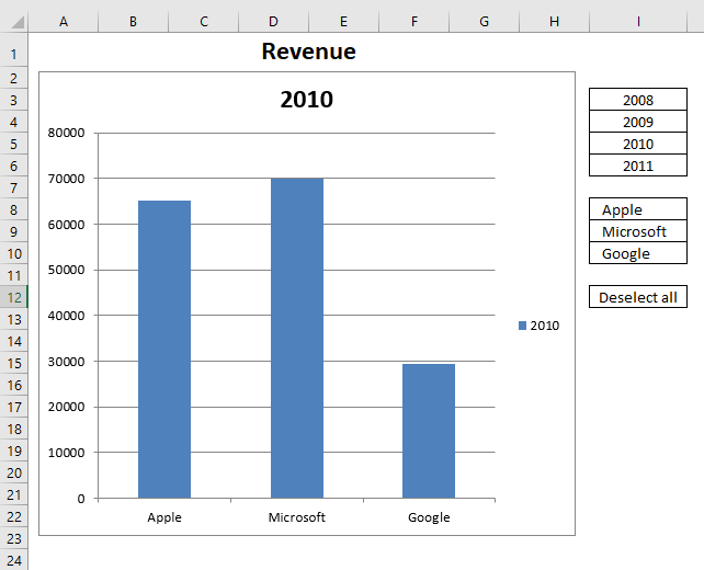
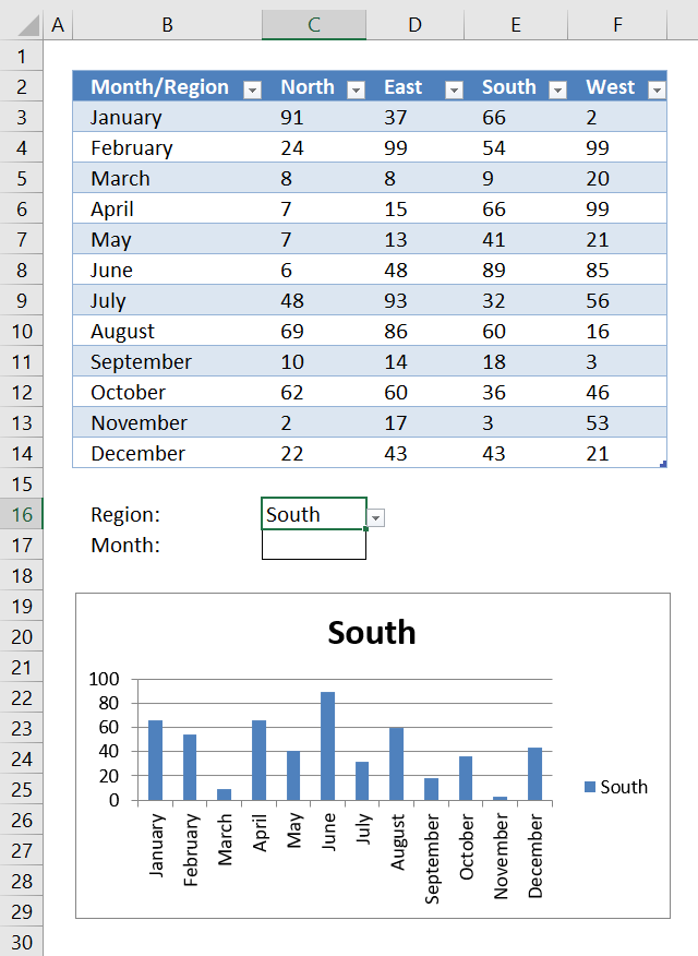
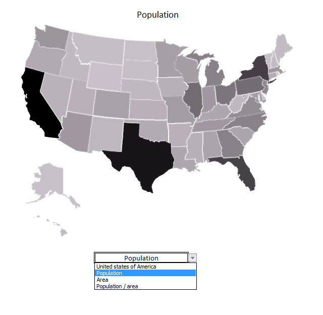
8. Heat map using pictures
I made a heat map calendar a few months ago and it inspired me to write this article. The heat map calendar changes the background color of each cell unlike the technique used here where I change the brightness of each picture based on numbers from a data set.
The drop-down list below allows you to change statistics, it contains three items: Population, Area and Population/area.
The map changes automatically when you change the value in the drop-down list, the workbook contains Event code that is run when the value in the drop-down list changes.
Instructions
Step 1 - Find and copy a map

- I found a map at the Wikimedia commons website.
- Press with right mouse button on on the image you want to use and press with left mouse button on "Copy".
- Paste it to your favorite image editing software.
Step 2 - Copy each state/country/territory
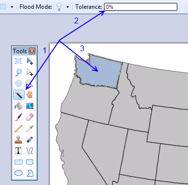
This step, step 3 and 4 are somewhat tedious if you have many images to copy.
- Select the "Magic Wand" tool. I made this in paint.net.
- Tolerance : 0%.
- Press with mouse on a state.
- Copy the selected area (Ctrl + c).
Step 3 - Paste to Excel
- Start Excel.
- Paste the picture to a worksheet.
- Select the picture and name it using the name box located almost at the top left corner, see image below.
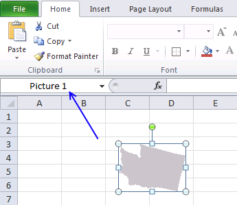
The name is important, we will use it in a macro to change the brightness.
Step 4 - Select a transparent color
- Double press with left mouse button on picture. This takes you to the "Format" tab on the ribbon.
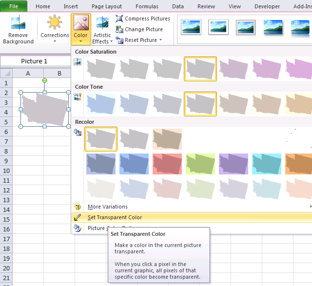
- Press with left mouse button on "Color" button.
- Press with left mouse button on "Set Transparent Color".
- Press with left mouse button on a "white" area on the picture.
Repeat step 2 - 4 and copy all states to Excel.
Step 5 - Organize pictures

Press and hold on a state and then drag to the location you want. You will se something like the image above when all states have been copied to the worksheet.
Step 6 - Create a group (optional)
Make a group of all pictures and you will be able to resize the entire map in one single step.
- Select all pictures. Tip! Use the "Selection pane" on the "Format" tab.
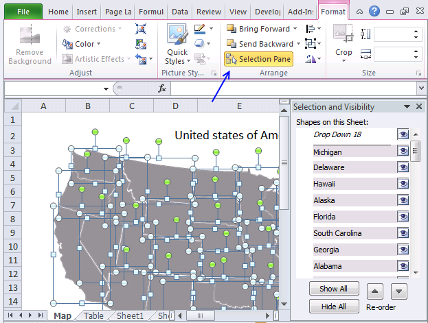
- Press with right mouse button on on a picture.
- Press with left mouse button on Group | Group.
- Size handles appear when you select the group.

- Press and hold on one of the handles then drag with the mouse to resize the group.
Step 7 - Create an Excel defined Table
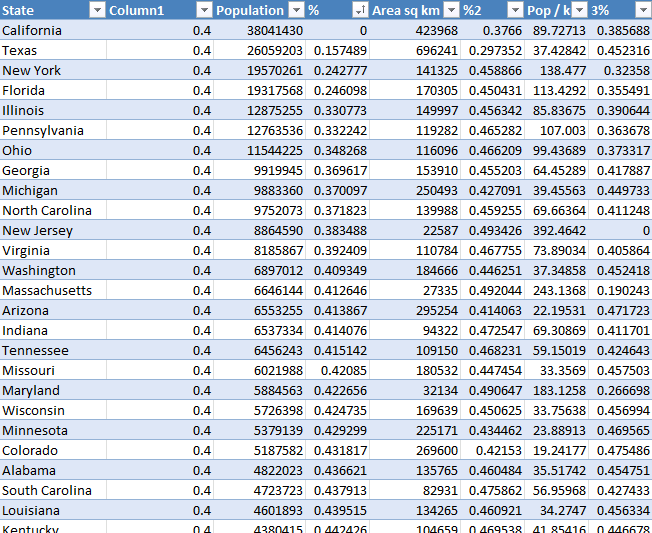
I geted data from wikipedia and created the Excel Table above. An Excel Table has a few great features, one of them is that they use structured references which makes them really easy to reference and work with.
Here is how to convert a data set to an Excel Table:
- Press with mouse on any cell in your data set.
- Press shortcut keys CTRL + T and a dialog box appears.
- Press with left mouse button on checkbox if you data set contains header names.
- Press with left mouse button on OK.
The data set changes it appearance and is now formatted differently, this tells you that you now have an Excel Table.
Table column Column1 contains a single value. The brightness property is ranging from 0 to 1. 0 - darkest and 1 brightest. It is hard to see pictures with a brightness ranging from 0.5 to 1 so I am using values from 0 to 0.5.
We need to create values between 0 (zero) and 0.5 based on the data in one state compared to the maximum and minimum value in the same column, the formulas are shown below.
Formula in table column %:
Excel Tables uses structured references which are different than regular cell references. [@Population] is a reference to a value in column Population on the same row as the formula. [Population] is a reference to all values in column Population.
The formula above calculates a value between 0 and 0.5 based on the ratio of a given state's population compared to the largest population of the values in column "Population". The formulas below calculate a ratio using the values in column "Area sq km" and "Pop / km".
Formula in table column %2:
Formula in table column %3:
What we now have done is indexing values, I have made a post about indexing data before:
Compare your stock portfolio with S&P500 in excel
Step 8 - Create a drop down list
A drop-down list allows you to control which values the user can choose from, they are easy to create:
- Select cell D26.
- Go to tab "Data" on the ribbon.
- Press with left mouse button on "Data Validation" button.
- Select "List".
- Source: United states of America,Population, Area, Population / area.
- Press with left mouse button on OK.
There is also a hidden formula in cell F26. The following formula calculates a value that the event code below uses.
These steps demonstrate how to hide the value in cell F26.
- Select cell F26.
- Press CTRL + 1 to open the "Format Cells" dialog box.
- Select Custom, see image below.
- Type ;;;
- Press OK button.
The value in cell F26 is still there but you can't see it. The worksheet looks cleaner with this setup.
Step 9 - Change picture brightness for each picture

- Copy code below. (CTRL + c)
- Press with right mouse button on on sheet name, see image above.
- Press with left mouse button on "View Code".
- Paste code below to code window. (CTRL + v)

- Exit VB Editor and return to Excel.
'Event code is rund when a cell is changed in worksheet "Map".
Private Sub Worksheet_Change(ByVal Target As Range)

'Dimension variables and declare data types
Dim r As Single, c As Integer, Arr() As Variant

'Check if cell's address is D26
If Target.Address = "$D$26" Then

    'Populate variable Arr with values from Excel Table "Table1" in worksheet "Table"
    Arr = Worksheets("Table").Range("Table1").Value

    'Iterate through values in a given column based on the hidden value in cell F26
    For r = LBound(Arr, 1) To UBound(Arr, 1)

        'The With ... End With statement allows you to write shorter code by referring to an object only once instead of using it with each property.
        With ActiveSheet.Shapes.Range(Arr(r, 1)).PictureFormat

            'Set brightness from value in array variable based on row and column number
            .Brightness = Arr(r, Range("F26"))
        End With
    Next r
End If
End Sub
If you like maps, check out this post: Use a map in an Excel chart
Recommended links
- Create a Map chart in Excel
- How to make a killer map using Excel in under 5 minutes with PowerMap plugin
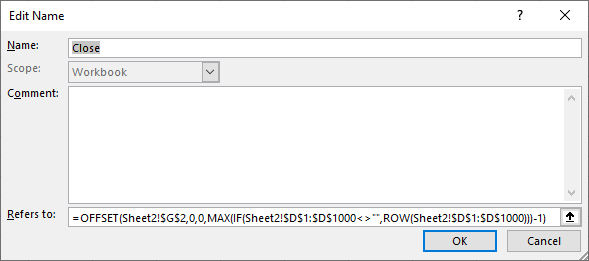
9. Change chart axis range programmatically
This article demonstrates a macro that changes y-axis range programmatically, this can be useful if you are working with stock charts and you are not happy with the axis range Excel has chosen for you.
The macro automates this for you, the formulas in cell E2 and E3 extracts the largest and smallest stock price respectively. The macro simply uses those values to change the y-axis range for you, you don't need to change these values manually each time you change the data source (stock ticker).
What you will learn in this article
- Extract the largest and smallest number from a cell range.
- Round a number up and down to the nearest integer.
- Create named range that expands based on size of the data source.
- Change chart axis range programmatically.
- How to use the minimumScale and maximumScale property
- Assign a macro to a chart allowing the user to press with left mouse button on the chart in order to run the macro.
Formula in cell E2:
High is a named range that expands based on the size of the data source, it references the column that contains the highest stock price for a given period.
The MAX function returns the maximum number and the ROUNDUP function rounds the number up to the nearest integer.
Formula in cell E3:
Low is a named range that expands based on the size of the data source, it references the column that contains the lowest stock price for a given period.
The MIN function returns the minimum number and the ROUNDDOWN function rounds that number down to the nearest integer.
How to use named ranges?
- Press with mouse on tab "Formulas" on the ribbon.
- Press with mouse on "Name Manager".
- Press with mouse on "New" button.
- Type the name and paste the formula shown below to "Refers to:".
- Repeat steps with remaining named ranges.
Named range formulas
Close:
Date:
High:
Low:
You can find an explation to these formulas here: Create a dynamic named range
How to use macro?

The macro is rund when you press with left mouse button on the chart, see animated image above. The macro uses the values in cell E2 and E3, the chart axis max and min values are instantly changed.
I also created a dynamic named ranges. You don´t need to adjust chart cell ranges manually anymore when stock data changes.
VBA macro
'Name macro
Sub RefreshChart()

'The With ... End With statement allows you to write shorter code by referring to an object only once instead of using it with each property.
'The Axis object has one argument, choose between xlCategory, xlSeriesAxis, or xlValue
With Worksheets("Sheet3").ChartObjects("Chart 1").Chart.Axes(xlValue)

    'Change maximum scale for chart 1 on sheet 3 to value in cell E2 on worksheet Sheet3
    .MaximumScale = Worksheets("Sheet3").Range("E2")

    'Change minimum scale for chart 1 on sheet 3 to value in cell E3 on worksheet Sheet3
    .MinimumScale = Worksheets("Sheet3").Range("E3")
End With
End Sub
How to assign macro to the chart
- Press with right mouse button on on a chart.
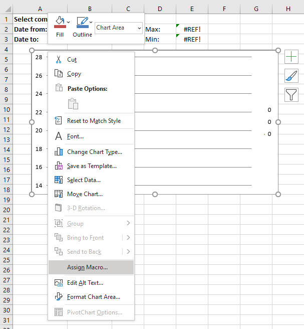
- Press with left mouse button on on "Assign Macro...".
- Press with mouse on the macro you want to link to the chart.
- Press with left mouse button on OK button.
User defined function
Edit: Yahoo Finance has changed, the following UDF is not working anymore.
You can copy historical stock data from the Yahoo Finance website.
I posted a userdefined function a year ago that automatically imported stock prices from yahoo finance. The workbook demonstrated in this blog posts imports stock prices and refreshes a stock chart. The problem is how excel calculates maximum and minimum axis values.
I made some small modifications to the user defined function.
Stock data are now sorted from smallest to largest by datePrices are numbers
Function YahooStockQuotes(Fyear As String, Fmonth As String, Fday As String _
, Tyear As String, Tmonth As String, Tday As String, interval As String _
, ticker As String)

Dim url As String, http As Object
Dim csv As String, temp() As Variant, txt As String
Dim r As Integer, a As Single, b As String, c As Single, irows As Single
Dim temp1() As Variant
ReDim temp(6, 0)
ReDim temp1(6, 0)

url = "https://ichart.finance.yahoo.com/table.csv?s=" & ticker & _
"&d=" & Tmonth - 1 & "&e=" & Tday & "&f=" & Tyear _
& "&d=d&a=" & Fmonth - 1 & "&b=" & Fday & "&c=" & Fyear & "&g=" & interval & "&ignore=.csv"
On Error Resume Next
Set http = CreateObject("MSXML2.XMLHTTP")
http.Open "GET", url, False
http.Send
csv = http.responseText
r = 0
txt = ""
For a = 1 To Len(csv)
  b = Mid(csv, a, 1)
  If b = "," Then
    If UBound(temp, 2) = 0 Then
        temp(r, UBound(temp, 2)) = txt
    ElseIf r = 0 Then
        temp(r, UBound(temp, 2)) = txt
    Else
        temp(r, UBound(temp, 2)) = Val(txt)
    End If
    r = r + 1
    txt = ""
  ElseIf b = Chr(10) Then
    If UBound(temp, 2) = 0 Then
        temp(r, UBound(temp, 2)) = txt
    ElseIf r = 0 Then
        temp(r, UBound(temp, 2)) = txt
    Else
        temp(r, UBound(temp, 2)) = Val(txt)
    End If
    ReDim Preserve temp(UBound(temp, 1), UBound(temp, 2) + 1)
    txt = ""
    r = 0
  Else
    txt = txt & b
  End If
Next a

For c = LBound(temp, 1) To UBound(temp, 1)
    temp1(c, UBound(temp1, 2)) = temp(c, 0)
Next c
ReDim Preserve temp(UBound(temp, 1), UBound(temp, 2) - 1)
ReDim Preserve temp1(UBound(temp1, 1), UBound(temp1, 2) + 1)
For a = UBound(temp, 2) To LBound(temp, 2) Step -1
    For c = LBound(temp, 1) To UBound(temp, 1)
        temp1(c, UBound(temp1, 2)) = temp(c, a)
    Next c
    ReDim Preserve temp1(UBound(temp1, 1), UBound(temp1, 2) + 1)
Next a

irows = Range(Application.Caller.Address).Rows.Count
For a = UBound(temp1, 2) - 1 To irows
    For c = 0 To 6
        temp1(c, a) = ""
    Next c
    ReDim Preserve temp1(UBound(temp1, 1), UBound(temp1, 2) + 1)
Next a

YahooStockQuotes = Application.Transpose(temp1)

Set http = Nothing

End Function
Sheet 2 - Import stock prices

Array formula in cell range C1:I150
Built-in Charts
Combo Charts
Combined stacked area and a clustered column chartCombined chart – Column and Line on secondary axis
Combined Column and Line chart
Chart elements
Chart basics
How to create a dynamic chartRearrange data source in order to create a dynamic chart
Use slicers to quickly filter chart data
Four ways to resize a chart
How to align chart with cell grid
Group chart categories
Excel charts tips and tricks
Custom charts
How to build an arrow chartAdvanced Excel Chart Techniques
How to graph an equation
Build a comparison table/chart
Heat map yearly calendar
Advanced Gantt Chart Template
Sparklines
Win/Loss Column LineHighlight chart elements
Highlight a column in a stacked column chart no vbaHighlight a group of chart bars
Highlight a data series in a line chart
Highlight a data series in a chart
Highlight a bar in a chart
Interactive charts
How to filter chart dataHover with mouse cursor to change stock in a candlestick chart
How to build an interactive map in Excel
Highlight group of values in an x y scatter chart programmatically
Use drop down lists and named ranges to filter chart values
How to use mouse hover on a worksheet [VBA]
How to create an interactive Excel chart
Change chart series by clicking on data [VBA]
Change chart data range using a Drop Down List [VBA]
How to create a dynamic chart
Animate
Line chart Excel Bar Chart Excel chartAdvanced charts
Custom data labels in a chartHow to improve your Excel Chart
Label line chart series
How to position month and year between chart tick marks
How to add horizontal line to chart
Add pictures to a chart axis
How to color chart bars based on their values
Excel chart problem: Hard to read series values
Build a stock chart with two series
Change chart axis range programmatically
Change column/bar color in charts
Hide specific columns programmatically
Dynamic stock chart
How to replace columns with pictures in a column chart
Color chart columns based on cell color
Heat map using pictures
Dynamic Gantt charts
Stock charts
Build a stock chart with two seriesDynamic stock chart
Change chart axis range programmatically
How to create a stock chart
Excel categories
123 Responses to “How to create an interactive Excel chart”
Leave a Reply
How to comment
How to add a formula to your comment
<code>Insert your formula here.</code>
Convert less than and larger than signs
Use html character entities instead of less than and larger than signs.
< becomes < and > becomes >
How to add VBA code to your comment
[vb 1="vbnet" language=","]
Put your VBA code here.
[/vb]
How to add a picture to your comment:
Upload picture to postimage.org or imgur
Paste image link to your comment.
Hey - thanks for the mention!
This site is a great resource, too.
This is really neat!
I have so many ideas but have so much to learn.
This is a great site!
Jordan and Gerald,
Thanks!
By the way, if you want to add labels to your hyperlinks that won't redirect the user when pressed with left mouse button , you can write it as:
IFERROR(HYPERLINK(MouseHover("Apple", FALSE),"Apple"),"Apple")
In lieu of concatenating above
J
Oscar, how do you get the mouse over event to kick in?
duh..........sorry I figured that out, but thanks for this cool tip!
Jordan,
Thanks!
chrisham,
I forgot to mention that! Conditional formatting compares the value in cell I11.
Hi,
I am trying to create a dynamic chart (a line chart), but a bit different to the one in this example. I have thousands of records on file and would like to be able to create a chart where I can use multiple filters. The below description is just an example of what I want to achieve.
At the moment I have: one row per customer, with information about customers' behaviour. I would like to show on my graph how many customers there are with x number of purchases (I have this info) - so it would be my x-axis, and be able to filter this information out by acquisition campaigns, and whether customer is still seen as active or lapsed. Now there is a little bit more tricky part. What I really want on my chart is % of all customers with 1 purchase, 2 purchases etc. So if someone is recruited by campaign A (I want to use filter here and simultaneously another one with customer's status) then from 100% of recruited customers I want to see how many made 1 purchase, how many 2 purchases etc, so someone with 3 purchases would be included in 3 groups (because they have done 1 and 2 purchases before doing 3rd one). I hope it makes sense. It is like survival graph.
Another tricky part is to include two lines representing two different campaigns so that they can be compared on one chart at the same time. It seems that maybe reapeating the same excercise on the same graph and defining two filters for campaigns could be a solution, but I wouldn't know for sure.
Is it something you will be able to help me with?
Many thanks,
Joanna
example of the data:
campaign status Purchases
A Lapsed 5
B Lapsed 9
C Active 12
D Lapsed 6
D Lapsed 1
D Lapsed 13
E Lapsed 1
E Lapsed 1
E Lapsed 1
C Active 11
D Lapsed 2
C Lapsed 10
D Active 12
A Lapsed 1
B Lapsed 4
B Lapsed 4
D Lapsed 11
A Lapsed 3
B Lapsed 3
B Lapsed 1
C Lapsed 14
C Lapsed 9
C Active 12
D Lapsed 2
E Lapsed 1
E Lapsed 16
D Lapsed 4
D Lapsed 1
A Active 4
B Lapsed 2
A Lapsed 3
B Active 7
B Lapsed 4
E Active 8
C Lapsed 11
E Lapsed 2
E Active 8
D Lapsed 2
B Lapsed 8
Can you share the actual data file so that I can think of what can be done?
Hi, its really gr8 resource for learner and developer. I am facing one problem whenever i m trying to open the .xlsm file getting .zip file and finally after extracting getting .xlm files from which not getting the impact. which is talked about.
Please help, n thanx.
Shiven
How would I adapt this to work if I have a number of stacked series in the chart, each with a defined range? Each time I update the chart, I want it to pull data from the same sheet, same rows, just offset columns.
Amanda,
read this: Dynamic chart – Display values from a table row or column
How can I adapt the code to run on Excel 2003, I did in 2010 and works fine, but in 2003 had an error (Range error on method _Global)
Worksheets("Chart").ChartObjects("Chart 1").Chart.SetSourceData Source:= _Range(.List(.Value) & "[#All]")
Any clue?
Hernan Delgado,
Maybe this answers your question:
https://www.excelforum.com/excel-programming-vba-macros/386423-vba-error-unable-to-set-the-values-property-of-the-series-class.html
Works great!! Thanks! As an advice to the people that find this, the chart name is *not* the title of the chart, it is "Chart 1" or "Chart 2", etc. I dunno how to change this.
scasbyte,
As an advice to the people that find this, the chart name is *not* the title of the chart, it is "Chart 1" or "Chart 2", etc.
1. Select a a chart
2. The name box displays the chart name
The chart title is not the chart name.
Hi,
When I insert the combobox at the end of the instructions, nothing is present in the drop down. I was wondering if you would be able to help with that?
Thanks for the help!
Ash
Ash,
I have added instructions, see above: Populate combo box
Amanda,
Thanks!
Hi Ash,
Select "Design Mode" on the Developer tab, then press with right mouse button on the combobox and select Properties. In the ListFillRange field enter the range of cells that hold the values you would like in the dropdown. Close the Properties window, deselect "Design Mode" and I believe you should be good to go.
I have tabular data that is dymanic how could i change this vba to update a charts range from this tabular data. needs to be vba as the number of series changes when the data changes,
Charles,
please explain in greater detail or preferably upload a workbook without sensitive data.
[...] I'm probably going to go with the following method, when I get my data organised that is!!..... Change chart data range using a drop down list (vba) | Get Digital Help - Microsoft Excel resource Cheers. [...]
Hi Oscar, excellent site and very helpful and easy to follow solutions and tips. I've been a long time vistor to this site and you have solved many problems for me, thanks.
I am trying to use the above code, but I get this error... -2147352571 (80020005) Type mismatch
On this line...
Any suggestions on what may be causing this error?
My "Table" is in the range..U4:X7
My Chart is on a seperate sheet (Dashboard) to the Table
Thanks
Ak
Ak,
I am using rounded rectangles as buttons.
Insert | Shapes | Rectangles
If you press with left mouse button on a shape the following code changes it´s color:
With ActiveSheet.Shapes(Application.Caller).Fill.ForeColor
    If .Brightness = 0 Then
        .Brightness = -0.150000006
    Else
        .Brightness = 0
    End If
End With
Maybe you are not using shapes?
Hi Oscar, thanks for the reply.
I am indeed using shapes, as directed in your instructions above, Rounded Rectangles.
I have just opened the workbook and tried again and I am now getting this error...
Run-time error '438':
Object doesn't support this property or method
on this line...
MS Help offers me this...
"Object doesn't support this property or method (Error 438)
Not all objects support all properties and methods. This error has the following cause and solution:
You specified a method or property that doesn't exist for this Automation object.
See the object's documentation for more information on the object and check the spellings of properties and methods.
You specified a Friend procedure to be called late bound.
The name of a Friend procedure must be known at compile time. It can't appear in a late-bound call."
But that doesn't tell me anything!!
Sorry to be an idiot about this.
Ak
Ak,
Can you upload an example file?
The rounded rectangles were named Rounded Rectangle 7, 10 and 11 on AK´s sheet.
Change this line:
temp = Array("Rounded Rectangle 1", "Rounded Rectangle 2", "Rounded Rectangle 3")
to
temp = Array("Rounded Rectangle 7", "Rounded Rectangle 10", "Rounded Rectangle 11")
From where we will get the value of x and y
jitendra,
You can use longitude and latitude coordinates if your map has straight longitude and latitude lines.
https://www.worldatlas.com/aatlas/findlatlong.htm#.UZM85bWeNPY
Hi,
Happy to see above code but when i try to incorporate the above code in to excel its not working kinldly guide
Best Regards
Rahul jadhav
Rahul Jadhav,
What happens?
Hi Oscar,
Glad to see your reply.
i would like to tell you that I got your file and checked the macro and its working fine.
would like to say few words regarding this website, you have develope it very nicely. i am working on excel from last 7-8 years and i have never come across any website like this. good job done and its really very helpful to understand different Scenario.
good work and best wishes
Rahul Jadhav
India
Rahul Jadhav,
Thank you!
Hello Oscar,
Thanks for sharing the excel options
I am getting the error message, when i have more than 10 columns on selection
saying range of object worksheet failed
debbug shows in last line
Thanks
narayan
Narayan,
can you provide a workbook?
Upload here
Tutorial Please
Is it posible to create this interactive chart into interactive candlestick chart to compare two or more chart ?
Rudy,
Yes, I believe so. Hopefully I´ll have a tutorial ready this week.
Oscar, I am missing something here, are those x and y just longitute and latitude values? If I were to use a picture of Middle East, all I need is to change the x and y values according to the longitudes and Latitude?
chrisham,
are those x and y just longitude and latitude values?
No, this map doesn´t have straight longitudinal and latitudinal lines. I am not even sure if that kind of maps exist.
Example, here is a map with longitudinal and latitudinal lines.
https://www.mapsofworld.com/world-maps/world-map-with-latitude-and-longitude.html
I'm getting the following error:
Run-time error ‘-2147024809 (80070057)’
The item with specified name wasn’t found.
With ActiveSheet.Shapes(temp(i))
What could be wrong? How do I find the name of my rounded rectangle shapes? Maybe that's the problem...
Thank you!
Rodrigo Canar,
How do I find the name of my rounded rectangle shapes?
1. Select a shape (Press with right mouse button on the shape)
2. Read the name in the name box
It works like charm. I was just wondering if there is a way to get the vba set the source data in a dual axis environment. Setting the source data on primary axis from the drop down, while leave the secondary axis intact, with its setting, or have another drop down for it?
Thank you. That was easy and the macro now is running without giving me any error messages, but it is not working properly. Every time I press with left mouse button over one of the three buttons, the displayed graph is not accurate. If I repeat a press on the same button, the result changes every time... Any idea?
I can't get it to work. Can you provide more details about how to link up the combo box to the actual tables please? When I try to run a macros, it also gives me "Type Mismatch" error message
Thanks,
Yuri
Yuri,
Check the combo box name and that it matches the shape name in the vba code.
Hi There,
I am getting the following error.
Run-Time error'-2147352571(80020005)
The item with the specified name wasn't found for the below line code
With ActiveSheet.Shapes(Application.Caller).ControlFormat
Manish,
Your drop down list must be named "Drop Down 1"
or change the name here accordingly:
If ActiveSheet.Shapes(Application.Caller).Name = "Drop Down 1" Then
[...] Rudy asks in this post Use a mouse hovering technique to create an interactive chart: [...]
OMG, you're really genius. Thank you very much
Mr. Oscar, can you help me once again, how to apply horizontal line or diagonal line based on cell value in this interactive candlestick chart so I can make target or risk reward ratio. Can we make that line in excel ? Thank you Mr. Oscar for the reply. You are the best.
Rudy,
Thanks. This post explains how to add series to a stock chart:
https://peltiertech.com/Excel/Charts/StockChartPlus.html
Hi There,
How can i share my excel sheet with you? I have a work assignment similar to the tutorial above but i will need to display two related graphs (side by side) when I press/select one of the option box.
Please help me.
Thanks in advance,
JL
Jamie. L
Upload a file
[…] Tutorial on Interactive Dashboard using Hyperlinks by Chandoo Use a mouse hovering technique to create an interactive chart by Oscar of […]
I have followed the "Use drop down lists to compare data series in an excel chart" tutorial to the letter and it is not working for me. I am using this type of chart in a dashboard and want it to compare the information. The part I am having the issue with is linking the chart and dropdowns I am using the =Calculation!Chrt_tbl1 formula in the series value but excel keeps telling me:-
A formula in this worksheet contains one or more invalid references.
Verify that your formulas contain a valid path, workbook, range name, and cell reference.
Can you please, please help me I have been driving myself nuts over it for almost a week now.
Jaye,
Can you provide the named range formulas or upload your workbook.
I don't know if Oscar has answered or not, you simply need to make a selection from your dropdown. If you do, then the calculation should be accepted.
Your works are wonderful
Hi,
Even the attached example is also showing the same error. Can you please fix this.
Pankaj,
What error?
Run time error
Object doesn't support this property or method on debug get following method.
If .Brightness = 0 Then
This happen with:
Get the Excel *.xlsm file
Chart.xlsm
Pankaj,
The file works here (excel 2010), your excel version?
Hello Oscar,
I am having excel 2007, is it possible with excel 2007.
Regards,
Pankaj
Hello,
Waiting for your kind reply can this work for 2007.
Regards,
Pankaj
Pankaj,
I don´t get the error. I am not sure what is wrong.
Helo,
Thanks for this great tutorial. I would really like to change the colors of the pictures on the map, not just the brightness.
It looks like "PictureFormat" object only supports Brightness and Contrast values.
I have been playing with your code a bit and added the following code before "Next r":
With ActiveSheet.Shapes.Range(Arr(r, 1)).Fill
.ForeColor.RGB = RGB(255, 1, 1)
End With
This will change the color of each image BUT for some reason it will only change the transparent background of the image, not the actual shape.
If I select a picture and chose "Recolor" from the menu it works corretly on the non-transparent portion of the image but apparently
there is no VBA code for this action.
Any ideas?
thanks
Frank,
Any ideas?
No, but if you discover a workaround I would be happy if you let me know.
Perhaps the following website is helpful:
https://www.clearlyandsimply.com/clearly_and_simply/2009/06/choropleth-maps-with-excel.html
thanks for the links
This here is exactly what I was looking for:
https://www.clearlyandsimply.com/clearly_and_simply/2012/09/faster-choropleth-maps-with-microsoft-excel.html
This is excellent! I'm looking for ways to graph location points on a map, and this article clears the basic procedure: there is no map object, you just need to add the map and ensure correct scaling for the x and y. Thanks.
Sami Jumppanen,
Thank you for commenting.
Hi,
Thanks for the tut but I'm stuck on step 8. I wasn't able to copy and paste in the formulas for column % even after replacing 'population' with my column title of interest. But I was able to get around this by just inputting an alternative formula:
=1-((C6)/MAX(C6:C36)*0.5+0.5)
To get brightness values.
Now I'm up to to step 10 and the macros is failing due to 'the index into the specified collection is out of bounds'. Debugging specifically highlights the line:
With ActiveSheet.Shapes.Range(Arr(r, 1)).PictureFormat
Any help would be much appreciated.
Thanks in advance
Ignore that post - sorted
Hi,
One issue I had (but easily fixed) was giving my table of data the name of "Table1" which corresponds with the code provided. This may be helpful to check/add to the Step by Step.
However, now I am currently stuck in the same place that Steve had trouble with.
Debugging specifically highlights "With ActiveSheet.Shapes.Range(Arr(r, 1)).PictureFormat" but I cannot figure out why.
Any advice? Thanks!
Hi,
Found this thread and I am hoping it is still active.
Two Questions:
1. I have four items that need to be in my drop down box, instead of three. How would you go about adding a 2012 table to the spreadsheet and enable the macro to recognize the new sheet? When I tired I got an error message even though all I did was copy one of the existing sheets and renamed it.
2. Is there a way that I can rename the sheets using a word rather than a number? For instance, instead of the current name of the sheets (2009,2010,2011), I would like to use the words Gender, Race, etc. Again, I got an error message when I attempted to do this. In fact, I got the same error message in both cases.
Jeff Lucas,
1. I have four items that need to be in my drop down box, instead of three. How would you go about adding a 2012 table to the spreadsheet and enable the macro to recognize the new sheet? When I tired I got an error message even though all I did was copy one of the existing sheets and renamed it.
Add a new table and name the table, not the sheet, Table2012.
2. Is there a way that I can rename the sheets using a word rather than a number? For instance, instead of the current name of the sheets (2009,2010,2011), I would like to use the words Gender, Race, etc. Again, I got an error message when I attempted to do this. In fact, I got the same error message in both cases.
You can name the tables or sheets whatever you want, almost.
Get the following Excel example file, it has a fourth table named Table2012 and it is on sheet2.
change-chart-data-rangev2.xlsm
Thank you so much! This worked perfectly!
I'm stuck where Steve and Elizabeth hit a snag. Debugging specifically highlights "With ActiveSheet.Shapes.Range(Arr(r, 1)).PictureFormat" but I cannot figure out why. Any suggestions?
I'm admittedly a bit of a newby in the VBA space, but I'm trying to learn. I've tried to faithfully recreate the formate that Oscar initially posted, but the code is failing for some reason.
Thank you!
Is there a way to use this method with pivot tables? I'm having some difficulty updating the structured references of the normal tables to those of pivot tables.
I am a noob on VBA, so I have limited skills on this. I was able to apply the VBA perfectly in my Worksheet, however, I need to use the hover effect in two ranges that are in different sheets in the same workbook.
What should I do to make the code different and make it works? Appreciate any help
Caio,
If you need to create another hover range on another worksheet, you can simply make a second UDF rollover function. Then, in that new range, make sure you point to that new UDF function.
Hi Oscar, thanks for this amazing article - especially for updating with more basic how to create a drop-down menu it makes it so much more accessible.
I wanted to know, can this work where your tables are BETWEEN workbooks? Like, you have one Excel file for 2014, one for 2013, etc.
Many thanks.
I am trying to do this same example but for North America. I have Lat/long coordinates but want to build an excel formula to convert the lat long into x y coordinates as you have. Any tips?
Hi, Oscar;
Is it possible to have a multi variable dropdown list comparing two countries (these are also drop down lists).
I have three drop-down lists, two of them are regions (much like your example here), and the third consist of 2 variablees -- cost and manpower. I would like to compare one region's cost or manpower to another region, but I am stumped on how to populate my chart's data tables in order to reflect the above.
Thanks!
Please could you help me understand how to get the hover area to be the entire cell rather than the just the text? I have added some extra cells for the reporting that I need but the hover area is only for the text and everything that I have tried has not worked.
Thanks
Dear Sir,
I was trying to figure out how this code actually works, as since I am very new to VBA coding I was not able to understand why the code always makes its own chart even if you provide your axis series.
My data is in the reverse form as in North East West South are in column not in rows.
Hope you would help.
Hello,
This page has been extremely helpful but I'm an receiving the below error message when attempting to run the macro. Can anyone help?
Field:=1, Criteria1:=Series, Operator:=xlFilterValues
Compile Error: syntax Error
Thank you
CasesST,
Have you made any changes to the sheet?
Please Help!
I'm very extremely basic in my knowledge of VBA, where is it that the macro is being assigned exactly? I've opened the file but code is not appearing to find this?
thank you
CasesST,
I've opened the file but code is not appearing to find this?
1. Open the VB Editor (Press Alt+F11).
2. Double press with left mouse button on Modules in the Project Explorer window.
3. Double press with left mouse button on Module1.
Thanks for your help.
This part seems to be fine... though when I'm hovering over the hyperlinked cells nothing is happening, I'm using cell Q13 as oppposed to I11 which I have amened the vba to accomodate this but nothing appears in this cell.
Any ideas?
Thank you
Hello Oscar, I noticed for the vba code for the chart max and min to change, you have code in Module1 and module 2.
Oscar, Why do you have vba code for the chart max min code in both module 1 and module 2?
Oscar, I noticed I have to press with left mouse button on the chart for the y axis on the chart to change.
Is it possible to automatically change the the y axis, when I change the company symbol? In other words, with out selecting the chart?
Also is there a way where I can add to the drop down list to automatically update as I add more companies and the symbols?
Thanks,
Rene
Rene,
Oscar, Why do you have vba code for the chart max min code in both module 1 and module 2?
You can delete module 2 if you want.
Oscar, I noticed I have to press with left mouse button on the chart for the y axis on the chart to change.
Yes, you need to press with left mouse button on the chart to refresh.
Is it possible to automatically change the the y axis, when I change the company symbol? In other words, with out selecting the chart?
Probably, I have not figured out how yet.
Also is there a way where I can add to the drop down list to automatically update as I add more companies and the symbols?
Yes, create a dynamic named range:
https://www.get-digital-help.com/create-a-dynamic-named-range-in-excel/
[…] Use a mouse hovering technique to create an interactive chart […]
[…] Use a mouse hovering technique to create an interactive chart […]
Hi,
Can you tell me what if i want to change the data of chart and use this code to make the similar chart and can i also copy and paste it in my final presentation without showing the background work just chart with drop down
Hi, I am trying to compare the data series not in excel chart but in excel graph.
However, I cannot set the Headers of the table.
I got your excel file and the Headers pull down list also is not working. Please help me.
[…] Use a mouse hovering technique to create an interactive chart […]
Hi,
I need exactly same thing. BUT instead of Tables, i have Pivot Tables, Which i want to switch as data Source for a Chart. Can you give the Macro for that?
Great Work Sir!
Gagan Brar,
A pivot chart or a regular chart?
Hi Oscar!
Thank you so much for your comprehensive guide, it's been extremely helpful. I'm trying to add a live filter function with a slicer, so I can filter which months are displayed on the X-axis. When I do so however, I need to reselect the ranges in the dropdown menu for it to update the chart. Do you have any idea how I could ensure that the charts will update right away as the user presses with left mouse button on the filter options in the slicer?
Much appreciated!
Gerbrand
three buttons works perfectly fine,
i need about 6 button, how can i add more button to this chart?
Any assistance you can offer would be greatly appreciated.
Anant,
Make sure your buttons have the same button text values as the values in the Excel defined table column1, also name the buttons:
Rounded Rectangle 1
Rounded Rectangle 2
Rounded Rectangle 3
Rounded Rectangle 4
Rounded Rectangle 5
Rounded Rectangle 6
Change this line:
temp = Array("Rounded Rectangle 1", "Rounded Rectangle 2", "Rounded Rectangle 3")to
temp = Array("Rounded Rectangle 1", "Rounded Rectangle 2", "Rounded Rectangle 3", "Rounded Rectangle 4", "Rounded Rectangle 5", "Rounded Rectangle 6")tancks
Dear Sir,
I tried xy scatter charts with actual coordinates ( lat. & Long.) value for district map of Rajasthan India but it is not showing points on the exact location on the map. I have received a map from website ( google maps) but I am not getting results as I require
pls help to get scale maps
Thnx
DPK
Hi,
Could you help me please how to use countifs formula based on Data validation list?. Same thing I have been written the formula but when I selecting the dropdown values are not changing kindly help me on that.
Thanks
Sri.
Hi,
Could you help me please how to use countifs formula based on Data validation list in VBA?. Same thing I have been written the formula but its not working when I changing the names in the dropdown kindly help me on that.
Thanks
Sri.
Hi Sri
Can you explain what you are trying to do?
hello,
i have a question and i was wonder if you could help me please:
i have a map and i want to display some informations ( in front
of the shape or in the label ) when my mouse is over a shape 1 for
example and that information comes from a table on the sheet
thanks
Hi
i want to note down a value which is dynamically changing for every 15 minutes.
can you help me on that.
for example:
stock price is ticking every second and i want to note down values of a that stock every 15 minutes.
thanks
Create another named range, named Chrt_tbl2 and use this formula: =INDEX(Table1, 0, MATCH(Chart!$D$21, Table1[#Headers], 0))
should be
Create another named range, named Chrt_tbl2 and use this formula: =INDEX(Table2, 0, MATCH(Chart!$D$21, Table2[#Headers], 0))
chris,
you are right, thank you!
I have made changes to this article.
Hi,
I have tried to populate a chart with values selected from drop down combo box list. My challenge here is it has populate from different column and row based on the value selected in the dropdown list. the cells will be constant like E and F column will only be selected for the chart but it might take from E1-23 or E 24-E30 or E30 - E40 depending on the value selected from combo box. combo box will have headers like for example server name, so based on the server name displayed the chart has to change by picking up values from E and F columns either E1-24 or E24-30 or E3-0-40,F1-24 or F24-30 or F3-0-40. I want this to be done automatically using VBA.
My Present Code:
Sub create_chart_sheet()
Dim oChartObj As ChartObject
Application.ScreenUpdating = False
Application.Calculation = xlCalculationManual
Set oChartObj = ActiveSheet.ChartObjects.Add(Top:=0, Left:=0, Width:=50, Height:=50)
'Add Data to Chart Sheet
oChartObj.Chart.SetSourceData Sheets("log").Range("A2:F69")
Set oChartObj = ActiveSheet.ChartObjects.Add(Top:=60, Left:=400, Width:=450, Height:=450)
With oChartObj.Chart
'.ChartType = xlPie
.ChartType = xlBarClustered
.SeriesCollection.NewSeries
.SeriesCollection(1).Name = "Server Disk Usage"
.SeriesCollection(1).XValues = ActiveSheet.Range("F3:F23") ' Hardcoded for one server
.SeriesCollection(1).Values = ActiveSheet.Range("E3:E23")
Dim oChart As Chart
Set oChart = Sheets("log").ChartObjects(1).Chart
'Set oChartObj = Charts("log")
oChart.HasTitle = True
oChart.ChartTitle.Text = "Server Disk Usage"
End With
Application.ScreenUpdating = True
Application.Calculation = xlCalculationAutomatic
End Sub
If you want to change the row instead of the column, what will the VBA code be?
MAHMOUD,
It is not possible to reference a row in an Excel Table using structured references, at least no with my approach.
I recommend that you copy and with "Paste Special..." transpose the Excel table so the rows become columns and columns become rows.
You also need to create an Excel Table with the new values before trying the macro again.
MAHMOUD
Here is an image.
I also renamed the Table1 to Table2 and the new Table to Table1.
I NEED MAKE CHART BY MONTH NOT BY NORTH OR SOUTH
Hi Oscar!
Thanks for this excellent post. In regards to your "Final notes" section:
Worksheets("Sheet1").ListObjects("Table1").Range.AutoFilter _
Field:=1, Criteria1:="*", Operator:=xlFilterValues
Would this not work as well:
Worksheets("Sheet1").AutoFilterMode = False 'I use this in Excel 2007 and 2013Hi,
I tried the method- Use a named range to change chart data
In my case I am also using some slicers on the data. It worked perfectly. But when I save and close the file, and then reopen again -- the "series values" of the chart changes from 'sheet_name!data' to 'file_name!data'. Due to this when selecting a different value in the slicer, the data in the table changes but not in the chart, the chart remains constant no matter what i select in the slicer.
I am trying to understand where this code is coming from. I'm tasked with creating a table that has 38 categories(like your months) and 12 instances(like your directions except mine is months). I need to be able to press with left mouse button in the column for each month to display that month's data for each category. I have it oriented so my months are across the top of the table and my categories are down the left side but it doesn't work. It gives a chart with random numbers down the left axis and that's it. I was looking at your code in the module1 where you set your source range and I was confused about where the A11:A17 and D11:D17 came from since that's not the expanse of your source data. If you could break down what I would need to know to make this applicable for me I would greatly appreciate it.
In VBA, I prefer transferring the Y value to an array, and then sorting them low to high (or high to low). Use a bubble sort for that. You can then use the min and max value in the array as the min an max Y values of the chart object. Round up or down if you prefer.
¿Qué tipos de cambio harías en el código, si tu gráfica se te presenta como hoja excel, es decir mueves tu gráfica a ocupar totalmente una nueva hoja excel?
Gracias por tu aporte.
Could you please help me understand how to make the hover area cover the entire cell, rather than just the text, when I add extra cells for reporting? Clicking on different options hasn't worked.