Complex Calculations: A Guide to Excel’s IM Functions
Table of Contents
- How to use the IMABS function
- How to use the IMAGINARY function
- How to use the IMARGUMENT function
- How to use the IMCONJUGATE function
- How to use the IMCOS function
- How to use the IMCOSH function
- How to use the IMCOT function
- How to use the IMCSC function
- How to use the IMCSCH function
- How to use the IMDIV function
- How to use the IMEXP function
- How to use the IMLN function
- How to use the IMLOG10 function
- How to use the IMLOG2 function
- How to use the IMPOWER function
- How to use the IMPRODUCT function
- How to use the IMREAL function
- How to use the IMSEC function
- How to use the IMSECH function
- How to use the IMSIN function
- How to use the IMSINH function
- How to use the IMSQRT function
- How to use the IMSUB function
- How to use the IMSUM function
- How to use the IMTAN function
- How to use the COMPLEX function
1. How to use the IMABS function
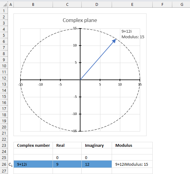
The IMABS function calculates the absolute value (modulus) of a complex number in x + yi or x + yj text format.
A complex number consists of an imaginary number and a real number, complex numbers let you solve polynomial equations using imaginary numbers if no solution is found with real numbers. It has applications in engineering such as electronics, electromagnetism, signal analysis, and more.
Table of Contents
1.1. Syntax
IMABS(inumber)
1.2. Arguments
| inumber | Required. A complex number in x+yi or x+yj text format. |
1.3. Example

The IMABS function calculates the modulus of a complex number, IMABS probably stands for imaginary absolute. The absolute value is the same as the modulus.
The modulus of a complex number is the distance of the complex number from the origin in the complex plane. It is the square root of the sum of the squares of the real part and the imaginary part of the complex number. If the complex number is Z then the modulus is denoted |Z|.
The image above shows a chart of the complex plane, complex number 9+12i is the blue line ending with an arrow. The complex plane has an imaginary axis and a real axis, the dashed circle shows the modulus value when it crosses both the imaginary axis and the real axis.
Formula:
The formula calculates the modulus based on the value in cell C26 which is "9+12i" in this example. The formula returns 15 which the dashed circle also shows when it crosses the imaginary and real axis. Section 4 below explains in greater detail how the IMABS function calculates the modulus.
The modulus is needed when you want to:
- convert complex numbers from rectangular form to polar form or vice versa.
- compare sizes or magnitudes of different complex numbers.
- calculate the distance between two complex numbers
1.3.1 Explaining formula
Step 1 - Populate arguments
IMABS(inumber)
becomes
IMABS(C26)
Step 2 - Evaluate IMABS function
IMABS(C26)
becomes
IMABS("9+12i")
and returns 15.
1.4. How is the modulus calculated in detail?
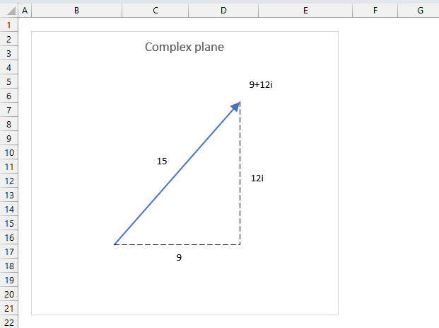
The formula to calculate the absolute value or modulus z from a complex number is based on the Pythagorean theorem.
z2 = x2+y2
The IMABS function calculates the absolute value using this formula which is based on the Pythagorean theorem:
IMABS(z) = |z| =√(x2+y2)
x is the real coefficient and y is the imaginary coefficient of the complex number.
The modulus of a complex number is how far it is from the point where the real and imaginary axes cross (0,0). It is the square root of the real part squared plus the imaginary part squared.
Here is how the modulus is calculated for complex number 9+12i:
z = x + yi
z = 9 + 12i
IMABS(z) = |z| =√(x2+y2)
IMABS(z) = |z| =√(92+122)
IMABS(z) = |z| =√(81+144)
IMABS(z) = |z| =√225
IMABS(z) = |z| =15
1.5. How imaginary numbers were invented
1.6. How to convert complex numbers to polar form?
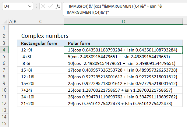
Formula in cell D4:
Complex numbers are usually presented in this form
z = x + yi
or
z = x + yj
However, complex numbers can also be represented in polar form:
z = r*(cos θ + isin θ)
In other words, theta θ in the polar form is calculated using the IMARGUMENT based on complex numbers.
Pythagorean Theorem
r2 = x2 + y2
To calculate the absolute value we can use this formula:
r = √(x2+y2)
Excel has a function that does this for you, the IMABS function calculates the absolute value based on complex numbers.
Explaining formula
Step 1 - Calculate theta θ
The IMARGUMENT function calculates theta θ which is an angle displayed in radians based on complex numbers in rectangular form.
Function syntax: IMARGUMENT(inumber)
IMARGUMENT(C4)
becomes
IMARGUMENT("12+9i")
and returns
0.643501108793284
Step 2 - Calculate the absolute value
The IMABS function calculates the absolute value (modulus) of a complex number in x + yi or x + yj text format.
Function syntax: IMABS(inumber)
IMABS(C4)
becomes
IMABS("12+9i")
and returns
15
Step 3 - Join calculations with text
The ampersand character lets you concatenate values in an Excel Formula.
IMABS(C4)&"(cos "&IMARGUMENT(C4)&" + isin "&IMARGUMENT(C4)&")"
Step 4 - Evaluate the formula
IMABS(C4)&"(cos "&IMARGUMENT(C4)&" + isin "&IMARGUMENT(C4)&")"
becomes
15&"(cos "&0.643501108793284&" + isin "&0.643501108793284&")"
and returns
15(cos 0.643501108793284 + isin 0.643501108793284)
Useful links
2. How to use the IMAGINARY function
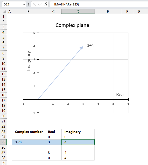
The IMAGINARY function calculates the imaginary number of a complex equation in x + yi or x + yj text format.
The letter j is used in electrical engineering to distinguish between the imaginary value and the electric current.
Table of Contents
2.1. Syntax
IMAGINARY(inumber)
2.2. Arguments
| inumber | Required. A complex number in x+yi or x+yj text format. |
2.3. Example

A complex number consists of an imaginary number and a real number, complex numbers let you solve polynomial equations using imaginary numbers if no solution is found with real numbers.
A complex number in rectangular form can be described as z = x + yi or z = x + yj text form in Excel. The IMAGINARY function extracts the imaginary value from the complex number.
Formula in cell D3:
The imaginary coefficient is the number ending with a i or j, this number is what the IMAGINARY function extracts from a complex number.
2.3.1 Explaining formula
Step 1 - Populate arguments
IMAGINARY(inumber)
becomes
IMAGINARY(B25)
Step 2 - Evaluate IMAGINARY function
IMAGINARY(C3)
becomes
IMAGINARY("3+4i")
and returns 4.
2.4. When to use the IMAGINARY function?
Use the IMAGINARY function when you want to
- add, subtract, multiply and divide complex numbers.
- calculate the modulus which is the distance from the origin to the point representing the complex number.
- graph complex numbers
- calculate the complex determinant of a 2x2 matrix
The links above points to articles explaining how to manually calculate these properties, however, Excel has functions so you don't need to calculate them manually:
IMSUM | IMSUB | IMPRODUCT | IMDIV | IMARGUMENT | IMABS
2.5. How to plot the imaginary part of a complex number on a chart

The chart above shows how to represent the complex number “3+4i” on the complex plane. The complex plane has two axes: the x-axis is for real numbers and the y-axis is for imaginary numbers. The blue line with an arrow points from the origin (0,0) to (3,4), which is the location of “3+4i” on the plane.
The horizontal dashed line marks the imaginary part of the complex number “3+4i” on the y-axis. The IMAGINARY function can extract the real part from any complex number, which is useful for plotting complex numbers on charts.
A complex number has both a real part and an imaginary part, and we need both of them to plot a complex number on the plane.
2.5.1 Calculate the real and imaginary parts of a complex number
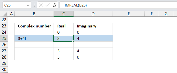
To plot a complex number on the complex plane, we have to find its real and imaginary parts separately. Cell B25 has the complex number in rectangular form.
Formula in cell C25:
The IMREAL function extracts the real number from the complex number in cell B25.
Formula in cell D25:
The IMAGINARY function extracts the imaginary number from the complex number in cell B25.
To plot a line, we need to use coordinates from the origin (0,0), so I have entered 0 (zero) in cells C24 and D24. The scatter chart that we will create soon requires a blank row between the line coordinates to show two separate lines that are not connected.
The dashed line also needs two points on the chart to be displayed correctly. It starts from where the complex number is (3,4) and ends at the y-axis. The line is horizontal, so the end point must have an real part of 0 (zero).
2.5.2 Insert a scatter chart
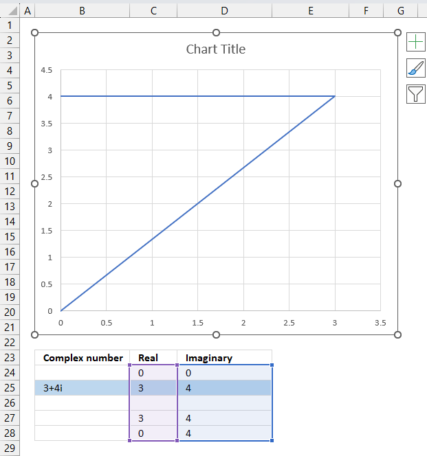
The following steps describe how to plot a complex number and the corresponding real number.
- Select cell range C24:D28.
- Go to tab "Insert" on the ribbon.
- Press with left mouse button on the "Insert Scatter (x,y) or Bubble chart" button.
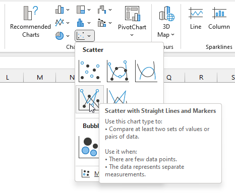
- A popup menu appears, press with left mouse button on the "Scatter with straight lines".
A chart shows up on the worksheet, move the chart to its desired location.
Change the chart so it shows the complex number as a line with an ending arrow, the imaginary number as a dashed line and so on. Here are detailed instructions:
How to plot theta θ - Argand diagram
Useful links
IMAGINARY function - Microsoft
3. How to use the IMARGUMENT function
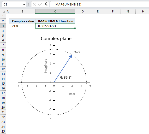
The IMARGUMENT function calculates the argument theta θ which is an angle displayed in radians based on complex numbers in rectangular form like z = x + yi or z = x + yj.
Table of Contents
3.1. Syntax
IMARGUMENT(inumber)
3.2. Arguments
| inumber | Required. A complex number in x+yi or x+yj text format. |
3.3. Example

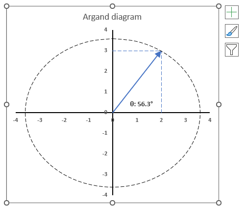
The image above shows how to calculate the θ with the IMARGUMENT function based on the corresponding complex numbers on the same row specified in cell B3. The dashed circle represents the complex modulus |z| of "2+3i" and the angle theta represents its complex argument.
Formula in cell C3:
The IMARGUMENT function returns a value expressed in radians, the image above shows a chart where theta θ is displayed in degrees.
3.3.1 Explaining formula
Step 1 - Populate arguments
IMARGUMENT(inumber)
becomes
IMARGUMENT(B3)
Step 2 - Evaluate IMARGUMENT function
IMARGUMENT(B3)
becomes
IMARGUMENT("2+3i")
and returns
0.982793723247329
3.4. How is the theta θ calculated in detail?

The IMARGUMENT function calculates theta θ expressed in radians using this formula:
θ = tan-1(y/x) for x>0
Here is how 0.982793723247329 is calculated:
tan θ = y/x
becomes
θ = tan-1(y/x)
tan-1(y/x)
becomes
tan-1(3/2)
equals
0.982793723247329
3.5. How to convert angle theta θ from radians to degrees

The following formula calculates theta θ based on a given complex number in rectangular form, the result is a value expressed in radians.
The DEGREE function takes the radian value and converts it to degrees.
Formula:
3.5.1 Explaining formula
Step 1 - Calculate theta θ in radians
The IMARGUMENT function calculates theta θ which is an angle displayed in radians based on complex numbers in rectangular form.
Function syntax: IMARGUMENT(inumber)
IMARGUMENT(B3)
becomes
IMARGUMENT("2+3i")
and returns
0.982793723247329
Step 2 - Convert radians to degrees
The DEGREES function calculates degrees from radians.
Function syntax: DEGREES(angle)
DEGREES(IMARGUMENT(B3))
becomes
DEGREES(0.982793723247329)
and returns
56.3099324740202
3.6. How to plot theta θ - Argand diagram
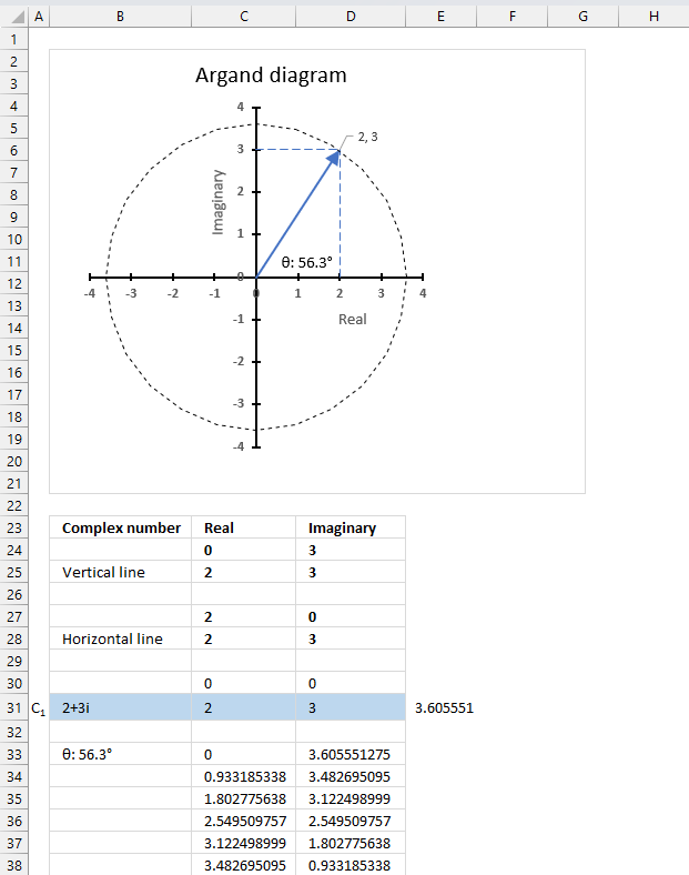
The image above shows an Argand diagram which is a chart of complex numbers, the dashed circle is the modulus of the complex numbers.
C1 = 2 +3i
|C1| = |2 +3i| = Modulus = square root of 13 = 3.605551
theta θ = tan-1(3/2) = 0.982793723247329 radians = 56.3099324740202 degrees
Change the complex number in cell B31 and the chart adjusts accordingly.
3.6.1 Calculate the numbers
We need to setup the worksheet before we can insert the scatter chart.
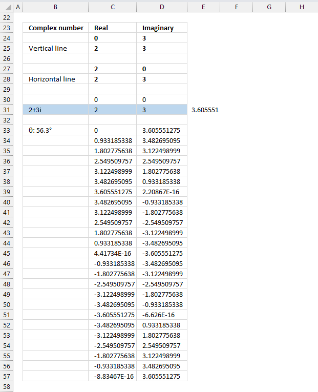
Value in cells C24, D27, C30, and D30: 0
Formula in cell D24, D25, D28, and D31:
Formula in cell C25. C27, C28, and C31:
Value in cell D27: 0
Value in cells C30 and D30: 0
Formula in cell B33:
3.6.2 Explaining formula in cell B33
The value in cell B33 will be used in the chart, I will show you how to do that below.
Step 1 - Calculate theta θ
The ATAN function calculates the arctangent of a number.
Function syntax: ATAN(number)
ATAN(D31/C31)
Step 2 - Convert radians to degree
The ATAN function calculates the arctangent of a number.
Function syntax: ATAN(number)
DEGREES(ATAN(D31/C31))
Step 3 - Round degrees to one digit
The ATAN function calculates the arctangent of a number.
Function syntax: ATAN(number)
ROUND(DEGREES(ATAN(D31/C31)),1)
Step 4 - Concatenate values
"θ: "&ROUND(DEGREES(ATAN(D31/C31)),1)&"°"
3.6.3 Create values for a circle on the chart
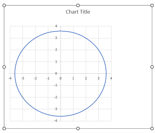
The following formulas in cells C33 and D33 calculates values that creates a circle on the chart, the image above shows a circle on a chart.
Formula in cell C33:
3.6.4 Explaining formula in cell C33
Step 1 - Calculate each 15 degree segment
The PI function returns the number pi (¶).
Function syntax: PI()
PI()/12
Step 2 - Create a sequence
The ROWS function calculate the number of rows in a cell range.
Function syntax: ROWS(array)
ROWS($A$1:A1)-1
Step 3 - Multiply segment with sequence
The ROWS function calculate the number of rows in a cell range.
Function syntax: ROWS(array)
PI()/12*(ROWS($A$1:A1)-1)
Step 4 - Calculate sine
The SIN function calculates the sine of an angle.
Function syntax: SIN(number)
SIN(PI()/12*(ROWS($A$1:A1)-1))
Step 5 - Calculate modulus
The IMABS function calculates the absolute value (modulus) of a complex number in x + yi or x + yj text format.
Function syntax: IMABS(inumber)
IMABS($B$31)
Step 6 - Multiply sine with modulus
SIN(PI()/12*(ROWS($A$1:A1)-1))*IMABS($B$31)
Formula in cell D33:
The formula in cell D33 is the same as in cell C33, except it calculates the cosine instead.
The cos function calculates the cosine of an angle.
Function syntax: COS(number)
Copy cells C33 and D33, paste to 24 rows below so the entire circle can be charted.
3.6.5 Insert "Scatter with smooth lines" chart
- Select cell range B24:D57.
- Go to tab "Insert" on the ribbon.
- Press with left mouse button on the "Scatter (x,y) or Bubble chart" button on the ribbon.
- A popup menu appears. Press with left mouse button on the "Scatter with smooth lines" button.
A new chart is now created. Move the chart to the desired location.
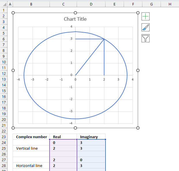
Select the chart, the boundaries now have "handles" that you can drag with the mouse to resize the chart.
- Double-press with left mouse button on the circle to select all lines on the chart and open the settings pane.
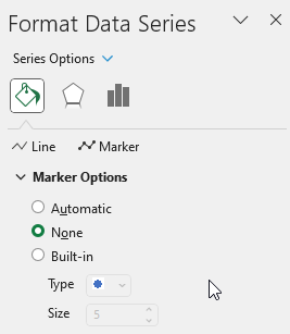
- Press with left mouse button on the "Fill & Line" button on the settings pane.
- Press with left mouse button on the "Line" on the settings pane, new settings in context to "Line" shows up.
- Press with left mouse button on the "Dash type" button, select a dashed line.
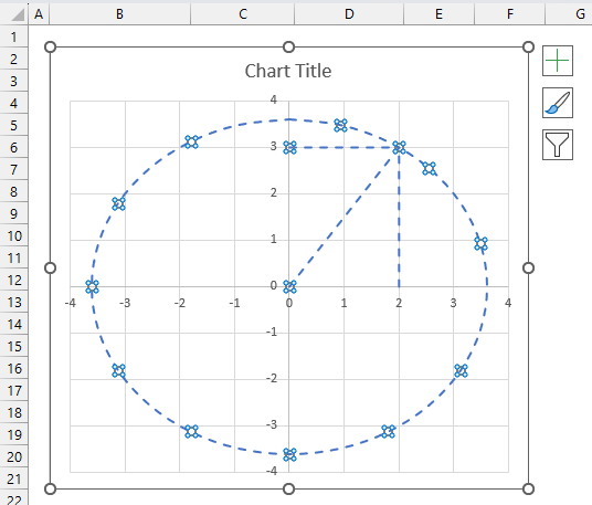
- All lines are now dashed. Press with left mouse button on the "Color" button and change to black.
3.6.6 Change the complex number line on the chart
- Select only the "complex number" line. Press with left mouse button on the "complex number" line once to select it if you have all lines selected.
If no lines are selected then press with left mouse button on the "complex number" line twice to select it. - Press with left mouse button on the "Line" on the settings pane. Change color, dash type and add an ending arrow.
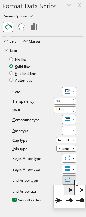
- Repeat these steps for the imaginary and real lines.
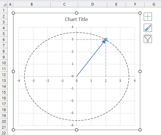
Change the chart tite, use the settings pane to change the axis line widths and colors, remove chart grids.
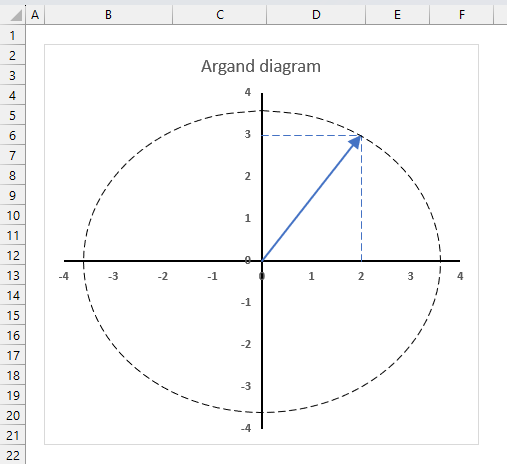
- Select the "complex number" line (blue).
- Press with left mouse button on the "plus" sign next to the chart.
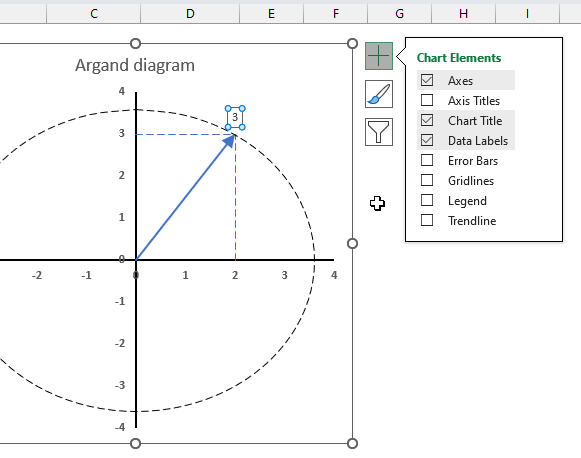
- Press with left mouse button on the check box next to "Data Labels" to enable data labels.
- Open the settings pane.
- Go to "Label options"
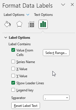
- Press with left mouse button on checkbox next to "Value From Cells", select cell B33.
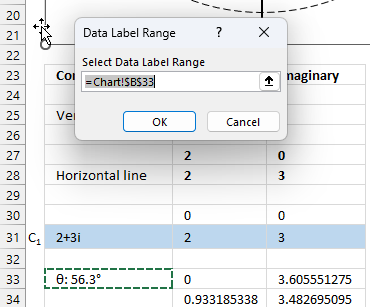
- Move the data label to its destination.
Useful links
IMARGUMENT function - Microsoft
Argument of a complex number
What Is Argument Of Complex Number?
4. How to use the IMCONJUGATE function
The IMCONJUGATE function calculates the complex conjugate of a complex number in x + yi or x + yj text format.
The letter j is used in electrical engineering to distinguish between the imaginary value and the electric current.
Table of Contents
4.1. Syntax
IMCONJUGATE(inumber)
4.2. Arguments
| inumber | Required. A complex number in x+yi or x+yj text format. |
4.3. Example

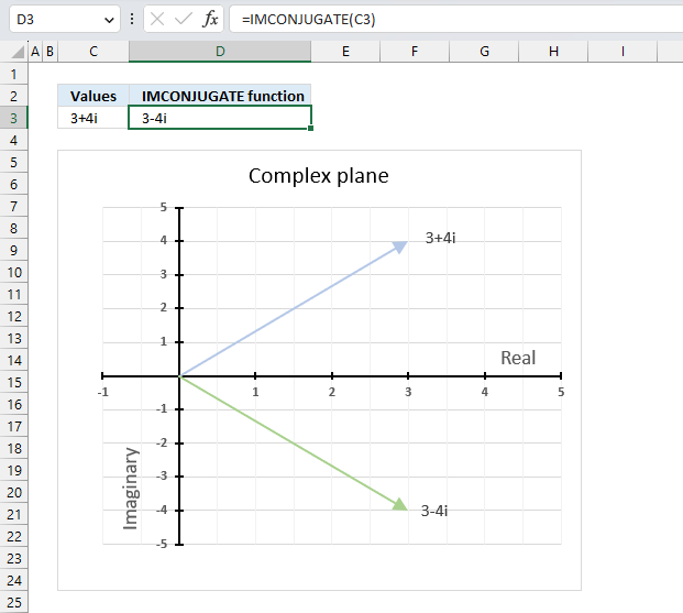
The image above demonstrates a formula in cell D3 that calculates the complex conjugate of a complex number specified in cell C3. The chart shows the complex number 3+4i on the complex plane, it also shows the complex conjugate of 3+4i which is 3-4i.
Formula in cell D3:
4.3.1 Explaining formula
Step 1 - Populate arguments
IMCONJUGATE(inumber)
becomes
IMCONJUGATE(C3)
Step 2 - Evaluate IMCONJUGATE function
IMCONJUGATE(C3)
becomes
IMCONJUGATE("3+4i")
and returns
"3-4i".
4.4. How is the complex conjugate calculated?

The complex conjugate is calculated by changing the sign of the imaginary value of a complex number. The real part and the imaginary part are equal in magnitude however the imaginary part is opposite in sign.
IMCONJUGATE(x+yi) = z̄ = (x-yi)
The complex conjugate is often denoted as z̄.
Z = x+yi
z̄ = x-yi
4.5. How to calculate the product of a complex number and its complex conjugate
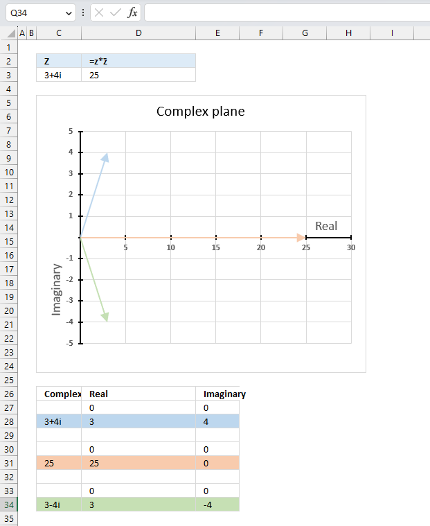
The product of a complex number and its conjugate is a real number.
z*z̄ = |z|^2
z*z̄ = (3+4i)*(3-4i) = 9-12i+12i+16 = 25
|z|^2 = 5^2 = 25
Formula in cell D3:
The image above shows a chart that has a complex number, its complex conjugate and the product plotted on a complex plane. The light blue line is the complex number, the green line is its complex conjugate and the orange line is the product of those two complex numbers.
4.5.1 Explaining formula in cell D3
Step 1 - Calculate the complex conjugate
The IMCONJUGATE function calculates the complex conjugate of a complex number in x + yi or x + yj text format.
Function syntax: IMCONJUGATE(inumber)
IMCONJUGATE(B25)
becomes
IMCONJUGATE("3+4i")
and returns
"3-4i"
Step 2 - Calculate the product of a complex number and its complex conjugate
The IMPRODUCT function calculates the product of complex numbers in x + yi or x + yj text format.
Function syntax: IMPRODUCT(inumber1, [inumber2], ...)
IMPRODUCT(B25,IMCONJUGATE(B25))
becomes
IMPRODUCT("3+4i","3-4i")
and returns 25.
4.6. How to calculate the modulus of a complex conjugate
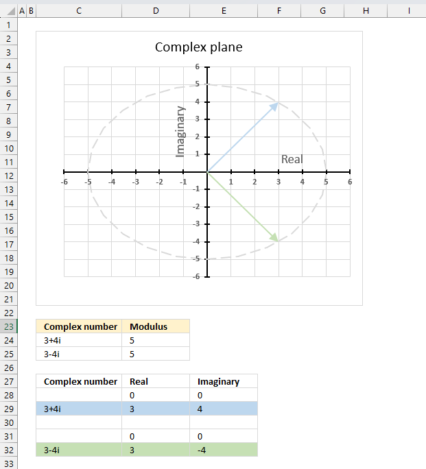
The conjugate of a complex number z̄ has the same modulus as the complex number z.
|z̄| = |z|
The image above shows the modulus as a grey dashed circle on the chart, both the complex number and its complex conjugate has the same modulus.
Formula in cell C24:
IMABS(B24)
Formula in cell B25:
Formula in cell C25:
The formulas above also show that the modulus of a complex number is the same as the modulus of its complex conjugate. Cell C24 contains "3+4i", the complex conjugate is "3-4i" displayed in cell B25. The modulus is 5 for both the complex number and its complex conjugate.
4.7. How to calculate the conjugate of a conjugate complex number
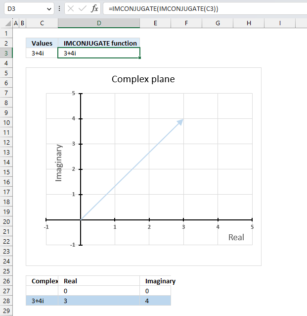
The conjugate of a conjugate of a complex number is the original complex number,
Formula in cell D3:
The above formula demonstrates that it is the original complex number. Cell C3 contains the original complex number, cell D3 contains a formula that calculates the conjugate of a conjugate of the complex number in cell C3. The result is the exact same complex number.
Explaining formula
Step 1 - Calculate the complex conjugate
The IMCONJUGATE function calculates the complex conjugate of a complex number in x + yi or x + yj text format.
Function syntax: IMCONJUGATE(inumber)
IMCONJUGATE(C3)
becomes
IMCONJUGATE("3+4i")
and returns
"3-4i"
Step 2 - Calculate the complex conjugate
The IMCONJUGATE function calculates the complex conjugate of a complex number in x + yi or x + yj text format.
Function syntax: IMCONJUGATE(inumber)
IMCONJUGATE(IMCONJUGATE(C3))
becomes
IMCONJUGATE("3-4i")
and returns "3+4i"
Useful links
IMCONJUGATE function - Microsoft
Complex Conjugate
Complex conjugate - wikipedia
5. How to use the IMCOS function
What is the IMCOS function?
The IMCOS function calculates the cosine of a complex number in x + yi or x + yj text format.
The letter j is used in electrical engineering to distinguish between the imaginary value and the electric current.
What is the cosine?
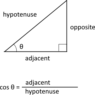
The cosine is a trigonometric function that relates to an angle θ in a right triangle to the ratio of the length of the side adjacent the angle and the length of the longest side (hypotenuse) of the triangle. A right triangle has one angle that measures 90° or π/2 radians which is approximately 1.5707963267949 radians.
What is the difference between sine and the complex sine?
The difference between cosine and complex cosine is that the former is defined for real numbers only, while the latter is defined for complex numbers as well. The cosine of a complex number has some similarities to the cosine of a real number, such as periodicity.
The cosine function is periodic considering the angle, meaning it repeats its values after a certain interval. The period of the cosine function is 2π or 360 degrees.
cosine z = (eiz + e-iz)/2
z - complex number
i - imaginary unit
Table of Contents
5.1. Syntax
IMCOS(inumber)
5.2. Arguments
| inumber | Required. A complex number in x+yi or x+yj text format. |
5.3. Example

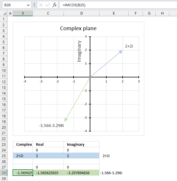
The image above demonstrates a formula in cell B28 that calculates the cosine of a complex number specified in cell B25.
Cell C28 calculates the real number from the complex number in cell B28. Cell D28 extracts the imaginary number from the complex number specified in cell B28.
The real and imaginary numbers separated in a cell each allow us to graph the complex number on the complex plane.
Formula in cell B28:
5.3.1 Explaining formula
Step 1 - Populate arguments
IMCOS(inumber)
becomes
IMCOS(B25)
Step 2 - Evaluate IMCOS function
IMCOS(B25)
becomes
IMCOS("2+2i")
and returns
-1.56562583531574-3.29789483631124i
5.4. How is the IMCOS function calculated in detail?

The cosine of a complex number is calculated like this:
C = x + yi
cos(C) = cos(x)*cosh(y) - sin(x)*sinh(y)i
For example, C=2+2i
cos(2+2i) = cos(2) cosh(2) - sin(2) sinh(2)i
becomes
cos(2+2i) = -0.416146836547142*3.76219569108363 + 0.909297426825682*3.62686040784702i
equals
cos(2+2i) = -1.56562583531574 - 3.29789483631124i
sin - calculates the sine of a number
cos - calculates the cosine of a number
cosh - calculates the hyperbolic cosine of a number
sinh - calculates the hyperbolic sine of a number
5.5. Function not working - #NUM error
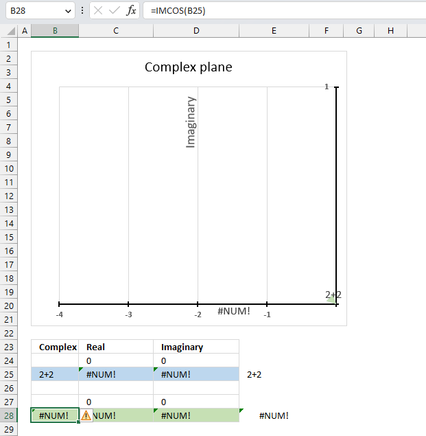
The IMCOS function returns a #NUM error if the provided argument is not a valid complex number. The image above shows a worksheet with an invalid complex number specified in cell B25: 2+2
Excel needs an i or j in the complex number to work properly, correct the mistake and the IMCOS function will work again.
Useful links
IMCOS function - Microsoft
The Complex Cosine and Sine Functions - Mathonline
Cosine of Complex Number - Proofwiki
6. How to use the IMCOSH function
What is the IMCOSH function?
The IMCOSH function calculates the hyperbolic cosine of a complex number in x + yi or x + yj text format.
The letter j is used in electrical engineering to distinguish between the imaginary value and the electric current.
What is the hyperbolic cosine?
Hyperbolic functions are similar to ordinary trigonometric functions, but they use a different shape to define them.
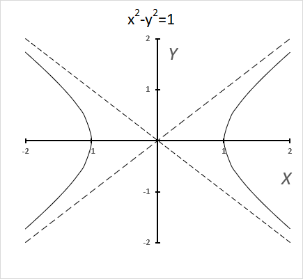
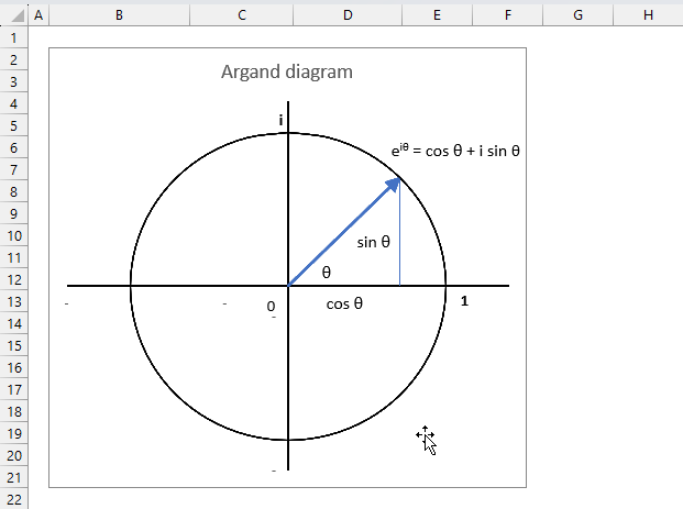
Trigonometric functions use a circle, while hyperbolic functions use a hyperbola. The chart above shows a hyperbola and two asymptotes (dashed lines) where the intersection is at the center of the hyperbola. The chart below shows a circle containing the trigonometric functions.
What is a hyperbola?
The equation of a hyperbola with a horizontal axis is
(x2/ a2) - (y2 / b2) = 1
where a and b are positive constants.
A circle has a constant distance from the center point, while a hyperbola is a curve that has two focus points (+ae, 0), and (-ae, 0).
What is the difference between hyperbolic cosine and complex hyperbolic cosine?
The difference between hyperbolic cosine and hyperbolic cosine for complex numbers is that the former is defined for real numbers, while the latter is defined for complex numbers.
The hyperbolic cosine of a real number x is defined as
cosh(x) = (ex + e-x)/2
Natural number e is the base of the natural logarithm.
The complex hyperbolic cosine of a complex number z = x + yi is defined as cosh(z) = cosh(x)cos(y) + i sinh(x)sin(y)
Complex numbers has i as the imaginary unit.
Table of Contents
6.1. Syntax
IMCOSH(inumber)
6.2. Arguments
| inumber | Required. A complex number in x+yi or x+yj text format. |
6.3. Example

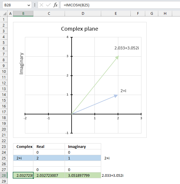
The image above demonstrates a formula in cell B28 that calculates the hyperbolic cosine of a complex number specified in cell B25.
Cell C28 calculates the real number from the complex number in cell B28. Cell D28 extracts the imaginary number from the complex number specified in cell B28.
The real and imaginary numbers separated in a cell each allow us to graph the complex number on the complex plane.
Formula in cell B28:
The chart above shows the complex plane, the y-axis is the imaginary axis and the x-axis is the real axis.
Complex number 2+i is the light blue line in the first quadrant. The hyperbolic cosine of 2+i is the green line also shown in the first quadrant.
6.3.1 Explaining formula
Step 1 - Populate arguments
IMCOSH(inumber)
becomes
IMCOSH(B25)
Step 2 - Evaluate the IMCOSH function
IMCOSH(B25)
becomes
IMCOSH("2+i")
and returns
2.03272300701967+3.0518977991518i
6.4. How the IMCOSH function is calculated in detail

The hyperbolic cosine of a complex number is calculated like this:
C = x + yi
cosh(x + yi) = cosh(x)*cos(y) + isinh(x)*sin(y)
For example, C=2+i
cosh(2 + i) = cosh(2)*cos(1) + isinh(2)*sin(1)
becomes
cosh(2 + i) = 3.76219569108363*0.54030230586814 + 3.62686040784702*0.841470984807897i
equals
cosh(2 + i) = 2.03272300701967+3.0518977991518i
6.5. Function not working
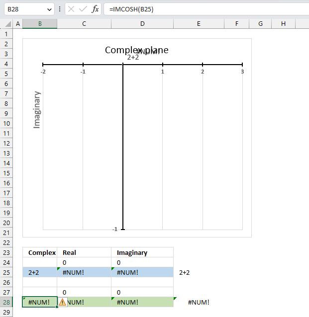
The IMCOSH function returns a #NUM error if the provided argument is not a valid complex number.
Useful links
IMCOSH function - Microsoft
Hyperbolic functions for complex numbers
Hyperbolic functions – Graphs, Properties, and Examples
Hyperbolic curve fitting in Excel
7. How to use the IMCOT function
The IMCOT function calculates the cotangent of a complex number in x + yi or x + yj text format.
The letter j is used in electrical engineering to distinguish between the imaginary value and the electric current.
What are complex numbers?
What is a cotangent?
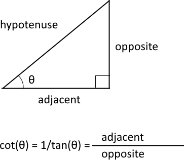
The trigonometric cotangent is a function that relates an angle of a right-angled triangle to the ratio of adjacent side and the opposite side. It is also the inverse of the tangent, cot(θ) = 1/tan(θ).
What is the difference between cotangent and complex cotangent?
The difference between cotangent and cotangent for complex numbers is that the former is defined for real numbers, while the latter is defined for complex numbers.
The cotangent of a real number x is defined as cot(x) = i(eiθ + e-iθ)/(eiθ - e-iθ)
Natural number e is the base of the natural logarithm.
The complex cotangent of a complex number z = x + yi is defined as cot(x + yi) = (cosh(x)*cosh(y) - isin(x)*sinh(y)) / (sin(x)*cosh(y) + icos(x)*sinh(y))
Complex numbers has i as the imaginary unit.
Table of Contents
7.1. Syntax
IMCOT(inumber)
7.2. Arguments
| inumber | Required. A complex number in x+yi or x+yj text format. |
7.3. Example

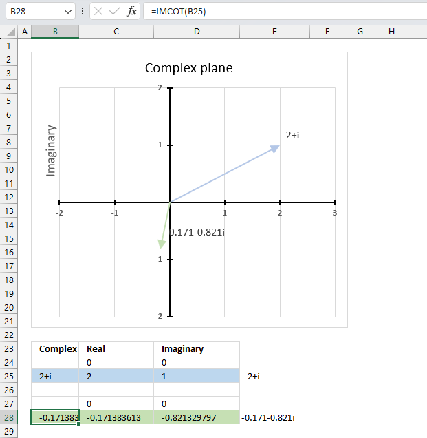
The image above shows a formula in cell B28 that calculates the cotangent of a complex number specified in cell B25.
Cell C28 calculates the real number from the complex number in cell B28. Cell D28 extracts the imaginary number from the complex number specified in cell B28.
The real and imaginary numbers separated in a cell each allow us to graph the complex number on the complex plane.
Formula in cell B28:
The chart above shows the complex plane, the y-axis is the imaginary axis and the x-axis is the real axis.
Complex number 2+i is the light blue line in the first quadrant. The cotangent of 2+i is the green line located in the third quadrant.
7.3.1 Explaining formula
Step 1 - Populate arguments
IMCOT(inumber)
becomes
IMCOT(B25)
Step 2 - Evaluate the IMCOT function
IMCOT(C3)
becomes
IMCOT("2+i")
and returns
-0.171383612909185-0.821329797493852i
7.4. How is the IMCOT function calculated in detail?

The cotangent of a complex number is calculated like this:
cot(x + yi) = (cos(x)*cosh(y) - isin(x)*sinh(y)) / (sin(x)*cosh(y) + icos(x)*sinh(y))
For example, C=2+i
cot(2+i) = (cos(2)*cosh(1) - isin(2)*sinh(1)) / (sin(2)*cosh(1) + icos(2)*sinh(1))
becomes
cot(2+i) = (-0.416146836547142*1.54308063481524 - i0.909297426825682*1.1752011936438) / (0.909297426825682*1.54308063481524 + i-0.416146836547142*1.1752011936438)
becomes
cot(2+i) = (-0.64214812471552 - i1.06860742138278) / (1.40311925062204 + i-0.489056259041294)
equals
-0.171383612909184-0.821329797493853i
7.5. Function not working - #NUM error
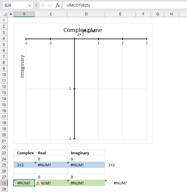
The IMCOT function returns a #NUM error if the provided argument is not a valid complex number.
Useful links
IMCOT function - Microsoft
Cotangent of Complex Number
How to find cotangent of complex numbers
8. How to use the IMCSC function
The IMCSC function calculates the cosecant of a complex number in x + yi or x + yj text format.
The letter j is used in electrical engineering to distinguish between the imaginary value and the electric current.
What is a complex number?
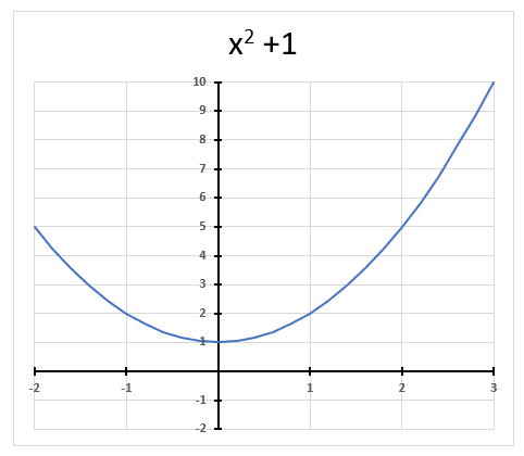
A complex number contains a real and imaginary value, they let you for example solve equations with no real solutions like x2 + 1 = 0 The chart above shows x2 + 1 = 0 and it never touches the x-axis.
However, mathematicians invented the imaginary number and named it i, it extends into the complex plane and lets you solve equations using imaginary numbers.
What is the cosecant?
The cosecant is one of the six trigonometric functions, it is the multiplicative inverse of the sine function. This means that it is equal to 1 divided by the sine of a given angle θ.
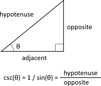
The cosecant is csc θ = 1 / sin θ. In a right-angled triangle, the cosecant of an angle θ is equal to the hypotenuse divided by the opposite side.
What is the complex cosecant?
The complex cosecant is the extension of the cosecant function to the complex plane. It is defined as the reciprocal or the multiplicative inverse of the complex sine function, which means that it is equal to 1 divided by the sine of a complex number.
csc z = 1 / sin z, where z is a complex number.
The complex sine function can be expressed using the ordinary sine and cosine functions and the hyperbolic functions.
sin (x+yi) = sin x cosh y + i cos x sinh y
Table of Contents
8.1. Syntax
IMCSC(inumber)
8.2. Arguments
| inumber | Required. A complex number in x+yi or x+yj text format. |
8.3. Example

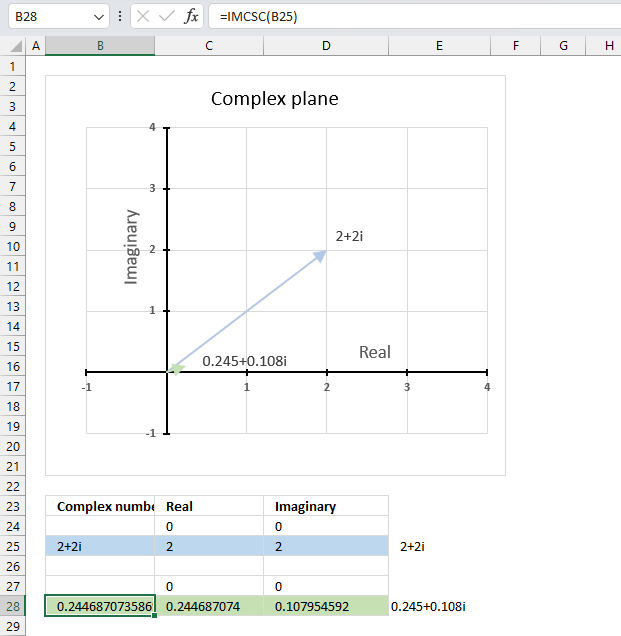
The image above demonstrates a formula in cell B28 that calculates the cosecant of a complex number specified in cell B25.
Cell C28 calculates the real number from the complex number in cell B28. Cell D28 extracts the imaginary number from the complex number specified in cell B28.
The real and imaginary numbers separated in a cell each allow us to graph the complex number on the complex plane.
Formula in cell D3:
The chart above shows the complex plane, the y-axis is the imaginary axis and the x-axis is the real axis.
Complex number 2+2i is the light blue line in the first quadrant. The cosecant of 2+2i is the small green line also displayed in the first quadrant.
8.3.1 Explaining formula
Step 1 - Populate arguments
IMCSC(inumber)
becomes
IMCSC(B25)
Step 2 - Evaluate the IMCSC function
IMCSC(B25)
becomes
IMCSC("2+2i")
and returns
0.244687073586957+0.107954592221385i
8.4. How is the IMCSC function calculated in detail?

The cosecant of a complex number is calculated like this:
C = x + yi
csc(C) = (sin(x)*cosh(y) - icos(x)*sinh(y)) / (sin²(x)*cosh²(y) + icos²(x)*sinh²(y))
For example, C = 2 + 2i
csc(2+2i) = (sin(2)*cosh(2) - icos(2)*sinh(2)) / (sin²(2)*cosh²(2) + icos²(2)*sinh²(2))
becomes
csc(2+2i) = (3.42095486111701 - (-1.50930648532362i)) / 13.9809382284401
equals
csc(2+2i) = 0.244687073586957+0.107954592221385i
8.5. IMCSC function not working
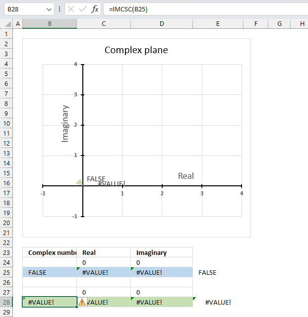
The IMCSC function returns a #VALUE! error if the argument is a boolean value.
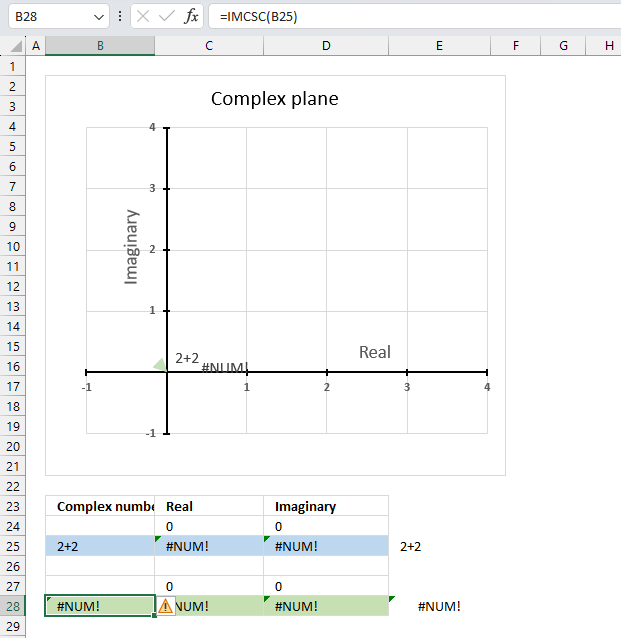
The IMCSC function returns a #NUM! error if the argument is an invalid complex number. The i is missing in cell B25 shown in the image above.
Useful links
IMCSC function - Microsoft
Cosecant of Complex Number
Trigonometric functions - Wikipedia
9. How to use the IMCSCH function
What is the IMCSCH function?
The IMCSCH function calculates the hyperbolic cosecant of a complex number in x + yi or x + yj text format.
The letter j is used in electrical engineering to distinguish between the imaginary value and the electric current.
What is a complex number?

A complex number contains a real and imaginary value, they let you for example solve equations with no real solutions like x2 + 1 = 0 The chart above shows x2 + 1 = 0 and it never touches the x-axis.
However, mathematicians discovered the imaginary number i that solves equations into the complex plane.
What is the hyperbolic cosecant?
Hyperbolic functions are similar to ordinary trigonometric functions, but they use a different shape to define them.

Trigonometric functions use a circle, while hyperbolic functions use a hyperbola. The chart above shows a hyperbola and two asymptotes (dashed lines) where the intersection is at the center of the hyperbola. The chart below shows a circle containing the trigonometric functions.

Table of Contents
9.1. Syntax
IMCSCH(inumber)
9.2. Arguments
| inumber | Required. A complex number in x+yi or x+yj text format. |
9.3. Example

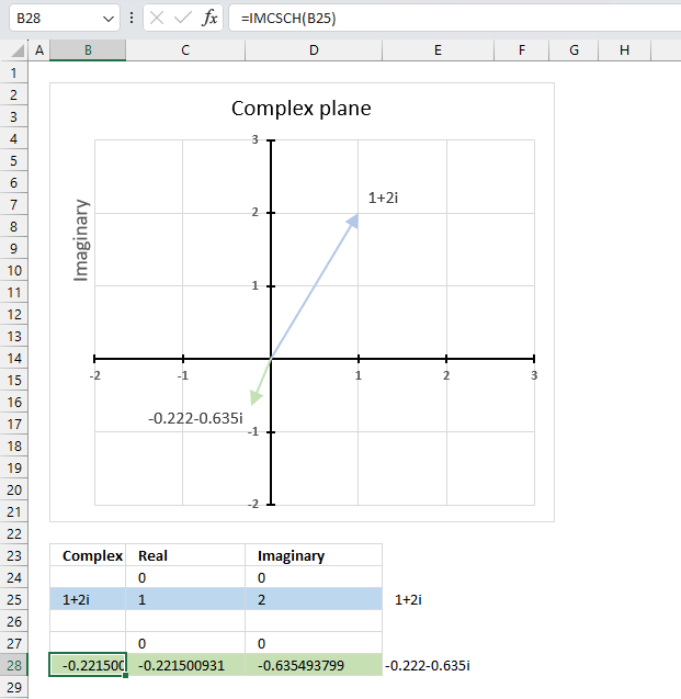
The image above demonstrates a formula in cell B28 that calculates the hyperbolic cosecant of a complex number specified in cell B25.
Cell C28 calculates the real number from the complex number in cell B28. Cell D28 extracts the imaginary number from the complex number specified in cell B28.
The real and imaginary numbers separated in a cell each allow us to graph the complex number on the complex plane.
Formula in cell D3:
The chart above shows the complex plane, the y-axis is the imaginary axis and the x-axis is the real axis.
Complex number 1+2i is the light blue line in the first quadrant. The hyperbolic cosecant of 1+2i is the green line displayed in the third quadrant.
9.3.1 Explaining formula
Step 1 - Populate arguments
IMCSCH(inumber)
becomes
IMCSCH(B25)
Step 2 - Evaluate the IMCSCH function
IMCSCH(B25)
becomes
IMCSCH("1+2i")
and returns
-0.221500930850509-0.6354937992539i
9.4. How is the IMCSCH function calculated in detail?

The hyperbolic cosecant of a complex number is calculated like this:
csch(x + yi) = sinh(x)*cos(y) - icosh(x)*sin(y) / (sinh2(x)*cos2(y)+cosh2(x)*sin2(y))
For example, C=1+2i
csch(1 + 2i) = sinh(1)*cos(2) - icosh(1)*sin(2) / (sinh2(1)*cos2(2)+cosh2(1)*sin2(2))
becomes
csch(1 + 2i) = ( 1.1752011936438*-0.416146836547142 - i1.54308063481524*0.909297426825682 ) / (1.38109784554182*0.173178189568194+2.38109784554182*0.826821810431806)
becomes
csch(1 + 2i) = ( -0.489056259041293 - 1.40311925062204i ) / 2.20791965597362
equals
csch(1 + 2i) = -0.221500930850509-0.6354937992539i
9.5. Function not working
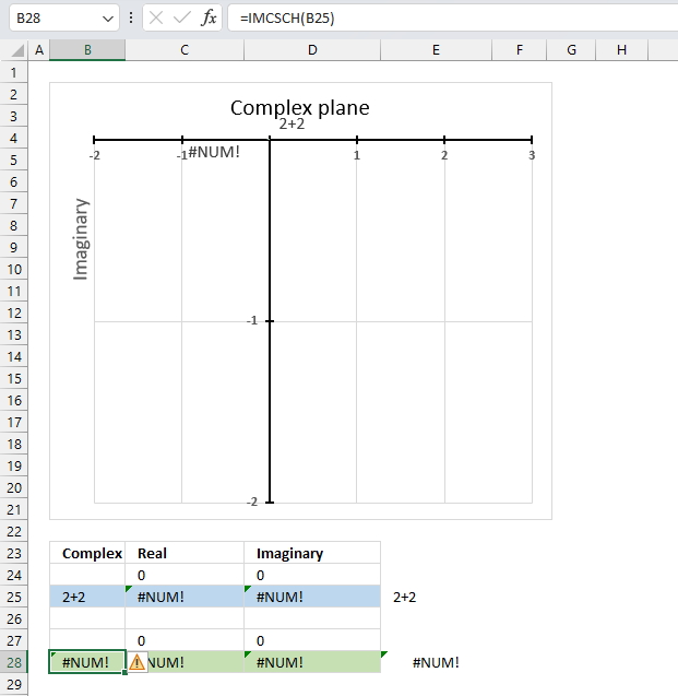
The IMCSCH function returns a #NUM! error if the provided argument is not a valid complex number.
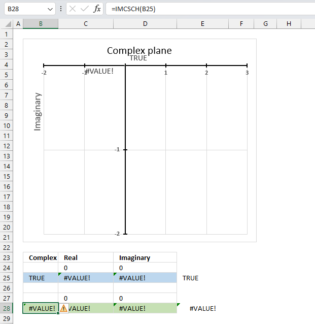
The IMCSCH function returns a #VALUE! error if the provided argument is a boolean value.
Useful links
IMCSCH function - Microsoft
Hyperbolic Cosecant of Complex Number
Hyperbolic functions
10. How to use the IMDIV function
The IMDIV function calculates the quotient of two complex numbers in x + yi or x + yj text format.
The quotient is the result of dividing one complex number inumber1 by another complex number inumber2. The numerator is inumber1 and the denominator is inumber2.
The letter j is used in electrical engineering to distinguish between the imaginary value and the electric current.
Table of Contents
10.1. Syntax
IMDIV(inumber1, inumber2)
10.2. Arguments
| inumber1 | Required. The complex numerator in x+yi or x+yj text format. |
| inumber2 | Required. The complex denominator in x+yi or x+yj text format. |
10.3. Example

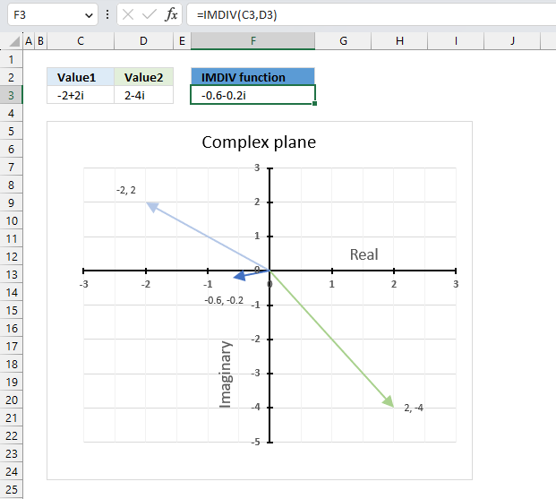
The image above demonstrates a formula in cell F3 that calculates the quotient of two complex numbers specified in cell C3 and D3 respectively.
The complex number in cell C3 is the numerator and the value in D3 is the denominator. The numerator and denominator are the top and bottom numbers of a fraction.
Formula in cell F3:
The IMDIV function divides one complex number by another complex number, the formula above divides the complex number in cell C3 by the complex number in cell D3.
The chart above shows complex numbers "-2+2i" and "2-4i" on the complex plane, the y-axis is the imaginary axis and the x-axis is the real axis.
10.3.1 Explaining formula
Step 1 - Populate arguments
IMDIV(inumber1, inumber2)
becomes
IMDIV(C3, D3)
Step 2 - Evaluate the IMDIV function
IMDIV(C3, D3)
becomes
IMDIV("-2+2i","2-4i")
and returns
-0.6-0.2i
Use the rectangular form when you want to perform addition, subtraction, multiplication, and division of complex numbers. Section 5 below demonstrates how to convert complex numbers in polar form to rectangular form.
10.4. How to perform division between two complex numbers

This example demonstrates how Excel calculates in detail the quotient between two complex numbers in rectangular form.
z1 is the light blue line on the chart, z2 is green line, and the quotient is the dark blue line.
z1 = a+ib
z2 = c+id
IMDIV(z1,z2) = (a+ib)/(c+id) = ((ac+bd) + (bc-ad)i)/(c2+d2)
To perform a complex division of two complex numbers we need to divide the dividend and the divisor to calculate the quotient.
z1 = -2+2i
z2 = 2-4i
IMDIV(z1,z2) = (-2+2i)/(2-4i) = ((-2*2+2*(-4)) + (2*2-(-2)*(-4))i)/(22+(-4)2) = (-12 + -4i)/20 = -0.6 - 0.2i
10.5. How to convert complex numbers from polar form to rectangular form
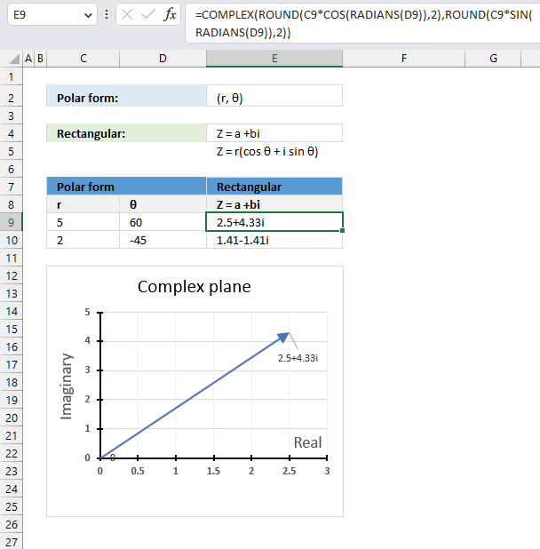
The polar form has an absolute value or modulus which is the distance from the origin to a +bi. The θ is the angle of direction.
The following math formula allows us to calculate the complex value in rectangular form using the modulus and the θ:
Z = r(cos θ + isin θ)
This part calculates the real value: r*cos θ and this part calculates the imaginary value: r*i*sin θ
Formula in cell E9 calculates the complex values in rectangular form with Excel functions:
The result is obtained with a two-digit approximation, you can change the argument in the ROUND functions or remove the ROUND functions altogether from the formula to get a more accurate result.
Explaining formula in cell E9
Step 1 - Convert degrees to radians
The RADIANS function converts degrees to radians.
Function syntax: RADIANS(angle)
RADIANS(D9)
becomes
RADIANS(60)
and returns
1.0471975511966
Step 2 - Calculate cosines for θ
The COS function calculates the cosine of an angle.
Function syntax: COS(number)
COS(RADIANS(D9))
becomes
COS(1.0471975511966)
and returns
0.5
Step 3 - Multiply magnitude with cosines for θ
C9*COS(RADIANS(D9))
becomes
5*0.5
equals 2.5
Step 4 - Round to two digits
The ROUND function rounds a number based on the number of digits you specify.
Function syntax: ROUND(number, num_digits)
ROUND(C9*COS(RADIANS(D9)),2)
becomes
ROUND(2.5, 2)
and returns
2.5
Step 5 - Calculate sine for θ
The SIN function calculates the sine of an angle.
Function syntax: SIN(number)
SIN(RADIANS(D9))
becomes
SIN(1.0471975511966)
and returns
0.866025403784439
Step 6 - Multiply magnitude with sine for θ
C9*SIN(RADIANS(D9))
becomes
5*0.866025403784439
and returns
4.33012701892219
Step 7 - Round to two digits
The ROUND function rounds a number based on the number of digits you specify.
Function syntax: ROUND(number, num_digits)
ROUND(C9*SIN(RADIANS(D9)),2)
becomes
ROUND(4.33012701892219,2)
and returns
4.33
Step 8 - Calculate complex numbers
The COMPLEX function returns a complex number based on a real and imaginary number.
Function syntax: COMPLEX(real_num, i_num, [suffix])
COMPLEX(ROUND(C9*COS(RADIANS(D9)),2),ROUND(C9*SIN(RADIANS(D9)),2))
becomes
COMPLEX(2.5,4.33)
and returns
2.5+4.33i
Useful links
IMDIV function - Microsoft
Complex number
Dividing Complex Numbers
11. How to use the IMEXP function

The IMEXP function calculates the exponential of a complex number in x + yi or x + yj text format.
The letter j is used in electrical engineering to distinguish between the imaginary value and the electric current.
What is the exponential e?
Exponential e is an irrational number also called Euler's number. It is approximately 2.718
What is an irrational number?
It is a number that can't be expressed as a simple fraction, in other words, the number of decimals are infinite. Other examples are √2 and π.
Why is e called Euler's number?
Leonard Euler is the first one to use the exponential e in the 18-th century. e is also known as the base of natural logarithms which are logarithms to the base of e.
Why is e known as the base of natural logarithms?
The number e is known as the base of natural logarithms because the natural logarithm function is the inverse of the natural exponential function.
x = eln x or x = ln ex
In what applications are complex logarithms useful?
Many fields of mathematics and scientific disciplines use logarithms extensively.
- compound interest formulas
- exponential decay formulas
What is the exponential form?
Calculations with trigonometric functions and exponential functions of complex numbers become simpler with this form. It also demonstrates the connection between complex numbers and cyclical phenomena, such as waves and oscillations.
Z = re(iθ)
Table of Contents
11.1. Syntax
IMEXP(inumber)
11.2. Arguments
| inumber | Required. A complex number in x+yi or x+yj text format. |
11.3. Example
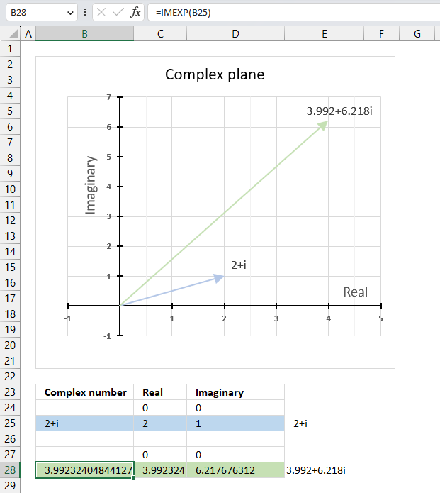
The image above demonstrates a formula in cell B28 that calculates the exponential of a complex number specified in cell B25.
Formula in cell B28:
The chart above demonstrates the complex plane, the y-axis the the imaginary axis and the x-axis is the real axis.
Complex number 2+i is the light blue line in the first quadrant. The exponential of 2+i is the green line also in the first quadrant.
11.3.1 Explaining formula
Step 1 - Populate arguments
IMEXP(inumber)
becomes
IMEXP(B25)
Step 2 - Evaluate the IMEXP function
IMEXP(B25)
becomes
IMEXP("2+i")
and returns
-3.99232404844127+6.21767631236797i
11.4. How is the exponential of a complex number calculated in detail?

The exponential of a complex number is calculated like this:
C = x + yi
IMEXP(C) = e(x+yi) = exeyi = ex(cos y + isin y)
For example, if C = 2+i then
IMEXP(C) = e(2+i) = e2ei = e2(cos 1 + isin 1)
e2(cos 1 + isin 1) = e2 * cos 1 + ie2 *sin 1
becomes
7.38905609893065*cos 1 + i7.38905609893065*sin 1
becomes
7.38905609893065*0.54030230586814 + i7.38905609893065*0.841470984807897
equals
3.99232404844127 + 6.21767631236797i
11.5. The exponential function of a complex number produces a wave
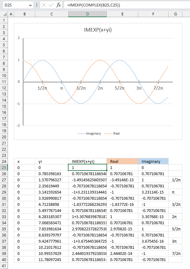
The image above demonstrates how the exponential function of a complex number results in a wave shown in the chart.
C=x+yi
The imaginary part starts with 0 (zero) in cell C25 and is increased by (1/2)π or 45 degrees for each cell below. The real number is always 0 (zero) in this example.
The IMEXP function calculates the exponential in cells D25 and below for each complex number and the result shows the real number and the imaginary number oscillating back and forth.
The chart shows the real numbers in orange and the imaginary numbers in light blue, the real axis displays radians in fractions of pi in steps of (1/2)π.
Useful links
IMEXP function - Microsoft
Exponential Form of a Complex Number
Euler's formula - Wikipedia
12. How to use the IMLN function

The IMLN function calculates the natural logarithm of a complex number in x + yi or x + yj text format.
The letter j is used in electrical engineering to distinguish between the imaginary value and the electric current.
What is a natural logarithm?
A natural logarithm is a logarithm with the base e, which is an irrational number approximately 2.7182818284591
Ln is the inverse of the natural exponential function e.
x = eln x or x = ln ex
x + yi= eln x+yi or x + yi = ln ex+yi
What is an irrational number?
It is a number that can't be expressed as a simple fraction, in other words, the number of decimals are infinite. Other examples of irrational numbers are √2 and π.
Table of Contents
12.1. Syntax
IMLN(inumber)
12.2. Arguments
| inumber | Required. A complex number in x+yi or x+yj text format. |
12.3. Example
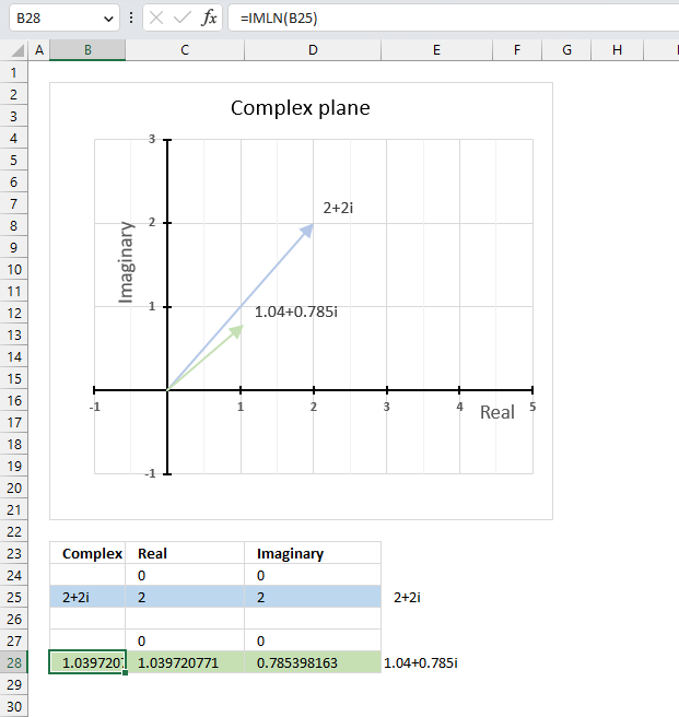
The image above demonstrates a formula in cell B28 that calculates the natural logarithm of a complex number specified in cell B25.
Formula in cell B28:
The chart above demonstrates the complex plane, the y-axis the the imaginary axis and the x-axis is the real axis.
Complex number 2+2i is the light blue line in the first quadrant. The natural logarithm of 2+2i is the green line also in the first quadrant.
12.3.1 Explaining formula
Step 1 - Populate arguments
IMLN(inumber)
becomes
IMLN(B25)
Step 2 - Evaluate the IMLN function
IMLN(B25)
becomes
IMLN("2+2i")
and returns
1.03972077083992+0.785398163397448i
12.4. How is the function calculated in detail?

The natural logarithm of a complex number is calculated like this:
C = x + yi
IMLN(C) =ln√(x2+y2)+ itan-1(y/x)
For example,
C=2+2i
IMLN(C) =ln√(22+22)+ itan-1(2/2)
IMLN(C) =ln√8+ 0.785398163397448i
IMLN(C) =1.03972077083992+ 0.785398163397448i
12.5. Function not working - #NUM error?
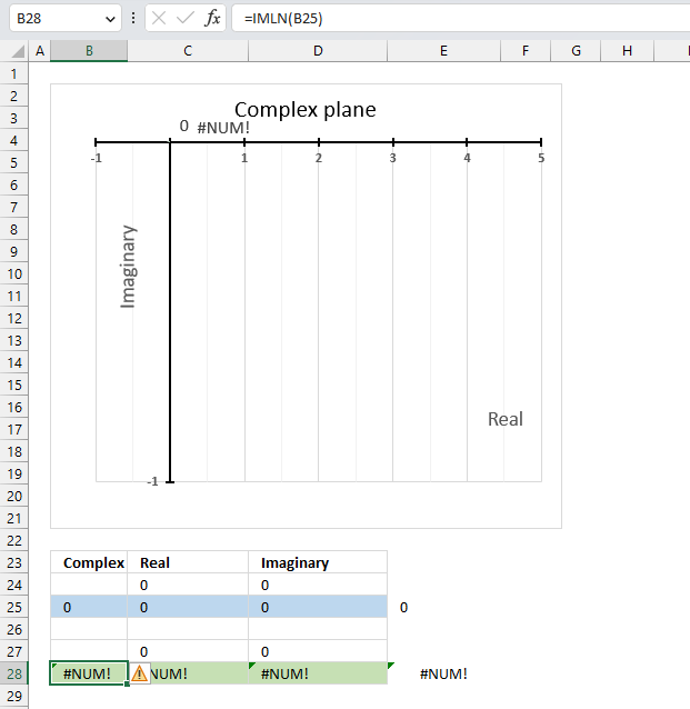
IMLN(0) (zero) is not possible because the natural logarithm function ln(x+yi) is defined only for x<>0. The IMLN function returns #NUM error if the argument is 0 (zero).
The IFERROR function lets you catch errors, it can return a value you specify if an error value is returned.
12.6. How to enter negative complex numbers in Excel
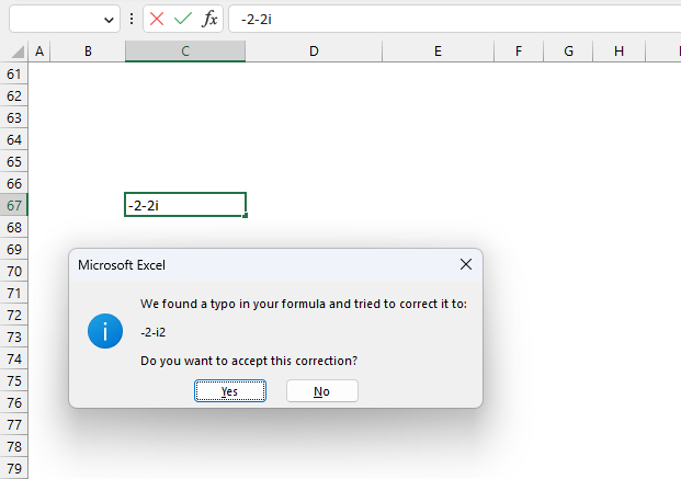
Excel shows a dialog box if you try to enter a negative complex number in a cell. It thinks a typo was made and tries to correct the input, however, the corrected string is wrong.
Press with left mouse button on the "No" button, another dialog box appears.
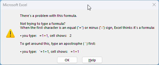
This dialog box is actually helpful, Excel thinks t's a formula when the first character is an equal sign or a minus sign. A workaround is to type an apostrophe ' first and then the string.
Press the "OK" button to dismiss the dialog box.
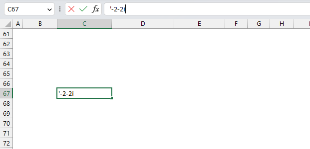
Now type the apostrophe and then the negative complex number. This works and Excel thinks the input string is a text string.
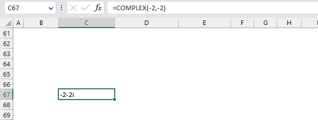
Another way to enter negative complex numbers is to use the COMPLEX function. It returns a complex number based on a real and imaginary value.
Useful links
IMLN function - Microsoft
Complex logarithm
The Logarithmic Function
13. How to use the IMLOG10 function
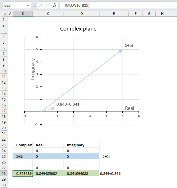
The IMLOG10 function calculates the base 10 logarithm (common logarithm) of a complex number in x + yi or x + yj text format.
The letter j is used in electrical engineering to distinguish between the imaginary value and the electric current.
Provide an example equation of when the base 10 logarithm is needed with real values ?
The following equation can be solved using the base 10 logarithm: 10x=100
becomes
log10(10x) = log10(100)
becomes
x log10(10) = 2
log10(10) = 1
x*1=2
equals
x = 2
What is the difference between the natural logarithm and the base 10 logarithm?
The natural logarithm uses e as the base and the common logarithm uses 10 as the base.
What is the difference between the IMLOG10 function and the IMLOG2 function?
The IMLOG function uses the common logarithm or 10 as the base and the IMLOG2 function uses 2 as the base.
Table of Contents
13.1. Syntax
IMLOG10(inumber)
13.2. Arguments
| inumber | Required. A complex number in x+yi or x+yj text format. |
13.3. Example

The image above demonstrates a formula in cell B28 that calculates the base 10 logarithm of a complex number specified in cell B25.
Cell C28 calculates the real number from the complex number in cell B28. Cell D28 extracts the imaginary number from the complex number specified in cell B28.
The real and imaginary numbers separated in a cell each allow us to graph the complex number on the complex plane.
Formula in cell B28:
The chart above demonstrates the complex plane, the y-axis the the imaginary axis and the x-axis is the real axis.
Complex number 5+5i is the light blue line in the first quadrant. The base 10 logarithm of 5+5i is the green line also in the first quadrant.
13.3.1 Explaining formula
Step 1 - Populate arguments
IMLOG10(inumber)
becomes
IMLOG10(B25)
Step 2 - Evaluate the IMLOG10 function
IMLOG10(B25)
becomes
IMLOG10("5+5i")
and returns
0.849485002168009+0.34109408846046i
13.4. How is the function calculated in detail?

The base 10 logarithm of a complex number is calculated like this:
C = x + yi
IMLOG10(C) =log10(x+yi)=(log10e)ln(x+yi)
For example, C = 5 + 5i
IMLOG10(5 + 5i) =log10(5+5i)=(log10e)ln(5+5i)
becomes
IMLOG10(5 + 5i) =(log10e)ln(5+5i)=0.434294481903252*ln(5+5i)
becomes
IMLOG10(5 + 5i) =0.434294481903252*ln(5+5i)=0.434294481903252*(1.95601150271407+0.785398163397448i)
and returns
IMLOG10(5 + 5i) =0.849485002168009+0.34109408846046i
13.5. Function not working - #NUM error
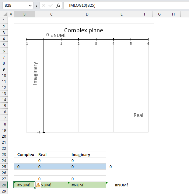
The base 10 logarithm function IMLOG10(x+yi) is not defined for x=0, so IMLOG10(0) is not a valid expression. The IMLN function will return a #NUM error if the argument is zero.
The IFERROR function can help you handle errors by returning a value of your choice if an error value occurs.
Why is it not possible to calculate the base 10 logarithm of a complex number that has a real part of zero and an imaginary part of 0?
The formula to calculate the base 10 logarithm of a complex number is log10(x+yi)=(log10e)ln(x+yi)
There is no solution to ln(0) which is why the calculation is not possible.
Useful links
IMLOG 10 function - Microsoft
Common logarithm
Value of Log 10
14. How to use the IMLOG2 function
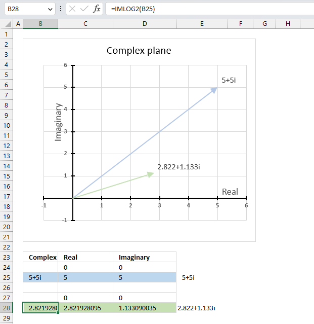
The IMLOG2 function calculates the base 2 logarithm of a complex number in x + yi or x + yj text format.
The letter j is used in electrical engineering to distinguish between the imaginary value and the electric current.
Provide an example equation of when the base 2 logarithm is needed with real values ?
This equation can be solved using the base 2 logarithm: 2x=16
becomes
log2(2x) = log2(16)
becomes
x log2(2) = 4
log2(2) = 1
x*1=4
equals
x = 4
What is the difference between the natural logarithm and the base 2 logarithm?
The natural logarithm uses e as the base and the log2 uses 2 as the base.
What is the difference between the IMLOG2 function and the IMLOG10 function?
The IMLOG2 function uses 2 as the base and the IMLOG10 function uses 10 as the base.
Table of Contents
14.1. Syntax
IMLOG2(inumber)
14.2. Arguments
| inumber | Required. A complex number in x+yi or x+yj text format. |
14.3. Example

The image above demonstrates a formula in cell B28 that calculates the base 2 logarithm of a complex number specified in cell B25.
Cell C28 calculates the real number from the complex number in cell B28. Cell D28 extracts the imaginary number from the complex number specified in cell B28.
The real and imaginary numbers separated in a cell each allow us to graph the complex number on the complex plane.
Formula in cell B28:
The chart above shows the complex plane, the y-axis is the imaginary axis and the x-axis is the real axis.
Complex number 5+5i is the light blue line in the first quadrant. The base 2 logarithm of 5+5i is the green line also in the first quadrant.
14.3.1 Explaining formula
Step 1 - Populate arguments
IMLOG2(inumber)
becomes
IMLOG2(B25)
Step 2 - Evaluate the IMLOG2 function
IMLOG2(B25)
becomes
IMLOG2("5+5i")
and returns
2.82192809488736+1.1330900354568i
14.4. How to calculate the base 2 logarithm of a complex number in detail?

The base 2 logarithm of a complex number is calculated like this:
C = x + yi
IMLOG2(C) =log2(e)ln(x+yi)
For example, C = 5 + 5i
IMLOG2(C) =log2(e)ln(x+yi) = log2(e)ln(5+5i)
IMLOG2(C) = log2(e)ln(5+5i) = 1.44269504088896*ln(5+5i)
IMLOG2(C) = 1.44269504088896*ln(5+5i) =1.44269504088896*(1.95601150271407+0.785398163397448i)
IMLOG2(C) = 1.44269504088896*(1.95601150271407+0.785398163397448i) = 2.82192809488736+1.1330900354568i
14.5. Function not working - #NUM error
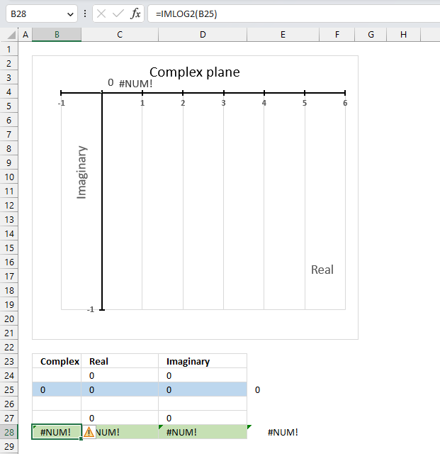
The base 2 logarithm function IMLOG2(x+yi) is not defined for x=0, IMLOG2(0) is not a valid expression.
The IFERROR function can help you handle errors by returning a value of your choice if an error value occurs.
Why is it not possible to calculate the base 10 logarithm of a complex number that has a real part of zero and an imaginary part of 0?
The formula to calculate the base 2 logarithm of a complex number is log10(x+yi)=(log10e)ln(x+yi)
There is no solution to ln(0) which is why the calculation is not possible.
Useful links
IMLOG2 function - Microsoft
Binary logarithm
Log base 2
15. How to use the IMPOWER function
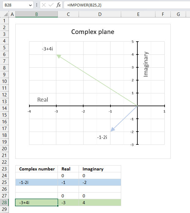
The IMPOWER function calculates a complex number raised to a given power in x + yi or x + yj text format.
The letter j is used in electrical engineering to distinguish between the imaginary value and the electric current.
Table of Contents
15.1. Syntax
IMPOWER(inumber, number)
15.2. Arguments
| inumber | Required. A complex number in x+yi or x+yj text format. |
| number | Required. The power you want to raise the complex number to. Integer, fractional, or negative values are allowed. |
15.3. Example

The image above demonstrates a formula in cell B28 that calculates a complex number specified in cell B25 raised to a power.
Formula in cell C3:
The chart above shows the complex number -1-2i on the complex plane as a light blue line with an ending arrow, the green line with an ending arrow represents -1-2i raised to the power of 2 which is -2+4i.
15.3.1 Explaining formula
Step 1 - Populate arguments
IMPOWER(inumber, number)
becomes
IMPOWER(B3, 2)
Step 2 - Evaluate the IMPOWER function
IMPOWER(B3, 2)
becomes
IMPOWER("1+2i", 2)
and returns
-3+4i
15.4. Calculate a given complex number raised to a power in detail

A complex number raised to a given power is calculated like this:
C = x + yi
Convert the complex number in rectangular form to polar form:
Z = r(cos θ + i sin θ)
θ = tan-1 (x/y)
r = √(x2+y2)
Raise the complex number in polar form to a power.
IMPOWER(C) = (x+y)n = rneinθ = rncos nθ+irnsin nθ
Convert the complex number in polar form to rectangular form.
x + yi = √(x2+y2)(cos θ + i sin θ)
15.4.1 Example: Raise -1-2i to the power of 2
C = -1-2i
θ = tan-1 (x/y) = tan-1 (-1/-2) = tan-1 (0.5) = 0.463647609000806 radians. This is true if the complex number is in the first quadrant.
However, complex number -1-2i is in the third quadrant. We need to add π to 0.463647609000806 to get the correct radians.
π + 0.463647609000806 = 4.24874137138388
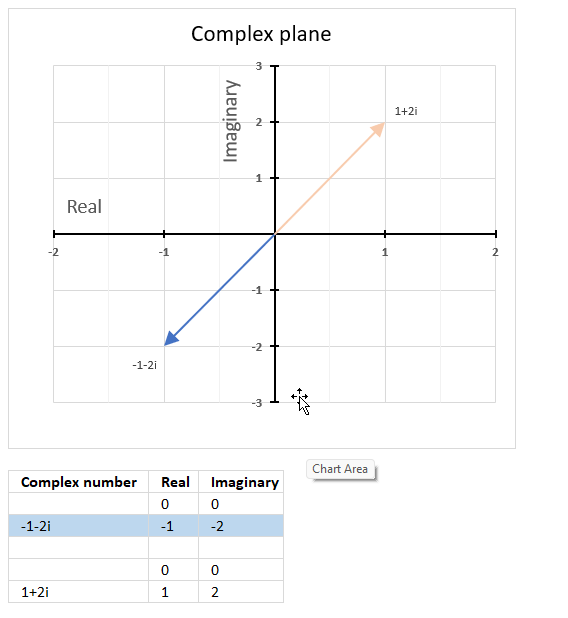
The complex plane is divided into four quadrants, the orange line with an ending arrow represents 1+2i. It is in the first quadrant. The blue line with an ending arrow represents -1-2i, it is in the third quadrant.
r = √(x2+y2) = √((-1)2+(-2)2) = √(1+4) = √5
rncos nθ+irnsin nθ = (√5)2cos (2*4.24874137138388) + i(√5)2sin (2*4.24874137138388) = 5*cos (2*4.24874137138388) + i*5*sin (2*4.24874137138388) = 5*-0.6 + i*5*0.8 = -3+4i
You can also multiply x + yi by itself since we are raising it to the power of 2.
(x+yi)*(x+yi) = x2 + xyi + xyi -y2 = x2 + 2xyi - y2
i*i = -1
(-1-2i)*(-1-2i) = 1+2*2i-4 = -3+4i
15.5. What are quadrants in the complex plane?
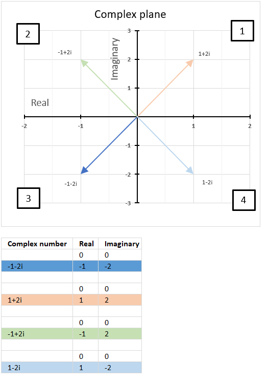
Quadrants are four regions (Quad = 4) formed by the intersection of the real axis and the imaginary axis in the complex plane.
How are quadrants numbered in the complex plane?
They are numbered counterclockwise from 1 to 4 and starts from the region where both the real and imaginary parts are positive.
The chart above shows the complex plane with the corresponding quadrants and four complex numbers in each quadrant.
The first quadrant is defined as 0 < θ < π/2, the orange line represents 1+2i and is in the first quadrant.
The second quadrant is defined as π/2 < θ < π, the green line represents -1+2i and is in the second quadrant.
The third quadrant is defined as -π/2 < θ < -π, the blue line represents 1-2i and is in the third quadrant.
The fourth quadrant is defined as 0 < θ < -π/2, the light blue line represents -1-2i and is in the fourth quadrant.
Why is it important to know which quadrant a given complex number is located?
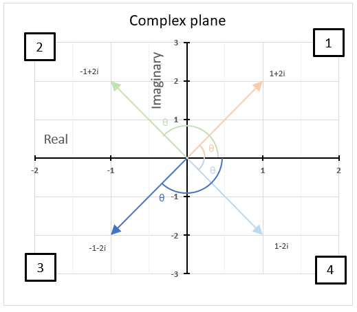
It is important to know which quadrant a given complex number is in because it helps us determine the sign and angle. The angle of a complex number is between the line and the positive real axis.
The image above shows the angle or argument for the following four complex numbers:
1+2i, θ = 1.10714871779409 radians
-1+2i, θ = 2.0344439357957 radians
1-2i, θ = -1.10714871779409 radians
-1-2i, θ = -2.0344439357957 radians
15.6. Calculate the n-th root of a complex number
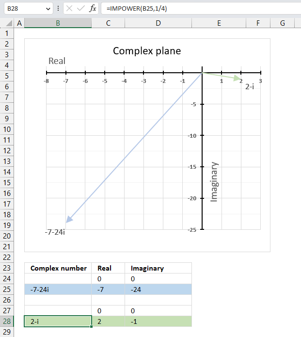
The IMPOWER function lets you calculate the n-th root of a given complex number. To calculate the n-th root of a complex number divide 1 by n in the second argument. This is the same as complex_number^(1/n) which returns the n-th root.
IMPOWER(complex_number, 1/n)
The following formula calculates the 4-th root of complex number specified in cell B25.
Formula in cell B28:
Explaining formula
Step 1 - Divide 1 by n
1/n
becomes
1/4
Step 2 - Populate IMPOWER function
IMPOWER(inumber,number)
becomes
IMPOWER(B25,1/4)
Step 3 - Calculate the n-th root of a given complex number
IMPOWER(B25,1/4)
becomes
IMPOWER("-7,-24i",1/4)
and returns
"2-i"
Useful links
IMPOWER function - Microsoft
Powers and Roots of Complex Numbers
Raising a Number to a Complex Power
16. How to use the IMPRODUCT function
The IMPRODUCT function calculates the product of complex numbers in x + yi or x + yj text format.
The letter j is used in electrical engineering to distinguish between the imaginary value and the electric current.
Table of Contents
16.1. Syntax
IMPRODUCT(inumber1, [inumber2], ...)
16.2. Arguments
| inumber1 | Required. A complex number in x+yi or x+yj text format. |
| [inumber2] | Optional. Up to 255 complex numbers to multiply. |
16.3. Example

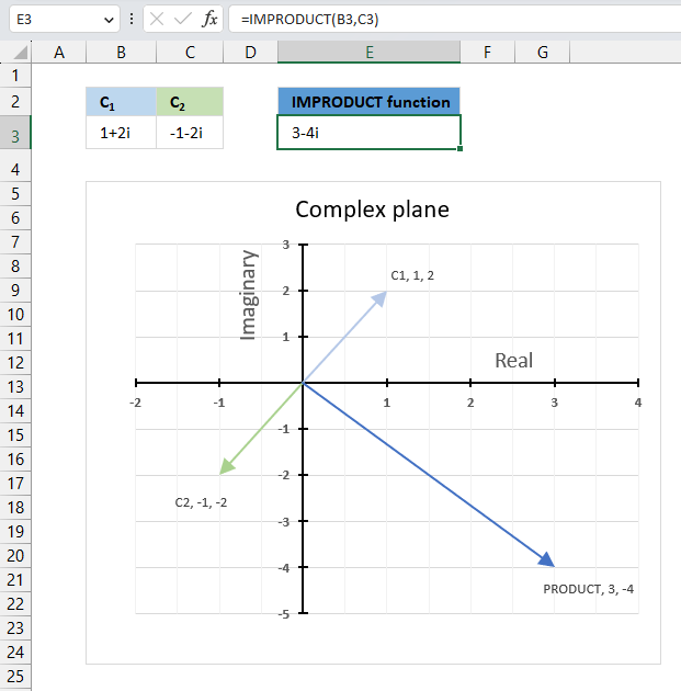
The image above demonstrates a formula in cell D3 that calculates the product of two complex numbers specified in cells C3 and B3.
Cell B3 contains this complex number "1+2i" and cell C3 contains the following complex number "-1-2i". The IMPRODUCT function in cell E3 calculates the complex product.
Formula in cell C3:
The image above shows a chart displaying the complex plane, the vertical axis is the imaginary axis, and the horizontal axis is the real axis. The light blue line C1 is the complex number "1+2i" and the green line C2 is the complex number "-1-2i". The product of C1 and C2 is the dark blue line.
16.3.1 Explaining formula
Step 1 - Populate arguments
IMPRODUCT(inumber, number)
becomes
IMPRODUCT(B3, C3)
Step 2 - Evaluate the IMPRODUCT function
IMPRODUCT(B3, C3)
becomes
IMPRODUCT("1+2i", "-1-2i")
and returns
3-4i
16.4. How is the function calculated in detail?

A product of two complex numbers is calculated like this:
C1 = x + yi
C2 = z + wi
IMPRODUCT(C1,C2) = (x+y)(z+w) = (xz - yw) + (xw + yz)i
16.4.1 Detailed calculation
C1 = 1 + 2i
C2 = -1 - 2i
IMPRODUCT(C1,C2) = (x+y)(z+w) = (1*(-1) - 2*(-2)) + (1*(-2)+ 2*(-1))i
Step 1 - Multiply first part (xz - yw)
(1*(-1) - 2*(-2))
becomes
(-1-(-4))
Step 2 - Calculate the difference for the first part (xz - yw)
(-1-(-4))
equals 3.
Step 3 - Multiply second part (xw + yz)i
(1*(-2) + (2*(-1))i
becomes
(-2 + -2)i
Step 4 - Calculate the addition for the second part (xw + yz)i
(-2 + -2)i
equals
-4i
Step 5 - Construct complex product - add parts
(xz - yw) + (xw + yz)i
equals
3-4i
16.5. Calculate the complex determinant of a 2x2 matrix
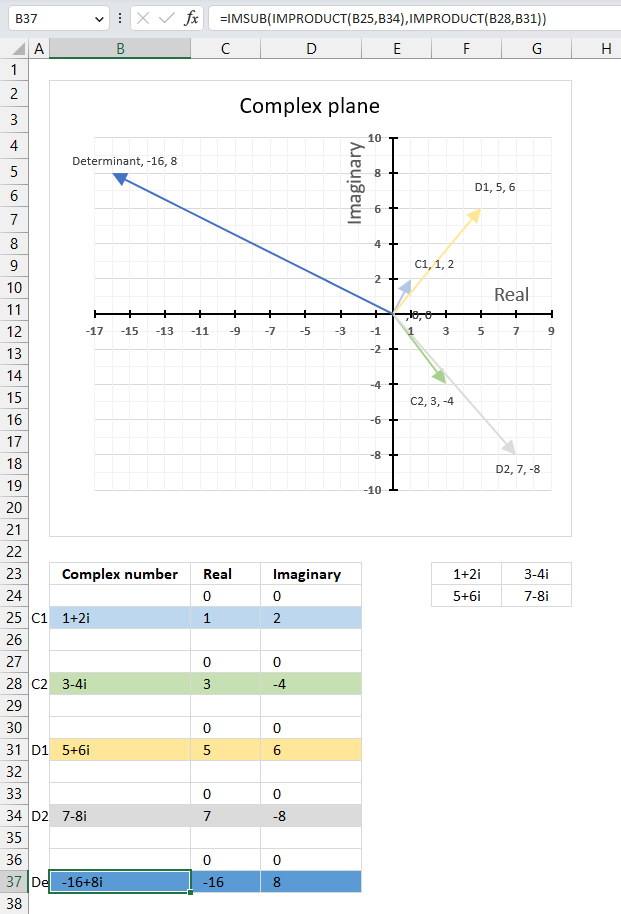
The image above shows a complex 2 by 2 matrix in cells F23:G24, they are [[1+2i, 3-4i], [5+6i, 7-8i]]. The formula in cell B37 calculates the complex determinant of a 2 by 2 matrix based on complex numbers.
Formula in cell B37:
The image above demonstrates all four complex values in a chart and their corresponding determinant.
16.5.1 Explaining the formula in cell B37

a : 1+2i
b : 3-4i
c : 5+6i
d : 7-8i
det(A) = a*d - b*c = (1+2i)*(7-8i) - (3-4i)*(5+6i) = (23+6i) - (39-2i) = -16+8i
Step 1 - Calculate complex product
The IMPRODUCT function calculates the product of complex numbers in x + yi or x + yj text format.
Function syntax: IMPRODUCT(inumber1, [inumber2], ...)
IMPRODUCT(B25,B34)
becomes
IMPRODUCT("1+2i","7-8i")
and returns
"23+6i"
Step 2 - Calculate complex product
The IMPRODUCT function calculates the product of complex numbers in x + yi or x + yj text format.
Function syntax: IMPRODUCT(inumber1, [inumber2], ...)
IMPRODUCT(B28,B31)
becomes
IMPRODUCT("3-4i","5+6i")
and returns
"39-2i"
Step 3 - Calculate the difference
The IMSUB function calculates the difference between two complex numbers in x + yi or x + yj text format.
Function syntax: IMSUB(inumber1, inumber2)
IMSUB(IMPRODUCT(B25,B34),IMPRODUCT(B28,B31))
becomes
IMSUB("23+6i","39-2i")
and returns
-16+8i
16.6. Multiply a complex number by i
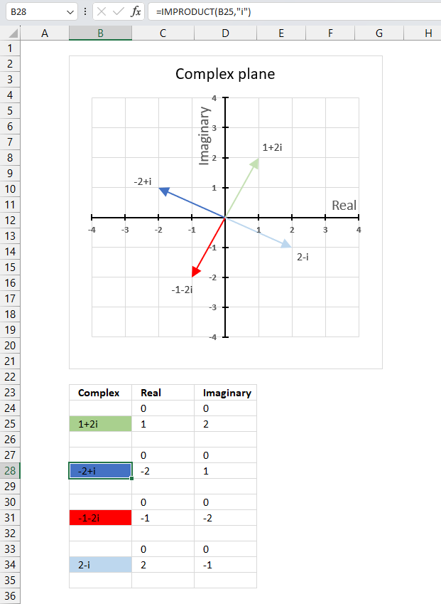
Multiplying a complex number by i is equivalent to rotating it by 90 degrees counterclockwise on the complex plane. (x + yi)*i = -y + xi
For example, if you multiply 1 + 2i (green line in the chart above) by i you get -2 + i (blue line in the chart above) which is 90 degrees counterclockwise from 1 + 2i.
Formula in cell B28:
You can also simplify i2 = -1 to multiply complex numbers by i. For example, if you multiply (-2 + i) by i you get -2i+i2 equals -1-2i.
Useful links
IMPRODUCT function - Microsoft
Multiplying Complex Numbers - Cuemath
Multiplying complex numbers - Clark university
17. How to use the IMREAL function
The IMREAL function calculates the real coefficient of a complex number in x + yi or x + yj text format.
The letter j is used in electrical engineering to distinguish between the imaginary value and the electric current.
Table of Contents
17.1. Syntax
IMREAL(inumber)
17.2. Arguments
| inumber | Required. A complex number in x+yi or x+yj text format. |
17.3. Example

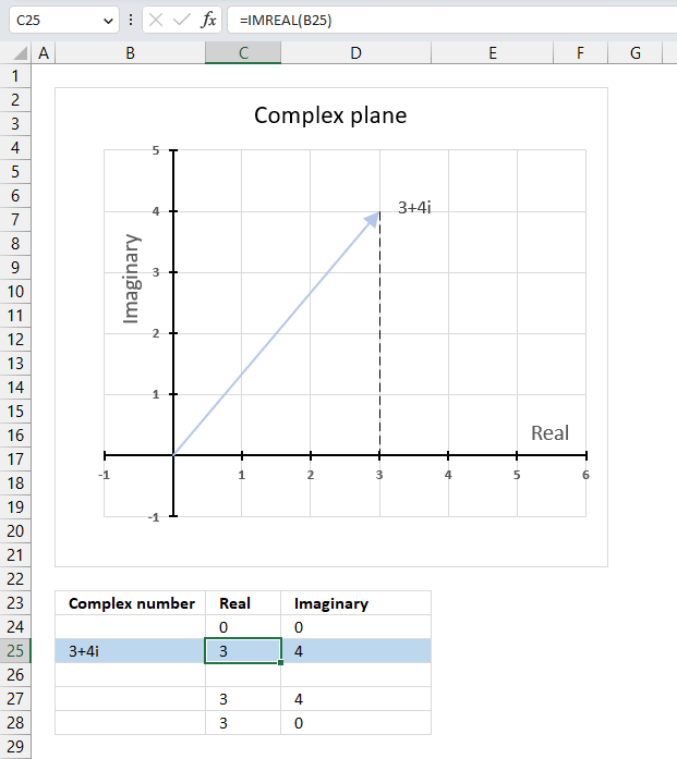
The image above demonstrates a formula in cell C25 that calculates the real coefficient of a complex number specified in cell B25. Cell B25 contains "3+4i" which is a complex number constructed from a real and imaginary part.
The real part from cell B25 is extracted and displayed in cell C25, the imaginary part is shown in cell D25.
Formula in cell C25:
The image above also shows a chart of a complex plane, the real and imaginary numbers are coordinates. The real number is a dashed line representing the real number from "3+4i" to the real axis (x-axis).
17.3.1 Explaining formula
Step 1 - Populate arguments
IMREAL(inumber)
becomes
IMREAL(B3)
Step 2 - Evaluate the IMREAL function
IMREAL(B3)
becomes
IMREAL("3+4i")
and returns 3.
17.4. When to use the IMREAL function?
Use the IMREAL function when you want to
- add, subtract, multiply and divide complex numbers.
- calculate the modulus which is the distance from the origin to the point representing the complex number.
- graph complex numbers
- calculate the complex determinant of a 2x2 matrix
The links above points to articles explaining how to manually calculate these properties, however, Excel has functions so you don't need to calculate them manually:
IMSUM | IMSUB | IMPRODUCT | IMDIV | IMARGUMENT | IMABS
17.5. How to plot the real part of a complex number on a chart

The chart above demonstrates complex number "3+4i" on the complex plane. The y-axis is the imaginary axis and the x-axis is the real axis, the light blue line with an arrow represents the complex number from the origin (0,0) to (3,4).
The vertical dashed line displays the real number of the complex number "3+4i" on the real axis. The IMREAL function lets you extract the real number from a complex number, this is handy if you want to plot a complex number on chart.
A complex number number consists of a real number and an imaginary number, we need both these numbers to plot a complex number on a chart.
17.5.1 Calculate the real and imaginary numbers

To be able to plot the complex number on the complex plane we need to calculate the real and imaginary number separately. Cell B25 contains the complex number in rectangular form.
Formula in cell C25:
The IMREAL function extracts the real number from the complex number in cell B25.
Formula in cell D25:
The IMAGINARY function extracts the imaginary number from the complex number in cell B25.
To plot a line we must use coordinates from the origin (0,0), I have entered 0 zero in cells C24 and D24. The scatter chart we are soon going to create needs a blank row between the line coordinates in order to show two different lines not attached to each other.
The dashed line also needs two points on the chart in order to be displayed properly. It begins where the complex number ends (3,4) and ends at the real axis, the line is vertical meaning the end point must have an imaginary number of 0 (zero).
17.5.2 Insert a scatter chart
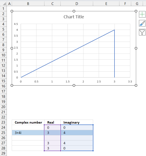
The following steps describe how to plot a complex number and the corresponding real number.
- Select cell range C24:D28.
- Go to tab "Insert" on the ribbon.
- Press with left mouse button on the "Insert Scatter (x,y) or Bubble chart" button.

- A popup menu appears, press with left mouse button on the "Scatter with straight lines".
A chart shows up on the worksheet, move the chart to its desired location.
Change the chart so it shows the complex number as a line with an ending arrow, the real number as a dashed line and so on. Here are detailed instructions:
How to plot theta θ - Argand diagram
Useful links
IMREAL function - Microsoft
Real and imaginary numbers
Imaginary numbers - Math is fun
18. How to use the IMSEC function
What is the IMSEC function?
The IMSEC function calculates the secant of a complex number in x + yi or x + yj text format.
The letter j is used in electrical engineering to distinguish between the imaginary value and the electric current.
What is a complex number?
What is a secant?
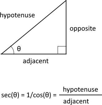
The trigonometric secant is a function that defines an angle of a right-angled triangle to the ratio of the hypotenuse to the adjacent side. It is also the inverse of the cosine, sec(θ) = 1/cos(θ).
What is the difference between a secant and a complex secant?
The difference between secant and secant for complex numbers is that the former is defined for real numbers, while the latter is defined for complex numbers.
The secant of a real number x is defined as sec(θ) = 2/(eθ + e-θ)
Natural number e is the base of the natural logarithm.
The secant of a complex number z = x + yi is defined as sec(x + yi) = (cos x cos y + isin x sinh y) / (cos2 x cosh2 y+ sin2 x sinh2 y)
Complex numbers has i as the imaginary unit.
Table of Contents
18.1. Syntax
IMSEC(inumber)
18.2. Arguments
| inumber | Required. A complex number in x+yi or x+yj text format. |
18.3. Example

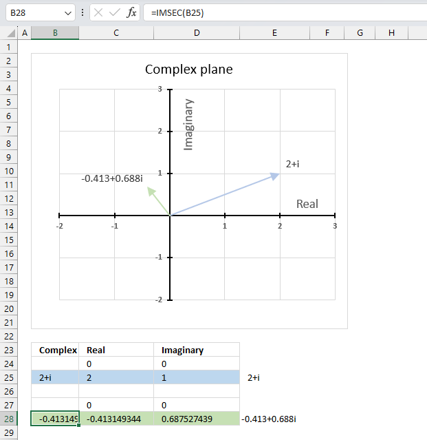
The image above shows a formula in cell B28 that calculates the cotangent of a complex number specified in cell B25.
Cell C28 calculates the real number from the complex number in cell B28. Cell D28 extracts the imaginary number from the complex number specified in cell B28.
The real and imaginary numbers separated in a cell each allow us to graph the complex number on the complex plane.
Formula in cell B28:
The chart above shows the complex plane, the y-axis is the imaginary axis and the x-axis is the real axis.
Complex number 2+i is the light blue line in the first quadrant. The complex secant of 2+i is the green line located in the second quadrant.
18.3.1 Explaining formula
Step 1 - Populate arguments
IMSEC(inumber)
becomes
IMSEC(B25)
Step 2 - Evaluate the IMSEC function
IMSEC(B25)
becomes
IMSEC("1+2i")
and returns
-0.41314934426694+0.687527438655479i
18.4. How is the IMSEC function calculated in detail?

The secant of a complex number is calculated like this:
C = x + yi
IMSEC(C) = (cos x cosh y + isin x sinh y) / (cos2 x cosh2 y+ sin2 x sinh2 y)
For example, C=2+i
IMSEC(2+i) = (cos 2 cosh 1 + isin 2 sinh 1) / (cos2 2 cosh2 1+ sin2 2 sinh2 1)
becomes
IMSEC(2+i) = (-0.416146836547142*1.54308063481524 + i0.909297426825682*1.1752011936438) / (0.173178189568194*2.38109784554182+ 0.826821810431806*1.38109784554182)
becomes
IMSEC(2+i) = (-0.64214812471552 + i1.06860742138278) / (0.412354214075659+ 1.14192182103435)
equals
IMSEC(2+i) = -0.41314934426694+0.687527438655479i
18.5. Function not working - #NUM error
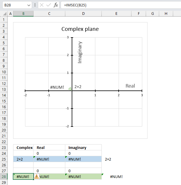
The IMSEC function returns a #NUM error if the provided argument is not a valid complex number.
Useful links
IMSEC function - Microsoft
Secant of Complex Number
Complex number - Wikipedia
19. How to use the IMSECH function
What is the IMSECH function?
The IMSECH function calculates the hyperbolic secant of a complex number in x + yi or x + yj text format.
The letter j is used in electrical engineering to distinguish between the imaginary value and the electric current.
What is the secant?
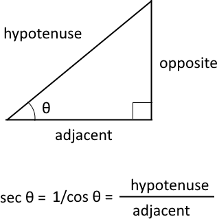
It is a trigonometric function that defines an angle of a right-angled triangle to the ratio of hypotenuse and the adjacent side. In other words, it is the inverse or reciprocal of cosine.
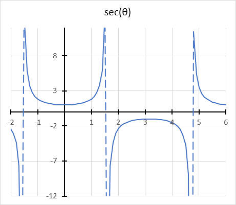
The secant function has a domain of all real numbers except where cos θ = 0, and a range of all real numbers except the interval -1 < y < 1
cos θ = 0 when θ is 90 degrees or π/2
What is the hyperbolic secant?
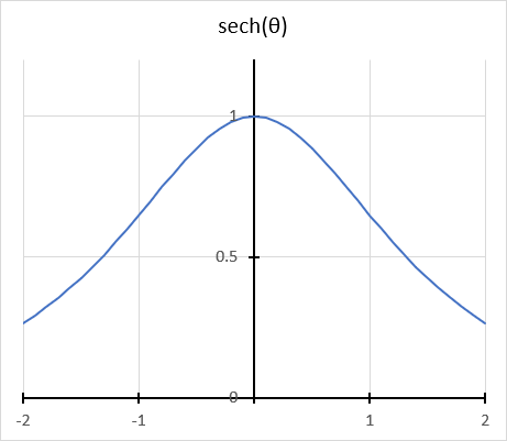
The hyperbolic secant is related to the hyperbolic cosine. sech x = 1/(cosh x) The hyperbolic secant has real numbers between 0 and 1.
What is a hyperbola?
The equation of a hyperbola with a horizontal axis is
(x2/ a2) - (y2 / b2) = 1
where a and b are positive constants.
A circle has a constant distance from the center point, while a hyperbola is a curve that has two focus points (+ae, 0), and (-ae, 0).
What is the difference between hyperbolic secant and complex hyperbolic secant?
The difference between hyperbolic secant and hyperbolic secant for complex numbers is that the former is defined for real numbers, while the latter is defined for complex numbers.
The hyperbolic secant of a real number x is defined as sech(x) = 2/(ex + e-x)
Natural number e is the base of the natural logarithm.
The complex hyperbolic secant of a complex number z = x + yi is defined as IMSECH(C) = (cosh x cos y - isinh x sin y) / (cosh2 x cos2 y+ sinh2 x sin2 y)
Complex numbers has i as the imaginary unit.
Table of Contents
19.1. Syntax
IMSECH(inumber)
19.2. Arguments
| inumber | Required. A complex number in x+yi or x+yj text format. |
19.3. Example

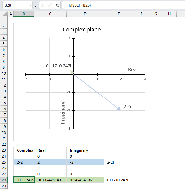
The image above shows a formula in cell B28 that calculates the hyperbolic secant of a complex number specified in cell B25.
Cell C28 calculates the real number from the complex number in cell B28. Cell D28 extracts the imaginary number from the complex number specified in cell B28.
The real and imaginary numbers separated in a cell each allow us to graph the complex number on the complex plane.
Formula in cell D3:
The chart above shows the complex plane, the y-axis is the imaginary axis and the x-axis is the real axis.
Complex number 2-2i is the light blue line in the fourth quadrant. The hyperbolic secant of 2-2i is the green line located in the second quadrant.
19.3.1 Explaining formula
Step 1 - Populate arguments
IMSECH(inumber)
becomes
IMSECH(B3)
Step 2 - Evaluate the IMSECH function
IMSECH(B3)
becomes
IMSECH("1+2i")
and returns
-0.41314934426694-0.687527438655479i
19.4. How is the function calculated in detail?

The hyperbolic secant of a complex number is calculated like this:
C = x + yi
IMSECH(C) = (cosh x cos y - isinh x sin y) / (cosh2 x cos2 y+ sinh2 x sin2 y)
19.5. Function not working - #NUM error
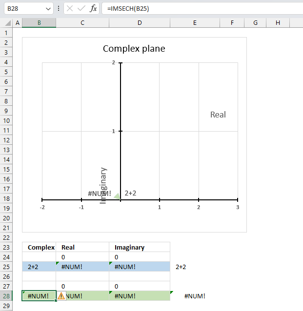
The IMSECH function returns a #NUM error if the provided argument is not a valid complex number.
Useful links
IMSECH function - Microsoft
Hyperbolic Secant of Complex Number
Complex trigonometric definitions
20. How to use the IMSIN function
What is the IMSIN function?
The IMSIN function calculates the sine of a complex number in x + yi or x + yj text format.
The letter j is used in electrical engineering to distinguish between the imaginary value and the electric current.
What is the sine?
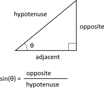
The sine is a trigonometric function that relates an angle θ in a right triangle to the ratio of the length of the side opposite the angle and the length of the longest side (hypotenuse) of the triangle. A right triangle has one angle that measures 90° or π/2 radians which is approximately 1.5707963267949 radians.
What is the difference between sine and the complex sine?
The difference between sine and complex sine is that the former is defined for real numbers only, while the latter is defined for complex numbers as well. The sine of a complex number has some similarities to the sine of a real number, such as periodicity.
The sine function is periodic considering the angle, meaning it repeats its values after a certain interval. The period of the sine function is 2π or 360 degrees.
sin z = (e(iz) - e(-iz))/2i
z - complex number
i - imaginary unit
e -
Table of Contents
20.1. Syntax
IMSIN(inumber)
20.2. Arguments
| inumber | Required. A complex number in x+yi or x+yj text format. |
20.3. Example

The image above demonstrates a formula in cell B28 that calculates the sine of a complex number specified in cell B25.
Cell C28 calculates the real number from the complex number in cell B28. Cell D28 extracts the imaginary number from the complex number specified in cell B28.
The real and imaginary numbers separated in a cell each allow us to graph the complex number on the complex plane.
Formula in cell B28:
The chart above shows the complex plane, the y-axis is the imaginary axis and the x-axis is the real axis.
Complex number 2+2i is the light blue line in the first quadrant. The sine of 2+2i is the green line shown in the fourth quadrant.
20.3.1 Explaining formula
Step 1 - Populate arguments
IMSIN(inumber)
becomes
IMSIN(B25)
Step 2 - Evaluate the IMSIN function
IMSIN(B25)
becomes
IMSIN("2+2i")
and returns
3.42095486111701-1.50930648532362i
20.4. How to calculate the sine of a complex number in detail?

The sine of a complex number is calculated like this:
C = x + yi
sin (C) = sin (x) cosh (y) + cos (x) sinh (y)i
For example, C=2+2i
sin (2+2i) = sin (2) cosh (2) + cos (2) sinh (2)i
becomes
sin (2+2i) = 0.909297426825682*3.76219569108363 + -0.416146836547142*3.62686040784702i
equals
sin (2+2i) = 3.42095486111701 - 1.50930648532361i
sin - calculates the sine of a number
cos - calculates the cosine of a number
cosh - calculates the hyperbolic cosine of a number
sinh - calculates the hyperbolic sine of a number
20.5. Function not working
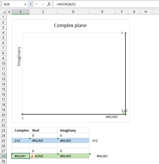
The IMSIN function returns a #NUM error if the provided argument is not a valid complex number.
Useful links
IMSIN function - Microsoft
Sine of Complex Number - Proof Wiki
Sine of a Complex Number - Stack Exchange
21. How to use the IMSINH function
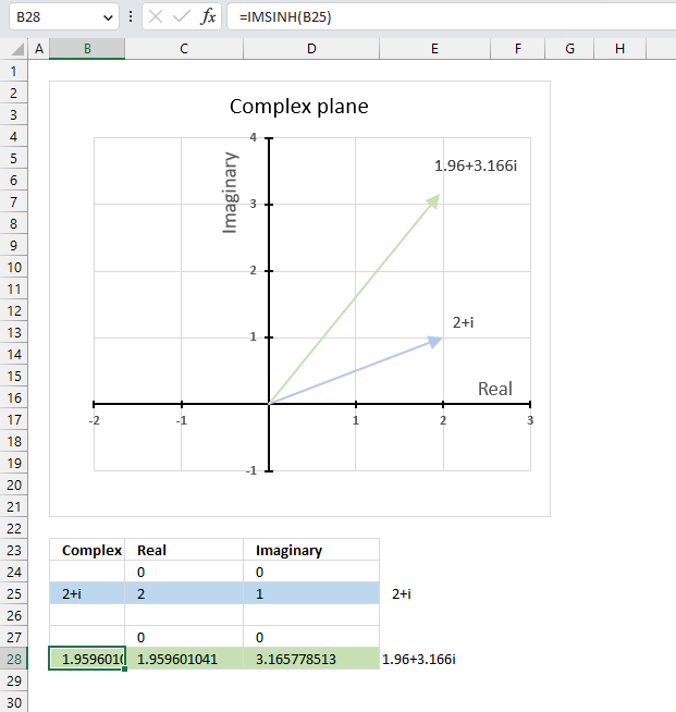
What is the IMSINH function?
The IMSINH function calculates the hyperbolic sine of a complex number in x + yi or x + yj text format.
The letter j is used in electrical engineering to distinguish between the imaginary value and the electric current.
What is the hyperbolic sine?
Hyperbolic functions are similar to ordinary trigonometric functions, but they use a different shape to define them.

Trigonometric functions use a circle, while hyperbolic functions use a hyperbola. The chart above shows a hyperbola and two asymptotes (dashed lines) where the intersection is at the center of the hyperbola. The chart below shows a circle containing the trigonometric functions.

What is a hyperbola?
The equation of a hyperbola with a horizontal axis is
(x2/ a2) - (y2 / b2) = 1
where a and b are positive constants.
A circle has a constant distance from the center point, while a hyperbola is a curve that has two focus points (+ae, 0), and (-ae, 0).
What is the difference between hyperbolic sine and complex hyperbolic sine?
The difference between hyperbolic sine and hyperbolic sine for complex numbers is that the former is defined for real numbers, while the latter is defined for complex numbers.
The hyperbolic sine of a real number x is defined as
sinh(x) = (ex - e-x)/2
Natural number e is the base of the natural logarithm.
The complex hyperbolic sine of a complex number z = x + yi is defined as sinh(z) = sinh(x)cos(y) + i cosh(x)sin(y)
Complex numbers has i as the imaginary unit.
Table of Contents
21.1. Syntax
IMSINH(inumber)
21.2. Arguments
| inumber | Required. A complex number in x+yi or x+yj text format. |
21.3. Example

The image above demonstrates a formula in cell B28 that calculates the hyperbolic sine of a complex number specified in cell B25.
Cell C28 calculates the real number from the complex number in cell B28. Cell D28 extracts the imaginary number from the complex number specified in cell B28.
The real and imaginary numbers separated in a cell each allow us to graph the complex number on the complex plane.
Formula in cell B28:
The chart above shows the complex plane, the y-axis is the imaginary axis and the x-axis is the real axis.
Complex number 2+i is the light blue line in the first quadrant. The hyperbolic sine of 2+i is the green line also shown in the first quadrant.
21.3.1 Explaining formula
Step 1 - Populate arguments
IMSINH(inumber)
becomes
IMSINH(B3)
Step 2 - Evaluate the IMSINH function
IMSINH(B3)
becomes
IMSINH("1+2i")
and returns
-0.489056259041294+1.40311925062204i
21.4. How is the function calculated in detail?

The hyperbolic sine of a complex number is calculated like this:
C = x + yi
sinh(x + yi) = sinh x*cos y + icosh x*sin y
For example, C=2+i
sinh(2 + i) = sinh 2*cos 1 + icosh 2*sin 1
becomes
sinh(2 + i) = 3.62686040784702*0.54030230586814 + 3.76219569108363*0.841470984807897i
equals
sinh(2 + i) = 1.95960104142161+3.16577851321617i
21.5. Function not working #NUM error
The IMSINH function returns a #NUM error if the provided argument is not a valid complex number.
Useful links
IMSINH function - Microsoft
Hyperbolic Sine of Complex Number
Hyperbolic Functions
22. How to use the IMSQRT function
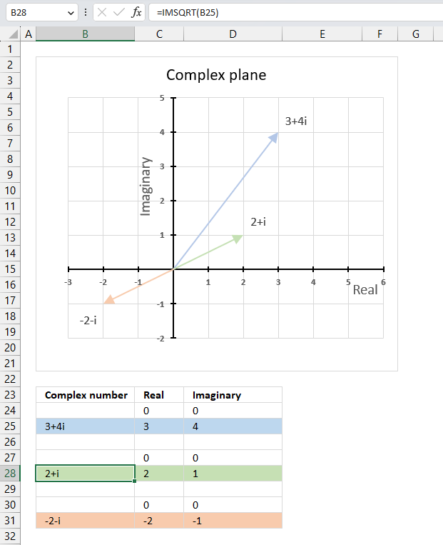
The IMSQRT function calculates the square root of a complex number in x + yi or x + yj text format.
The letter j is used in electrical engineering to distinguish between the imaginary value and the electric current.
Table of Contents
22.1. Syntax
IMSQRT(inumber)
22.2. Arguments
| inumber | Required. A complex number in x+yi or x+yj text format. |
22.3. Example

The image above demonstrates a formula in cell B28 that calculates the square root of a complex number specified in cell B25.
Formula in cell D3:
I have also included the second solution to square root of 3+4i in cell B31. The chart shows complex number 3+4i in light blue, the solutions to square root of 3+4i which are 2+i and -2-i in green and orange respectively.
22.3.1 Explaining formula
Step 1 - Populate arguments
IMSQRT(inumber)
becomes
IMSQRT(B25)
Step 2 - Evaluate the IMSQRT function
IMSQRT(B3)
becomes
IMSQRT("3+4i")
and returns
"2+i".
Note! The IMSQRT function returns only one of two possible solutions.
The solutions to square root of 3+4i are 2+i and -2-i. Change the sign of both the real and imaginary parts of the complex number to get the second square root.
You can verify these solutions using the IMPOWER function. IMPOWER("2+i",2) equals 3+4i, however, IMPOWER("-2-i",2) also equals 3+4i.
22.4. How to calculate the second square root of a complex number?
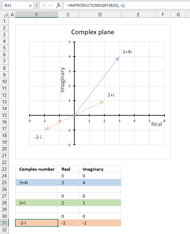
The formula in cell B31 calculates the second square root of a given complex number specified in cell B25.
Formula in cell B31:
It takes the value in cell B25, which is a complex number, and calculates its square root using the IMSQRT function. This returns one of the two possible square roots of the complex number.
It then multiplies the result of the IMSQRT function by -1 using the IMPRODUCT function. This changes the sign of both the real and imaginary parts of the complex number, and effectively returns the other square root.
Explaining formula
Step 1 - Calculate the first square root
The IMSQRT function calculates the square root of a complex number in x + yi or x + yj text format.
Function syntax: IMSQRT(inumber)
IMSQRT(B25)
becomes
IMSQRT("3+4i")
and returns "2+i".
Step 2 - Second square root
The IMPRODUCT function calculates the product of complex numbers in x + yi or x + yj text format.
Function syntax: IMPRODUCT(inumber1, [inumber2], ...)
IMPRODUCT(IMSQRT(B25),-1)
becomes
IMPRODUCT("2+i",-1)
and returns "-2-i".
22.5. How is the square root of a complex number in rectangular form calculated in detail?

The following math formula shows how to calculate the square root of a complex number.
Z = x + yi
y ≠ 0 (zero)

iy/|y| gives the sign of the imaginary part of the square root. |y| is the absolute value of y. For example, |4| = 4 and |-4| = 4.
iy/|y| = i if y is positive and -i if y is negative. This makes the two square roots have opposite signs for both parts.
For example, Z = 3+4i
|Z| = (3^2+4^2)^0.5 = (9+16)^0.5 = 25^0.5 = 5
Z^0.5 = ((5+3)/2)+i((5-3)/2)^0.5 = 4^0.5+i1^0.5 = 2+i
Polar form
IMSQRT(C) = √(x + yi) = √r cos (θ/2) + i√r sin (θ/2)
θ = tan-1 (x/y)
r = √(x2 + y2)
Useful links
IMSQRT function - Microsoft
How do I get the square root of a complex number? - Stack Exchange
23. How to use the IMSUB function
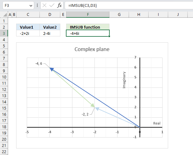
What is the IMSUB function?
The IMSUB function calculates the difference between two complex numbers in x + yi or x + yj text format.
The letter j is used in electrical engineering to distinguish between the imaginary value and the electric current.
Table of Contents
23.1. Syntax
IMSUB(inumber1, inumber2)
23.2. Arguments
| inumber1 | Required. A complex number in x+yi or x+yj text format. |
| inumber2 | Required. A complex number in x+yi or x+yj text format. |
23.3. Example - rectangular form
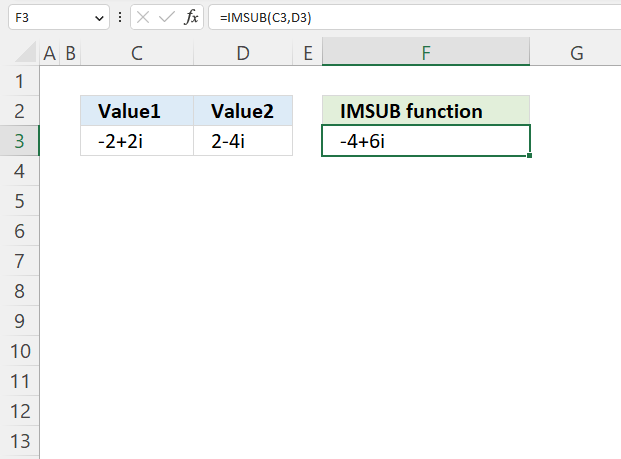
The image above demonstrates the IMSUB function in cell F3 that calculates the difference between two complex numbers specified in cells C3 and D3.
Formula in cell F3:
23.3.1 Explaining formula
Step 1 - Populate arguments
IMSUB(inumber1, inumber2)
becomes
IMSUB(C3, D3)
Step 2 - Evaluate the IMSUB function
IMSUB(C3, D3)
becomes
IMSUB("-2+2i","2-4i")
and returns
-4+6i
23.4. How to calculate the difference between two complex numbers in rectangular form?

This example demonstrates how Excel calculates in detail the difference between two complex numbers in rectangular form.
C1 is the first complex number specified in cell C3, C2 is the second complex number specified in cell D3.
C1 = x + yi
C2 = z + wi
To calculate the difference between two complex numbers we need to find the difference between the real numbers and the imaginary numbers separately.
C1- C2 = (x + yi) - (z + wi) = (x - z) + (y - w)i
C1 = -2+2i
C2 = 2-4i
C1- C2 = (-2 + 2i) - (2 - 4i) = ((-2) -2) + (2 - (-4))i = -4+6i
23.5. How to graph the difference between two complex numbers?
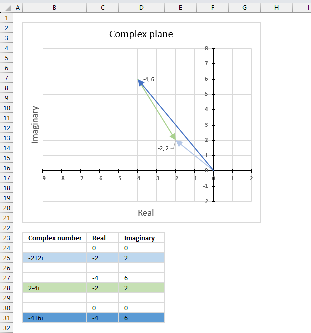
The image above demonstrates a scatter chart that shows two different complex numbers and their difference, in total three different complex values.
Complex numbers in rectangular form a+bi have real and imaginary values which are positive, negative or zero, this makes it possible to use a chart with two dimensions x and y.
The imaginary values on the vertical axis (y) and the real values on the horizontal axis (x).
C1 = -2+2i (light blue)
C2 = 2-4i (green)
C1- C2 = -4+6i (dark blue)
Subtracting a complex number means that it points the opposite way with the same distance (green). The dark blue complex number is the difference between C1 and C2 .
23.5.1 Extract real and imaginary numbers from complex numbers
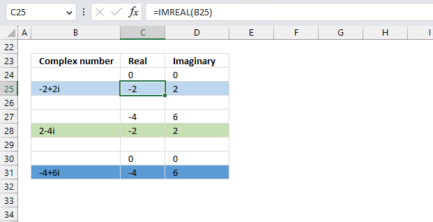
Make sure that each complex number begins with real value 0 and imaginary value 0 on a separate row except the complex number you subtract with (green). The real and imaginary values on the next row, and that there is an empty row between. You can use the IMREAL function and the IMAGINARY function to extract the coordinates from the complex numbers in column B, make sure they are in rectangular form.
Formula in cell C25:
Formula in cell D25:
Copy these cells and paste to cells C28 and D28 respectively.
Formula in cell B31:
The row before complex number 2-4i (row 27) must contain the result from cells C31 and D31.
23.5.2 Insert scatter chart
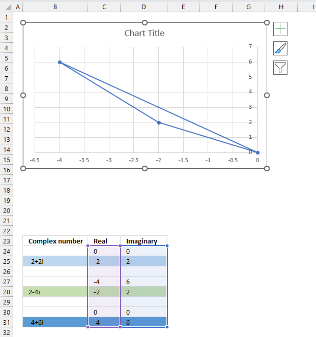
- Select cell range C24:D31.
- Go to tab "Insert" on the ribbon.
- Press with mouse on the icon named "Insert Scatter (x,y)", a popup menu appears.
- Press with left mouse button on the icon "Scatter with Straight Lines and Markers".

- The chart shows up on the worksheet.
Press and hold with left mouse button on the chart border, then drag it to the location you want. Use the "handles" to resize the chart, see the image below.
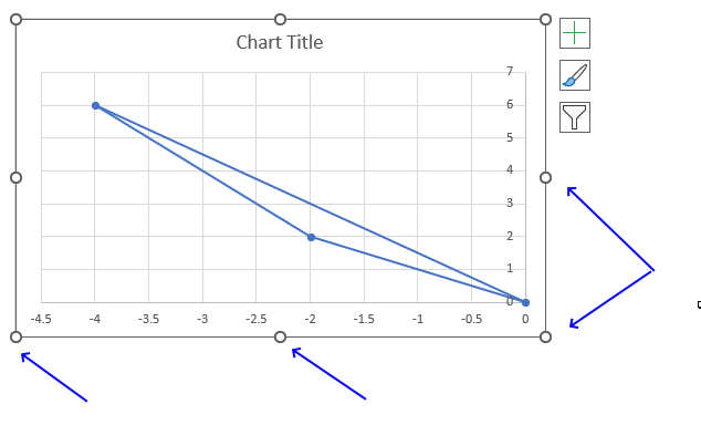
23.5.3 Create arrows and change colors
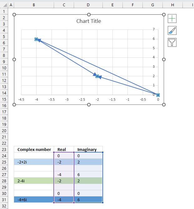
- Double-press with left mouse button on with left mouse button on one of the lines on the chart, all lines will be selected and a settings pane shows up.
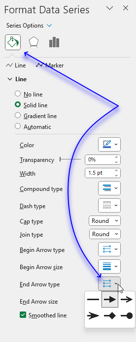
- Press with left mouse button on the "Fill&Line" button.
- Press with mouse on "End Arrow type", select an arrow.
- Press with mouse on "End Arrow size, pick a size.
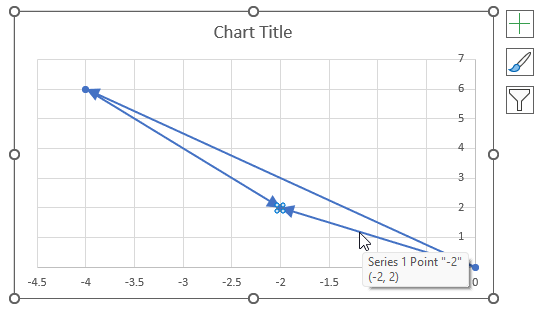
- Press with left mouse button on twice on a line to select a specific line.
- Press with left mouse button on the color button on the settings pane. A popup menu appears.
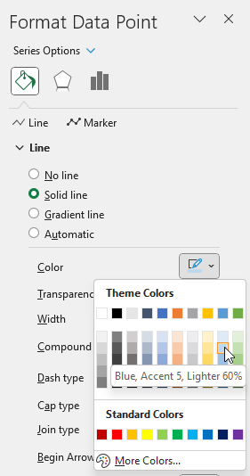
- Pick a color.
- Repeat steps 1 to 3 with remaining lines.
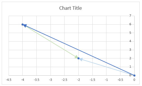
There are still three markers on the chart, here is how to remove them.
- Select all the lines by press with left mouse button oning on them once.
- Go to the settings pane.

- Press with left mouse button on "Marker Options".
- Select "None".
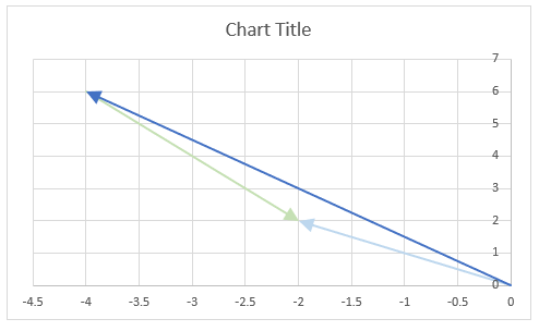
23.5.4 Change axis min and max value
- Double-press with left mouse button on one of the y-axis to open the settings pane.
- Press with left mouse button on the "Axis Options" button.
- Change the Bounds and the Units.
- Repeat step 1 to 3 with the x-axis.
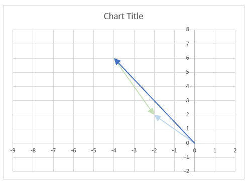
23.5.5 Change axis markers and line width
- Select the y-axis.
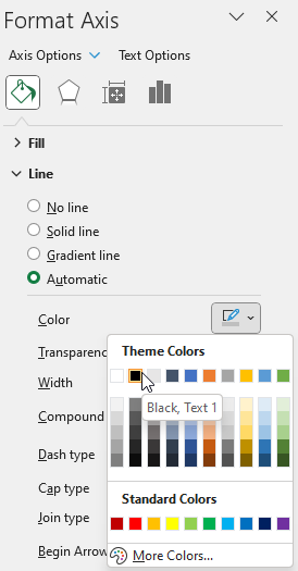
- Press with left mouse button on the "Fill & Line" button.
- Press with left mouse button on the "Line".
- Press with left mouse button on the "Color" button. Press with mouse on black.
- Change the width to 1.5
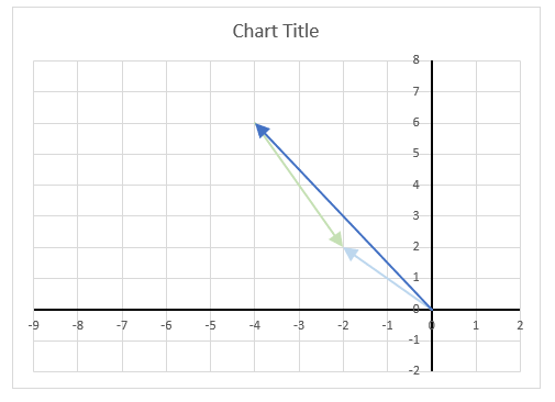
- Press with right mouse button on on one of the lines, a popup menu appears.
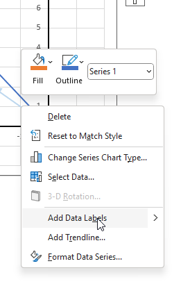
- Press with mouse on "Add Data Labels".
- Double-press with left mouse button on one of the data labels, the settings pane shows up.
- Select "X Value" as well.
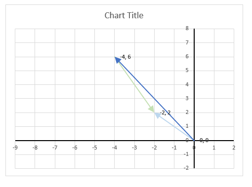
Change the chart title and add axis titles.
23.6. How to calculate the distance between two complex numbers?
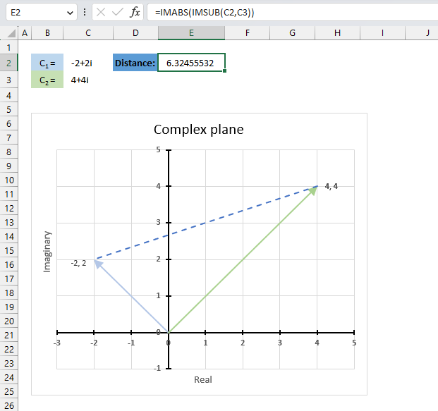
The following formula calculates the length between two complex numbers in the complex plane. First, the formula subtracts the second complex number from the first, then it calculates the modulus of the difference.
For example, the first complex number is -2+2i and the second complex number is 4+4i. The difference is -6-2i, the modulus of -6-2i is the square root of 40 which equals approx. 6.32
Formula in cell E2:
The image above shows the distance between these two points on the complex plane, the distance is the dashed blue line between -2+2i and 4+4i.
Explaining formula in cell E2
Step 1 - Calculate the difference between two complex numbers
The IMSUB function calculates the difference between two complex numbers in x + yi or x + yj text format.
Function syntax: IMSUB(inumber1, inumber2)
IMSUB(C2,C3)
becomes
IMSUB("-2+2i","4+4i")
and returns
"-6-2i"
Step 2 - Calculate the modulus of a complex number
The IMABS function calculates the absolute value (modulus) of a complex number in x + yi or x + yj text format.
Function syntax: IMABS(inumber)
IMABS(IMSUB(C2,C3))
becomes
IMABS("-6-2i")
and returns
6.32
Useful links
IMSUB function - Microsoft
Complex numbers: the complex plane, addition and subtraction
Adding and Subtracting Complex Numbers
24. How to use the IMSUM function
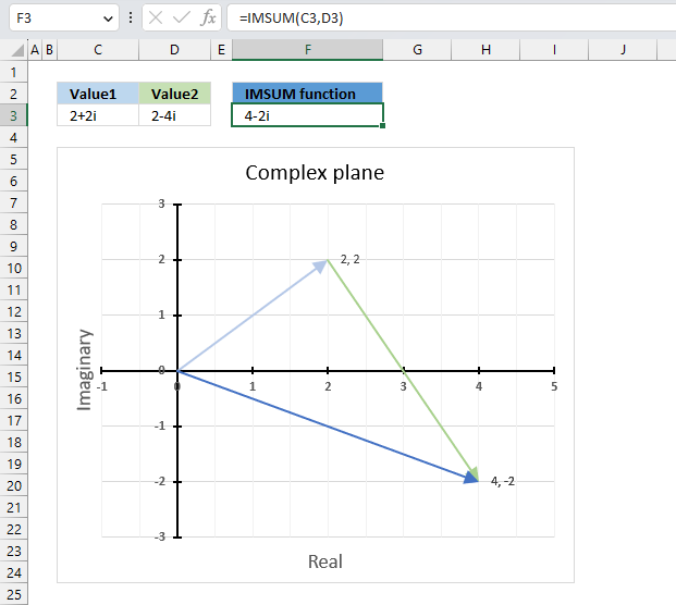
The IMSUM function calculates the total of two or more complex numbers in x + yi or x + yj text format.
The letter j is used in electrical engineering to distinguish between the imaginary value and the electric current.
Table of Contents
24.1. Syntax
IMSUM(inumber1, [inumber2], ...)
24.2. Arguments
| inumber1 | Required. A complex number in x+yi or x+yj text format. |
| [inumber2] | Optional. A complex number in x+yi or x+yj text format. Up to 255 complex numbers. |
24.3. Example
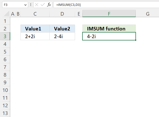
The image above demonstrates a formula in cell D3 that calculates the total of two complex numbers specified in cells C3 and D3.
Formula in cell D3:
24.3.1 Explaining formula
Step 1 - Populate arguments
IMSUM(inumber1, inumber2)
becomes
IMSUM(C3, D3)
Step 2 - Evaluate the IMSUM function
IMSUM(C3, D3)
becomes
IMSUM("2+2i","2-4i")
and returns
4-2i
24.4. How to calculate the sum of two complex numbers in rectangular form?

This example demonstrates how Excel calculates in detail the sum of two complex numbers in rectangular form.
C1 is the first complex number specified in cell C3, C2 is the second complex number specified in cell D3.
C1 = x + yi
C2 = z + wi
To calculate the sum of two complex numbers we need to perform addition to the real and the imaginary numbers separately.
C1+ C2 = (x + yi) + (z + wi) = (x + z) + (y + w)i
C1 = 2+2i
C2 = 2-4i
IMSUM(C1, C2) = C1+ C2 = (2 + 2i) + (2 - 4i) = (2-2) + (2 + (-4))i = 4-2i
24.5. How to plot the sum of two complex numbers?
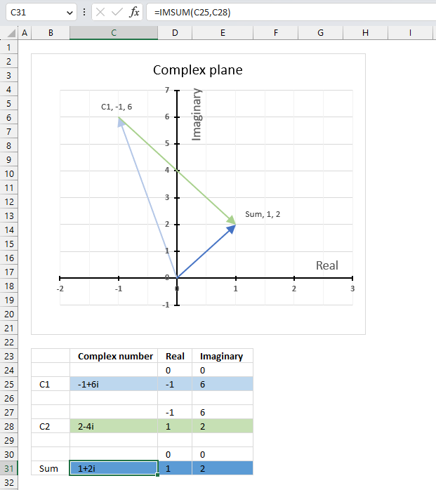
The image above shows a scatter chart that displays two different complex numbers and their sum, in total three different complex values.
Complex numbers in rectangular form a+bi have real and imaginary values which are positive, negative or zero, this makes it possible to use a chart with two dimensions x and y.
The imaginary values on the vertical axis (y) and the real values on the horizontal axis (x).
C1 = -1+6i (light blue)
C2 = 2-4i (green)
C1+ C2 = 1+2i (dark blue)
Adding complex numbers means that you can put the second complex number at the first complex number, in other words, the green line starts where the light blue line ends. The dark blue complex number is the sum of C1 and C2 .
24.5.1 Extract real and imaginary numbers from complex numbers
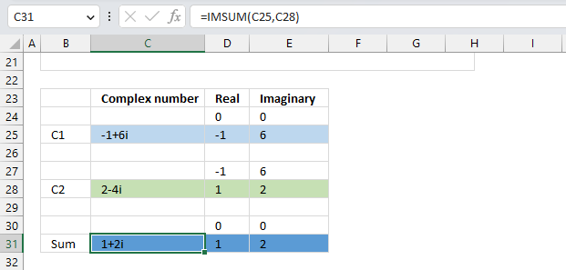
The table demonstrated in the image above shows how the data needs to be arranged in order to plot different complex numbers on a chart.
- Each complex number has a starting point and an ending point.
- A blank row below each complex number.
- Formulas for calculating real and imaginary parts.
Formula in cell C31:
Formula in cell D25:
Formula in cell E25:
Complex number C2 begins where C1 ends and ends where the sum is located on the complex plane.
24.5.2 Insert scatter chart
- Select cell range D24:E31.
- Go to tab "Insert" on the ribbon.
- Press with mouse on the icon named "Insert Scatter (x,y)", a popup menu appears.
- Press with left mouse button on the icon "Scatter with Straight Lines and Markers".

- The chart shows up on the worksheet.
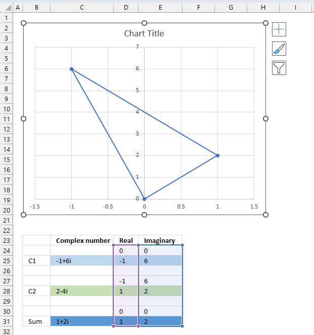
Press and hold with left mouse button on the chart border, then drag it to the location you want. Use the "handles" to resize the chart, see the image above.
24.5.3 Create arrows and change colors
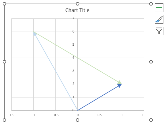
- Double-press with left mouse button on with left mouse button on one of the lines on the chart, all lines will be selected and a settings pane shows up.

- Press with left mouse button on the "Fill&Line" button.
- Press with mouse on "End Arrow type", select an arrow.
- Press with mouse on "End Arrow size, pick a size.
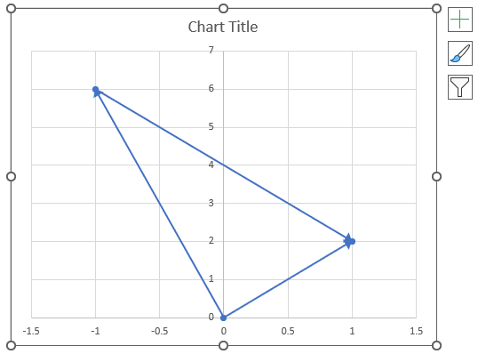
- Press with left mouse button on twice on a line to select a specific line.
- Press with left mouse button on the color button on the settings pane. A popup menu appears.

- Pick a color.
- Repeat steps 1 to 3 with remaining lines.
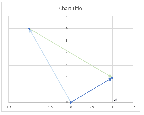
There are still three markers on the chart, here is how to remove them.
- Select all the lines by press with left mouse button oning on them once.
- Go to the settings pane.

- Press with left mouse button on "Marker Options".
- Select "None".

24.5.4 Change axis min and max value
- Double-press with left mouse button on one of the y-axis to open the settings pane.

- Press with left mouse button on the "Axis Options" button.
- Change the Bounds and the Units.
- Repeat step 1 to 3 with the x-axis.
24.5.5 Change axis markers and line width
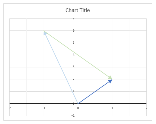
- Select the y-axis.

- Press with left mouse button on the "Fill & Line" button.
- Press with left mouse button on the "Line".
- Press with left mouse button on the "Color" button. Press with mouse on black.
- Change the width to 1.5

- Press with right mouse button on on one of the lines, a popup menu appears.

- Press with mouse on "Add Data Labels".
- Double-press with left mouse button on one of the data labels, the settings pane shows up.

- Select "X Value" as well.
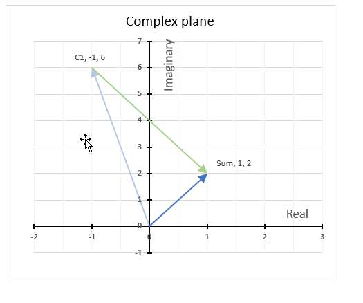
Change the chart title and add axis titles.
24.6. How to calculate the midpoint of two complex numbers?
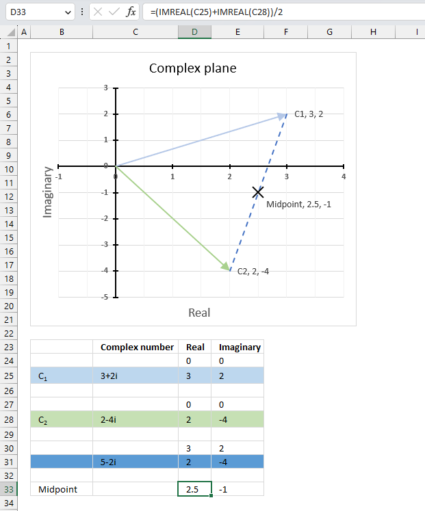
The midpoint of the line between two complex numbers x + yi and z + wi is the average of the real and imaginary numbers at the endpoints.
C1 = x + yi
C2 = z + wi
To calculate the average we need to add the real and imaginary numbers separately and then divide by 2.
Midpoint: (x+z) / 2 + ((y+w) / 2)i
Excel formula in cell D33:
Excel formula in cell E33:
Explaining formula in cell D33
Step 1 - Calculate real number
The IMREAL function calculates the real coefficient of a complex number in x + yi or x + yj text format.
Function syntax: IMREAL(inumber)
IMREAL(C25)
becomes
IMREAL("3+2i")
and returns 3.
Step 2 - Add real numbers
The plus sign lets you add numbers in an Excel formula.
IMREAL(C25)+IMREAL(C28)
becomes
3+2
equals 5.
Step 3 - Divide sum by 2
The division operator lets you divide numbers in an Excel formula.
(IMREAL(C25)+IMREAL(C28))/2
becomes
5/2
equals 2.5
Useful links
IMSUM function - Microsoft
Complex numbers: the complex plane, addition and subtraction
Adding and Subtracting Complex Numbers
25. How to use the IMTAN function
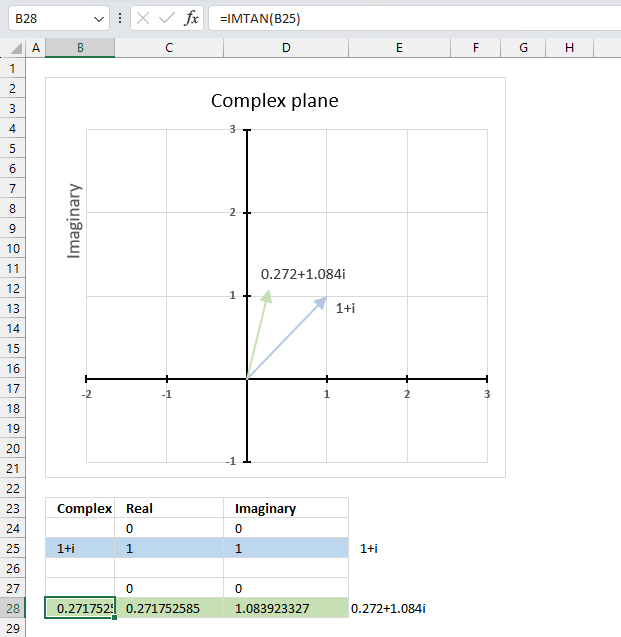
What is the IMTAN function?
The IMTAN function calculates the tangent of a complex number in x + yi or x + yj text format.
The letter j is used in electrical engineering to distinguish between the imaginary value and the electric current.
Table of Contents
25.1. Syntax
IMTAN(inumber)
25.2. Arguments
| inumber | Required. A complex number in x+yi or x+yj text format. |
25.3. Example 1

The image above demonstrates a formula in cell D3 that calculates the tangent of a complex number in general or rectangular form specified in the function.
The IMTAN probably stands for imaginary tangent.
25.3.1 What are complex numbers?
Complex numbers allow us to solve equations that have no real solutions. Complex number have two parts, a real part and an imaginary part called i which means imaginary and stands for the square root of -1.
Link: How are complex numbers used in real life?
25.3.2 What are the applications for complex numbers?
Complex numbers are very useful in many fields of mathematics and science.
- Electronics: Complex numbers are used to analyze circuits that involve alternating current (AC) or signals modulated by electromagnetic waves.
- Electromagnetism: Complex numbers are used to describe the electric and magnetic fields in terms of their magnitude and direction.
- Control theory: Complex numbers are used to design and optimize systems that have feedback loops, such as robots, airplanes, or rockets.
- Signal analysis: Complex numbers are used to perform Fourier transforms, which are methods of decomposing a signal into its frequency components.
- Relativity: Complex numbers are used to express the space-time interval in special relativity, which is a measure of the distance between two events that occur in different locations and times.
- Fluid dynamics: Complex numbers are used to model the flow of fluids, such as air or water.
Link: Complex number - Wikipedia
25.4. How is the function calculated?

z - complex number: 1+1i
a - real number: 1
b - imaginary number: 1
The math formula to calculate the imaginary tangent is:

Step 1 - Calculate real sin
The SIN function calculates the sine of an angle.
Function syntax: SIN(number)
sin(2a)
becomes
sin(2*1)
and returns 0.909297426825682
Step 2 - Calculate real cos
The COS function calculates the cosine of an angle.
Function syntax: COS(number)
cos(2a)
becomes
cos(2*1)
and returns -0.416146836547142
Step 3 - Calculate imaginary sinh
The SINH function
Function syntax:
sinh(2b)
becomes
sinh(2*1)
and returns 3.62686040784702
Step 4 - Calculate imaginary cosh
The COSH function
Function syntax:
cosh(2b)
becomes
cosh(2*1)
and returns 3.76219569108363
Step 5 - Divide first quotient
0.909297426825682/(-0.416146836547142+3.76219569108363)
becomes
0.909297426825682/3.34604885453649
and returns 0.271752585319512
Step 6 - Divide second quotient
3.62686040784702/(-0.416146836547142+3.76219569108363)
becomes
3.62686040784702/3.34604885453649
and returns 1.08392332733869i
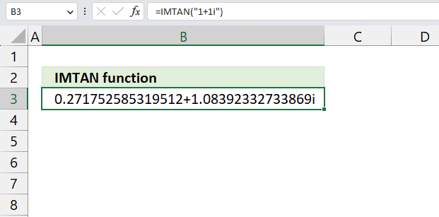
The calculations match the result from the IMTAN function.
25.5. Example 2 - cell reference
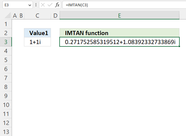
The image above demonstrates a formula in cell D3 that calculates the tangent of a complex number specified in cell C3.
Formula in cell D3:
25.5.1 Explaining formula
Step 1 - Populate arguments
IMTAN(inumber1)
becomes
IMTAN(C3)
Step 2 - Evaluate the IMTAN function
IMTAN(C3)
becomes
IMTAN("1+1i")
and returns
0.271752585319512+1.08392332733869i
25.6. Example 3 - real and imaginary coefficients
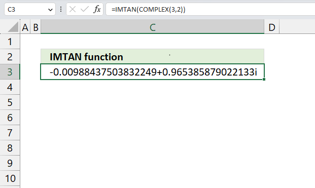
The image above demonstrates a formula in cell D3 that calculates the tangent of real and imaginary coefficients specified in the COMPLEX function. The COMPLEX function lets you create a complex number using a real and imaginary number.
Formula in cell D3:
25.6.1 Explaining formula
Step 1 - Calculate complex number based on a real and imaginary number
The COMPLEX function returns a complex number based on a real and imaginary number.
Function syntax: COMPLEX(real_num, i_num, [suffix])
COMPLEX(3,2)
returns
"3+2i".
Step 2 - Calculate the tangent of a complex number
IMTAN(COMPLEX(3,2))
becomes
IMTAN("3+2i")
and returns
-0.009+ 0.965i
25.7. Function error
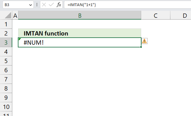
The IMTAN function returns a #NUM error if we use an invalid argument. Make sure the argument is valid.
The IMTAN function returns #NUM error if the suffix is not "i" or "j", or omitted.
Useful resources
26. How to use the COMPLEX function
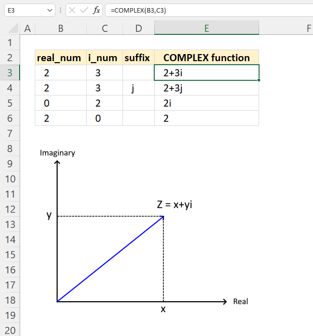
What is the COMPLEX function?
The COMPLEX function returns a complex number in the general form (also known as the rectangular form) based on a real and imaginary number.
What is a complex number?
A complex number can be written in this form x+yi, it contains a real and imaginary part. Complex numbers extend the real numbers by allowing solutions to equations that have no real solutions.
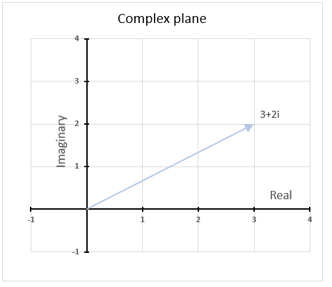
Complex numbers can be represented as points or vectors on a plane called the complex plane, where the horizontal axis is the real axis and the vertical axis is the imaginary axis, see the image above. The complex plane allows a geometric interpretation of complex numbers and their operations.
Table of Contents
26.1. Syntax
COMPLEX(real_num, i_num, [suffix])
26.2. Arguments
| real_num | Required. The real coefficient of the complex number. |
| i_num | Required. The imaginary coefficient of the complex number. |
| [suffix] | Optional. This argument lets you choose the suffix of the imaginary component. The default value is "i". |
The letter j is used in electrical engineering to distinguish between the imaginary value and the electric current.
26.3. Example

The COMPLEX function is useful when you want to create a complex number with given real and imaginary coefficients. A complex number is a number that has two parts: a real part and an imaginary part. The real part is a number that you are familiar with, such as 2, -5, or 0.5. The imaginary part is a number that is multiplied by a special symbol called i, which stands for the square root of -1.
The COMPLEX function converts real and imaginary coefficients into a complex number of the form x + yi or x + yj, where x represents the real part and y represents the imaginary part.
The COMPLEX function returns a text result, not a numeric result. You can not perform arithmetic operations on the result directly. However, Excel has other functions that work with complex numbers, check out the Engineering category for more imaginary functions.
Formula in cell E3:
Cell B3 contains the real coefficient of the complex number, x in the diagram. Cell C3 contains the imaginary coefficient of the complex number, y in the diagram shown above.
Cell E3 calculates the complex number based on the real and imaginary coefficients specified in cells B3 and C3 respectively.
26.3.1 Explaining formula
Step 1 - Populate arguments
COMPLEX(real_num, i_num, [suffix])
becomes
COMPLEX(B3,C3)
Step 2 - Evaluate COMPLEX function
COMPLEX(B3,C3)
becomes
COMPLEX(2,3)
and returns
"2+3i".
The COMPLEX function returns complex numbers in general form.
26.3.2 What is the general form of complex numbers?
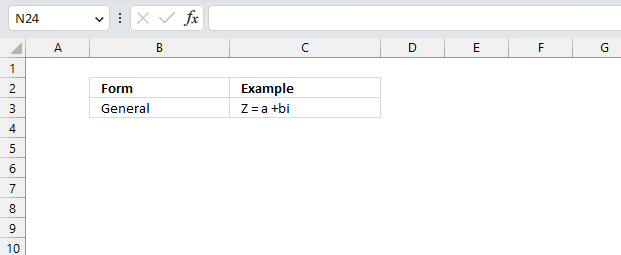
The general form of complex numbers is a + bi, where a and b are real numbers and i is the imaginary unit that satisfies i^2 = -1. The real part of a complex number is a, and the imaginary part is b.
26.3.3 Describe different forms of complex numbers?
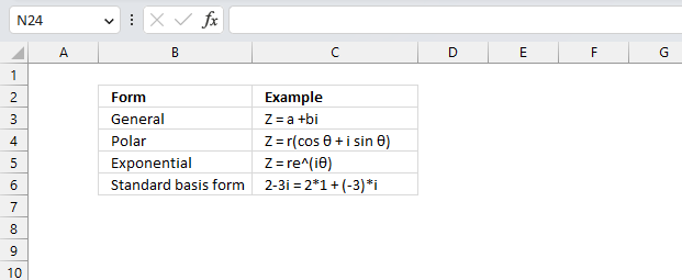
| Form | Description |
| General or rectangular | Z = a +bi. Use this form when you want to perform arithmetic operations such as addition, subtraction, multiplication, and division of complex numbers. It also shows the real and imaginary parts of a complex number clearly. |
| Polar | Z = r(cos θ + i sin θ) This form is useful for finding the roots, powers, and logarithms of complex numbers. It also shows the geometric interpretation of a complex number as a point on the complex plane with a certain distance and direction from the origin. |
| Exponential | Z = re^(iθ) Use this form when you want to simplify calculations involving trigonometric functions and exponential functions of complex numbers. It also shows the connection between complex numbers and periodic phenomena such as waves and oscillations. |
| Standard basis form | Example, 2-3i = 2*1 + (-3)*i This form is useful for performing linear algebra operations such as scalar multiplication, vector addition, dot product, and cross product of complex numbers. It also shows the algebraic structure of complex numbers as a two-dimensional vector space. |
The general form and the polar form of complex numbers are equivalent and can be converted from one to another using trigonometry and algebra.
26.3.4 Why is i equal to the square root of -1?
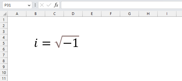
The symbol i is defined as the square root of -1 because there is no real number that satisfies this equation. If we try to find a real number x such that x^2 = -1, we get a contradiction.
For example, if x is positive, then x^2 is also positive, so it cannot be equal to -1.
If x is negative, then x^2 is also positive, for the same reason.
If x is zero, then x^2 is also zero, which is not equal to -1. So there is no real solution to x^2 = -1.
However, mathematicians wanted to extend the real numbers to include a solution to this equation, so they invented a new symbol i (iota) and defined it as the square root of -1. This means that i^2 = -1 by definition. This also means that i is not a real number, but an imaginary number.
We can create complex numbers, by using i, which are numbers that have both a real part and an imaginary part. Complex numbers are useful because they allow us to solve equations that have no real solutions, such as x^2 + 1 = 0. Using i, we can find two solutions: x = i and x = -i. This is because i^2 = -1 and (-i)^2 = -1.
26.4. Function error
The COMPLEX function returns #VALUE error if the two first arguments are not numbers.
The COMPLEX function also returns a #VALUE if the suffix is not "i", "j" or omitted.
Useful resources
COMPLEX function - Microsoft
Intro to complex numbers
An Introduction to Complex Numbers
Excel categories
Leave a Reply
How to comment
How to add a formula to your comment
<code>Insert your formula here.</code>
Convert less than and larger than signs
Use html character entities instead of less than and larger than signs.
< becomes < and > becomes >
How to add VBA code to your comment
[vb 1="vbnet" language=","]
Put your VBA code here.
[/vb]
How to add a picture to your comment:
Upload picture to postimage.org or imgur
Paste image link to your comment.